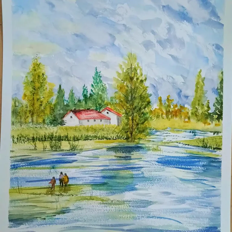
Direct answer: Start with a simple triangle silhouette, a pale green wet-on-wet wash, and 2 to 3 darker layers for shadow. That one method makes almost every tree in this guide look finished in minutes, even if you are a beginner. For a handmade card, pick a minimalist tree with lots of white space. For a realistic tree, keep the bottom darker than the top and lift a few white highlights with a clean, barely wet brush.
In this guide you will find all 23 watercolor Christmas tree ideas, a picker to match a technique to your goal, a 5-step method, fixes for muddy color and flat trees, and answers to the questions beginners ask most.
Quick pick: First tree ever? Try idea 11, the simple pot tree. Short on time? Try idea 1, the minimalist pine, or idea 10, the festive splatter tree. Making cards? Try ideas 1, 10, or 14, the glass globe scene. Want realism? Try ideas 4, 18, or 23, and use cold press paper so the washes stay soft.
Watercolor Christmas tree drawing ideas are a simple, beautiful way to paint festive art, even if you are a beginner. You will learn quick shapes, layered washes, and tiny details that turn practice into confident results.
In this guide, you will find easy watercolor Christmas tree sketches, modern styles, and creative prompts that help you grow your brush control. You are also joining a friendly, skill-building space where sharing, saving, and trying new variations keeps your inspiration strong.
1. Which Easy Technique Should You Try First?
Do not start by copying the fanciest tree on this page. Start by matching the technique to what you want the finished painting to do. A card needs bold shapes and white space. A realistic study needs slow layers and patience while each wash dries. A playful page for kids needs loose splatter and bright dots, not perfect needles.
| Your goal | Best technique | Try these ideas |
|---|---|---|
| A first tree tonight | One triangle wash, then darker edges | 1, 11 |
| A handmade card | Minimalist shape and negative space | 1, 10, 14 |
| A realistic tree | 2 to 3 layered washes, dark at the bottom | 4, 18, 23 |
| A fun, loose page | Splatter and dots, no outlines | 10, 17, 22 |
| A modern, stylish tree | Limited palette of 3 colors | 7, 16 |
The 5-step method that works for most trees here
Step 1: Sketch lightly. Draw one tall triangle, or three stacked triangles, in faint pencil. Leave the top narrow and the bottom wide.
Step 2: Wet the shape. Brush clean water just inside the triangle. This is the wet-on-wet base that keeps the first wash soft.
Step 3: Drop in pale green. Touch a watery sap green into the wet shape and let it spread on its own. Do not scrub it around.
Step 4: Add shadow while damp. Drop a darker green along the lower edges and the underside of each branch layer. Let the paint meet, not mix into mud.
Step 5: Finish dry. Once the paper is fully dry, add the trunk in diluted burnt umber, a few ornament dots, and white highlights with a gel pen or lifted paint. If you want a refresher on how the wet surface should behave, Winsor & Newton’s working wet on wet in watercolour masterclass shows the wash moving on wet paper.
Supplies that keep it easy: cold press paper if you want soft texture, smooth paper if you want crisp details, one round brush in size 6 or 8, sap green plus one dark green, burnt umber for the trunk, and a white gel pen for snow and stars. Two greens and patience beat a drawer full of tubes.
Common beginner mistake: painting over a damp wash again and again. Each extra stroke lifts the paint below it and turns green into grey-brown mud. Put the wash down, step back, and wait for it to dry before the next layer.
How do I paint an easy watercolor Christmas tree that still looks realistic?
- Direct answer: Use a triangle silhouette, then build depth with 2 to 3 layered washes.
- Start with a pale green wet-on-wet base so the “needles” feel soft and natural.
- While damp, drop a darker green along the lower edges to suggest shadowed branches.
- Lift highlights with a clean, barely wet brush to create sparkling light gaps.
- Add trunk and branches with a diluted burnt umber, then soften edges with water.
- Finish with simple ornaments using small color dots, and add a few white gel-pen stars.
- Keep the bottom darker than the top for instant dimension and a realistic glow.
What are the best watercolor Christmas tree styles for cards and minimal holiday art?
- Direct answer: Try minimalist trees using negative space, one color palette, and controlled splatter.
- Paint 3 to 5 trees in different sizes to create a quick “forest” composition.
- Use a limited palette like sap green, Payne’s gray, and gold for a modern look.
- Make a loose tree with one brush: press, drag downward, then lift to taper strokes.
- Add snow with light splatter, then place a clean sheet to protect the card border.
- Create a wreath-tree by painting a circle of leaves, then add a small trunk beneath.
- Outline only one side of the tree with a darker value to keep it clean but striking.
Grab your brush and try one watercolor Christmas tree drawing idea tonight, then test a second style tomorrow. Share your favorite version, tweak one technique, and watch your holiday painting skills grow.
2. The 23 Watercolor Christmas Tree Ideas
Work through these in order, or jump to the one that matches your goal in the picker above. Every idea below keeps its original painting, so you can compare paper types, palettes, and moods side by side.
1. Minimalist Pine Study on Sketchbook Paper
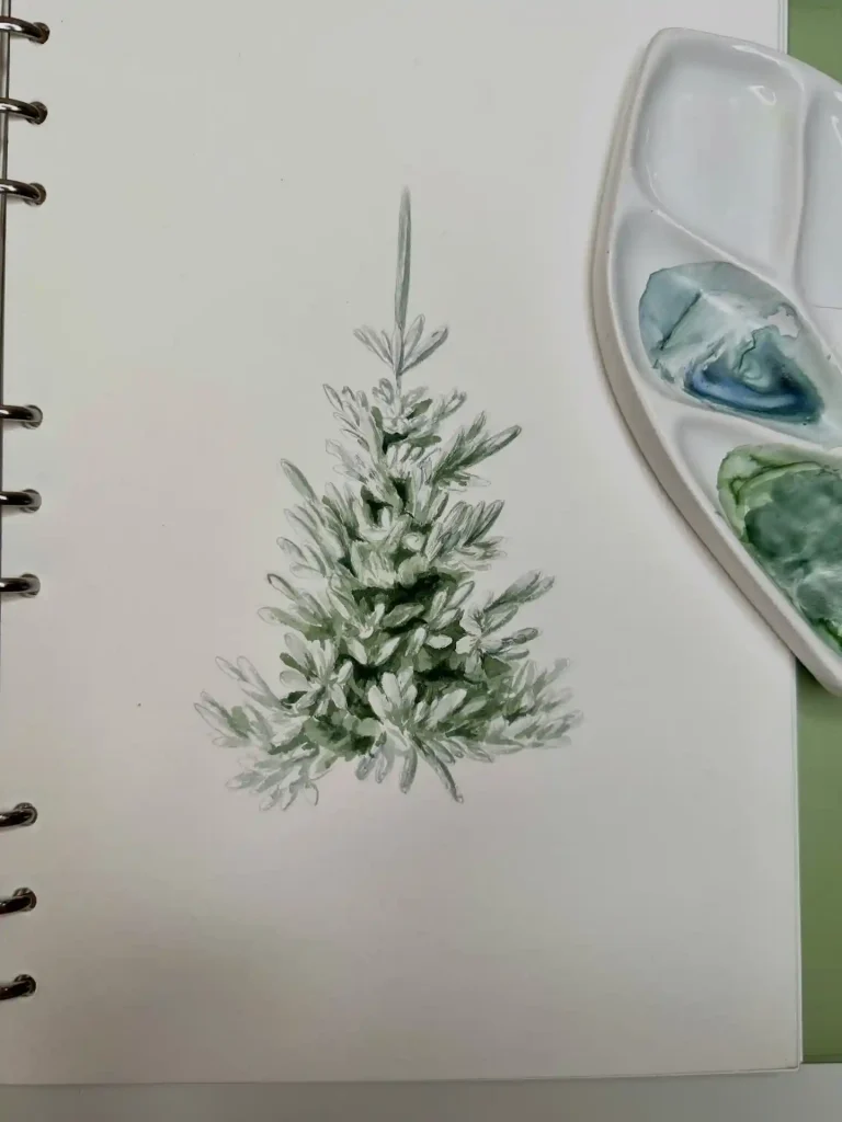
Sometimes you just want to focus on the structure of the branches without any distractions. This piece captures the raw beauty of a young evergreen using sage and forest green hues on smooth sketchbook paper. It really shows how practicing basic needle patterns creates texture without needing ornaments. It is a perfect way to study the natural organic shape of winter foliage.
2. Town Square Celebration on Cold Press Paper
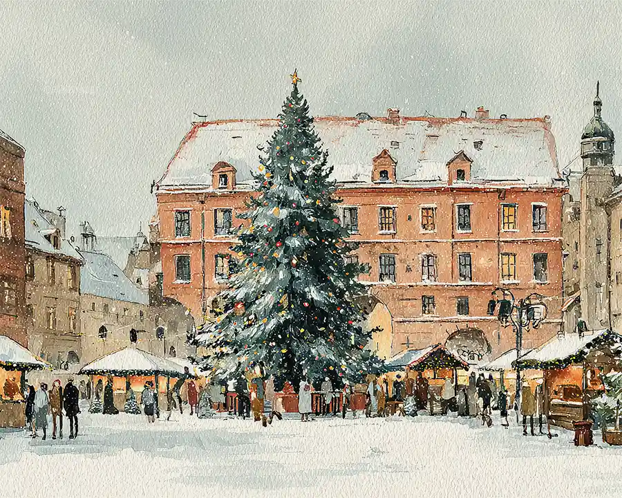
There is nothing quite like the energy of a holiday market in the city. This expansive watercolor scene brings a giant spruce to life amidst historic architecture and falling snow. The red buildings contrast beautifully with the cool winter whites to remind us of gathering together. It captures that bustling feeling of community spirit during the freezing December evenings.
3. Cozy Holiday Flat Lay on White Cardstock
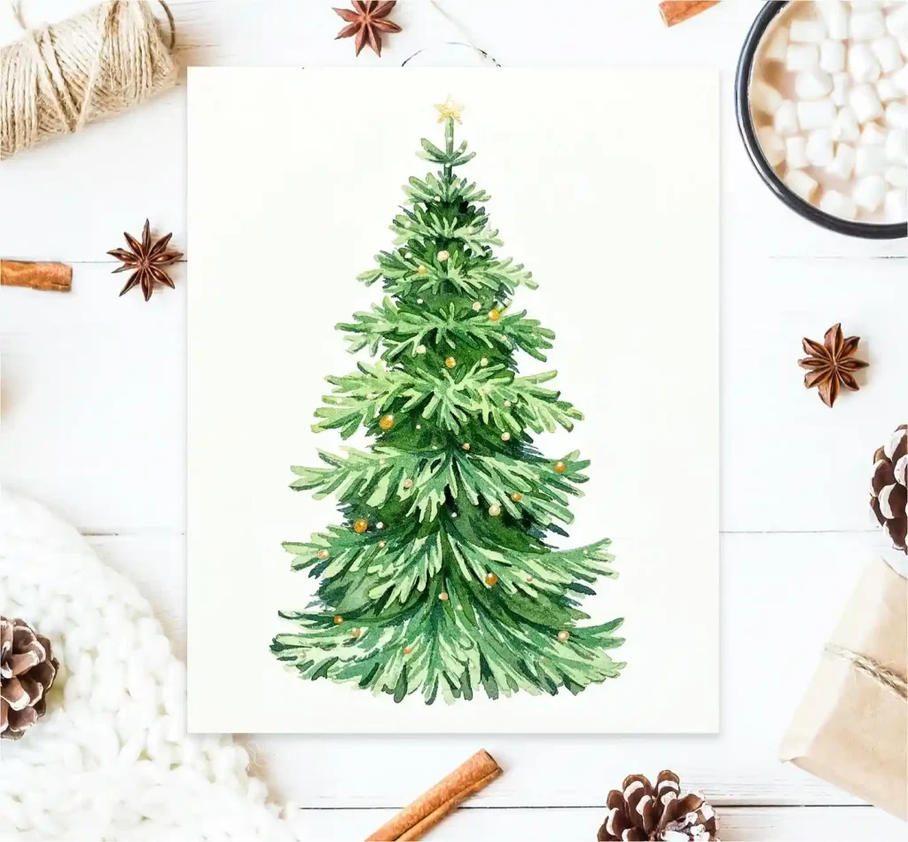
Cinnamon sticks and marshmallows set the mood for this festive illustration. The tree features vibrant evergreen tones with simple golden baubles resting centrally on a crisp white card. It feels like a warm hug that combines traditional holiday symbols with a cozy aesthetic. This style is great for handmade greeting cards that evoke memories of sipping hot cocoa by the fire.
4. Snowy Forest Lineup on White Watercolor Paper
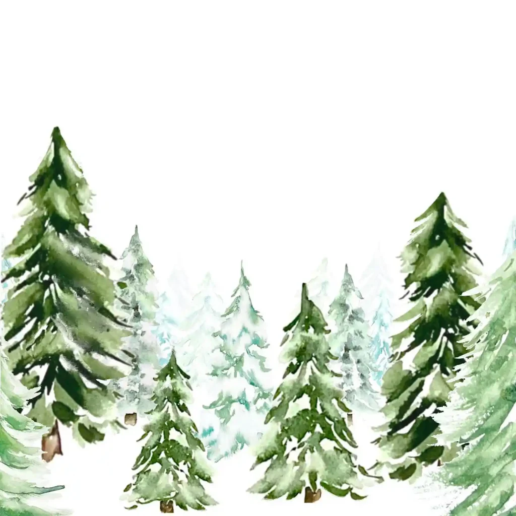
Winter landscapes offer a peaceful escape from the busy season. Here we see a collection of fir trees fading into the misty background to create lovely depth. The wet-on-wet technique allows the green paint to bleed into the snowy white areas naturally. It celebrates the quiet majesty of a wild forest where the trees stand tall against the cold air.
5. Vintage Winter Solitude on Deckle Edge Paper
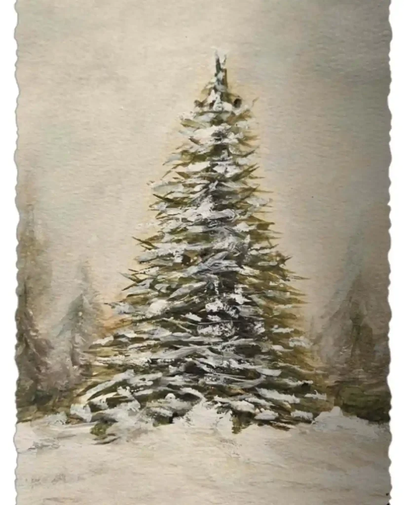
Vintage aesthetics bring a timeless charm to holiday art. This piece on textured deckle-edge paper uses muted olive tones and heavy white gouache to simulate thick snowfall. It looks like an heirloom postcard found in an attic. The solitary tree standing firm in the blizzard symbolizes resilience and the quiet, slumbering beauty of nature during the deepest winter months.
6. Golden Sparkle Miniature on Handmade Cotton Paper
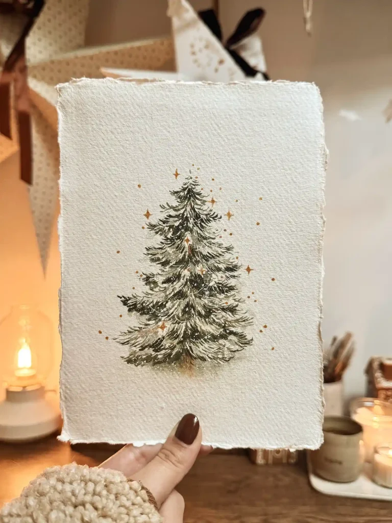
Holding a miniature piece of art makes the season feel personal. This delicate painting uses fine brushwork to detail the snowy boughs accented with magical gold stars that seem to shimmer. The interplay of dark greens and bright highlights creates a whimsical glow. It is a sweet reminder that even small sketches can carry the grand spirit of Christmas magic.
7. Whimsical Blue Spruce on Cellulose Paper

Who says holiday trees always have to be green? This playful interpretation uses shades of blue and periwinkle to create a stylized and fluffy texture. Topped with a bright yellow star and wrapped in loose garland, it breaks tradition in the most fun way. This approach shows how color theory exercises can turn into cheerful and modern holiday art.
8. Botanical Evergreen Study on Smooth White Paper
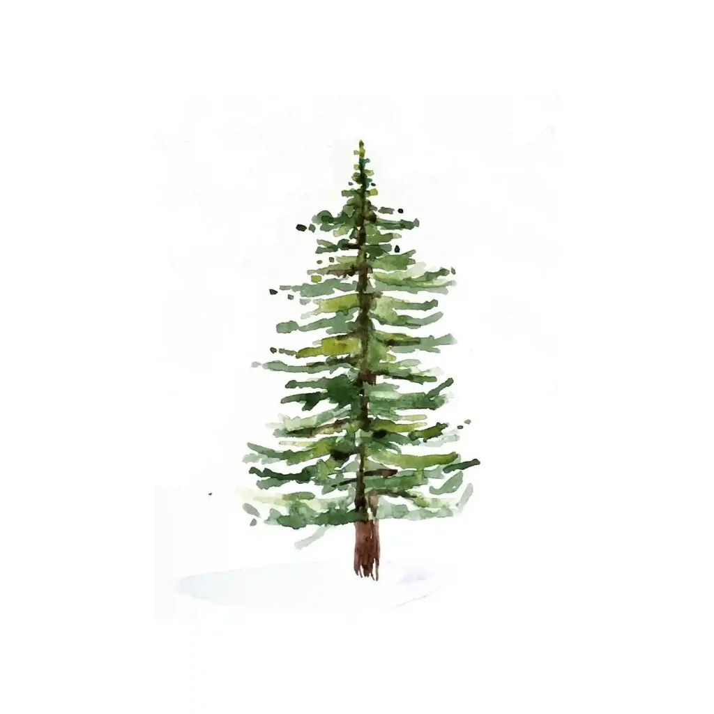
Nature provides the best design inspiration when you look closely. This botanical study isolates a single pine to focus on the variation between the brown trunk and the fresh green needles. The white background emphasizes the tree’s silhouette and upright posture. It speaks to the simplicity of the season by honoring the evergreen as a symbol of eternal life.
9. Artist Workspace Scene on Textured Paper

Seeing the tools beside the artwork is always inspiring for fellow creators. This setup features two variations of a spruce where one is detailed and the other shows the snowy environment. The green hues look rich against the neutral background to highlight the artistic process. It encourages us to grab a brush and experiment with different ways to capture wood textures.
10. Festive Splatter Tree on Textured Greeting Card
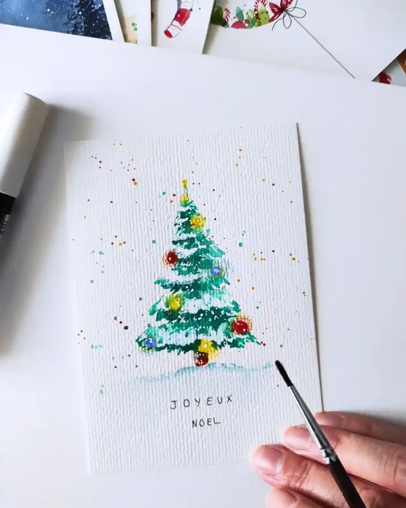
Splatters of paint add so much energy and movement to a drawing. This vibrant tree is decorated with large and colorful bulbs that pop against the textured paper. The loose and expressive dots dancing around the branches mimic falling snow or confetti. It captures the pure excitement of decorating day and brings a sense of childlike wonder to the page.
11. Simple Pot Tree on Spiral Notebook

Keeping a sketchbook is essential for growth. This quick study captures the essence of a classic pine with loose, layered green strokes and a distinct red star topper. The brown pot anchors the composition, symbolizing the humble roots of holiday traditions. It shows how daily practice in a spiral pad helps refine your hand for larger projects.
12. Polka Dot Pine on Textured Paper

Texture plays a huge role in watercolor depth. Here, the rough grain of the paper grabs the pigment to create a fuzzy, organic feel for the needles. Dotted with multicolored lights that look like candy, this piece evokes pure childhood joy. The soft shadow grounds the tree while the colorful ornaments add a playful rhythm to the branches.
13. Mood Wash Fir on Smooth Paper

Sometimes painting is about the atmosphere rather than the object. A soft wash of pastel pinks and blues in the background creates a dreamy winter sky behind the dark, solid evergreen. This contrast suggests the peaceful stillness of twilight. Using horizontal strokes for the branches builds a dense silhouette that stands strong against the fading light.
14. Glass Globe Scene on Greeting Card

Snow globes are like capturing a tiny world of magic. This illustration focuses on the transparency of glass and the distortion of the mini tree inside. The cool blue shading creates a convincing 3D effect that feels frosty and nostalgic. It represents the preservation of holiday memories, encased safely to be admired year after year.
15. Golden Garland Tree on Cotton Paper
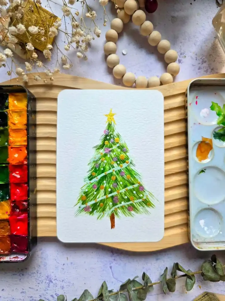
Bright colors can instantly lift your mood. This vibrant design uses cheerful greens layered with purple and yellow baubles for a festive pop. The real star is the sweeping white and gold garland that adds movement and sparkle. It celebrates the fun of trimming the tree, turning a simple natural form into a dazzling centerpiece of celebration.
16. Pink Bow Abstract on Hot Press Paper
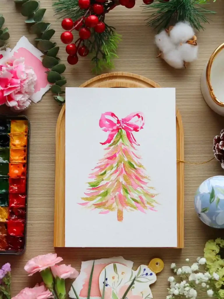
Fashion meets tradition in this chic interpretation. Instead of needles, sweeping brushstrokes in pink, green, and gold construct the tree shape, topped with a massive pink ribbon. It creates a whimsical and modern aesthetic perfect for stylish holiday cards. This approach symbolizes the gift of giving, wrapping up the spirit of the season in a beautiful, artistic package.
17. Splattered Spruce on Fine Grain Paper

Letting the paint lose control can be liberating. This sketch uses energetic splatters and loose, watery strokes to suggest a tree swaying in the wind. The light green washes blend freely to create a fresh, organic look. It captures the raw energy of nature and the artist’s hand, proving that perfection is not needed to convey beauty.
18. Tall Snowy Pine on White Paper

Winter has a quiet dignity that is breathtaking. This tall, slender tree is heavily laden with snow, created by leaving the white paper untouched. The dark green depths contrast with the bright snow to show the weight of the season. It stands as a symbol of endurance and grace, thriving silently even in the coldest conditions.
19. Sunset Snow Scene on Sketchbook Paper
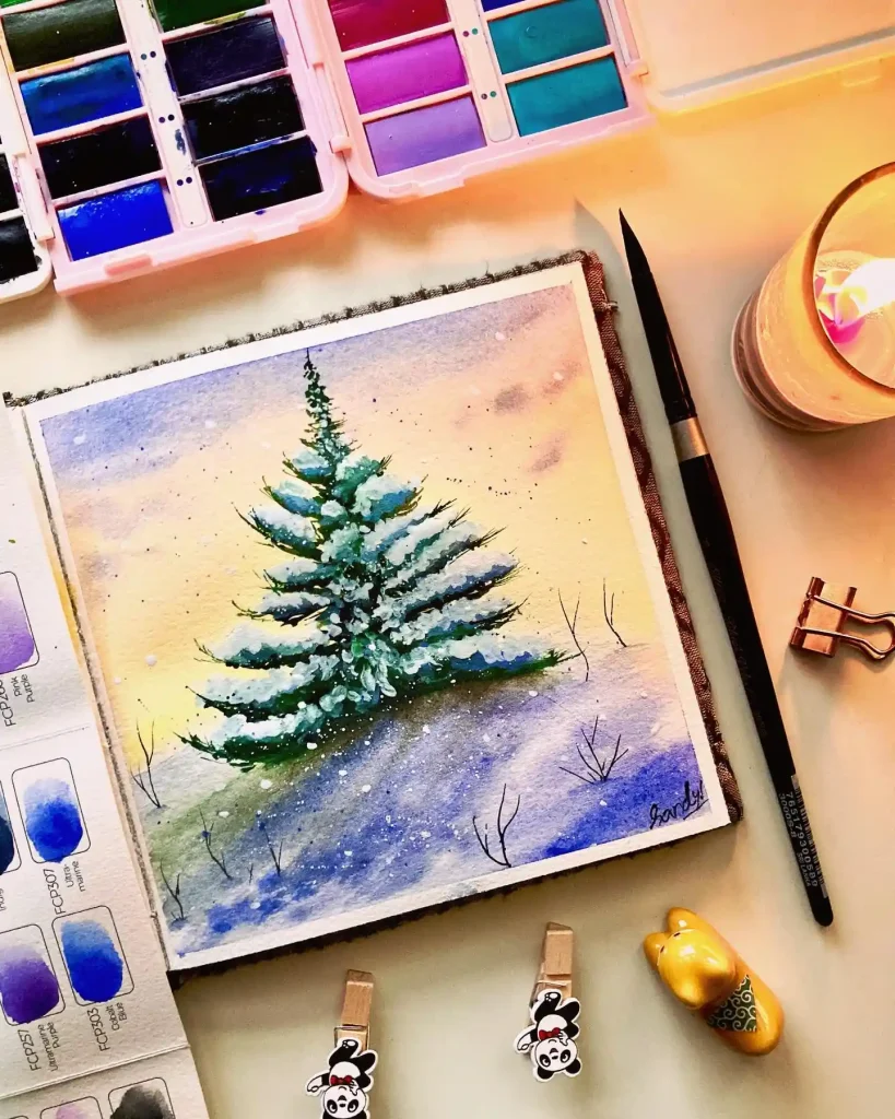
Capturing the light changes everything in a landscape. A warm gradient of yellow and purple simulates a winter sunset, casting a glow behind the snowy branches. Thick white gouache is used here to add texture to the heavy snow piles. This piece reflects the warmth we find at home while the world outside freezes during the holidays.
20. Holiday Delivery Car on Textured Paper

Bringing the tree home is an adventure itself. This charming illustration features a vintage red car hauling a large evergreen on its roof, dusting through the snow. The white splatters create a blizzard effect that adds action to the scene. It evokes nostalgia for family road trips and the excitement of starting the holiday preparations.
21. Comparative Pine Duo on Textured Paper
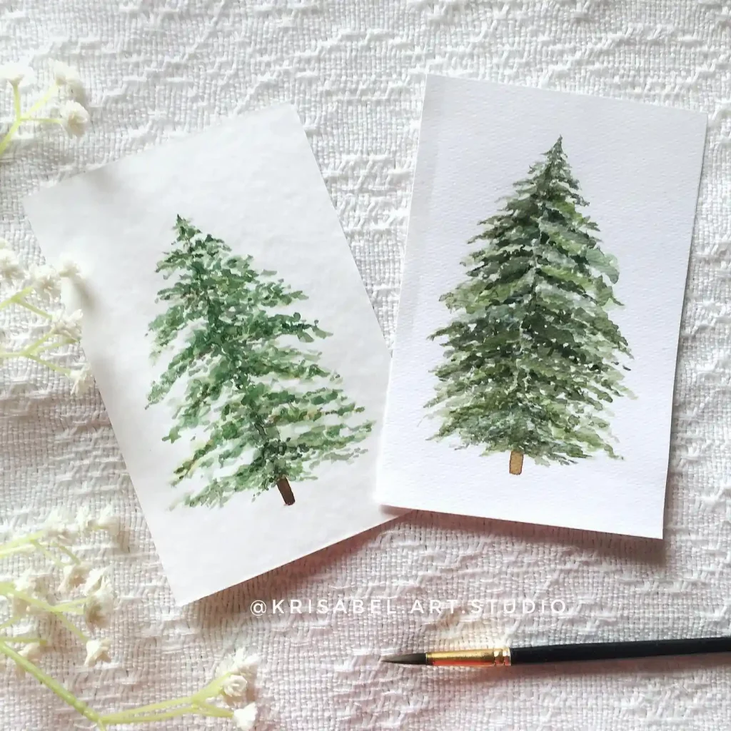
Comparison often teaches us the most about technique. This image displays two variations of a fir tree side-by-side to demonstrate density. The version on the left remains airy with visible paper whitespace, while the right uses heavier layers for a full forest feel. It is a smart way to practice needle textures on rough grain paper.
22. Abstract Confetti Tree on Cold Press Paper

Pointillism can turn a holiday classic into something modern. This cheerful design abandons lines entirely, building the tree form from loose dabs of green, blue, and gold paint. The scattered colorful marks look like falling confetti or ornaments. Paired with the cursive word “joy,” it captures the messy, vibrant happiness of the season rather than just the visual reality.
23. Realistic Needle Study on Smooth Paper
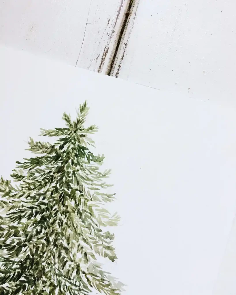
Nature’s texture is the primary focus here. This close-up sketch of a tree top uses short, feathered brushstrokes to mimic the sharpness of pine needles. By cropping the image to just the upper branches, the artist emphasizes the organic, uneven growth patterns. The earthy green tones against the stark white background highlight the raw and resilient beauty of winter foliage.
3. How to Fix Common Watercolor Tree Problems
My tree looks flat
Make the bottom third clearly darker than the top, and leave at least three small white gaps for light. One dark edge under each branch layer reads as shadow, even on a simple triangle tree.
My colors turned muddy
Let each wash dry fully before the next layer, use no more than three greens in one painting, and rinse your brush before you switch colors. Mud usually comes from reworking wet paint, not from the paint itself.
My snow disappeared
Paint around the snow instead of painting over it. Leave the paper white where snow should sit, then add only a faint blue-grey shadow on one side of each snow patch.
My tree looks stiff
Vary your branch lengths, let one side reach a little further than the other, and tilt the trunk slightly. A perfectly even triangle looks like a symbol. A slightly uneven one looks like a tree.
4. Frequently Asked Questions About Watercolor Christmas Trees
What is the easiest watercolor Christmas tree technique for beginners?
Paint a triangle silhouette with a pale wet-on-wet wash, then add a darker green along the lower edges while the paper is still damp. Finish with a trunk and a few ornament dots once the paper is dry.
How do I keep watercolor Christmas trees from looking muddy?
Let every wash dry before the next layer, limit yourself to two or three greens, and avoid scrubbing wet paint. Rinse the brush between colors so dark green does not drag into the light wash.
What paper is best for watercolor Christmas trees?
Cold press paper is the safest all-round choice because its texture softens washes and holds splatter well. Use smooth hot press paper for crisp needle details, and heavier cotton paper if you plan several wet layers.
How do I paint snow on a watercolor Christmas tree?
Leave the paper white where the snow should be, add white gouache only for thick snow texture, and finish with light splatter from a toothbrush or stiff brush. A faint blue-grey shadow on one side of each patch keeps the snow from looking flat.
Can I use watercolor Christmas trees for handmade cards?
Yes. Minimalist trees, splatter trees, and the glass globe scene in this guide work best for cards because they use bold shapes and plenty of white space. Paint on cardstock-weight watercolor paper, let it dry flat, and keep ornaments small so the card still folds cleanly.
How long does a simple watercolor Christmas tree take to paint?
A simple tree takes about 10 to 20 minutes of painting time, plus drying time between washes. A realistic layered tree takes longer mainly because each wash must dry fully, so plan 30 to 45 minutes from sketch to finished ornaments.
5. Try These Watercolor Ideas Next
When you have tried one tree here, keep the momentum going. Practice plain trees first with these watercolor tree drawing ideas, then try more festive scenes in these watercolor Christmas art drawing ideas. For a wider holiday set, browse these watercolor Christmas art ideas, study tree shapes in these tree drawings, and if you are painting with kids, try these watercolor art ideas for kids or these easy and simple watercolor art ideas for kids.