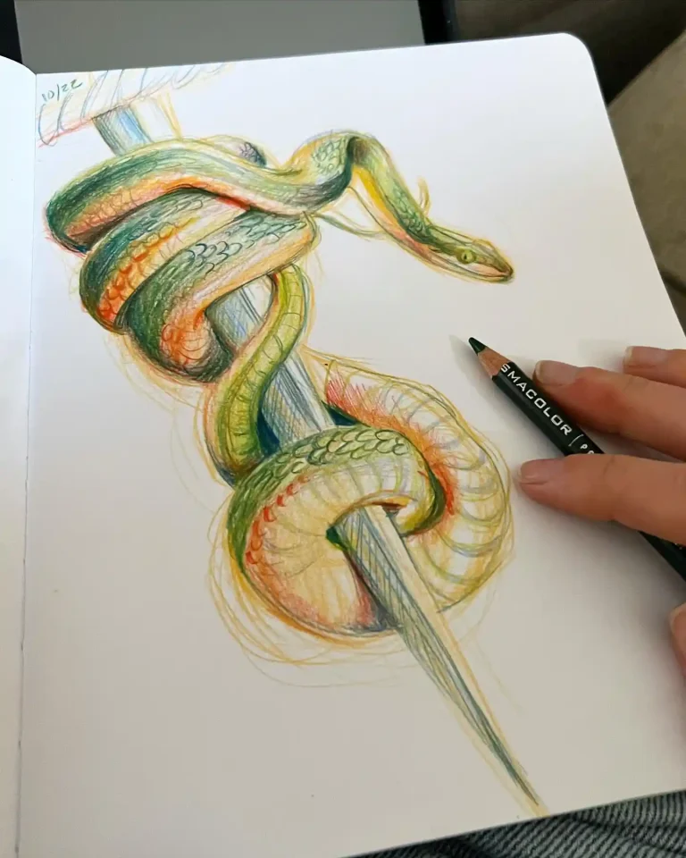
Alphabet art drawing transforms simple letters into extraordinary visual storytelling, where each character becomes a canvas for unlimited creative expression and artistic exploration. This unique art form bridges the gap between typography and illustration, offering artists of all levels the opportunity to reimagine familiar symbols in innovative ways.
Creating alphabet art develops essential design skills including composition, balance, and visual hierarchy while encouraging experimentation with different artistic styles and techniques. From decorative lettering adorned with floral motifs to three-dimensional block letters casting dramatic shadows, each approach builds fundamental drawing abilities.
The alphabet art community thrives on sharing diverse interpretations, from minimalist geometric designs to elaborate fantasy-themed letters filled with intricate details. Whether you’re designing personalized name art, educational materials for children, or sophisticated typographic illustrations, alphabet drawing opens doors to endless creative possibilities and skill development opportunities.
What are the best beginner techniques for creative alphabet art?
- Start with bubble letters: Create thick, rounded letter outlines that provide ample space for decorative fills and patterns
- Practice basic shading: Add dimension using simple light sources, creating depth with highlights on top edges and shadows underneath
- Experiment with pattern fills: Fill letters with stripes, polka dots, crosshatching, or geometric designs to add visual interest
- Use reference guides: Trace or copy existing fonts initially to understand letter structure before developing personal styles
- Focus on consistent spacing: Maintain even gaps between letters and words for professional-looking alphabet compositions
- Combine upper and lowercase: Mix different letter cases creatively to add visual variety and dynamic flow to your designs
- Add simple embellishments: Include basic decorative elements like swirls, stars, or hearts around letters for enhanced appeal
How do you create themed alphabet art with specific styles?
- Nature-inspired letters: Transform each letter into organic shapes using vines, branches, flowers, or animal silhouettes for whimsical designs
- Architectural alphabet: Design letters resembling buildings, bridges, or structural elements with perspective and dimensional details
- Fantasy theme integration: Incorporate dragons, castles, magical elements, or mythical creatures into letter forms for storytelling impact
- Seasonal adaptations: Modify letters to reflect seasons using autumn leaves, winter snowflakes, spring blooms, or summer sunshine motifs
- Cultural style exploration: Draw inspiration from different artistic traditions like Celtic knots, tribal patterns, or Art Deco influences
- Texture experimentation: Create letters that appear made from wood, metal, stone, fabric, or other materials using appropriate shading techniques
- Character personality: Give each letter unique facial expressions, limbs, or characteristics to create an animated alphabet series
Transform your artistic journey by exploring alphabet art today – let each letter become a stepping stone to discovering your unique creative voice and style!
1. A is for Astronauts and Apples on Watercolor on Paper
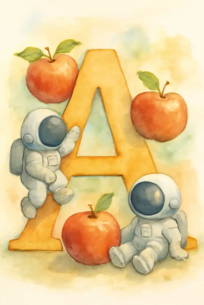
This is a wonderful example of classic alphabet illustration, playfully combining “A” for astronaut and apple. The artist used soft, blended watercolor washes to create a gentle, friendly atmosphere that’s perfect for a child’s room. I especially love how the little astronauts are drawn to interact with the large, friendly letter, making the whole scene feel alive and engaging.
2. B is for Bats and Balls on Watercolor on Paper
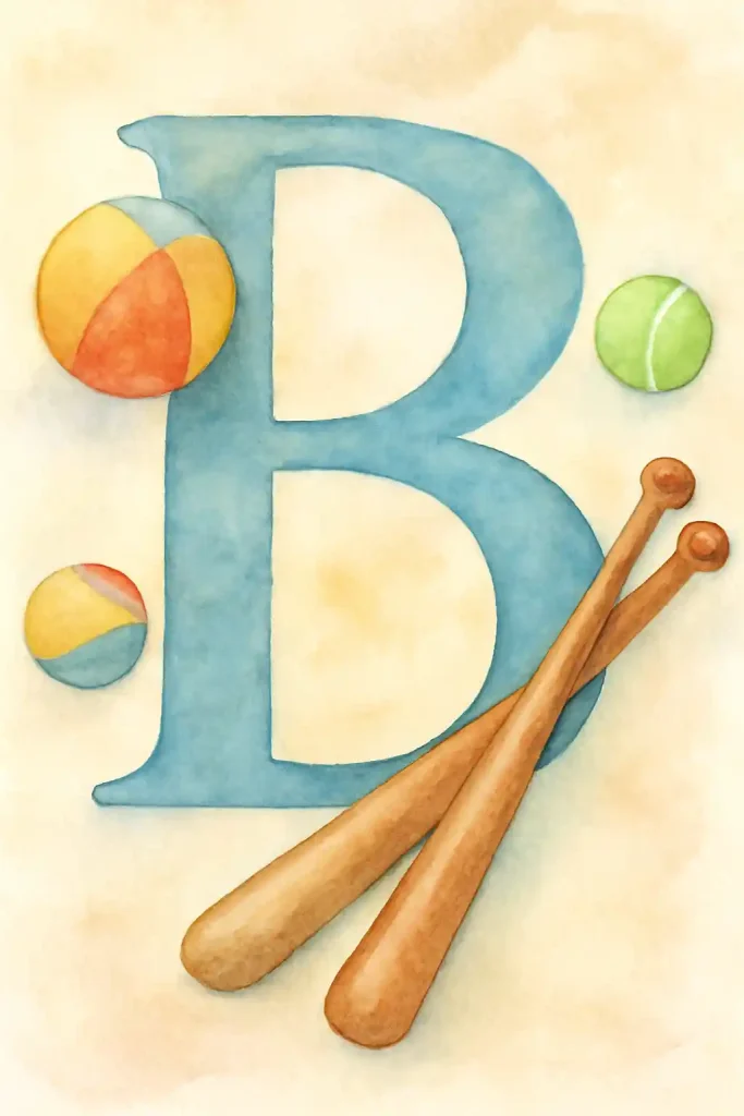
This composition for the letter “B” is so clean, simple, and effective. The artist used smooth watercolor washes to create the bold blue letter and the classic, recognizable shapes of the baseball bats and balls. The careful arrangement of the objects creates a great sense of balance and implied movement, perfectly capturing the simple joys of a summer ball game.
3. C is for Cats and Coconuts on Watercolor on Paper
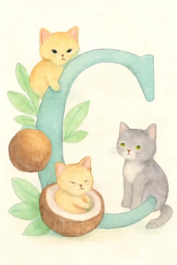
What a sweet and cozy world the artist has created around the letter “C.” The soft watercolor textures make these kittens look incredibly fluffy and gentle, and the clever idea of one napping inside a coconut is just delightful. This piece has a beautiful, warm color palette and a gentle, playful energy that is an absolute joy to look at.
4. D is for Dogs and Desks on Watercolor on Paper
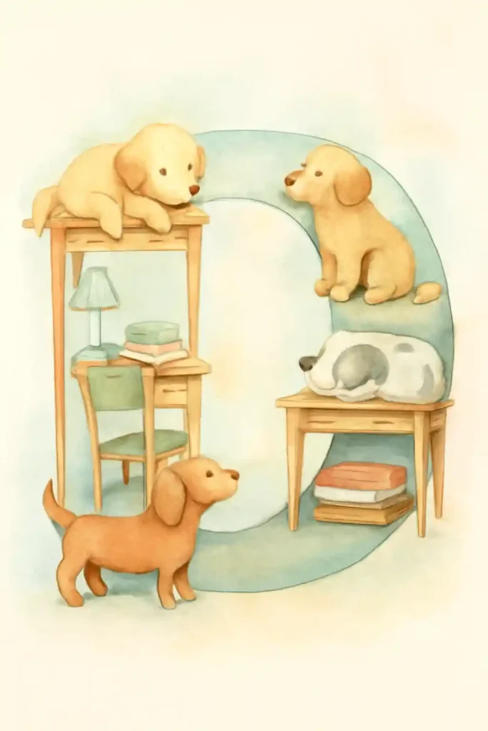
In this charming illustration, the letter “D” becomes a multi-level playground for a group of adorable puppies. The artist used a warm, gentle watercolor palette to create a cozy, domestic scene filled with books and furniture. I really appreciate how each dog has its own distinct personality, telling a little story of energetic play and quiet naps.
5. E is for Elephants and Earmuffs on Watercolor on Paper
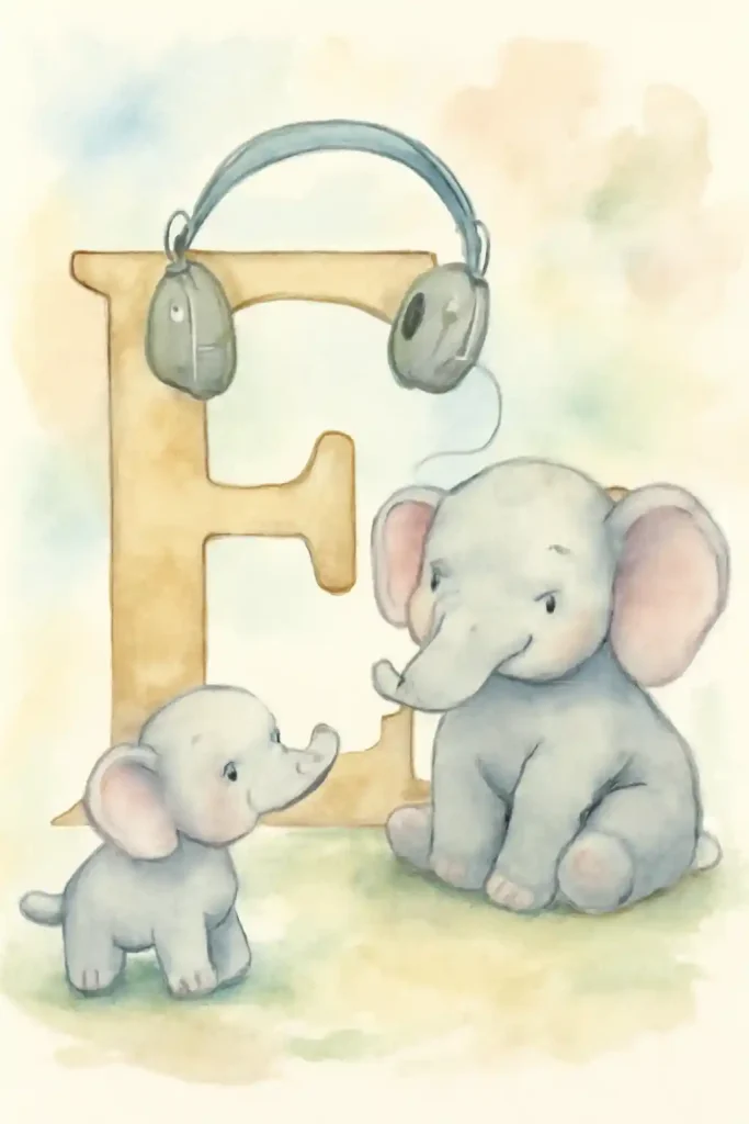
This is such a tender and sweet illustration for the letter “E.” The artist did a lovely job using soft, delicate watercolor washes to give the elephants a gentle and friendly appearance. The interaction between the parent and child elephant creates a heartwarming family narrative. Hanging the earmuffs from the letter is a fun, clever touch that completes the theme beautifully.
6. F is for Fish and Fruit on Watercolor on Paper
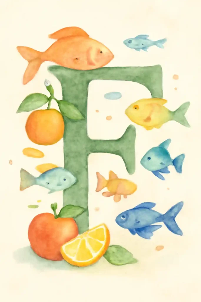
This composition is a vibrant and cheerful celebration of the letter “F.” The artist has filled the page with a lively school of colorful fish swimming around fresh, juicy fruit, creating a dynamic underwater scene. I love the way the transparent watercolor layers allow the different elements to overlap and interact, making the piece feel wonderfully energetic.
7. G is for Grapes and Guitar on Watercolor on Paper
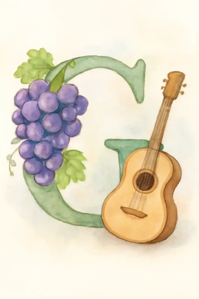
What a lovely, harmonious pairing for the letter “G.” The artist has rendered the bunch of grapes with beautiful, deep purple watercolors, making them look plump and almost luminous. The warm, wooden tones of the acoustic guitar are also captured perfectly. The whole composition feels balanced and gentle, a perfect tribute to the simple pleasures of good food and music.
8. H is for Hat House Castle on Watercolor on Paper
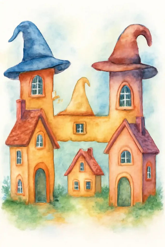
This is an incredibly imaginative and clever take on the letter “H.” The artist has brilliantly formed the letter from a whimsical village of houses, each one uniquely topped with a witch’s or wizard’s hat for a roof. The warm, earthy watercolor palette and the playful architecture give the piece a magical, storybook feel, turning a letter into a whole world.
9. I is for Ice Cream and Igloos on Watercolor on Paper
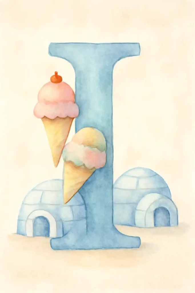
This is such a fun and charmingly contradictory scene. The artist used cool, frosty blue watercolors for the icy letter “I” and the two igloos, which contrast wonderfully with the warm, sweet pastel colors of the ice cream cones. It’s a playful and imaginative illustration that creates a delightful, chilly world full of fun and unexpected treats.
10. J is for Jelly Beans and Jackets on Watercolor on Paper
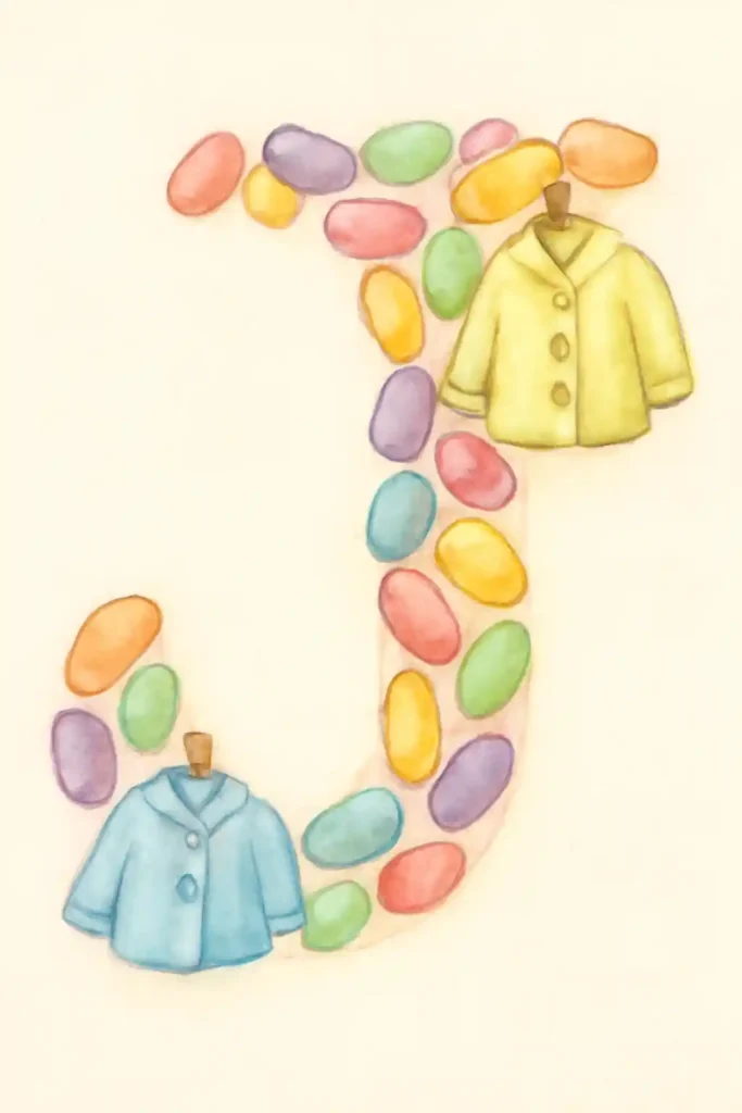
What a creative way to construct a letter! The artist has formed the letter “J” out of a cascade of colorful, candy-like jelly beans, giving the piece a playful texture and a vibrant, cheerful palette. Hanging the two little jackets from the letter itself is a wonderfully clever touch that completes the alliterative theme. A truly imaginative illustration.
11. K is for Kites and Keys on Watercolor on Paper
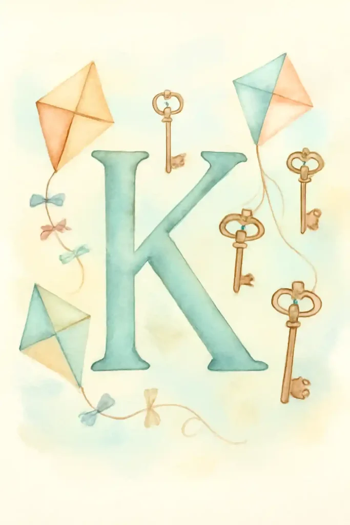
This is a wonderfully whimsical and imaginative pairing for the letter “K.” The artist used soft pastel watercolors to give the kites a light, airy feeling as they float on the page. In contrast, the antique keys add a touch of mystery and narrative, suggesting that adventures are waiting to be unlocked. A beautiful and dreamy composition.
12. L is for Lions and Lemons on Watercolor on Paper
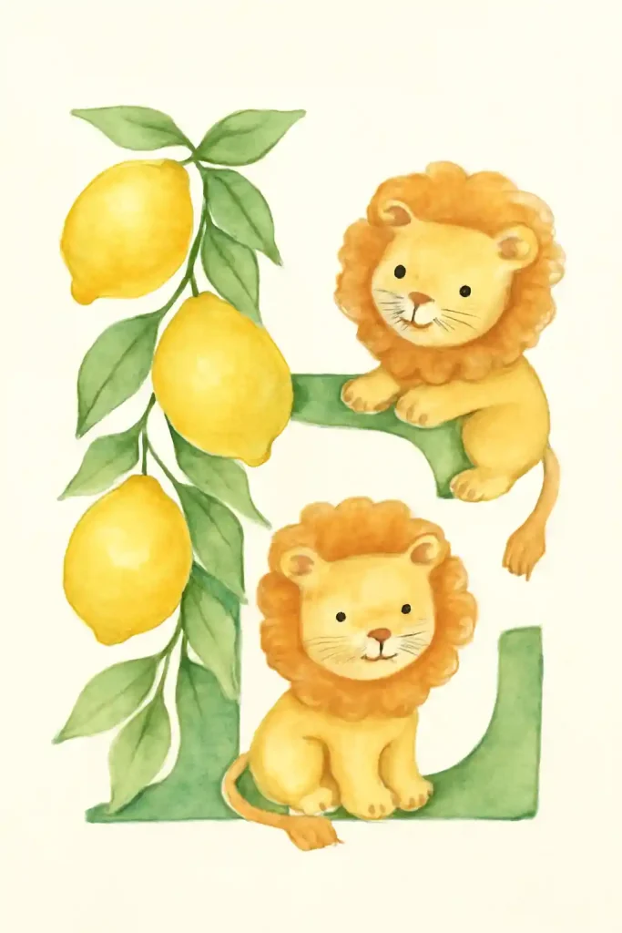
What a sweet and gentle take on the “king of the jungle.” The artist has rendered these two lions with soft, fluffy manes and kind, friendly faces, making them incredibly charming. The branch of bright, cheerful lemons adds a wonderful pop of contrasting color and completes the alliterative theme. The soft watercolor technique makes the entire piece feel sunny and warm.
13. M is for Moons and Mugs on Watercolor on Paper
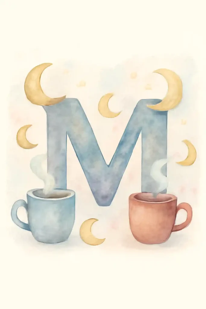
This illustration perfectly captures the feeling of a cozy, magical night. The artist used soft, cool watercolors to create a dreamy, moonlit sky around the letter “M.” The two steaming mugs in the foreground add a sense of warmth, comfort, and quiet companionship, creating a beautiful piece about finding magical moments in peaceful, cozy evenings with a friend.
14. N is for Nests and Necklaces on Watercolor on Paper
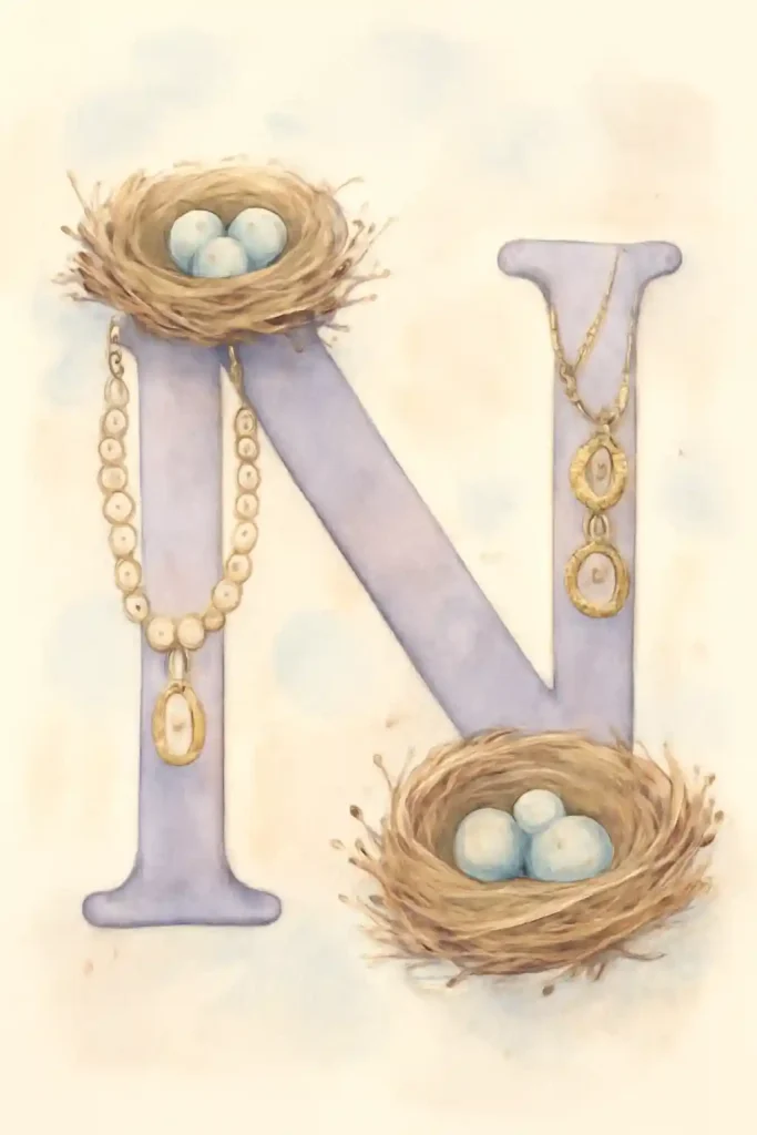
I absolutely love the elegant and thoughtful combination of objects in this piece. The artist has paired the natural, rustic texture of the birds’ nests with the delicate, refined beauty of the pearl necklaces. This creates a wonderful visual contrast and a beautiful narrative about precious things—both those found in nature and those crafted by hand.
15. O is for Owls and Oranges on Watercolor on Paper
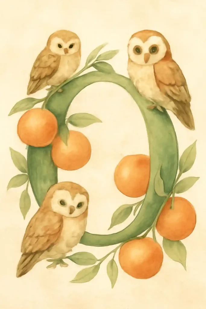
This illustration is just so warm and utterly charming. The artist used a lovely, earthy watercolor palette to bring these three wise little owls to life, giving each one its own unique personality. Having them perched on a letter “O” that cleverly doubles as a branch of an orange tree is a brilliant and beautifully integrated compositional choice.
16. P is for Penguins and Pineapples on Watercolor on Paper
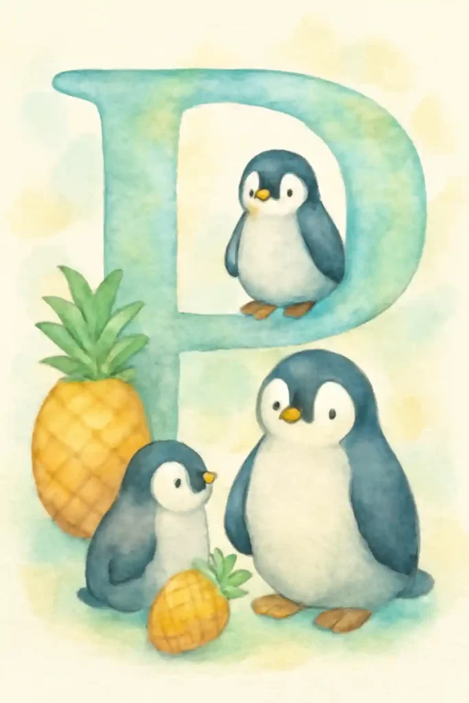
The playful contrast in this piece is just delightful. The artist has brought arctic penguins and tropical pineapples together in one charming, imaginative scene. The soft, cool watercolor tones of the penguins and the letter “P” are beautifully balanced by the warm, sunny yellow of the pineapples, creating a sweet and unexpected story of friendship.
17. Q is for Queens and Quilts on Watercolor on Paper
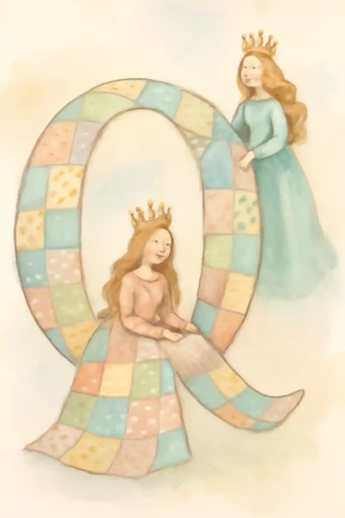
What a beautiful and highly imaginative way to illustrate the letter “Q.” The letter itself has been transformed into a soft, patchwork quilt—a wonderful symbol of comfort, history, and craftsmanship. The two gentle queens interacting with it give the piece a classic, timeless fairy-tale quality, enhanced by the artist’s soft, dreamy watercolor style.
18. R is for Rabbits and Rainbows on Watercolor on Paper
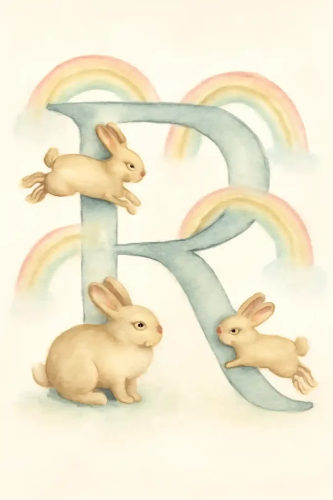
This painting is a picture of pure, gentle magic. The artist has rendered the fluffy rabbits with soft, delicate watercolor washes, giving them a sense of innocence and lively movement. The pale, dreamy rainbows arching in the background add to the magical, ethereal quality of the scene, creating a wonderfully sweet and imaginative piece that feels like a happy daydream.
19. S is for Shells and Starfish on Watercolor on Paper
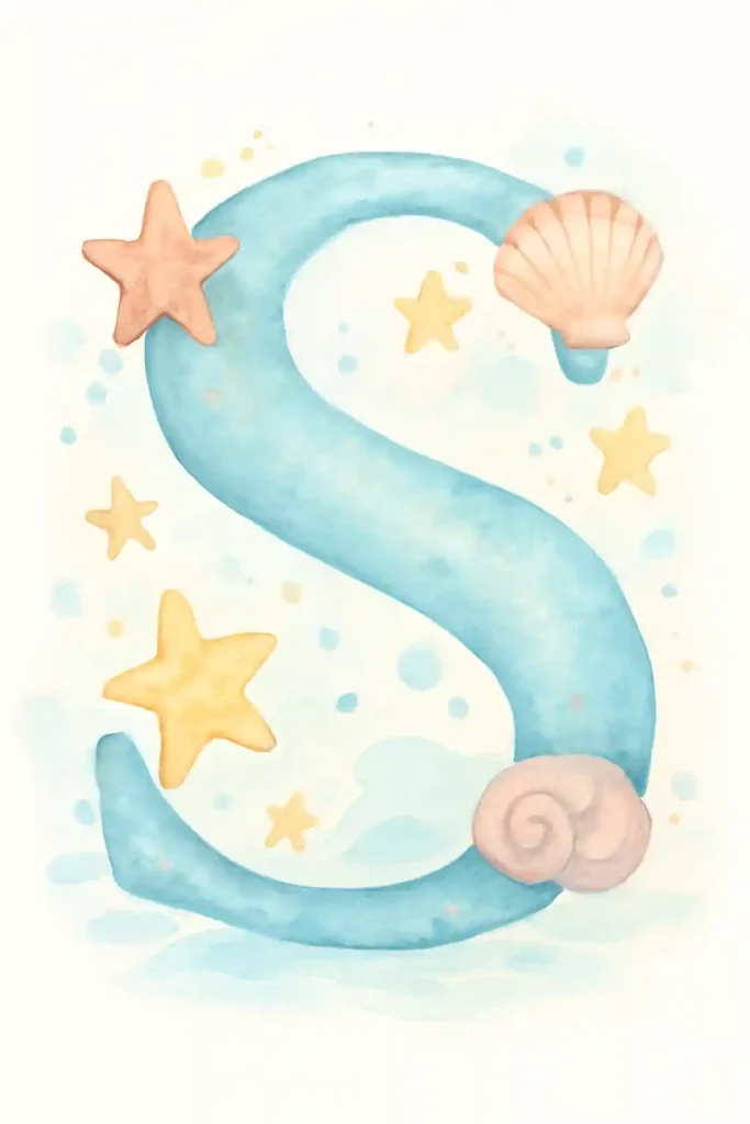
This illustration beautifully captures the serene feeling of the sea. The artist has given the letter “S” a fluid, watery texture, complete with little bubbles, as if it were a current in the ocean itself. The scattered seashells and starfish complete the charming seaside theme, while the soft, cool blue and sandy-pink color palette is perfectly peaceful.
20. T is for Turtles and Trees on Watercolor on Paper
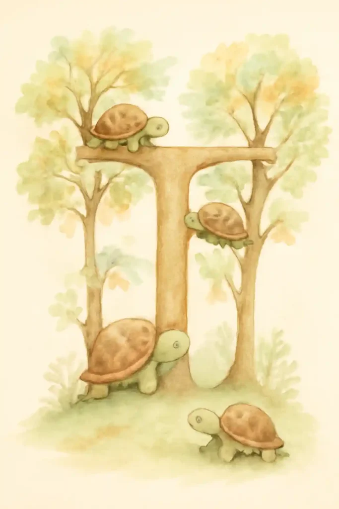
I love how the artist has creatively transformed the letter “T” into a tree, or perhaps even a small forest grove. The soft, earthy watercolor palette gives the entire scene a gentle, natural feel. The group of little turtles exploring this unique letter-tree adds a sense of slow, peaceful adventure, beautifully merging the alphabet with the natural world.
21. U is for Unicorns and Umbrellas on Watercolor on Paper
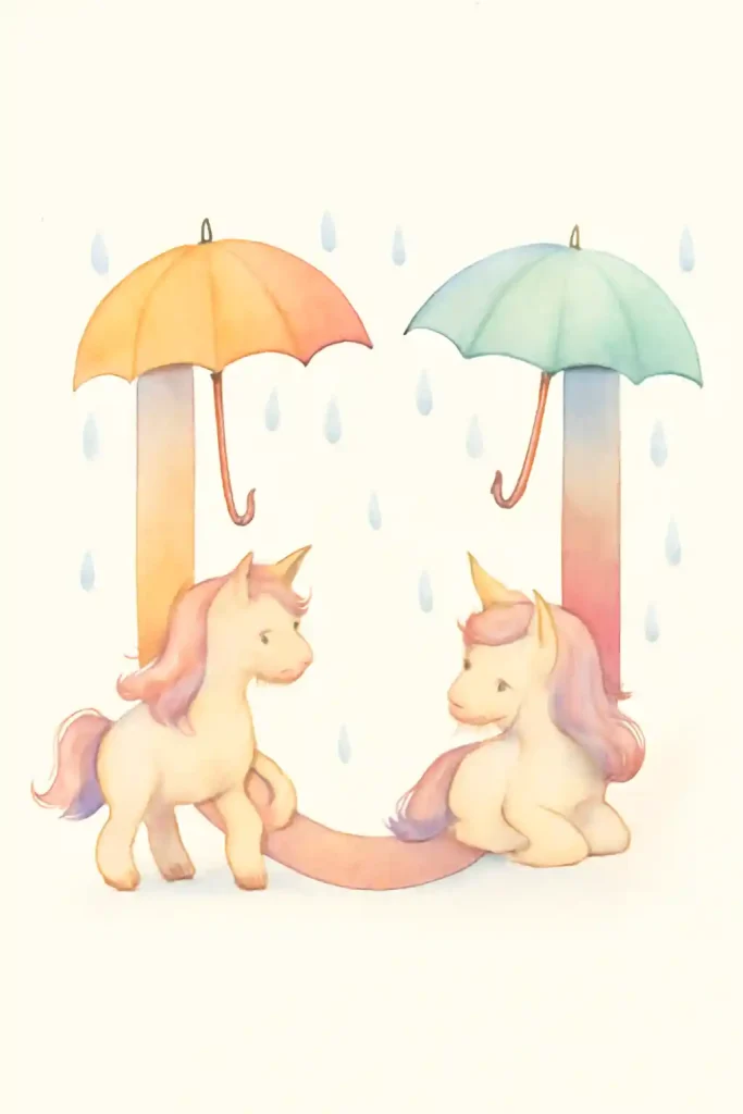
This is an absolutely enchanting scene for the letter “U.” The artist used soft, pastel watercolors to create a gentle, magical atmosphere, which is perfectly suited for the two sweet unicorns. The addition of the umbrellas is a charming touch, suggesting that even in a magical world, a little shelter from the rain is always welcome.
22. V is for Violins and Violets on Watercolor on Paper
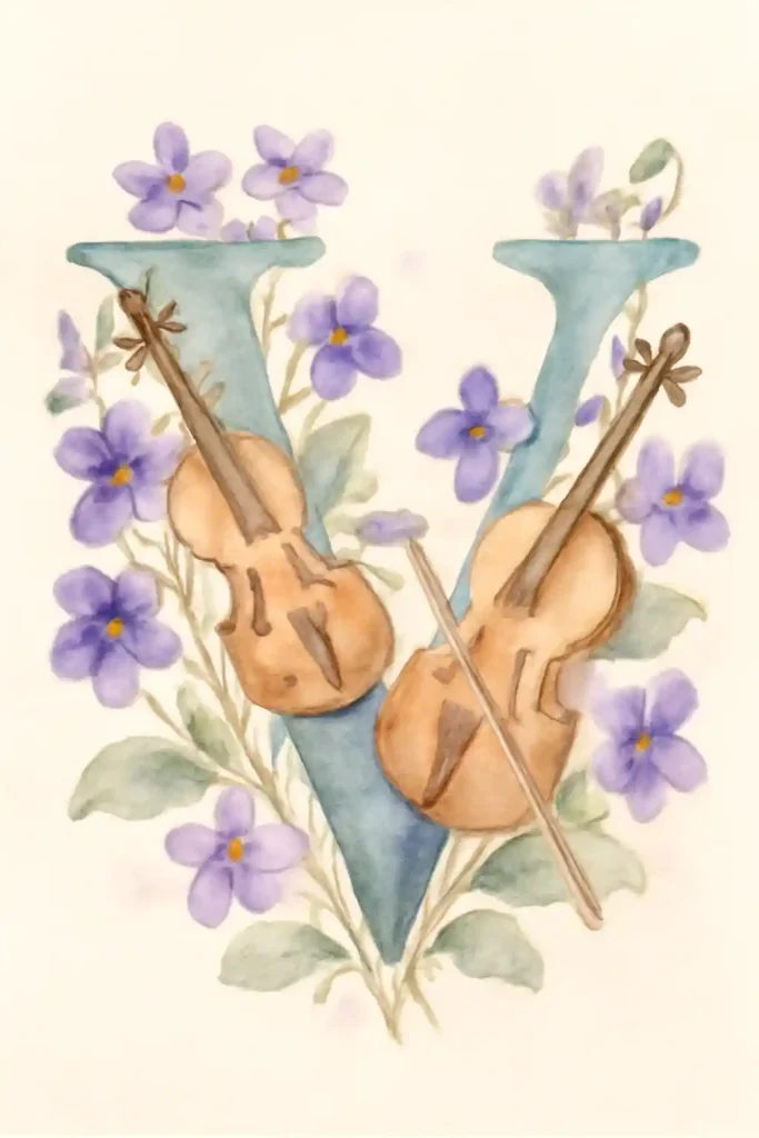
What an elegant and harmonious composition for the letter “V.” The artist has beautifully intertwined the letter’s form with delicate purple violets and two classical violins. The soft, transparent watercolor technique gives the flowers a fresh, natural feel, while the warm wood tones of the violins are captured perfectly, celebrating beauty in both nature and music.
23. W is for Whales and Watches on Watercolor on Paper
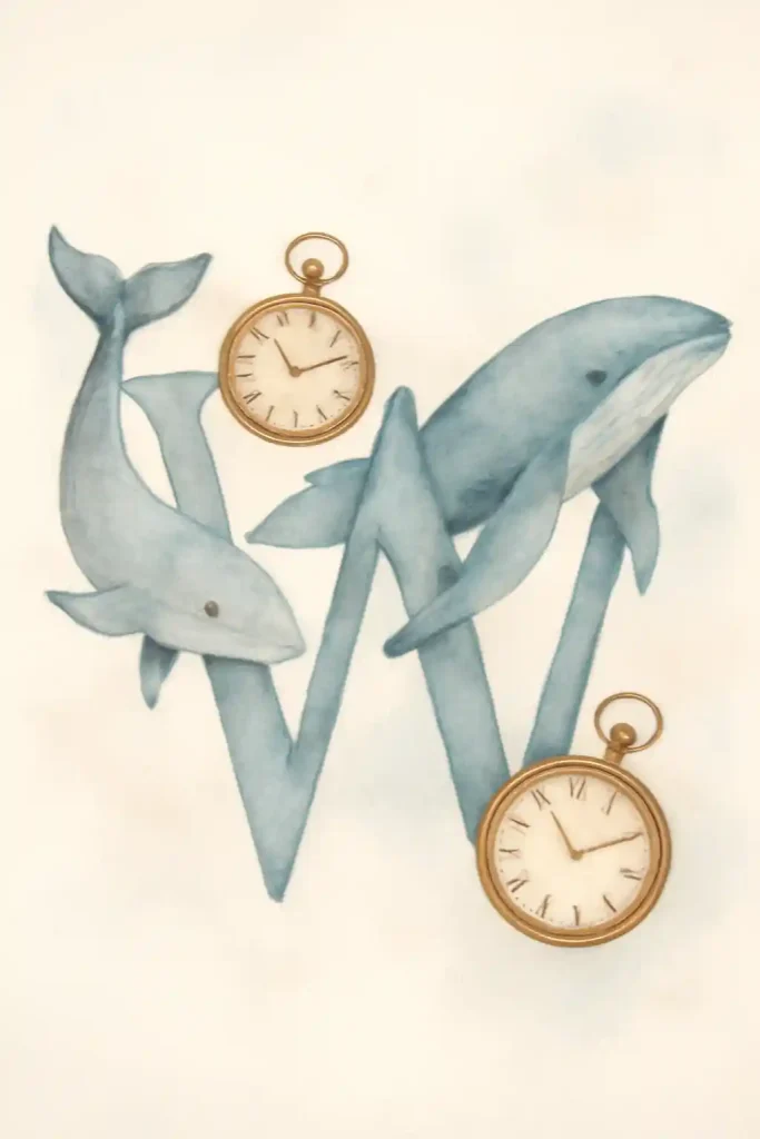
This is such a surreal and thought-provoking pairing of objects. The artist has gracefully woven two majestic whales through the letter “W,” giving them a wonderful sense of fluid motion. The addition of the vintage pocket watches introduces a fascinating theme of time in contrast to the timeless, ancient nature of these gentle giants. A truly imaginative piece.
24. X is for Xylophone and X-Ray on Watercolor on Paper
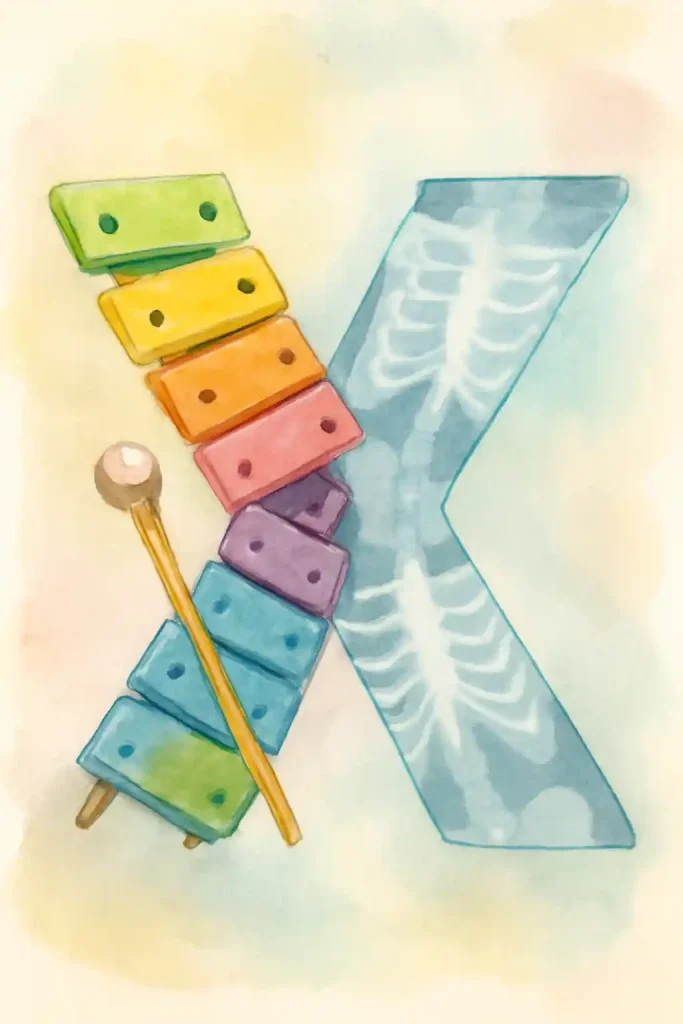
Finding great subjects for the letter “X” is always a fun artistic challenge, and this artist nailed it. The playful, colorful xylophone on one side contrasts brilliantly with the scientific, cool blue of the x-ray on the other. It’s a wonderfully clever and visually engaging design that perfectly balances art and science in one composition.
25. Y is for Yaks and Yachts on Watercolor on Paper
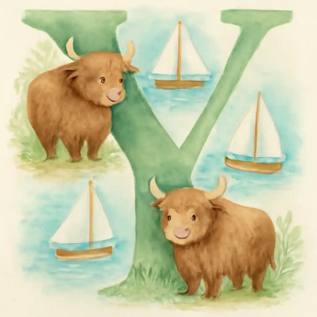
The wonderfully fluffy texture of the yaks in this piece is a highlight. The artist used soft, layered watercolor washes to perfectly capture their shaggy coats, giving them such a friendly and huggable appearance. The little toy yachts sailing in the background add a sense of gentle, playful adventure to this charming and unexpected combination of subjects.
26. Z is for Zebras and Zucchini on Watercolor on Paper
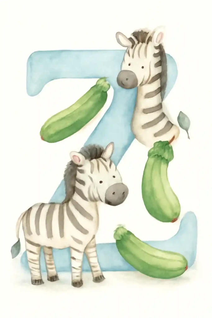
This is a delightful and beautifully composed finale for an alphabet series. The artist has rendered the two friendly zebras with soft, gentle stripes and sweet, curious expressions. The bright green zucchinis are a fun, alliterative addition that adds a lovely pop of fresh color to the scene, creating a balanced and cheerful final illustration.