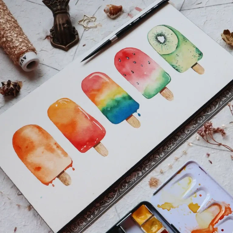
Vibrant watercolor abstract art is created by experimenting with paint flow, color harmony, and textures. Utilize techniques like salt sprinkling, alcohol drops, splattering, and wet-on-wet bleeding to create organic shapes and rich, modern visual depth.
Key takeaways
- Select a limited, cohesive color palette to prevent muddy blends.
- Incorporate household elements like salt or plastic wrap for unique texture effects.
- Contrast soft watercolor bleeds with sharp pen lines or gold leaf accents.
Watercolor abstract drawing ideas ignite the imagination, letting loose vibrant washes and bold strokes to capture emotions on canvas without rigid rules. This fluid medium empowers you to express inner worlds, from swirling dreams to chaotic energies, fostering a deep connection to your creative core. As you experiment, skills in blending, layering, and spontaneity grow, opening doors to explore abstract interpretations of life’s rhythms and colors.
Unlock Watercolor Abstract Drawing Ideas through guided tutorials, diverse inspirations, and a vibrant community of artists sharing techniques and encouragement. Whether you’re just starting or seeking fresh challenges, this space welcomes your unique vision, turning every brushstroke into a personal adventure of discovery and joy.
Beginner Tips for Watercolor Abstract Art
- Embrace Wet-on-Wet Techniques: Start by wetting your paper and dropping in colors to let them bleed naturally—this spontaneous method builds confidence in flow and unpredictability, helping beginners express emotions freely without overthinking structure.
- Layer Colors Gradually: Apply thin washes one at a time, allowing each to dry before adding the next; this develops control over transparency and depth, turning simple marks into layered stories that reflect your inner world.
- Use Salt for Texture: Sprinkle salt on wet paint to create organic patterns, mimicking clouds or waves—experimenting with this adds whimsy to your abstracts, enhancing skill in observing and harnessing watercolor’s magical reactions.
- Focus on Emotion Over Form: Choose colors based on mood, like blues for calm or reds for passion; this intuitive approach sharpens your expressive voice, making abstract drawing a powerful tool for personal growth and world exploration.
- Practice with Prompts: Dedicate sessions to themes like “urban energy” or “serene voids”—regular practice refines blending skills and invites you to see everyday inspirations through an abstract lens, sparking endless creativity.
Advanced Techniques for Abstract Watercolor Expression
- Incorporate Resist Methods: Apply masking fluid or wax crayons before painting to preserve whites and create contrasts; this advanced control elevates your compositions, allowing deeper exploration of light and shadow in emotional abstracts.
- Experiment with Dripping and Splattering: Tilt your canvas to guide drips or flick paint from a brush for dynamic energy—this technique hones spontaneity and movement, transforming skill into bold statements of inner turmoil or joy.
- Build Mixed Media Layers: Integrate ink lines or collage elements over watercolor bases for added dimension; blending mediums fosters innovative expression, pushing experienced artists to reinterpret the world in multifaceted ways.
- Refine Negative Space: Leave intentional unpainted areas to imply forms, balancing busyness with breath—this subtlety sharpens compositional awareness, turning abstracts into evocative narratives that resonate on multiple levels.
- Join Concept Challenges: Tackle series like “abstract emotions in nature” to iterate and evolve; community-inspired prompts accelerate growth, making watercolor a gateway to profound self-discovery and artistic community bonds.
Ready to dip your brush into a world of color and chaos? Dive into Watercolor Abstract Drawing Ideas now—let your creativity flow and create something truly yours!
1. Stacked Organic Forms on Watercolor Paper
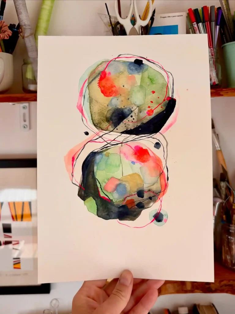
This piece is all about balance. I love stacking these two organic orbs, letting them feel connected yet distinct. Using wet-on-wet watercolor allows the bright reds and earthy greens to bleed naturally. The scribbled pink and black ink lines then add a layer of chaotic energy, tracing the forms and tying the whole composition together. It feels both cellular and cosmic.
2. Abstract Horizon Study on Watercolor Paper
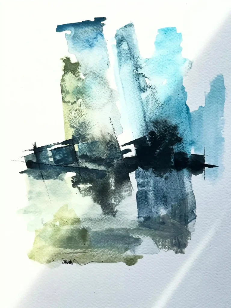
A study in atmosphere. This piece is all about capturing the mood of a misty horizon or a blurred reflection. I used broad, vertical strokes of wet watercolor, letting the blues and earthy greens granulate and fade. That strong, dark horizontal brushstroke cuts right through, anchoring the composition and giving it a sense of place. It’s minimalism with a lot of feeling.
3. Botanical Ink and Wash on Paper
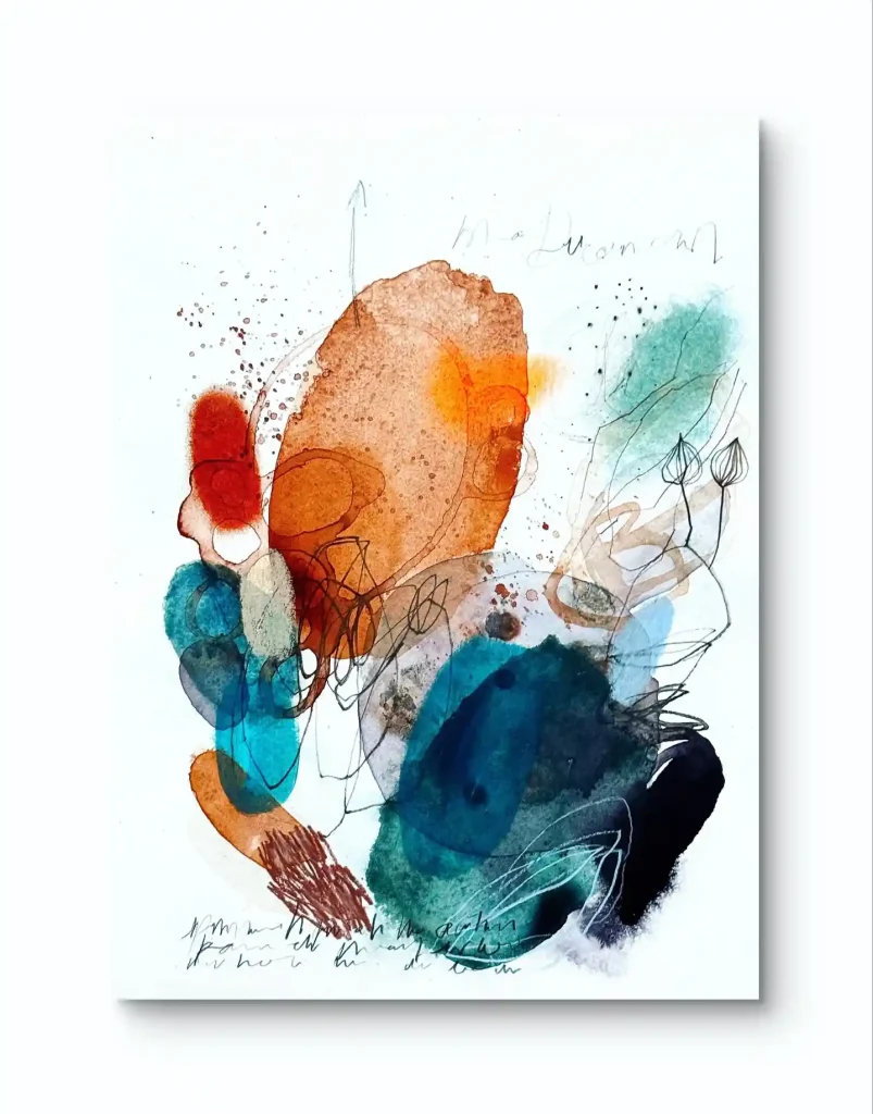
What a fun exploration of mixed media. This piece is all about layering spontaneous marks. I started with big, wet washes of watercolor, loving how that rusty orange plays against the deep teal. Then, I went in with fine-line ink, adding chaotic scribbles and delicate botanical sketches. The splatters and textures just add to that raw, energetic, “in-the-moment” feeling.
4. Ethereal Seed Heads on Watercolor Paper
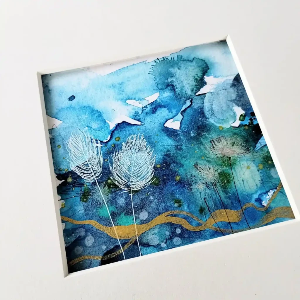
This piece is a dive into deep, saturated color. I flooded the paper with rich blues and teals, letting the pigments bloom to create an underwater feel. The magic happens when that dries, and I come in with fine white ink to draw those delicate, ethereal seed heads. That single, flowing gold line adds a touch of warmth and guides the eye.
5. Abstract Marsh Reeds on Watercolor Paper
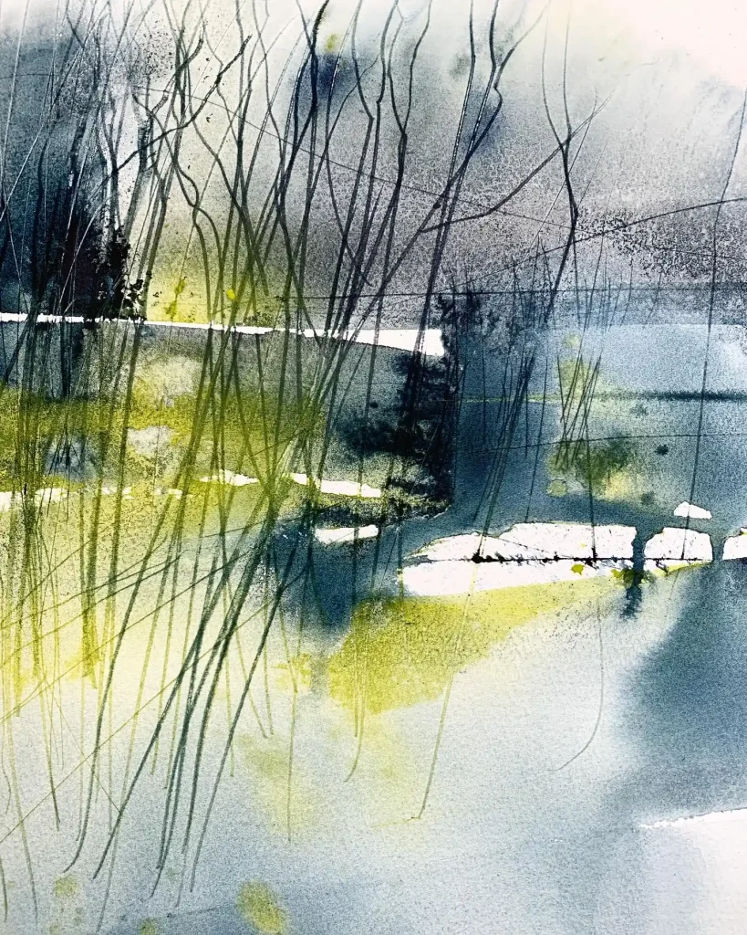
This piece feels like a quiet marsh after the rain. The entire mood is built on that watery, reflective background, created with wet-on-wet blues and greys. I dropped in pops of chartreuse green for a hint of life. The final touch is the tall, gestural ink lines—they create the sense of reeds and reflections, defining the whole scene with just a few quick marks.
6. Wild Bouquet Explosion on Watercolor Paper
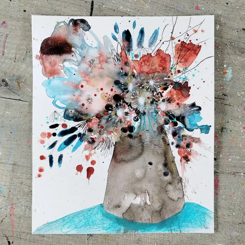
Just a pure explosion of joy. I started with a simple, solid vase shape to ground the whole piece. The bouquet itself is all about chaotic energy—a mix of watercolor splatters, blooms, and drips in bright red and blue. I went back in with ink to add whimsical, spiky flowers and delicate seed pods, finding order within the beautiful mess. It’s meant to feel wild.
7. Floating Blue Shapes on Watercolor Paper
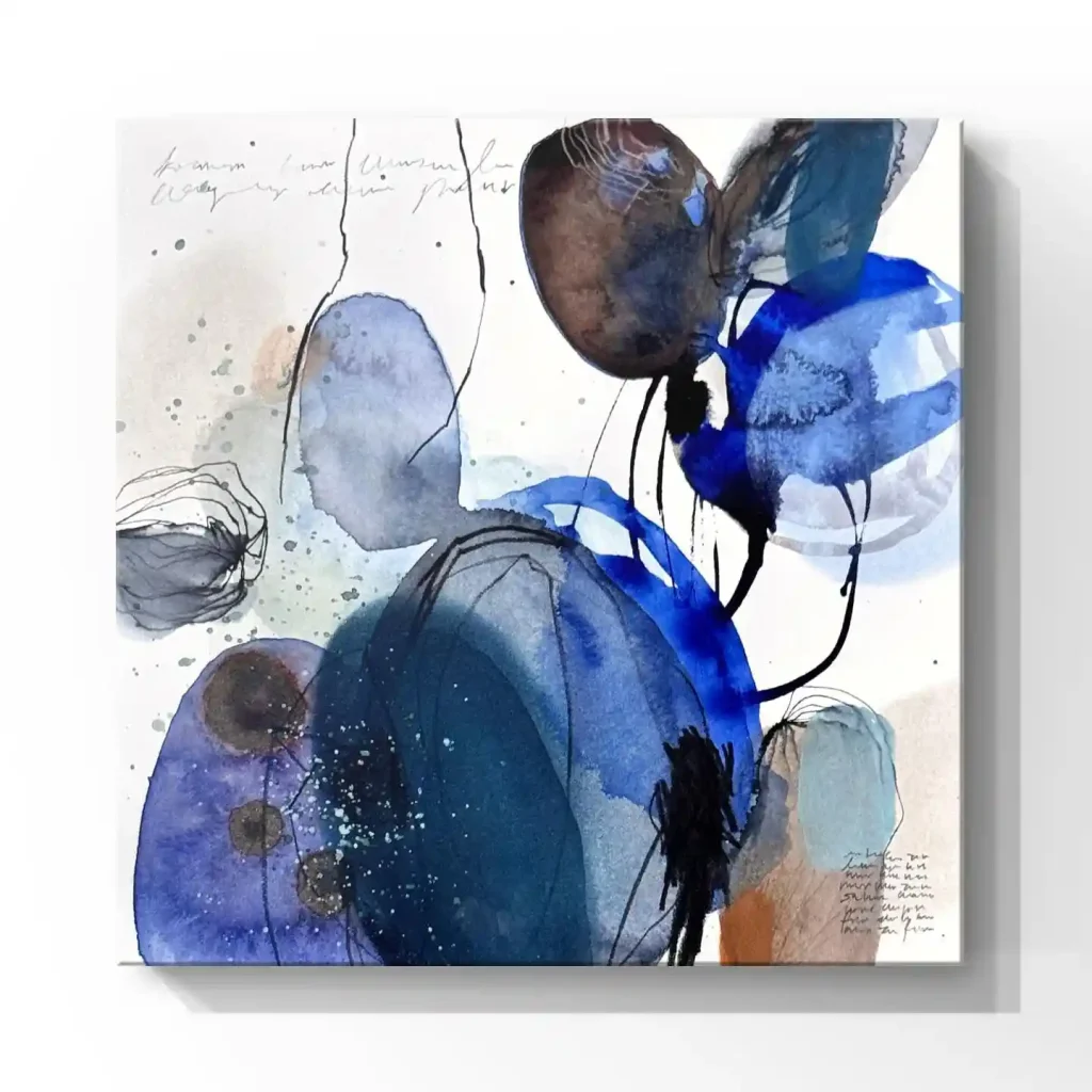
An exercise in transparency and overlapping forms. I built this piece by layering these large, balloon-like shapes, letting the watercolor glazes of blue, grey, and brown show through each other. It creates a beautiful sense of depth. The thin, wiry ink lines are there to define a few edges and connect the forms, making them all float together as one cohesive, gentle cluster.
8. Whimsical Garden on Watercolor Paper
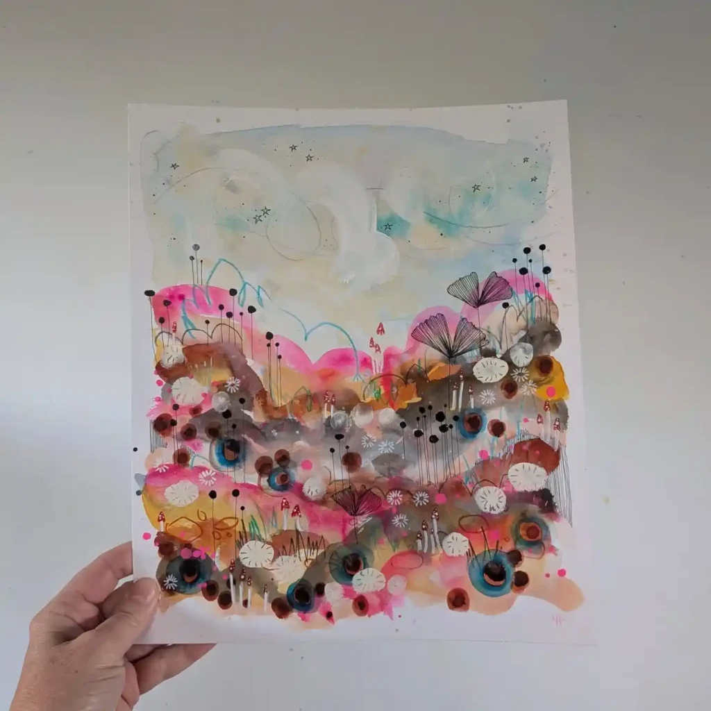
This is just a field of pure play. It’s a whimsical, imaginary garden bursting with life. I started with soft watercolor washes in pinks, browns, and yellows to create the landscape. Then, the real fun began: using an ink pen to draw all kinds of stylized flowers, dots, circles, and stems. It’s a “more is more” approach, creating a magical, storybook feeling.
9. Abstract Field Path on Watercolor Paper
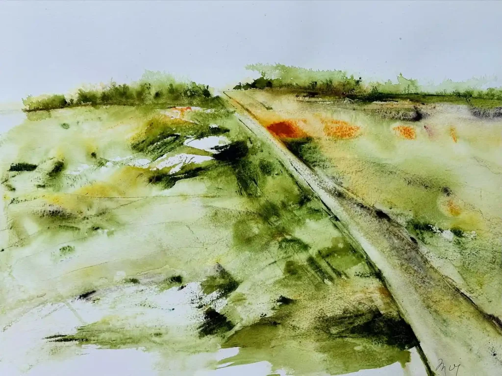
This piece is less about a specific place and more about the feeling of an open field. I worked very quickly, wet-on-wet, letting the olive greens, yellows, and that surprise pop of orange bleed together. It captures that sense of wild, sunlit grass. The strong diagonal line—maybe a path or a fence—cuts through the composition and draws your eye right into the hazy distance.
10. Rhythmic Geometric Abstract on Watercolor Paper
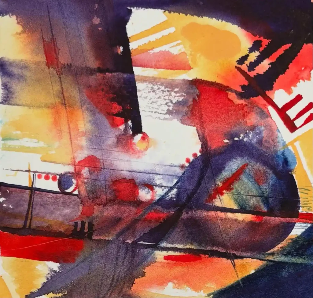
This piece is a nod to the modern masters. It’s a purely non-representational study of color and shape. I used bold, flat washes of primary red, orange, and deep indigo, letting the hard edges create tension. The dark, graphic lines and shapes are all about building a sense of rhythm and musical movement across the page. It’s pure, emotional abstraction.
11. Energetic Abstract Burst on Watercolor Paper
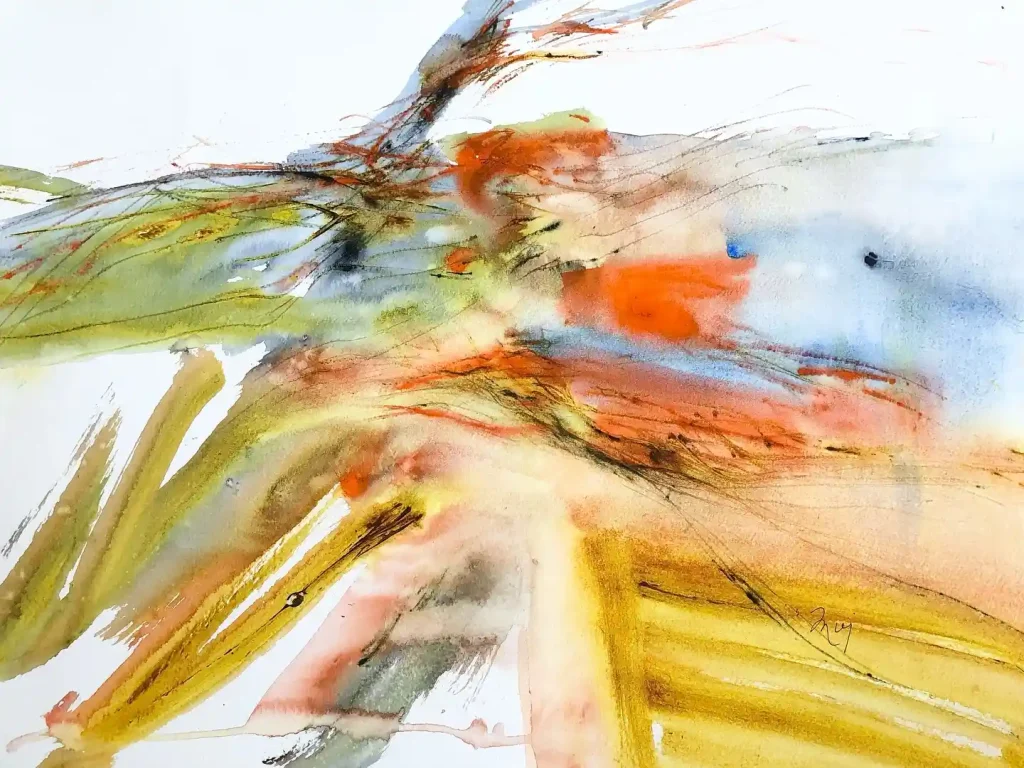
This is pure energy captured on paper. The artist used such dynamic, gestural strokes, sweeping across the page with vibrant yellows and oranges. It feels like a sudden burst of wind or a bird taking flight. The scribbled ink lines add a nervous, fast-paced texture that really contrasts with the soft, wet-in-wet blue and green washes in the background.
12. Impressionistic Purple Roses on Watercolor Paper
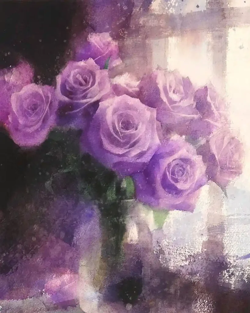
This piece has a classic, romantic feel, almost like a vintage photograph. The artist focused on the mass of purple roses, a color often symbolizing enchantment or royalty. By keeping the background and vase loose and impressionistic, all the attention goes to the soft, layered petals. The high-contrast light from the window gives it a dreamy, nostalgic atmosphere.
13. Misty Forest Scene on Watercolor Paper
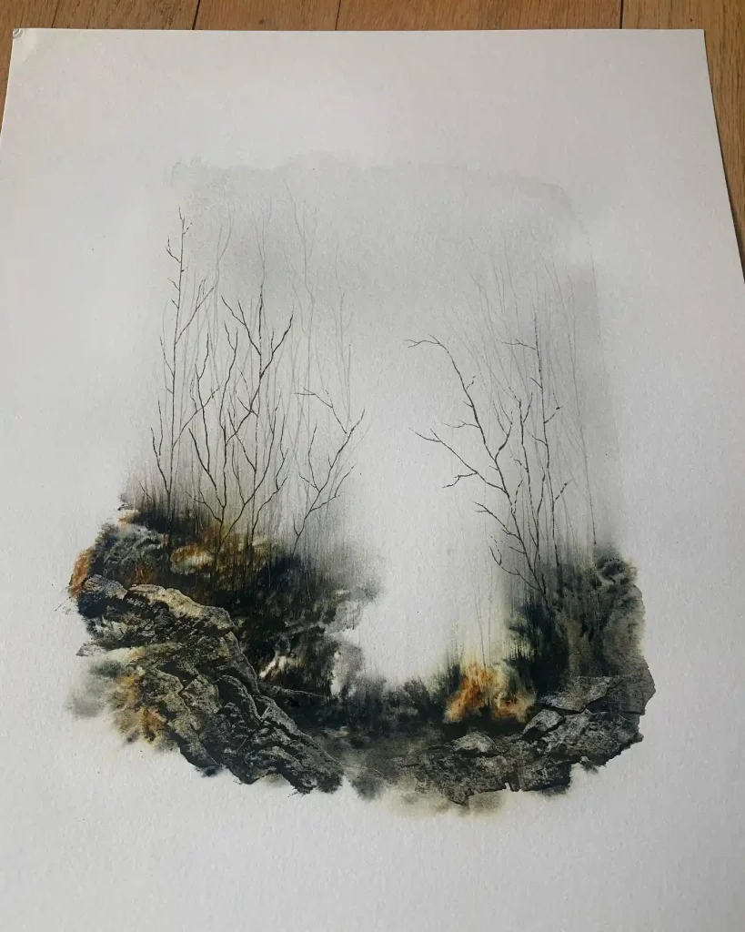
What incredible control of atmosphere. This piece is a masterclass in contrasting textures. The artist built up the foreground with dark, complex, and granular watercolor to create those rocky forms. Then, they used delicate, fine-line ink for the bare trees, letting them just fade away into the soft, misty wash of the background. It creates a powerful sense of depth.
14. Dense Abstract Floral on Watercolor Paper
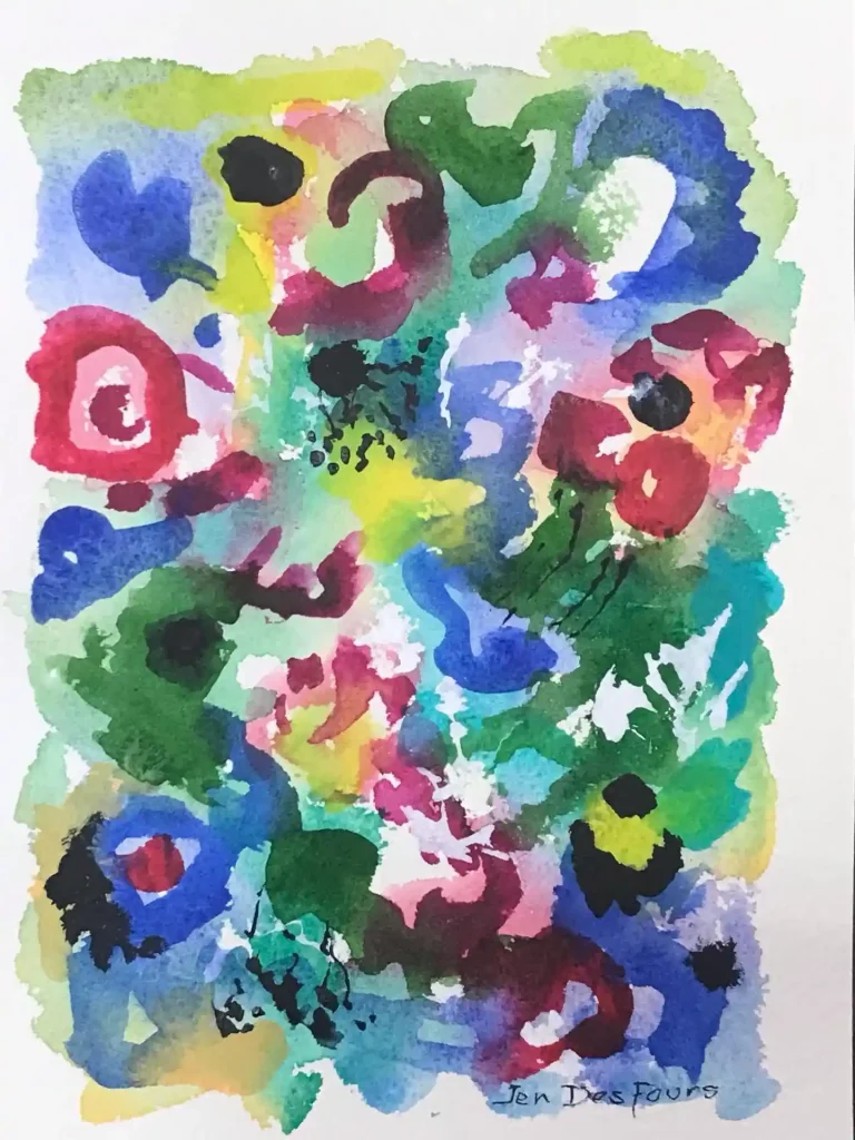
A really joyful, playful piece. It’s like a vibrant, overgrown garden pressed flat. The artist just filled the page with bold, overlapping dabs of color—bright blues, reds, and greens. The little black ink details and dark patches help define the flower shapes and keep the composition from becoming too chaotic. It’s all about color and happy energy.
15. Biomorphic Abstract Forms on Watercolor Paper
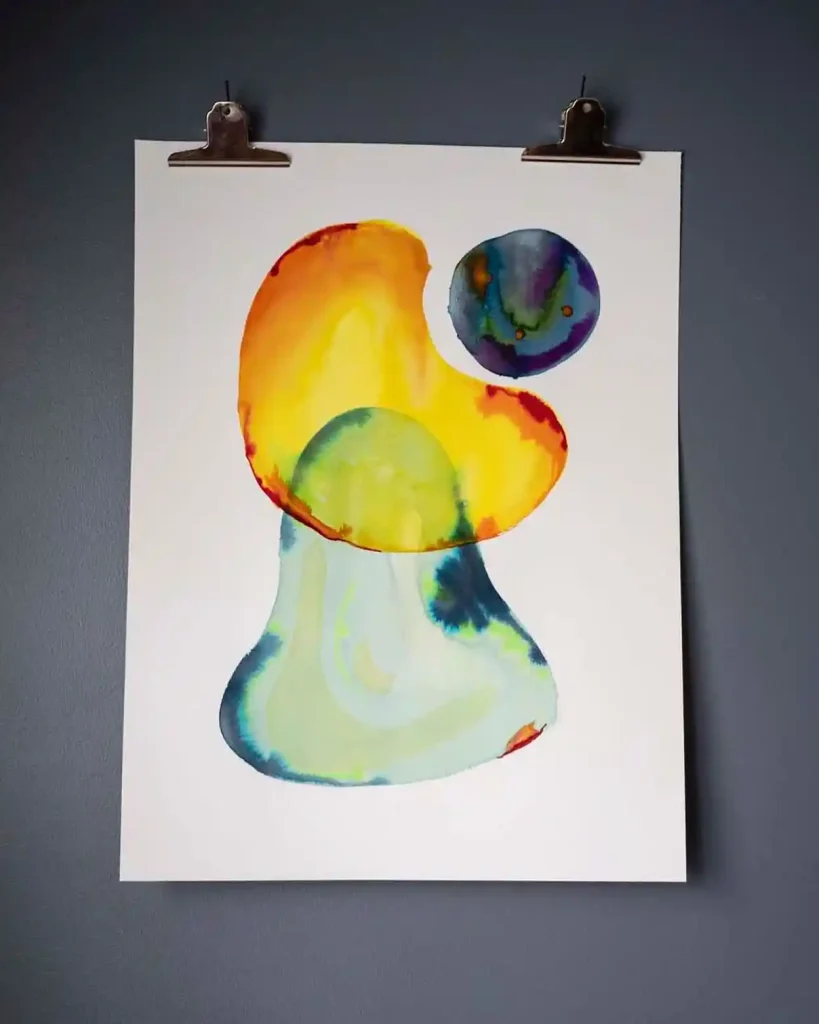
This has such a great mid-century modern vibe. It’s all about these two simple, biomorphic forms and how their colors interact. The artist used beautiful, clean washes, letting the yellow and orange bleed into the light blue base. That separate, darker orb creates a perfect focal point and a sense of gravitational pull. It feels very balanced and design-oriented.
16. Moody Abstract with White Dots on Mixed Media Paper
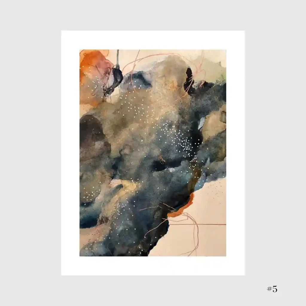
This piece feels very cosmic, like looking at a nebula. The artist built up these deep, moody layers of dark watercolor, letting them bloom and granulate. The tiny, scattered white dots are a perfect contrast, suggesting stars or distant light. Those thin, wandering red lines add a subtle energy, like pathways connecting the dark masses. It’s beautifully atmospheric.
17. Playful Abstract Shapes on Watercolor Paper
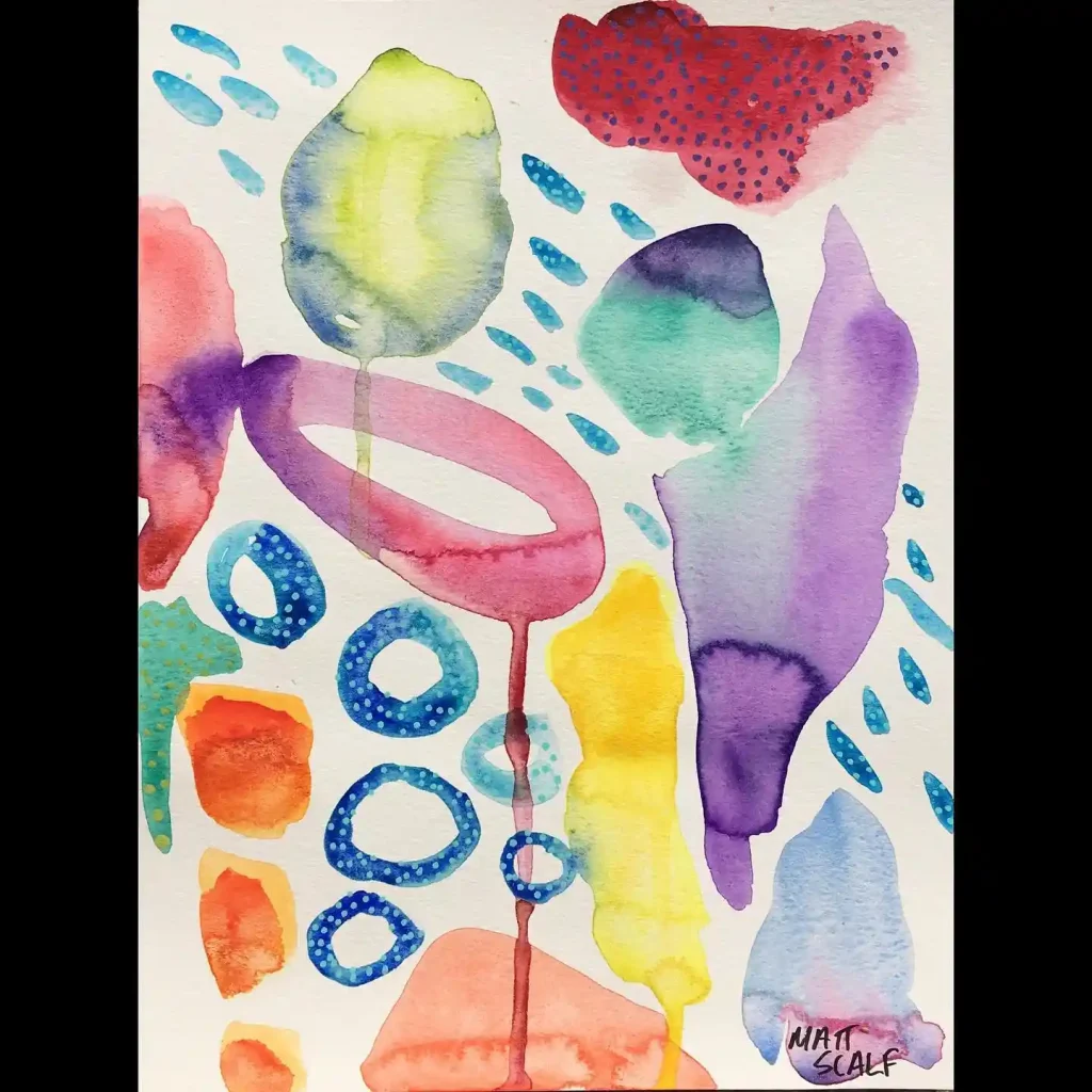
What a fun, whimsical composition. This piece is like a little party of shapes. Each form is its own character, from the big, transparent watercolor washes to the small, patterned blue circles. The artist played with drips, dots, and simple lines, scattering them around the page to create a sense of movement. It feels light, happy, and very illustrative.
18. Red Sunset on Water on Watercolor Paper
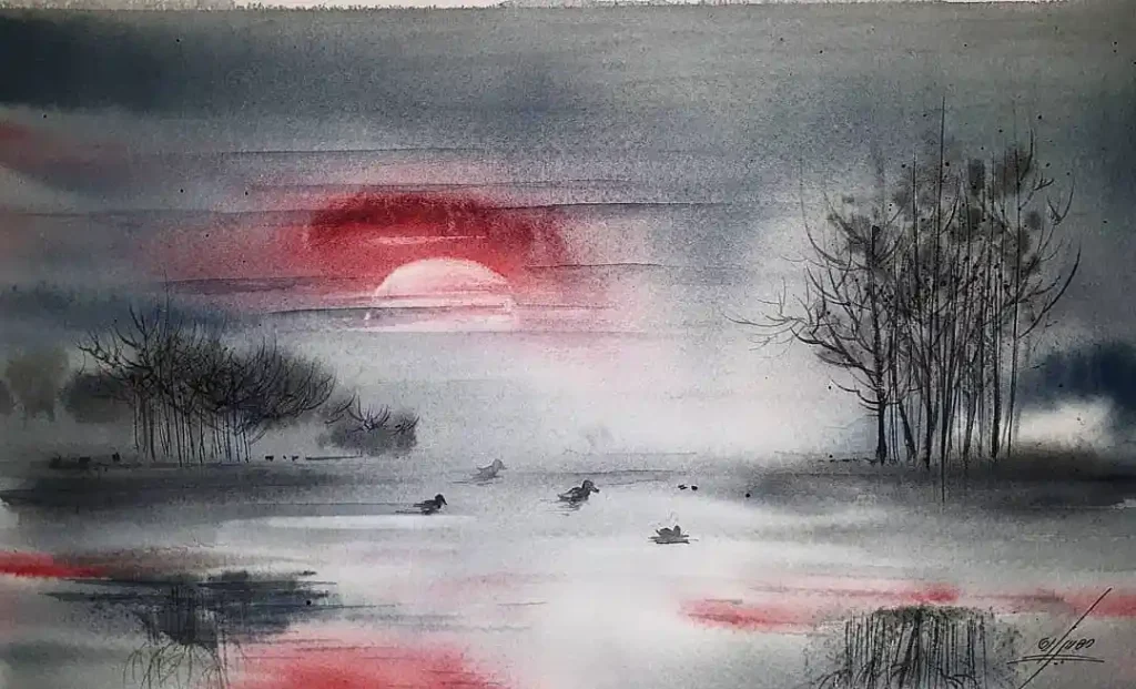
This is all about mood. The artist used a very limited palette—mostly greys—which makes that single burst of red sun so powerful and symbolic. It creates a focal point of warmth in a cold scene. The wet-on-wet technique in the sky and water gives it that soft, hazy, end-of-day feeling. The silhouetted trees and ducks really complete the sense of stillness.
19. Abstract Floral Sky on Watercolor Paper
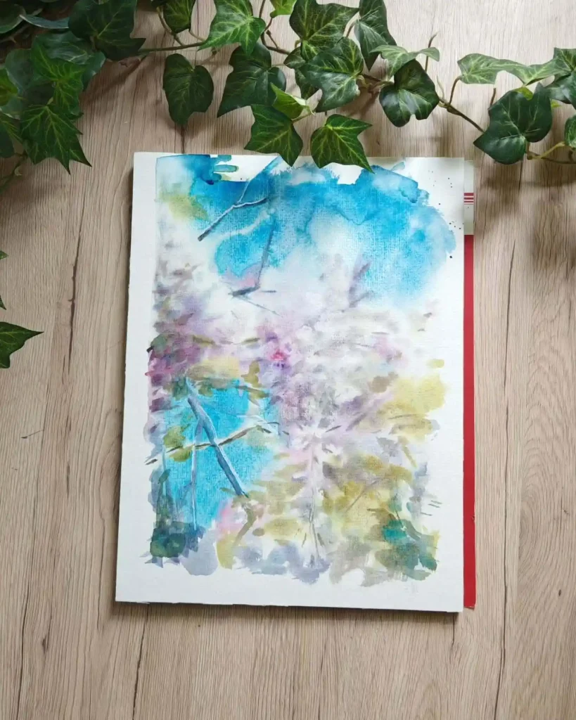
This piece is a beautiful exploration of soft-focus abstraction. It feels like looking up through cherry blossoms on a bright day. The artist used a wet-on-wet or “lifting” technique to create those soft, undefined white and pink areas. The patches of bright blue sky peeking through really ground the piece, while the green and grey shapes add a nice earthy contrast.
20. Abstract Aerial Map on Mixed Media Paper
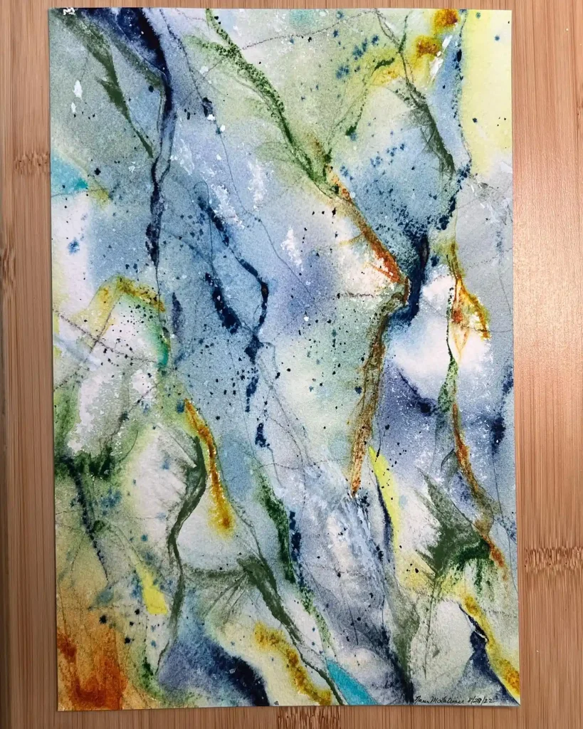
This looks like an imaginary aerial map or a cross-section of earth. The artist let the watercolor pigments granulate and flow, creating organic “veins” of color—blues for water, greens and rust for land. The thin ink lines that are scribbled and splattered on top add a layer of man-made or natural chaos, like fault lines or tributaries.
21. Blue Vertical Forms on Watercolor Paper
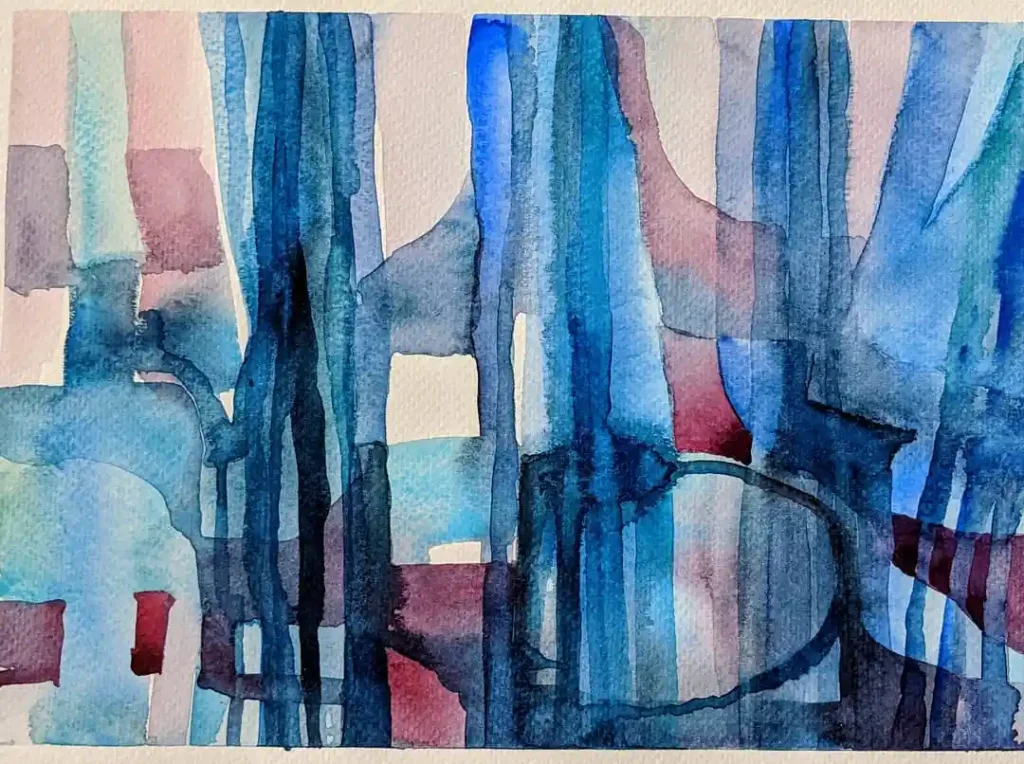
I really love playing with transparency here. This composition is built from overlapping vertical washes of blue and indigo. Those pops of muted red add a bit of warmth to an otherwise cool palette. The negative white spaces are key—they act like windows, creating a sense of an abstract, watery city. It’s a study in layering.
22. Playful Abstract Strata on Mixed Media Paper
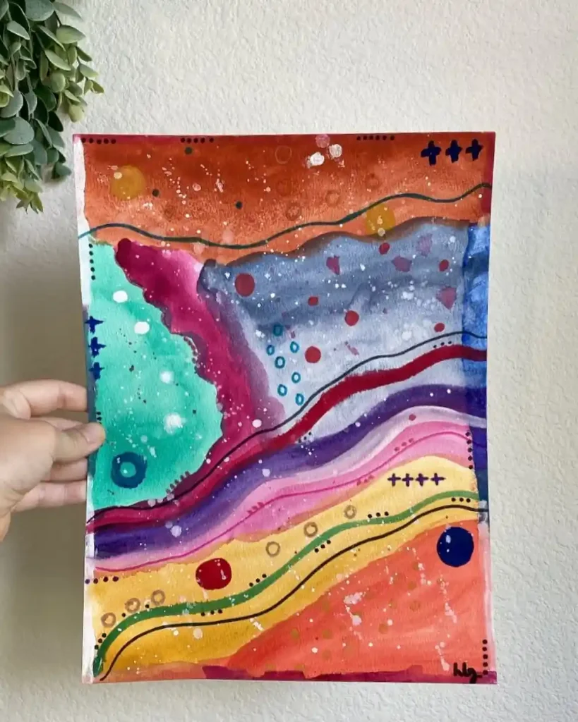
This is just a super playful piece. It’s like an imaginary map or a colorful slice of the earth. I started by laying down these big, bright, horizontal bands of color—reds, purples, greens. Then the fun part was adding all the little details: the dots, crosses, and splatters that give it so much energy and rhythm.
Your work is wonderful and your explanations are so helpful. I really like the idea of using black ink over the watercolor shapes. What kind of ink and pen work best?
Thank you
Thank you so much for your kind words! 😊
For black ink over watercolor, I usually recommend using waterproof, archival ink pens like Sakura Micron or any pigment-based fineliner. They work best because they don’t smudge over watercolor. Thanks again for your support!
JUST GREAT AND GENEROUS!
Thank you so much! 😊 Your kind words truly mean a lot to me.
Ciao,mi piacciono moltissimo le tue creazioni;sono fresche ed allegre !Proverò a fare qualche esercizio.Complimenti !!!