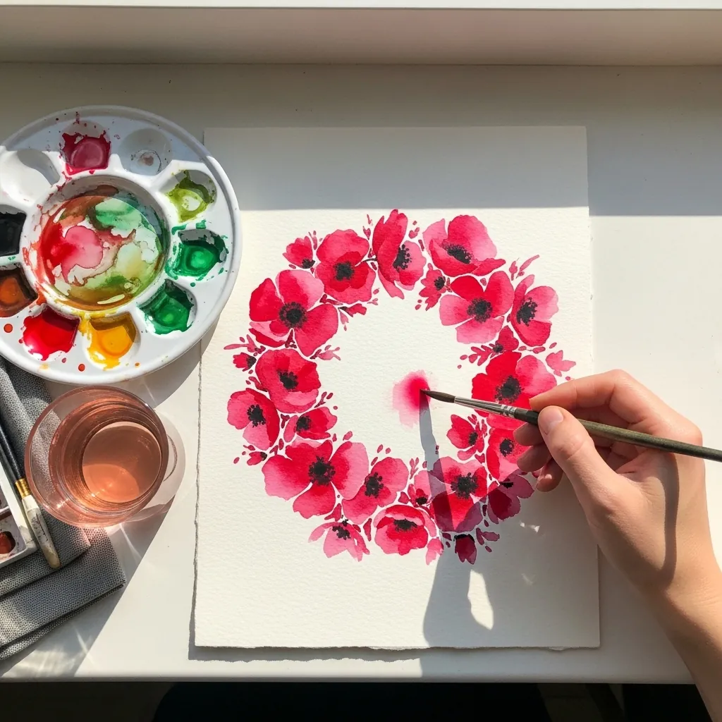
Memorial Day art rests on a few symbols used correctly: the red poppy from the 1915 poem In Flanders Fields, the flag at half-staff until noon, and the burial flag folded into a triangle showing only stars on blue.
Key takeaways
- Memorial Day honors service members who died in service, and has fallen on the last Monday in May since 1971.
- The remembrance poppy traces to John McCrae's 1915 poem In Flanders Fields.
- On Memorial Day the flag flies at half-staff until noon, then rises to full staff.
- A burial flag is folded into a triangle so only the blue field and white stars remain visible.
- A poppy has four crinkled petals, a dark central boss and a ring of stamens around it.
Memorial Day art works best when its symbols are used accurately rather than decoratively. The red poppy comes from John McCrae’s 1915 poem In Flanders Fields, the flag flies at half-staff only until noon, and a burial flag is folded into a triangle showing nothing but stars on blue.
Those details are worth getting right, because the day marks service members who died in service. It has fallen on the last Monday in May since 1971, and was known as Decoration Day long before that, when graves were marked with flowers each spring.
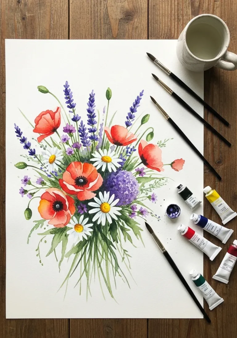
The poppy itself has a specific structure. Four crinkled petals in two overlapping pairs, a dark central boss ringed with stamens, and a slightly hairy bending stem. For the botanical side of that, watercolor flower studies cover the same petal problems.
The forty pieces below move through graphite portraits, charcoal cemeteries, watercolor flags, pastel candlelight and folded-flag geometry. For the skies several of them need, watercolor sunset ideas and graphite shading practice are the closest companions.
Compiled by the GS Art Zone editorial team. Last updated August 2026. Each idea is paired with the specific step that produces the effect, so you can go from the reference straight to paper.
What You Need Before You Start
- A 2H through 6B range, since the graphite pieces here rely on a genuinely wide value scale
- One cool red and one warm red, because a poppy shifts noticeably between petal and shadow
- Charcoal and a kneaded eraser for the cemetery and sky pieces, which need lifted light
- A ruler for flag stripes and folded-flag geometry, both of which punish freehand work
- Toned or black paper for the candle, silhouette and night pieces further down
1. Graphite Flag Beside a Headstone
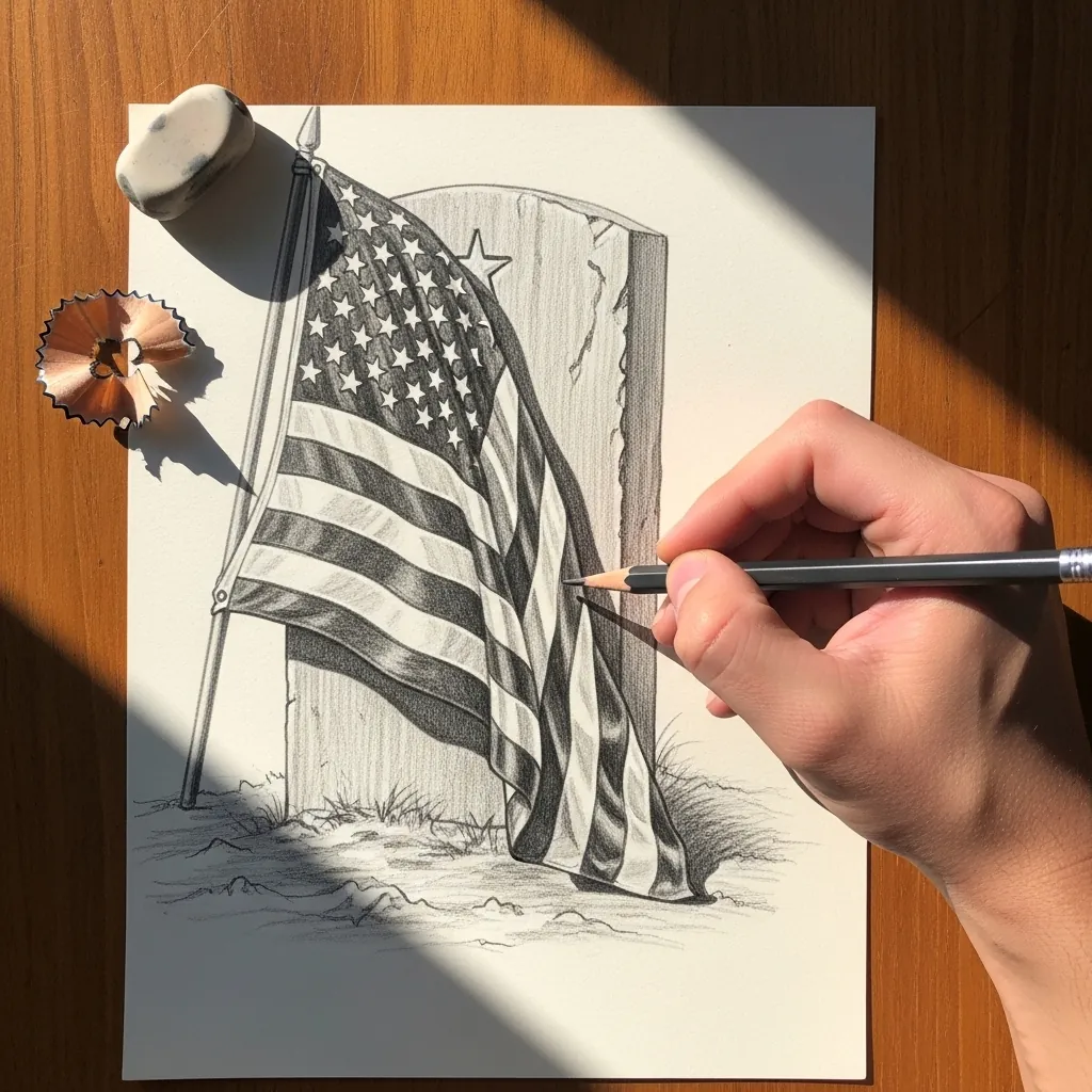
Two objects of different materials need different mark-making. Render the stone with a granular side-of-the-pencil texture and keep the fabric smooth and directional, following each fold. That contrast in surface does more for the drawing than any amount of extra detail.
2. Watercolor Field of Poppies
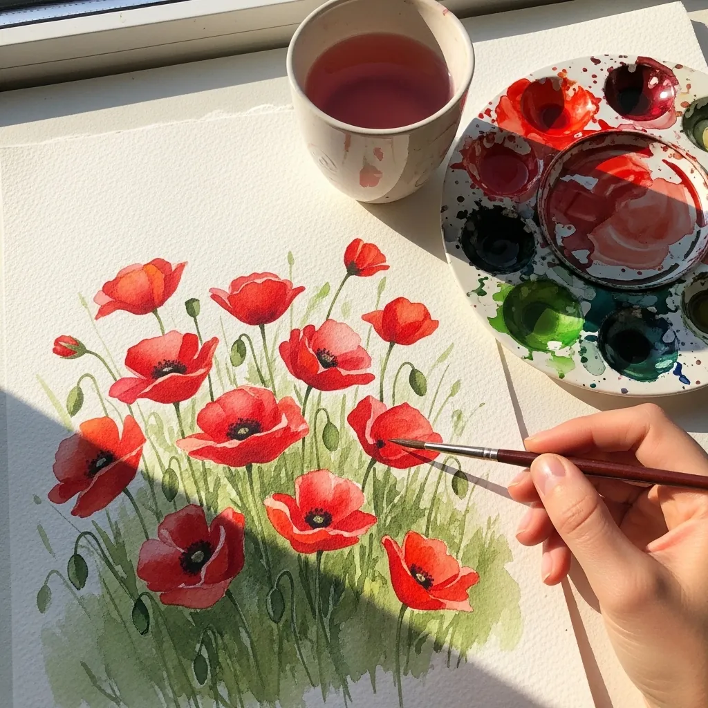
Painting many of one flower means varying their orientation. Turn some heads toward the viewer, some in profile, and let two or three face away entirely. Keep the reds slightly different from bloom to bloom, since identical flowers read as a printed pattern.
3. Ink Eagle With Spread Wings
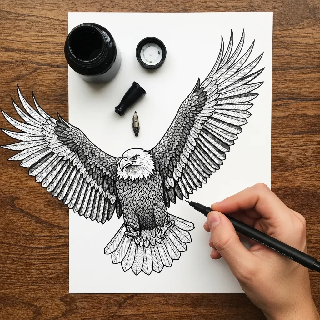
Wing feathers fall into three groups, and drawing them as one mass is the common error. Lay the long primaries along the outer edge first. Set the shorter secondaries inboard of them, then overlap the small covert feathers in rows nearer the body.
4. Pastel Cemetery at Sunrise
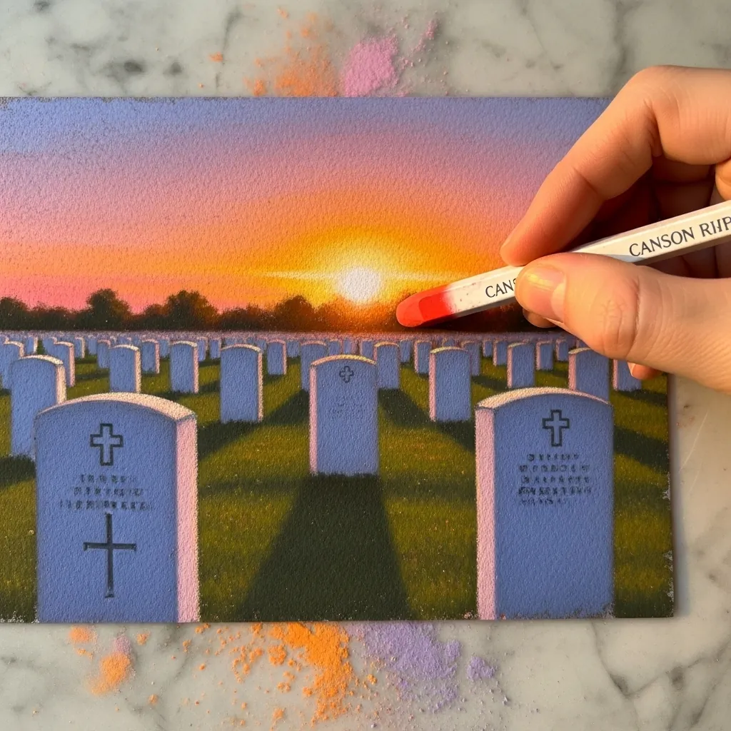
Rows receding into distance need consistent spacing to convince. Space the near stones widely. Compress them steadily toward the horizon, keeping every top edge on a single converging line. Warm light from behind then lets you drop the stone faces into cool shadow.
5. Charcoal Soldier Silhouette on Newsprint
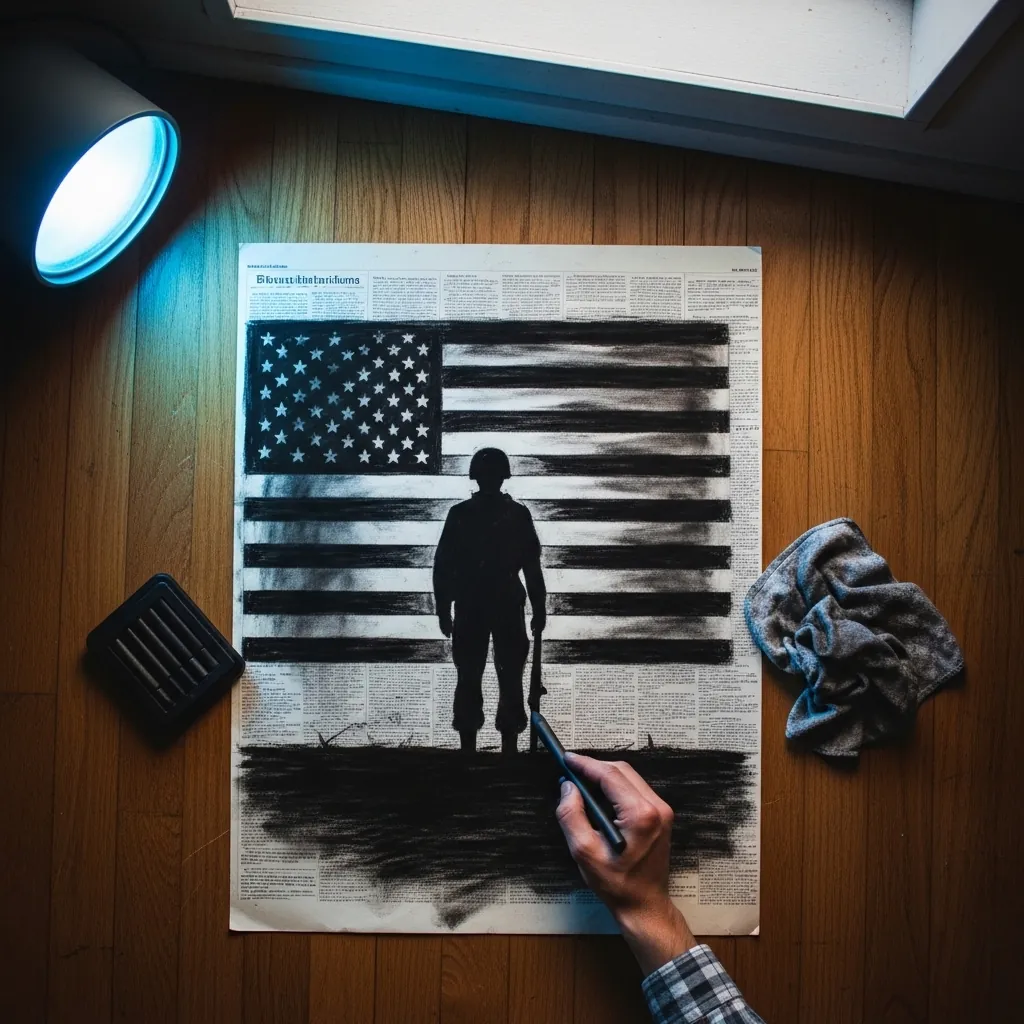
Working over printed text gives you texture and meaning at once. Keep the charcoal open enough that the newsprint reads through in the lighter areas, and reserve solid black only for the silhouette. The visible text should never compete with the figure.
6. Folded Flag Study in Watercolor
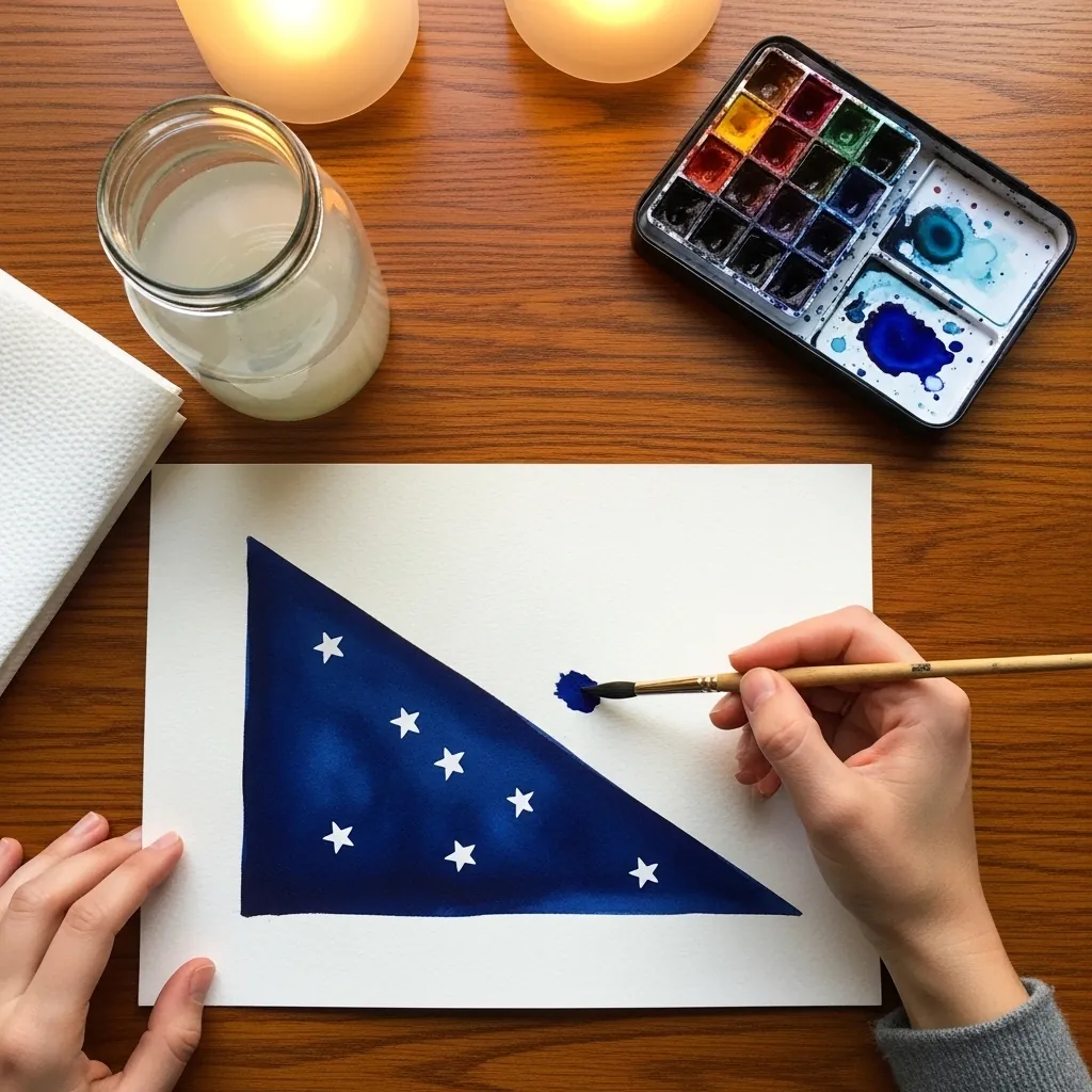
The folded flag is geometry before it is fabric. Rule the triangle accurately first, then let the star field wrap slightly around the visible face so it does not look printed on. Stars sit in rows that follow that curve rather than lying flat.
7. Waving Flag in Colored Pencil
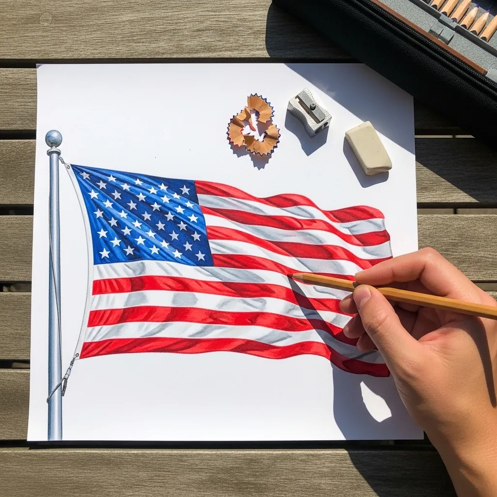
Stripes on a waving flag are the real test of this subject, so draw one continuous wave line first and repeat it downward at even spacing, letting each stripe narrow wherever the fabric turns away. Stripes drawn straight and curved afterward never line up.
8. Charcoal Wreath With Lettering
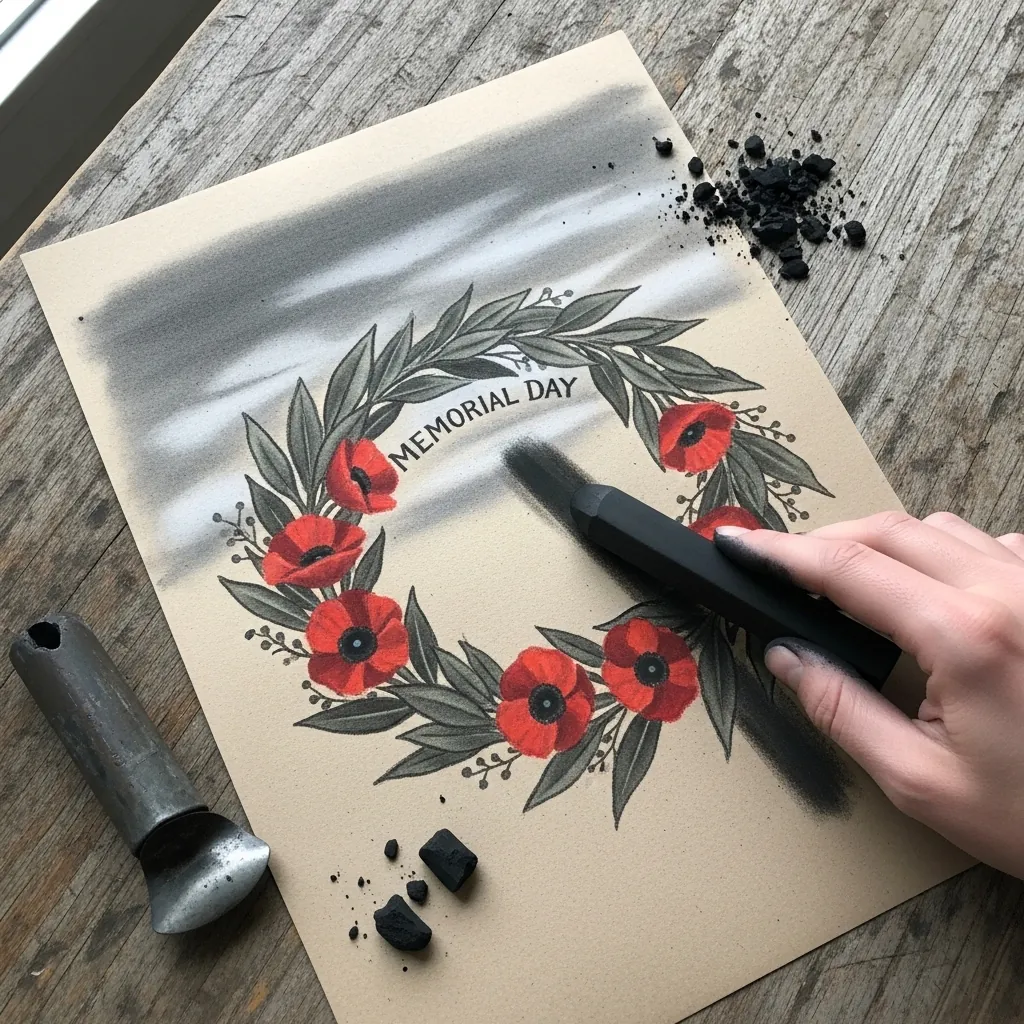
Lettering inside a wreath needs its own ruled guidelines. Set the baseline and cap height before drawing a single letter, center the text on the wreath axis, and keep the type simple. Ornate lettering competes with an already decorative frame.
9. Ink Study of Military Dog Tags
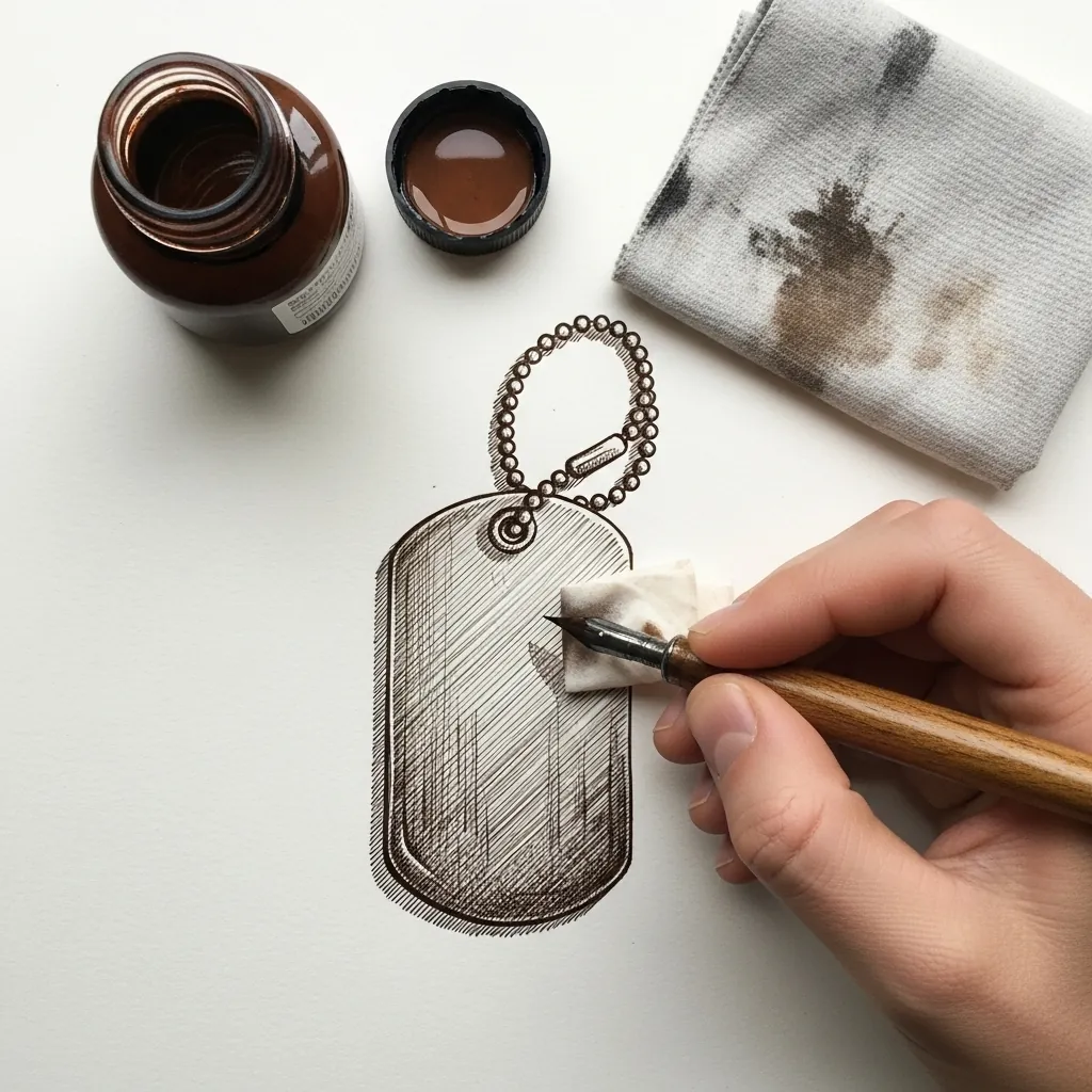
Small metal objects live on their edges. Draw the tag outline crisply, keep the surface almost blank, and put one bright reserved highlight along the top rim. The beaded chain reads best as a row of small circles that vary slightly in spacing.
10. Watercolor Poppy Wreath
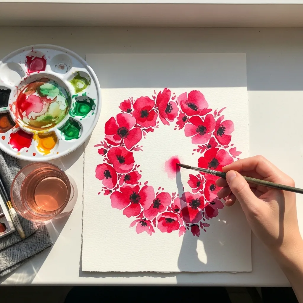
A wreath is built from an uneven distribution rather than a regular ring. Cluster the blooms at two opposite arcs. Thin them out elsewhere, letting a few buds and open gaps break the circle. Perfectly even spacing turns a wreath into a wallpaper motif.
11. Combat Boot Filled With Flowers
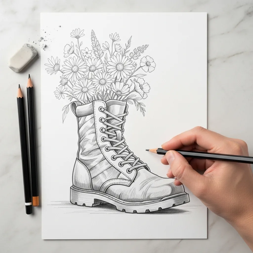
Pairing a hard object with soft ones needs a clear boundary between them, so render the boot with firm structural lines and visible stitching, then let the flowers loosen progressively as they rise. That transition should happen right at the boot opening, not gradually.
12. Oil Pastel Poppy on Toned Paper
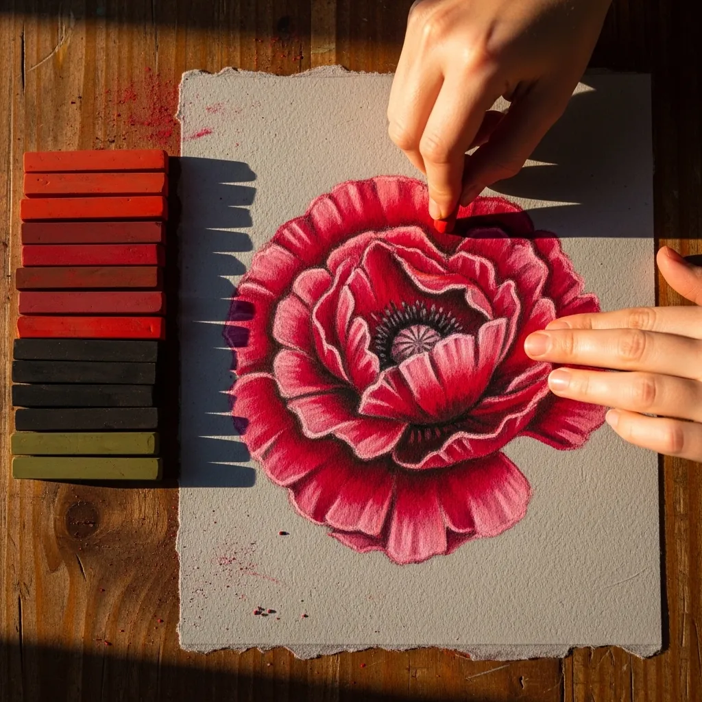
Oil pastel rewards working from dark to light. Lay the deep crimson in the petal creases first, then bring a lighter red across the raised areas, and finish with a pure white catch on one petal edge. Blending too early loses that crinkle.
13. Stippled Portrait of a Veteran
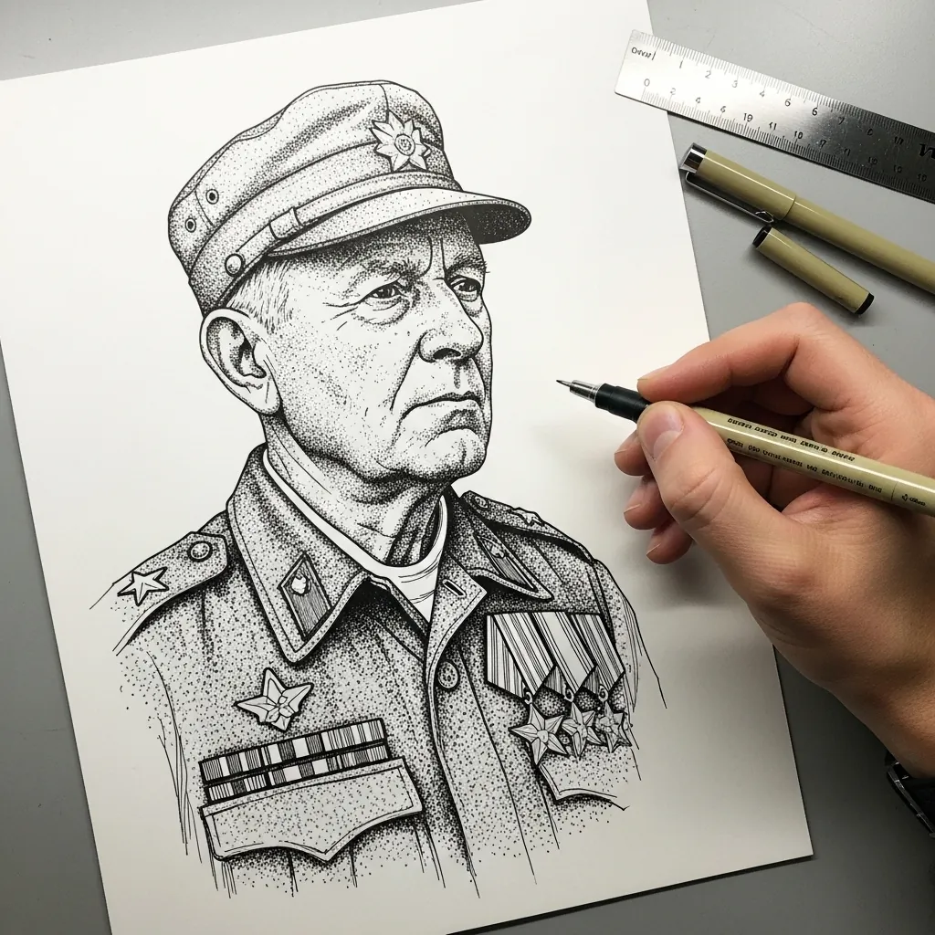
Portraits in stipple need patience and a plan. Establish the darkest areas first with dense clustering. Work outward from there, keeping every dot the same size throughout, and let uniform detail such as medals and braid stay slightly softer than the eyes.
14. Watercolor Sky Above a Cemetery
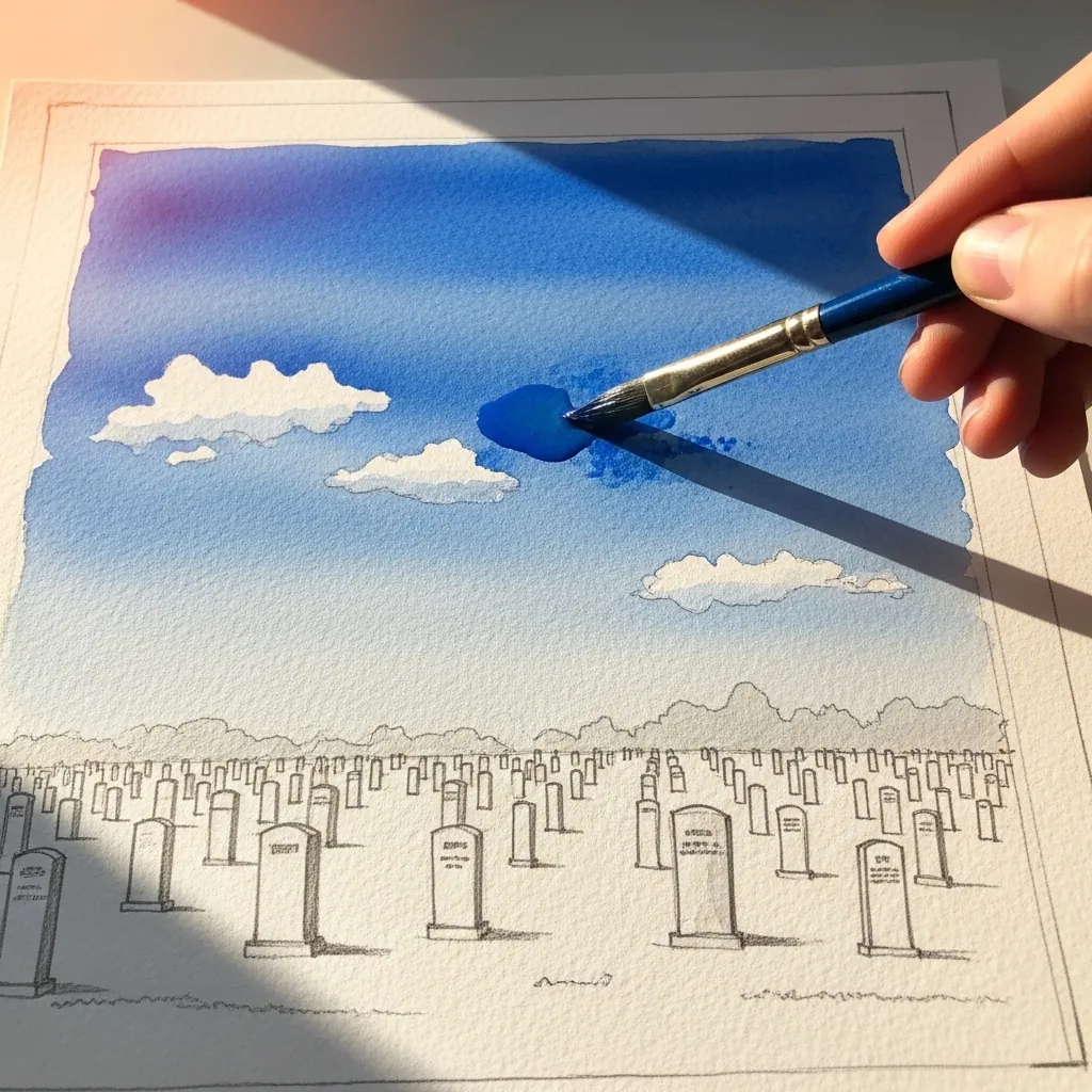
Letting the sky carry the color and the ground stay in line alone is a strong choice. Paint the blue wash confidently, reserve the clouds as bare paper, and keep the headstones as light pencil marks. The restraint reads as quietness.
15. Praying Hands in Sepia
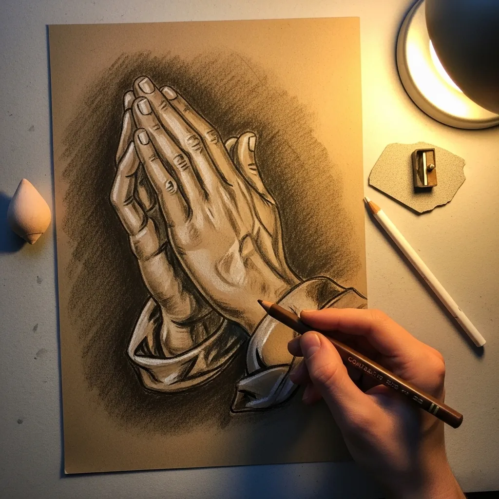
Hands are built from the wrist outward, so establish the block of the palm first, then the finger directions as simple tubes, and only after that the knuckles and nails. Keep the fabric beneath simpler than the hands, or it starts pulling focus away from them.
16. Helmet on a Rifle Memorial
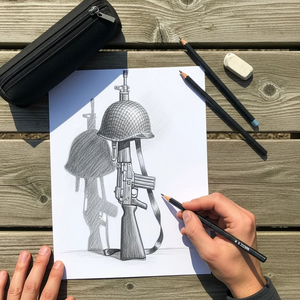
This arrangement is a recognized battlefield memorial, so accuracy matters more than invention. Keep the helmet sitting slightly tilted on the rifle stock, hang the tags so they respond to gravity, and let the whole silhouette read clearly from a distance.
17. Painted Laurel Wreath in Green
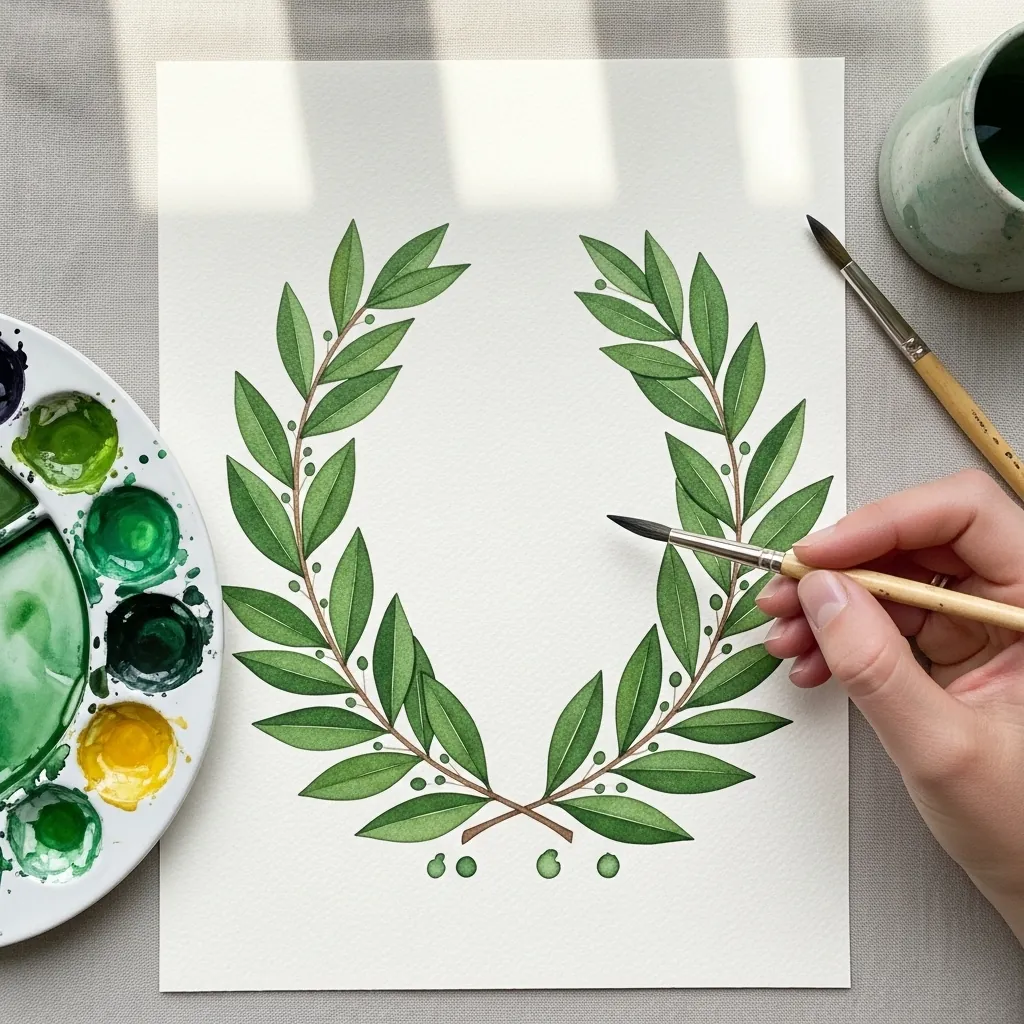
A laurel wreath is two mirrored branches rather than a closed ring. Paint each leaf as one pressed brushstroke, angling them consistently along the stem, and leave a deliberate gap where the two branches meet at the top. Closing that gap turns it into a generic circle.
18. Red Rose on a Stone Ledge
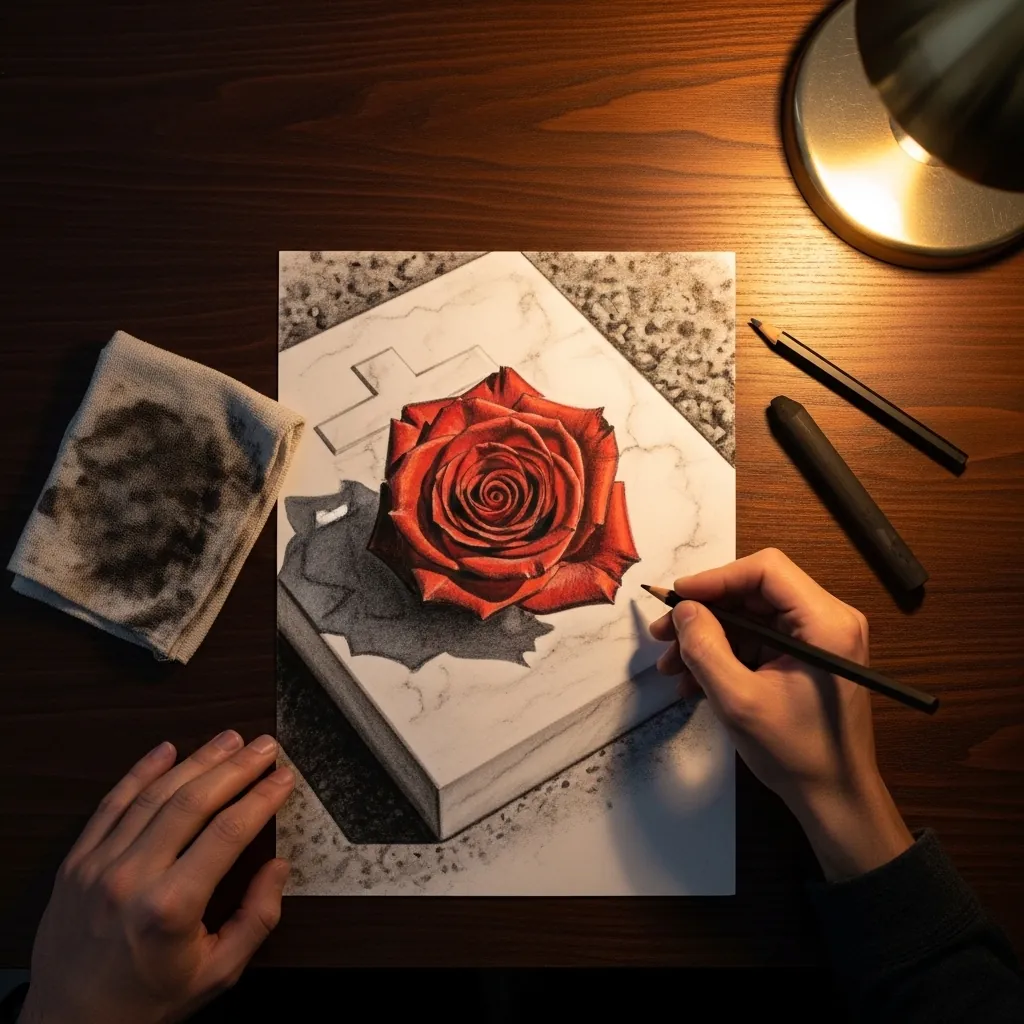
A single flower on stone is a study in contrast. Give the rose soft overlapping edges and full saturation, then keep the surrounding stone almost colorless with one hard cast shadow beneath it. Every decision on the page should push those two materials further apart.
19. Marching Silhouettes Against Sunset
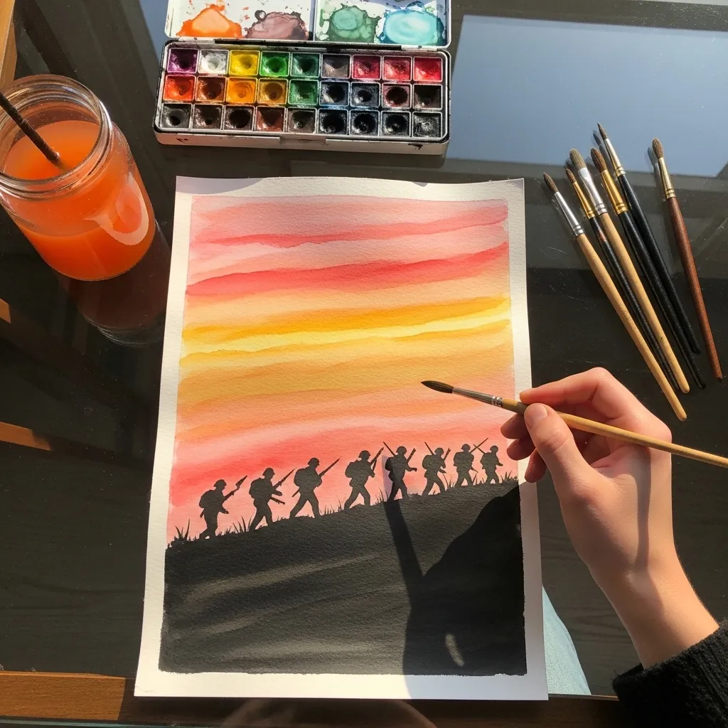
Silhouettes must be solid black with no interior detail whatsoever. Paint the sky in horizontal bands from yellow through orange to red, let it dry fully, then lay the figures flat on top. Any shading inside them breaks the effect immediately.
20. Small Colored Pencil Flag
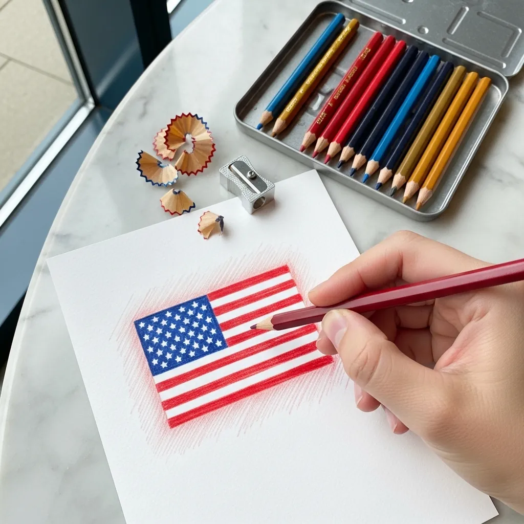
Working small demands accurate proportion rather than fine detail. Get the canton covering the correct share of the height, keep the stripe count right, and burnish the red evenly. At this scale a wrong proportion is more visible than a rough finish.
21. Charcoal Grave With Radiating Light
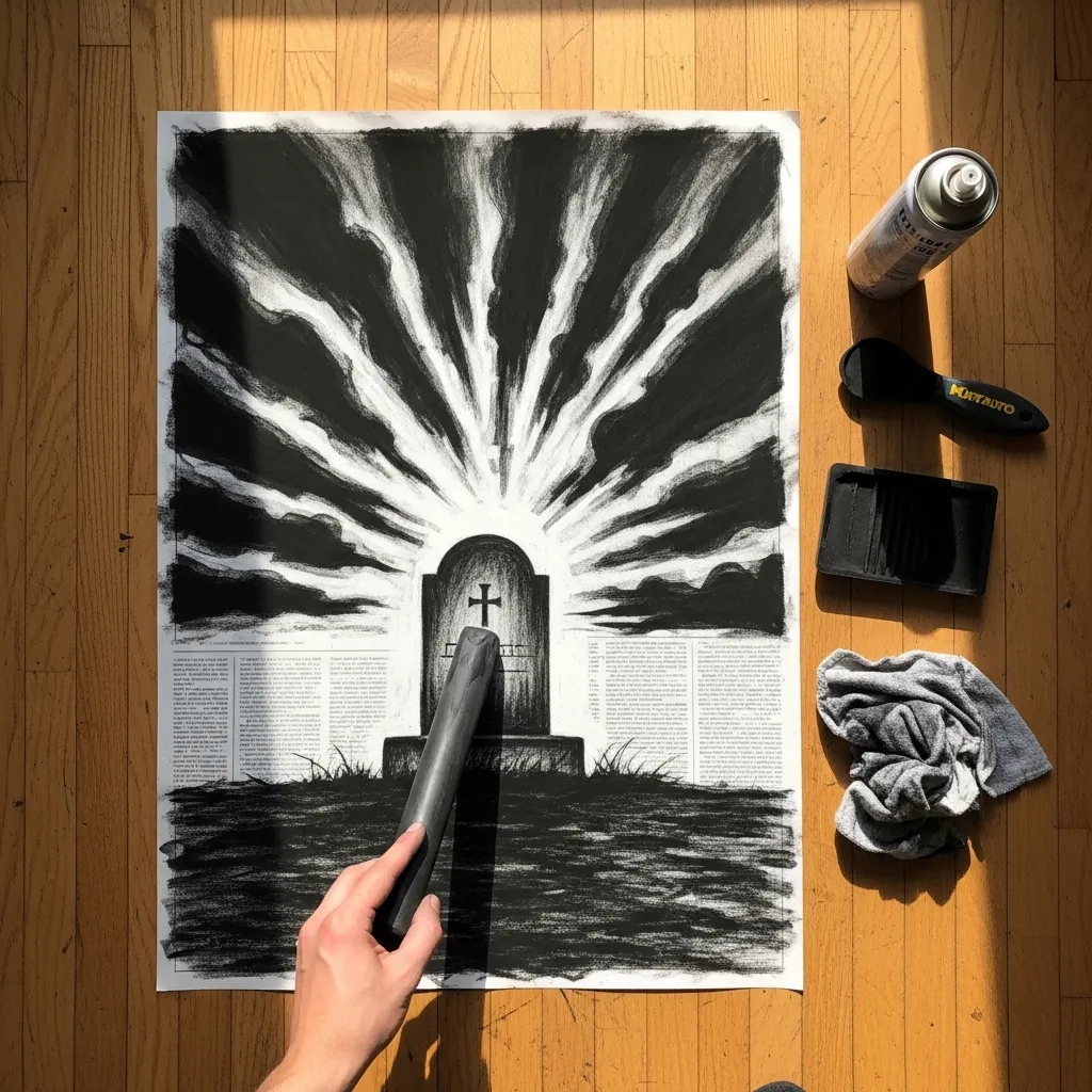
Radiating light is drawn by removing charcoal, not by adding white. Lay a full dark ground across the sheet. Lift the rays with a sharp eraser edge, all of them originating from one point behind the stone. Lifted light has an edge quality that applied white cannot match.
22. Ink Anchor With a Banner
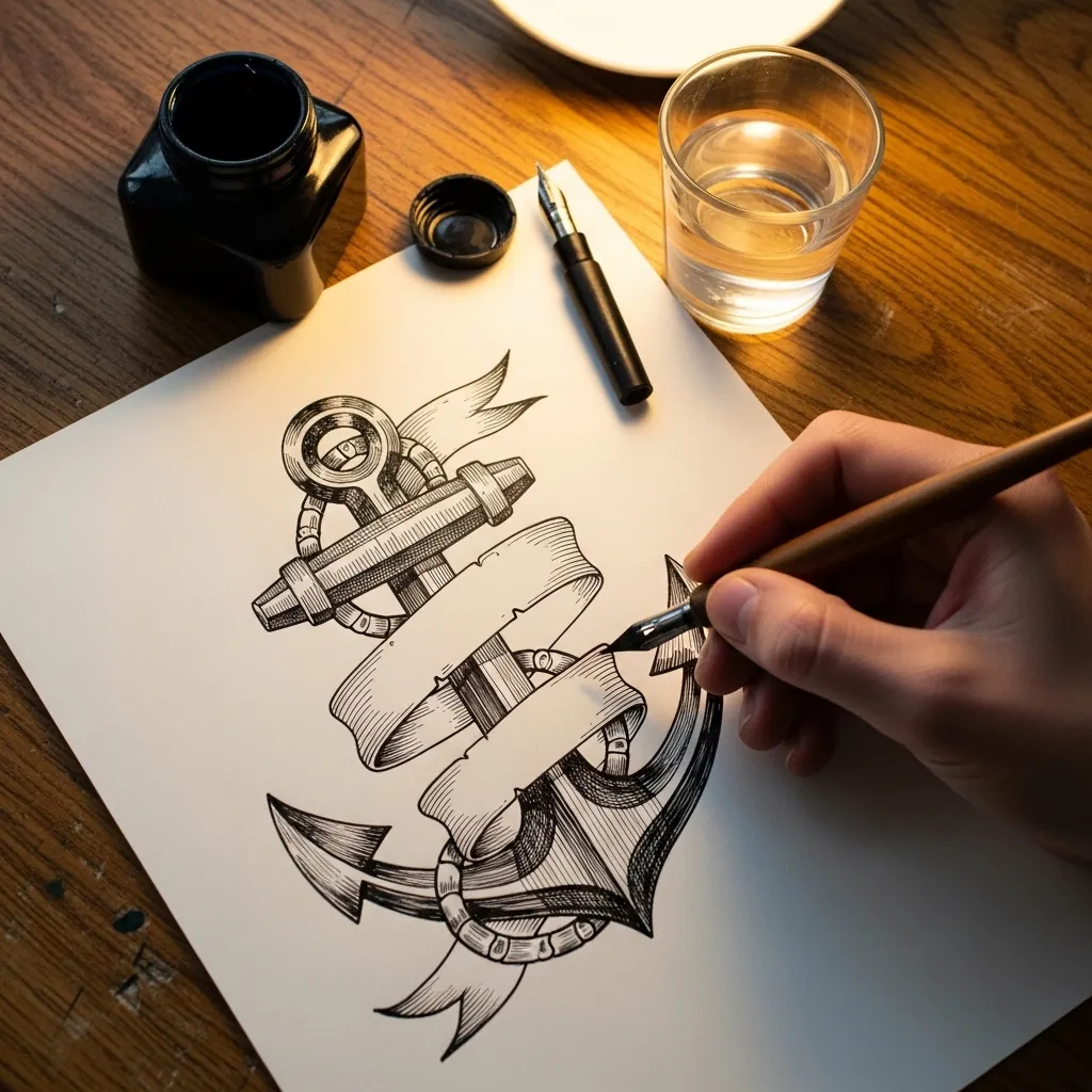
A banner has to turn to look like cloth. Give the ribbon at least two twists where it narrows to a line and reappears with its shading flipped, and let it pass both behind and in front of the anchor shaft.
23. Red Poppy on Navy Paper
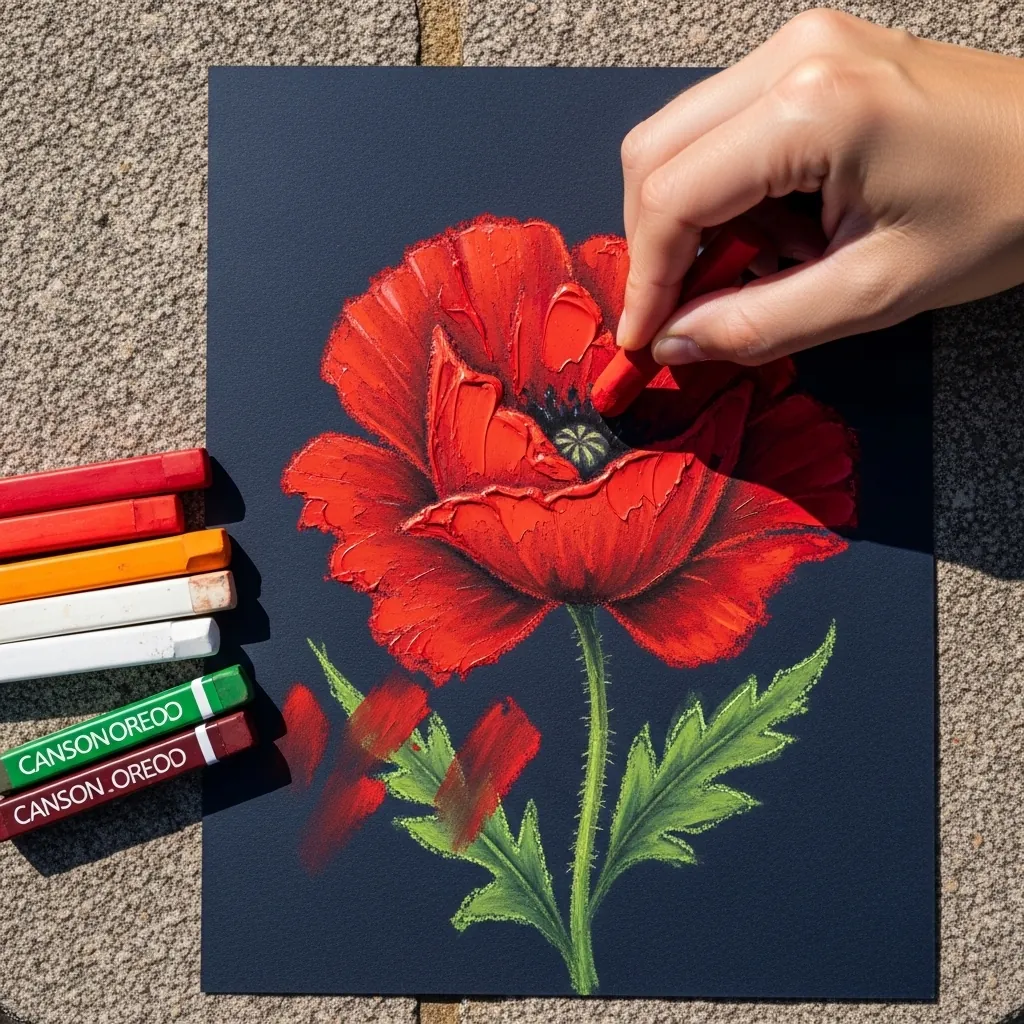
Dark grounds let saturated color reach full intensity. Build the red in several light passes rather than one heavy one, so the navy still shows through at the petal edges. That partial coverage is what keeps the flower from looking pasted on.
24. Loose Brushed Flag in Watercolor
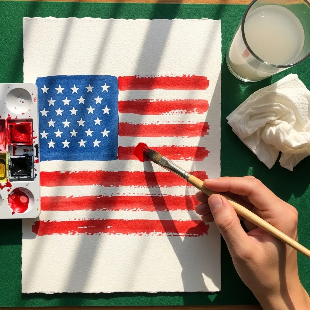
Deliberate looseness still needs structure underneath. Mark the canton and the stripe positions in light pencil first. Paint freely across them afterward, letting the brush skip on the rough paper, because those dry-brush gaps are what read as woven fabric.
25. Purple Heart Medal Study
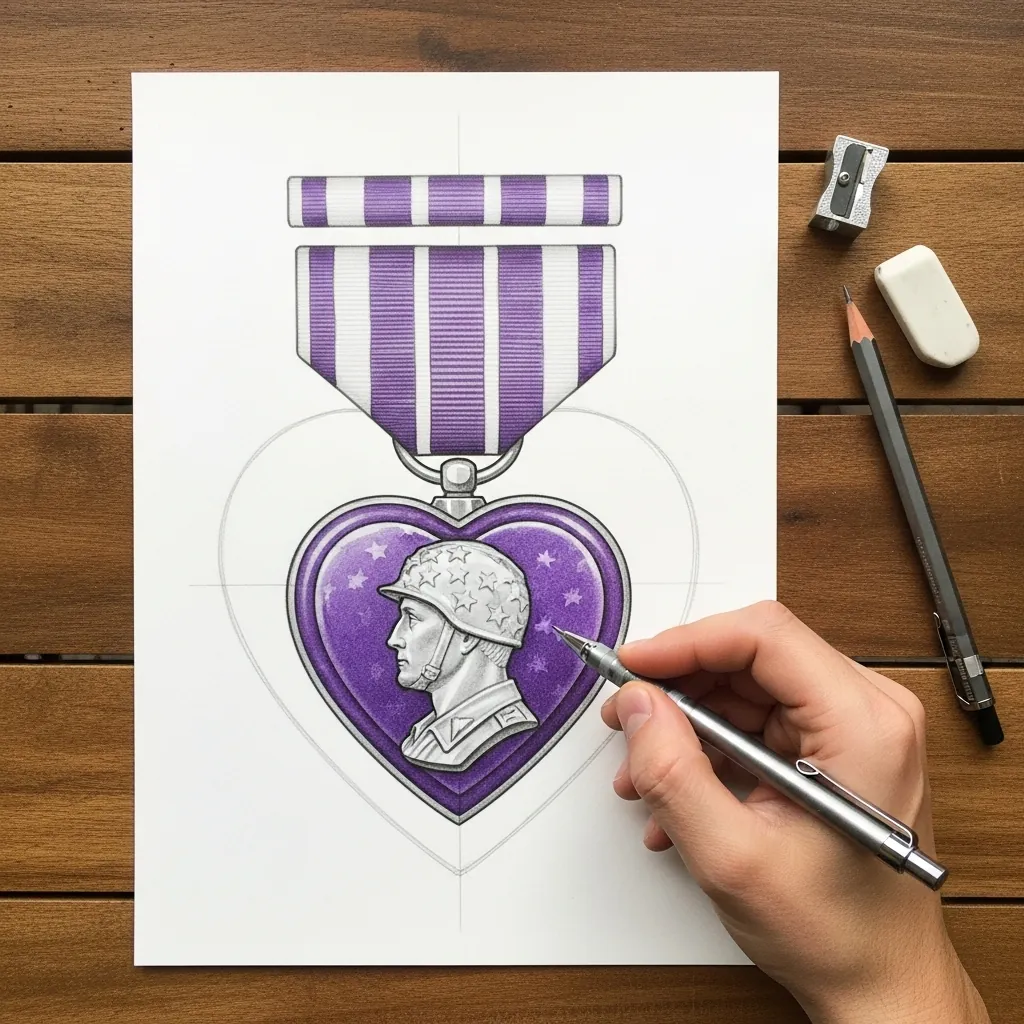
Medals are symmetrical objects, so build them on a center line. Draw the ribbon as a flat rectangle with even vertical bands, then hang the heart beneath it with the profile portrait centered. Small asymmetries are very visible on this subject.
26. Blue Monochrome Cemetery
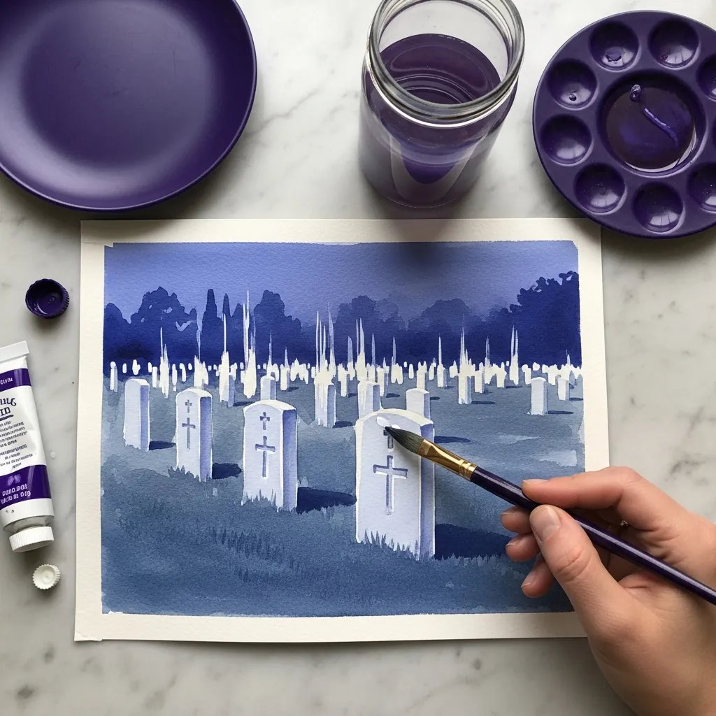
Limiting yourself to one hue forces value to do all the work, so mix five distinct steps from pale to deep before you start and assign them deliberately: sky lightest, stones next, ground darkest. Mixing as you go always produces a flat, crowded middle range.
27. Cyanotype Style Silhouette Scene
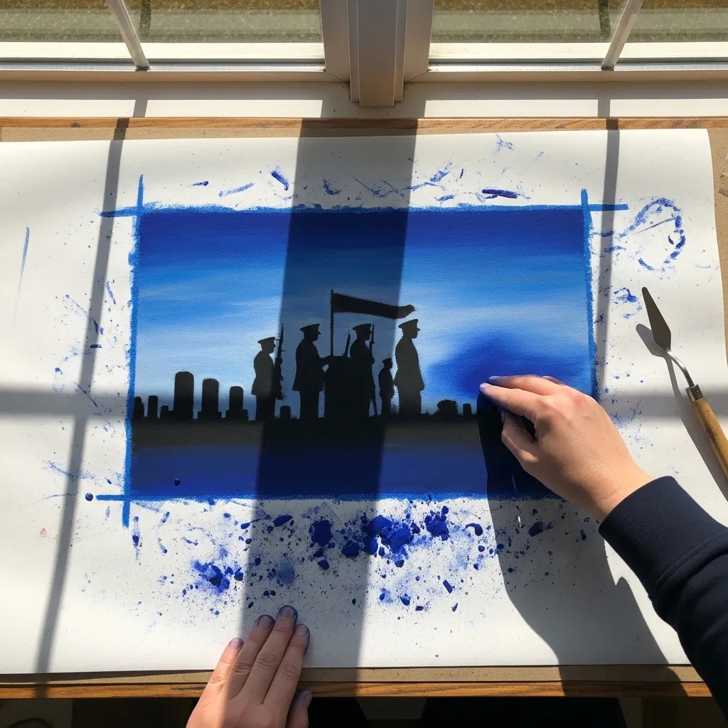
The cyanotype look depends on only two values existing. Keep the ground pure white. Mix a single deep Prussian blue and use nothing in between the two, then finish with ragged brushed edges around the image border to complete the printed impression.
28. Patterned Star in Fine Liner
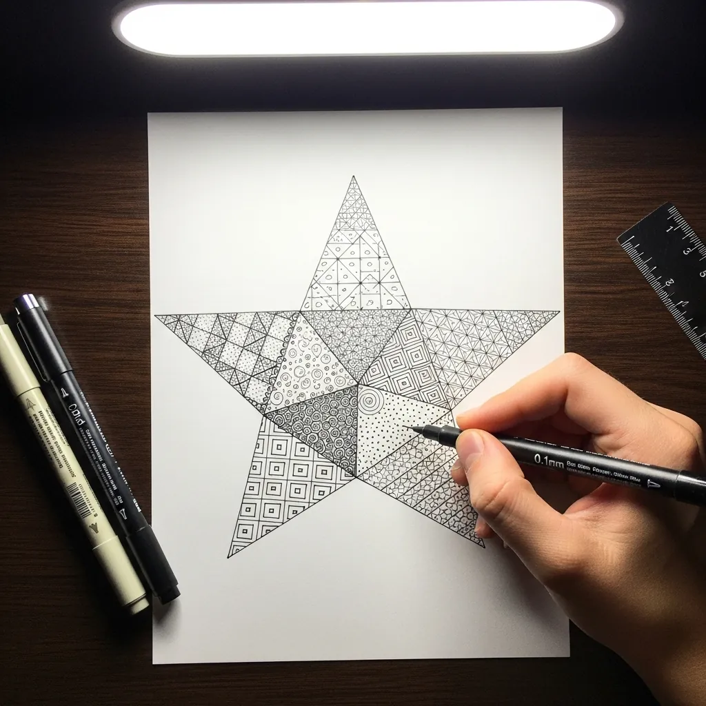
Dividing a shape into patterned zones needs a value plan first, so decide which sections should read dark and which light, then choose pattern densities to match, packing the linework tightest in the darkest zones. Without that plan the star flattens into texture.
29. Framed Folded Flag Case
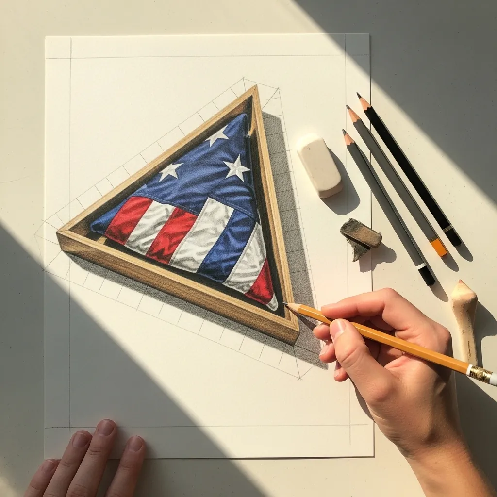
A display case is an exercise in straight lines and reflections. Rule the wooden frame precisely first. Suggest the glass with two or three long diagonal highlights that cross the flag beneath, and let those diagonals ignore the folds entirely, since a reflection sits on the surface rather than following what is behind it.
30. Poppy Arch in Watercolor
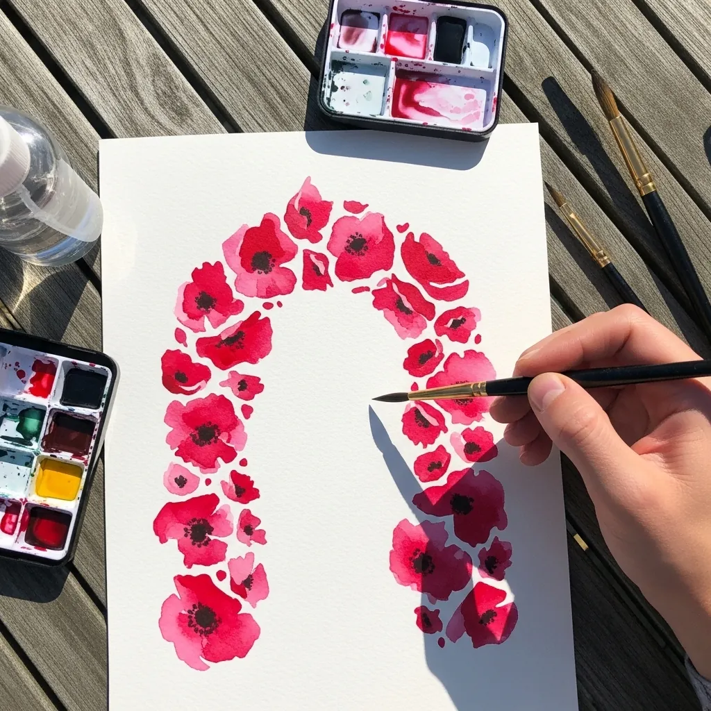
An arch of flowers frames empty space, so the empty space has to earn its place. Keep the poppies dense along the curve and let the arch thin at both ends, leaving the center of the page clear for text or simply for quiet.
31. Textured Acrylic Flag
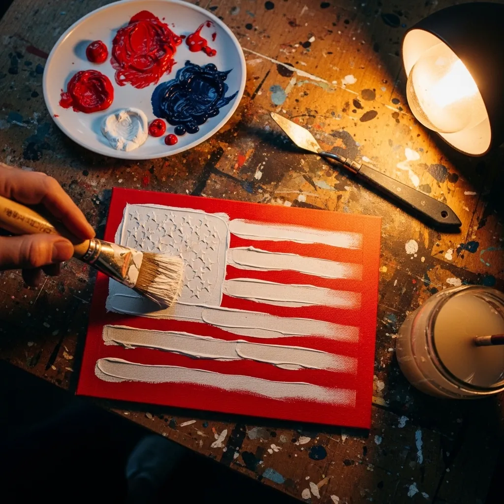
Impasto flags work because the ridges catch real light. Paint the stripes in single loaded strokes without going back over them, and let the underlying red show at the edges. Thick paint reworked while wet loses all of that texture.
32. Candle Flame in Soft Pastel
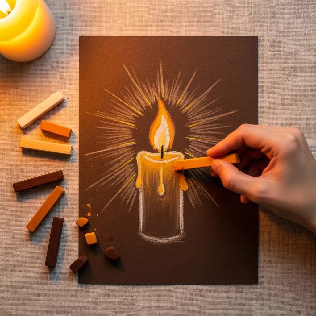
A flame needs three zones: a small dark core near the wick, a bright yellow body, and a soft halo beyond it. Keep the radiating rays uneven in length. Blend outward from the flame so the glow fades gradually into the paper rather than stopping at a hard edge.
33. Charcoal Cross Under Clouds
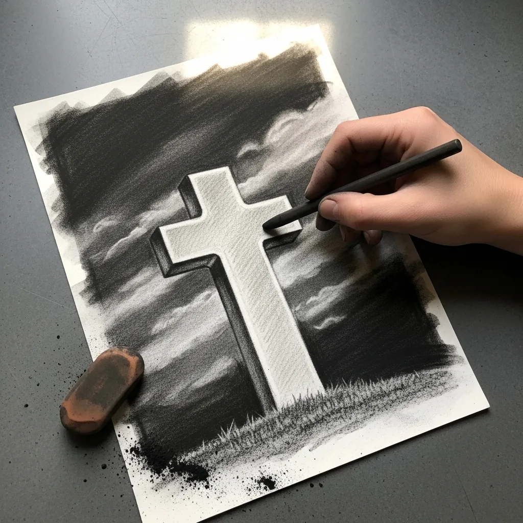
The cross is left as bare paper while everything around it is worked dark, so lay the sky in broad charcoal strokes, blend it down, then lift the cloud edges back out. Keeping the cross untouched from the start is far easier than reclaiming it later.
34. Botanical Poppy Plant Study
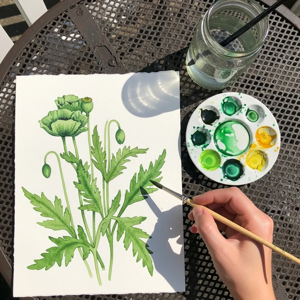
Botanical work means drawing the whole plant, not just the flower. Include a closed bud, an opening one and a seed head if you can, and give the leaves their deep irregular lobes. Those details are what separate a study from a decoration.
35. Medal Construction Sketch
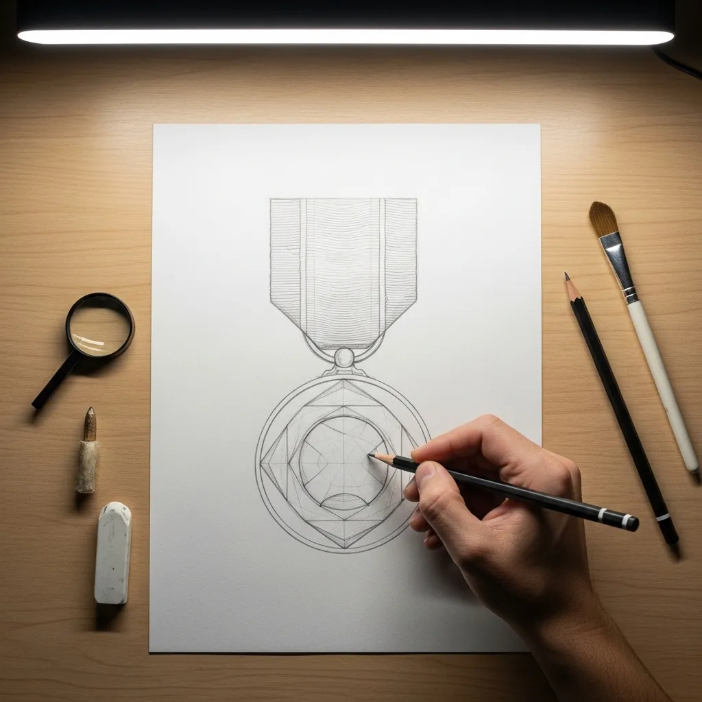
Leaving construction lines visible is honest and often more interesting than hiding them. Draw the center line, the ribbon rectangle and the circle for the medal, then refine on top without erasing any of that scaffolding. The viewer sees how the drawing was actually built.
36. Misty Gray Wash Cemetery
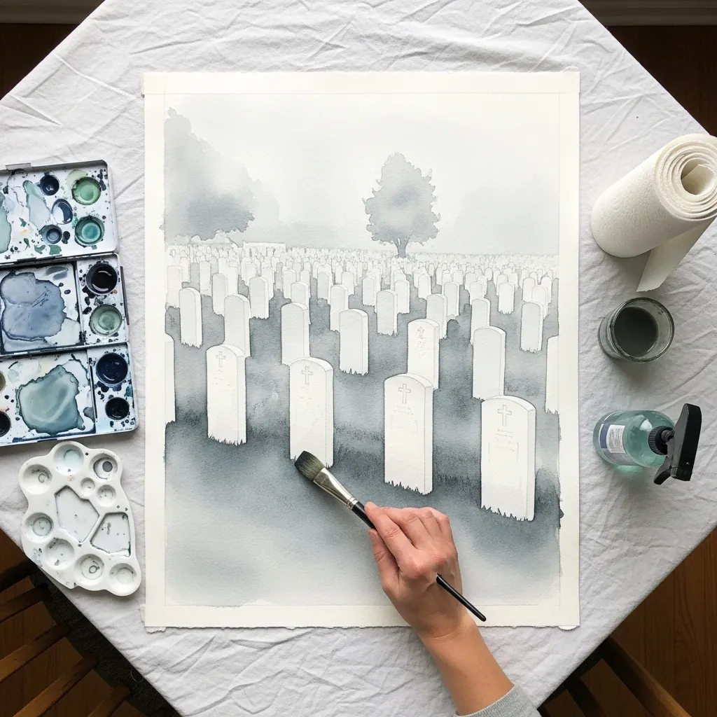
Atmospheric perspective is mostly about contrast rather than color. Keep the near stones darkest and most clearly defined. Reduce both contrast and detail with every row further back, until the furthest markers are barely separable from the sky behind them.
37. Continuous Line Eagle
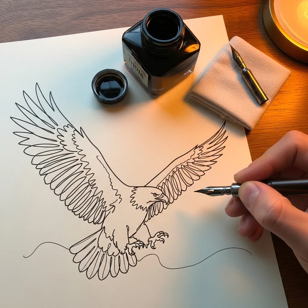
One line, and no lifting the pen at any point. Plan the route in pencil first, since you cannot correct halfway through. Let the wing feathers become long loops rather than individual shapes, and accept that the head has to be right on the first pass.
38. Large Poppy in Soft Pastel
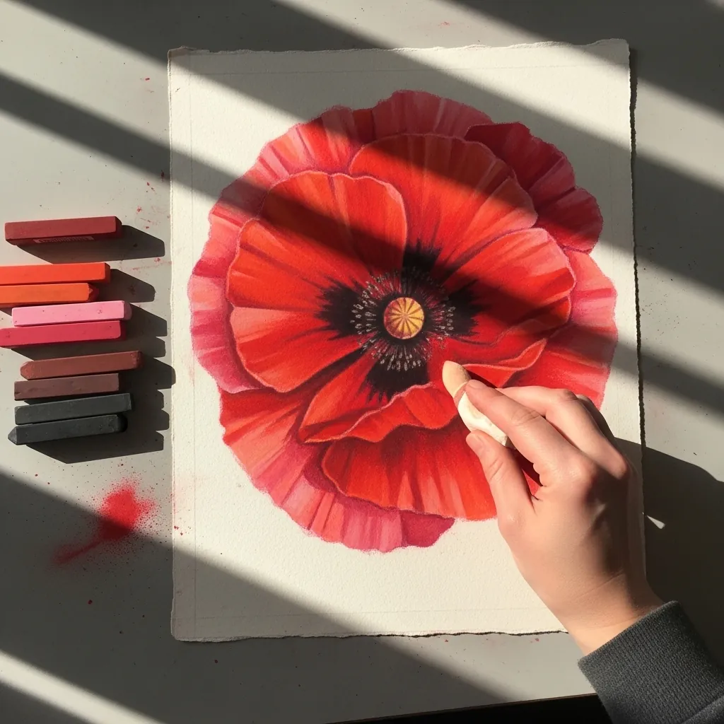
At this scale the petal crinkles become the subject. Work the creases as soft dark lines radiating from the center. Blend lightly across them afterward so they sit under the surface rather than on top of it, and keep the central boss the darkest note on the page.
39. Blue and Red Wash Flag
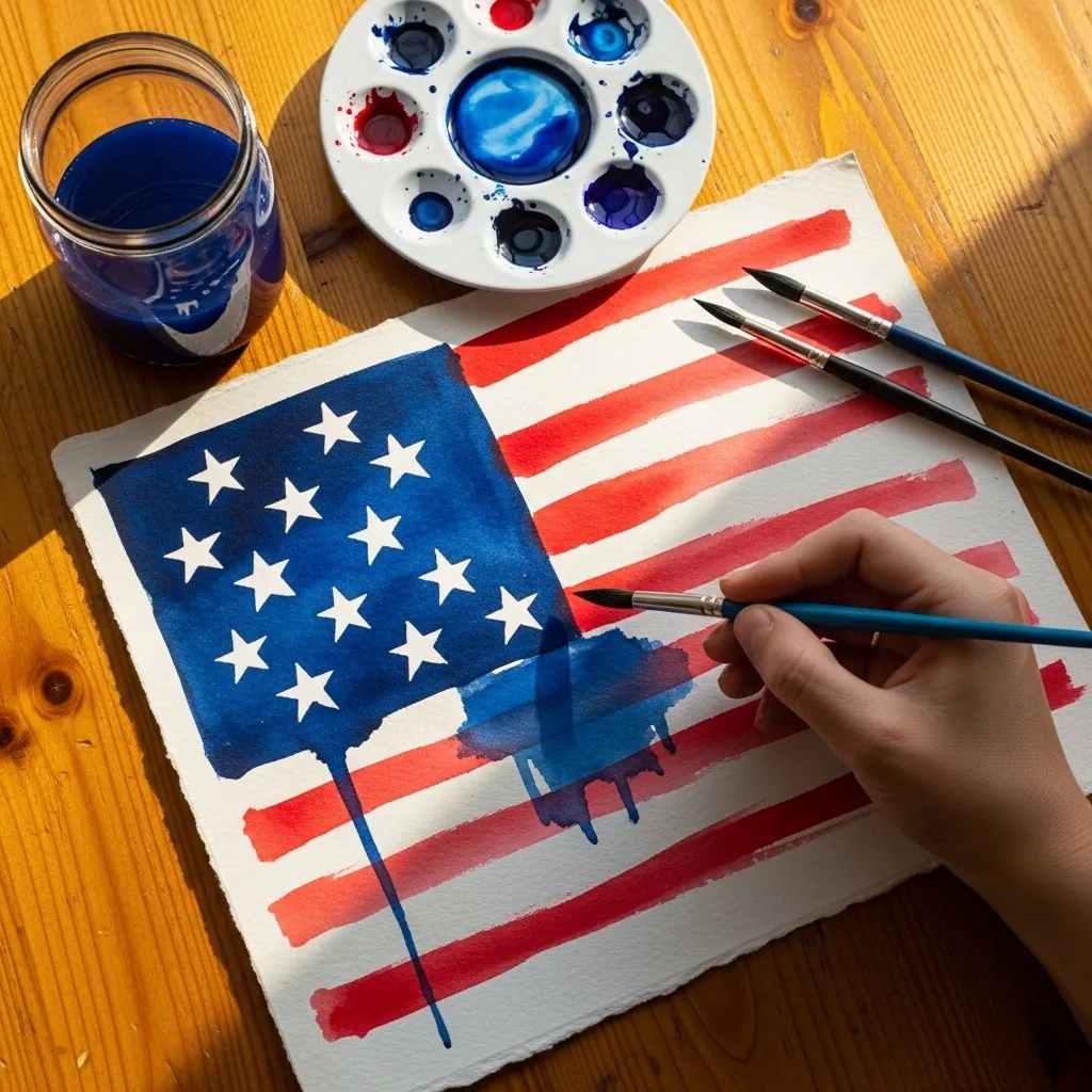
Two saturated colors meeting need a dry boundary between them. Paint the canton, let it dry completely, then lay the stripes up to its edge. Wet blue running into wet red produces a purple line that no amount of correction fixes.
40. Hands Holding a Folded Flag
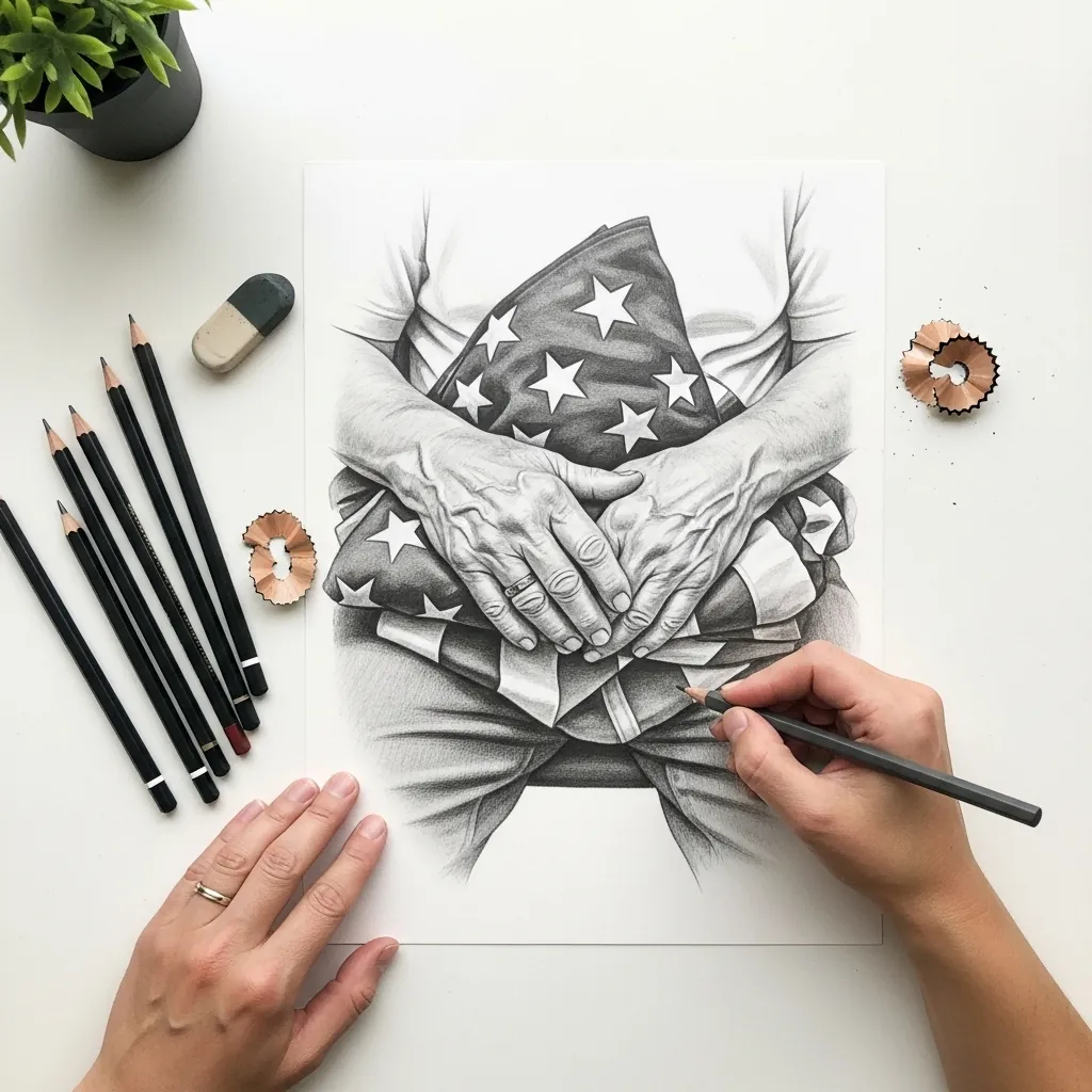
Hands holding an object should show pressure somewhere. Flatten the fingertips slightly where they press into the fabric, and let the flag itself compress a little beneath them. Contact drawn without any deformation is exactly what makes held objects look weightless.
Frequently Asked Questions
Why is the poppy a symbol of remembrance?
It comes from John McCrae’s 1915 poem In Flanders Fields, which describes poppies growing among war graves. Moina Michael and Anna Guerin then campaigned to adopt the flower as a memorial emblem, and it spread through veterans’ organizations from there.
How should the flag be drawn on Memorial Day?
At half-staff until noon, then at full staff for the rest of the day. If you are drawing a flag at half-staff, leave a clear gap of open pole above it, because a flag drawn only slightly below the top reads as a mistake rather than as intent.
How is a burial flag folded?
Into a triangle, through a series of folds that finish with only the blue field and white stars showing. When drawing one, treat it as a solid geometric wedge with crisp edges, and let the star field wrap slightly around the visible face.
How do you draw a poppy correctly?
Four crinkled petals, arranged as two overlapping pairs rather than four evenly spaced ones. Put a dark boss at the center with a ring of fine stamens around it, and keep the stem slightly hairy and bending, since poppy stems are never rigidly straight.
What is the difference between Memorial Day and Veterans Day?
Memorial Day honors those who died in military service, while Veterans Day honors all who have served. That distinction matters when choosing symbols, because a memorial piece leans toward graves, folded flags and poppies rather than celebration.
References and Further Reading