Short answer: The best hand-painted card designs are simple floral wedding suites, botanical save-the-date cards, and cheerful birthday cards, all painted on thick 300gsm (140lb) watercolor paper. Florals suit weddings and showers, clean botanical sprigs suit save-the-dates, and one bold shape, like a rainbow cake or a pine island, suits birthdays. Keep the design to two or three colors, leave plenty of white space, and let each layer dry fully so the card stays flat and looks professional.
TL;DR
- Start here if you are new: the pastel leafy invitation (idea 6), the blue floral affirmation card (idea 8), and the rainbow layer cake birthday card (idea 12).
- Use paper that is at least 300gsm (140lb), tape the edges down while painting, and press the finished card under heavy books overnight.
- Weddings suit soft, matching suites; birthdays suit one bold, colorful shape; save-the-dates suit a single clean botanical sprig.
- All 25 ideas below are shown exactly as painted, with the paper each design works best on.
Creating handmade greetings with watercolor cards drawing ideas transforms a simple gesture into a keepsake of love. This artistic practice allows you to explore personalized themes while honing your painting skills on a manageable scale.
Small paper canvases offer a low-pressure way to experiment with new techniques and express your unique style. Whether you are crafting for holidays or birthdays, these designs connect you to a community of makers who value the personal touch.
Our guide provides simple yet stunning concepts that turn blank cards into masterpieces. Dive into this fulfilling hobby and discover how meaningful your art can be when shared with others.
What are some quick and easy watercolor card ideas for beginners?
For those new to card-making, the most effective watercolor cards drawing ideas rely on simple geometric shapes and minimal layering. Beginners often look for designs that look professional but take less than 15 minutes to complete, allowing for batch creation during holidays or events.
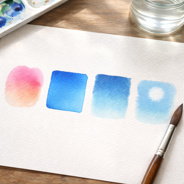
- Abstract Color Washes: Apply masking tape in geometric patterns (like stripes or triangles) on the card. Paint over the entire area with a blend of two or three colors, let it dry, and peel the tape for crisp, modern white lines.
- Simple Floral Wreaths: Draw a light circle with a pencil and dab small, irregular spots of pink and red around it to mimic roses. Add quick green strokes for leaves to create a delicate frame for a handwritten message.
- Minimalist Balloons: Paint simple oval shapes in various colors at the top of the card. Once dry, use a fine-liner pen to draw strings connecting them to a tiny basket or simply trailing off the page.
- Festive Baubles: For holiday cards, paint wet circles and drop in different colors to let them bleed together. Add a metallic gold or silver marker for the hanging strings and hooks to give it a festive shine.
How do you prevent watercolor paper from warping when making cards?
A common challenge when executing watercolor cards drawing ideas is paper buckling, which can ruin the professional look of a greeting card. Mastering paper preparation and water control is essential for ensuring your cards remain flat and pristine.
- Choose the Right Weight: Always use watercolor paper that is at least 300gsm (140lb) for your cards. Thinner cardstock cannot handle the water absorption and will almost certainly buckle or pill under the brush.
- Tape Down Your Edges: Secure your paper to a hard board using painter’s tape or washi tape before you start painting. Keep the paper taped down until the paint is 100% dry to force the fibers to dry flat.
- Control Your Water Usage: Avoid soaking the entire paper unless necessary for a specific background wash. Using a “dry brush” technique or working with less water helps maintain the structural integrity of the card.
- Flatten Under Weight: If slight warping occurs after the painting is dry, place the card between two sheets of clean paper. Stack heavy books on top and leave it overnight to press it back into a perfectly flat shape.
Start spreading joy with your art today by crafting your first batch of handmade cards. Grab your paints and let your personal touch turn simple paper into cherished memories for your loved ones.
1. 25 Hand-Painted Watercolor Card Ideas
Browse the full set below, from wedding suites to birthday cards. Each idea names the paper it was painted on, because paper choice changes how the paint sits and how flat the finished card stays. If you love floral frames, you will also enjoy the watercolor floral wreath drawing ideas for matching envelope and border practice.
1. Sweet Sixteen Floral Card on Textured Cardstock

Vibrant floral patterns symbolize the blossoming beauty of turning sixteen in this cheerful design. I love how the warm oranges and punchy purples create a festive, high-energy mood. The loose watercolor strokes represent the spontaneity of youth while the white space keeps the layout feeling modern. It is a perfect choice for an unforgettable milestone celebration today.
2. Blue Gradient Wedding Invitation on Heavyweight Paper

Deep blue washes create a striking ombré effect that mimics the shifting tides of the ocean. This abstract style symbolizes depth and eternal commitment for a modern couple. The artistic blending of sapphire and sky tones provides a serene background that feels sophisticated. Minimal elements allow the bold color to tell a story of love.
3. Indigo Watercolor Suite on Cotton Cardstock

Nightly indigo clouds bring a moody and romantic aesthetic to this full invitation suite. Darker values symbolize the mystery and beauty of shared dreams under the stars. By contrasting the deep ink with white botanical accents, the artist creates a timeless look. It honors evening ceremonies where elegance and quiet intimacy take center stage now.
4. Illustrated Wedding Map on Canvas Surface

Maps tell a story of a couple’s unique journey and this playful illustration is no exception. It highlights significant locations with charming icons like trees and deer, symbolizing a deep connection to the local landscape. The soft green washes evoke a sense of adventure. This design turns a simple guide into a cherished piece of storytelling.
5. Deckle Edge Blue Cards on Handmade Paper

Texture is the main focus here with the organic look of hand-torn edges and soft silk ribbons. The light blue watercolor represents the tranquility of clear skies and new beginnings. By layering different paper heights, the artist adds a tactile dimension that feels luxurious. Introducing a wedding theme with subtle elegance has never looked better.
6. Pastel Leafy Invitation Set on Smooth Cardstock

Breezy lavender and sage leaves frame the names in this delicate botanical design. The soft greenery symbolizes growth and the nurturing nature of a lifelong partnership. I enjoy the circular framing because it represents unity and the cycle of life. Gentle washes make the set feel approachable for a sunny spring or summer wedding.
7. Dusty Rose and Sage Suite on Textured Cardstock

Roses have long served as cultural symbols of romance and devotion across the globe. This design uses muted, dusty tones to give the flowers a vintage, heirloom quality. The lush floral border suggests a sense of abundance and natural beauty. It is a sophisticated take on a classic theme that honors floral wedding art.
8. Blue Floral Affirmation Card on Matte Art Paper

Peace and self-acceptance are the core themes of this beautiful floral spray. The light blue and green tones symbolize tranquility and a quiet mind. Artistically, the loose brushwork creates an effortless feeling that pairs perfectly with the supportive message. It is a wonderful gift for anyone needing a gentle reminder that they are already enough.
9. Eucalyptus Vellum Wedding Suite on Fine Art Paper

Eucalyptus leaves often symbolize healing and protection, making them a meaningful choice for a wedding. This suite uses vellum layering to add a sophisticated, misty effect to the greenery. The clean white background keeps the focus on the organic shapes of the silver dollar eucalyptus. It is a trendy look that remains timeless in its simplicity.
10. Monochromatic Blue Floral Invitation on Thick Cardstock

Loyalty and trust are represented by the monochromatic blue color palette in this floral arrangement. The symmetrical layout creates a sense of order and formal beauty that feels very traditional. Deep navy shadows provide excellent contrast against the softer blue washes. This piece captures the strength and reliability found in a deep, committed union today.
11. Teal Watercolor Splash Wedding Invite on Smooth Cardstock

Refreshing mint and teal washes symbolize the clarity and peace of a new beginning. This modern piece uses a fluid artistic approach where the pigment spreads naturally to create a dreamy background. The organic shapes suggest the beautiful unpredictability of life. I love how the clean layout keeps the focus on the ethereal color palette.
12. Rainbow Layer Cake Birthday Card on White Textured Paper

Joyous rainbow layers represent a celebration of every vibrant year lived. This playful design features a hand drawn cake with sketchy candles and delicate floral accents at the top. Notice the tiny yellow splatters that add a sense of festive confetti. It is a lighthearted way to share happiness with anyone.
13. Misty Pine Island Landscape Card on Heavyweight Art Paper

Tall evergreens standing in a foggy lake symbolize resilience and quiet reflection. The artist used a loose wet on wet technique to create the soft horizon and distant mountains. Small bird silhouettes add a sense of movement and freedom. This landscape is an evocative artistic choice for couples who love nature.
14. Blush Peony Floral Wedding Set on Cream Cardstock

Lush pink peonies are classic cultural symbols of romance and prosperity often used in bridal art. These cards feature full blooms paired with deep navy berries for a traditional yet high contrast look. The botanical borders feel very intentional and elegant. It is a design that uses classic floral symbolism to celebrate love.
15. Pale Sage Rose Invitation Suite on Matte Paper

Soft green roses represent harmony and the nurturing side of a long term bond. This minimal monochromatic suite uses light washes to suggest the delicate petals of a single large flower. Sage tones symbolize fertility and nature in many traditions. Coordinated envelopes and ribbons pull this artistic vision together for guests.
16. Stacked Pink Rose Wedding Stationery on Premium Cardstock

Feminine pink roses are the star of this abundant floral design. The artist focused on soft transitions between white and coral to give the petals a glowing effect. Symbolically these flowers speak of grace and gratitude. Seeing them stacked highlights the detailed greenery that frames each bloom for a garden theme feel.
17. Sunset Forest and Floral Place Cards on White Paper

Sunlight provides endless inspiration as seen in this diverse collection of name cards. Each piece features a different scene from golden sunflowers to silhouetted pine forests under a vibrant sky. These designs symbolize the unique personality of every guest at the table. Bold colors and varied themes make the event feel interactive.
18. Pink and Yellow Floral Border Cards on Textured Watercolor Paper

Spring blossoms in pink and yellow form a protective border around the central message. This artistic arrangement symbolizes the beauty found in life’s small moments. I love how the stippled watercolor technique gives the flowers a soft and vintage feel. The warm light emphasizes the tactile quality of the heavy paper.
19. Tall Purple Peony Celebration Card on Heavy Textured Stock

Reaching upward these purple petals symbolize royalty and deep admiration. The vertical design uses black ink outlines to provide a crisp contrast against the soft lavender washes. Small splatters of ink add a modern artistic flair that feels very current. Bold color and fine line work create a standout celebratory message.
20. Wildflower Envelopes with Sage Green Ribbons on Cotton Paper

Green fields carry a message of untamed beauty and the freedom of the outdoors. These envelopes feature a detailed botanical illustration with various pink and white blooms nestled among green leaves. Sage ribbons symbolize peace and earthiness within this cultural tradition. The fine details like the tiny bee show a playful appreciation.
21. Bridal Shower Invitation Card on White Cardstock

Celebration is the heart of this Brunch and Bubbly bridal shower design. I am showing you this because the deep purple and soft peach florals symbolize a mixture of royalty and approachability. The airy layout provides plenty of room for guest details while the botanical header adds a feminine touch. It is a playful choice.
22. Tropical Wedding Invitation with Sheer Ribbon on Textured Paper

Island vibes come alive through this lush tropical border featuring hibiscus and palm leaves. Hibiscus flowers represent delicate beauty and femininity in various cultures. This artistic layout uses vibrant pinks and greens to frame the ceremony details. A sheer white bow adds a tactile element that feels high end. It is a great idea.
23. Floral Detail Card with Rings on Matte Cardstock

Everlasting love is symbolized by the pairing of wedding rings and soft rose patterns. These purple and peach roses signify gratitude and grace within the floral design. This piece focuses on the subtle details that make a wedding suite feel cohesive. The artist used muted tones to ensure the jewelry stands out. It is very romantic.
24. Venue Illustration Wedding Invitation on Textured Paper

Meaningful locations take center stage with this custom watercolor building illustration. I’m sharing this because venue drawings represent the physical foundation of new memories. The soft green envelope and matching timeline card create a professional yet personal look. Delicate brushwork on the trees adds organic texture. It is an artistic way to invite guests.
25. Botanical Save the Date Card on Smooth Paper

Nature provides a quiet announcement in this minimalist save the date design. Bluebells and foxgloves symbolize humility and constancy in traditional botanical art. I like how the clean typography allows the delicate watercolor stems to shine against the white space. It is a sophisticated artistic choice for a summer event. The simple layout feels fresh.
2. How to Pick the Right Card Design for Every Occasion
Choosing is easier when you match the design to the occasion first and the colors second. A wedding suite needs to feel calm and matching across every piece, while a birthday card needs one happy shape that reads clearly from arm’s length. The table below sums up the safest picks from the 25 ideas above.
| Occasion | Best designs from this list | Paper tip |
|---|---|---|
| Wedding or invitation suite | Ideas 2, 3, 6, 7, 9, 10, 14, 15, 16, 22, 24 | Heavyweight or cotton cardstock so every piece in the set feels the same |
| Save the date | Idea 25, plus idea 4 for a venue map | Smooth paper for clean, readable typography |
| Birthday | Ideas 1, 12, 19 | White textured paper so bright colors stay vivid |
| Shower or celebration | Ideas 21, 17, 23 | White or cream cardstock for a fresh, festive look |
| Everyday encouragement | Ideas 8, 11, 18, 20 | Matte art paper for soft color and easy handwriting |
1
Pick the occasion first. Decide whether the card is for a wedding, a birthday, a save-the-date, or just because. That one choice narrows 25 ideas down to three or four.
2
Pick one main shape. One rose cluster, one cake, or one island scene is enough. Cards with a single clear subject look more professional than cards crowded with many small drawings.
3
Limit yourself to two or three colors. A dusty rose with sage green, or a deep blue with a pale wash, looks planned and calm. Adding a fourth or fifth color is the most common reason a card starts to look muddy.
4
Paint a test card first. Try the design once on scrap paper from the same pad. You will learn how wet your brush can be before the paper buckles, and you will know exactly how the colors dry, since watercolor always dries lighter than it looks wet.
Tip: Watercolor has a long history as a card and keepsake medium. The Metropolitan Museum of Art notes that watercolor’s transparent washes let light reflect from the paper itself, which is what gives hand-painted cards their glow, and that artists stretched thinner papers taut to stop them cockling when damp. That is the same reason taping your card down while it dries works so well. Read the full history in the Met’s essay on Watercolor Painting in Britain, 1750–1850.
If your brushes are holding you back, the right tools make a visible difference before you change anything else. See the best watercolor brushes for beginners and a best watercolor set under $25 guide for simple, budget-friendly starting points.
Hand-painted cards also make a thoughtful gift for a teacher, and the right pens keep the lettering neat. See our guide to the best markers for teachers for options that work well on card and in the classroom.
A hand-painted card pairs nicely with a small art gift, and you do not need to spend much to make it special. Our guide to the best gifts for artists under $50 rounds up thoughtful, budget-friendly ideas for the artist in your life.
3. Frequently Asked Questions About Hand-Painted Watercolor Cards
What is the best paper for hand-painted watercolor cards?
Paper that is at least 300gsm (140lb). Thinner cardstock soaks up water, buckles, and pills under the brush. Cotton or heavyweight watercolor paper stays flat, holds washes evenly, and still folds cleanly if you score it first with a bone folder or the back of a spoon.
How do I stop my watercolor cards from warping?
Tape the paper to a hard board before you paint, use less water than you think you need, and keep the tape on until the paint is fully dry. If a finished card still curls slightly, press it between two sheets of clean paper under heavy books overnight.
How long do watercolor cards take to dry?
A light wash dries in about 15 to 30 minutes in a normal room, but a card with several layers needs a few hours before it is safe to stack, write in, or post. Drying it flat, taped down, gives the flattest result.
Can beginners really paint cards that look professional?
Yes, if the design stays simple. The beginner ideas at the top of this guide, abstract color washes, simple floral wreaths, minimalist balloons, and festive baubles, all take under 15 minutes and rely on basic shapes rather than detailed drawing. Simple shapes with clean edges read as intentional, which is what makes a card look professional.
What should I write inside a hand-painted card?
Write with a waterproof fine-liner pen or a pencil first, and only after the paint is completely dry. A short, specific message beats a long generic one: name the memory, the wish, or the reason you chose that design. For wedding cards, one sincere sentence about the couple means more than a full page of formal wording.
Can I post a hand-painted watercolor card in the mail?
Yes. Let it dry fully, press it flat overnight, and slip it into a slightly larger envelope so the painted surface does not rub. A blank sheet of tissue paper over the painting inside the envelope adds cheap protection against smudging in transit.
Where to Go Next
- Watercolor floral wreath drawing ideas — practice the frames and borders used in ideas 6, 7, and 18.
- Wildflower bouquet drawing ideas — loose, natural bunches like the wildflower envelopes in idea 20.
- Botanical leaf tracing ideas — leaf shapes and vein studies for cleaner foliage on every floral card.
- Best watercolor brushes for beginners — the brushes that make washes and fine lines easier.
- Best watercolor set under $25 — a budget starting set for your first batch of cards.
Pick one idea, paint it today, and send it to someone who will keep it. A handmade card is small, but it is the kind of gift people hold on to long after the occasion has passed.
If you are pairing a painted card with a painted envelope, see our 29 watercolor envelope drawing ideas — the card and envelope look best when they share one colour palette, and the guide covers paper picks, waterproofing, and mailing tips too.
If you want to put these cards to a specific use, our 30 easy watercolor thank you card drawing ideas walk through simple washes, wreaths, and floral designs that turn a blank card into a heartfelt thank you in about 15 minutes.