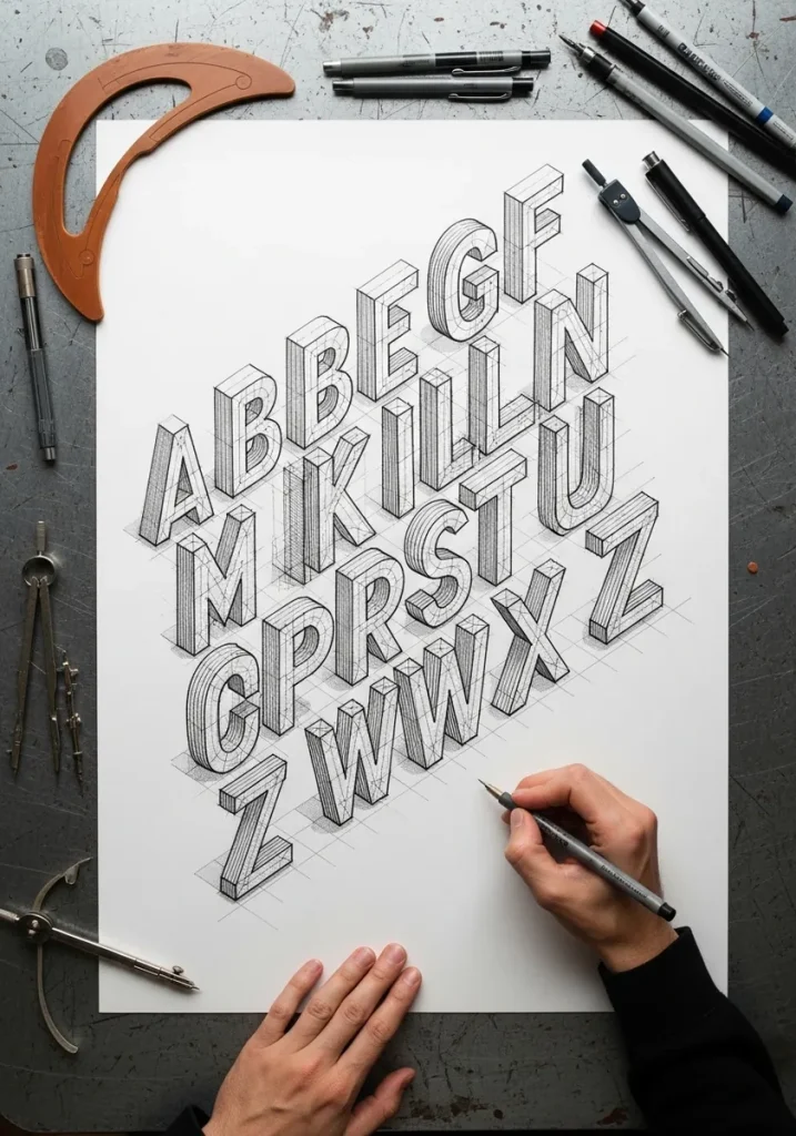
3D typography art drawing is lettering given depth by extruding each letter toward a single vanishing point and shading the resulting side faces. Pick one extrusion direction, one light source, and keep both consistent across every letter in the word.
Key takeaways
- Every 3D letter needs one extrusion direction and one light source, held consistent across the whole word.
- Draw flat letterforms and fix the spacing first; depth added to badly spaced letters never looks right.
- Keep the front face lightest and the extruded side faces a flat mid tone so the word stays readable.
- Materials like chrome, ice and neon are shading recipes, not letter shapes, so the construction never changes.
- Practice on full alphabet sheets before words, since single letters teach the method faster than a finished piece.
3D typography is flat lettering plus two decisions. Which direction the letters extrude, and where the light comes from. Push every letter back toward the same vanishing point by the same distance, shade the side faces from one light source, and even plain block capitals turn solid.
That is the whole method, and everything below is a variation on it. Watercolor bubble letters, chalk on black paper, chrome script, ice, stone, gears, graffiti and gold leaf are all the same construction with different shading recipes laid on top.
A lot of these are alphabet sheets rather than finished words, and that is deliberate. Single letters teach the technique far faster than a full piece, because you repeat the same extrusion twenty-six times and the mistakes become obvious. If you want the ornamental side of this, alphabet art drawing covers it, and these 3D digital art ideas apply the same depth logic in another medium.
Each idea below names the medium and the one technique that creates the dimensional effect, so you can pick a style and start today.
Compiled by the GS Art Zone editorial team. Last updated August 2026. Each idea is paired with the specific construction or shading step that produces the effect, so you can go from the reference straight to paper.
What You Need Before You Start
- HB pencil for construction lines and a 2B plus 4B for the extruded side faces
- A ruler and a set square, since almost every geometric style here needs ruled depth lines
- A kneaded eraser to lift highlights out of graphite rather than leaving the paper blank
- Fine liners in two widths for the inked alphabets, and a white pencil for the black paper styles
- Watercolor or gouache in a small warm and cool set for the painted letters
1. Soft Pastel Bubble Letters in Watercolor
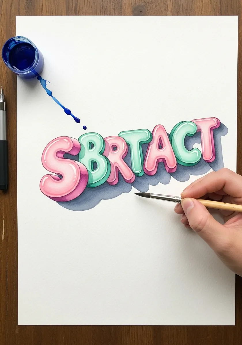
Inflated rounded capitals in soft pink and mint with a pale blue shadow underneath. Paint each front face and let it dry fully before adding the darker side tone, or the two colors bleed and the edge that creates the depth disappears.
2. Curved Block Letters on an Arc
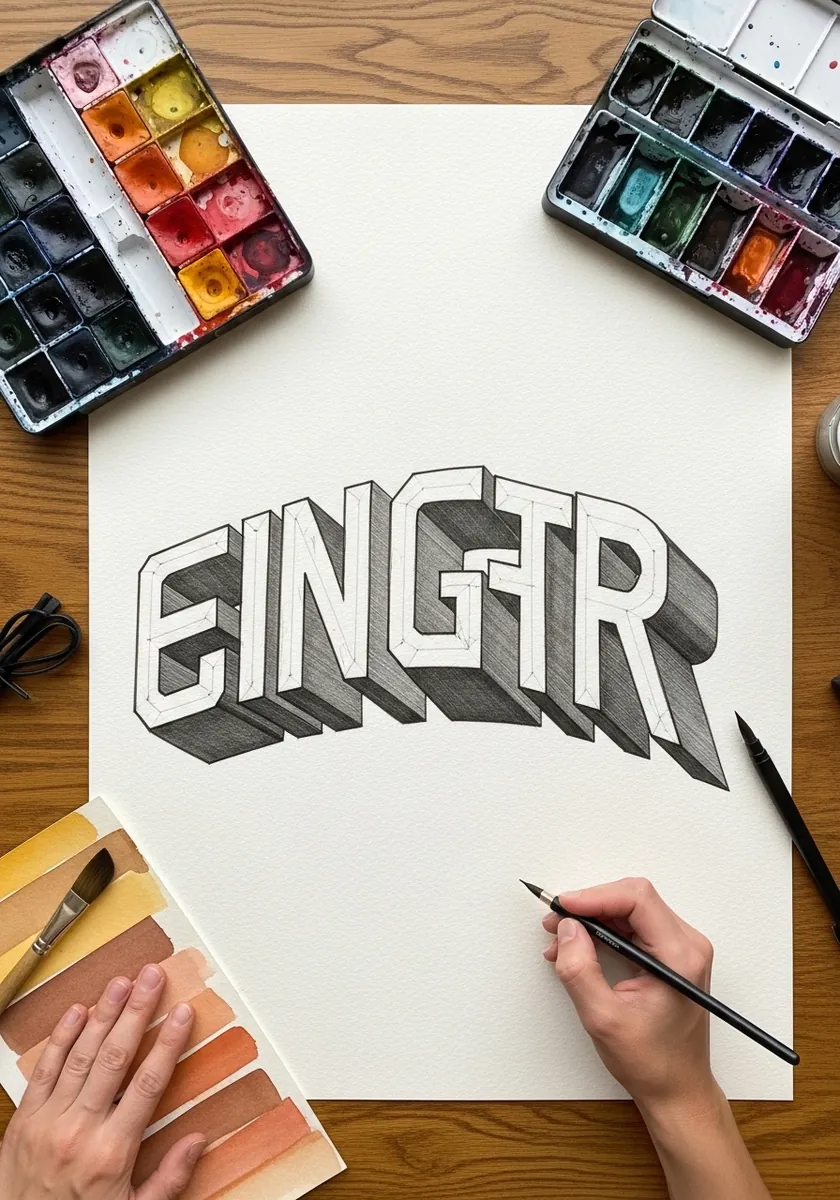
Heavy capitals set on a curve rather than a straight baseline. Draw the arc first and set every letter perpendicular to it, then extrude all of them in the same direction so the depth stays constant even as the letters rotate.
3. Gothic Blackletter with Deep Extrusion
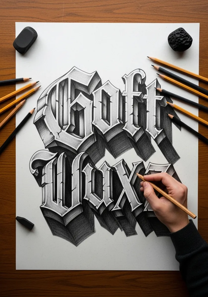
Blackletter capitals pushed back into a deep shaded side face. Draw the letter skeletons and fix the spacing before adding a single serif, because blackletter is dense and badly spaced letters turn into an unreadable block once extruded.
4. Thick Acrylic Impasto Alphabet
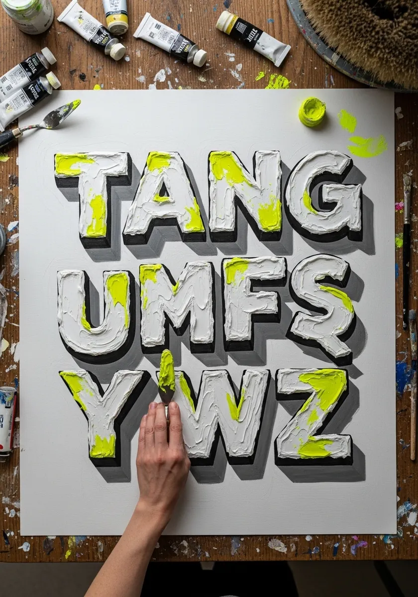
An alphabet built from ridges of thick white paint with neon yellow pushed through it. Load the knife heavily and lay each letter in one pass. The physical height of the paint does the 3D work, so resist smoothing anything flat.
5. Brush Script with Cherry Blossoms
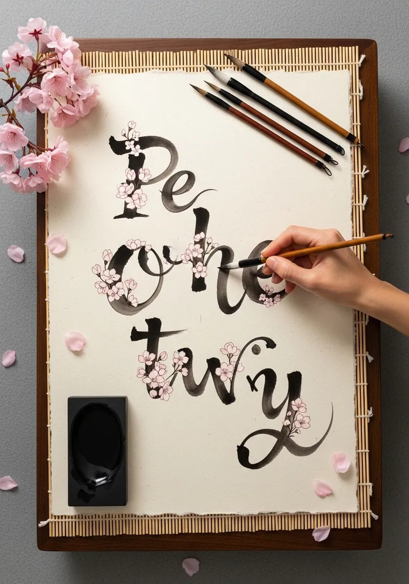
Loose brush script with blossoms growing along the strokes. Load the brush once per letter and commit, since the thick to thin taper inside a single stroke is what gives the script its dimension and it cannot be corrected afterward.
6. Carved Serif Letters on Deep Red
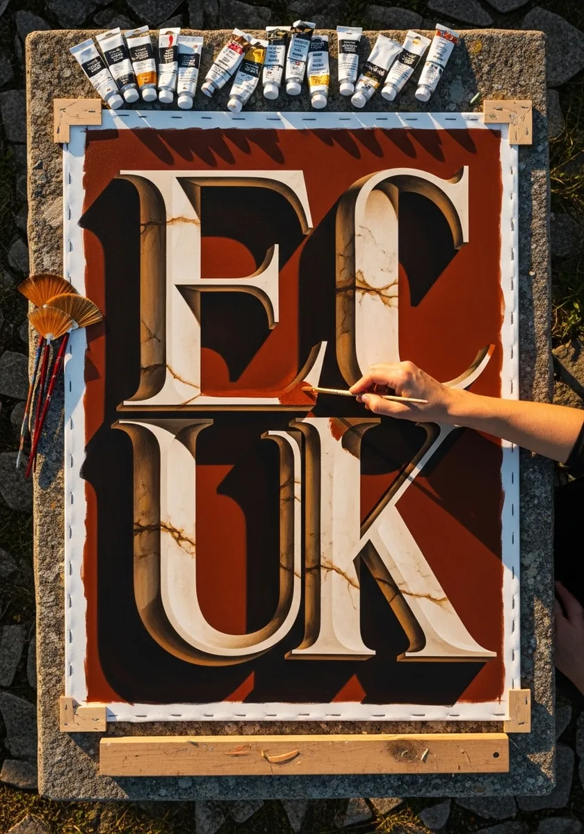
Cream serifs cut into a red ground with fine gold cracks running through. Carved letters are lit inside the groove, so put the highlight on the lower inner edge and the shadow on the upper one, which is the reverse of a raised letter.
7. Neon Tube Alphabet on Black
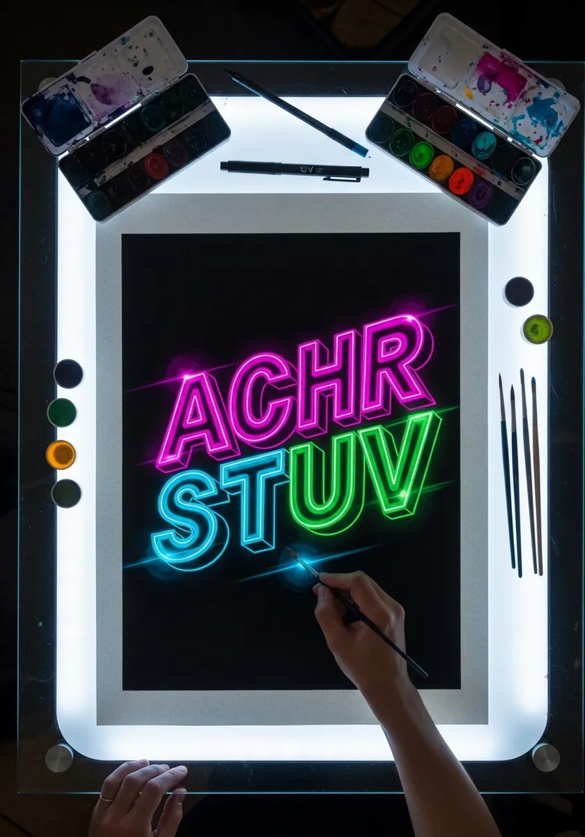
Letters drawn as lit glass tubing in pink, blue and green. Build the glow in two passes on a dark ground: a wide soft halo first, then a tight bright core line down the middle of every stroke.
8. Vintage Ornate Script on Kraft
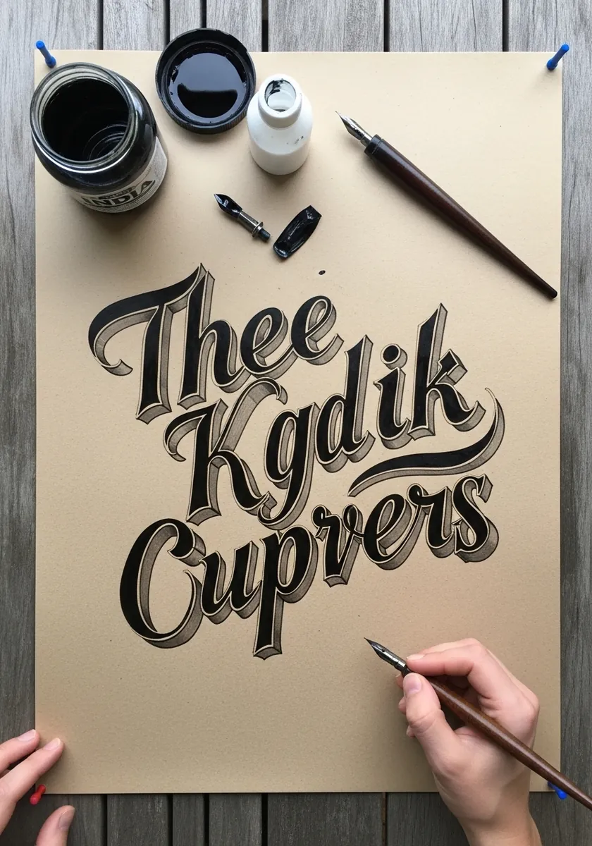
Victorian style script with a heavy drop shadow, drawn on tan paper. Kraft supplies the mid tone for free, so the only two values you need to add are a solid black letter and a white highlight along the top of each stroke.
9. Botanical Letters with Leaves
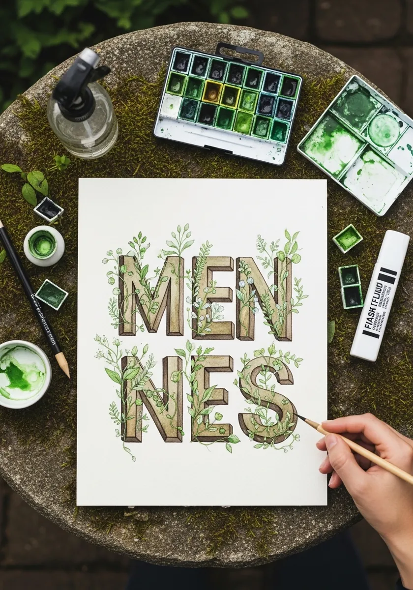
Soft green capitals with leaves growing out of the strokes. Let the foliage emerge from the letterform itself rather than sitting behind it, and keep the leaves outside the counters so the letters stay legible.
10. Comic Book Letters with Radiating Lines
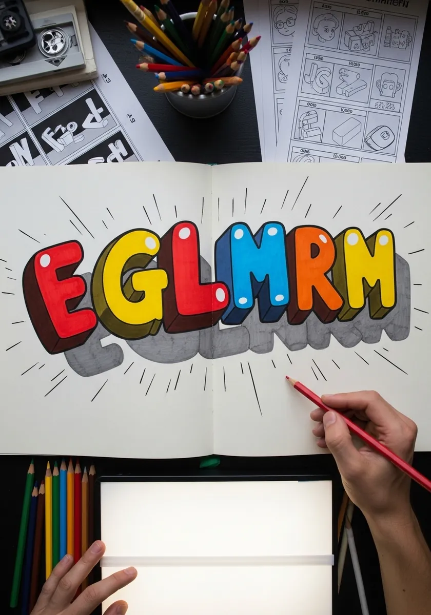
Chunky primary colored capitals with speed lines bursting behind them. Rule those lines from a single point behind the word; freehand radiating lines wander and instantly flatten the effect.
11. Isometric Alphabet on a Construction Grid
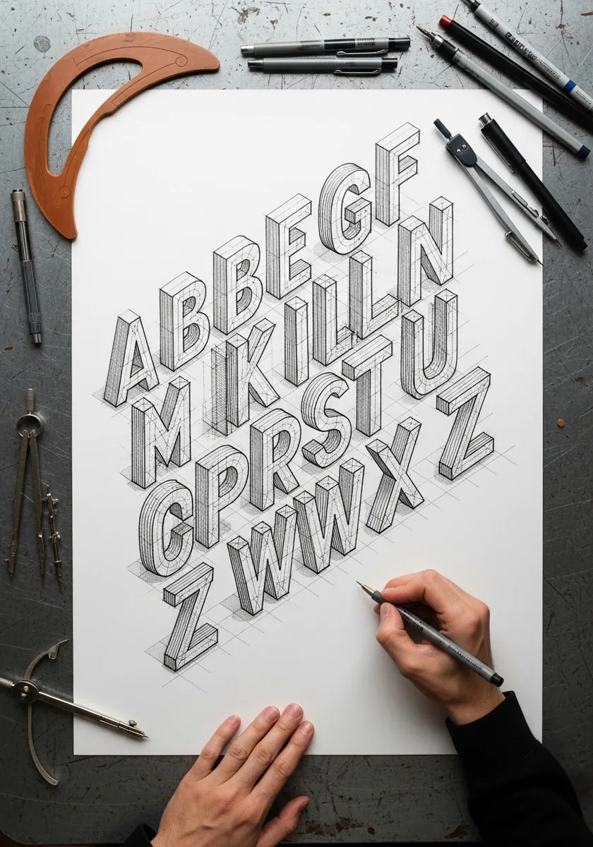
A full alphabet built on a strict isometric grid with the construction lines left visible. Rule the grid before drawing anything and keep every vertical truly vertical and every diagonal at thirty degrees. This is the exercise that unlocks all geometric lettering.
12. Sandy Watercolor Numerals
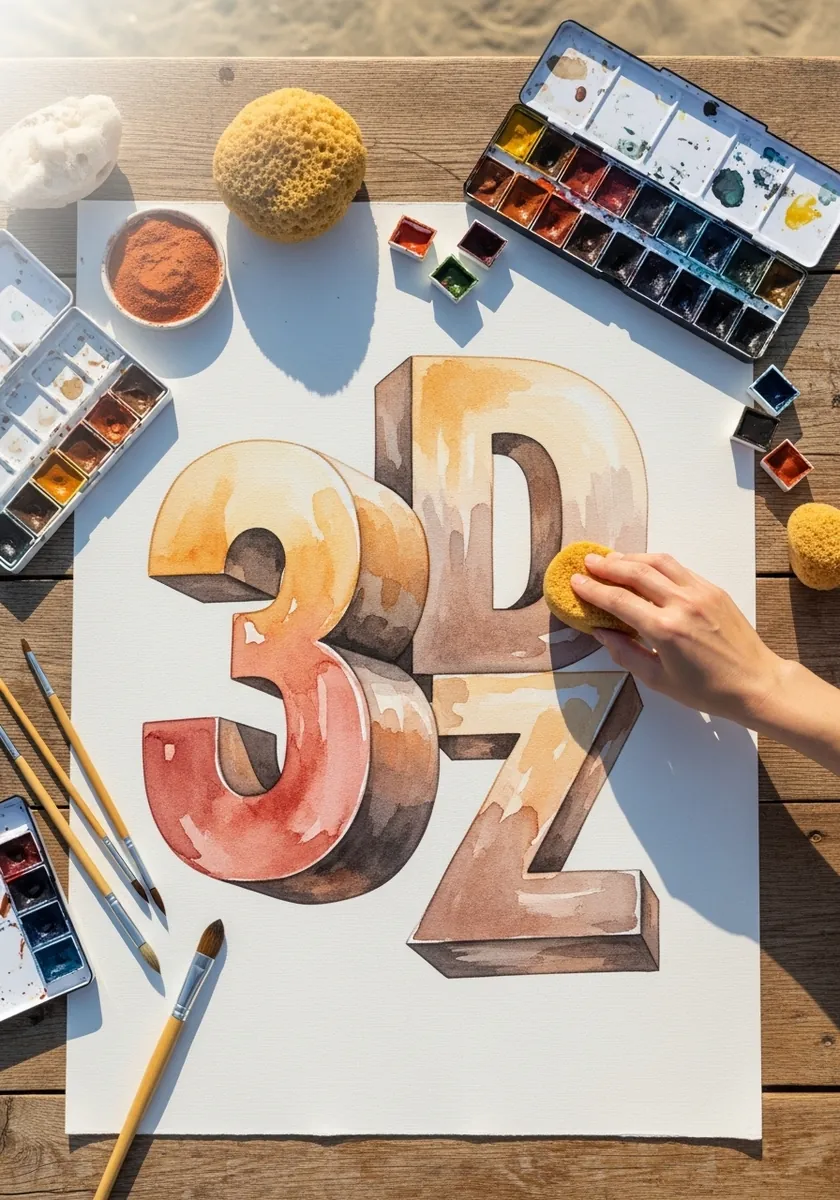
Oversized numerals washed in warm sand tones. Numbers are a good place to start because there are only ten of them, so you can practice one extrusion angle across the whole set in a single sitting.
13. Impasto Letters on a Swirled Ground
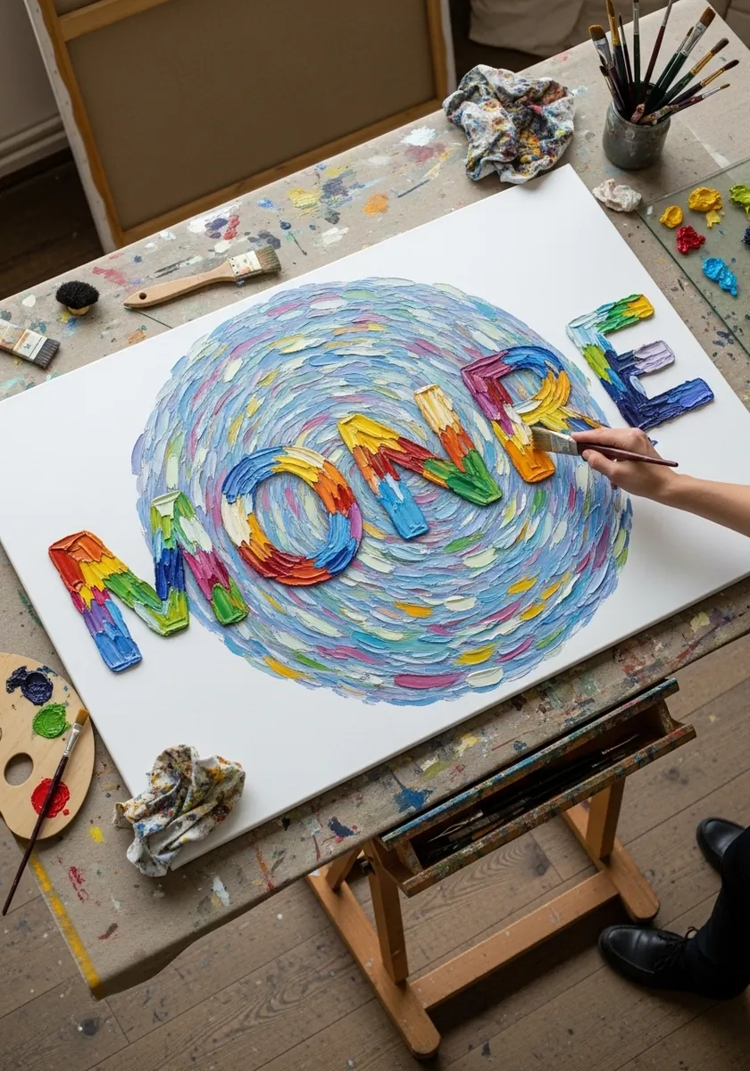
Bright letters laid over a swirled background of thick paint. Paint the swirl first and let it set, then build the letters on top with a clean knife so the two layers never mix and the type stays crisp against the movement behind it.
14. Ornamented Arabic Style Calligraphy
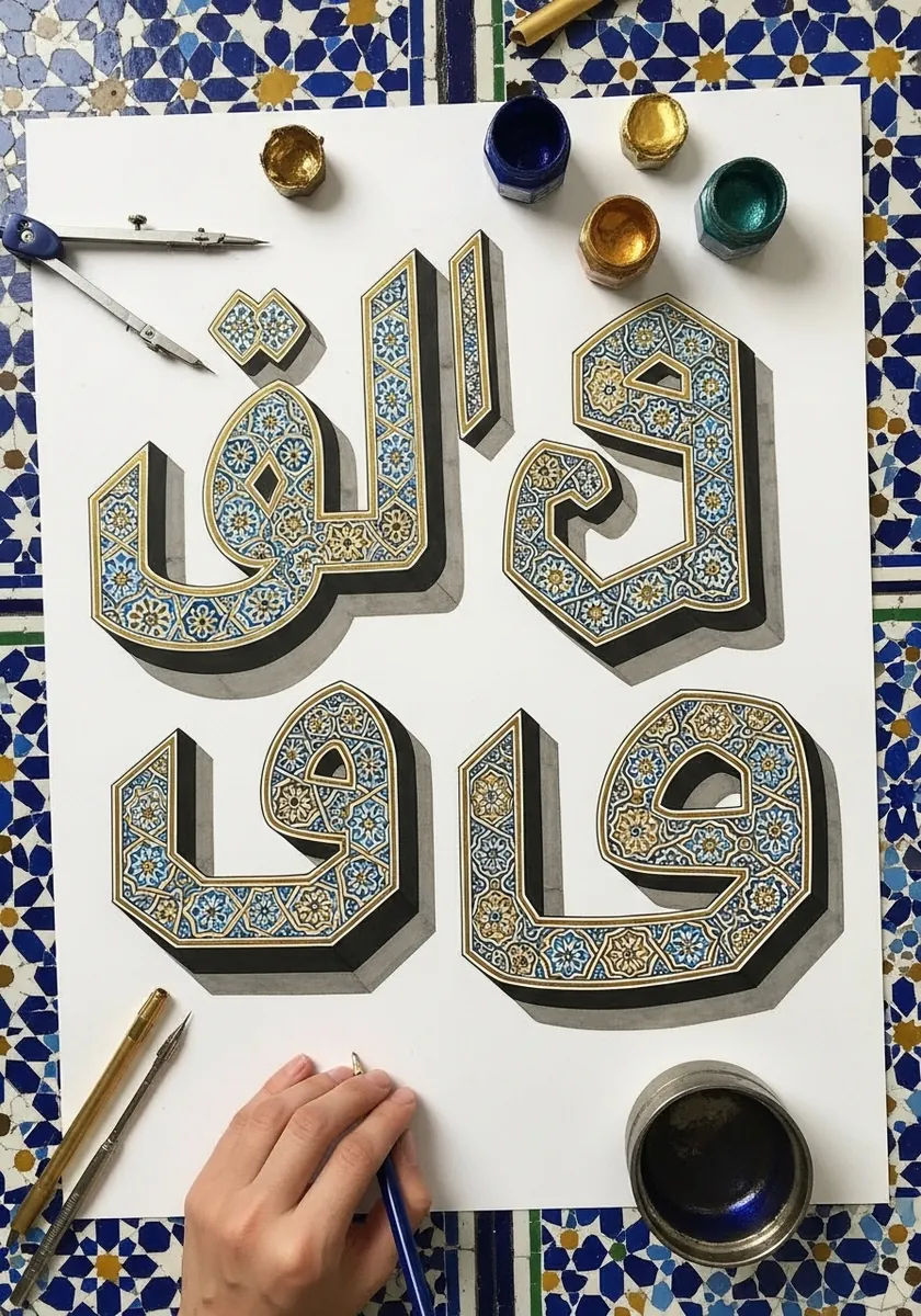
Angular calligraphic forms filled with fine blue and gold pattern. Draw the letter shapes as flat geometric blocks first and treat the ornament as a fill applied afterward, keeping it lighter in weight than the letter outlines.
15. Pastel Alphabet with Angled Sides
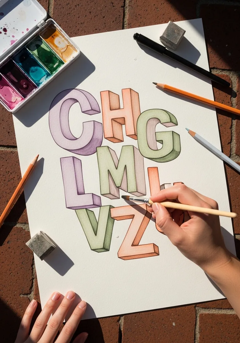
An alphabet in dusty lilac, peach and sage where every letter has a flat angled side face. Use no blending at all; the change of flat color at each fold does the entire dimensional job, which makes this ideal for beginners.
16. Chalk Letters on a Blackboard
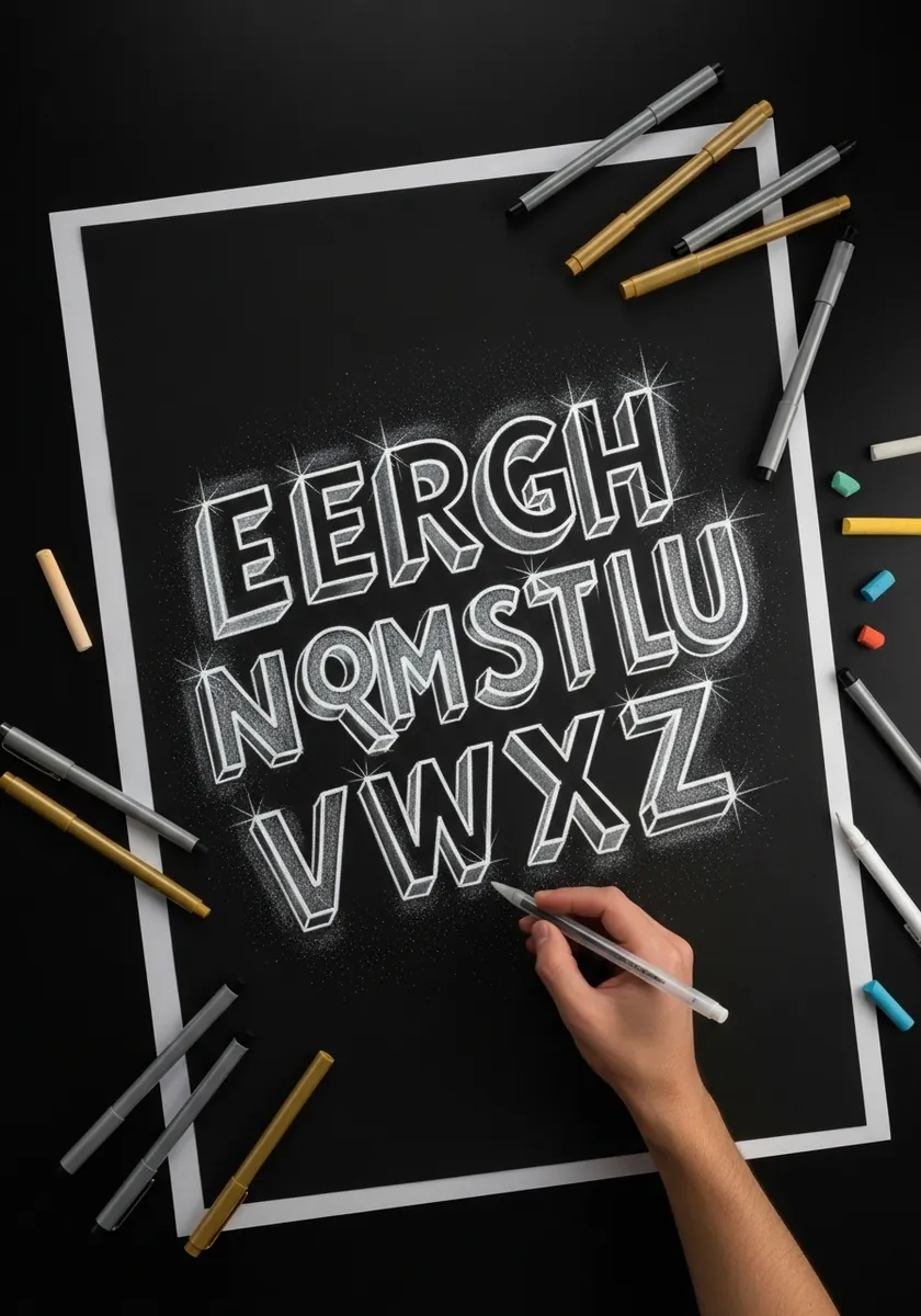
White chalk capitals with hard drop shadows on black. Working in reverse is the lesson: you add light instead of shadow, so put white only on the front faces and leave the side faces almost bare so the paper reads as shade.
17. Rusted Metal Letters with Drips
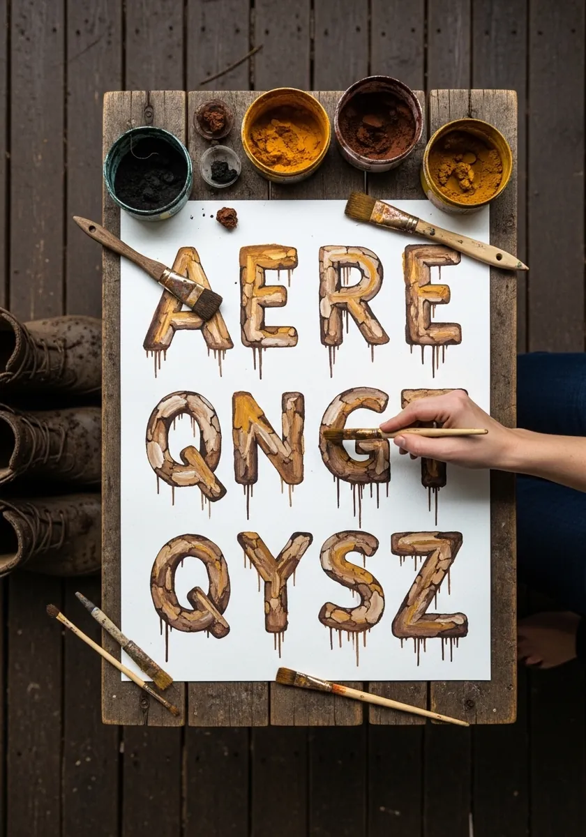
Corroded metal letters with rust running down from the base of each one. Build the base color in uneven patches rather than a flat wash, and let the drips vary in length so the surface reads as genuinely weathered.
18. Retro Groovy Letters with Rainbow Fill
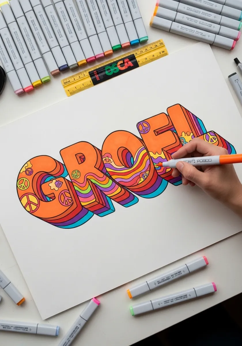
Seventies style rounded letters filled with flowing rainbow bands. Draw the outer silhouette of the whole word as one continuous shape first, then run the stripes through it so the color reads across the word rather than letter by letter.
19. Expressive Painted Letterforms
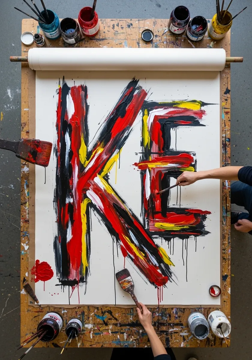
Two enormous letters painted in raw gestural strokes. Depth comes from layering here rather than extrusion, so put the darkest strokes down first and let the brighter ones sit on top and partly overlap them.
20. Stacked Serif Letters with Fine Hatching
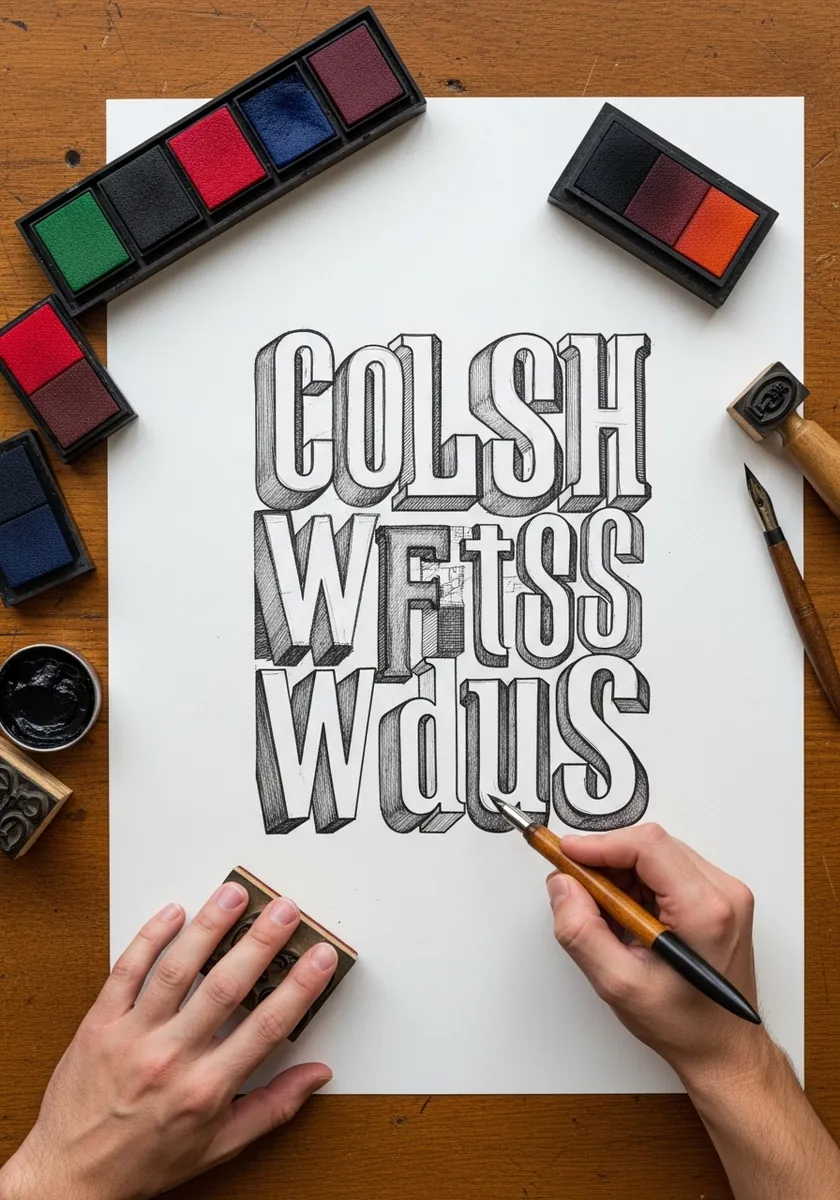
Three stacked lines of serif capitals with hatched side faces. Build every value from hatching alone with no blending, and run the hatch direction along the extrusion so the depth reads even at a glance.
21. Manga Impact Letters with Burst Effects
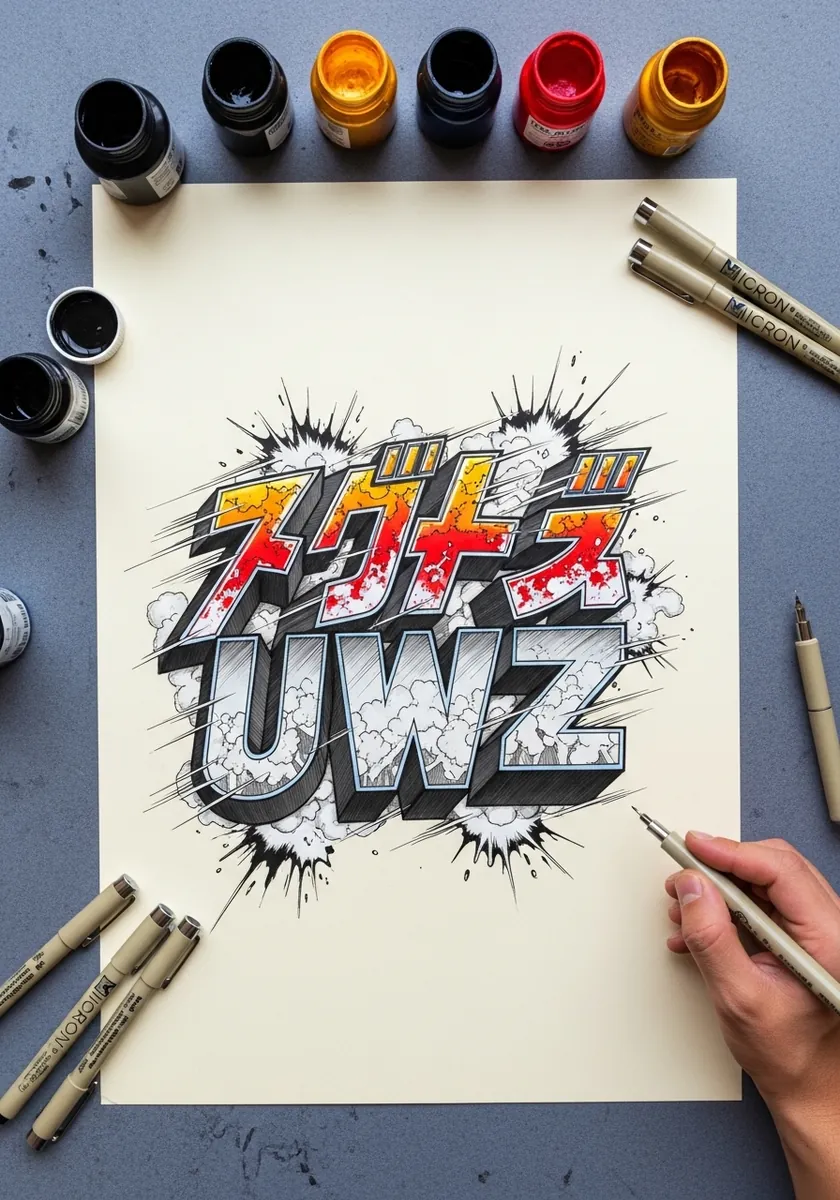
Angular impact letters with explosive bursts behind them. Keep the letters themselves nearly flat and let the burst carry all the drama, or the two effects compete and the word stops being readable.
22. Marble Letters on a Blue Sky Ground
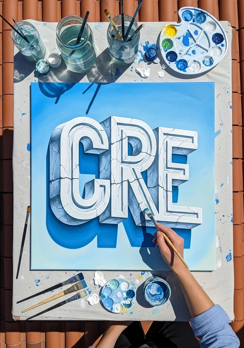
Heavy white letters with fine gray veining on a blue field. Paint the letters flat white first, add the veins in a very light gray with a fine brush, and let the veins run continuously across neighboring letters.
23. Bold Sans Letters on Gray with White Line
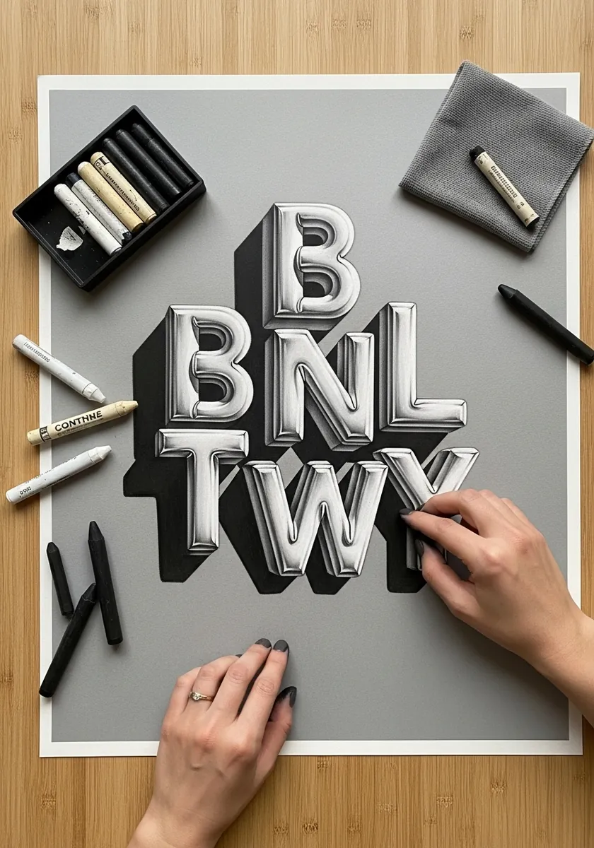
White outlined capitals on gray card with solid black extrusion. Two tones plus the paper give you three values with no shading at all, which makes this the fastest high impact style in the set.
24. Illuminated Letters with Gold Leaf
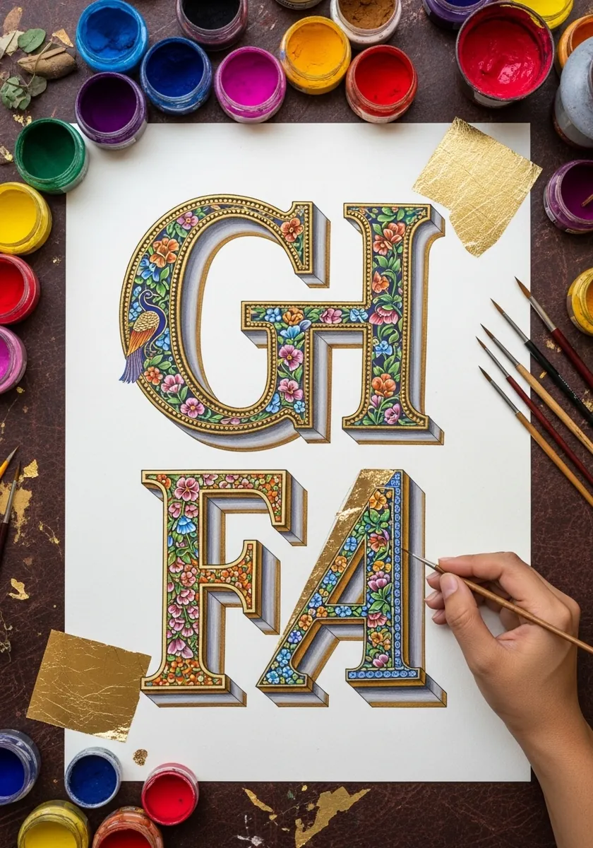
Decorative capitals packed with fine floral ornament and gold leaf. Complete the letterform and its extrusion fully before adding any ornament, then grow the pattern into the space around it rather than over the structure.
25. Silver Wildstyle Graffiti Piece
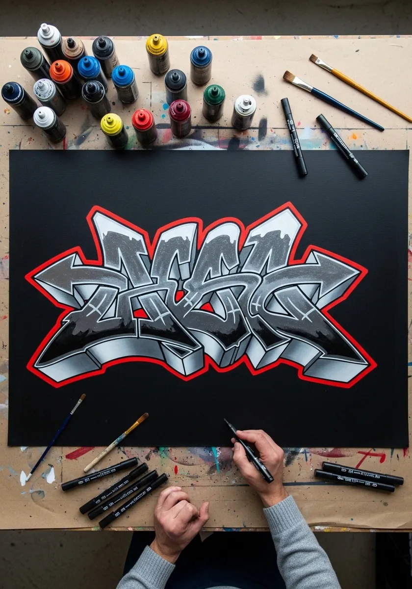
Interlocking chrome graffiti letters with a red keyline. Sketch plain readable capitals first, then stretch and overlap them while keeping each letter’s original spine intact so the piece still has structure underneath the style.
26. Ice Letters with Frost and Cracks
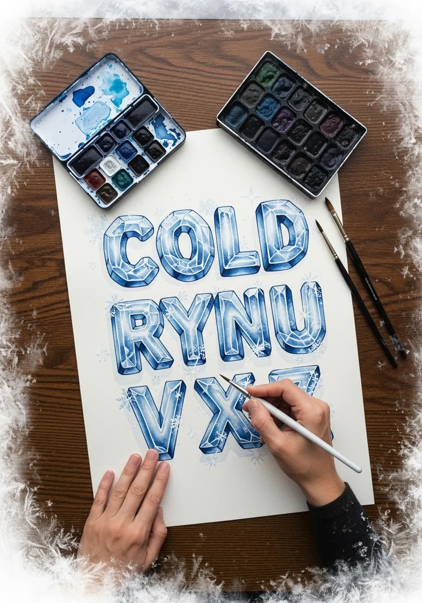
An alphabet drawn as blocks of ice with internal cracks and frost at the edges. Leave the paper white through the middle of every letter and keep the blue only at the edges, which is what makes the letters read as translucent.
27. Steampunk Pipe and Gear Letters
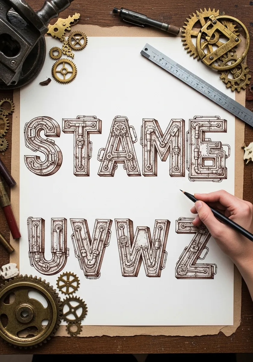
Letters constructed from pipework, rivets and gears in fine ink. Draw the plain letter as a wide outline first, then run the pipes along inside it, keeping the joints and valves evenly distributed so no letter looks busier than the rest.
28. Indigo Letter with Dripping Pattern
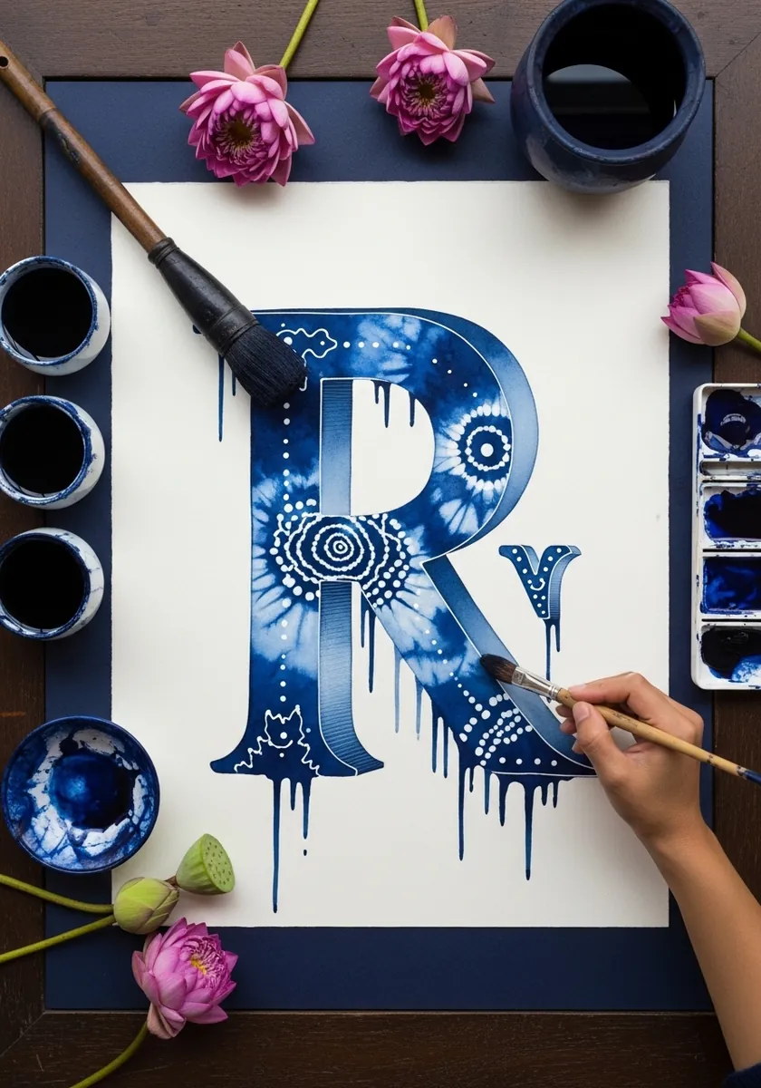
A single oversized capital in deep indigo with white dot pattern and drips. Working on one letter at this scale is the best way to learn a new surface treatment before committing to a whole alphabet.
29. Glitch Style Alphabet in Cyan
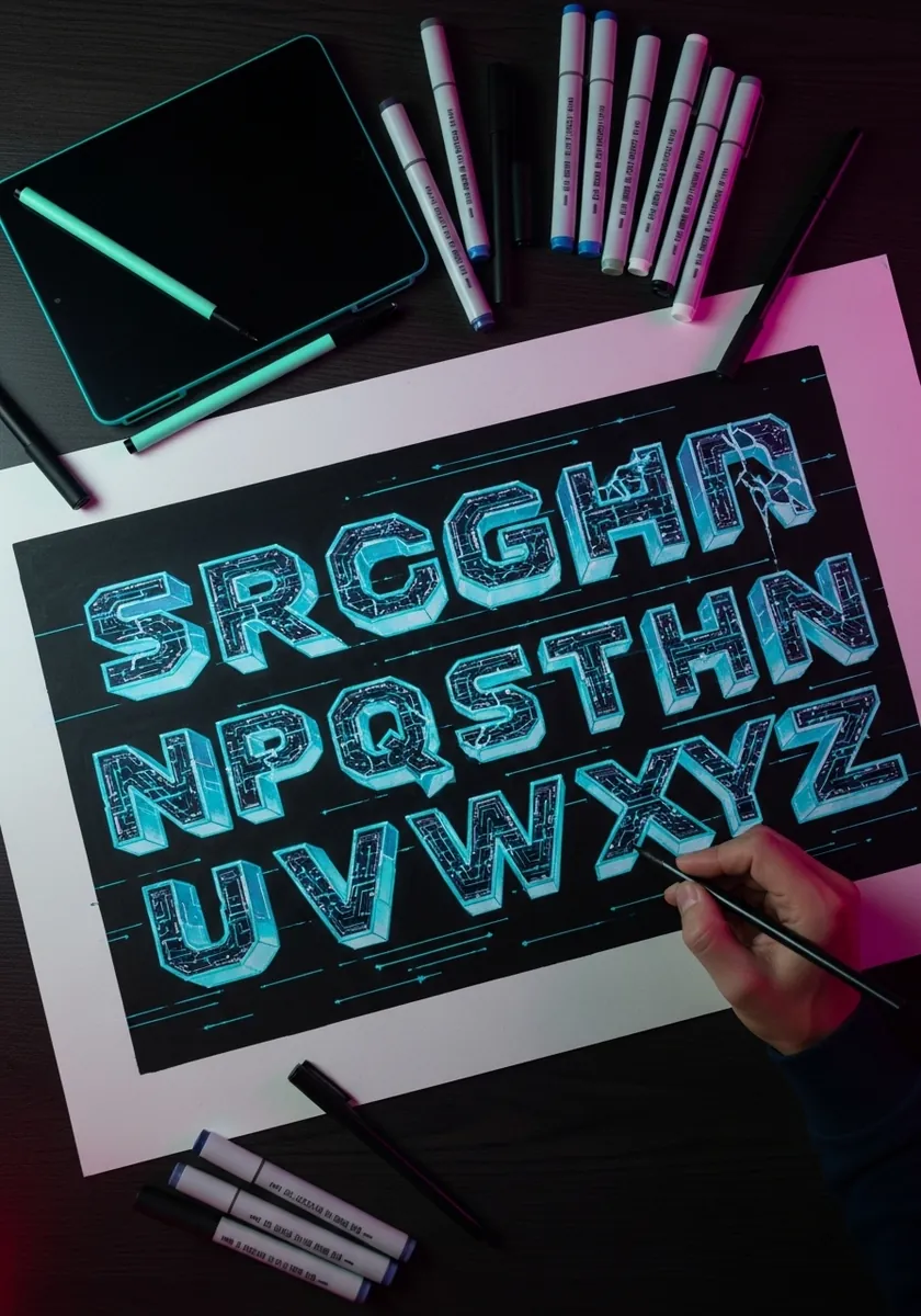
A digital glitch alphabet on black with offset horizontal slices. Draw each letter cleanly, then displace two or three narrow horizontal bands sideways and add fine scan lines through the whole thing.
30. Folk Art Letters with Bright Pattern
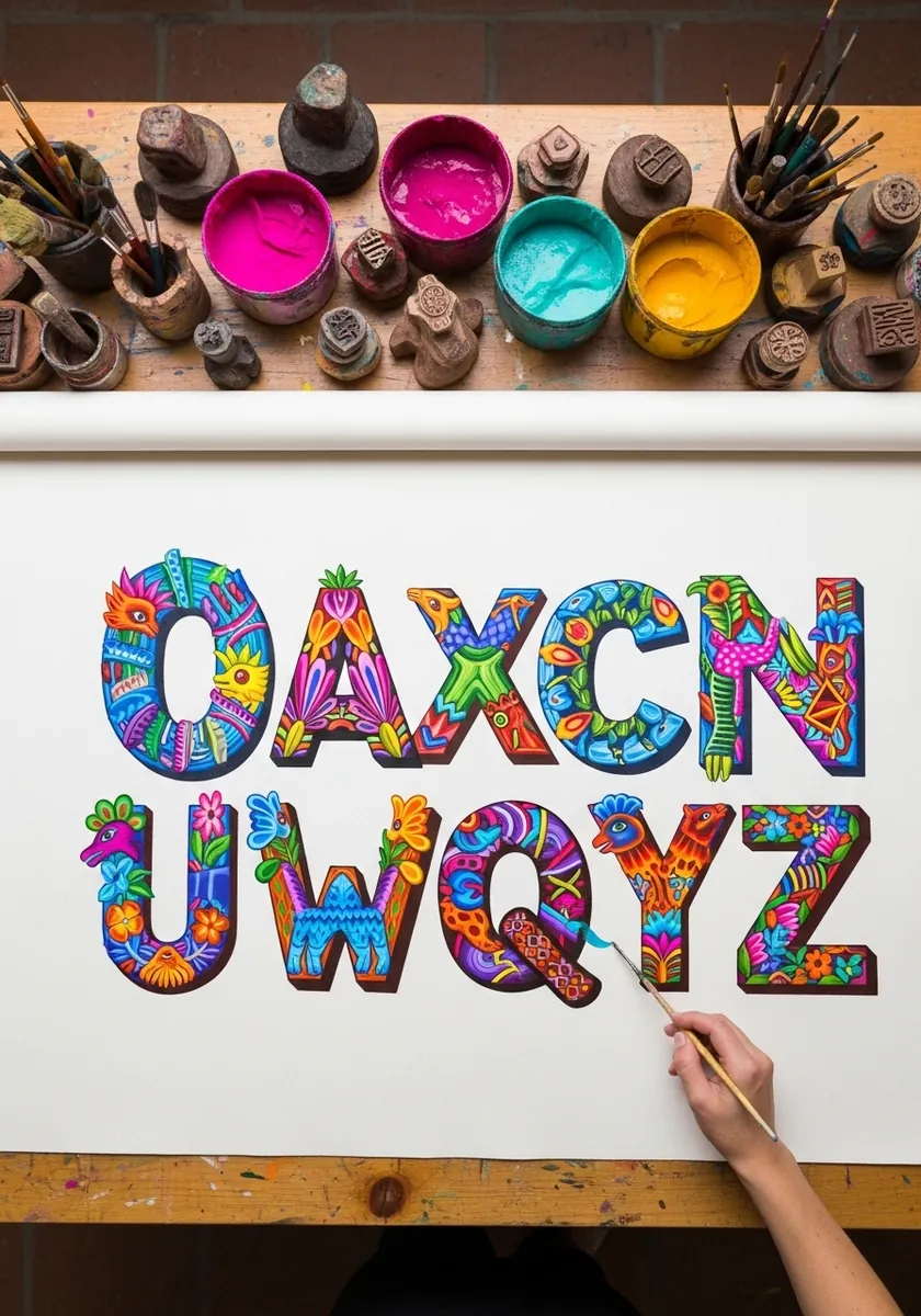
An alphabet filled with dense folk motifs in hot pink, turquoise and yellow. Establish a small vocabulary of four or five motifs on the first letter and reuse only those across the rest, which is what makes a set look designed rather than random.
Frequently Asked Questions
What is 3D typography art drawing?
It is lettering drawn so the letters appear solid rather than flat. You extrude each letterform toward a vanishing point to create side faces, then shade those faces from a single light source so the word reads as a physical object sitting on the page.
How do you draw 3D letters step by step?
Rule guidelines and draw the flat letters first. Pick one vanishing point and push a depth line back from every corner by the same distance. Close the far ends, erase hidden edges, then shade the front face lightest, the side faces mid gray, and add a cast shadow.
What is the easiest 3D lettering style for beginners?
The easiest 3D lettering style for beginners is block capitals with a straight offset extrusion. There are no curves to foreshorten and no reflections to solve, so you only keep the depth distance equal on every letter.
Which pencils and pens do you need for 3D typography?
An HB for construction lines, a 2B and 4B for the side faces and shadows, a kneaded eraser to lift highlights, and a ruler. For inked styles add fine liners in two or three widths. Toned or black paper plus a white pencil covers the neon and chalk styles.
How do you make 3D letters look like metal, ice or neon?
Change only the shading, never the construction. Chrome needs a hard horizon line through every letter with pale sky above and dark ground below. Ice needs internal cracks and a cool blue tone. Neon needs a dark ground, a wide soft halo, and a tight bright core line.
References and Further Reading