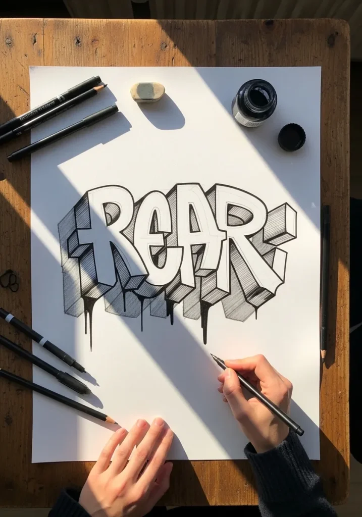
3D lettering design means drawing letters with real depth by extruding each letterform in one consistent direction and shading the side faces from a single light source. The extrusion direction and the light position are the only two decisions that matter.
Key takeaways
- Pick one extrusion direction and one light source, then apply both to every letter without exception.
- Fix letter spacing while the letters are still flat, because extrusion magnifies every spacing error.
- Front faces stay lightest and extruded sides take a flat mid tone so the word remains readable.
- Ornament goes on after the letterform is finished, never while the structure is still being built.
- Materials such as chrome, glass and stone are shading recipes applied to the same basic construction.
Short answer: 3D lettering drawing means giving flat letters thickness and a light source so they look like solid objects on the page. Pick one direction for every letter to extrude, keep that depth identical across the whole word, then shade the front faces lightest, the side faces darker, and add one consistent cast shadow. That is the whole trick behind all 30 ideas below.
At a glance: This guide collects 30 3D lettering styles, from graffiti blocks and balloon letters to chrome script, glass type and carved stone. Every idea names its medium and the single technique that creates the depth, so you can start with pencil and paper today. Beginners should start with idea 1 (block letters), then idea 3 (balloon letters), before trying chrome, glass or blackletter.
How to Pick the Right 3D Lettering Style
All 30 ideas use the same two rules, but they feel very different to draw. Use the table below to match a style to your skill level, your materials, and what the finished piece is for. If you only remember one thing, remember this: never mix extrusion directions inside one word, because that is the fastest way to make 3D letters look broken.
| Style group | Ideas | Best medium | Difficulty | Best for |
|---|---|---|---|---|
| Block and graffiti | 1, 11, 14, 21 | Pencil, markers | Easy to medium | Posters, sketchbooks, learning extrusion |
| Soft and inflated | 2, 3 | Watercolor, graphite | Easy | Cards, party decor, playful words |
| Paint and texture | 5, 8 | Acrylic, palette knife | Medium | Bold display pieces with real texture |
| Historical and ornamental | 6, 10, 15, 18, 28, 30 | Ink, gold paint, pencil | Medium to hard | Monograms, invitations, decorative alphabets |
| Metal, glass and chrome | 19, 22, 25, 29 | Markers, colored pencil | Medium to hard | Logos, signs, dramatic display words |
| Nature and material | 7, 23, 24 | Colored pencil, watercolor | Easy to medium | Alphabet sheets, themed projects |
| Geometric and technical | 9, 20, 27 | Fine liner, ruler | Medium | Precise, modern, poster-style words |
A beginner path through the 30 ideas
1
Draw one block word first (idea 1). Sketch plain capitals, extrude them all in the same direction by the same depth, and shade the side faces one flat darker tone. If this word looks solid, you understand extrusion.
2
Then try a balloon word (idea 3). Rounded letters teach the second half of the skill: highlights. One long soft highlight per curve, a dark reflected edge, and the letters start to look inflated. For more on this family, see these inflatable lettering ideas.
3
Then add a light-dependent style (ideas 19 or 22). Chrome and glass only work when the light source stays fixed, so they are the best test of everything you practised in steps 1 and 2. If the light moves, the illusion collapses.
Tip: Draw a tiny sun or arrow in the margin of your sketchbook page before you start shading, and point every highlight and shadow from it. It takes five seconds and prevents the most common 3D lettering mistake: shadows pointing in different directions on different letters.
Watch out: Do not outline the extruded side faces in a heavy dark line and then also shade them dark. One or the other reads as depth; both together turn the side faces into muddy stripes and flatten the letters again.
Once block and balloon letters feel comfortable, the natural next step is full typography pieces with step-by-step construction, covered in these 3D typography art drawing ideas. The construction rules are the same; only the words get longer and the styles get more ambitious.
Every piece of 3D lettering comes down to two decisions: which way the letters extrude, and where the light is. Pick a single vanishing point, push every letter toward it by the same distance, then shade each extruded face consistently. Get those two right and even plain block capitals look sculpted.
The 30 ideas below apply that principle in very different directions. Some are drawn with a ruler and a compass, others painted wet and loose. There are inflated balloon letters, chrome script, blackletter carved in stone, glass type that refracts the page behind it, and full alphabets you can adapt to any word.
Lettering rewards practice on single letters before whole words, so several of these are alphabet sheets rather than finished pieces. If you enjoy the ornamental side of this, the same patience pays off in alphabet art drawing and in mandala work, where repetition and symmetry do most of the heavy lifting.
Each idea names the medium and the one technique that creates the dimensional effect, so you can pick a style and start. For more ways to build depth on a flat sheet, these 3D digital art ideas make a good companion.
1. Graffiti Block Letters with Drop Shadow
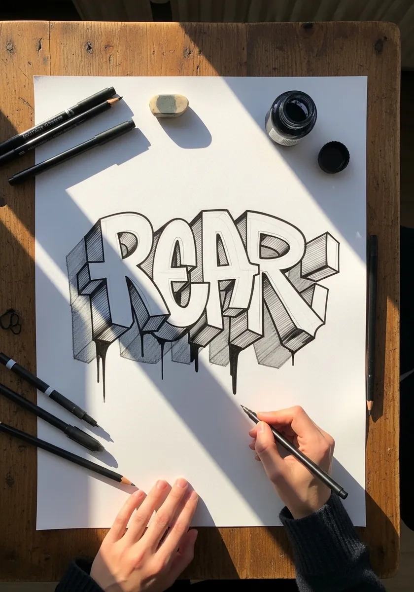
Chunky graffiti capitals extruded to one side with a solid shadow pooling beneath them. Everything depends on consistency: pick one extrusion direction and give every letter exactly the same depth. Shade the extruded faces a uniform mid gray and leave the front faces white so the letters stay readable.
2. Watercolor Bubble Letters in Blue and Magenta
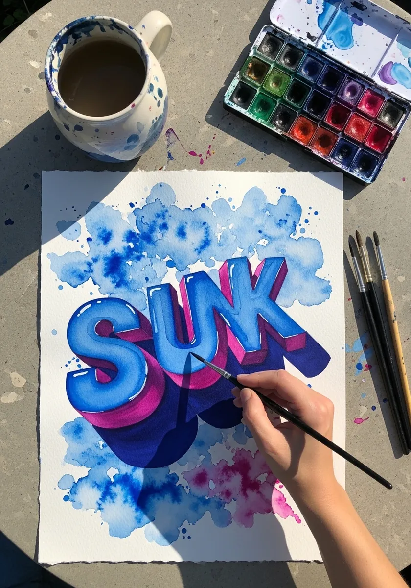
Soft rounded capitals in cobalt with a magenta side face, floating on watery blue splashes. Paint the front faces first and let them dry, then add the side faces in a darker tone so the two never bleed together. The loose background is what keeps it from looking like clip art.
3. Graphite Balloon Letters with Highlights
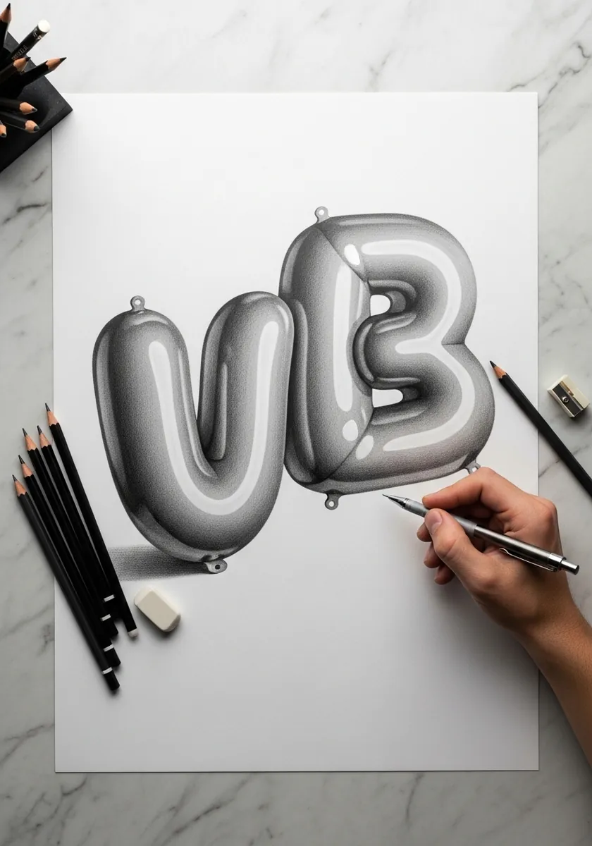
Inflated letters that look like foil balloons, drawn entirely in graphite. The illusion is built from three things: a long soft highlight down each curve, a dark reflected edge, and a small pinched knot where the balloon would be tied. Lift the highlights with an eraser rather than leaving them white.
4. Fire and Water Gradient Serif Letters
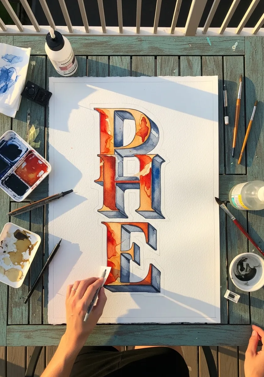
Heavy serif capitals stacked vertically, each washed with a gradient running from hot orange to deep blue. Paint the gradient across all the letters as one continuous field rather than letter by letter, so the color transition reads across the whole word.
5. Thick Impasto Primary Colour Letters
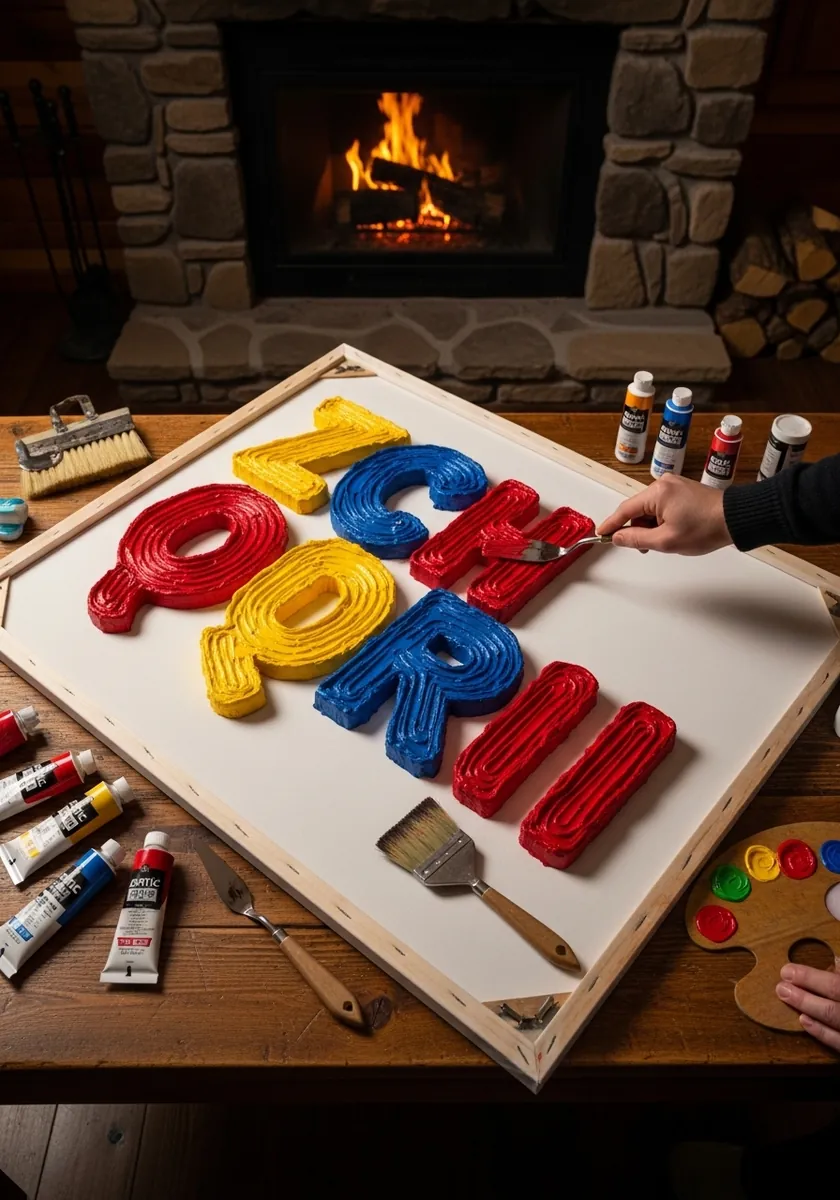
Rounded letters built from ridges of thick red, yellow and blue paint, with the texture of the strokes fully visible. Load the knife heavily and lay each letter in one pass. The physical thickness of the paint is doing the 3D work, so resist smoothing anything.
6. Ornate Blackletter with Flourishes
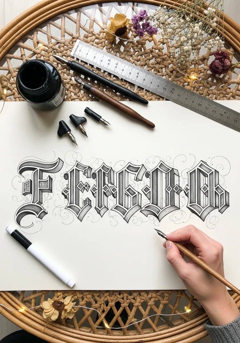
Gothic blackletter capitals with fine flourishes curling off the stems. Draw the letter skeletons in pencil first and get the spacing right before adding a single flourish, because ornament on badly spaced letters never recovers.
7. Weathered Wood Alphabet Sheet
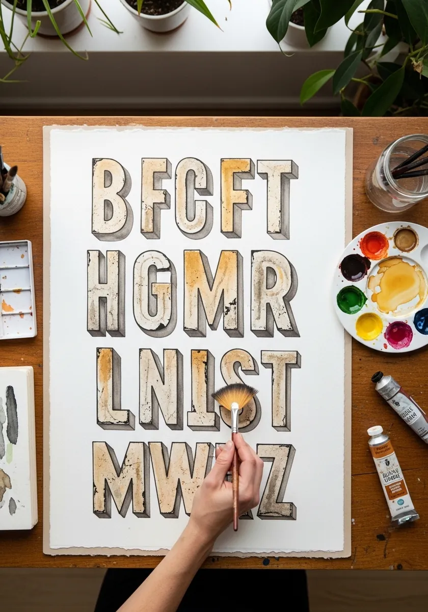
A complete alphabet drawn as worn painted wood, with chipped edges and grain showing through. Build the base color first, then scratch back highlights along every edge with a white pencil so each letter looks knocked about.
8. Isometric Grid Letters in Fine Ink
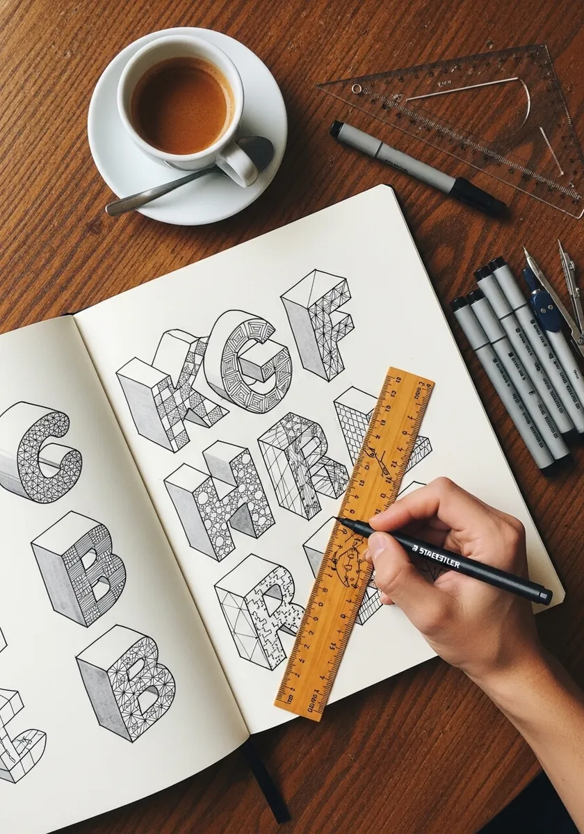
Letters constructed on a strict isometric grid so every vertical stays vertical and every diagonal sits at thirty degrees. Rule the grid before you draw anything. This is the most reliable way to make 3D type look genuinely constructed rather than sketched.
9. Bauhaus Geometric Word
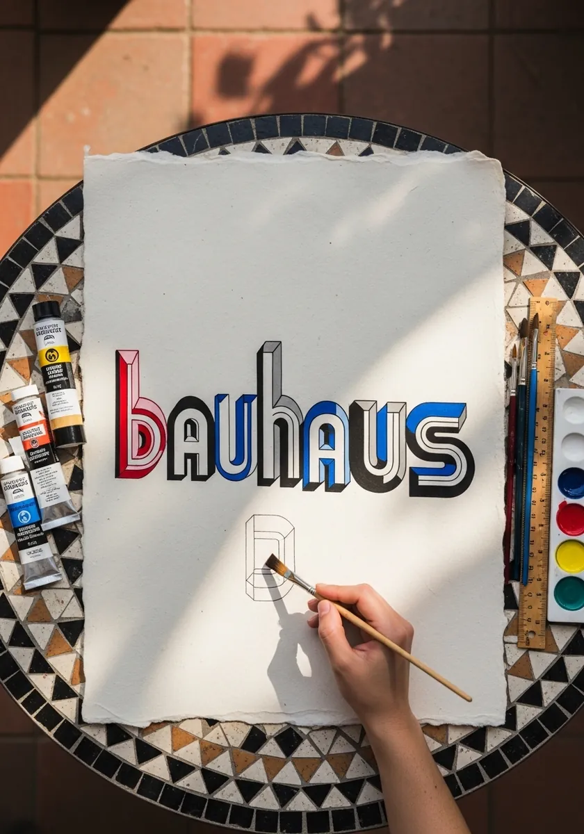
A word built from pure circles, squares and triangles in the Bauhaus manner, with red and blue side faces. Reduce every letter to two or three geometric primitives and refuse to add anything decorative.
10. Illuminated Manuscript Capitals
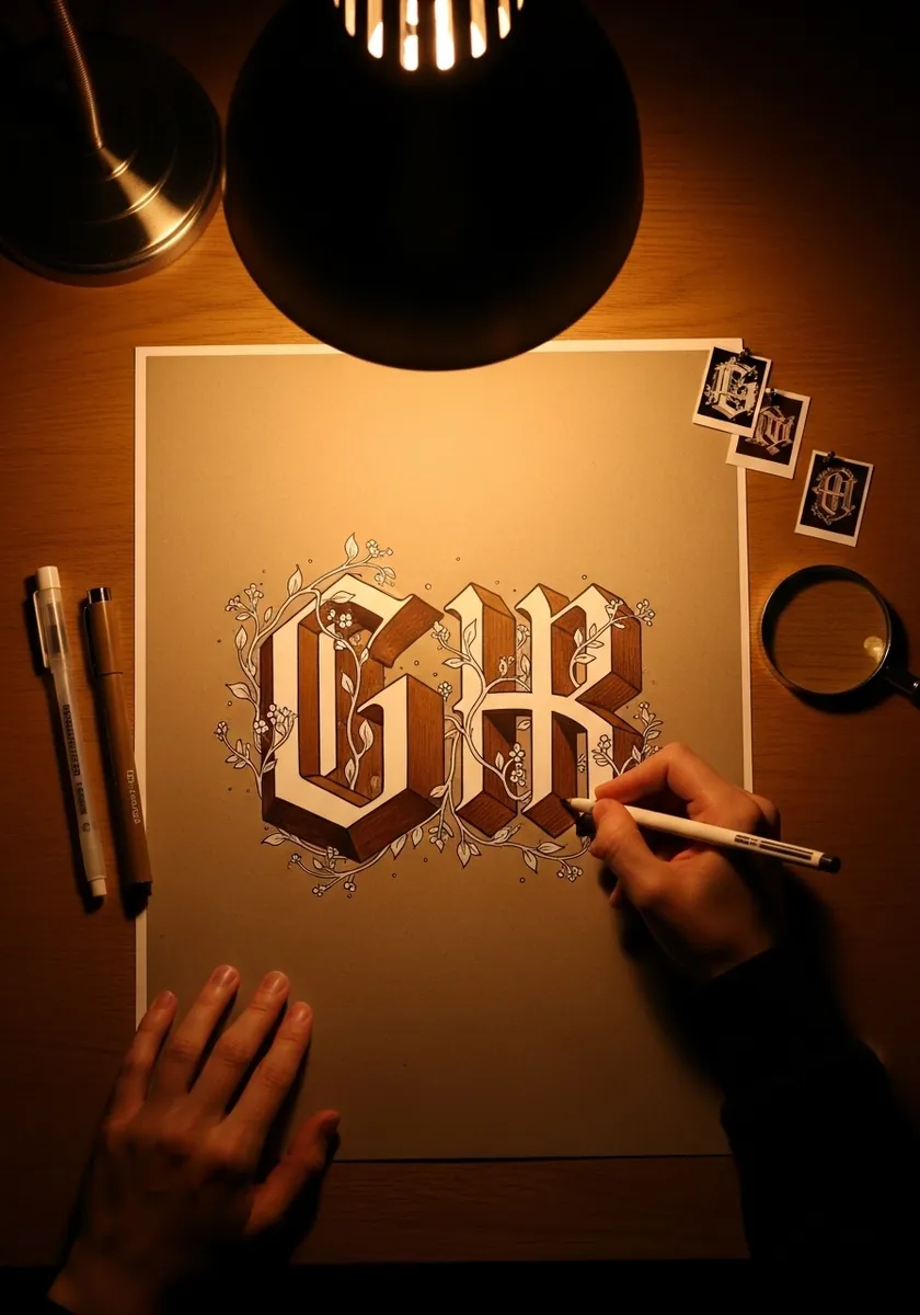
Two large decorative capitals with vine ornament and a faceted extrusion, drawn on toned paper. Work from the letter outward: complete the letterform fully, then grow the ornament into the space around it rather than over it.
11. Wildstyle Graffiti Piece with Drips
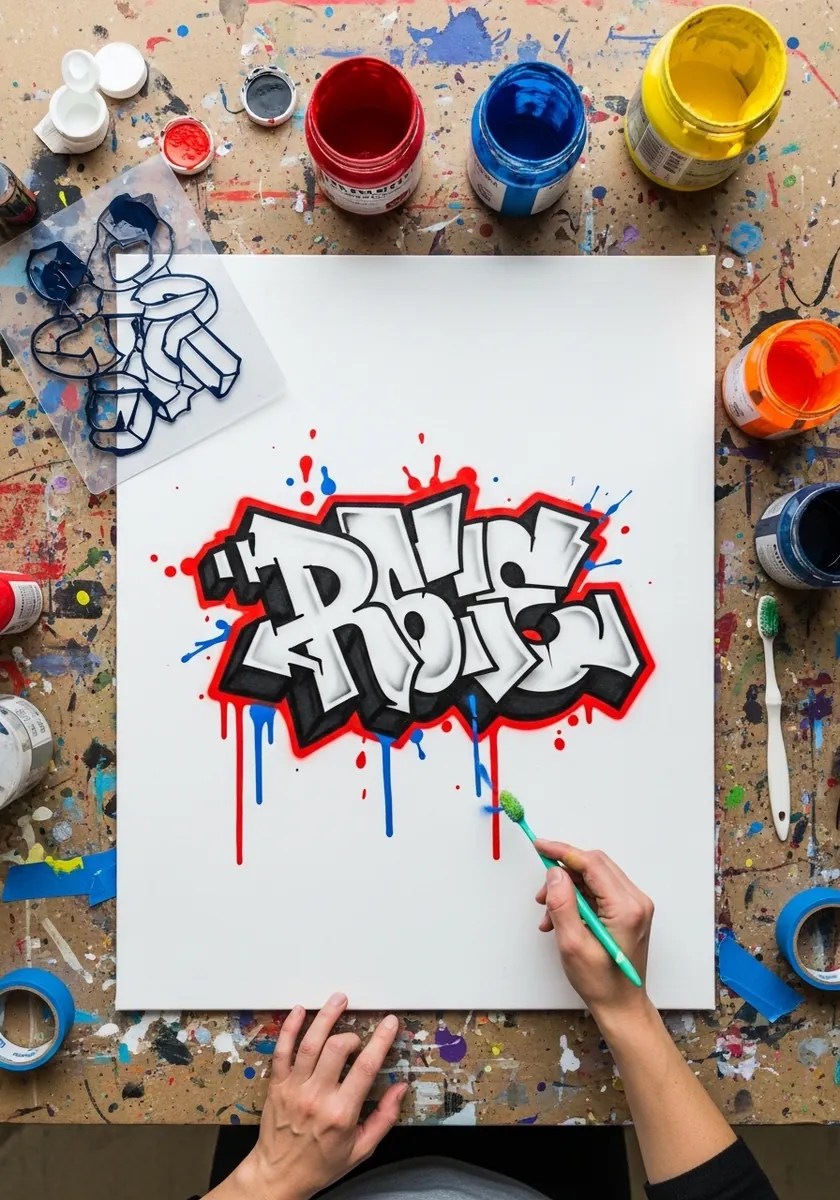
Interlocking wildstyle letters with a red outline and drips running down. Legibility comes last in this style, but the letters still need a skeleton. Sketch plain capitals first, then stretch and interlock them while keeping the original spine of each letter intact.
12. Brush Ink Kanji Style Strokes
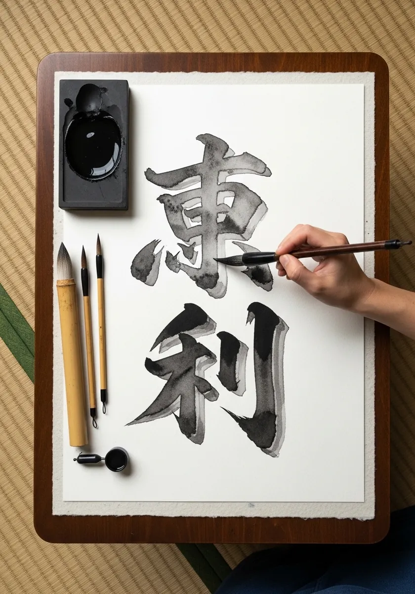
Characters painted with a fully loaded brush so each stroke carries its own thick-to-thin taper. Load once and commit; the variation within a single stroke is the whole point and cannot be corrected afterward.
13. Retro Layered Script in Yellow and Purple
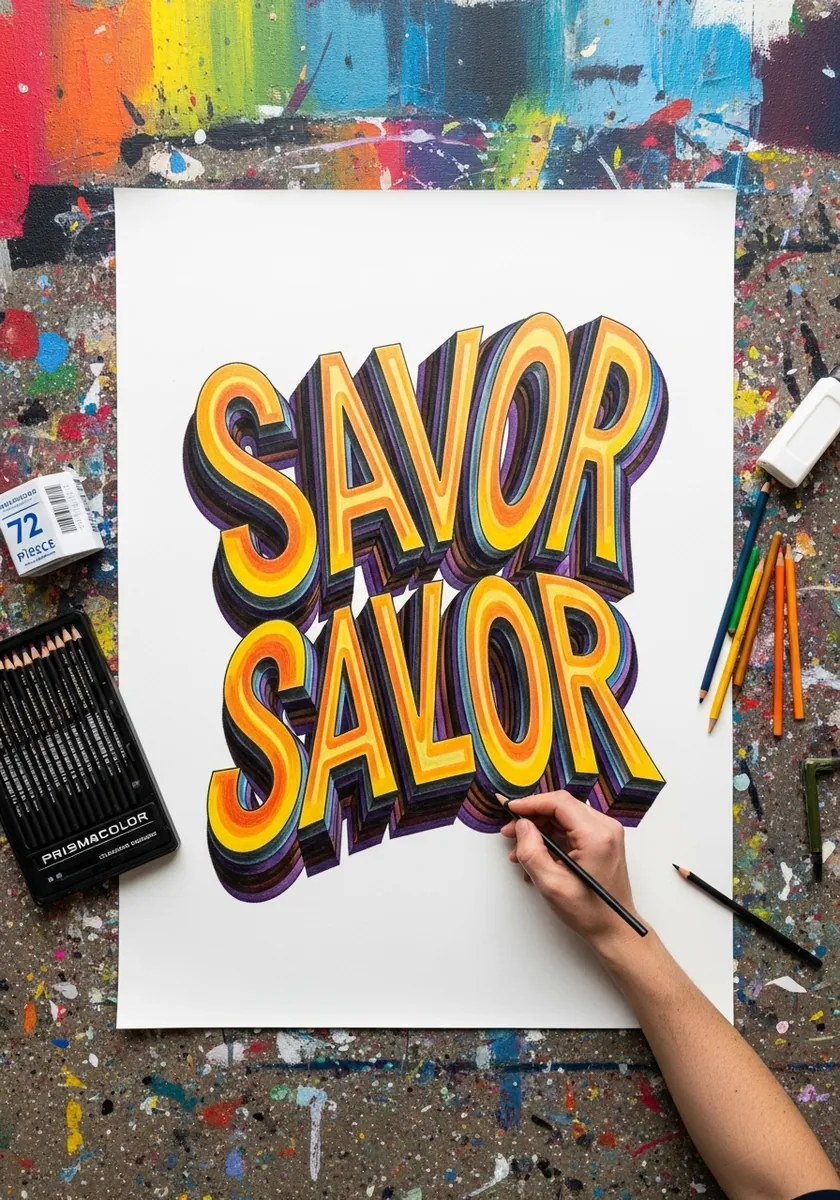
Sloped script repeated in offset layers of yellow, orange and purple so the word appears to stack backward. Draw the front layer cleanly, then trace it repeatedly at a fixed offset, changing color with each pass.
14. Industrial Bolted Metal Letters
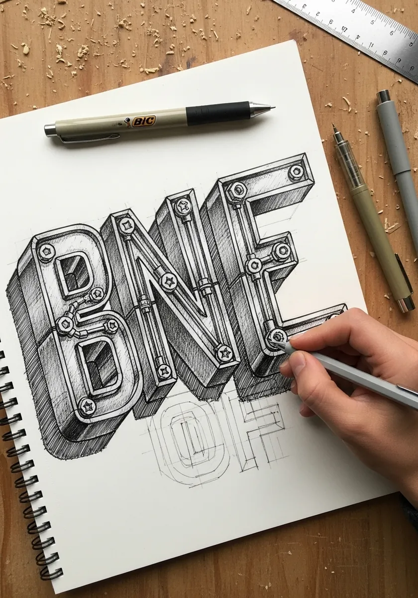
Blocky capitals built from riveted steel plates, drawn in graphite. Draw the letters first as plain blocks, then divide each face into panels and add bolts along the seams, keeping the bolt spacing even throughout.
15. Art Nouveau Botanical Letters
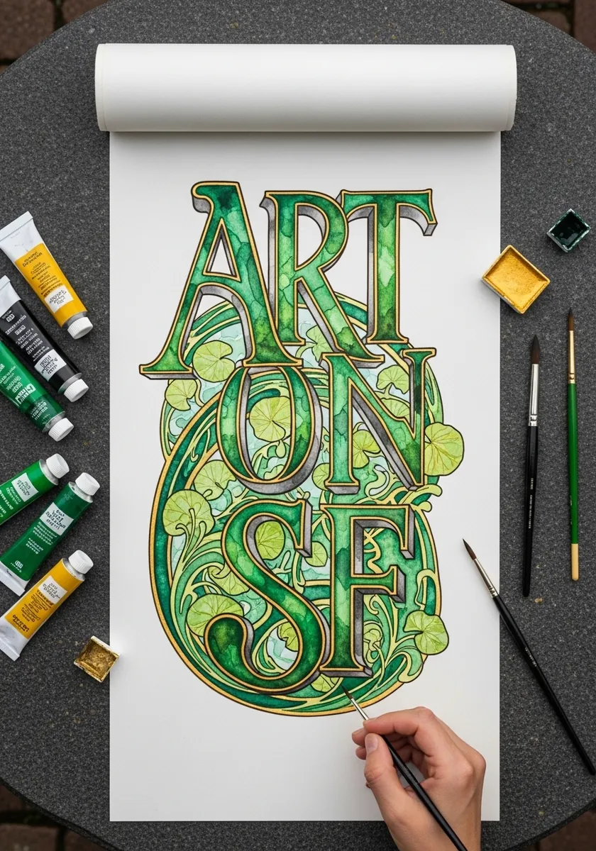
Letters in deep green and gold entwined with curling vines and leaves. Let the plant forms grow out of the letter strokes themselves rather than sitting behind them, so the two read as one design.
16. Neon Outline Letters on Dark Paper
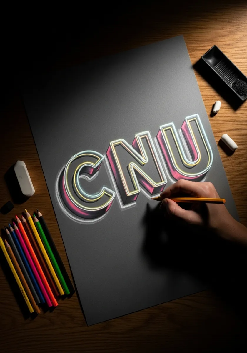
Letters drawn as glowing tube outlines on dark paper, with pink and cream layers suggesting lit glass. Work on a dark ground and build the glow in two passes: a wide soft halo first, then a tight bright core line.
17. Tropical Floral Letters
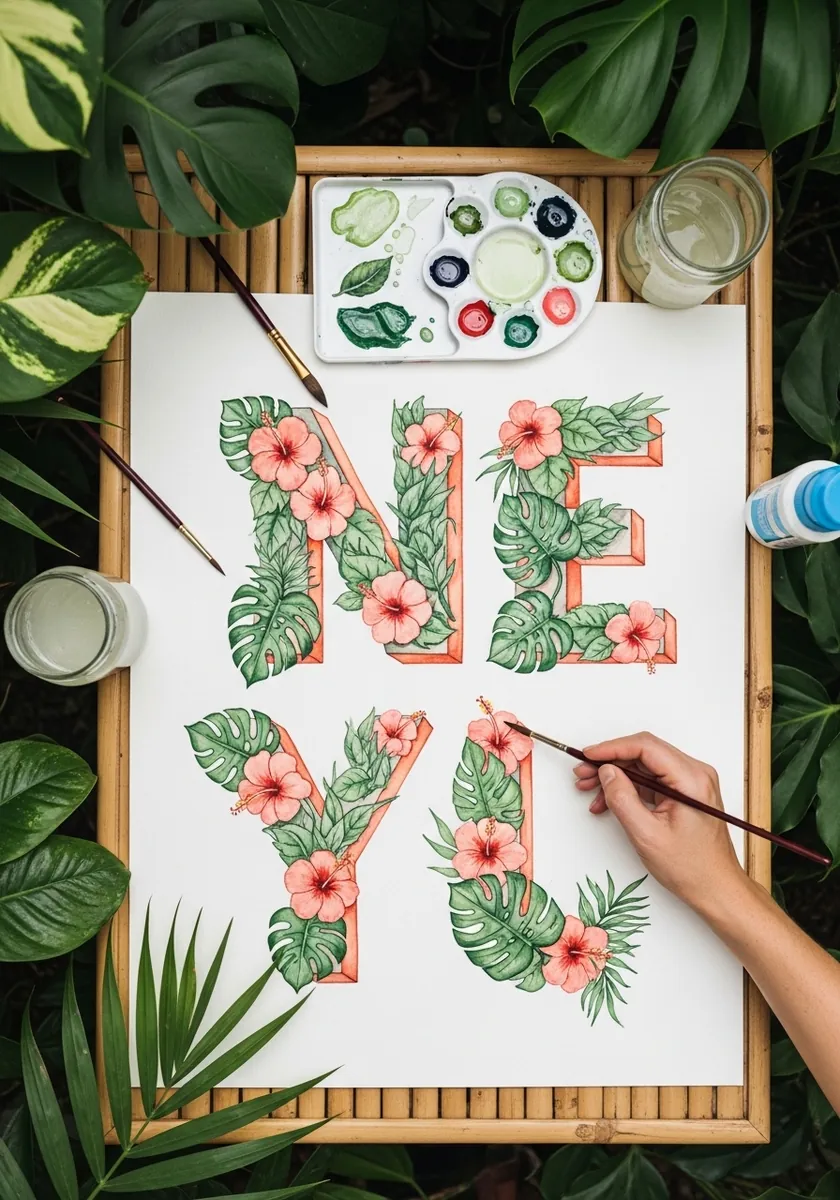
Coral outlined capitals packed with monstera leaves and hibiscus blooms. Outline the letters in pencil first and treat the outline as a wall, letting only a few leaves break past it so the shapes stay readable.
18. Victorian Decorative Monogram
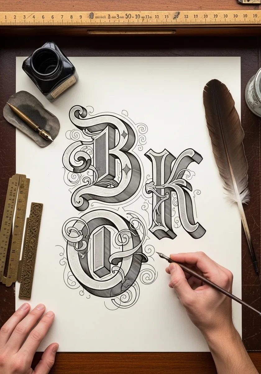
Two intertwined ornamental capitals with faceted sides and swirling filigree. Design the two letters to interlock before adding ornament, and keep the filigree lighter in weight than the letters themselves.
19. Chrome Script Lettering
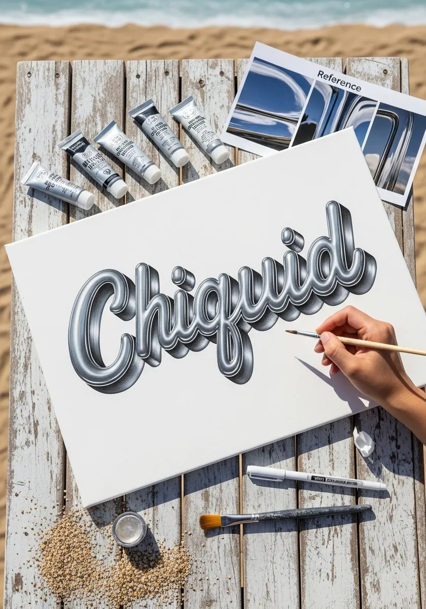
Flowing script rendered as polished chrome, with a hard horizon line running through every letter. That horizon is the trick: everything above it reflects sky and stays pale, everything below reflects ground and goes dark.
20. Blueprint Technical Letters
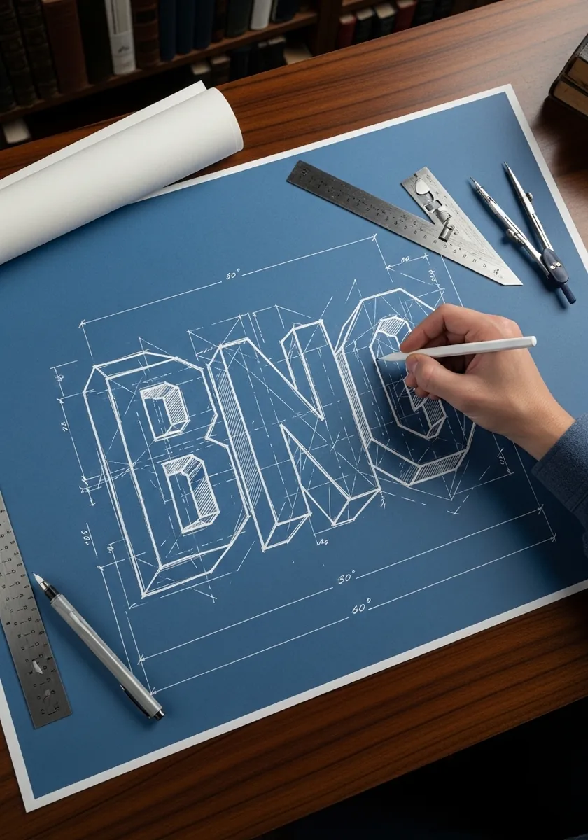
Letters drawn as a technical blueprint in white line on blue, complete with dimension arrows and angle notes. Keep every construction line visible and all line weights identical so it reads as a drafting sheet.
21. Aztec Patterned Block Letters
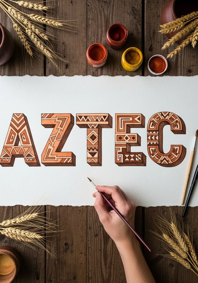
Terracotta capitals filled with stepped geometric motifs. Draw the letters as flat blocks first, then fill each with a repeating pattern that follows the letter's direction, turning corners with the stroke.
22. Glass Effect Transparent Letters
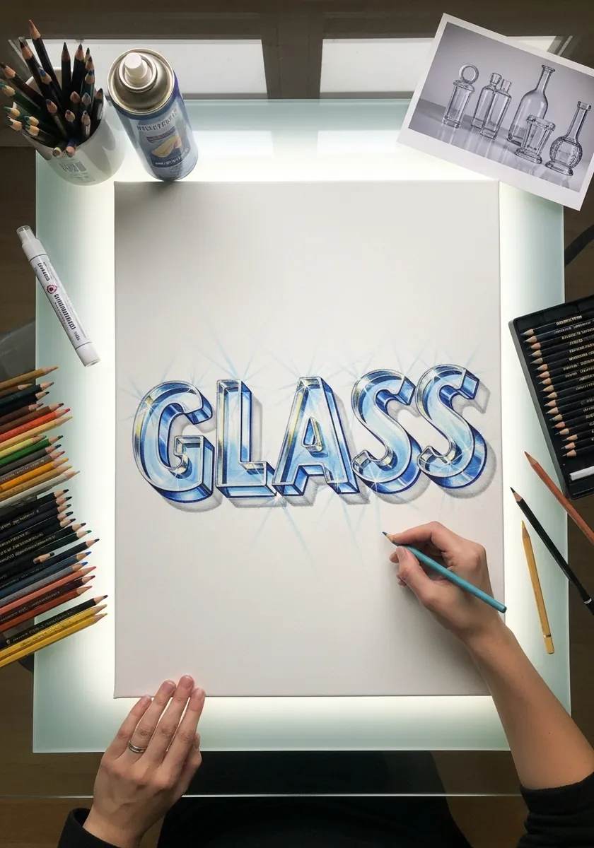
Letters rendered as thick glass, with the edges refracting and the background visibly distorted through them. Draw what is behind the letters first, then redraw it shifted and compressed inside the letterforms.
23. Bark and Moss Nature Letters
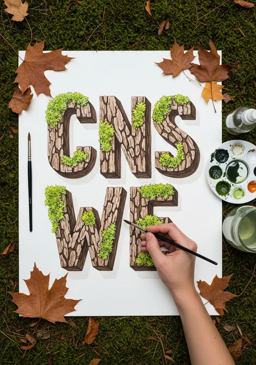
Capitals built from tree bark with moss growing along the top edges. Draw the bark texture as vertical broken lines following the letter stroke, and add the moss only where light would fall, which keeps the letters legible.
24. Retro Circus Alphabet with Chevrons
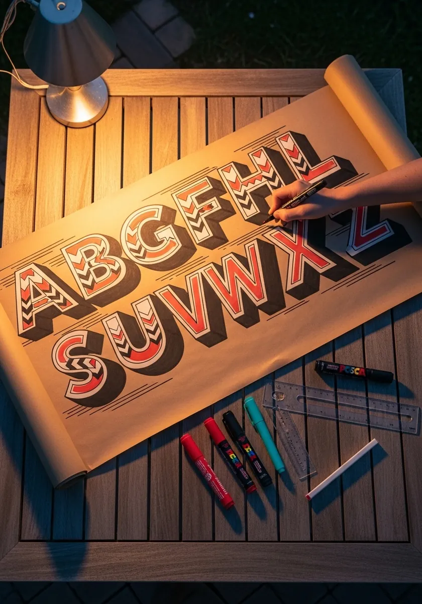
A full alphabet in circus style with red and cream chevrons running through each letter and a long extruded side. Draw the stripes on the front face only and leave the extrusion flat, or the letters become impossible to read.
25. Diamond Faceted Letters on Black
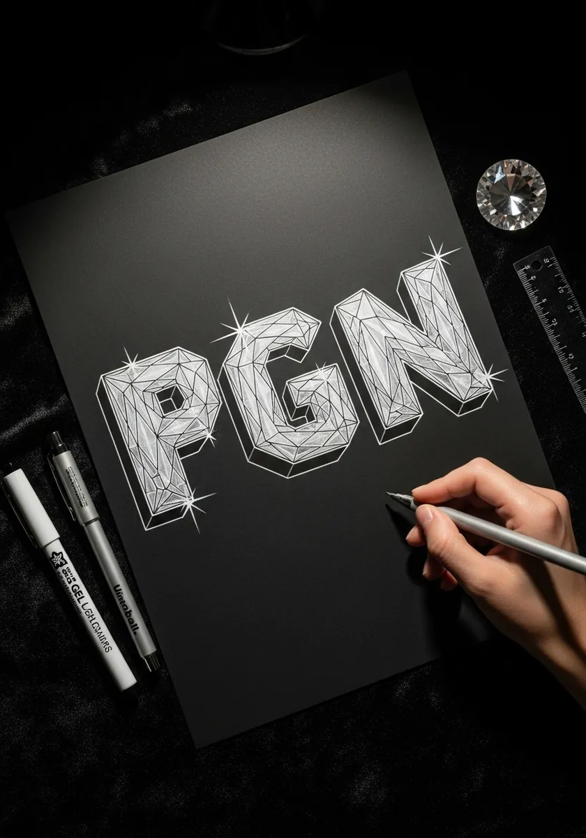
Letters cut into crystal facets, drawn in white line on black with small sparkle marks. Break each letter face into irregular polygons and vary their tone slightly so the surface reads as cut rather than flat.
26. Soft Pastel Geometric Letters
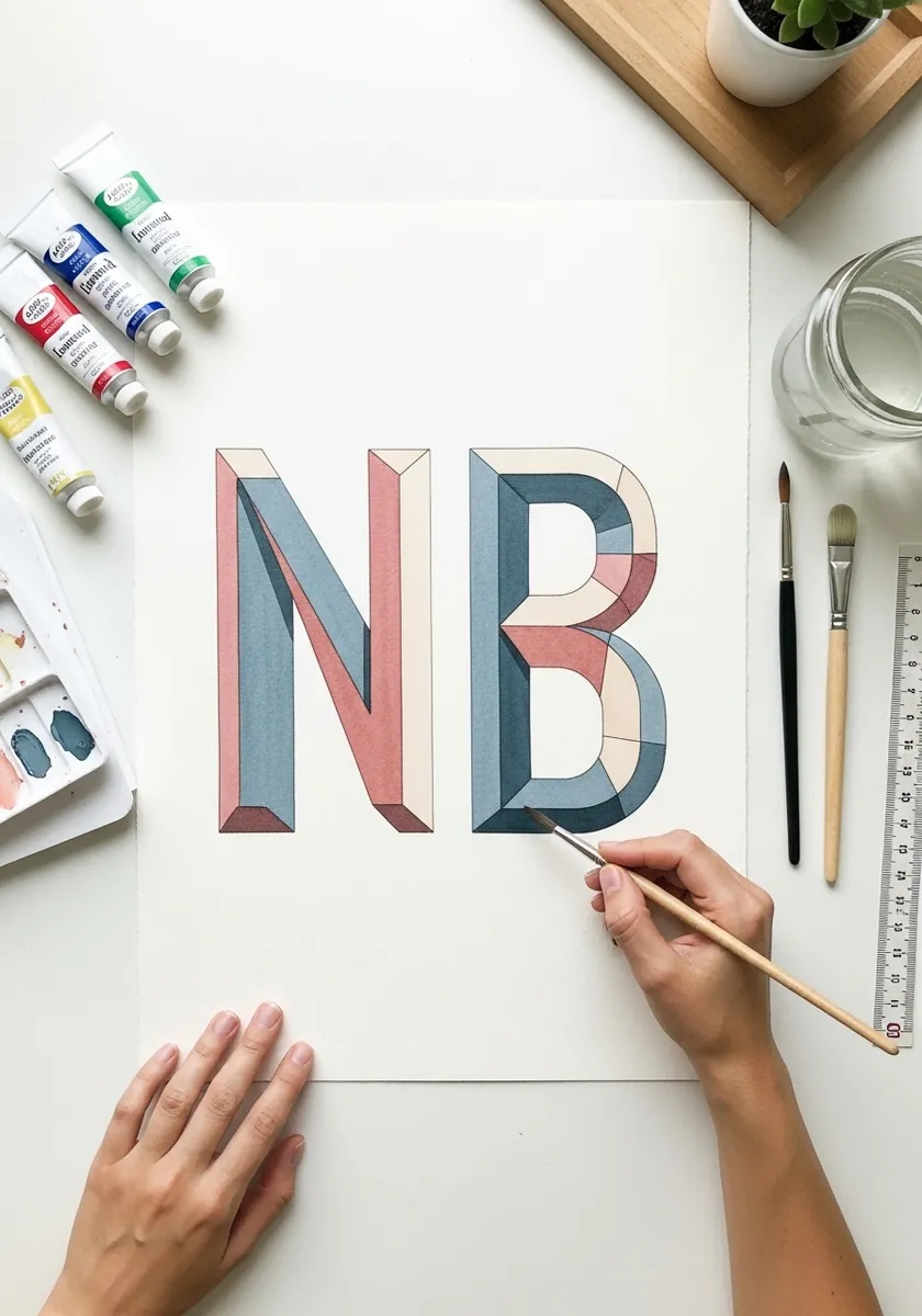
Two oversized capitals in dusty pink and slate blue, each split into flat angled planes. Use no shading at all; the change of flat color at each fold does all the dimensional work.
27. Art Deco Gold Panel Lettering
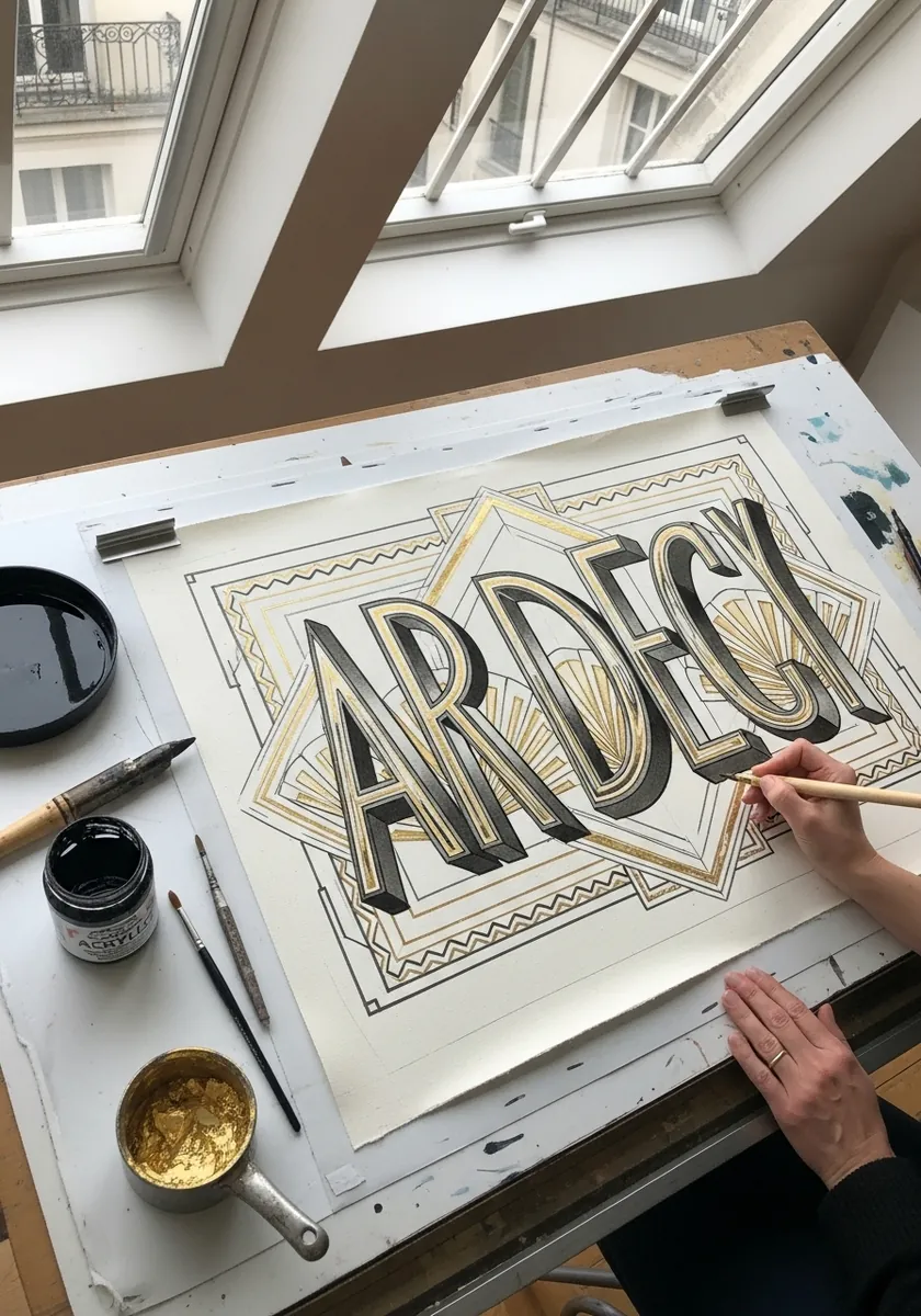
Deco capitals in black and gold set inside a stepped geometric frame. Rule the frame first and fit the lettering to it, keeping the letter widths uniform, which is what makes deco type feel machined.
28. Folk Floral Illuminated Alphabet
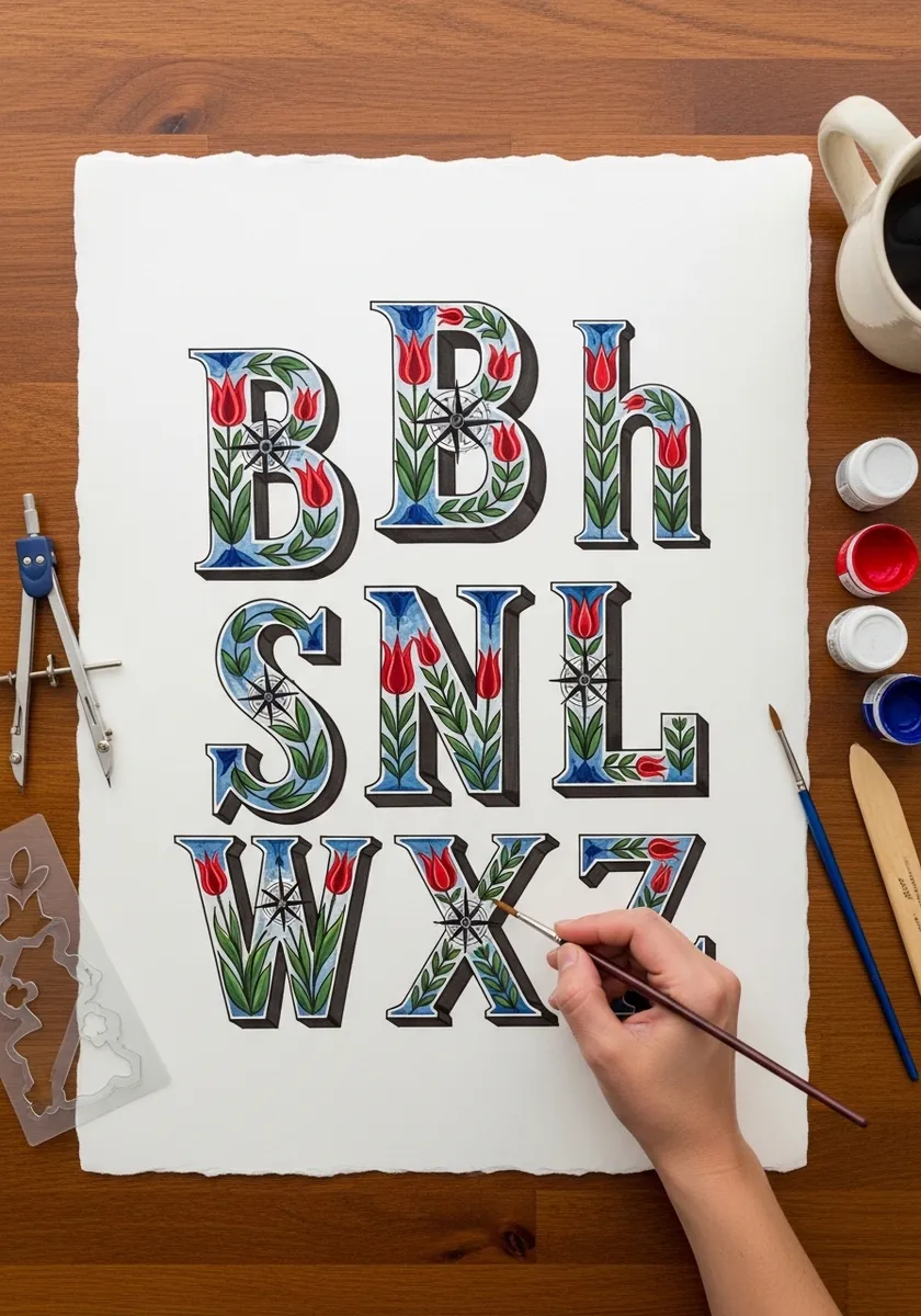
An alphabet of decorative capitals filled with red tulips and blue folk motifs. Draw one letter fully to establish the pattern vocabulary, then reuse the same handful of motifs across every other letter for consistency.
29. Carved Stone Letters with Cracks
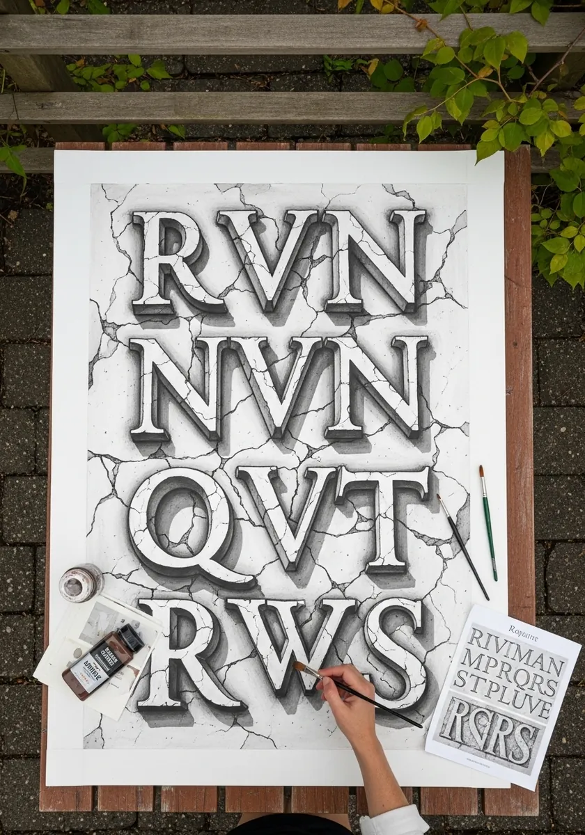
Serif capitals carved into cracked stone, drawn in graphite. Carved letters are lit from inside the groove, so put the highlight on the lower inner edge and the shadow on the upper one, which is the opposite of a raised letter.
30. Blackletter with Heavy Cast Shadow
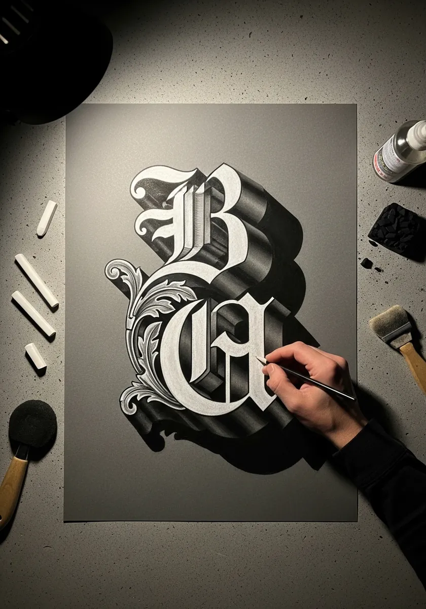
Two white blackletter capitals on gray paper with a heavy black shadow thrown behind them. The shadow is drawn as a solid silhouette offset diagonally, with no internal detail at all, which is what makes the letters lift.
If you are planning outdoor art with kids, our guide to the best sidewalk chalk sets compares washability, colour range, and durability so you can pick a set that holds up on driveways and sidewalks.
Frequently Asked Questions About 3D Lettering
What is 3D lettering?
3D lettering is the art of drawing letters so they appear to have thickness, depth and volume, as if they were solid objects sitting on the page. Unlike ordinary handwriting, each letter is drawn as an image with a front face, side faces and a shadow. Lettering in general is defined as artfully drawing letters rather than simply writing them, as explained on Wikipedia’s Lettering page, and the 3D version adds extrusion and light to that idea.
How do you make letters look 3D?
Choose one extrusion direction and one light source, then apply them to every letter without exception. Draw the front face of each letter, push it toward a single vanishing point or offset it by a fixed distance to create the side faces, shade those side faces darker than the front, and finish with a cast shadow on the same side of every letter. Ideas 1, 11 and 20 in this guide show the method most clearly.
What is the easiest 3D lettering style for beginners?
Block letters with a drop shadow (idea 1) are the easiest starting point, because they need only a pencil, a ruler and one shading tone for the side faces. Balloon letters (idea 3) come next: their rounded forms forgive wobbly lines, and the highlight does most of the dimensional work. Avoid wildstyle graffiti (idea 11) and chrome script (idea 19) until block letters feel easy.
What supplies do I need to start 3D lettering?
A pencil, an eraser, a ruler and a fineliner are enough for ideas 1, 8, 11 and 20. Add a set of alcohol markers or colored pencils for the gradient, chrome and glass styles (ideas 4, 19 and 22), and watercolor for the bubble and floral letters (ideas 2 and 17). Dark paper and a white gel pen are worth buying before attempting the neon letters in idea 16.
How do you shade 3D letters correctly?
Keep three tones in a strict order: the front face lightest, the side faces a mid-to-dark tone, and the cast shadow darkest and flattest. The side face that turns away from your light source should be darker than the one facing it. Carved letters (idea 29) reverse this rule, because light falls inside the groove, so the lower inner edge carries the highlight and the upper edge carries the shadow.
Can I use these 3D lettering ideas digitally?
Yes. Every idea here works on paper first, and the same extrusion and shading rules apply in drawing apps, where layers make the front face, side faces and shadow easier to separate. For digital-first depth techniques, pair this guide with these 3D digital art ideas, and practise single letters digitally before attempting a full word.
Keep going
If balloon letters were your favourite, try the full set of inflatable lettering ideas. If you want longer words with full construction steps, move on to 3D typography art drawing ideas. And if ornamental alphabets are what drew you here, the alphabet art drawing collection is the natural companion to ideas 10, 15 and 28.