Tweety's head is a circle wider than it is tall, and it is larger than his whole body. The two enormous eyes sit low and far apart inside it, which is the proportion that keeps him recognizable.
Key takeaways
- Draw the head as a circle wider than tall, and make it bigger than the body|Place the two large eyes low and wide apart, taking up most of the face width|There is no neck at all, so the head sits directly on the body|Three small feather tufts on top of the head, never more and never fewer|Keep the orange feet oversized, since they are what anchor him on the page
Almost every Tweety drawing that looks slightly off has the same problem, and it is proportion rather than detail. His head is bigger than his entire body, and it is drawn as a circle slightly wider than it is tall. Shrink that head toward a realistic size and he stops being Tweety immediately.
The eyes finish the job. They are enormous, they sit low in the face rather than centered, and they are set wide apart so they occupy most of the available width. Add three small feather tufts on top of the head, no more and no fewer, and the character is already readable before any color goes down.
One piece of history worth knowing. Bob Clampett created him for A Tale of Two Kitties in 1942, and in that first appearance Tweety was pink and featherless, a genuinely naked baby bird. He was reportedly recolored yellow after complaints about his appearance, which is how the canary we know came about.
The thirty ideas below run from blueprint construction and stipple through art nouveau, folk pattern, pop art halftone and neon. For real birds rather than cartoon ones, see watercolor bird drawing ideas and duck drawing ideas.
Compiled by the GS Art Zone editorial team. Last updated August 2026. Each idea is paired with the specific step that produces the effect, so you can go from the reference straight to paper.
What You Need Before You Start
- A compass or a round lid, because the head really is a circle and freehand drifts
- One mid yellow and one deeper gold, since flat single-yellow shading looks dead
- A warm orange for the beak and feet that is clearly separate from the body yellow
- A brush pen for the outline, which should vary in weight rather than stay uniform
- A kneaded eraser for lifting construction lines out from under finished color
1. Loose Pencil Sitting Pose
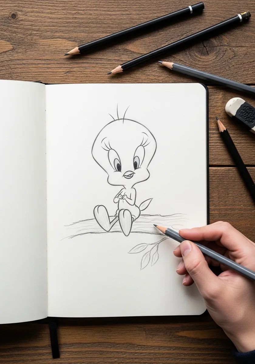
Start here before any other idea on this page. Draw the head circle first, sit the smaller body directly under it with no neck, and only then place the eyes low and wide. Keep every line light enough to erase, because the proportion is what you are practicing rather than the finish.
2. Classic Watercolor Tweety
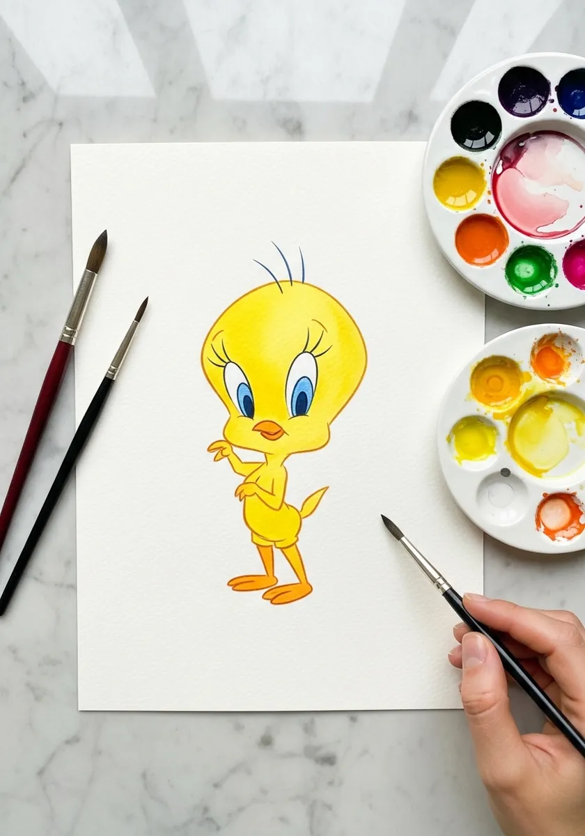
Flat yellow is the trap that ruins most attempts. Mix a slightly deeper gold for the underside of the head and the shadow beneath the body, and leave the paper white where the light lands on the top of the skull.
3. Ink Outline With a Quill
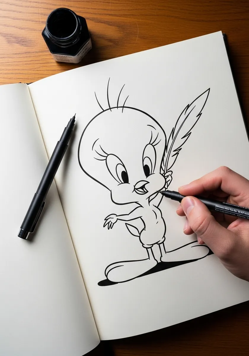
A pure outline exposes every proportion error you have. Vary the line weight so it thickens under the body and along the lower curve of the head, and thins across the top where light would fall. Uniform line weight is what makes cartoon drawings look traced. Turn the page upside down once to check the curves, since errors are obvious that way.
4. Charcoal Background Contrast
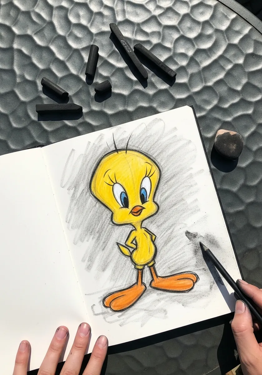
Putting flat color against a soft dark ground makes the character jump forward off the page. Smudge the charcoal loosely around the figure, keep it well clear of the outline itself, and let a clean halo of untouched paper separate the two.
5. Construction Grid Study
This is the study worth keeping. Rule a light box, mark the head circle, drop the eye line at about a third of the way up rather than the middle, and write the measurements in the margin so you can reuse them on every future drawing. Photograph this study and keep it beside you whenever you draw him again.
6. Blue Splash Gouache
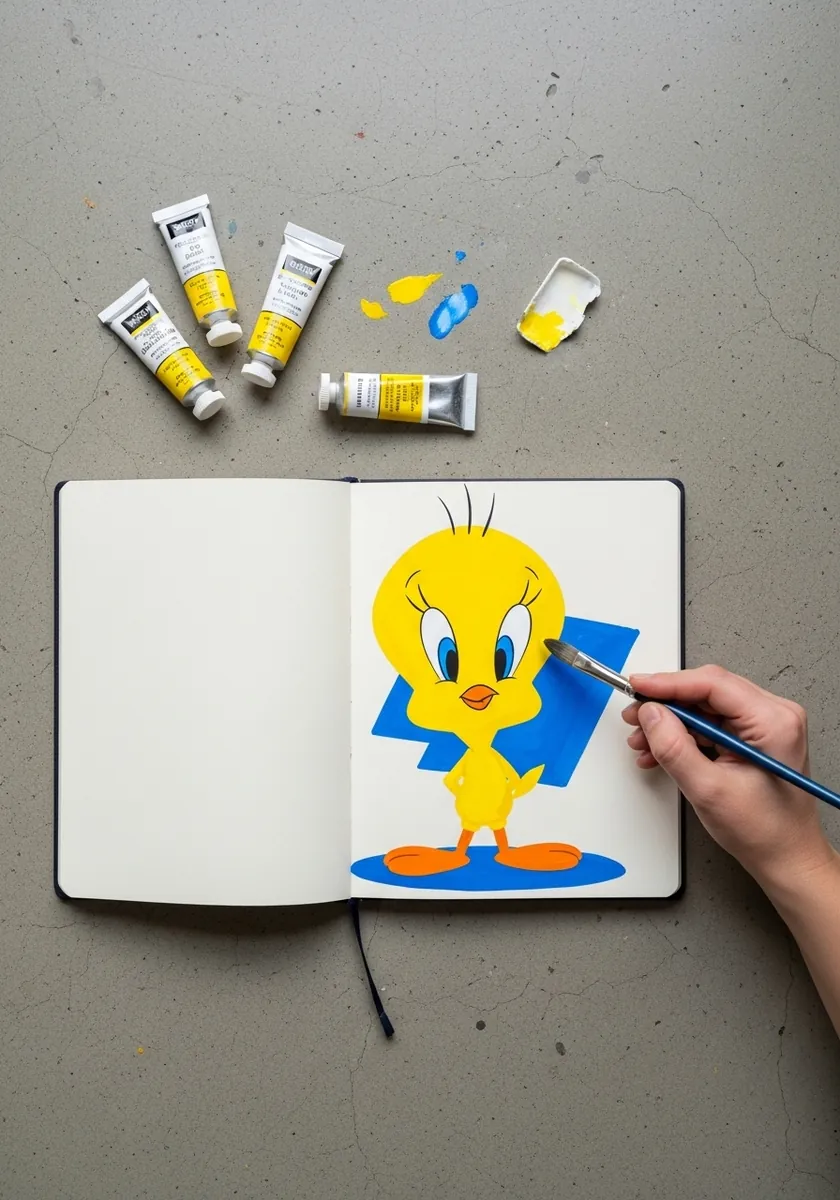
A single graphic shape under a character grounds it without drawing a background. Paint the blue splash first and let it dry hard, then place Tweety on top so his feet overlap the edge of it rather than floating above.
7. Large Clean Line Drawing
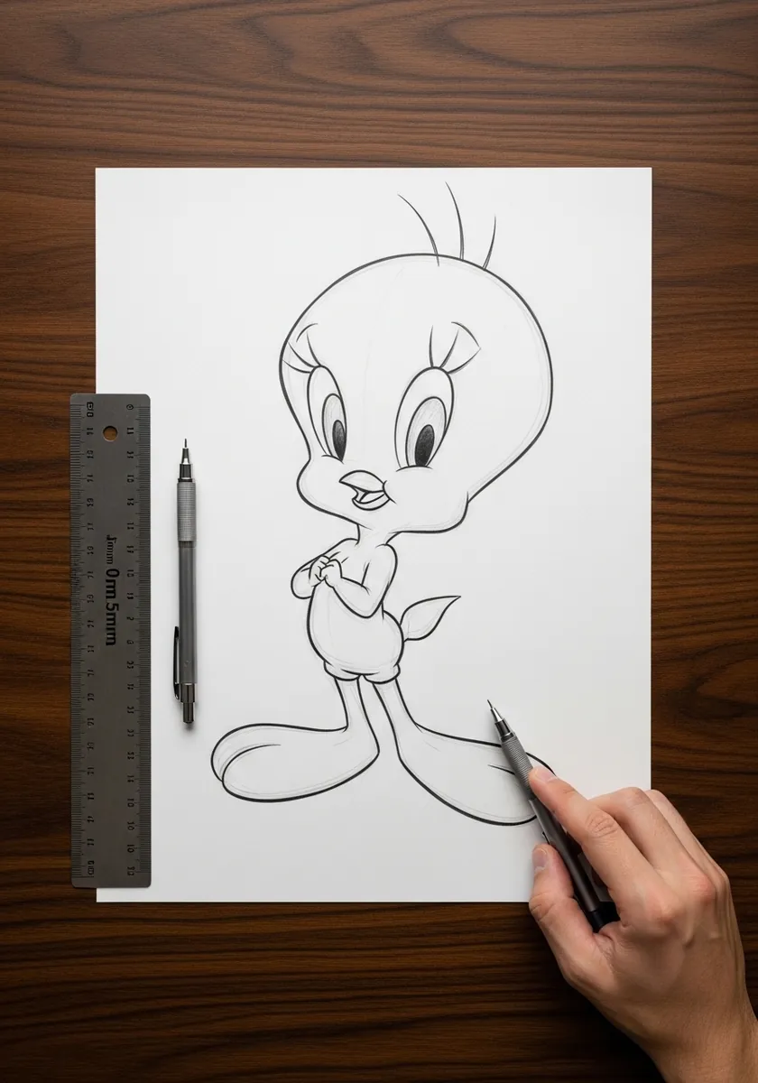
Working large forces every curve to be genuinely smooth rather than nervous. Draw each contour with a single sweeping arm movement instead of short wrist strokes, and turn the paper rather than twisting your hand whenever the curve changes direction.
8. Sumi-e Tweety With Seal
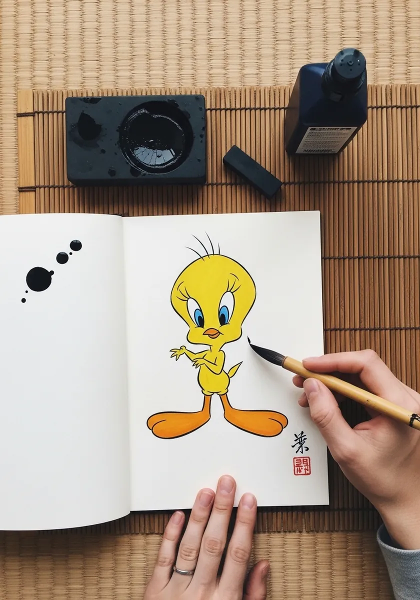
Brush work suits Tweety because his whole design is curves. Load the brush fully for the head, let it thin naturally for the feet, and accept the wobble rather than correcting it, since a brush line that has been fixed always looks fixed. Let the brush run genuinely dry at the very end of the last stroke.
9. Colored Pencil Sketchbook Study
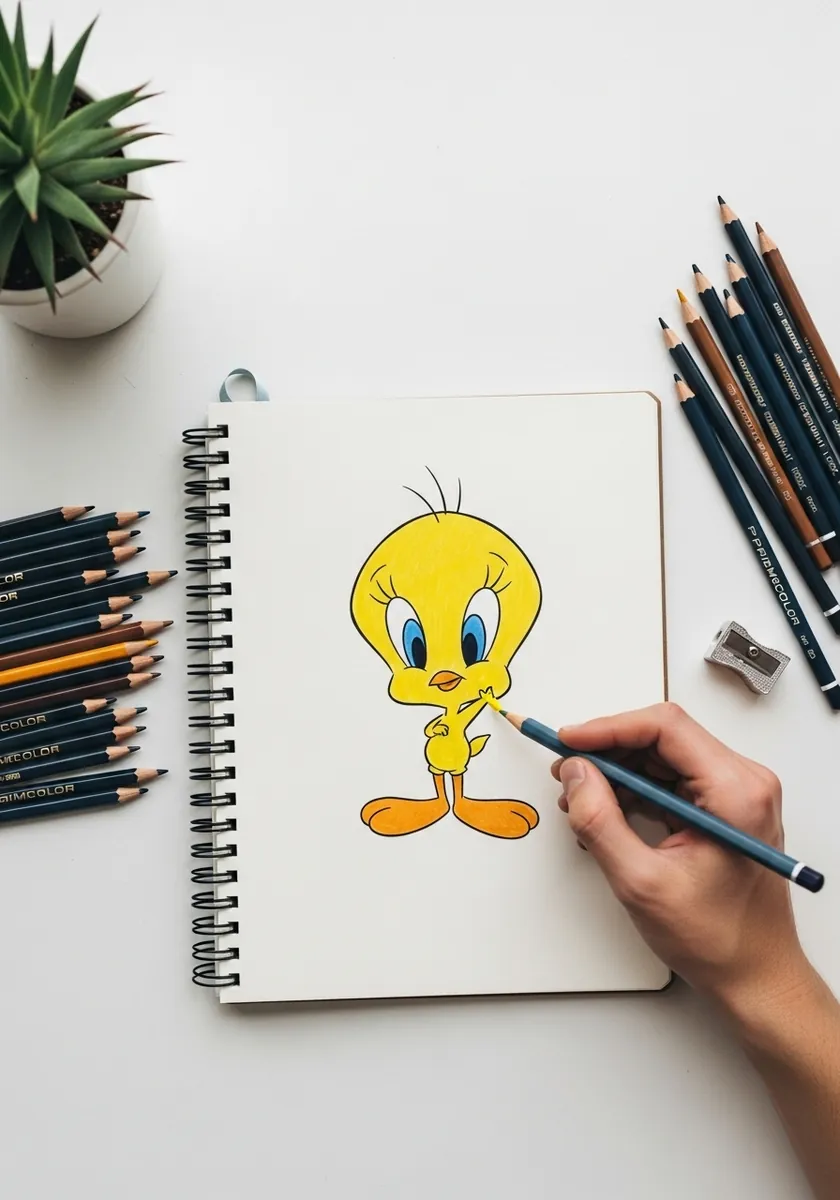
Colored pencil builds up rather than covers, which suits a yellow character well. Lay a light yellow base over the whole body, then push the gold into the shadow areas in two or three passes rather than pressing hard once.
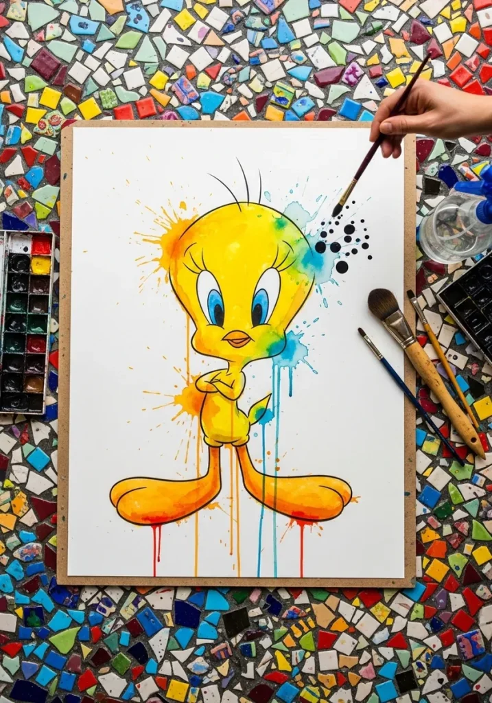
10. Watercolor Splash Portrait
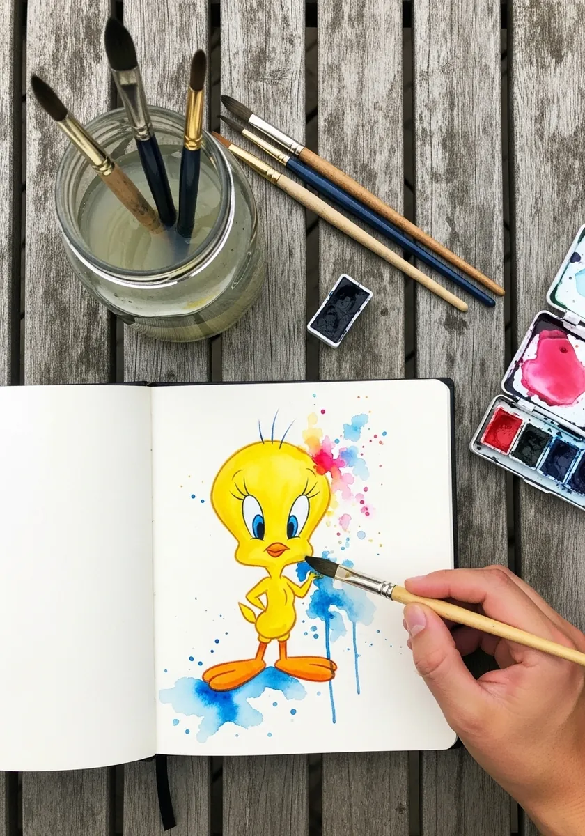
The splash has to stay behind the character rather than landing on him. Paint the color bursts first and let them dry completely, then keep Tweety himself crisp and fully opaque so the two layers never blur together at any edge.
11. Large Graphite Head Study
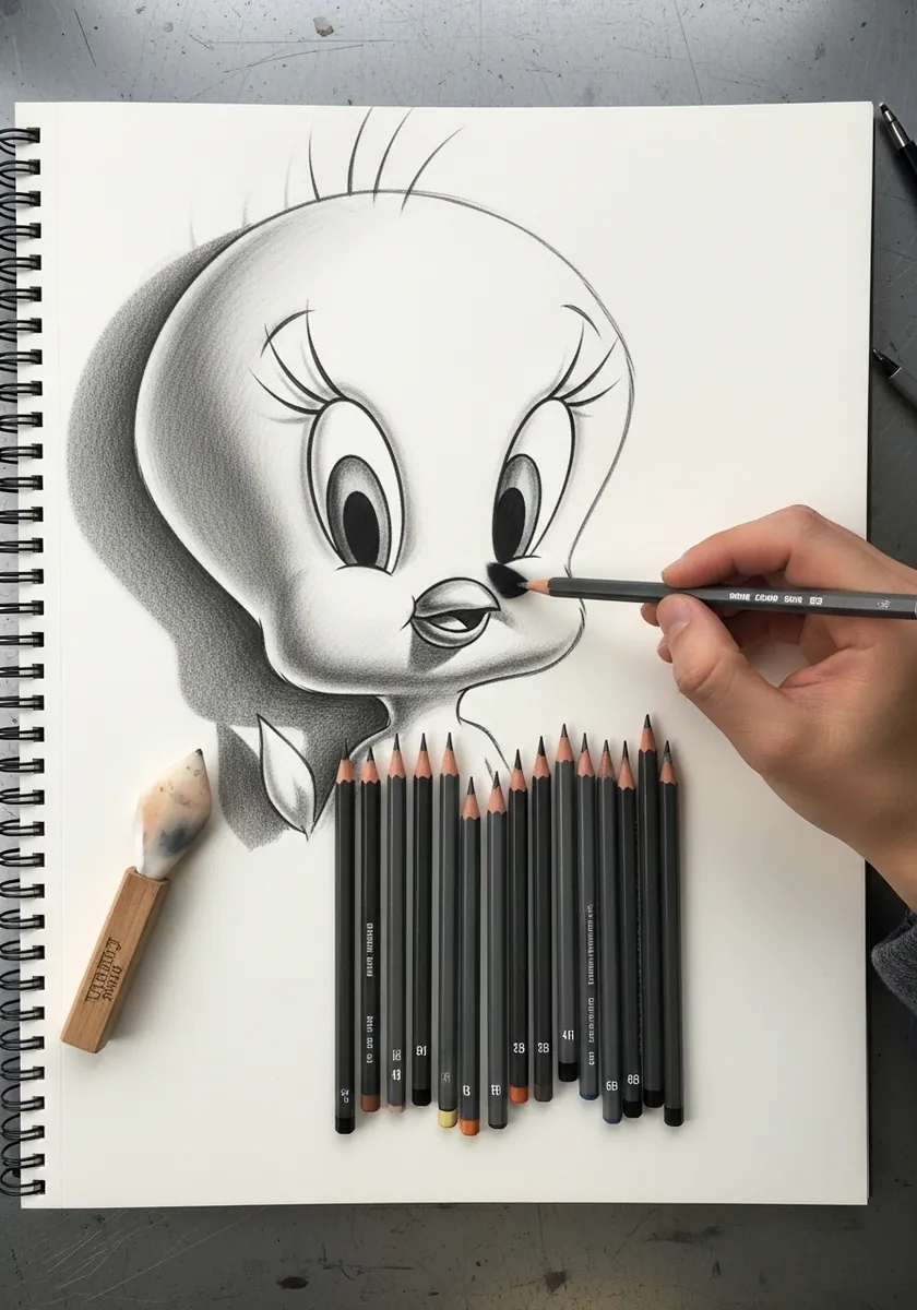
Rendering a flat cartoon in full tone means inventing form that was never there. Give the head a genuine sphere with light from one side, darken the underside of the beak, and keep the eyes glossy with a single hard highlight each.
12. Halftone Pop Art Panel
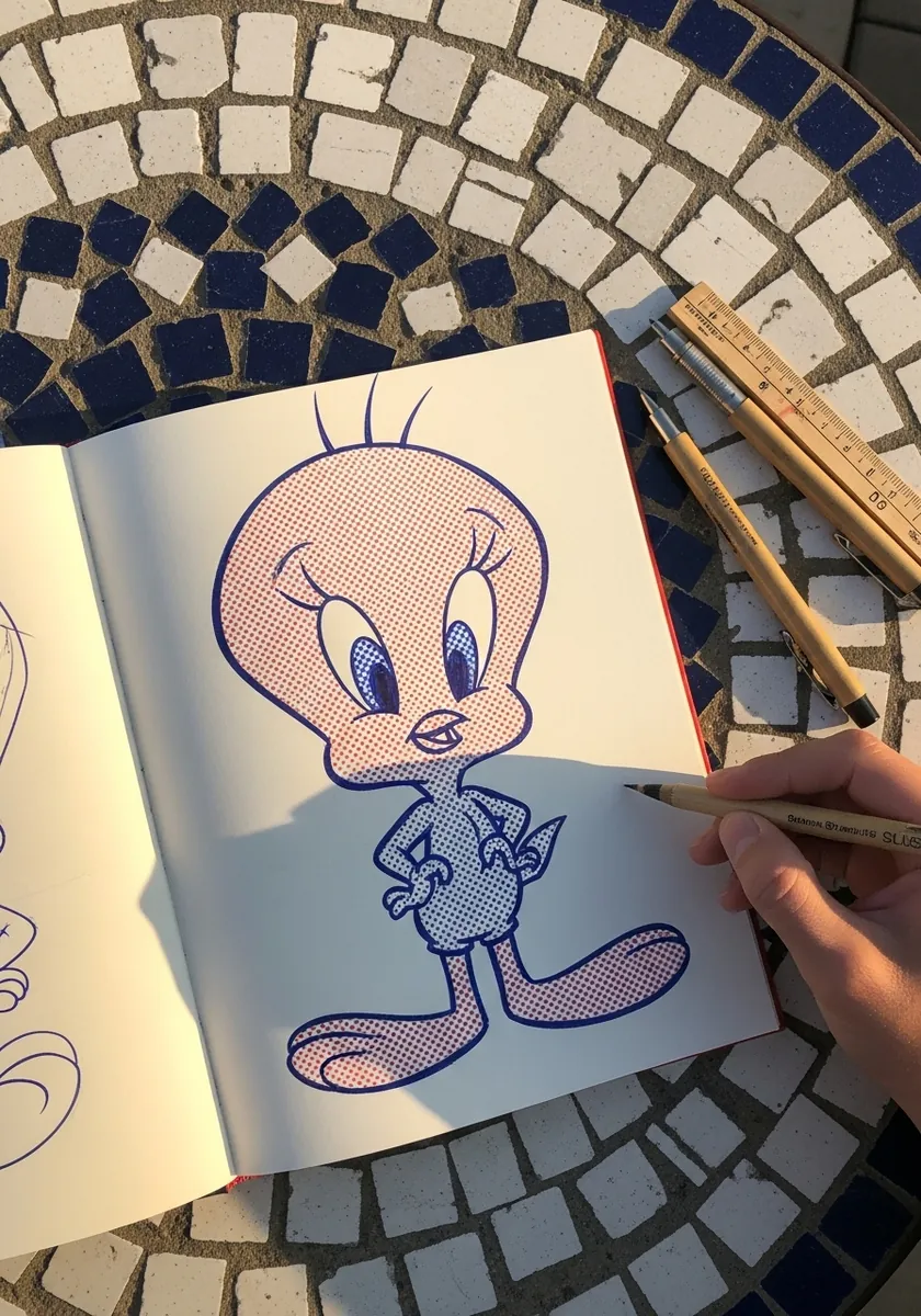
Halftone works if the dot size is consistent and the spacing is not. Use larger dots in the shadow areas and smaller in the light, keep the grid angle the same across the whole page, and let the flat colors stay completely unmodulated. Print the page in black and white to check the dot values are actually working.
13. Fine Stipple Ink Study
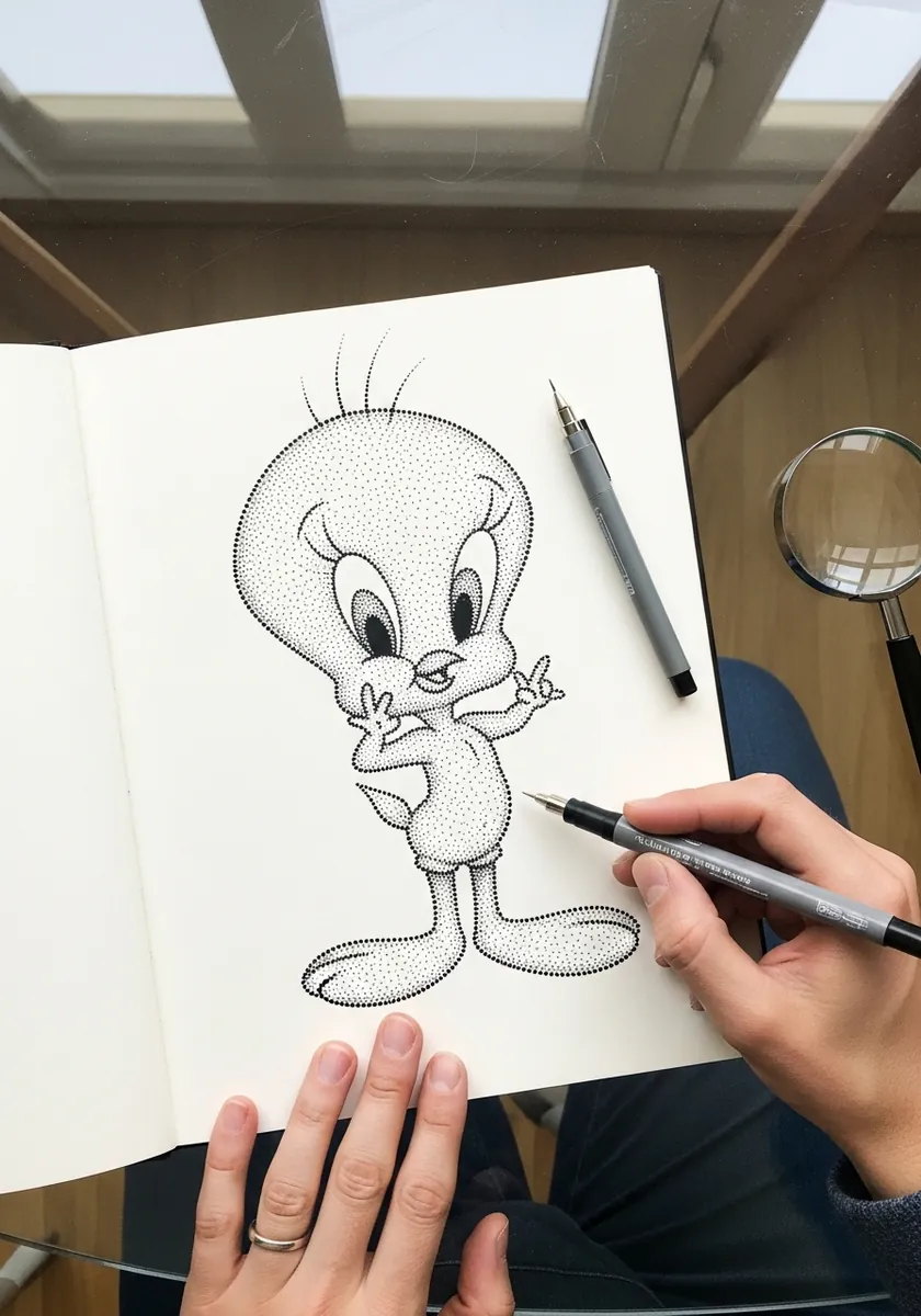
Stippling a smooth character is entirely about restraint rather than effort. Keep the whole body almost bare, build density only under the head and along the lower body where a real shadow would fall, and stop well before the page turns gray overall.
14. Oil Pastel With Rainbow
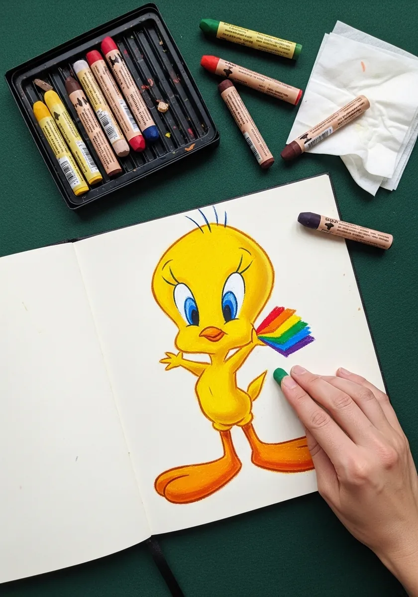
Oil pastel cannot blend cleanly, which is exactly why it suits flat cartoon color. Lay each band of the rainbow as its own solid stroke with no mixing at the edges, and press hard enough that the paper tooth disappears entirely.
15. Tweety in a Long Gown
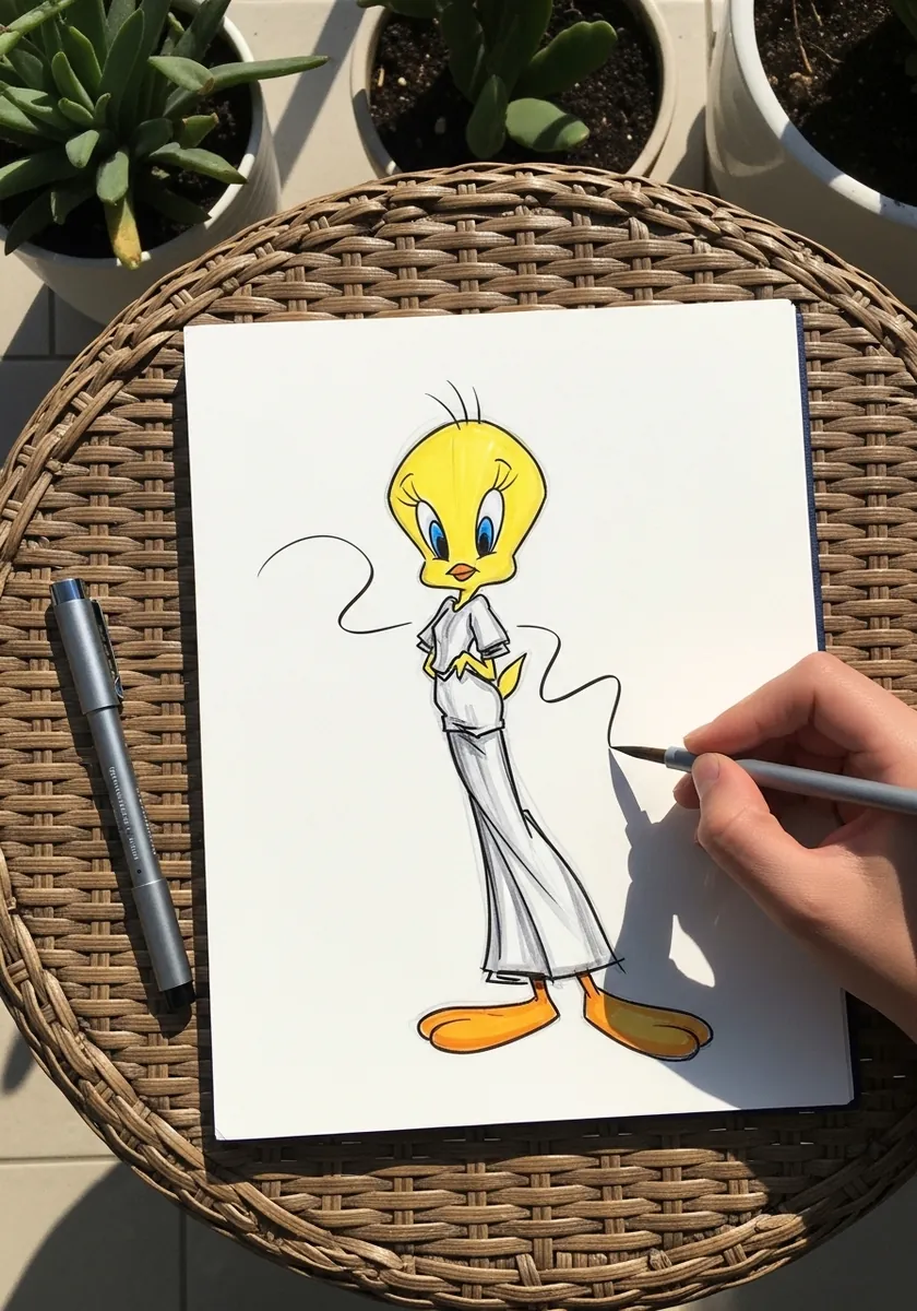
Clothing on a very round character needs the body shape to still read underneath. Let the fabric fall from the widest point of the body, keep the head and feet completely unchanged, and use only a few long folds rather than many small ones.
16. Folk Pattern With Flowers
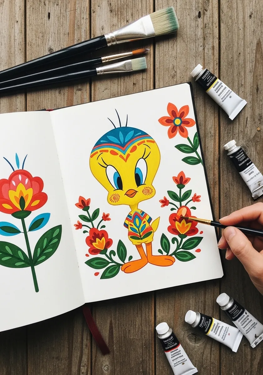
Folk decoration works through repetition and strict symmetry. Draw the flowers in mirrored pairs on each side of the page, keep every petal the same simplified shape throughout, and let Tweety sit dead center so the whole pattern balances around him.
17. Marker With Blue Outline
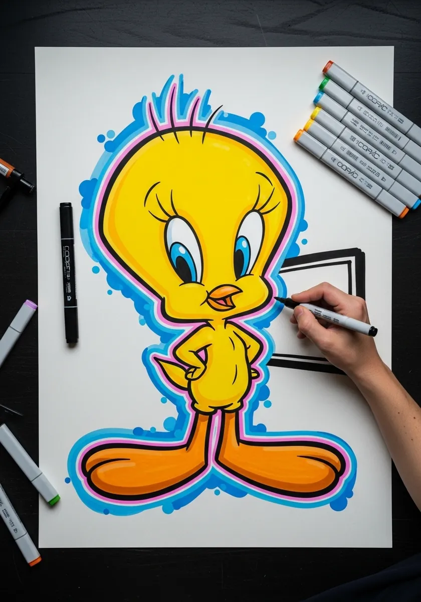
A contrasting keyline is a graphic decision rather than a shortcut. Keep the blue outline a consistent thickness all the way around, leave a thin gap of white between it and the yellow, and add no shading at all inside.
18. Tweety Holding a Flower
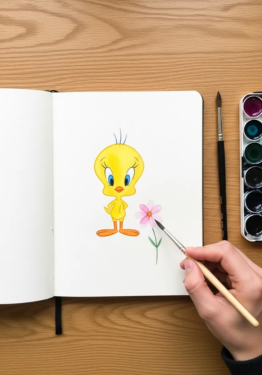
Small props change the entire read of a character. Keep the flower genuinely small so it never competes for attention, let one hand actually close around the stem rather than floating beside it, and tilt the head slightly toward it.
19. Botanical Leaf Border
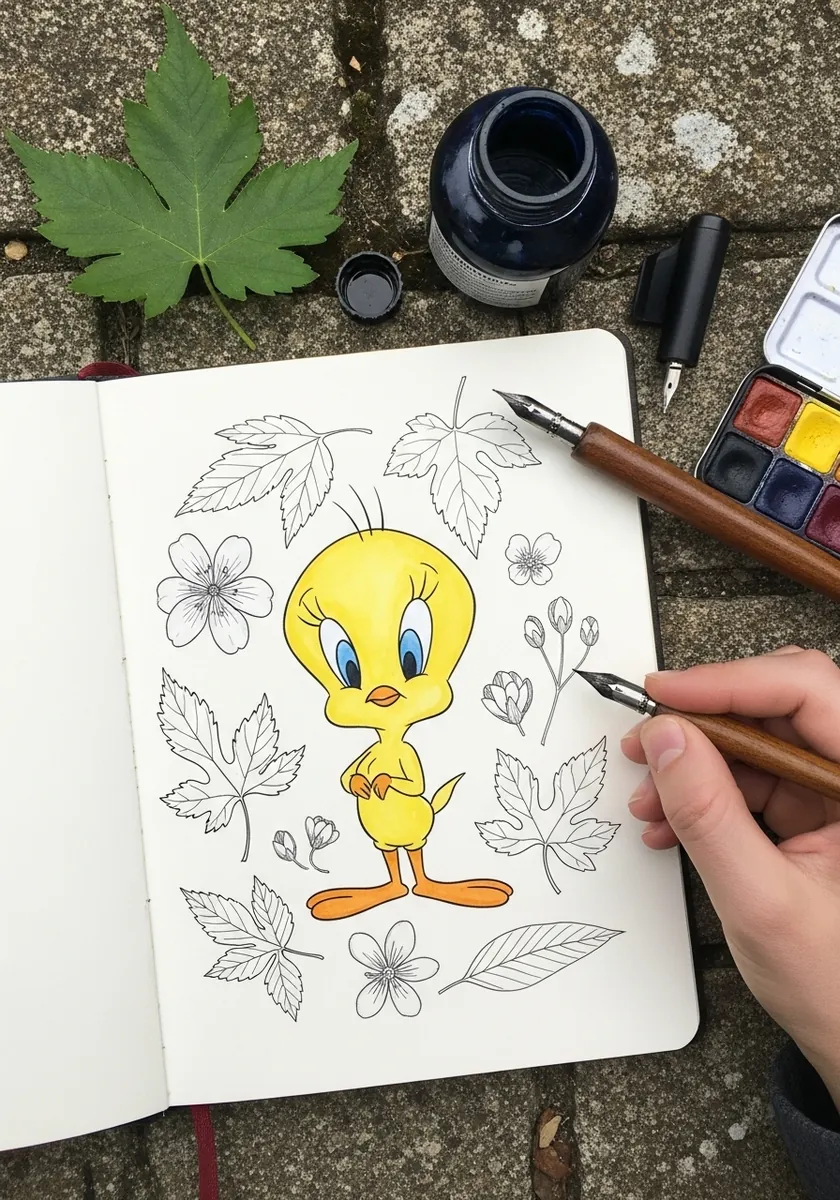
Mixing a flat cartoon with detailed botanical line creates a deliberate clash of languages. Render the foliage with real observation and careful weight, and keep Tweety absolutely flat by comparison, because that contrast is the entire point of the page.
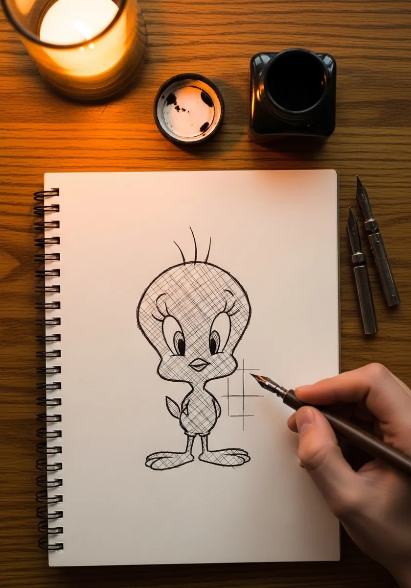
20. Candlelit Hatched Study
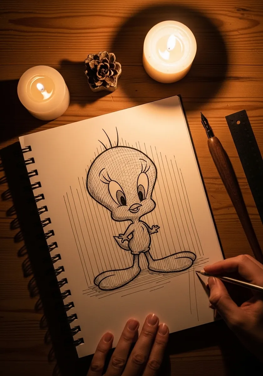
Hatching gives you tone without any smudging at all. Keep every stroke running the same direction across the whole figure, change only the spacing to change the value, and cross-hatch a second layer only in the deepest shadow beneath the body.
21. Pop Art on Purple
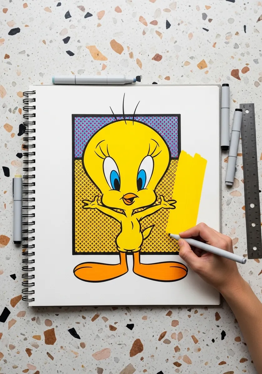
Complementary color is doing the work here. Purple sits opposite yellow on the color wheel, which is why the character glows against it, so keep both fully saturated and resist adding any third color at all. Leave the yellow shape unshaded so it reads as printed rather than painted.
22. Watercolor With Mushrooms
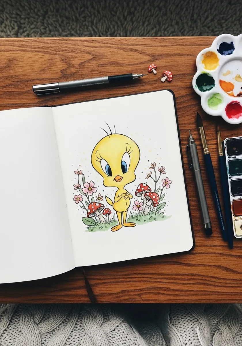
A scattered scene needs a clear focal hierarchy or the eye wanders. Keep Tweety the most saturated thing on the page, let the mushrooms and flowers stay pale and slightly cooler, and cluster them unevenly so one side is busier than the other.
23. Blueprint Construction Drawing
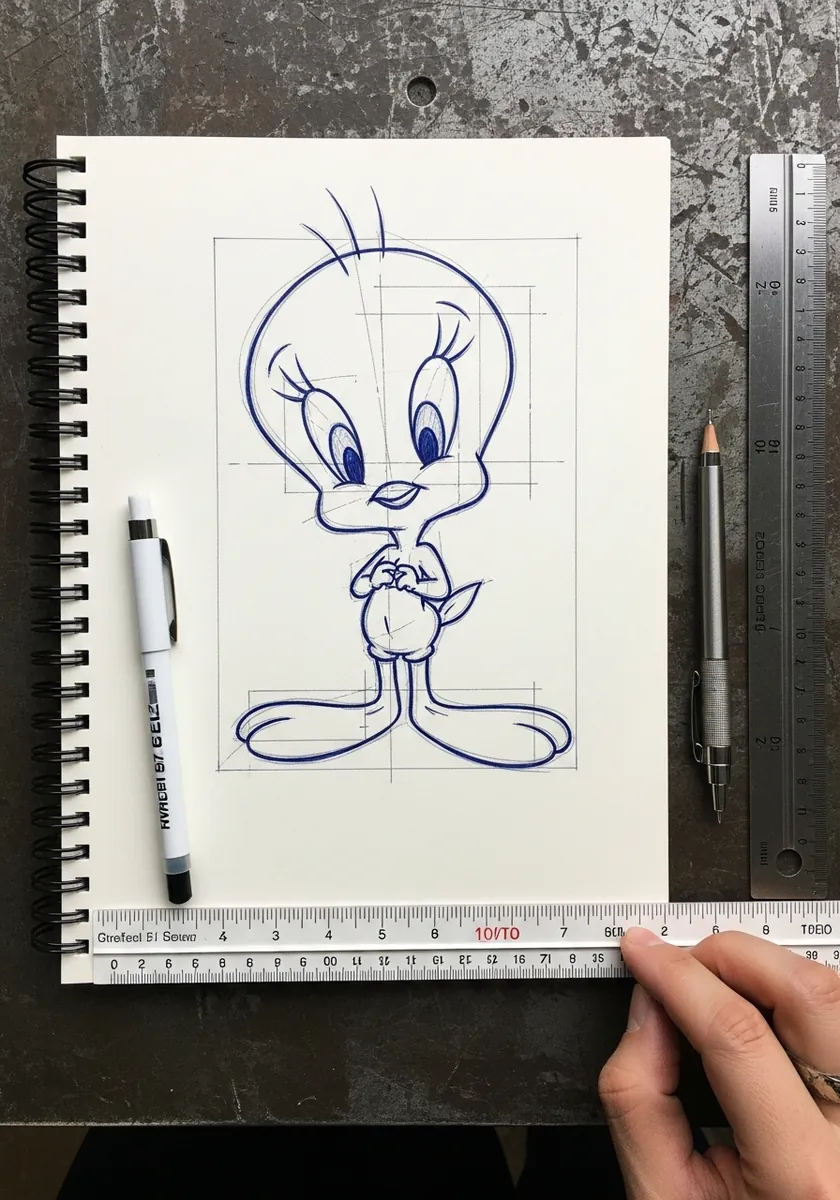
Turning a character into a measured drawing permanently fixes his proportions in your head. Mark the head diameter, note the body height as a fraction of it, and write the eye line position down. Those three numbers work on every drawing afterwards.
24. Splashy Drip Painting
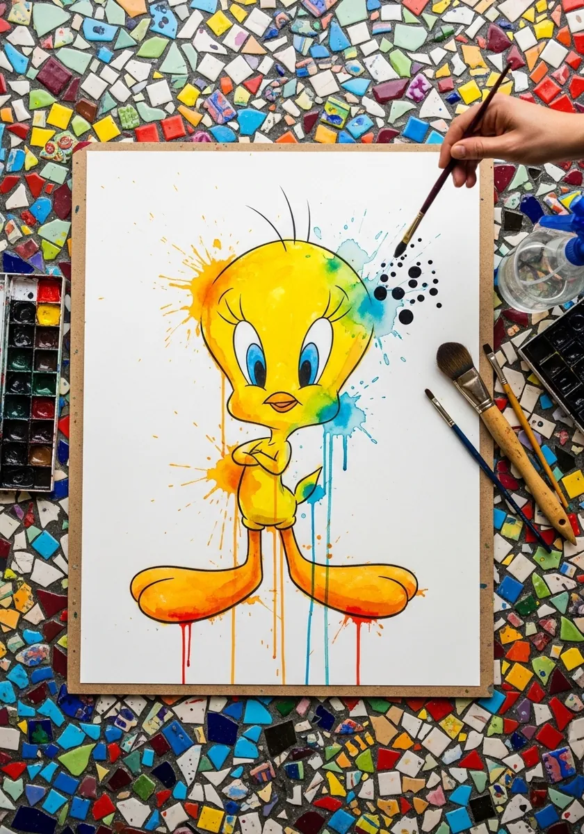
Controlled drips need gravity and timing. Tilt the board upright while the paint is still wet, let the color run only from the lower edge of the figure, and lay it flat again well before the runs reach the bottom of the sheet. Keep the drips off the face, because a run through an eye ruins the whole page.
25. Art Nouveau Panel
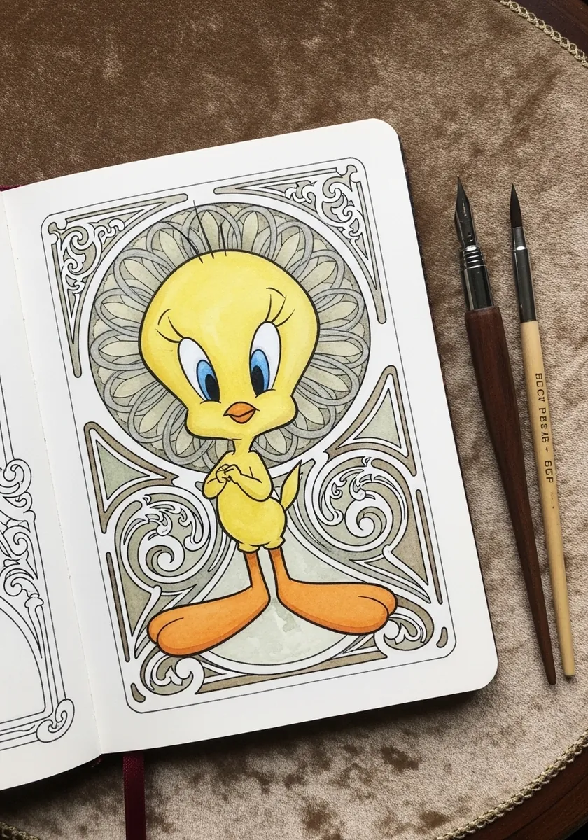
Nouveau frames swell and taper through every curve. Draw the border with a brush pen so the line thickens through the bends, then keep Tweety himself at a single fine weight so the frame reads as a separate decorative layer.
26. Neon Circuit Tweety
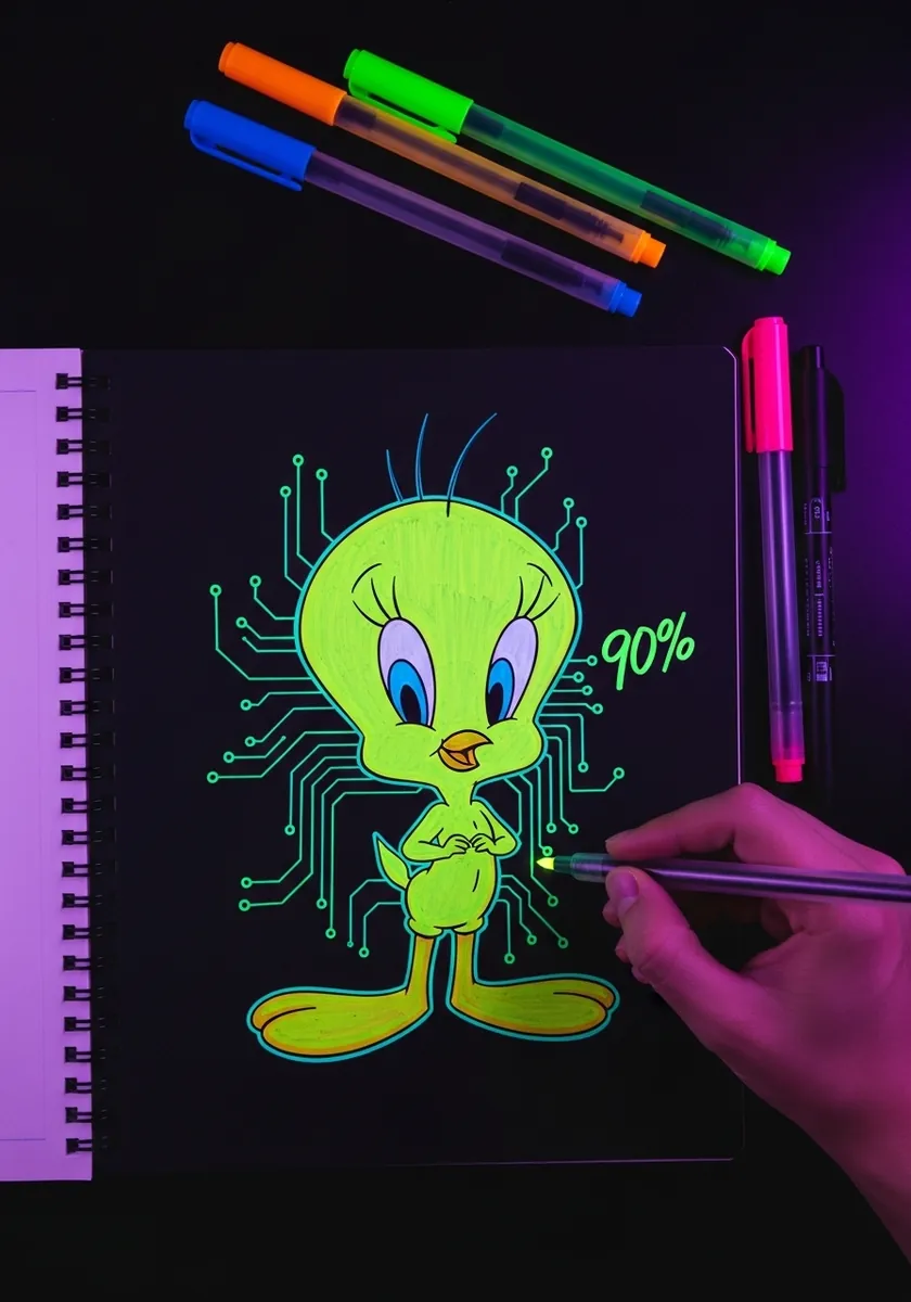
Fluorescent line on a black ground needs very little coverage to work. Outline the figure once, add the circuit traces as thin branching lines that always turn at right angles, and leave the rest of the page completely untouched black so the glow has somewhere dark to sit against.
27. Soft Pastel Palette Version
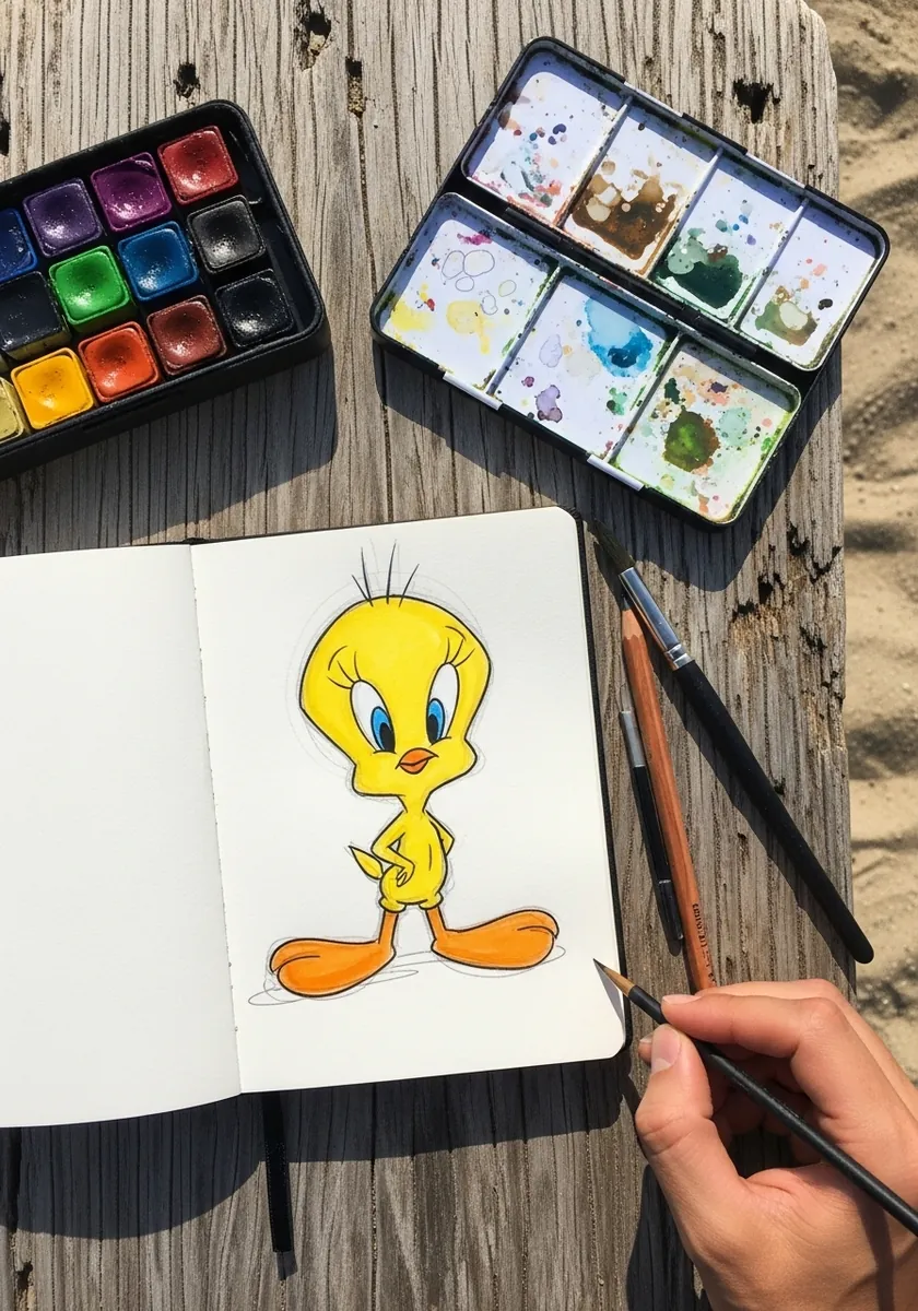
Desaturating a famously bright character is a real test of drawing. With the color no longer doing the identifying, the head proportion and eye placement have to carry everything, which is why this is a better exercise than it looks. Gray the background slightly too, or the muted figure will float on stark white.
28. Brush Ink With Red Seal
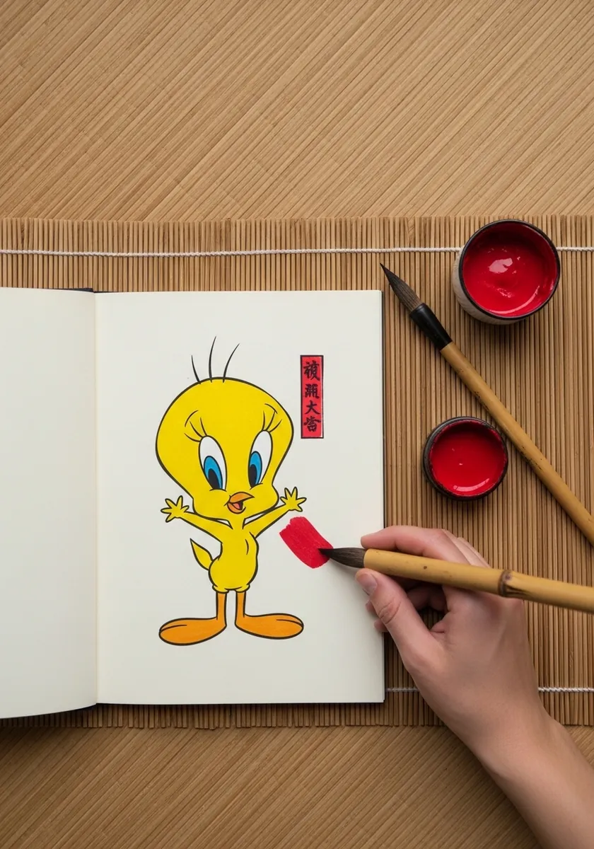
The seal is a compositional element, not a signature afterthought. Place it small, well off center, and in the emptiest quarter of the page, because a red mark in a bare corner balances a large yellow shape on the other side.
29. Blushing Cheeks Study
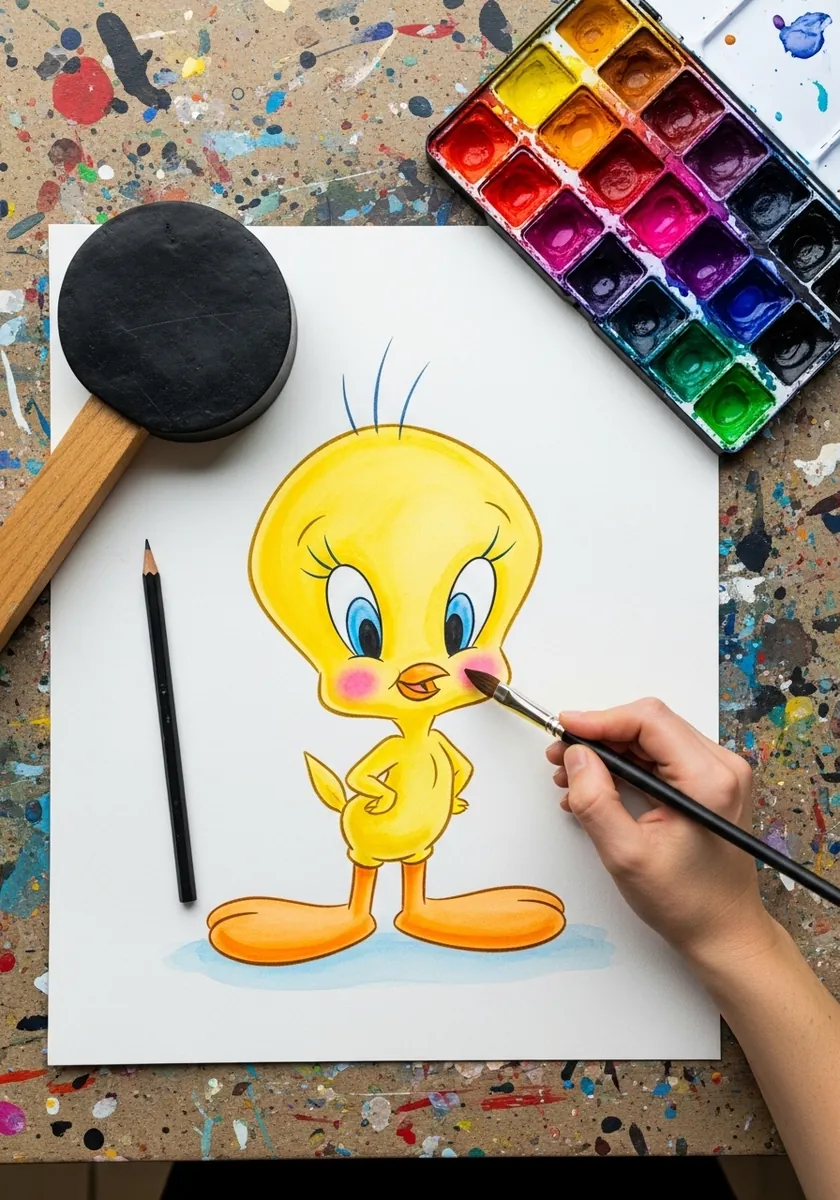
Blush is placed by the eye line rather than by the cheekbone on a character like this. Put the pink directly under and slightly outside each eye, keep the edge completely soft with no visible boundary, and use considerably less than feels right.
30. Construction Lines Left In
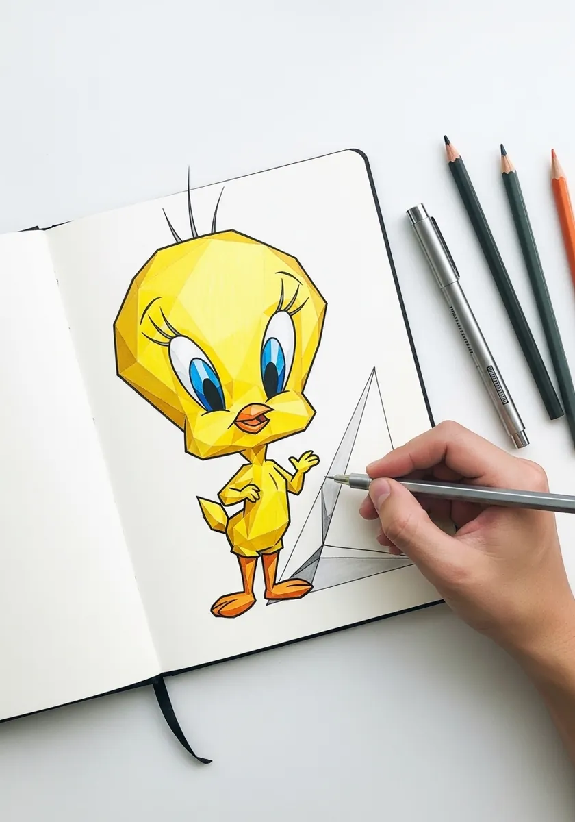
Leaving the scaffolding showing makes a finished drawing far more interesting than a clean one. Work the guides in a pale blue or red pencil, build the finished figure over them, and simply never erase, because anyone looking at the page then learns exactly how the character was assembled.
Frequently Asked Questions
What proportions does Tweety have?
The head is the largest part of him, drawn as a circle slightly wider than it is tall, and the body is smaller than the head. There is no neck between them at all. Getting that single relationship right does more than any amount of detail.
Why was Tweety originally pink?
When Bob Clampett created him for A Tale of Two Kitties in 1942, Tweety was drawn as a pink, featherless baby bird. He was reportedly recolored yellow after objections that he looked naked, and the yellow canary version is the one that became famous.
How many feathers are on Tweety’s head?
Three. It is a tiny detail and it is remarkably noticeable when it is wrong. Draw them as three short curved tufts of slightly different lengths rising from the top of the skull, not as a fringe or a spiky crest.
What kind of bird is Tweety?
A canary, which is a small finch. That is worth knowing because it explains the short conical beak and the compact rounded body, both of which are exaggerated in the design but rooted in the real bird.
Can I sell my Tweety drawings?
No. Tweety is owned by Warner Bros., so fan drawings are fine for practice, sketchbooks and personal posts, but selling them or using them commercially is not permitted. Original bird characters drawn in the same style are entirely yours to sell.
References and Further Reading