Two figures of different ages read correctly when you count heads. An adult stands about seven and a half heads tall, a young child around five, and a baby only four, so a child's head is proportionally far larger than most people draw it.
Key takeaways
- An adult figure runs about seven and a half heads tall; a young child around five and a baby four.
- Drawing a child's head too small is the single most common error in mother-and-child scenes.
- Wherever two figures touch, one must deform the other, or the contact looks pasted on.
- Give both figures one connected cast shadow so they share the same ground and the same light.
- Draw the eye-line between the two faces first, since that is where the emotional content sits.
Nearly every mother-and-child drawing fails the same way, and it is a measurement problem. An adult stands about seven and a half of their own heads tall, a young child roughly five, and a baby only four, so a child’s head is proportionally enormous. Shrink it and you have drawn a small adult.
The second rule is about contact. Wherever the two figures touch, one has to deform the other: hair pressing flat under a palm, a sleeve bunching around an arm, a shoulder compressing under a child’s weight. Touch without deformation always looks pasted together.
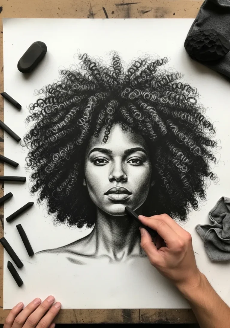
Then there is the gaze. Draw the eye-line between the two faces before you build either head, and let the tilt of both follow it, because that single relationship carries the emotion of the whole piece. For the portrait passages, graphite shading practice is the closest companion.
The fifty pieces below cover graphite portraits, watercolor meadows, sumi-e, folk miniature, chalk on black and painterly acrylic, plus several animal-pair studies. If you want the tray-and-still-life side of the holiday, breakfast in bed art covers that, and watercolor flower studies handle the bouquets.
Compiled by the GS Art Zone editorial team. Last updated August 2026. Each idea is paired with the specific step that produces the effect, so you can go from the reference straight to paper.
What You Need Before You Start
- A 2H for proportion checks and a 4B for the deep folds, since most figure work needs both
- A sanguine or sepia pencil, which suits skin far better than pure graphite for warm portraits
- A kneaded eraser for lifting the light along a cheek or a shoulder without scarring the paper
- One warm and one cool flesh tone, because skin shifts temperature between lit and shadow sides
- Black or toned paper for the chalk, charcoal and firefly pieces further down the list
1. Pencil Line Study of Mother and Baby
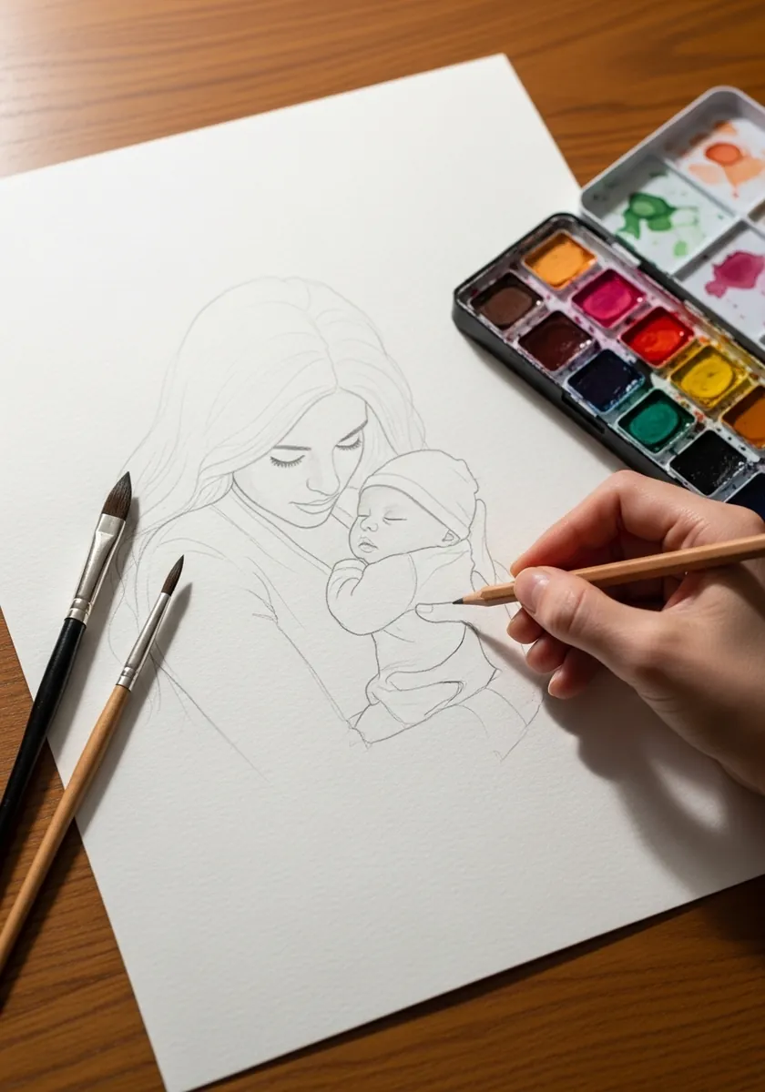
Outline stage is where proportion gets fixed or lost. Mark the adult’s head height and step it down the body seven and a half times, then do the same for the baby with four. Only once both figures check out should you commit to any detail.
2. Watercolor Bubbles With a Toddler
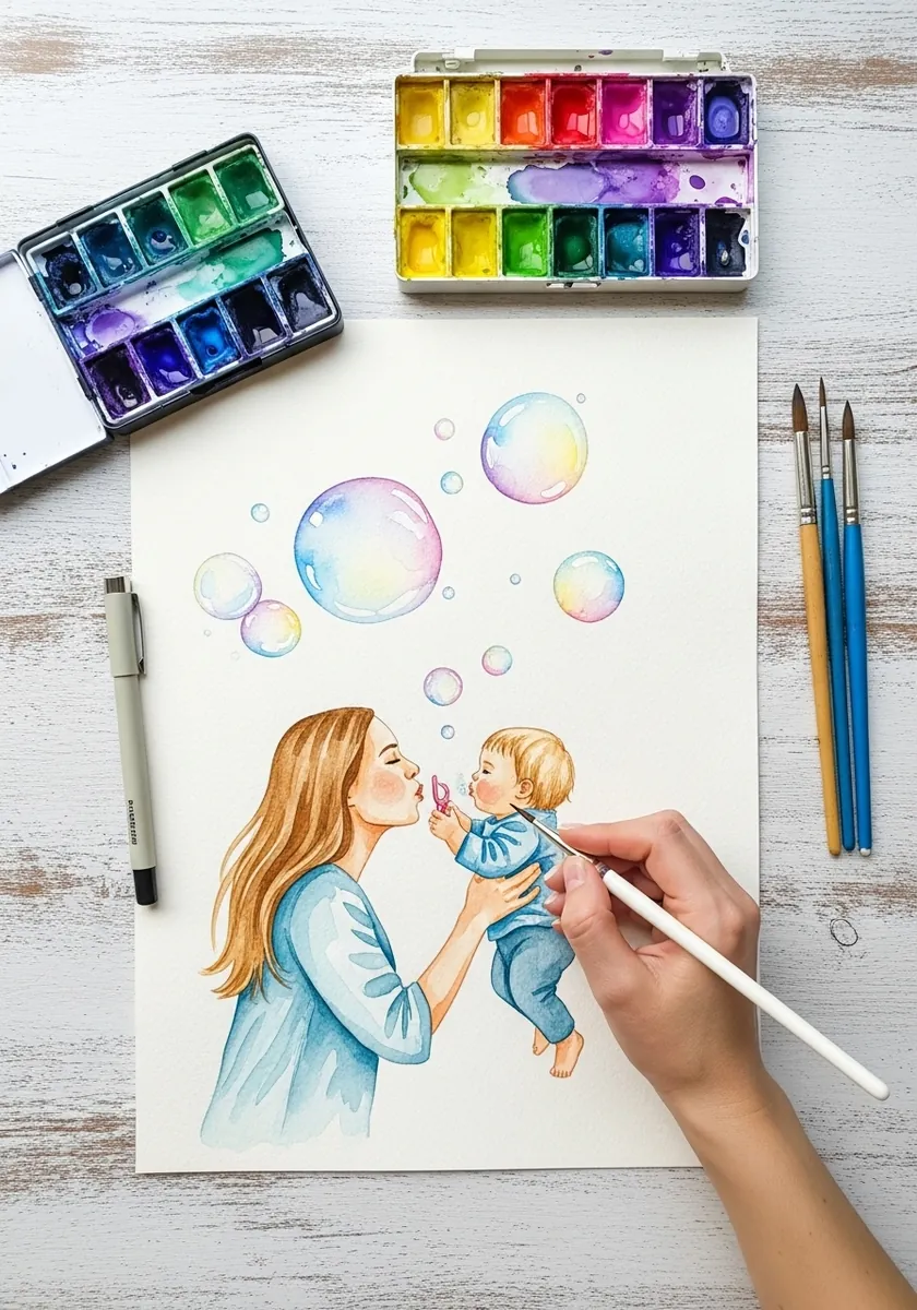
Bubbles are drawn almost entirely as reserved paper. Leave each one blank, paint around it, then add a single curved highlight and a thin colored arc on the shaded side. Painting bubbles as filled circles removes exactly the transparency you want.
3. Retro Poster Mother and Son
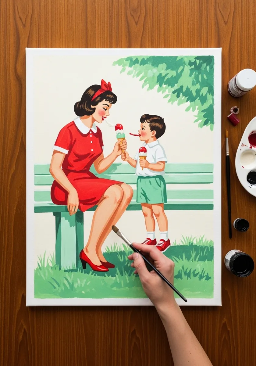
Mid-century styling uses flat color with a hard black keyline. Limit yourself to four or five hues, keep every edge crisp, and simplify the faces to a few decisive marks. The period look comes from restraint rather than from added detail.
4. Blossom Path in Watercolor
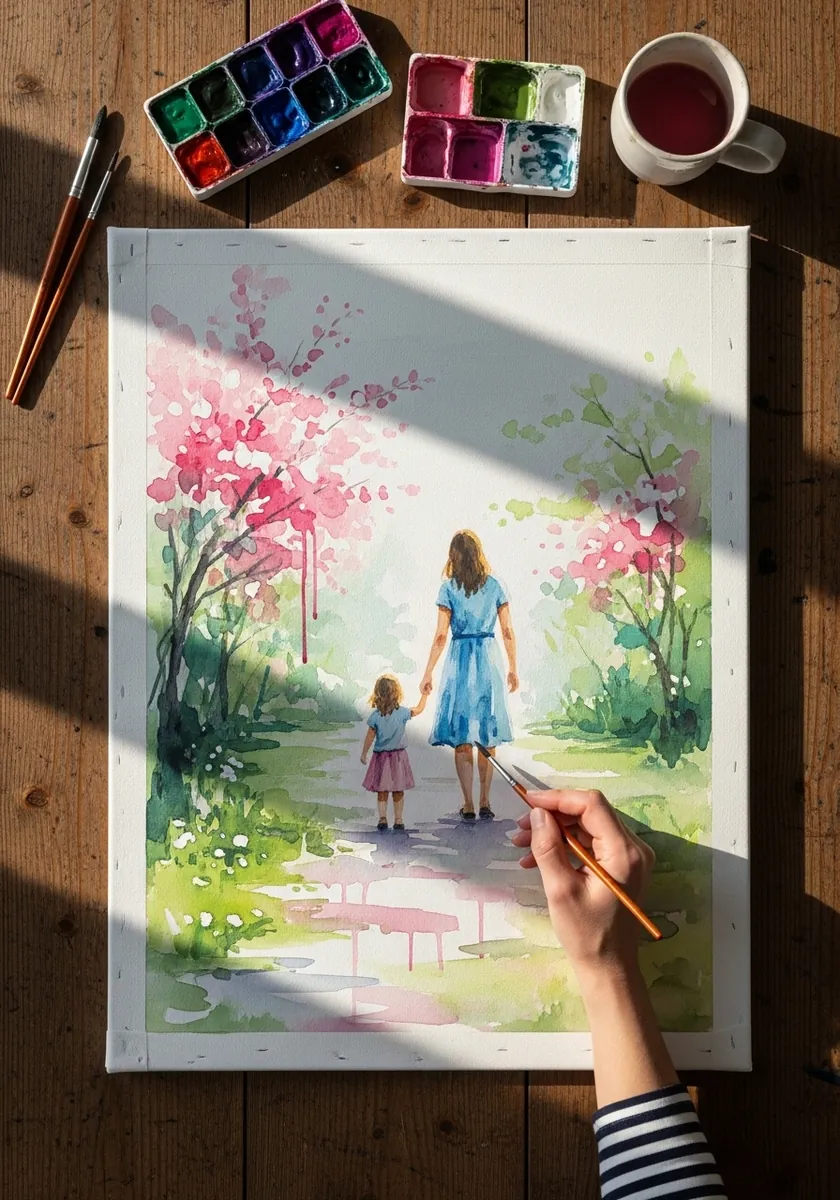
Figures seen from behind remove the hardest problem while keeping the whole story intact, so keep both silhouettes clean, let the height difference carry the relationship, and place the pair slightly off center on the path. Blossom stays loose so it never competes.
5. Blossom Park With Running Drips
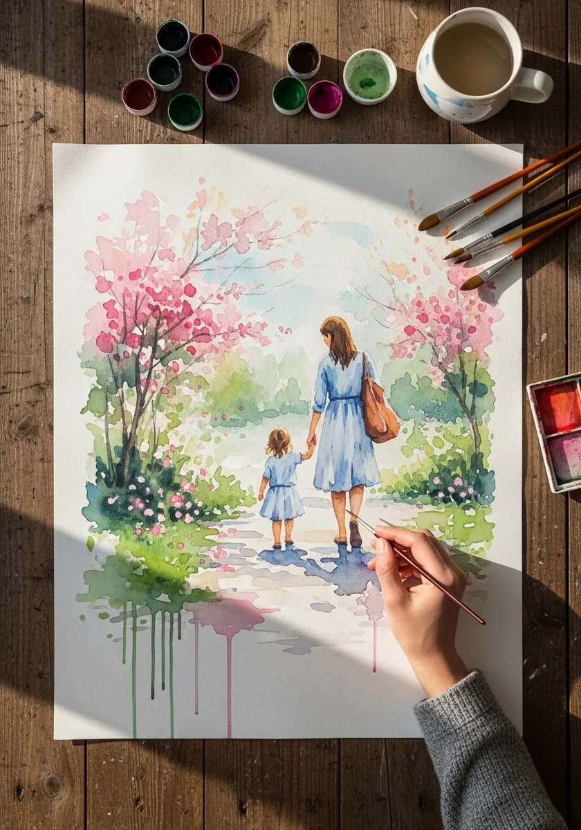
Deliberate drips need to start from one clear line. Let them all fall from the bottom edge of the painted area, keep them true vertical, and match their color to whatever sits directly above. Drips scattered through the middle just look like accidents.
6. Sanguine Study of Reading Together
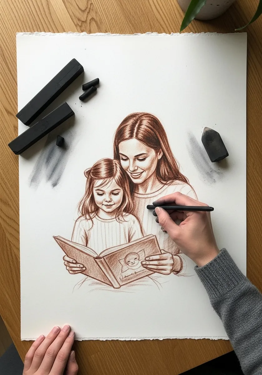
Sanguine suits skin because it already carries warmth. Build the tone with the side of the pencil, keep the darkest accents at the eyes and the hair partings, and leave the paper bare across the cheeks. Adding graphite over it cools everything down.
7. Butterfly and Caterpillar in Colored Pencil
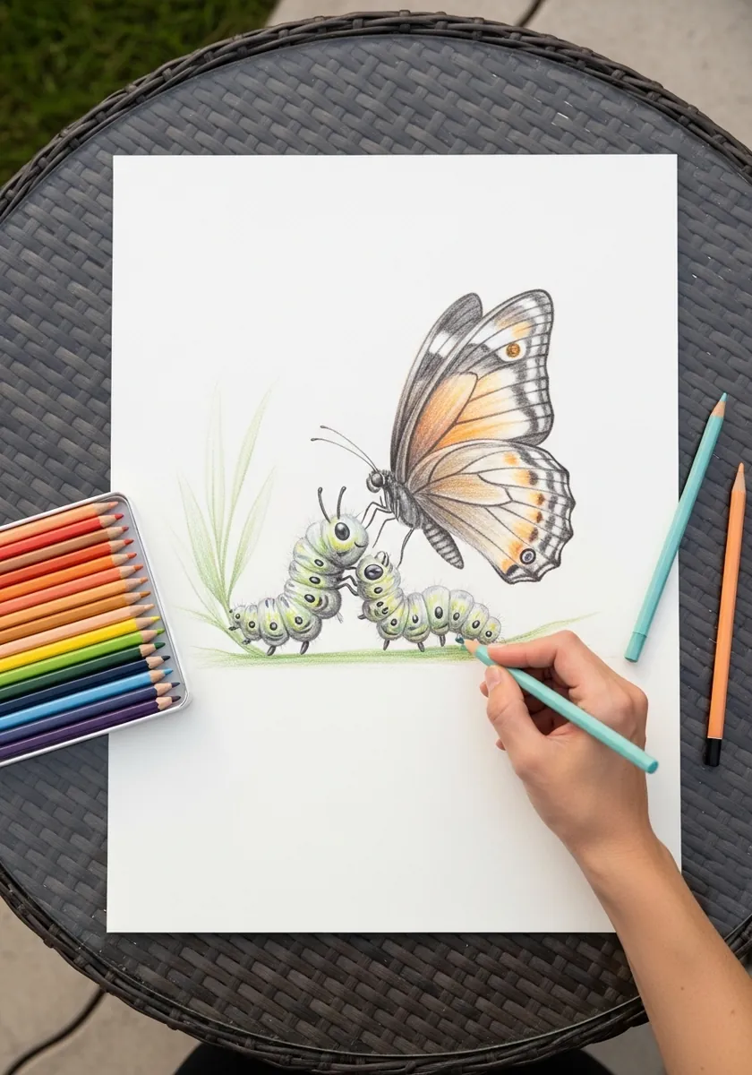
An animal pairing can carry the theme without any figures at all. Keep the two subjects clearly different in scale. Point their body axes toward one another, which creates the same relationship a two-figure composition would, and let the stem physically join them.
8. Tree Scene in Pencil Outline
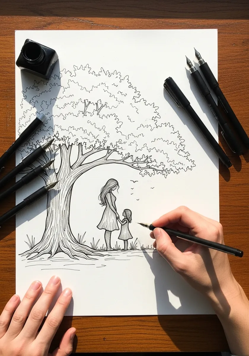
A big tree gives you scale for free. Draw the canopy first at real size, then place the figures small enough that the tree genuinely towers, and let one branch reach over them. That overhang is what makes the scene feel sheltering.
9. Ink Lioness With Her Cub
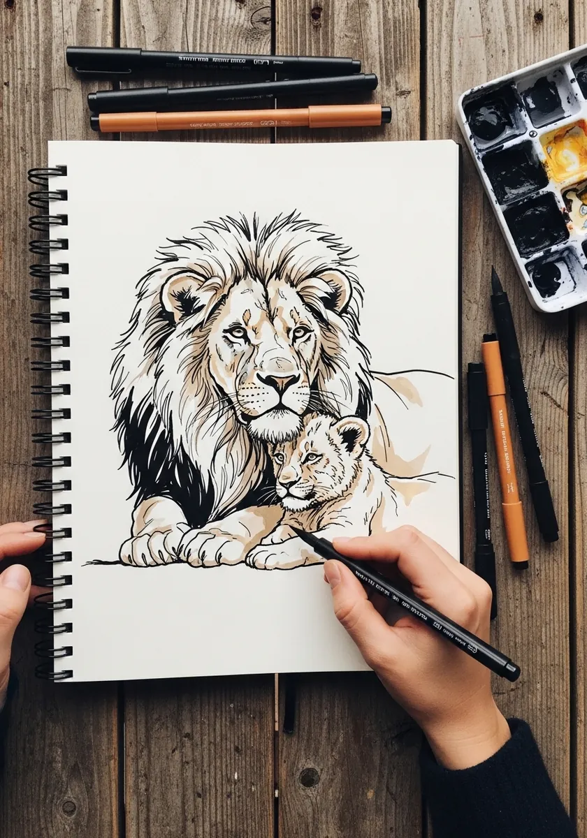
Fur direction changes at every body plane. Run the strokes outward from the muzzle, downward along the flank and in a swirl at the shoulder, and let the cub’s fur be shorter and softer throughout. Uniform hatching flattens both animals.
10. Marker Lift in Blue
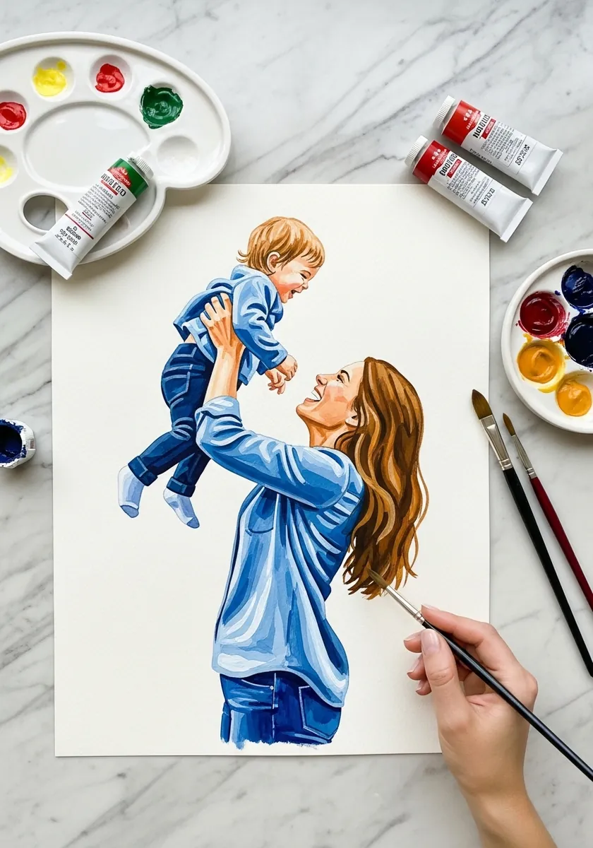
A lifted child is a weight problem before it is anything else. Bend the adult’s knees slightly, arch the spine backward and let the shoulders rise toward the ears. Without those three adjustments the child looks weightless and the whole pose quietly collapses.
11. Watercolor Lift on Marble
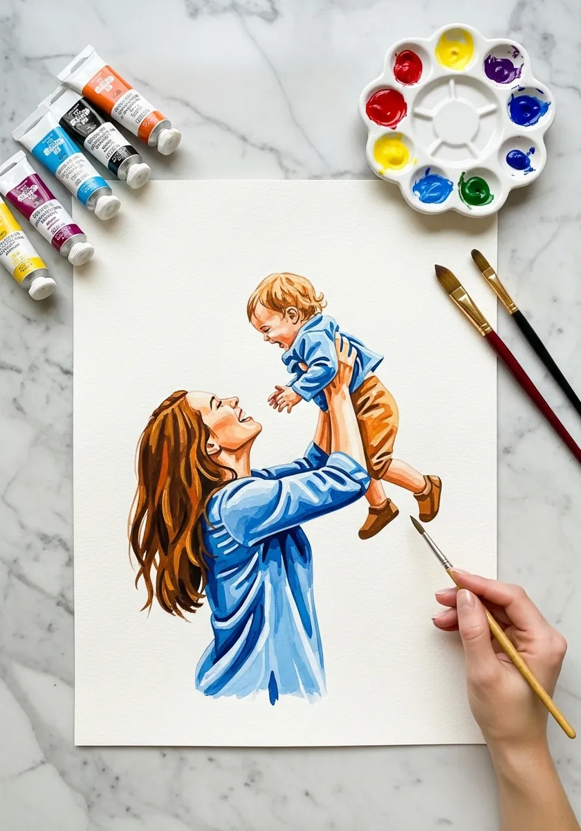
Repeating a pose in a different medium teaches you what each one gives you. Watercolor softens the edges and lets skin tones bleed together, so the figures merge more than they would in marker. Lean into that rather than fighting for crisp outlines.
12. Sumi-e Lantern in the Mist
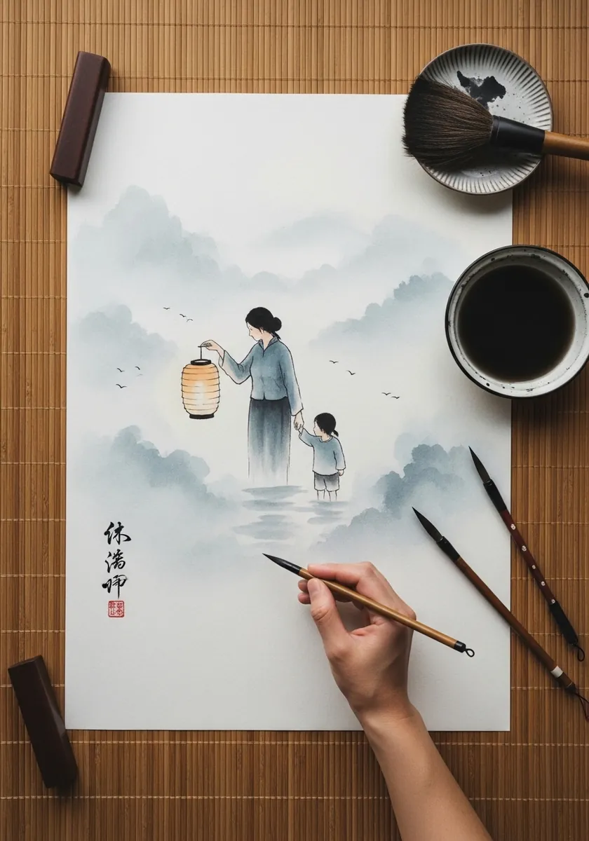
Mist is achieved by dilution, not by blending. Paint the near figures at moderate strength and everything beyond at a fraction of it, leaving broad areas of untouched paper between. The lantern is the only place ink reaches full black.
13. Braiding Hair in Clean Line
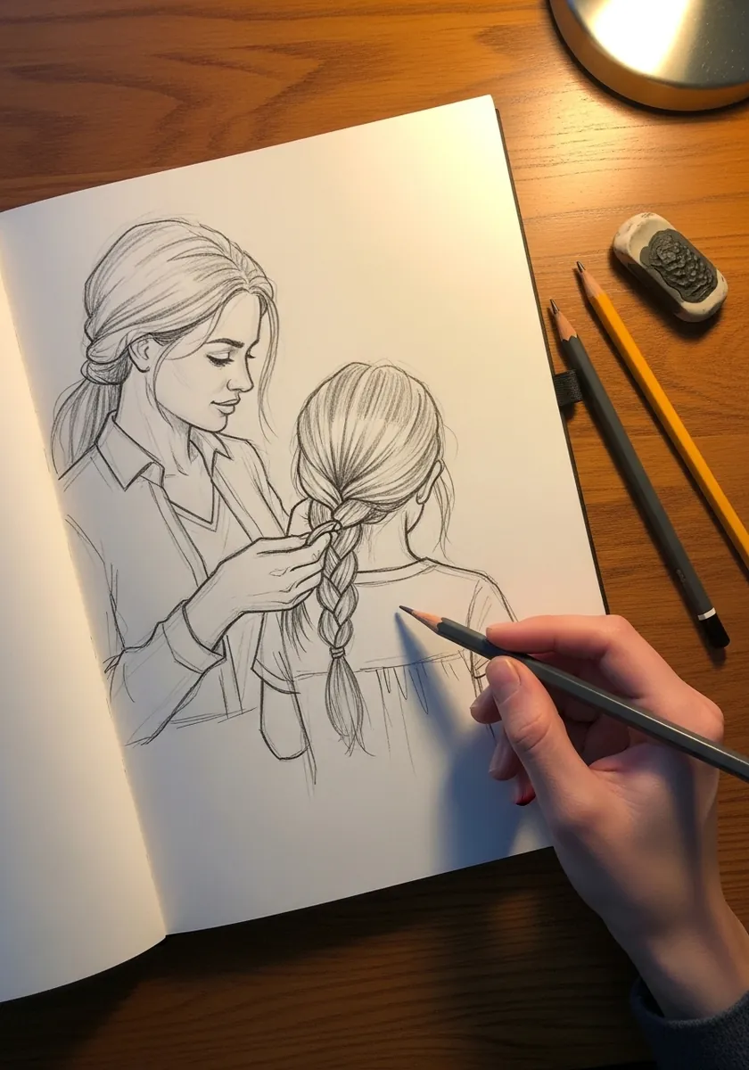
A braid is three strands crossing in a fixed rhythm. Draw the centerline first. Lay overlapping teardrops alternately from each side, narrowing steadily as they descend. Hair also compresses where the hand grips it, and that detail is what sells the contact.
14. Loose Braiding Sketch
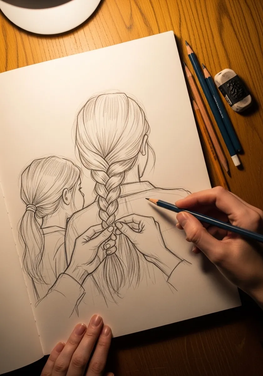
Keeping a drawing at sketch stage is a valid choice. Let the searching lines stay visible around the arms and shoulders, darken only the strongest contours, and stop before it tightens. The looseness reads as movement in a quiet subject.
15. Mirror Reflection in Graphite
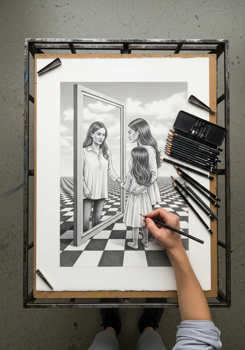
A reflection showing a different age needs both figures drawn with identical care. Keep the features consistent and change only what age actually changes: jawline softness, the set of the eyes, the hair. The floor pattern anchors both to one space.
16. Fireplace Scene in Watercolor
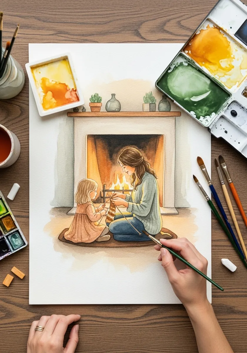
Firelight comes from below and warms only what faces it. Light the undersides of both chins, warm the fronts of their clothing, and keep every surface facing away cool and dark. Lighting a fire scene from above kills it instantly.
17. Flat Gouache Baking in Blue
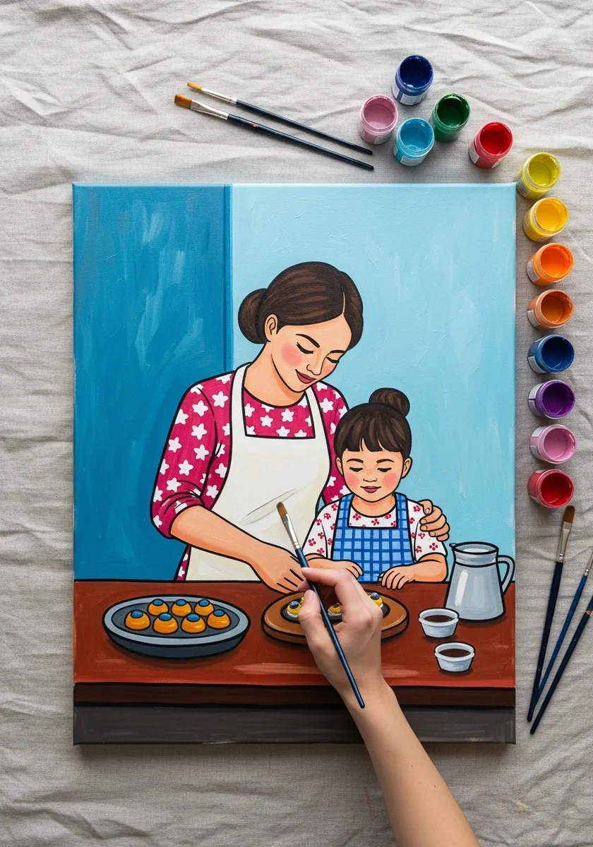
Flat illustration needs its shapes to separate by value rather than by hue alone, so give the apron, the counter and the wall clearly different lightnesses, then let your color choices sit on top of that structure. Squint, and everything should still read.
18. Gouache Kitchen With Shelves
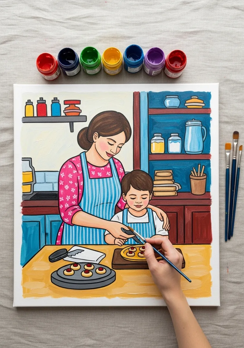
Background detail must stay behind the figures. Reduce the shelf contents to simple shapes with no highlights at all. Keep their outlines thinner, and save the strongest darks for the figures. Otherwise the jars pull as much attention as the faces do.
19. Superhero Mother in Ink
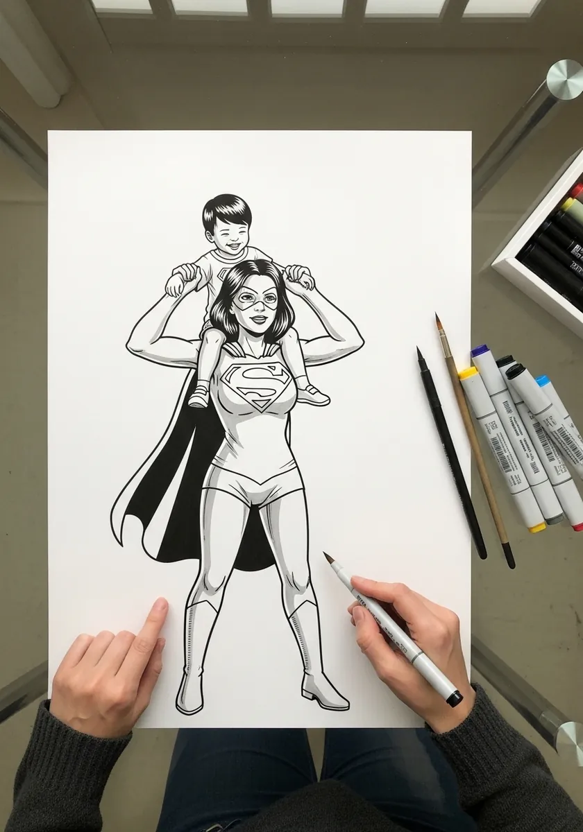
A child on shoulders changes the adult’s whole balance. Push the hips forward, tilt the torso back, and spread the feet wider than usual. Comic styling then allows an exaggerated stance that would look unstable in a realistic drawing. Keep the cape trailing on one side only so the pose does not read as perfectly symmetrical.
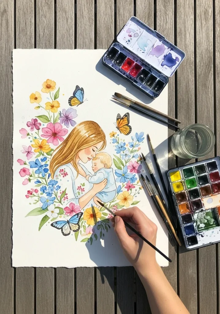
20. Floral Embrace in Watercolor
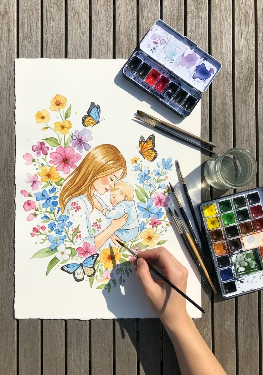
Surrounding an embrace with flowers risks burying it. Keep the blooms densest at the outer edges and let them thin out completely near the two faces, so a quiet zone forms around the point of connection. Butterflies stay small and few.
21. White Chalk Umbrella on Black
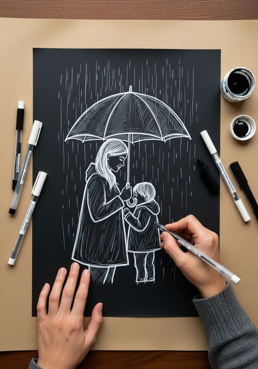
On black paper you draw only what the light strikes. Mark the top of the umbrella, the shoulders and the rain streaks, then stop. Rain reads best as short broken strokes all at the same angle rather than continuous lines.
22. Mermaid Mother in Watercolor
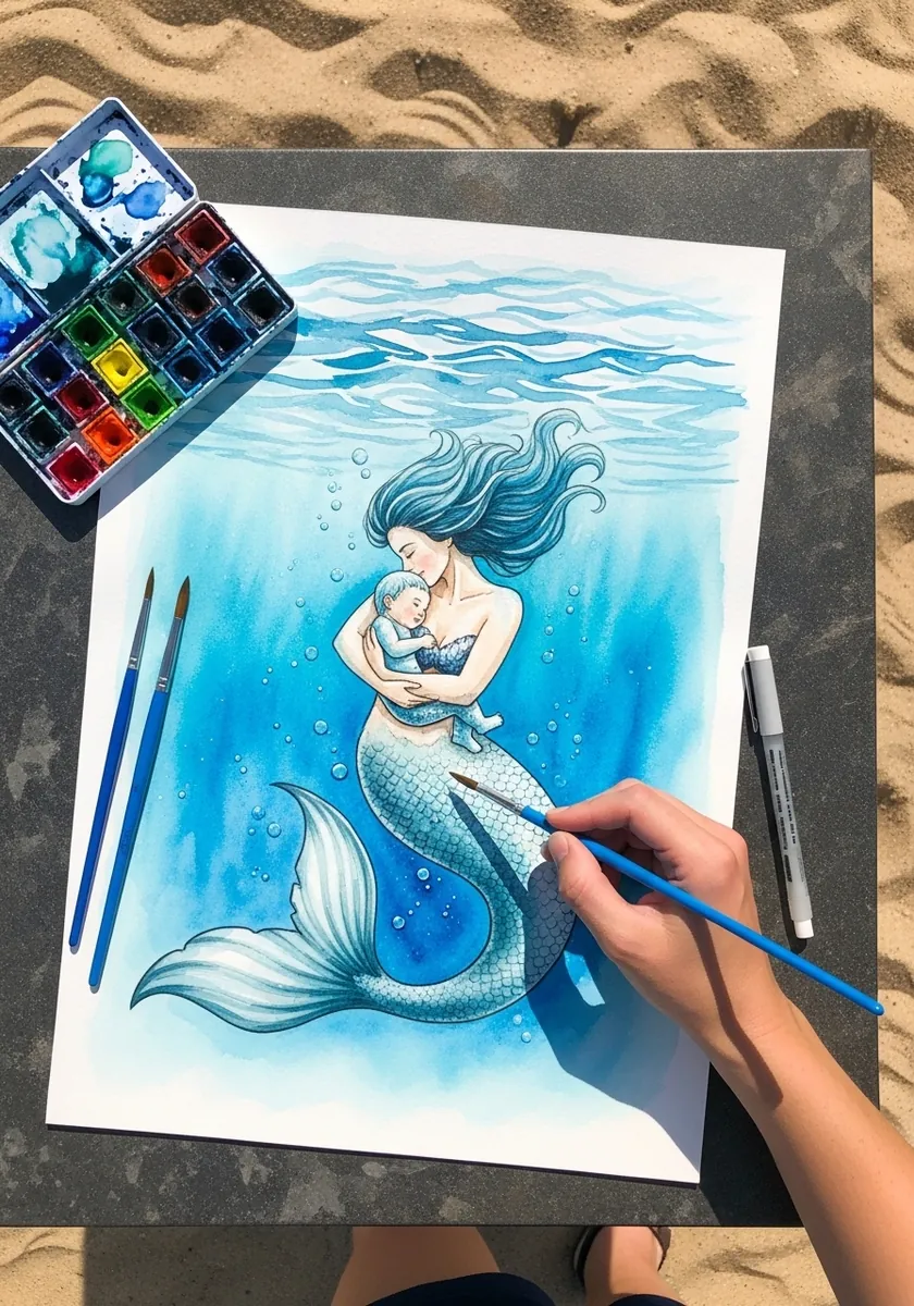
Underwater scenes need everything to drift upward. Let the hair, the fins and any bubbles all rise, keep the color cooler toward the bottom of the page, and soften the lower edges. Anything sharp at the base breaks the sense of water.
23. Barn Owl With Owlets
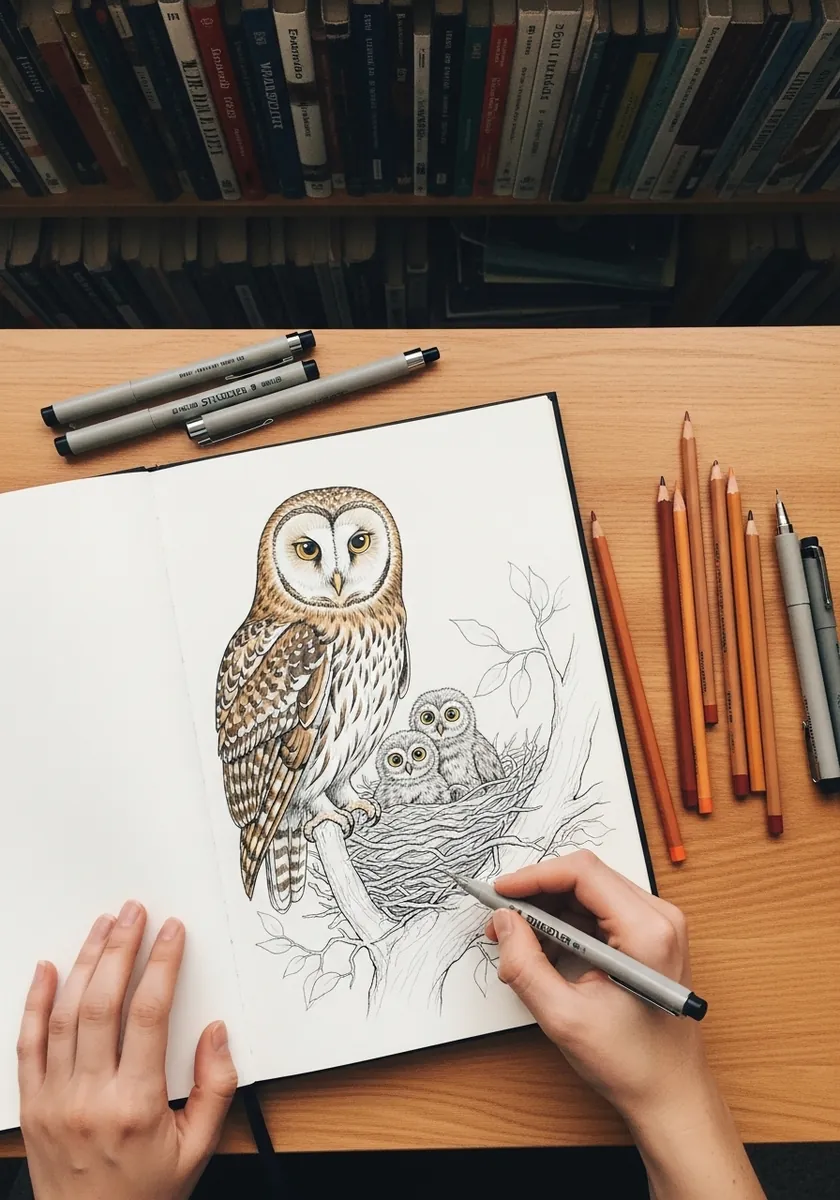
Owlets are mostly down, which behaves nothing like adult feathers, so draw the parent’s wing coverts as ordered overlapping rows and render the young as soft irregular clumps with broken edges. That difference in texture tells the entire story on its own.
24. Fireflies at Dusk in Soft Pastel
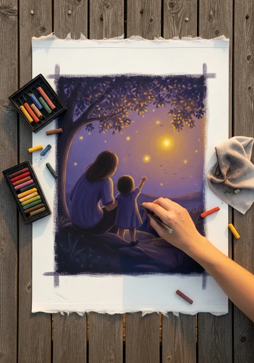
Small glowing points need halos to read as light. Place each firefly as a tiny bright core with a soft blended ring around it. Vary their sizes so a few feel much nearer than the rest, and keep both figures almost entirely in silhouette against the sky.
25. Purple Twilight With Fireflies
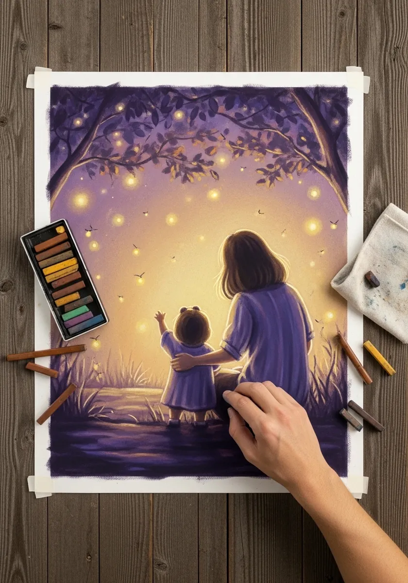
A limited twilight palette works through temperature rather than hue. Push the sky violet, the ground deeper violet, and let only the fireflies and the horizon carry warm gold. Two hues, correctly placed, are enough for an entire scene. Let the ground plane stay darkest of all, since the eye should travel upward toward the light.
26. Wildflower Meadow in Watercolor
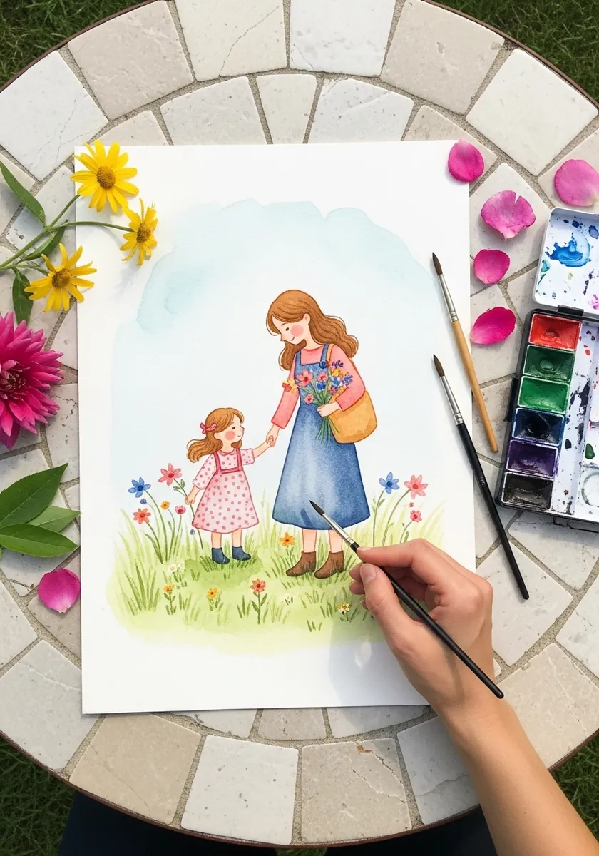
Meadow flowers are painted as three layers of depth. Dab the furthest as soft dots, the middle as simple shapes, and only the nearest few as recognizable blooms. Detailing them evenly flattens the field completely. Keep the flowers nearest the figures sparse, so nothing crowds the point where the hands join.
27. Garden Portrait With Flowers
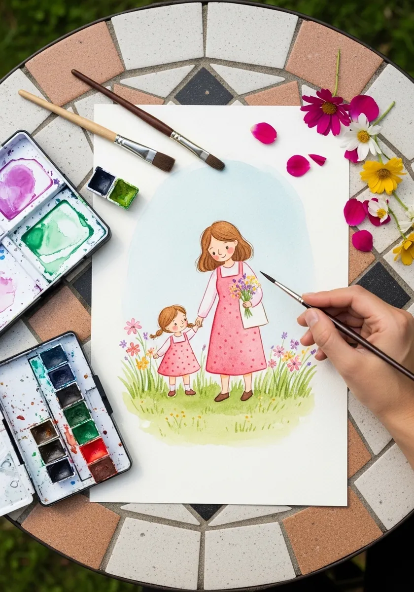
Two figures standing side by side need a reason to connect. Let the flowers pass between them, with one hand giving and one receiving, so the bouquet physically bridges the gap. Otherwise they read as two portraits sharing a page.
28. Paper Boats in the Rain
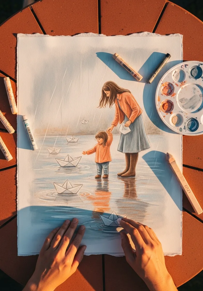
Wet ground reflects everything above it in a compressed, broken form. Mirror the figures downward, shorten the reflection, and break it with horizontal ripple lines. Reflections drawn at full length always look like a second scene. Keep the boats small and pale, because a large one immediately looks like a toy rather than paper.
29. Dancing Figures in Warm Acrylic
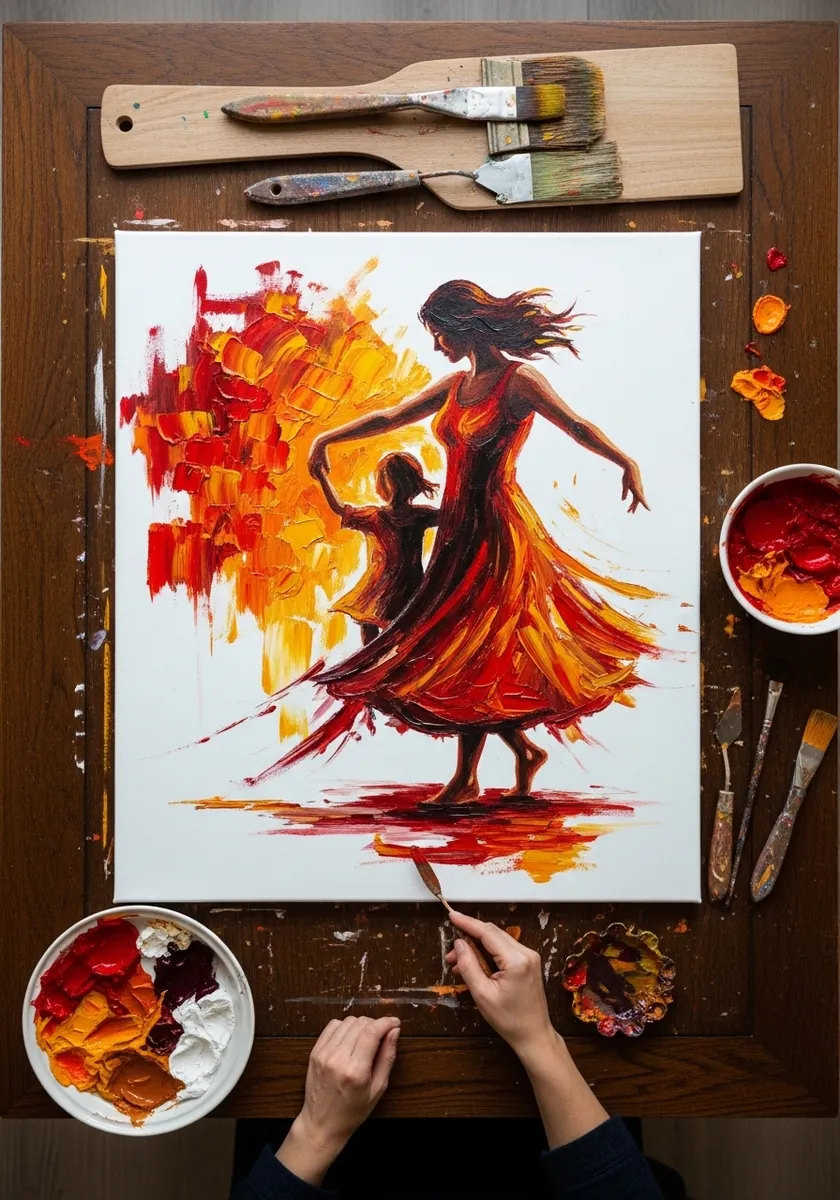
Movement lives in the line of action, so run one long curve from the raised hand through the spine and out to the trailing foot, then let the skirt and hair follow it exactly. Paint laid along that curve rather than across it doubles the effect.
30. Swirling Skirt in Red
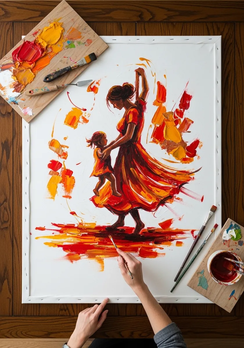
A spinning skirt is a cone flaring outward, not a flat shape. Give the hem a genuine ellipse, let it lift higher on the leading side, and paint the fabric folds radiating from the waist. Symmetrical skirts always read as standing still.
31. Elephant and Calf in Graphite
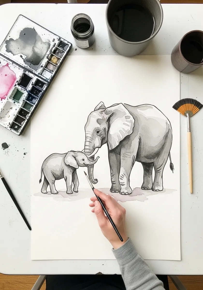
Elephant skin is a system of deep creases that follow the underlying form. Run them around the leg like contour lines and across the trunk in rings, then leave the calf’s skin far smoother. Age difference shows in texture as much as size.
32. Lettering Page With a Teaching Scene
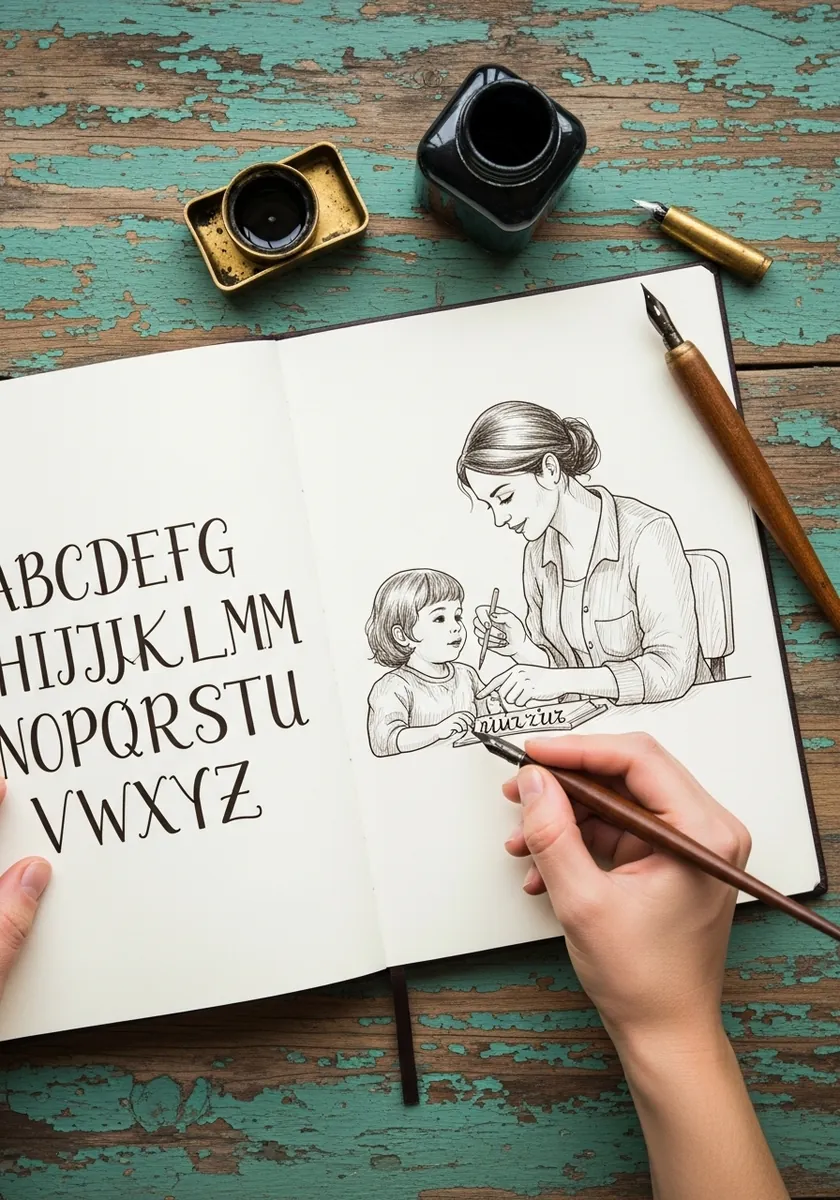
Combining lettering and figures on one spread needs a shared line weight. Ink both with the same nib, rule guidelines for the letters, and let the drawing spill slightly across the gutter. Matching weight is what makes the page cohere.
33. Newborn in Colored Pencil
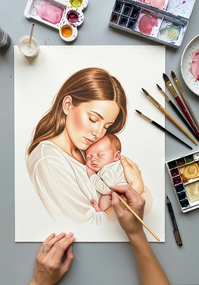
A newborn head is about a quarter of the whole body length, which feels wrong until you measure it. Keep the limbs short and softly creased. Leave the fingers barely defined, and curl the whole body inward, because straight limbs instantly age the child.
34. Teaching to Ride in Ink
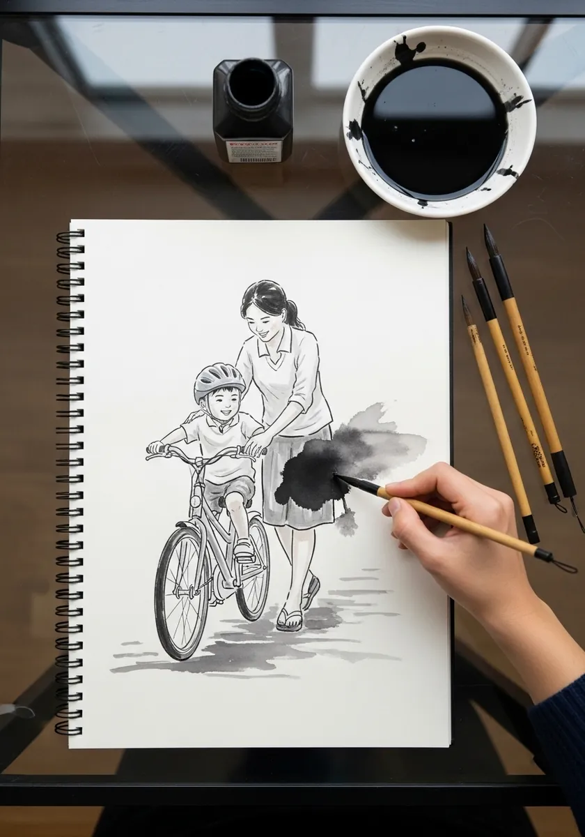
This pose is all about the supporting hand. Show the adult’s grip actually pressing into the saddle or the shoulder, bend her back forward, and tilt the bicycle slightly off vertical. A level bicycle removes all the tension from the scene.
35. Running Alongside the Bicycle
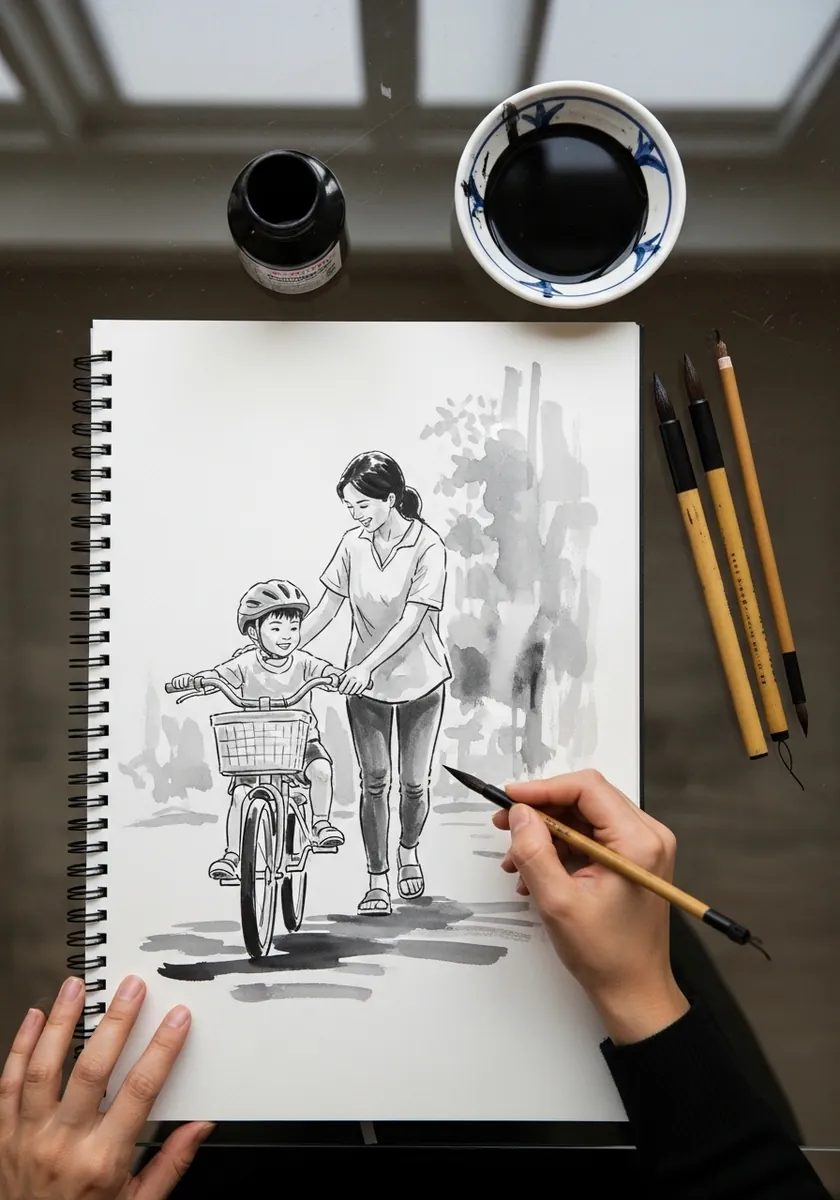
Running figures need both feet off the ground at some point in the stride. Lift the rear heel, extend the front leg, and lean the whole torso forward past the supporting foot. Two flat feet always read as walking. Let the adult trail slightly behind the frame, which is where a parent actually runs in this moment.
36. Sunflowers in Loose Watercolor
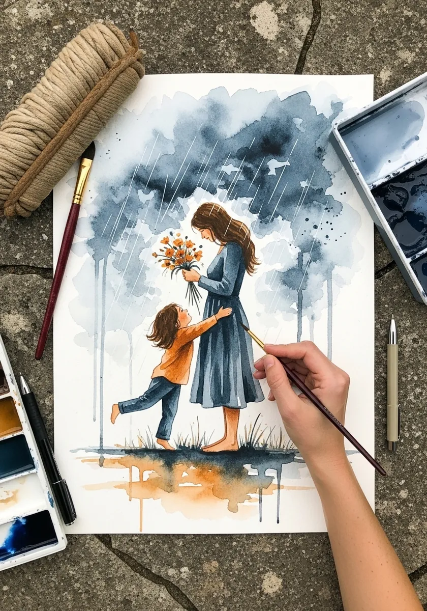
A reaching gesture needs a clear diagonal. Run the child’s arm and the adult’s arm along the same implied line, ending at the flowers, and let the composition tilt slightly to follow. Vertical arms make the gesture look static. Sunflower heads are heavy, so let every stem bend a little under the weight it carries.
37. Farmers Market in Gouache
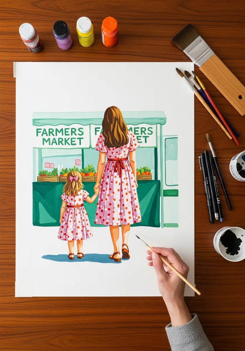
Backs of figures rely entirely on silhouette and clothing. Give each a distinct dress shape, let their hands join between them, and vary the shoulder heights. The stall behind should stay flat and graphic so the pair stays readable. Keep the produce colors muted so the two figures remain the most saturated shapes on the page.
38. Planting a Tree in Fine Ink
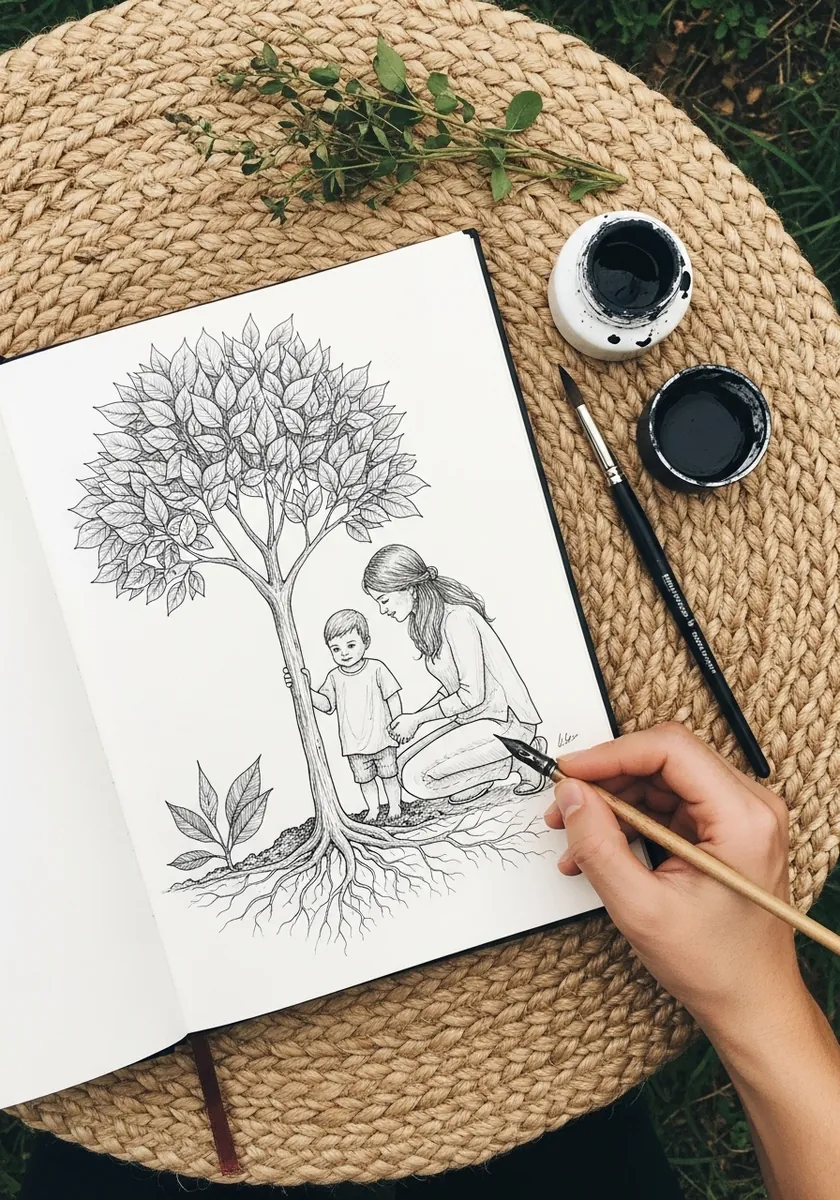
Showing roots below ground is a symbolic device that needs its own logic. Draw a clear soil line, keep the roots as a mirrored spread of the branches above, and hatch the underground area lightly so it stays secondary. Show loose soil crumbling at the hole edge, which is a small detail that makes the act look real.
39. Folk Miniature With a Border
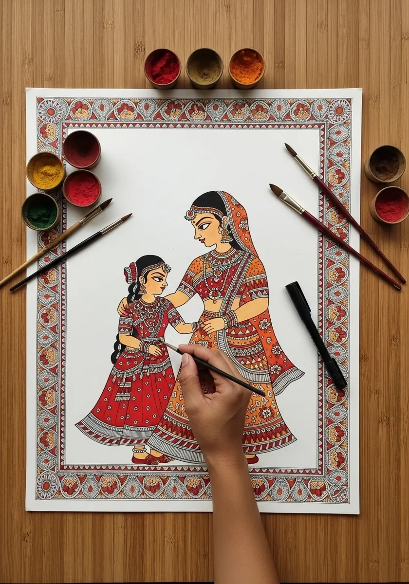
Miniature traditions use flat color, strong outline and no cast shadows at all. Keep the figures in profile or three-quarter view, fill the clothing with fine repeated pattern, and let the border be as detailed as the scene it frames.
40. Window Light in Gouache
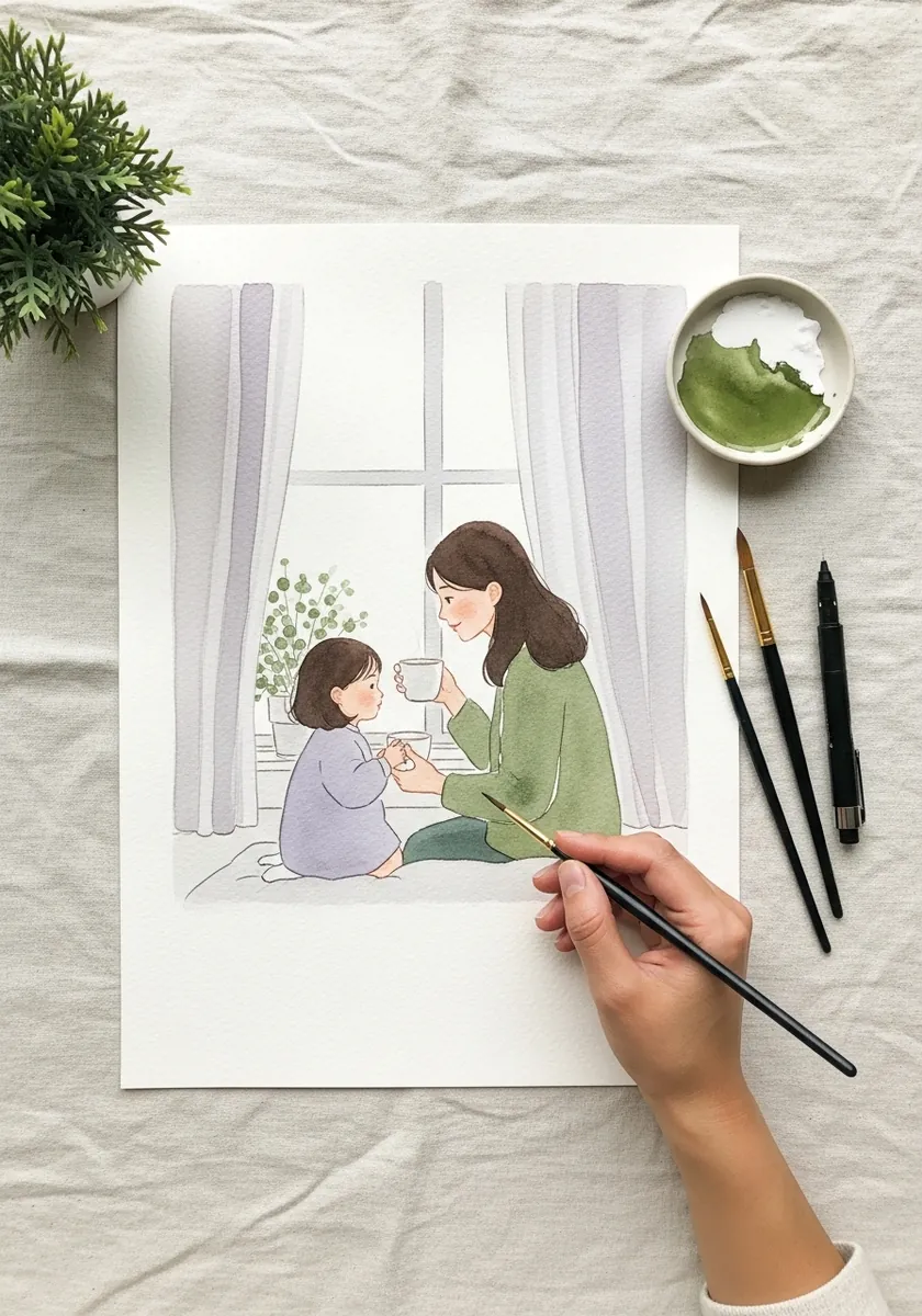
Window light is directional and falls off across the room. Keep the side nearest the glass brightest, cool the shadows toward blue, and let the far side of the room drop several values. A single light source makes an interior believable.
41. Two Adult Women in Graphite
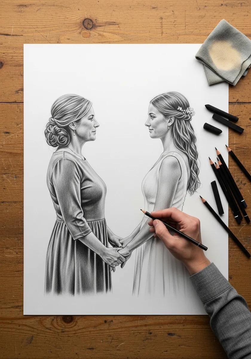
Drawing an adult child changes the whole approach, because both figures now share the same head-count proportion, so the relationship has to come from posture, gesture and family resemblance instead. Matching bone structure sells it far more than matching features.
42. Cherry Blossom Sumi-e

Brush painting places its subject off center and leaves the rest empty. Run the blossom branch in from one corner, set the figures low and small, and let two thirds of the paper stay blank. The red seal is the only warm note.
43. Painting Together in a Frame
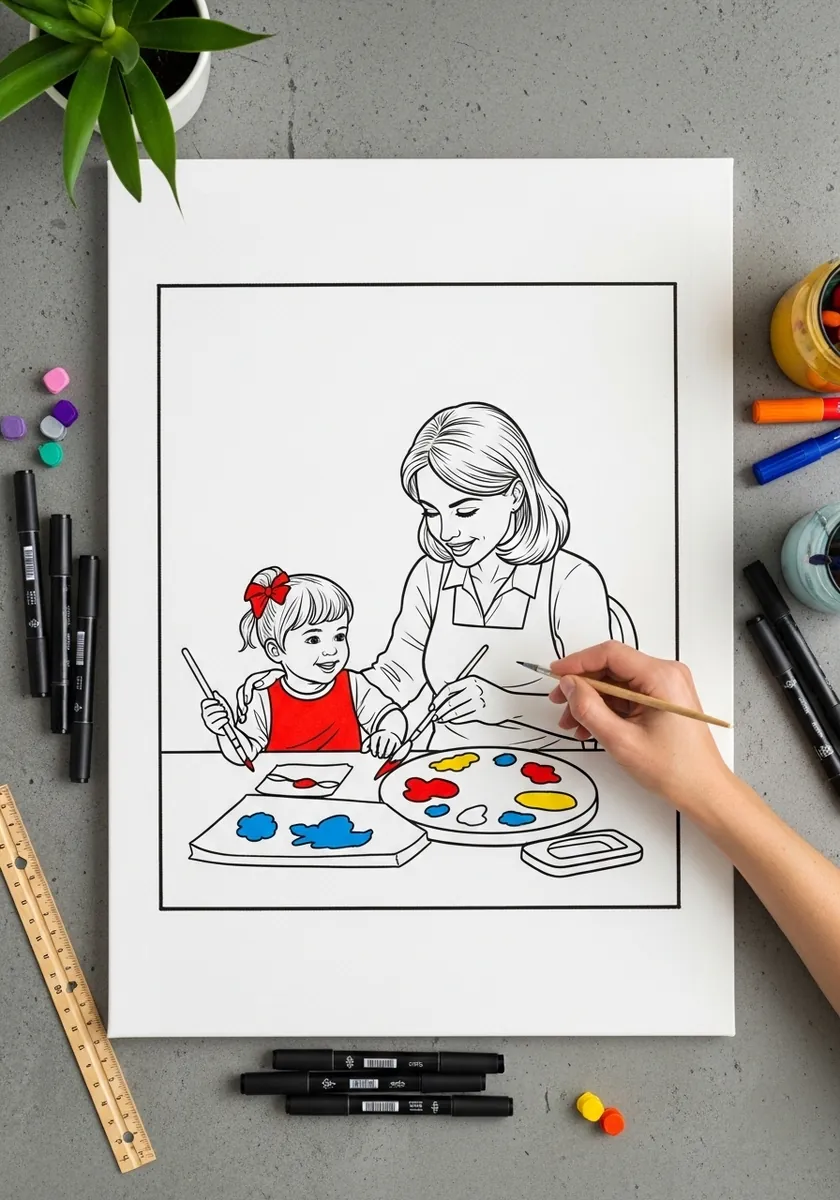
A drawn frame inside the page is a strong device. Rule the border first and treat it as a hard container, then let one element, an elbow or a brush, cross the line. That single break stops the frame feeling like a sticker.
44. Sepia Photographs Study
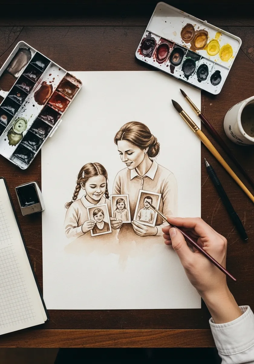
A picture within a picture needs to be clearly lower in contrast. Render the photographs softly with reduced darks, keep their frames simple, and save your sharpest edges for the two faces looking at them. Depth comes from that hierarchy.
45. Forest Walk in Fine Liner
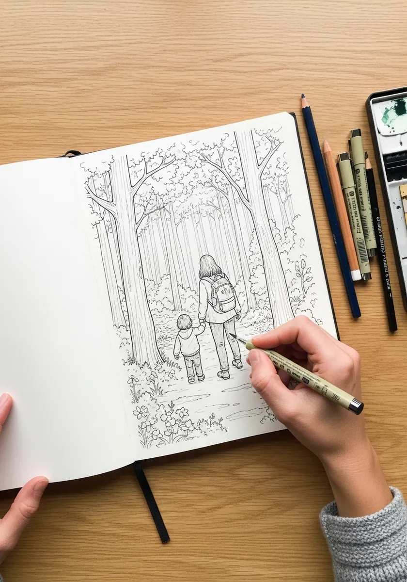
Dense foliage is built from three densities rather than individual leaves. Pack the linework tightly in the shadows, moderately in the mid-ground and barely at all near the figures. That clearing around them is what keeps them visible. Let one or two branches cross in front of the figures, which pushes them convincingly into the wood.
46. Charcoal Cradle on Black
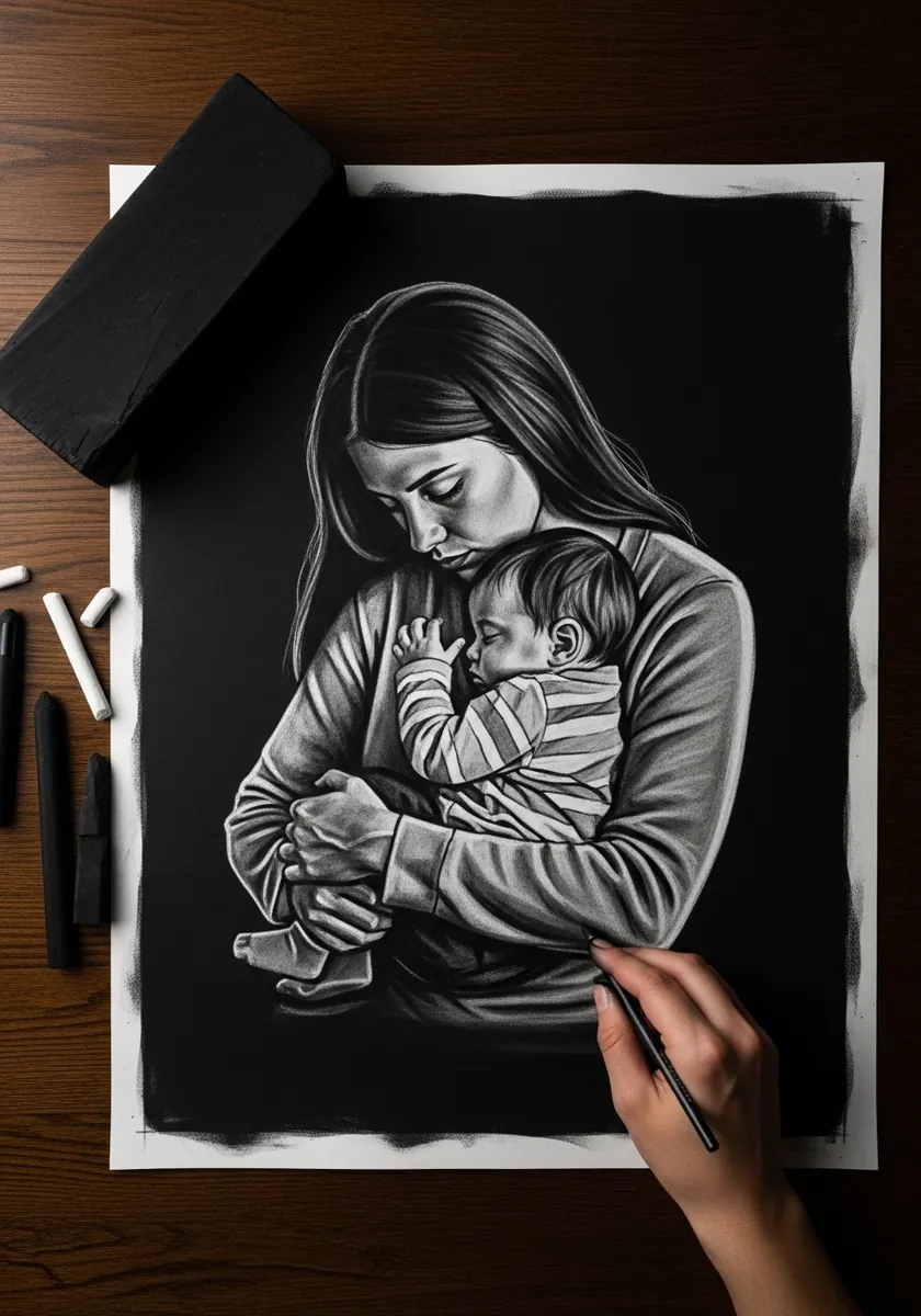
A full black ground turns the drawing into pure light. Establish where the light falls first, render only those passages, and let everything else disappear entirely. Resist the urge to define the far shoulder or the background. A single lifted highlight on the baby’s cheek is usually the brightest note the drawing needs.
47. Lion and Cub Portrait
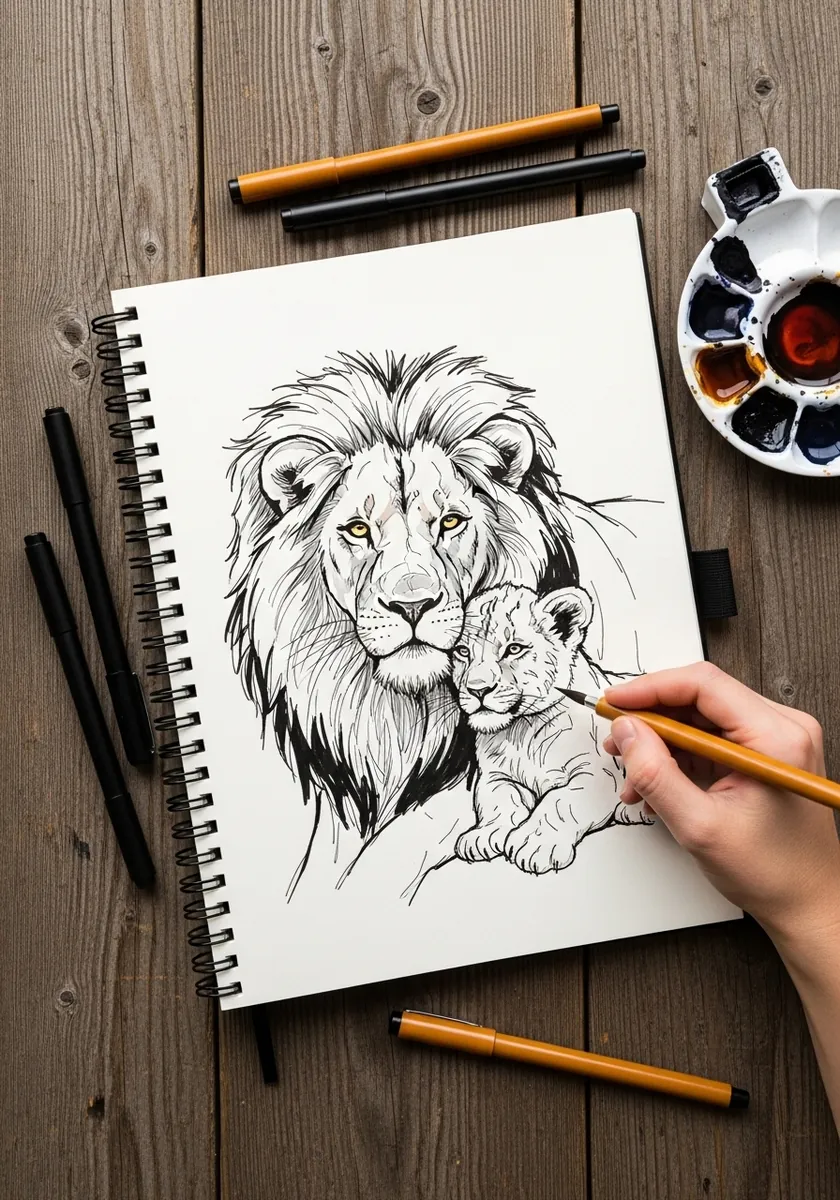
A mane is a mass with direction, not a collection of strands. Establish its overall silhouette first. Work the strokes radiating outward from the face afterward, and keep the cub’s coat flat by comparison. That contrast is what makes both animals read clearly.
48. Fireside Watercolor Scene
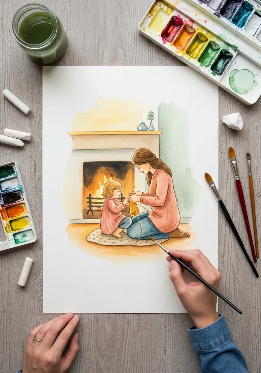
A quiet interior benefits from a limited palette. Keep the whole room in warm neutrals and reserve the only saturated color for the fire itself, letting it tint everything nearby. Restraint here reads as calm rather than as underpainting. Let the firelight tint the nearest wall slightly, so the glow belongs to the room and not just the hearth.
49. Sleeping Newborn in Colored Pencil
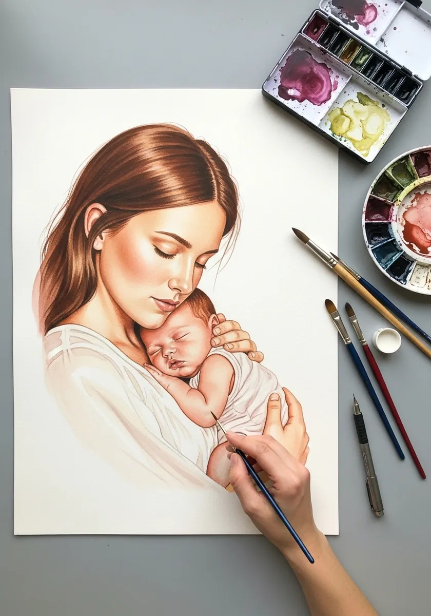
Sleeping faces are defined by relaxed weight. Let the cheek flatten slightly where it presses, drop the mouth open a fraction, and keep every lid curve soft. Tension anywhere in the face breaks the impression of sleep immediately. Keep the hands loosely open, since a sleeping infant rarely holds anything in a closed fist.
50. Market Walk in Flat Gouache
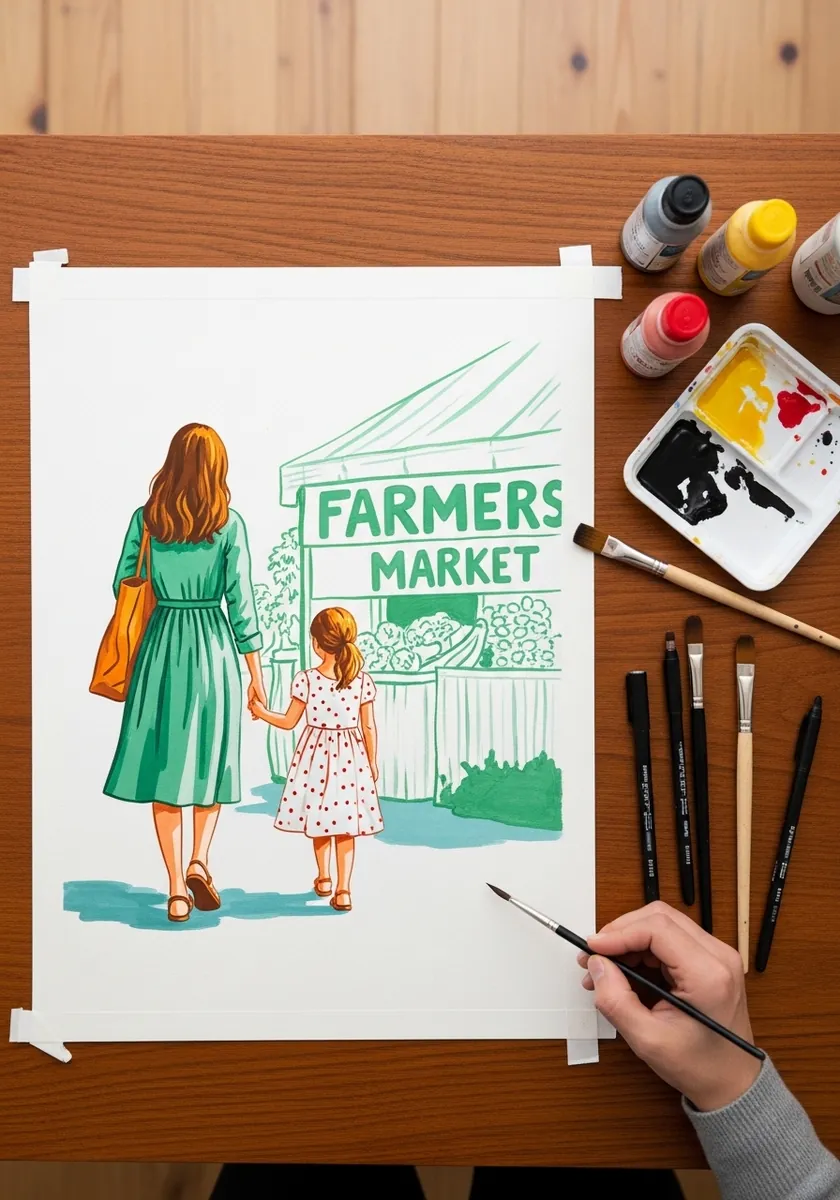
Two figures walking need their strides offset. Put one at full extension and the other mid-step, and let their joined hands sit between them at a comfortable height for the child rather than for the adult. That detail alone reads as real.
Frequently Asked Questions
How do you draw a mother and child in correct proportion?
Count heads. An adult stands roughly seven and a half of their own heads tall, a young child around five, and an infant only four. Because of that, a child’s head is far larger relative to their body, and shrinking it is what makes drawn children look like small adults.
How do you make two figures look like they are really touching?
Let one deform the other. Hair presses flat under a hand, a sleeve bunches where an arm wraps, a shoulder compresses under a child’s weight. Contact drawn without any deformation always reads as two separate figures placed side by side.
How do you draw an emotional connection between two figures?
Establish the eye-line before anything else. Draw a light line from one face to the other and build both heads around it, tilting each so the gaze genuinely lands. Everything else, hands, posture and clothing, follows from that single relationship.
What is the easiest Mother’s Day drawing for a beginner?
Two figures seen from behind, walking or sitting. It removes faces entirely, which is where most beginners lose control, while keeping the silhouette, the height difference and the connection between them fully readable.
Is Mother’s Day on the same date everywhere?
No. Much of the world including the United States and India marks it on the second Sunday in May, while the United Kingdom and Ireland observe Mothering Sunday during Lent, and many other countries use entirely different dates.
References and Further Reading