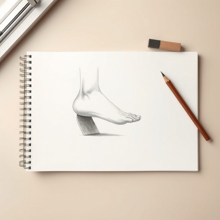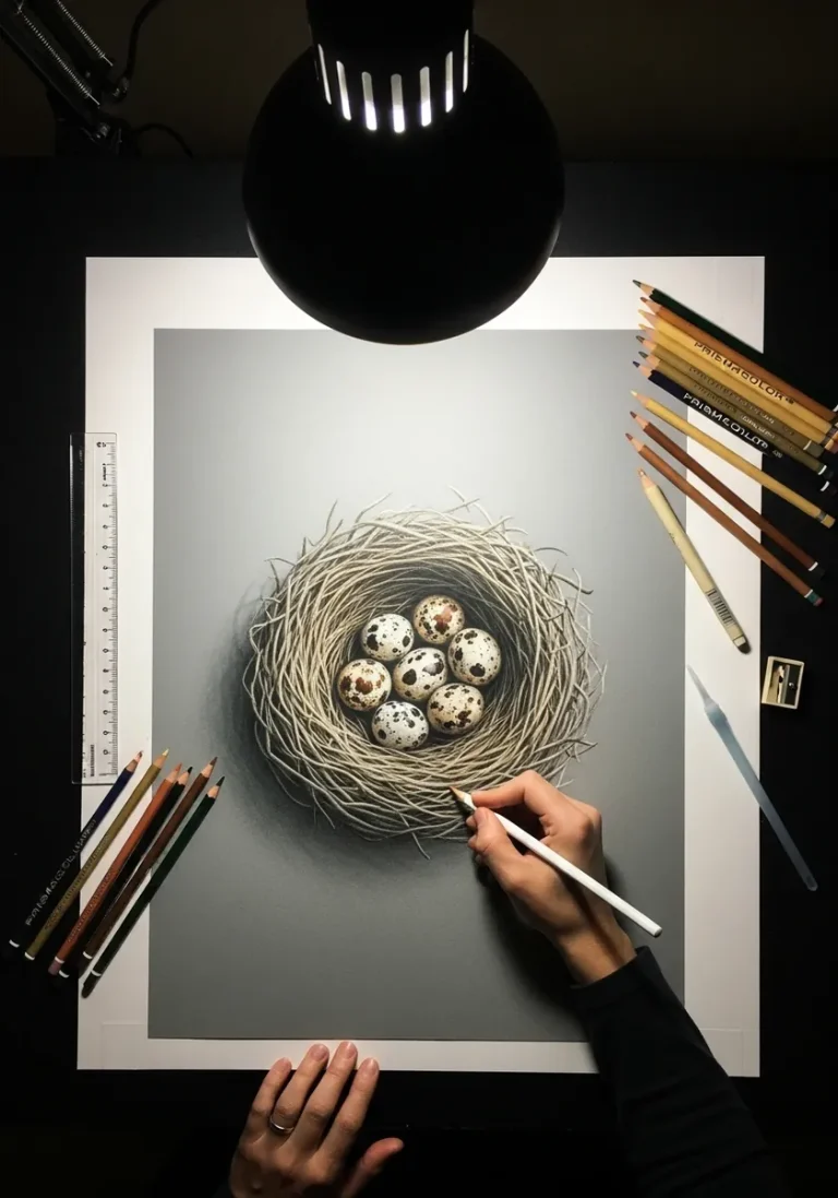
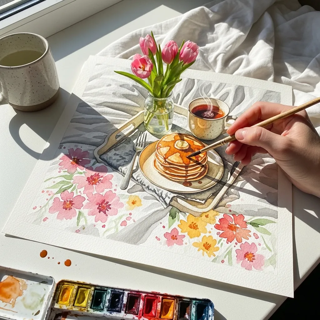
A breakfast tray is a still life built from ellipses. Every cup, plate and glass rim shares the same viewing angle, so they all open by the same amount, and the minor axis of each ellipse stays vertical.
Key takeaways
- Every rim on the tray is an ellipse, and objects further below your eye level open rounder.
- All ellipses in one drawing must share the same degree of opening, since they share one viewpoint.
- The minor axis of an upright cup's ellipse stays vertical wherever it sits on the page.
- Draw the tray as a rectangle in perspective first, then seat every object on that plane.
- The US holiday began with Anna Jarvis and was first observed in 1908, becoming national in 1914.
A breakfast tray is a still life, and still life lives or dies on ellipses. Every cup, plate, bowl and glass rim on that tray shares a single viewpoint, so they all have to open by the same amount, with the minor axis of each upright rim staying vertical. Disagree on that and everything looks tipped.
Build in the right order. Draw the tray as a rectangle in perspective first, then seat each object’s base ellipse on that plane, and only afterward worry about pancakes, petals and steam. A tray drawn last never quite fits under what is already on it.
The holiday itself has a specific origin. Anna Jarvis organized the first American observance in 1908, and it became national in 1914, though she later campaigned against how commercial it had become. For the flowers these trays nearly always carry, watercolor flower studies are the natural companion.
The forty pieces below run through graphite, gouache, sumi-e, ballpoint, oil pastel on black and children’s crayon. If you want more food subjects handled the same way, try watercolor food drawing, and graphite shading practice covers the china and metal passages.
Compiled by the GS Art Zone editorial team. Last updated August 2026. Each idea is paired with the specific step that produces the effect, so you can go from the reference straight to paper.
What You Need Before You Start
- An ellipse guide or a steady hand, because rims are where this subject succeeds or fails
- A warm gray and a cool gray, enough to render white china convincingly on white paper
- One saturated red or pink for the flowers, which are usually the only strong color present
- A kneaded eraser for lifting the highlight along a cup rim or a glass edge
- Toned kraft or black paper for the low-light and candlelit pieces further down
1. Watercolor Tray With Tulips and Pancakes
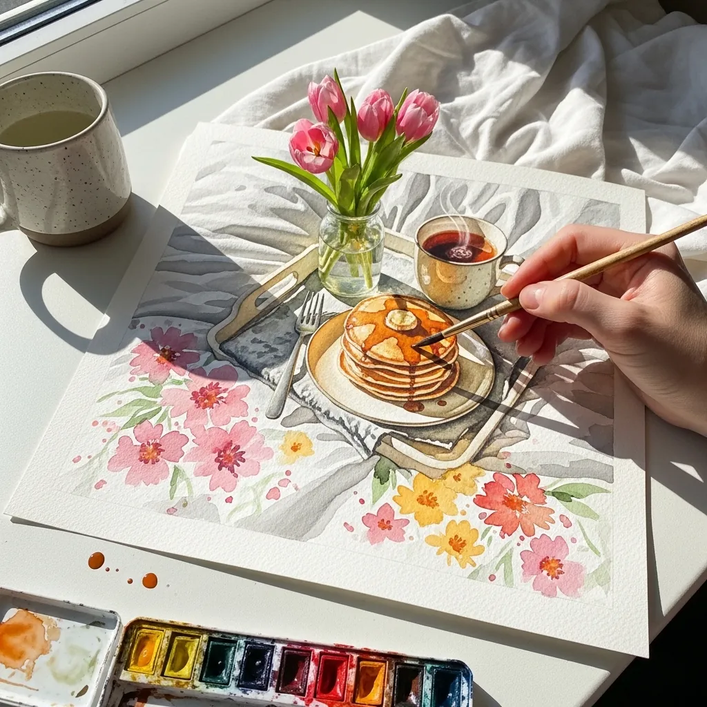
A painted floral border around a scene needs to stay lighter than the subject. Keep the flowers loose and pale at the page edges, then bring full saturation only to the tray itself. The border should frame without ever competing for attention.
2. Pencil Line Study of a Bed Tray
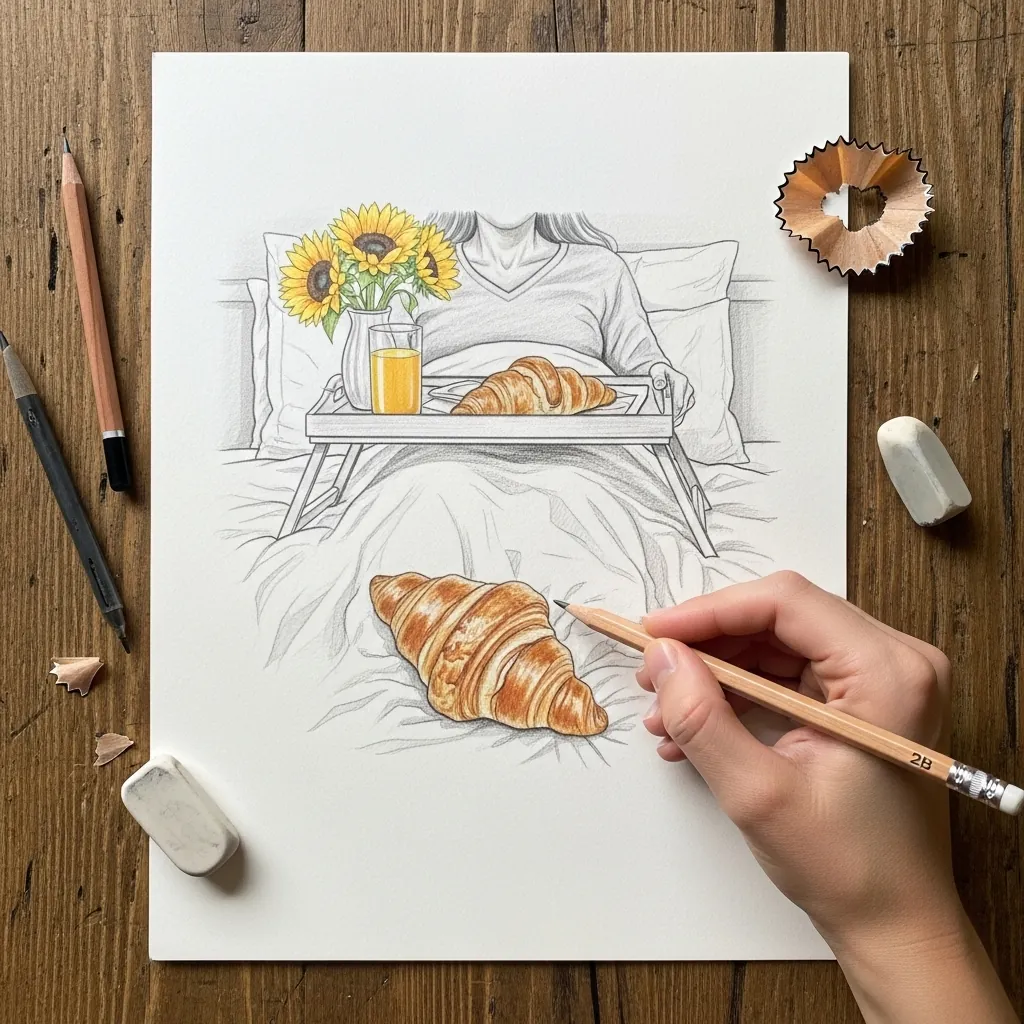
Pure outline exposes every ellipse error, which makes it excellent practice. Draw each rim as a full ellipse, including the half hidden behind the object, then erase what should not be visible. Guessing at the hidden half is where rims go wrong.
3. Colored Pencil Tray With a Rose
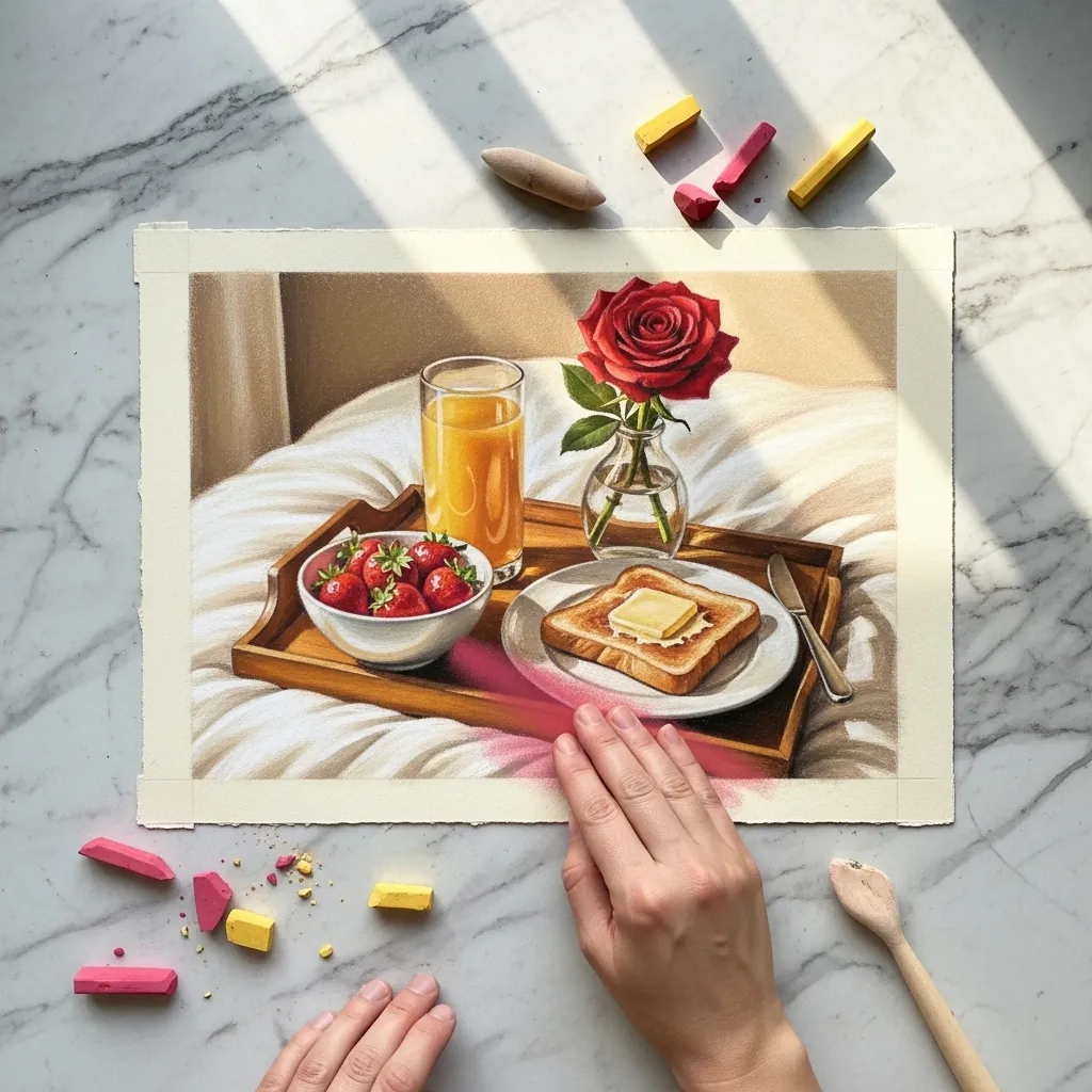
One tall element breaks a run of low objects. Put the rose in a slim bottle at the back and let it rise well above everything else, then keep the food arranged low and overlapping. That vertical is what stops the composition reading as a flat row.
4. Ink Tray With Fried Eggs and Toast
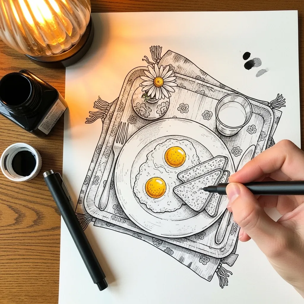
Pattern on a tray must sit in perspective with it. Let the decorative border compress toward the far edge exactly as the tray does, and keep the motifs noticeably smaller back there. Motifs drawn at one uniform size cancel out the depth you just built.
5. Gouache Tray With a Berry Smoothie
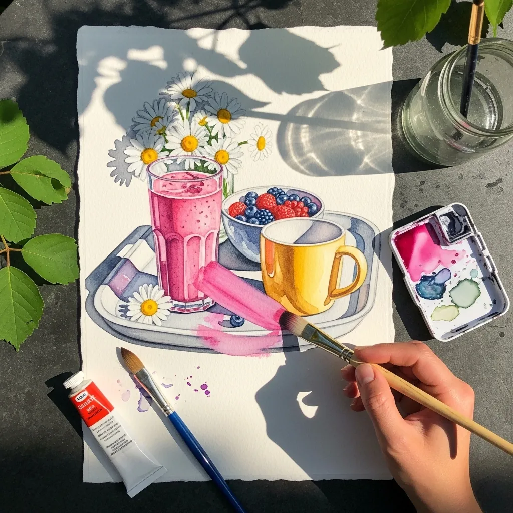
Flat gouache makes color relationships obvious. Choose three main hues before you start, here pink, yellow and white, and let everything else stay neutral. Opaque paint also lets you place the daisy petals last, directly over a dried background, which saves a lot of masking.
6. Charcoal Tray in a Dark Bedroom
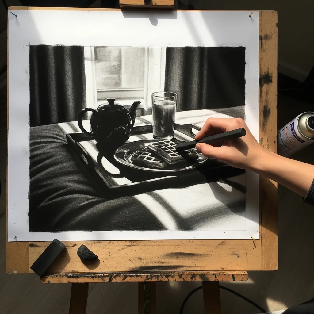
A bright window behind a dark subject sets the whole value scheme. Keep the window pure paper white, drop the tray and teapot to near silhouette, and let only their top edges catch light. Everything in between stays a compressed mid-gray.
7. Marker Peony With Macarons
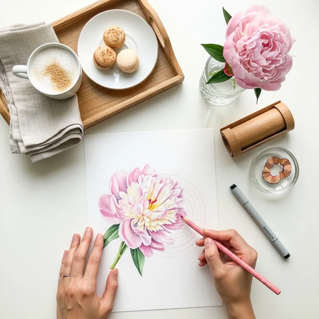
A peony is built in rings rather than individual petals. Work outward from a tight cluster at the center, letting each ring of petals get larger and looser, and keep the outer edge irregular. Macarons stay simple by contrast, as two flat discs with a filling.
8. French Press on a Floral Cloth
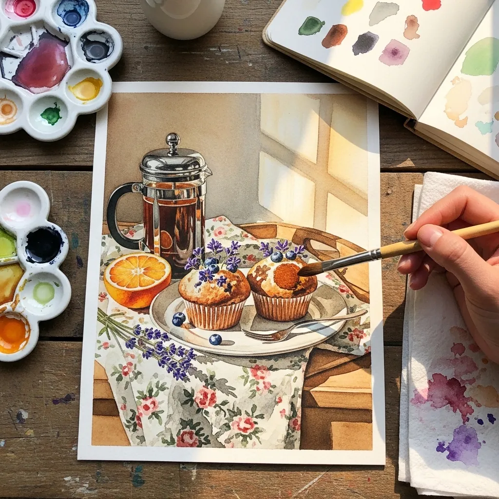
Patterned cloth under a still life is a value trap. Keep the fabric print low in contrast, almost tinted rather than drawn, so the objects on top stay clearly separate. Glass and chrome on the press then read as the sharpest things present.
9. Heart Pancake in Graphite
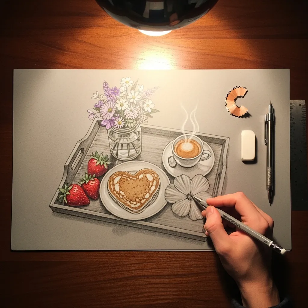
Graphite food needs texture differences to convince the eye. Give the pancake a slightly stippled surface, the coffee a smooth reflective one, and the strawberries fine pitted marks all over. Same value, different mark-making, and each material becomes instantly readable.
10. Candlelit Tray in Deep Red
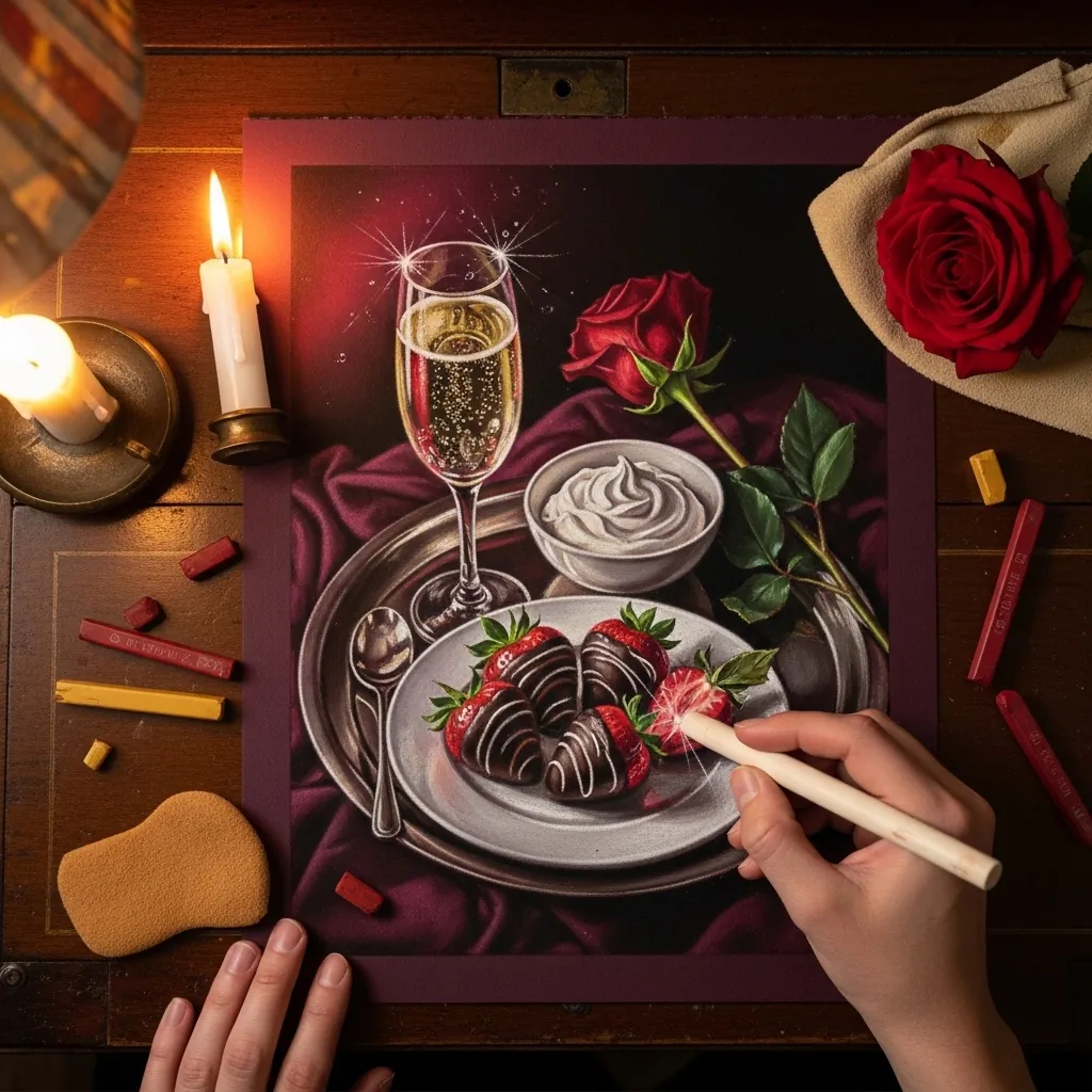
Candlelight is warm, weak and falls off fast. Keep the light pool small and centered on the glass. Let everything two hand-widths away drop into near darkness, and warm every highlight toward orange. A cool highlight anywhere breaks the illusion instantly.
11. Minimal Sumi-e Teapot Tray
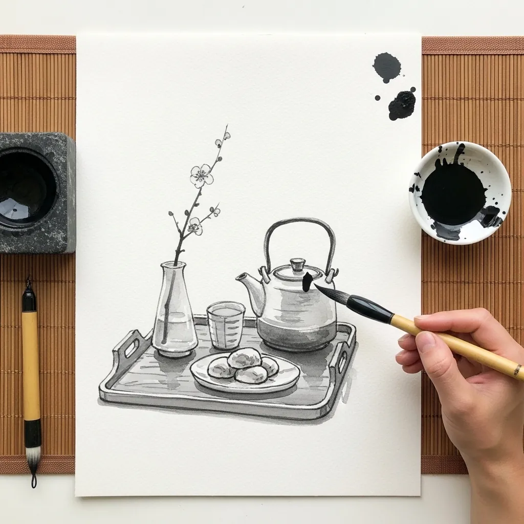
Brush painting rewards leaving things out. Establish the teapot in a few loaded strokes, suggest the tray with two lines, and let the rest of the paper stay empty. What you omit does as much work here as what you paint.
12. Gouache Waffles With Berries
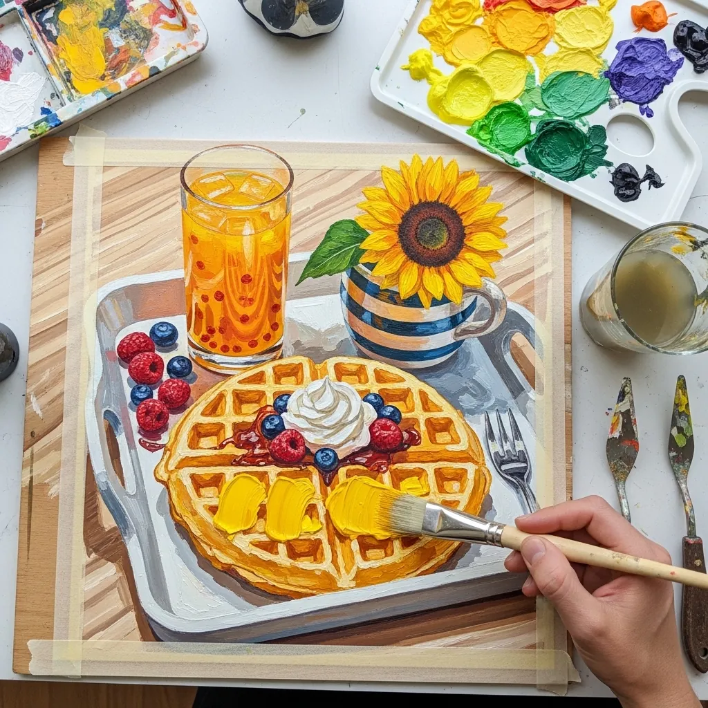
A waffle grid follows the surface curve, so the squares should compress toward the far edge and along the sides. Paint the base tone first, let it dry, then drop the shadow squares in as a second pass. Drawing the grid flat kills the form.
13. Oatmeal and Cocoa on Brown Paper
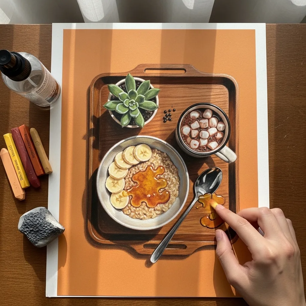
Kraft paper already gives you the mid tone for warm food. Work the highlights in white and cream and add only the deepest shadows in brown, leaving large areas of paper untouched. That restraint is what makes toned-ground work efficient.
14. Fine Ink Avocado Toast Tray
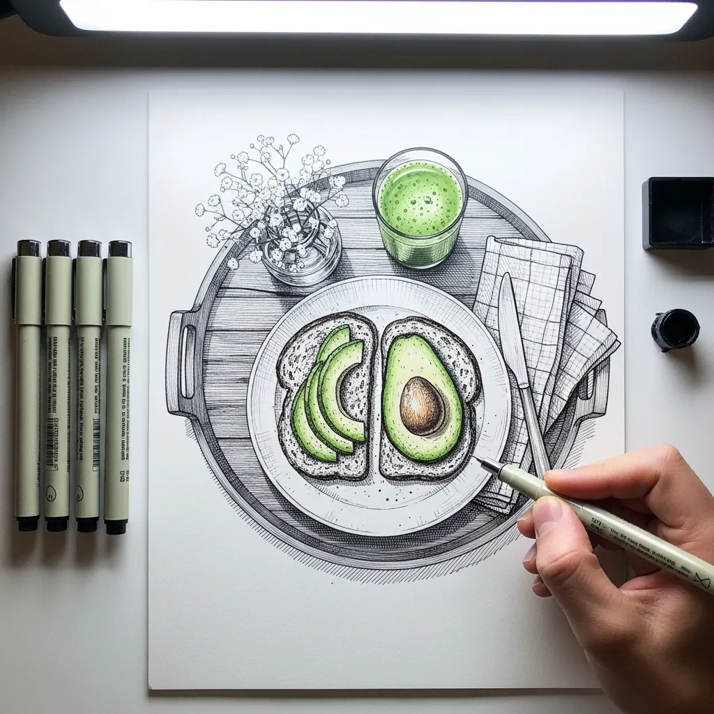
A round tray means one big ellipse governing everything else, so draw it first and get it genuinely right, since every plate and cup inside will echo its degree of opening. Hatching then follows each object’s own curve rather than the tray’s.
15. Wicker Tray With Teapot and Fruit
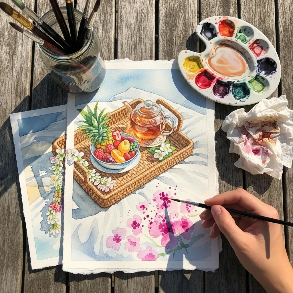
Woven texture is suggested rather than drawn thread by thread. Lay a flat base tone, then add short dark dashes in two crossing directions, denser at the tray edges where the weave turns. Detailing every strand flattens the whole object.
16. Graphite Tray With Lavender
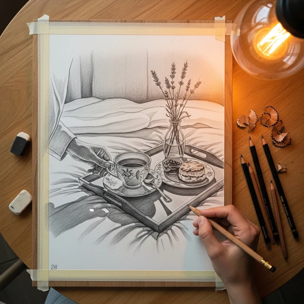
Bedding folds radiate from wherever pressure is applied. Find the point where the tray presses down. Fan the creases outward from there, keeping their edges soft throughout. Random parallel folds are the most common way this particular subject fails. Lavender stems stay stiff and vertical, which contrasts usefully with all that soft cloth.
17. Purple Tray With Waffles and Peonies
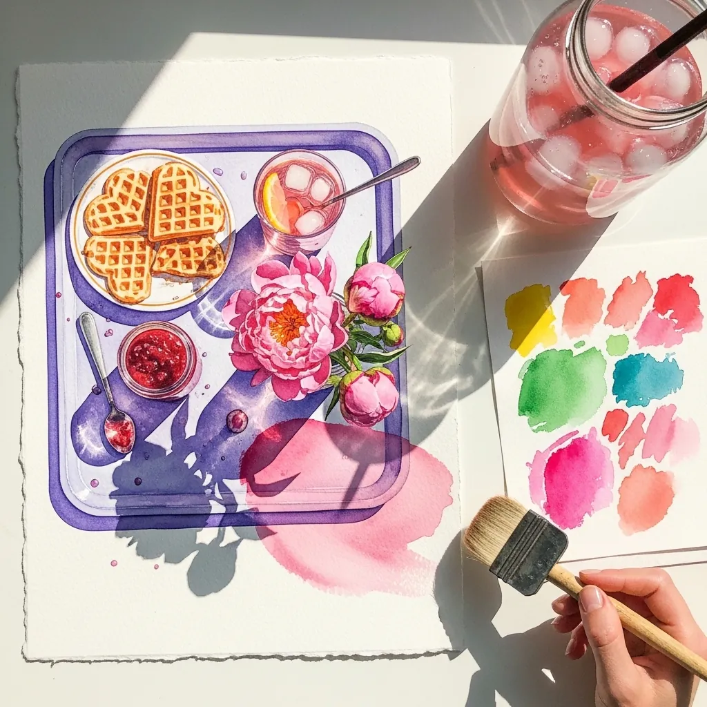
An unexpected tray color can carry the whole piece. Choose a hue that sits opposite the food on the wheel, here violet against warm waffles, and keep it slightly desaturated so the food stays the brightest passage on the page.
18. Pastel Tray on Dark Bedding
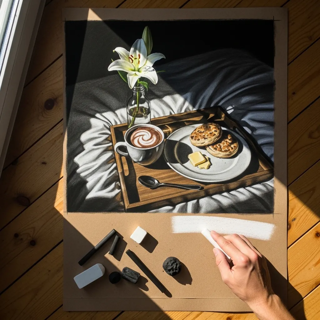
Dark ground with one white flower is a strong and simple structure. Build the bedding in low-contrast darks, then reserve your brightest pastel entirely for the lily and nothing else. A single bright note in a dark field always reads as luminous.
19. Teacup With Lemon Cake
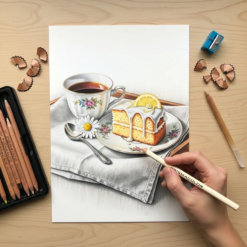
White china on white cloth is a study in tiny value shifts. Use warm gray for the cloth and cool gray for the porcelain so they separate by temperature rather than by darkness, and keep the cast shadows crisper under the china.
20. Oil Pastel Breakfast on Black
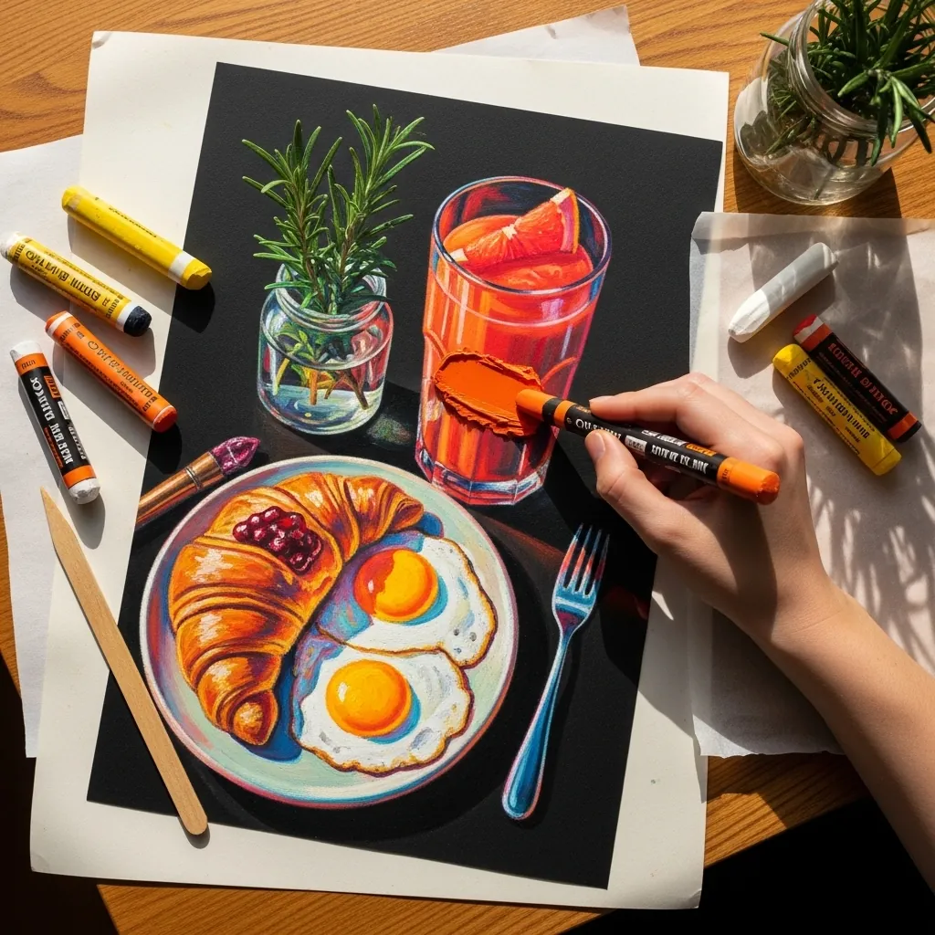
Oil pastel on black gives you saturated color with no mixing. Apply each hue thickly and separately, let the black show through at the object edges, and skip blending entirely. The unmixed quality is the point of working this way.
21. Wildflowers Beside a Real Bowl
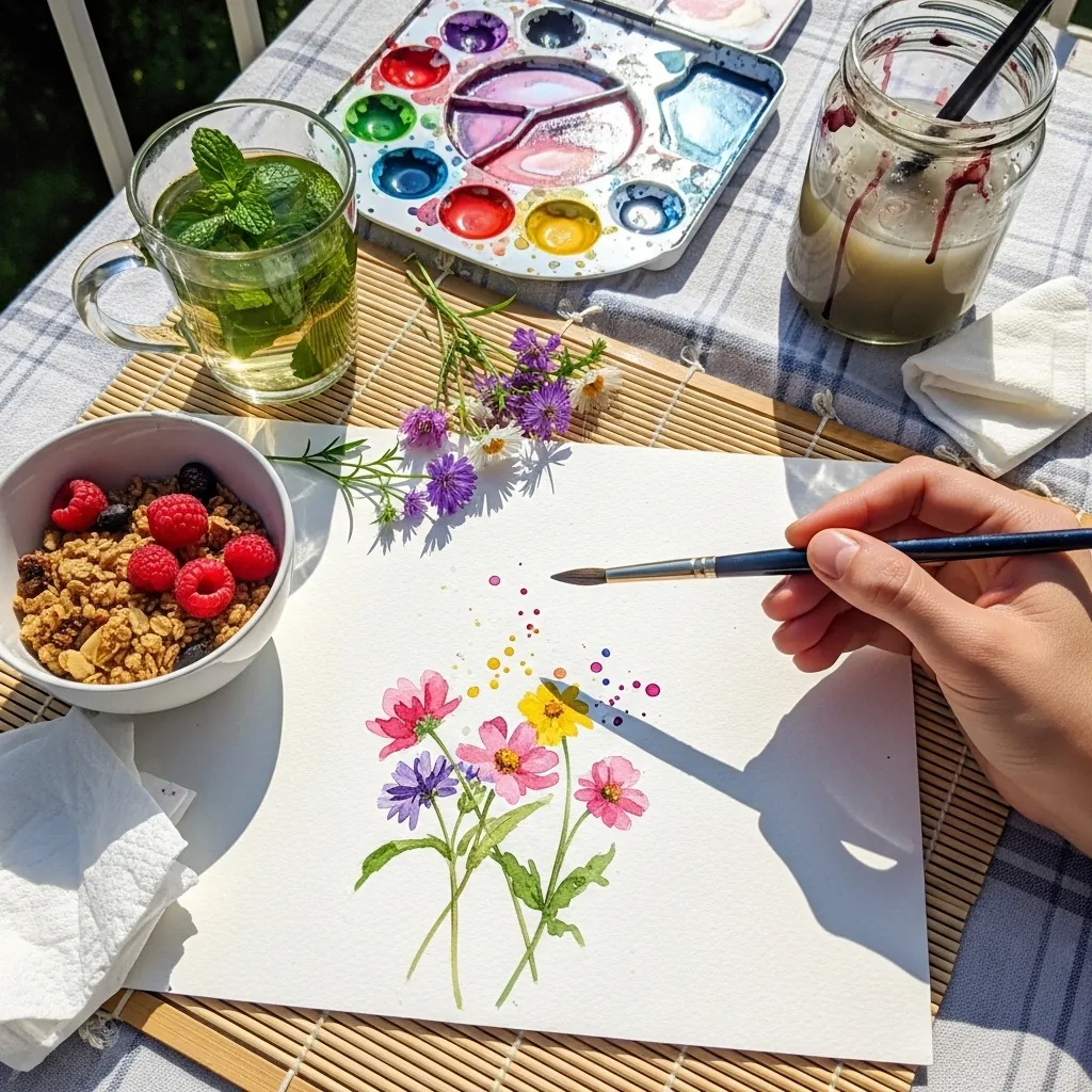
Painting alongside the real object keeps your color honest. Match the berry reds directly against the fruit in front of you rather than from memory. Check your greens the same way. Working from life corrects habits that reference photos quietly hide.
22. Ink Sketchbook French Press
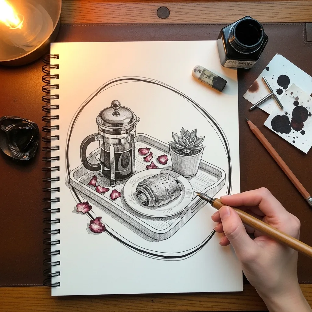
Sketchbook work benefits from visible searching, so let a few construction ellipses stay on the page, ink over them decisively and accept the ones that missed their mark. That layered quality reads as a working drawing rather than a finished illustration.
23. Flat Gouache Striped Tray
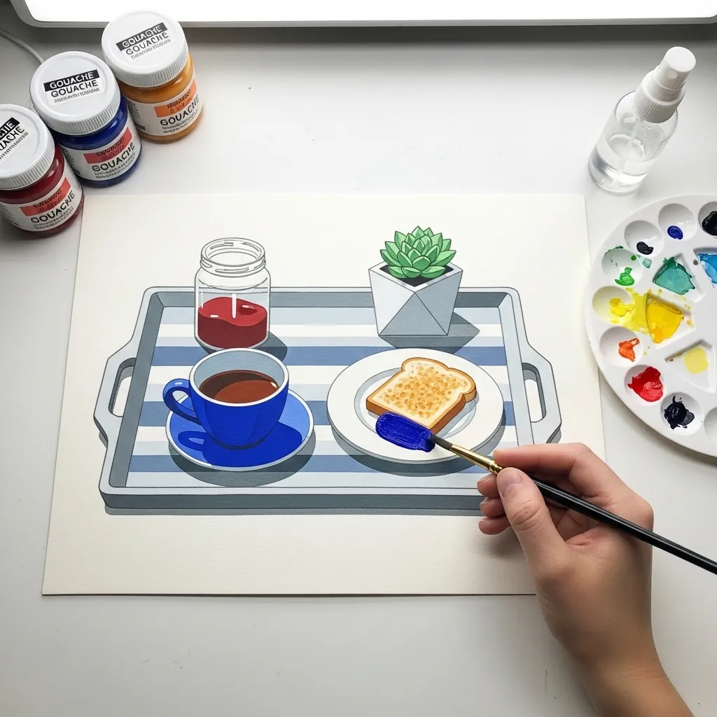
Flat color needs its shapes to overlap clearly. Cut every object as a clean silhouette, let the succulent overlap the mug, and use a slightly darker version of each color for the shadow rather than gray. No gradients anywhere. Stripes on the tray should also narrow toward the far edge rather than staying parallel.
24. Crayon Breakfast in Bed for Kids
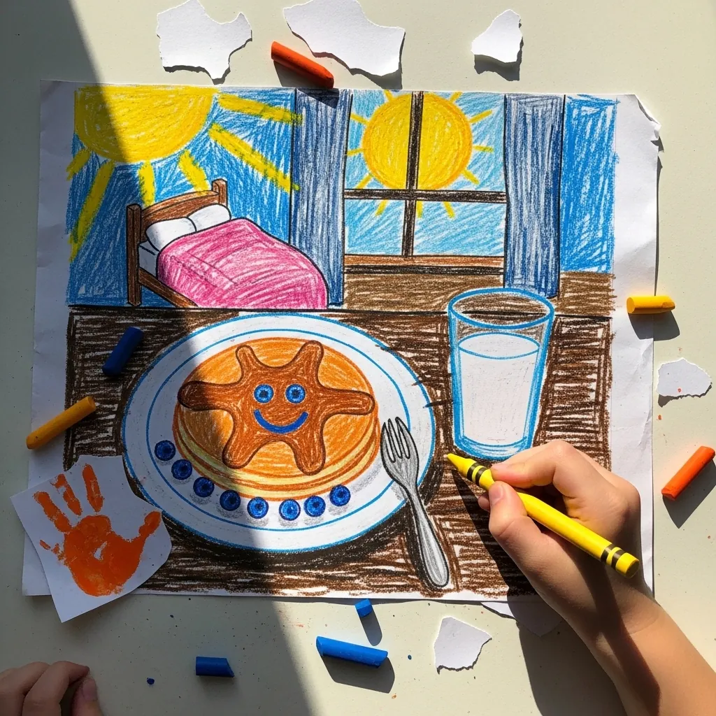
Drawing in a child’s style deliberately means abandoning perspective on purpose. Show the tray from above and the bed from the side in the same picture, press hard for saturated wax, and let the sun sit in the corner with rays. Charm comes from that inconsistency.
25. Teapot and Pancakes With Roses
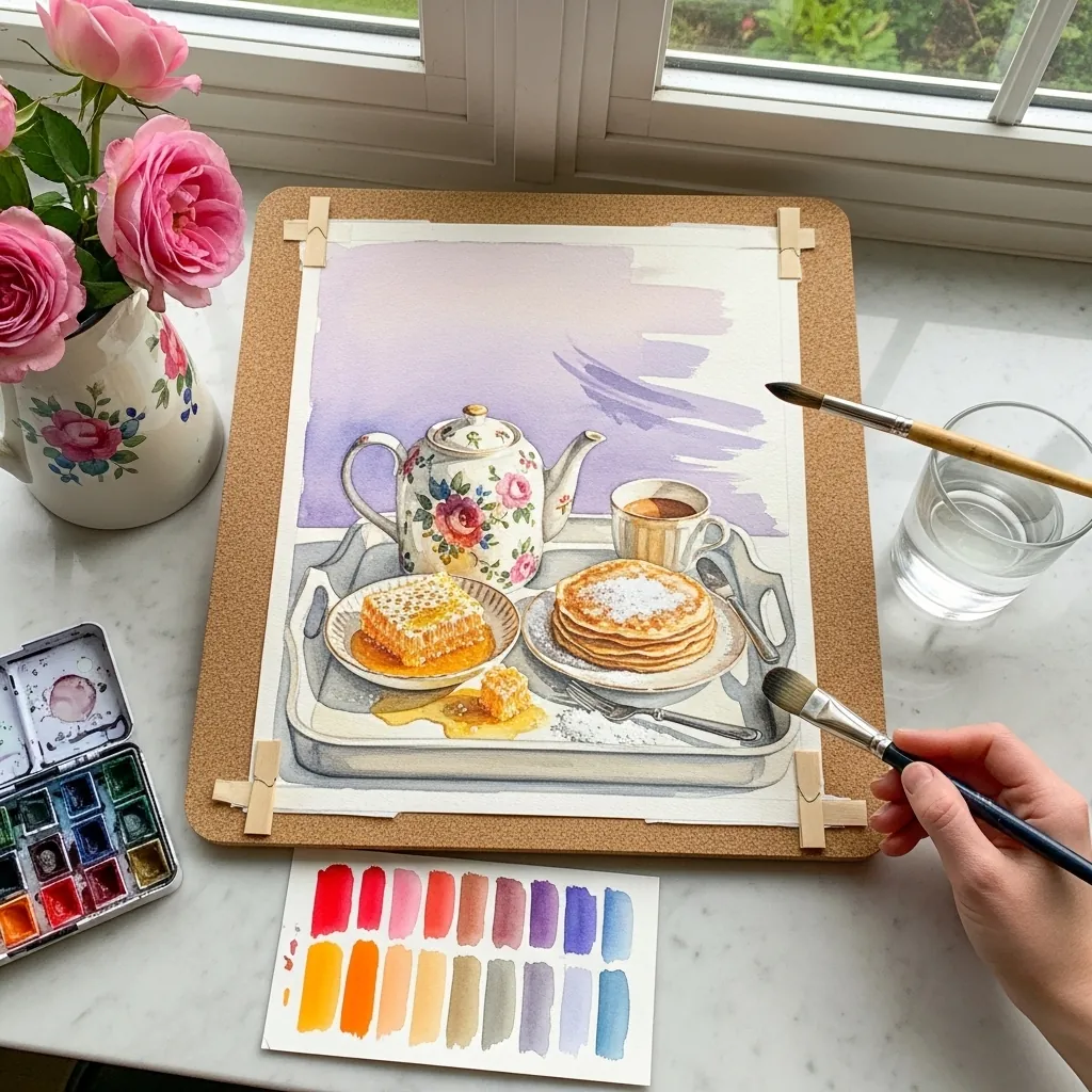
A stack of pancakes is a cylinder made of soft discs. Keep each layer’s ellipse consistent with the others, let the edges bulge slightly and irregularly, and add the syrup as one connected shape running over the side rather than as separate drips.
26. Graphite Portrait With a Mug
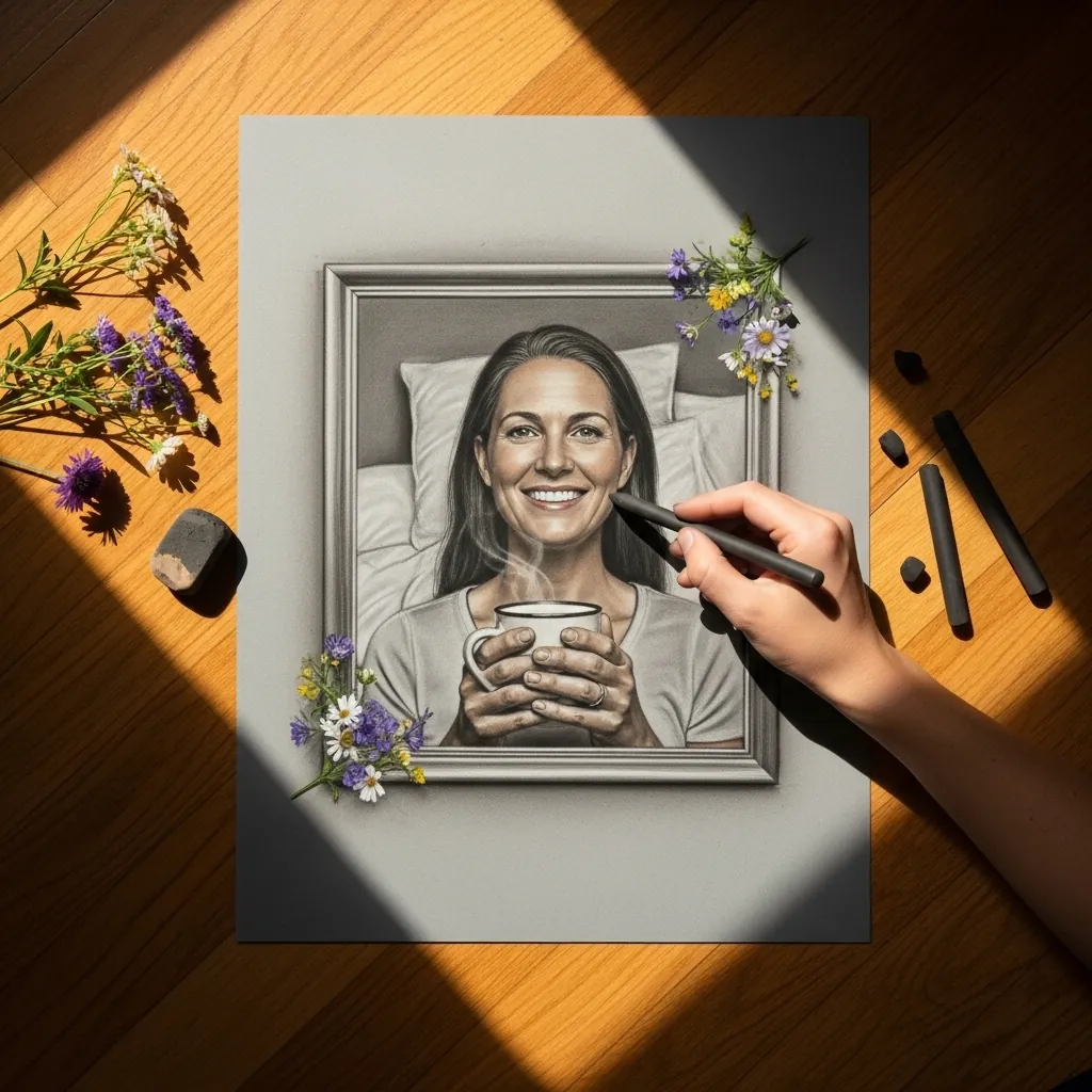
Adding a person changes the priorities completely. Render the face with the finest gradations you can manage. Keep the mug, bedding and background comparatively simple by contrast. Detail spent away from a face always pulls attention where you do not want it.
27. Botanical Wreath Around a Coffee Cup
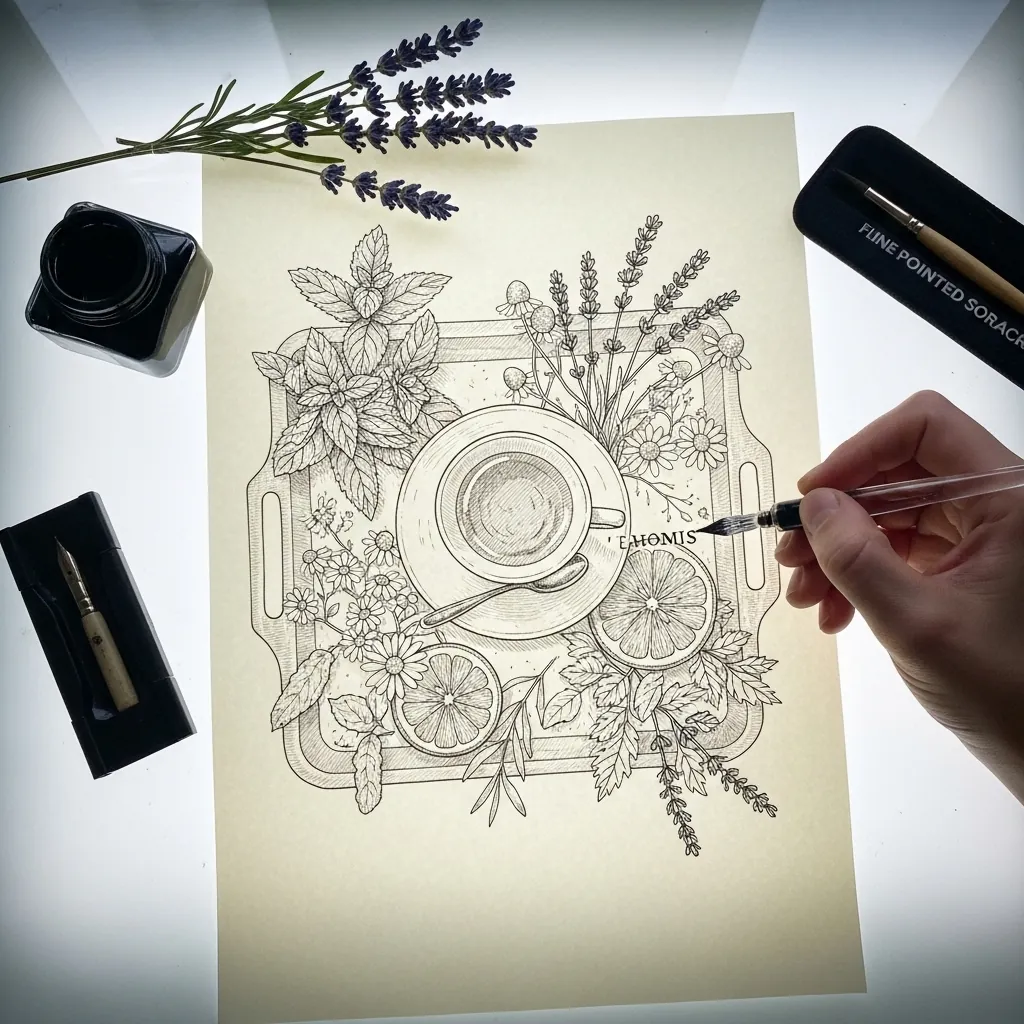
A wreath around a central object needs uneven density. Cluster the botanicals at two opposite arcs and thin them out between, letting a few single leaves trail off. The cup in the middle stays plainer than everything around it. Keep the cup rim as the only true ellipse in an otherwise flat, decorative composition.
28. Coffee and Biscotti on Terracotta
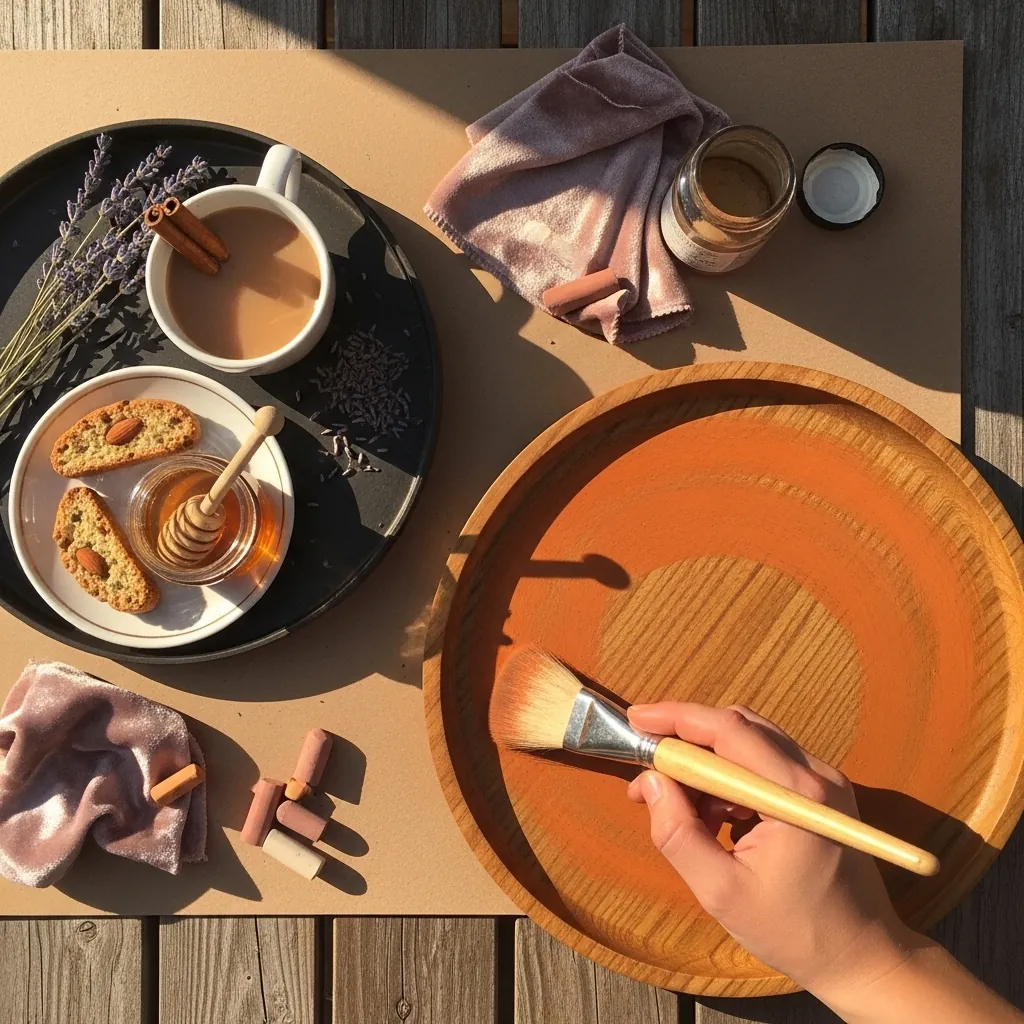
A warm ground unifies a limited palette. Let the terracotta show through everywhere and add only cream, brown and a single cool gray for the cup shadow. That one cool note stops the whole piece from going flat and monochrome.
29. Painterly Acrylic Tray With Daisies
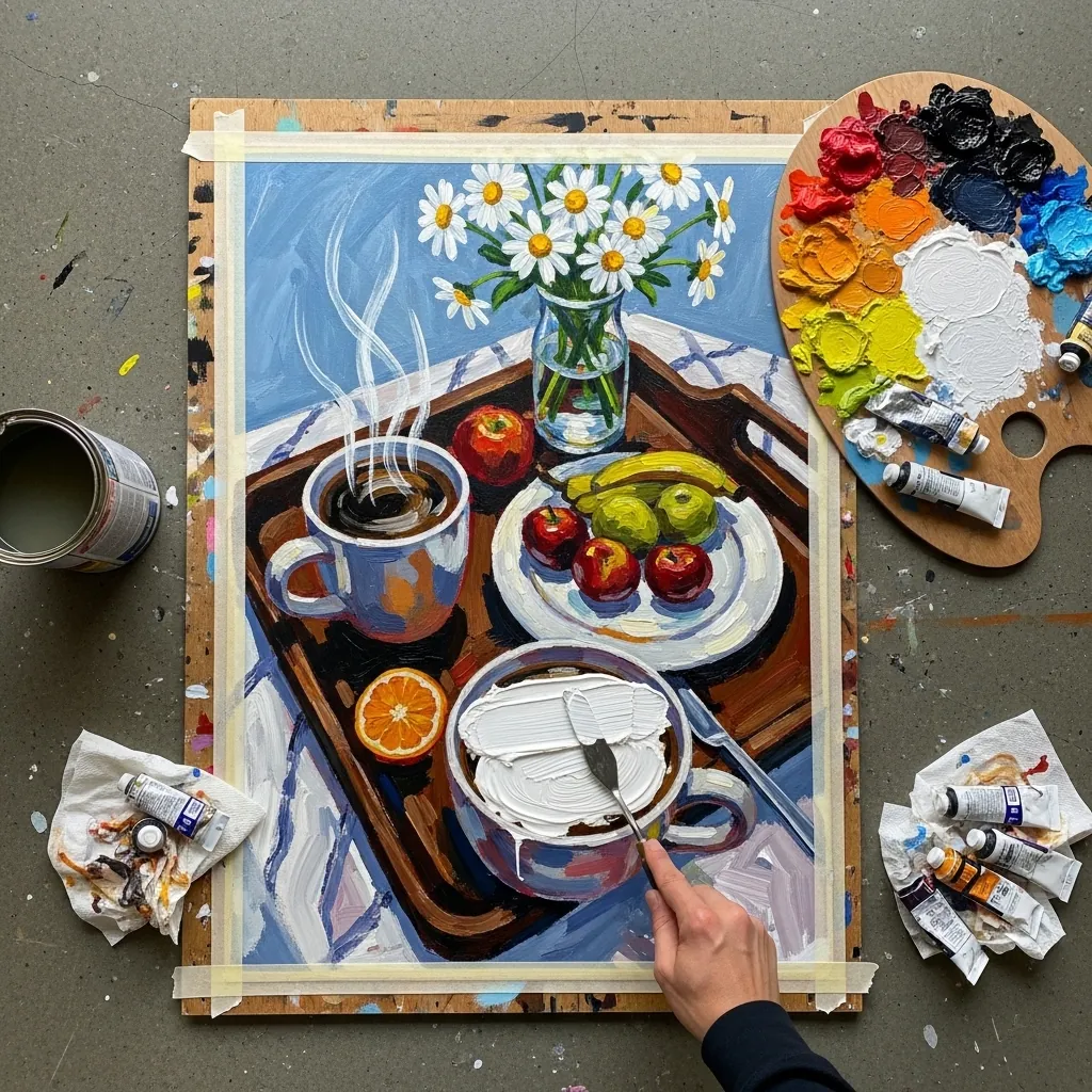
Visible brushwork means each stroke should describe a plane. Turn the brush to follow the curve of the mug, lay the tray in flat horizontal strokes, and let the daisies be single dabs. Strokes that ignore form just look busy.
30. Sumi-e Tea With Cherry Blossom
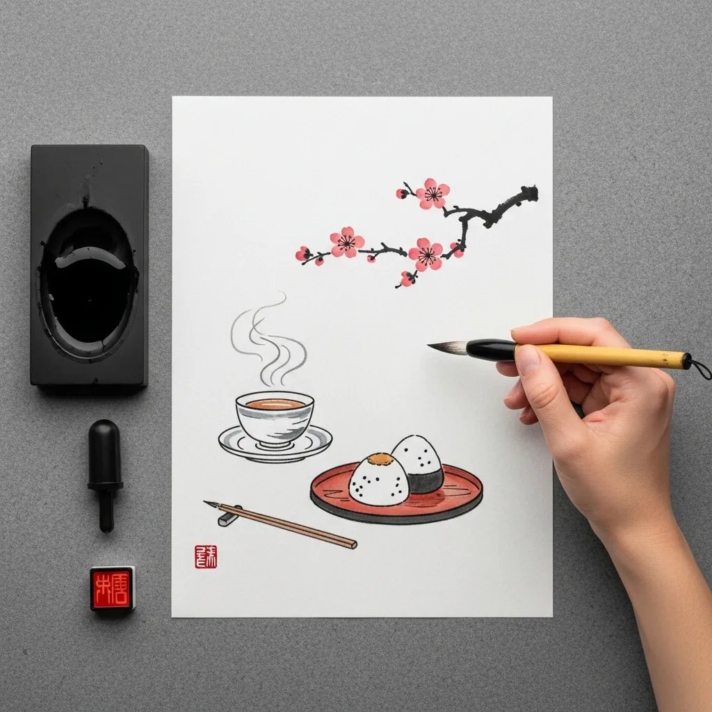
Composition in this tradition uses the diagonal and the void. Run the blossom branch corner to corner, place the cup off center, and leave two thirds of the page empty. The red seal is the only warm accent, so its position genuinely matters.
31. Graphite Pomegranate Still Life
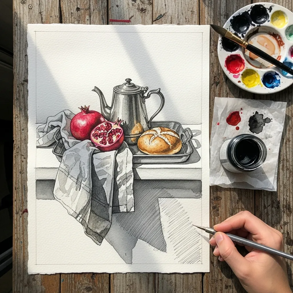
Metal reflects its surroundings rather than showing its own local color, so give the teapot a hard horizon across its middle, dark above and light below, and let it pick up a distorted reflection of the fruit beside it. That distortion is what says silver.
32. Coffee and Eucalyptus on Lace
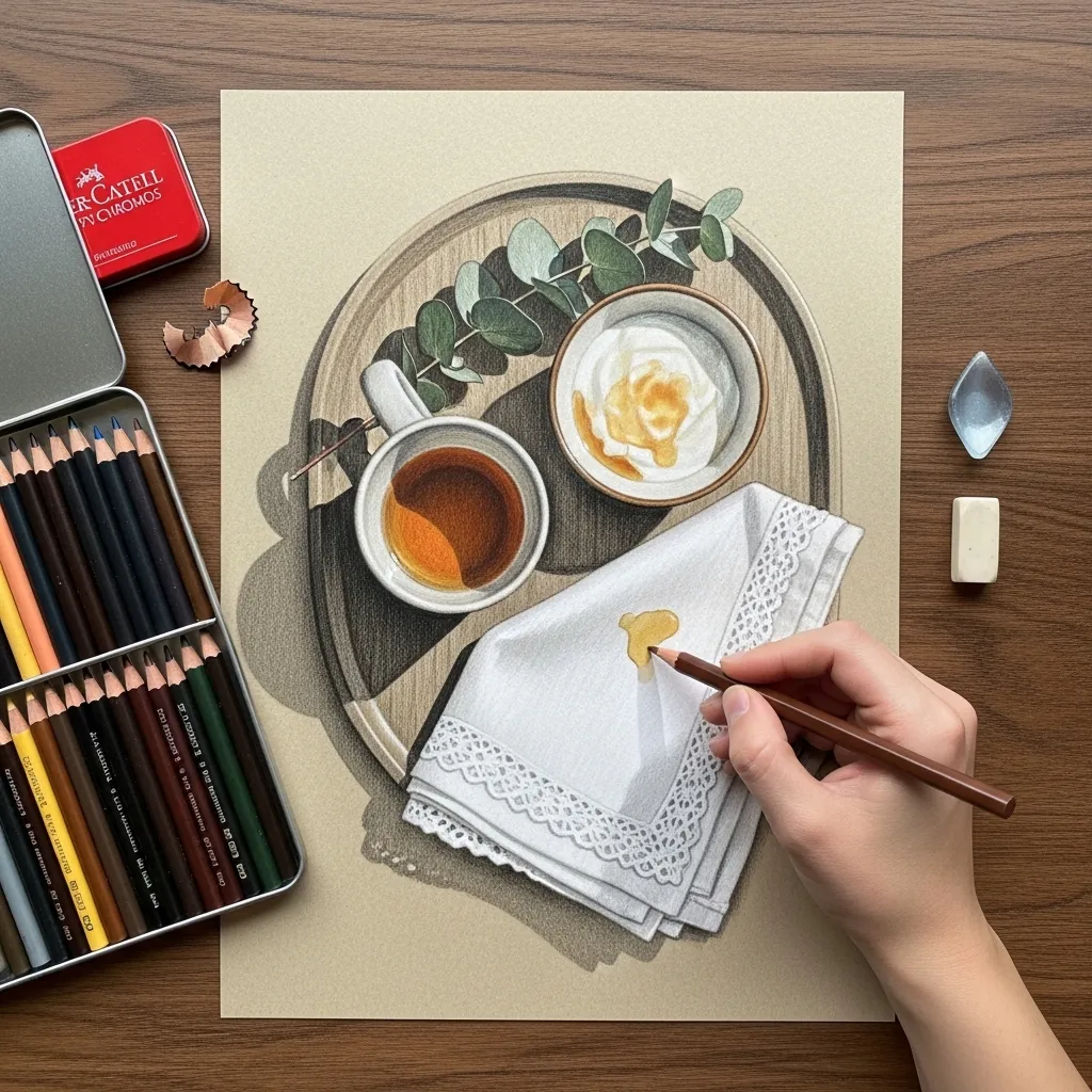
Lace is drawn as negative shapes. Establish the fabric tone first, then lift or leave the holes, keeping their pattern in perspective as it moves away. Drawing the threads themselves produces something that looks like a net rather than lace.
33. Silver Cloche in Dramatic Light
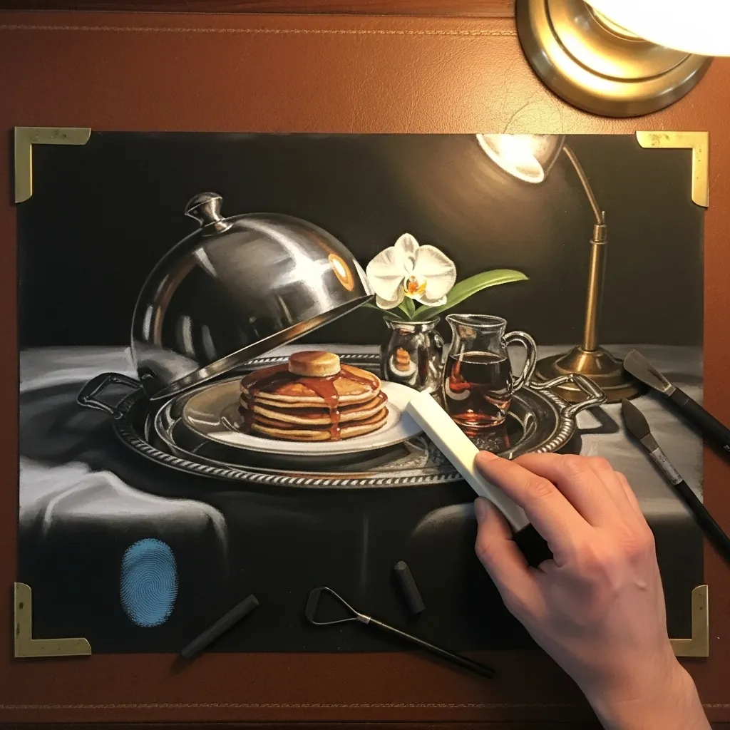
A single overhead lamp gives you a hard, controlled setup. Keep the light circle tight, let the cloche carry one bright vertical highlight and one dark reflected core, and drop the background to black. Nothing outside the pool of light needs describing.
34. Ballpoint Tray With a Card
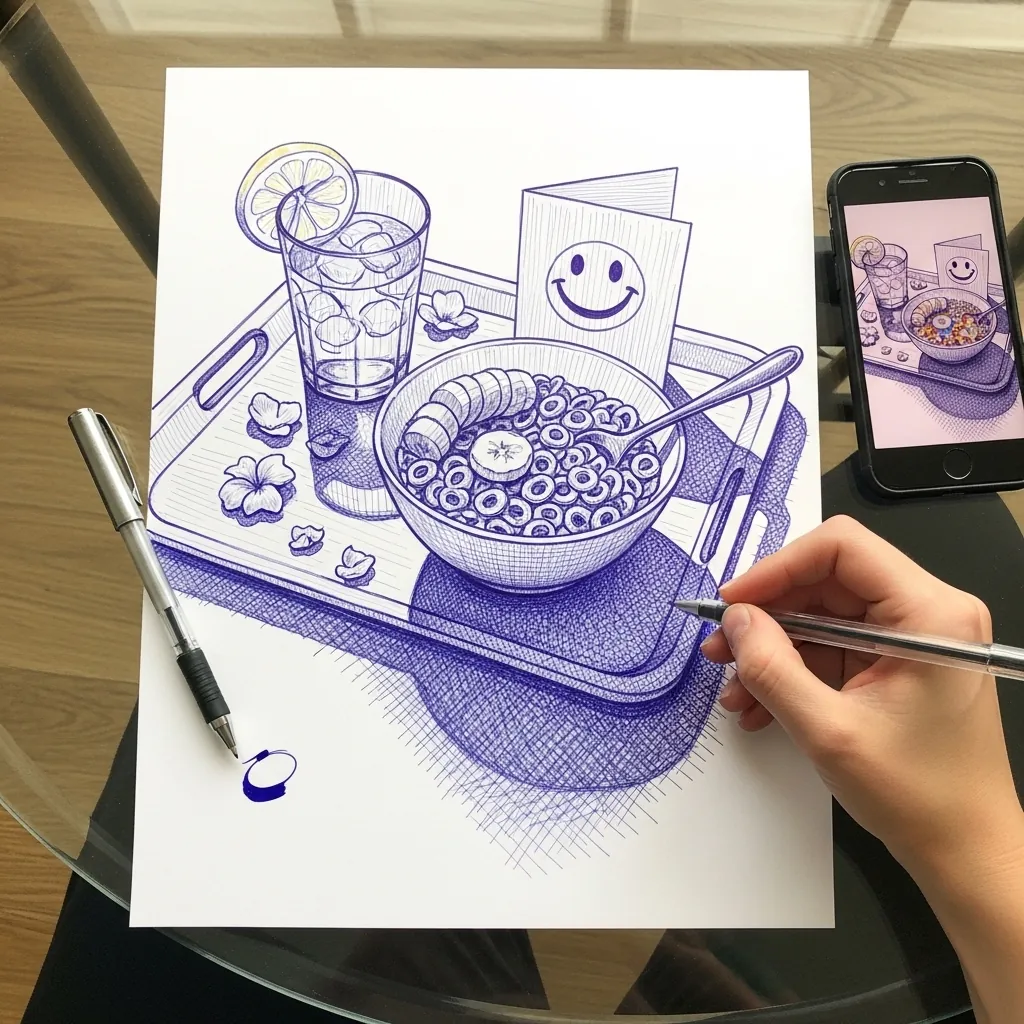
Ballpoint builds tone only through layered hatching. Work in one direction for the base tone, cross it at a shallow angle for the darks, and accept that you cannot lighten anything. Plan your highlights before the pen touches paper. Blue ink also warms slightly as it layers, which is worth allowing for in the darkest areas.
35. Figs and Coffee on a Purple Tray
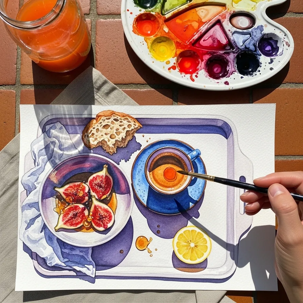
Cut fruit deserves its own treatment. Paint the fig skin in deep violet, then handle the exposed flesh as a completely different material, warm and granular with fine seed marks. That contrast between outside and inside carries the painting. Keep the coffee surface dark and glassy so it reflects a sliver of the fruit above it.
36. Loose Graphite Sketch on Bedding
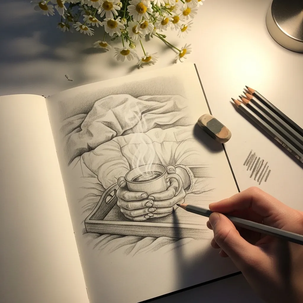
Not every drawing needs finishing. Render the mug and the tray edge properly. Let the bedding dissolve into a few directional strokes and bare paper beyond that. The eye completes it, and the contrast makes your finished passage look sharper than it really is.
37. Bright Flower Vase With Apple
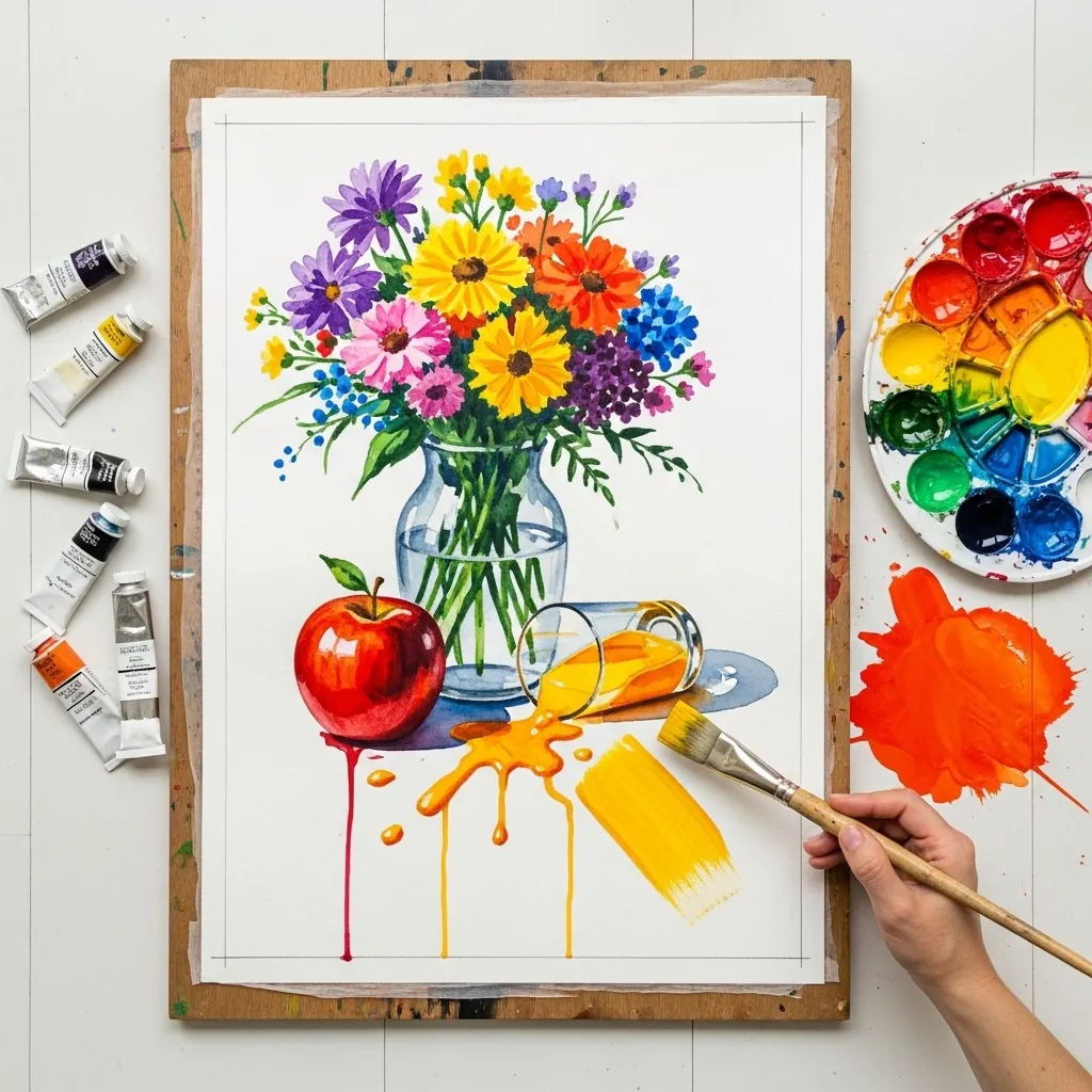
Mixed bouquets need one dominant color and two supporting ones. Choose the flower that will lead, give it the largest area and the highest saturation, and let everything else sit slightly duller. Bouquets with five equal colors always look chaotic.
38. Marker Tray With Color Swatches
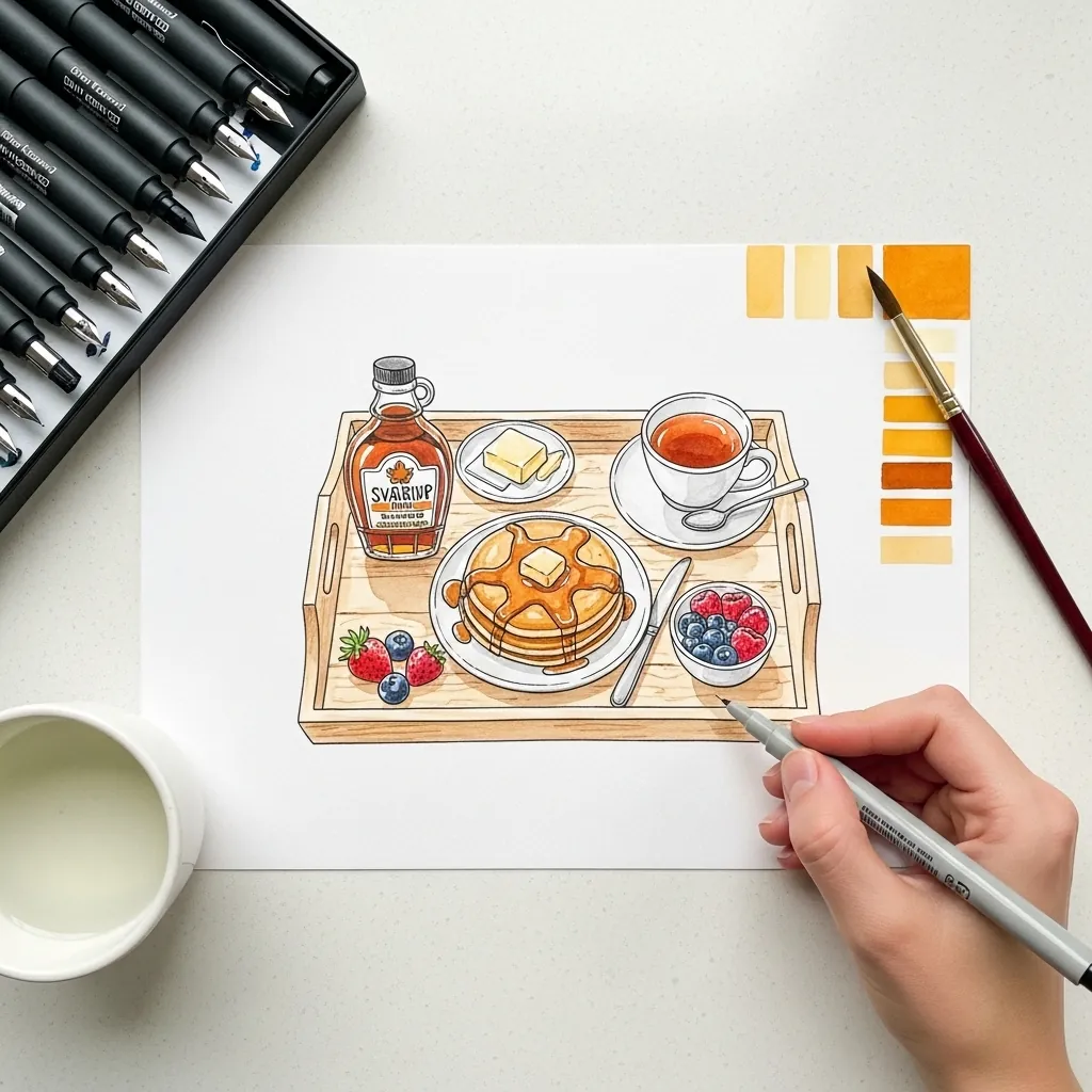
Testing swatches beside the drawing is a habit worth keeping. Lay three values of each marker on scrap first, decide which combination you want, and only then commit. Alcohol markers cannot be lightened, so the test strip saves the drawing.
39. Acrylic Tray With Jam and Gingham
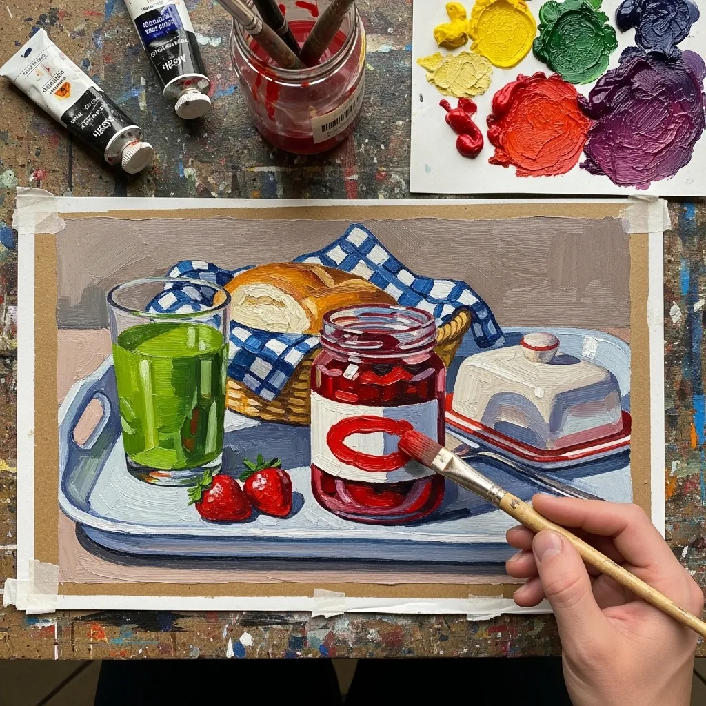
Gingham is two overlapping grids, not a checkerboard. Paint the pale stripes in one direction, the same stripes crossing, and let the overlaps darken naturally where they cross. It also has to follow the fabric’s folds rather than staying flat.
40. Asparagus and Egg Toast Tray
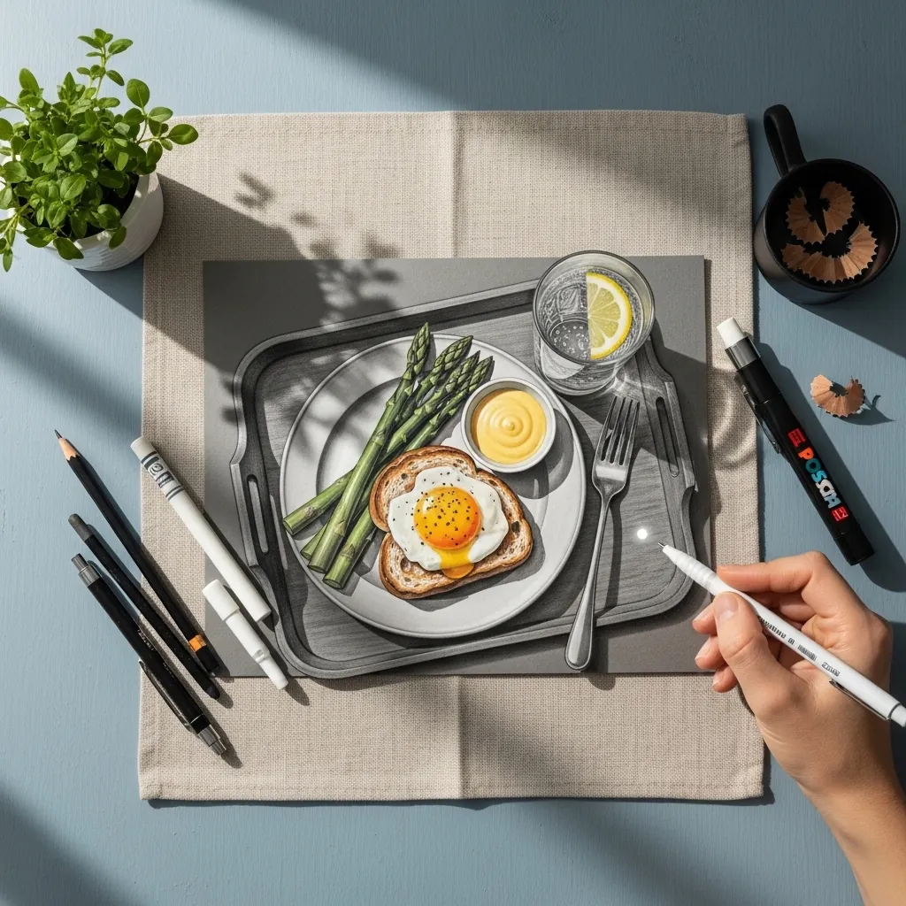
Mixing precise media with loose ones needs a clear division of labor. Draw the structure in graphite, then add color only to two or three objects, leaving the rest in line. Selective color directs the eye better than coloring everything.
Frequently Asked Questions
How do you draw a breakfast tray in perspective?
Draw the tray as a rectangle in perspective first, with both far corners narrower than the near ones. Then place each object’s base ellipse directly on that plane. Getting the tray right means every cup and plate afterward has a surface to sit on.
Why do my cups and plates look tilted?
Because their ellipses disagree. Every rim in one drawing shares the same viewpoint, so they must all open by roughly the same amount, and each upright object’s ellipse has a vertical minor axis. A rim drawn rounder than its neighbors reads as tipping toward you.
How do you arrange objects on a tray?
Use odd numbers, overlap at least two items, and include one tall element such as a vase or glass to break the horizontal run. Leave a little empty tray visible so the arrangement has room to breathe rather than filling every corner.
How do you draw crumpled bedding under a tray?
Folds radiate outward from points of tension, so find where the tray presses down and let the creases fan out from there. Keep the fold edges soft and the shadows between them cool, since white fabric picks up blue from ambient light.
When did Mother’s Day start?
Anna Jarvis organized the first observance in the United States in 1908, and it became a national holiday in 1914 under Woodrow Wilson. Jarvis later campaigned against its commercialization, which is a detail most people never hear.
References and Further Reading