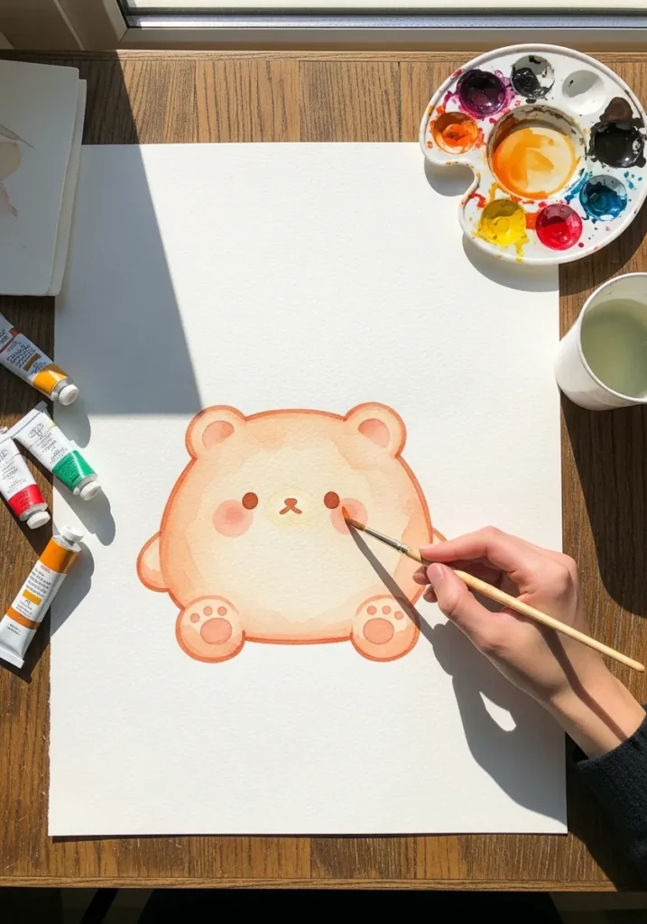
A squishy character keeps the same volume no matter how it deforms, so anything that flattens has to spread wider at the same time. Squashing a blob without widening it is what makes soft characters look deflated instead of springy.
Key takeaways
- Conserve volume: when the shape squashes down it must widen out by the same amount|Flatten the bottom where the body meets the surface and bulge it slightly just above|Keep one unbroken silhouette, with limbs merging into the mass rather than attached to it|Place the features low and close together, which is what reads as soft and young|Give the outline a slightly uneven weight, since a perfectly even line looks rigid
Soft characters fail for a reason that is easy to name. A squishy shape keeps the same volume however it deforms, so anything that flattens must spread wider at the same time. Squash a blob without widening it and the character stops looking springy and starts looking deflated.
That rule is the first of the twelve basic principles of animation, written down by Ollie Johnston and Frank Thomas in 1981, and it works just as well in a still drawing. The other half of it is the contact point: flatten the base against the surface and let the sides bulge slightly just above.
Two more decisions carry the style. Keep a single unbroken silhouette, with legs and ears merging into the mass rather than bolted onto it, and set the features low and close together on a large round head. That combination is the shorthand the kawaii tradition arrived at decades ago.
The twenty-eight ideas below cover marker, watercolor, soft pastel, palette knife, glow-on-black and pattern work. If you want the underlying shapes drawn more conventionally, cat drawing ideas and penguin drawing ideas both pair well with this page.
Compiled by the GS Art Zone editorial team. Last updated August 2026. Each idea is paired with the specific step that produces the effect, so you can go from the reference straight to paper.
What You Need Before You Start
- A brush pen, because a line that changes width does most of the softness work for you
- Round watercolor brushes only, since a flat brush leaves corners you will have to fix
- A light box or tracing paper for testing several squash amounts on the same shape
- One pale mid tone for the underside shadow that sits directly under the body
- Soft pastels or a blending stump if you want edges that fade rather than stop
1. Pink Bear Blob in Watercolor
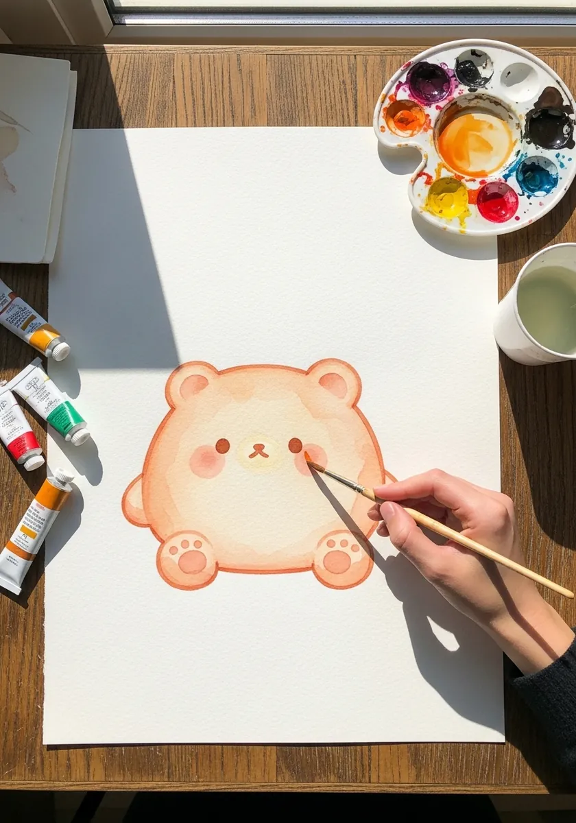
This is the plainest version of the whole idea, which makes it the right place to start. Draw one rounded shape wider at the base than the top, flatten the very bottom where it meets the ground, and add tiny ears and low set eyes. Nothing else.
2. Kawaii Marker Cat
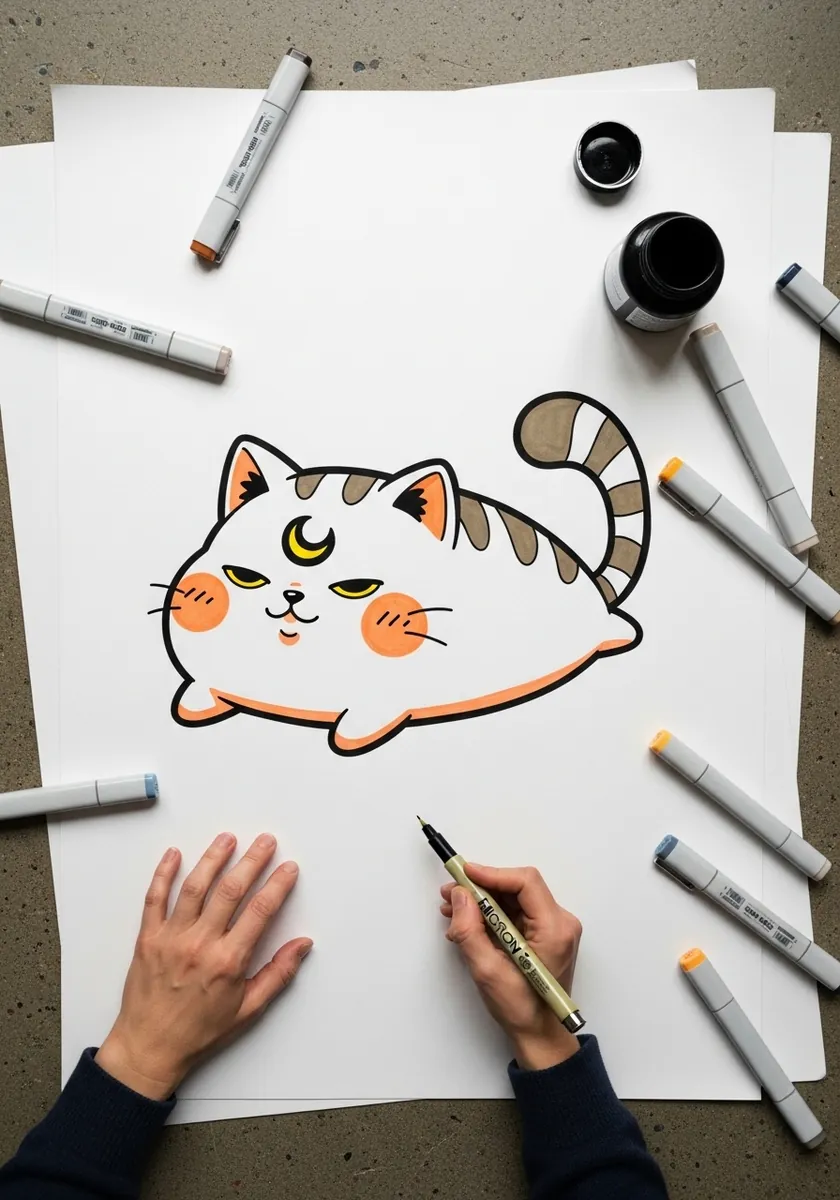
Marker forces you to commit to the outline, which is useful here. Vary the pressure so the line thickens under the belly and thins over the back, keep the tail curling outside the main mass, and let the blush circles sit directly under the eyes.
3. Pencil Frog Blob
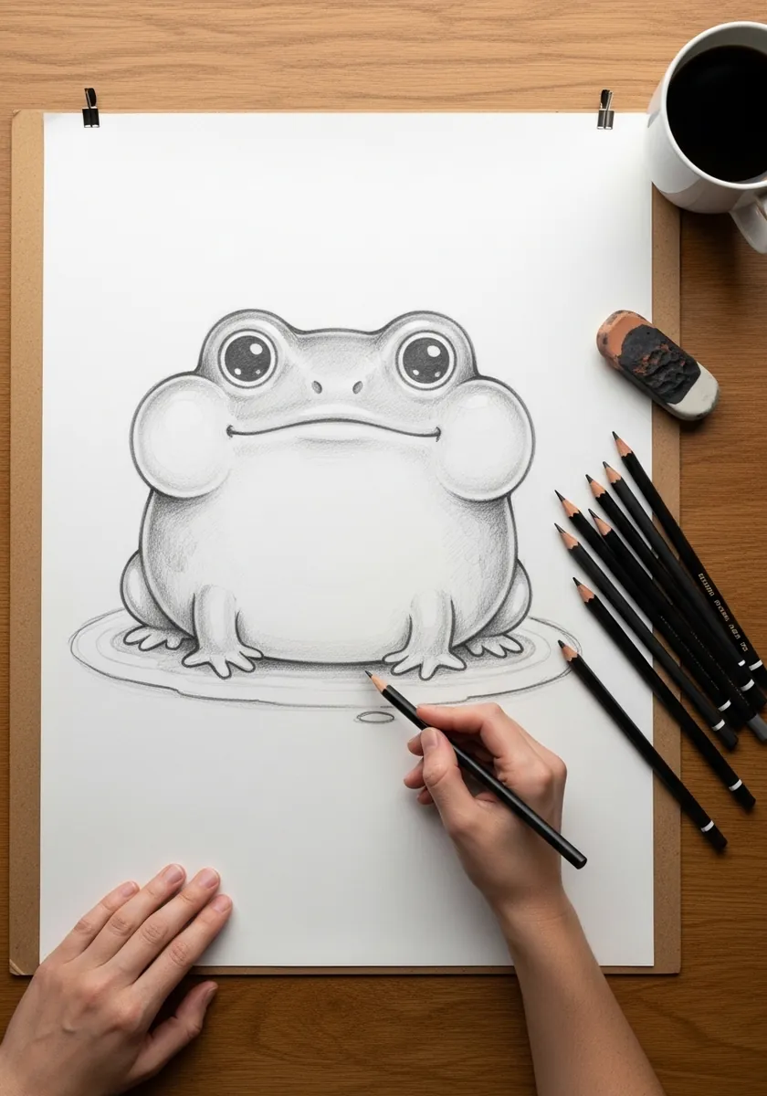
Frogs are already close to this shape, so the exaggeration can be subtle. Widen the base until the body is clearly broader than it is tall, sit the eyes on top of the head rather than the front, and let the front feet just barely poke out from under the mass.
4. Glowing Teal Jellyfish
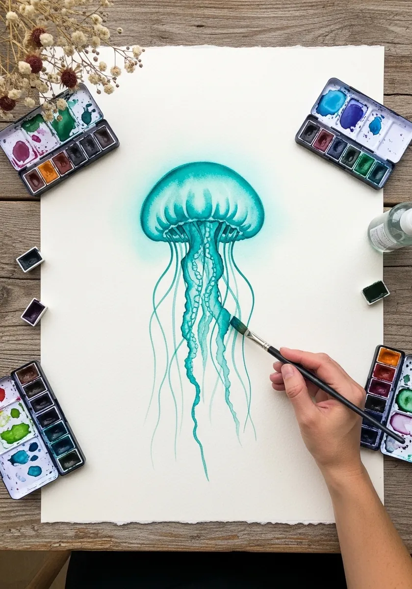
Translucency is a matter of edges rather than color. Keep the bell edge soft where it curves away and crisp along the rim, let the tentacles fade out before they reach the bottom of the page, and leave a bare highlight untouched at the top of the dome.
5. Gouache Corgi Loaf
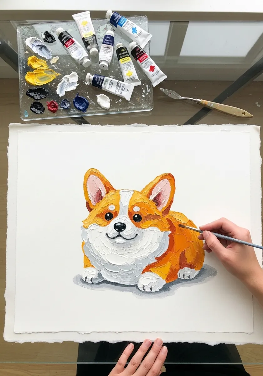
The loaf pose is entirely about hidden limbs. Tuck every leg completely under the body so the silhouette is one continuous curve from head to tail, and let the chest fur break the outline slightly so it does not read as a solid block.
6. Flat Black and White Panda
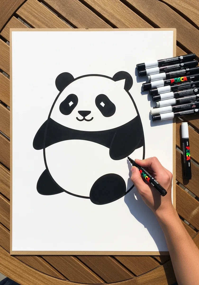
Two values and a strong shape is enough. Place the black patches so they balance across the body rather than sitting symmetrically, keep every edge of the black soft and rounded, and leave the white areas completely empty with no shading at all.
7. Pink Axolotl Watercolor
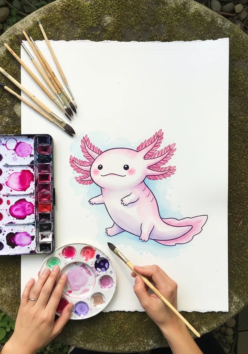
The gills are the one place to break the smooth silhouette. Keep the body edge unbroken and simple, then let the gill fronds spray outward in three clear clusters on each side. Contrast between the smooth mass and the feathery detail carries the drawing.
8. Light Drawing Sheep
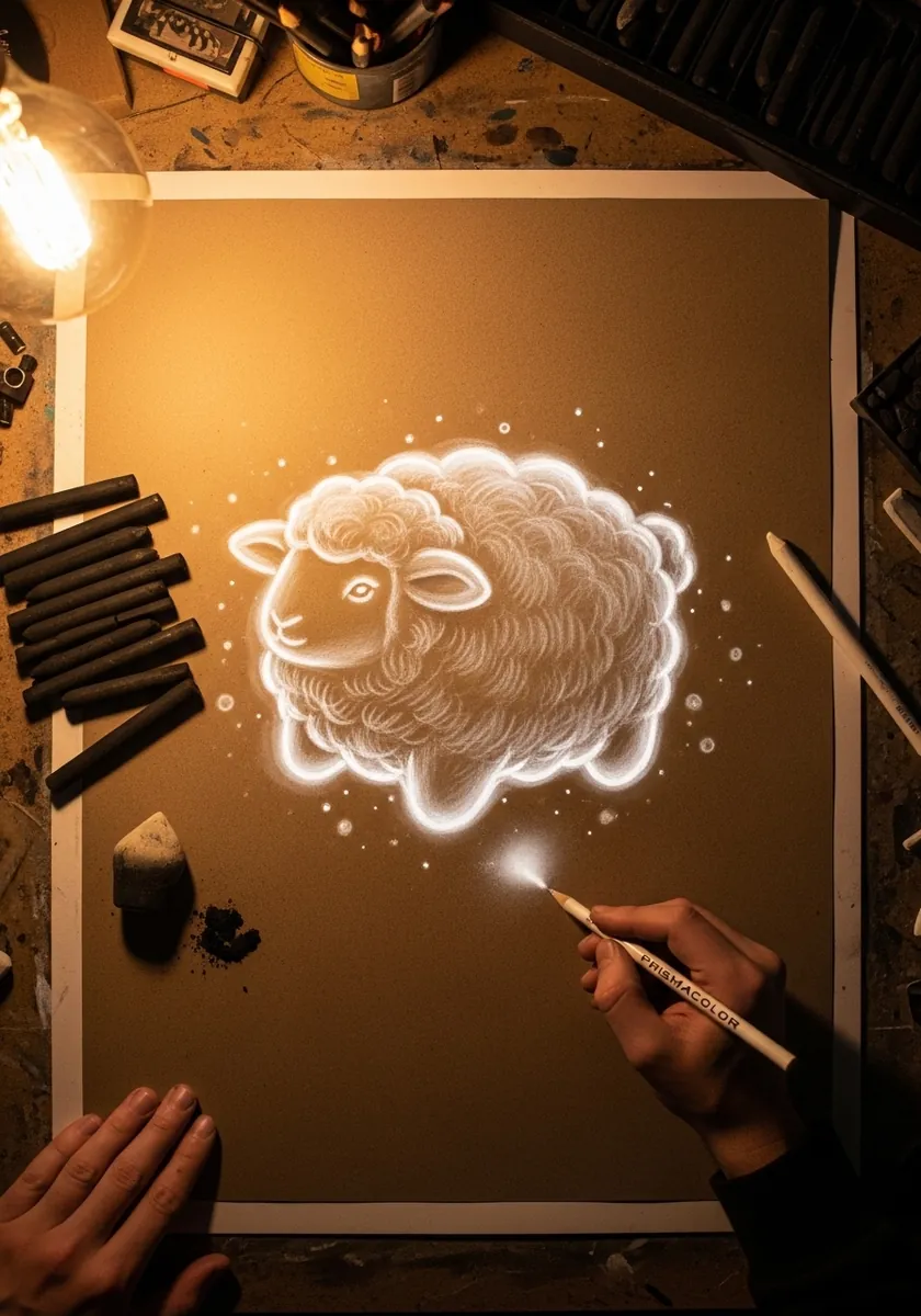
Building a shape purely from light means never drawing an outline. Work in small overlapping curls of white, densest at the top where the light falls, thinning to nothing at the edges. The shape emerges from the density rather than from any contour.
9. Sumi-e Raccoon Character
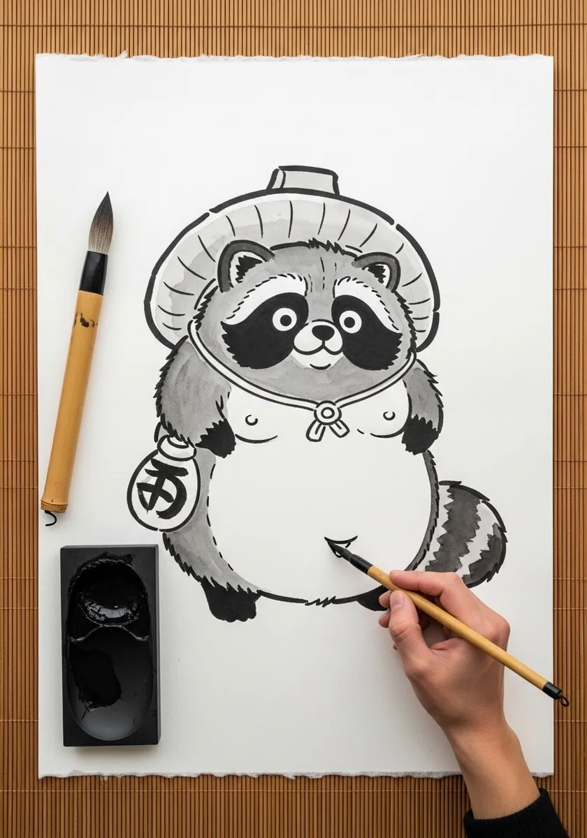
Brush and blob suit each other because both reward a single confident pass. Paint the body mass in two strokes, add the mask markings while the ink is still wet so they bleed slightly, and save the crisp detail for the hat and the pouch.
10. Zentangle Hedgehog
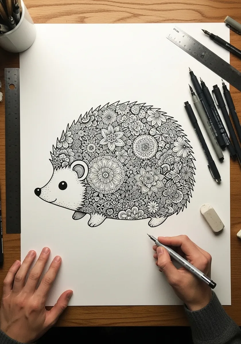
Pattern can stand in for texture entirely. Fill the spine area with concentric mandalas of varying size, keep the face and feet completely clean, and let the boundary between patterned and empty do the same job the quills would in a realistic drawing.
11. Soft Pastel Elephant
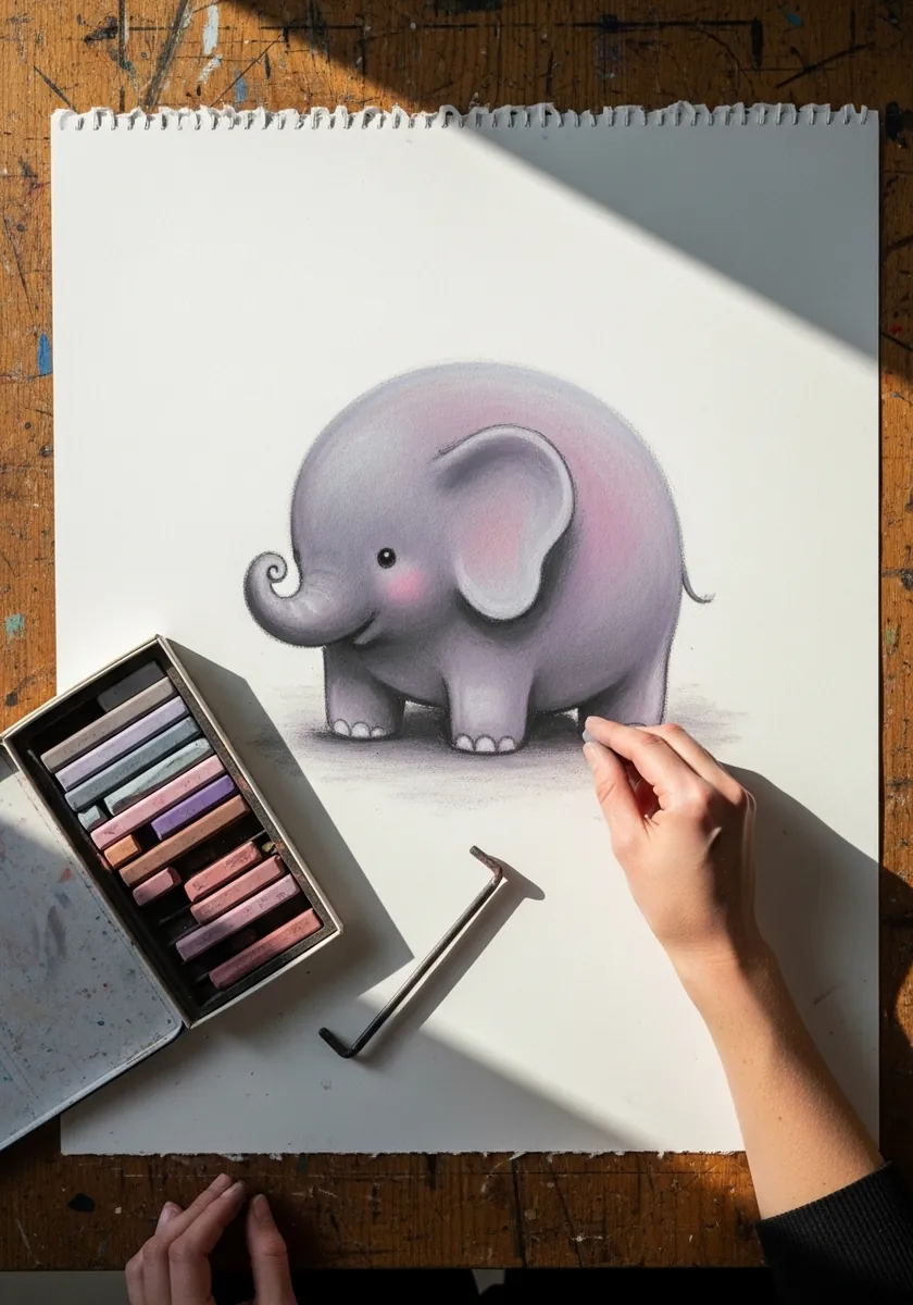
Pastel gives you an edge that fades, which is worth exploiting. Blend the outer few millimeters of the whole shape outward into nothing, keep the trunk and ears slightly crisper, and the body starts looking genuinely soft rather than merely rounded.
12. Neon Cat on Black
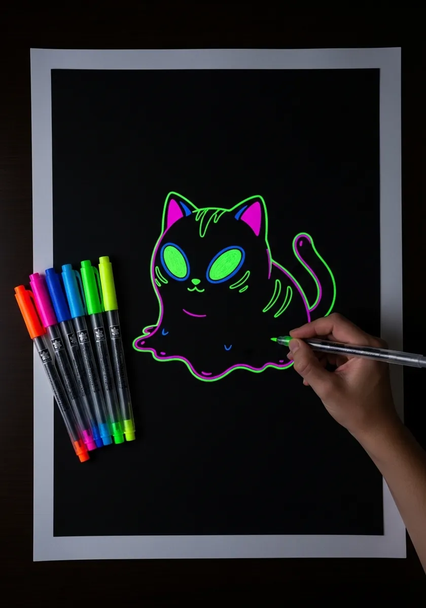
Fluorescent line on black is a coverage problem. Outline the shape once, add only the eyes and a single belly curve inside, and leave everything else black. The temptation to fill the body is what kills the glow in almost every attempt.
13. Acrylic Tortoise Blob
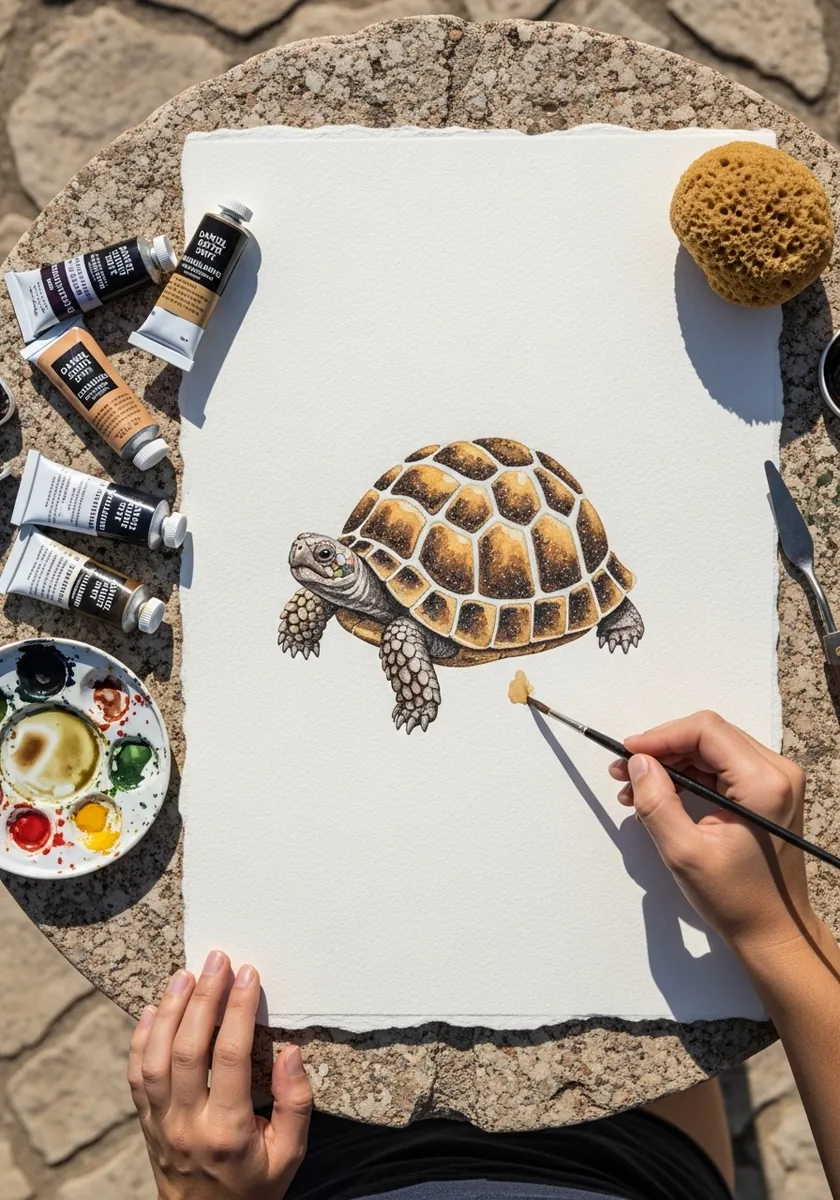
A patterned shell on a soft body needs the pattern to curve. Draw the scute divisions following the dome rather than as a flat grid, make the outer ring of plates narrower than the center ones, and keep the legs and head soft by comparison.
14. Minimal Flat Penguin
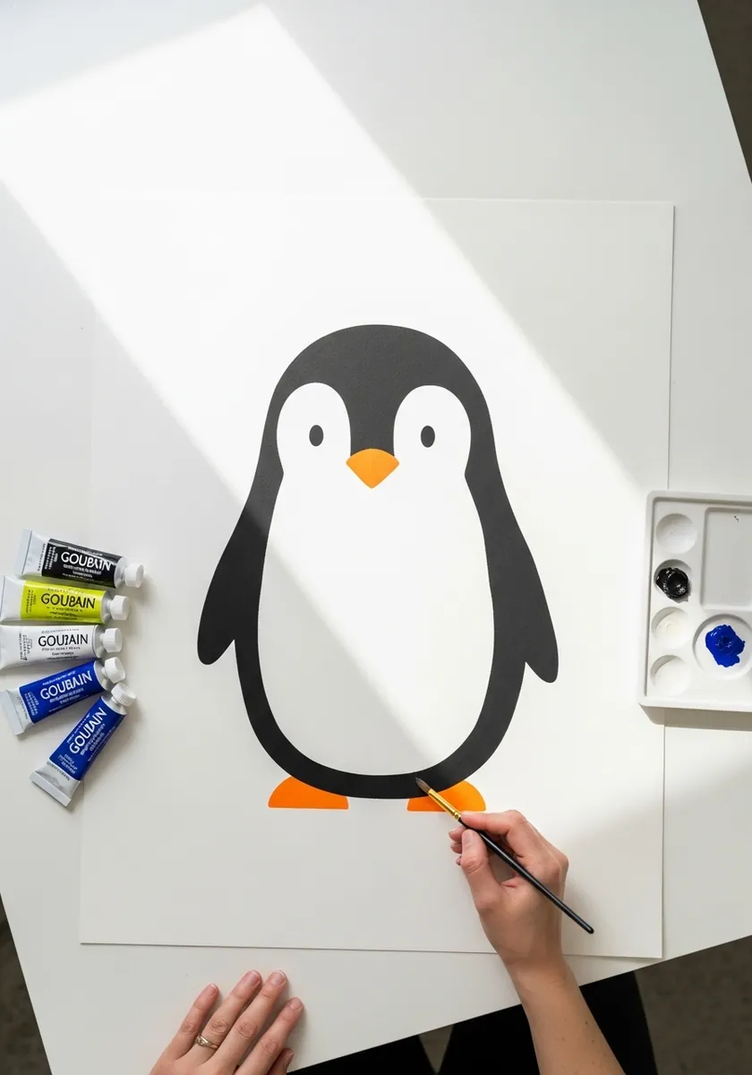
Reduction is its own exercise. Build the whole bird from one teardrop, one white oval, two triangles and two feet, with no line work anywhere. If the shape still reads instantly as a penguin, the silhouette is doing its job correctly.
15. Palette Knife Orange Cat
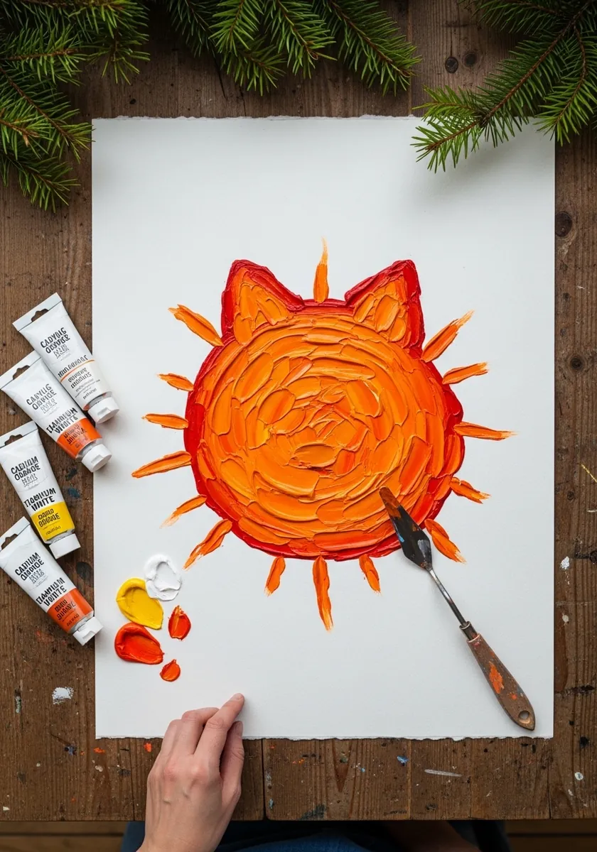
Knife work gives a soft subject a hard surface, which is a useful contradiction. Load the blade, sweep outward from the center so the strokes radiate, and let the ridges of paint stand for fur. Keep the eyes as two scraped gaps rather than painted marks.
16. Folk Pattern Rabbit Roundel
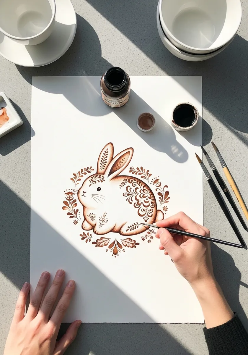
Fitting an animal into a circle means simplifying it until it agrees with that shape. Curl the body to follow the roundel, lay the ears along the inner edge rather than sticking out, and repeat the border motif at even intervals all the way around.
17. Glowing Anglerfish
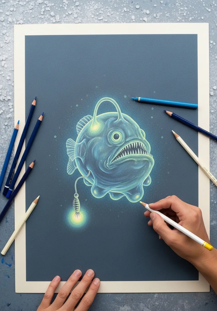
Comic menace works better on a round shape than a sharp one. Keep the body soft and wide, put every hard edge in the teeth and the lure, and let a pale halo spread from the lure across the nearest part of the face and nowhere else.
18. Watercolor Sloth With Drips
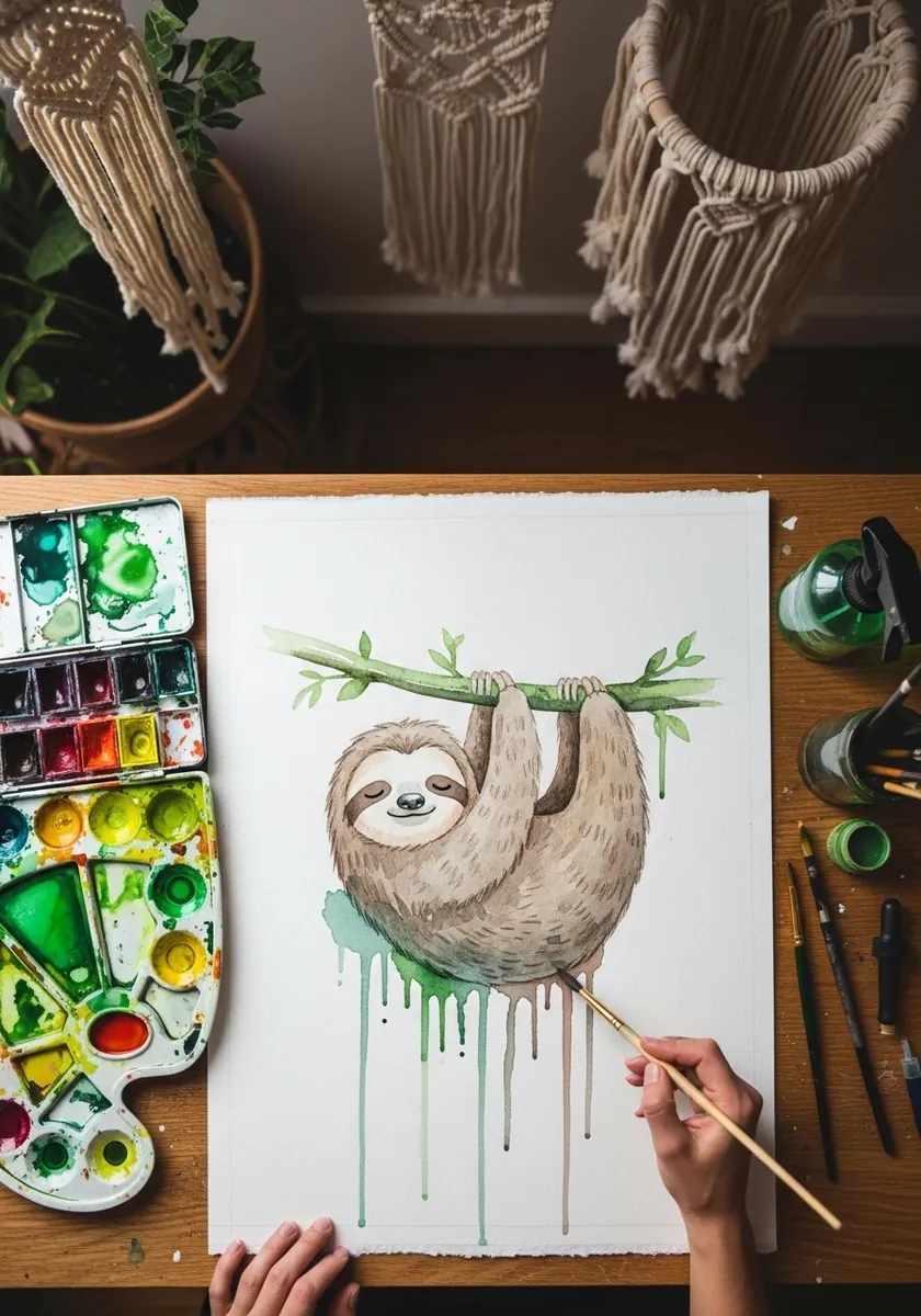
Hanging changes where the mass collects. Let the body sag away from the grip point so the lowest part is the widest, stretch the arms slightly longer than feels natural, and allow the drips to fall directly below to reinforce the downward pull.
19. Marker Capybara
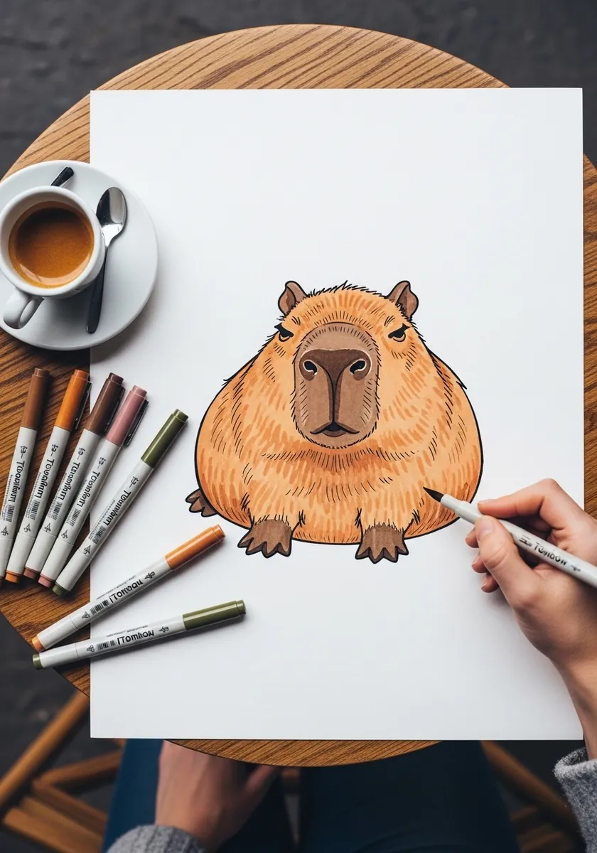
Not every soft animal is circular. Build this one from a rounded rectangle rather than an oval, keep the top edge almost flat, and set the eyes and ears very high and small. The squarer mass is exactly what makes a capybara recognizable.
20. Ornate Indian Pattern Elephant
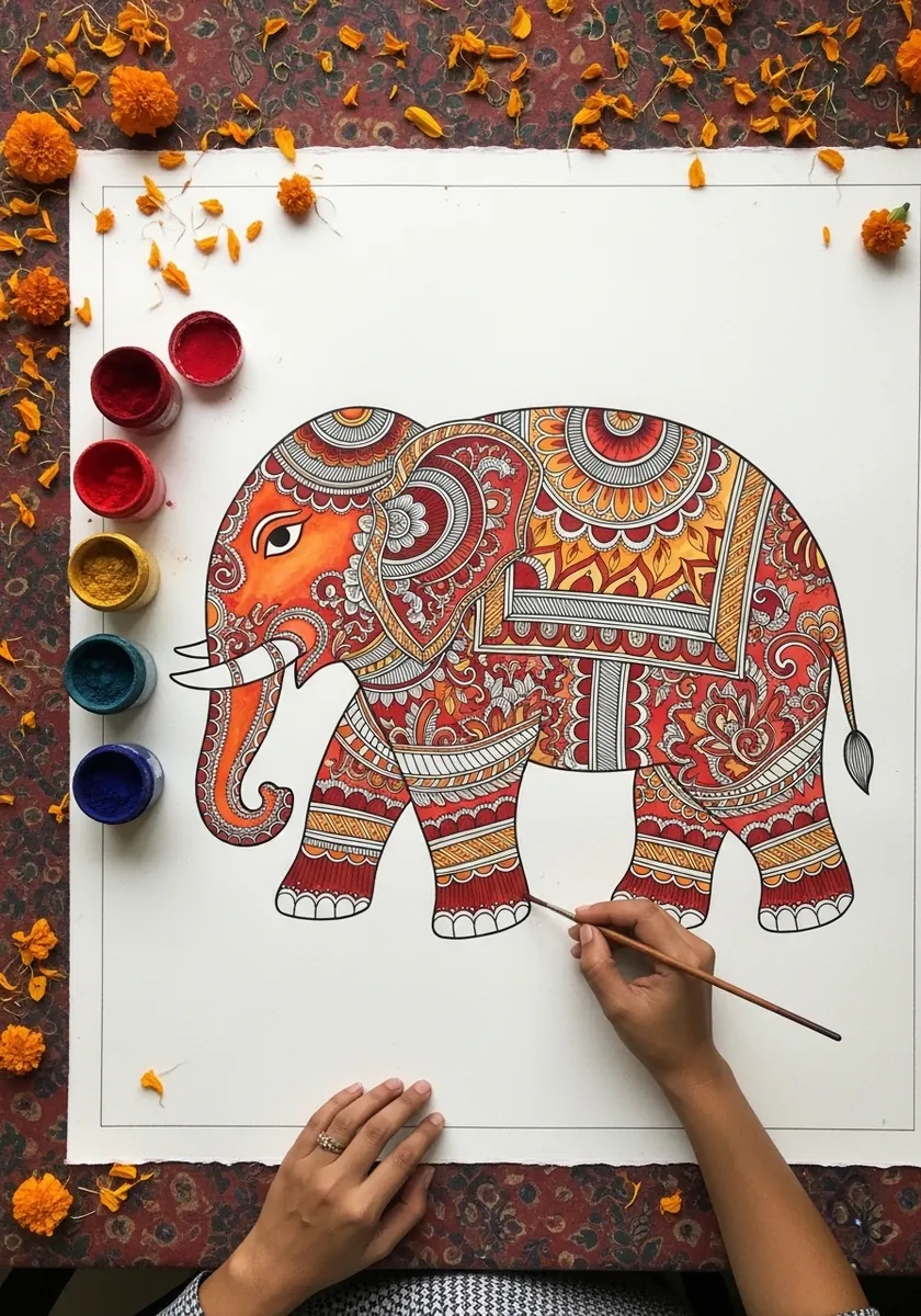
Dense ornament needs a strong shape underneath it. Draw the whole elephant as a simple heavy silhouette first, divide it into regions along the trunk, head, body and legs, then fill each region with its own repeating motif and a consistent color.
21. White Line Bear on Black
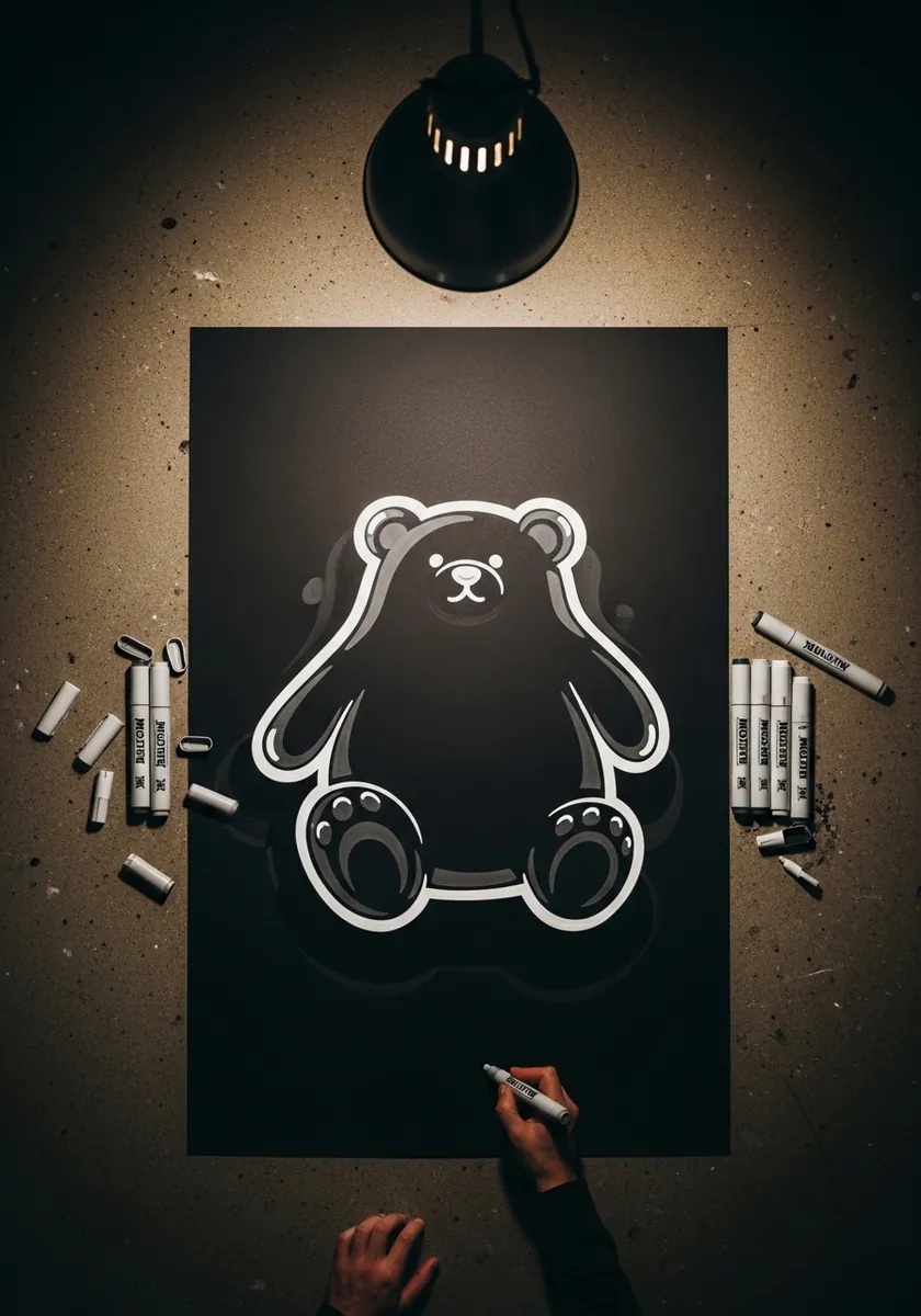
A single pale line on black is as minimal as this gets. Draw the outline in one pass without lifting, add only the paw pads and the muzzle inside, and let the darkness handle everything else. Any extra mark makes the shape feel heavier.
22. Detailed Pencil Owl
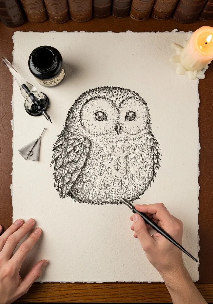
Fluff is a silhouette quality before it is a texture. Break the outer edge with small soft interruptions all the way around, keep the interior smooth and lightly shaded, and let the eyes and beak be the only crisply defined features on the page.
23. Rainbow Watercolor Hippo
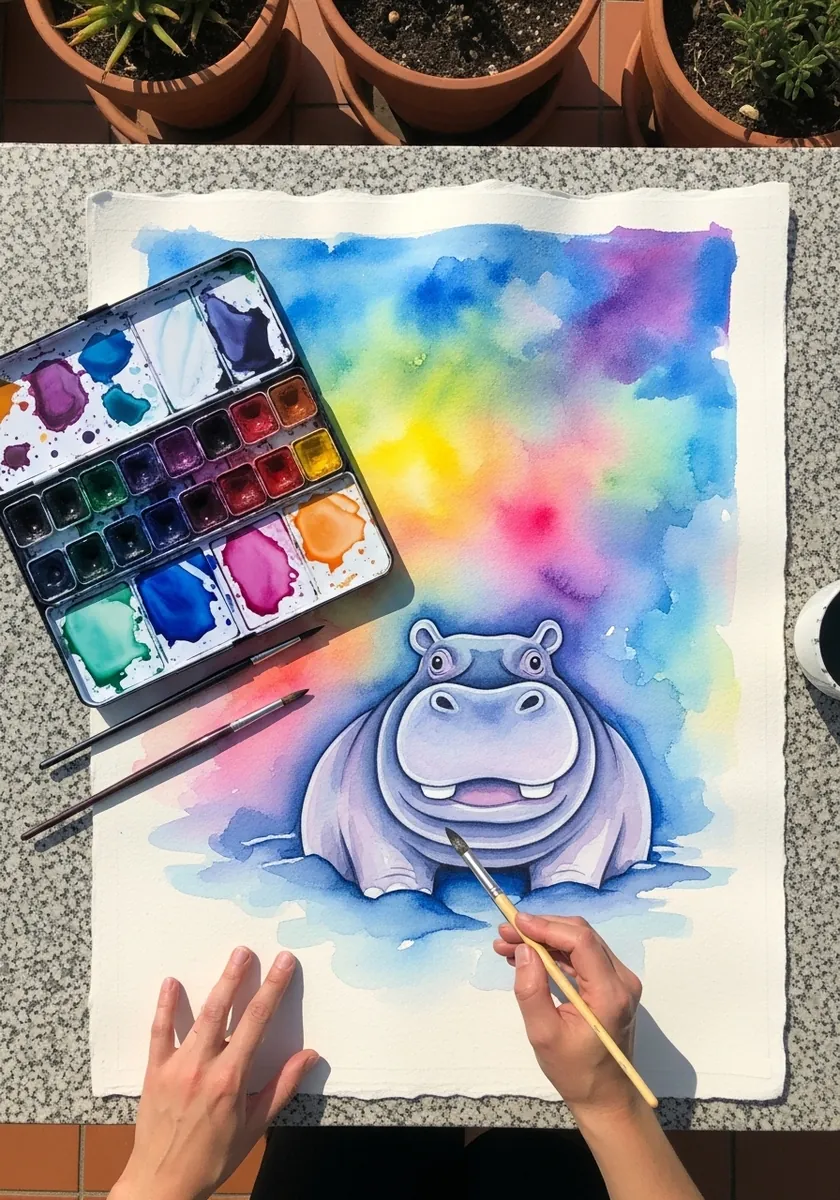
A saturated background needs the subject to be less saturated, not more. Wash the rainbow in first and let it dry completely, then paint the animal in muted violets so it sits calmly in front of all that color rather than competing with it.
24. Cat Croissant Line Drawing
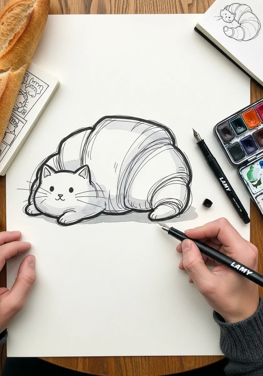
Merging an animal with an object is a shape exercise. Draw the croissant first with its ridges and tapering ends, then find the cat inside it, adding only ears, a face and a tail. If you draw the cat first the joke never quite lands.
25. Warm Ochre Armadillo
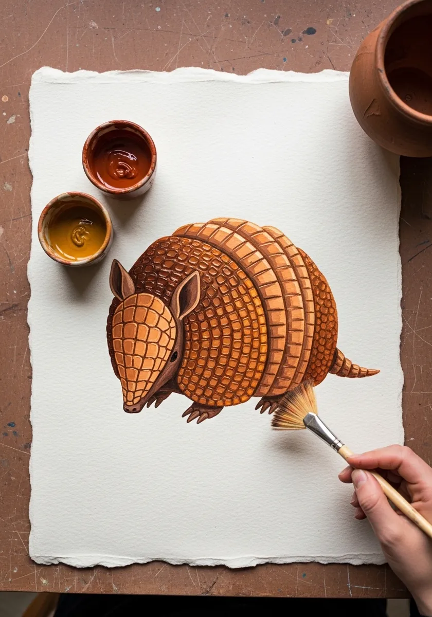
Banded plates give you a natural way to show the curve. Make the central bands widest and taper them toward each end, curve every band line around the body rather than straight across, and keep the underside completely soft and unbanded.
26. Neon Glow Bunny
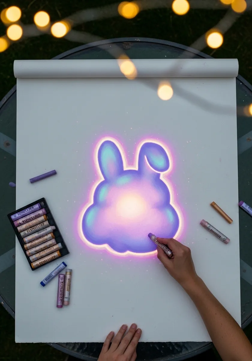
Glow reads as a gradient, not a color. Work from a hot bright core outward through pink to violet at the edges, keep the whole shape simple enough that the gradient is readable, and add no outline anywhere on the figure at all.
27. Lion Mandala Roundel
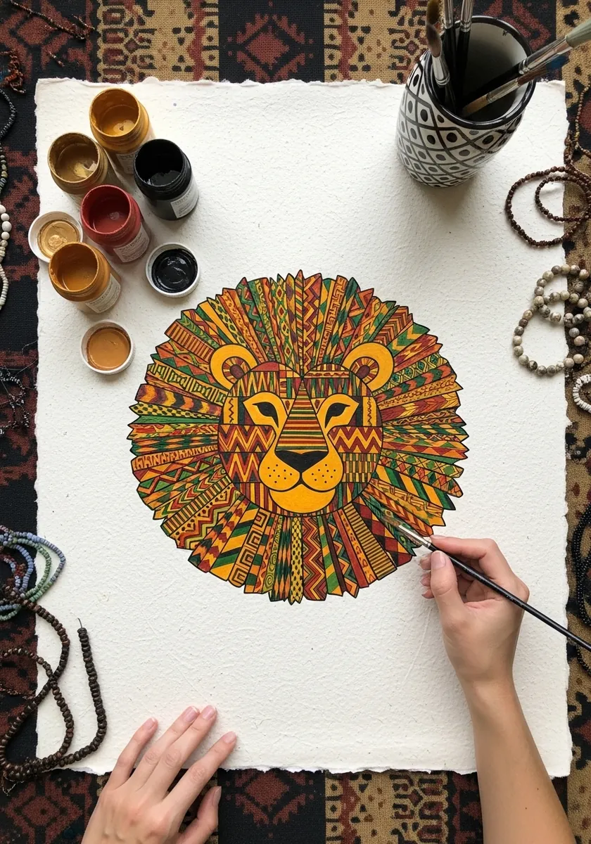
A mane is a natural mandala. Build it as concentric rings radiating from the face, alternate the colors ring by ring, and keep the face itself far simpler than the surround so it does not get lost in all that radial pattern.
28. Sleeping Seal Pup
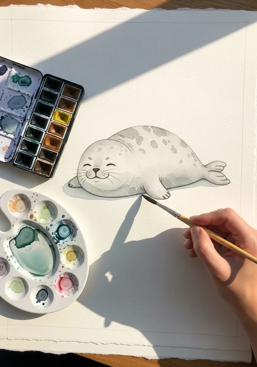
Sleep is drawn with curves and closed shapes. Arc the whole body into a shallow C, close the eyes to two upward curves, tuck the flippers against the sides, and flatten the underside where the animal presses into whatever it is lying on.
Frequently Asked Questions
What actually makes a drawing look squishy?
Volume conservation. Real soft objects keep the same amount of material when they deform, so a body that flattens has to spread sideways at the same time. Squashing without widening is the single most common reason a blob looks deflated.
Where does squash and stretch come from?
It is the first of the twelve basic principles of animation set out by Disney animators Ollie Johnston and Frank Thomas in The Illusion of Life, published in 1981. The principle applies just as well to a still drawing as to a moving one.
How do I show weight in a blob character?
At the contact point. Flatten the base where the body presses into the surface, bulge the sides slightly just above that flat area, and widen the ground shadow. Nothing above the contact point needs to change at all.
Why do the eyes sit so low on these designs?
Placing the features low on a large round shape leaves a big forehead, which reads as young. Setting them close together adds to it. Both are shortcuts from the cute design vocabulary that developed around kawaii illustration in Japan.
Should the outline be the same weight all the way around?
No. A perfectly even line reads as rigid. Thicken the line along the underside and wherever the body is compressed, and thin it along the top, and the shape immediately starts looking like something that could be pressed.
References and Further Reading