Earth reds such as red iron oxide are ground mineral pigments, so they sit on the paper surface, granulate visibly and can be lifted back off with a damp brush. Modern synthetic reds stain the fibers instead, and once they are down they stay down.
Key takeaways
- ["Earth reds granulate and lift; synthetic reds stain and cannot be removed", "One earth red plus water gives a full value range with no black at all", "Darken an earth red with green or blue rather than with black", "Granulation shows best on rough paper and almost disappears on hot pressed", "Test the lift on a scrap first, since brands vary more than the label suggests"]
The reason a clay red behaves differently from a bright modern red is in the pigment itself. Earth reds are ground mineral, so they settle into the paper’s texture and can be lifted straight back off with a damp brush. A quinacridone or naphthol red stains the fibers, and no amount of scrubbing will recover the white.
That single property changes how you work. With an earth red you can paint first and find the highlights afterwards, wiping light back out of a dry wash instead of reserving it in advance. It is the closest watercolor comes to forgiving a mistake.
The palette also solves its own problem. One clay red thinned with water reaches almost the full value range, and its darks come from adding a green or a blue rather than black. Black kills an earth red instantly, turning it gray and chalky rather than deep.
The twenty-nine pieces below run from portraits and figure studies to landscapes, ruins, botanicals and pure abstracts, all built on that one family of colors. For landscape work see watercolor national park drawing ideas, and for wet-surface subjects, spring rain puddle art.
Compiled by the GS Art Zone editorial team. Last updated August 2026. Each idea is paired with the specific step that produces the effect, so you can go from the reference straight to paper.
What You Need Before You Start
- A genuine earth red such as red iron oxide, light red or Venetian red
- Rough or cold pressed paper, because granulation needs a textured surface
- A stiff synthetic brush for lifting, which a soft sable will not do
- A single cool blue for mixing the darks without reaching for black
- Kitchen paper for blotting, which is half of the lifting technique
1. Warm Valley Landscape
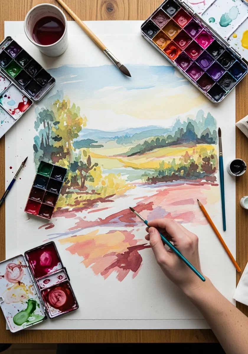
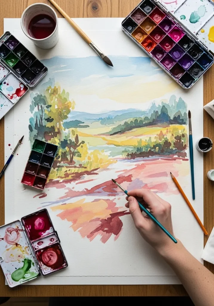
Warm ground against cool distance is the oldest depth trick there is. Keep the foreground in strong clay red and let the hills behind cool toward gray-green, and the space opens up without any change in detail or edge. Keep one small patch of untouched paper in the sky for the light source.
2. Ribbons of Gradient Red
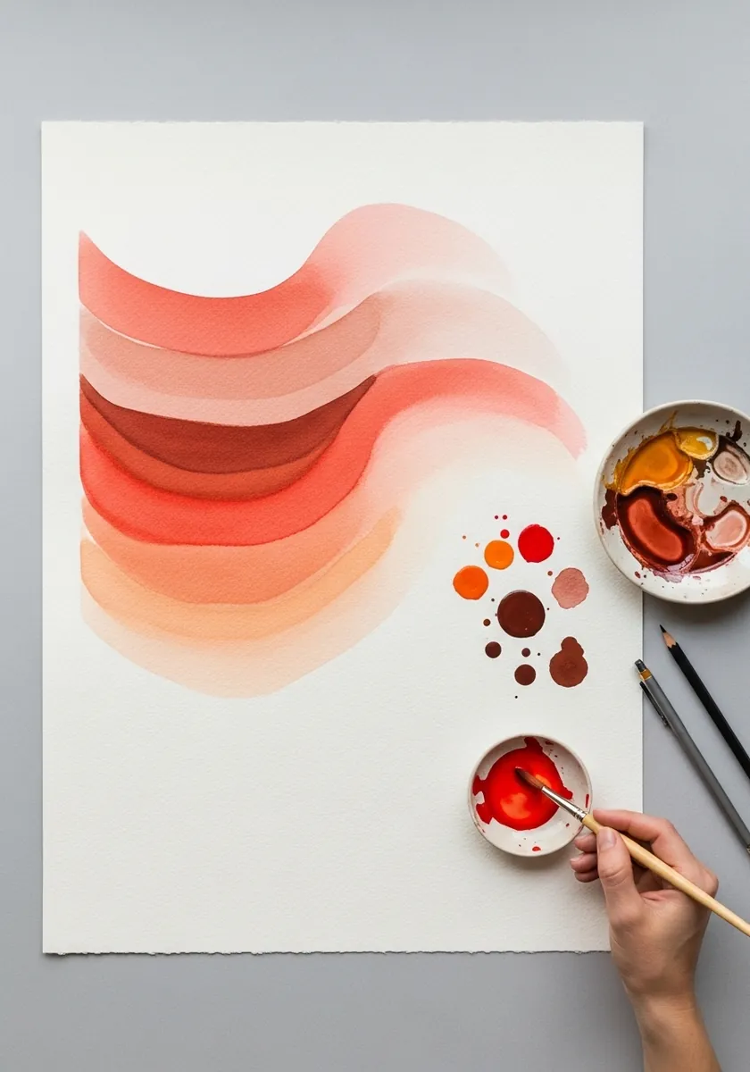
A graded ribbon is one loaded stroke that thins as it goes. Load the brush fully, pull it in a long curve, and keep adding clean water so the color weakens steadily. Never lift the brush partway through the sweep.
3. Terracotta Leaf Studies
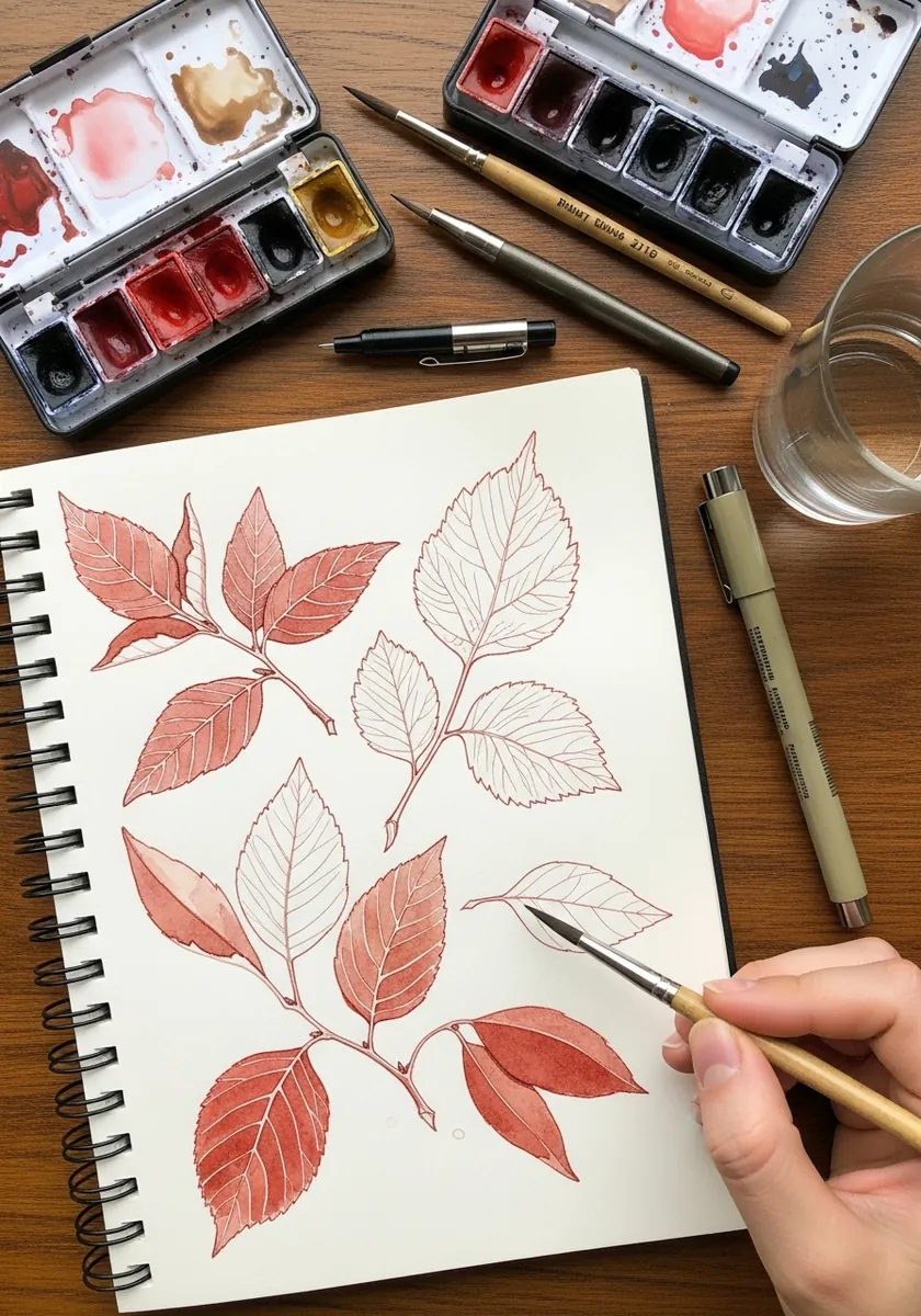
A study page should stay unfinished on purpose. Paint six or eight leaves at different angles, keep every one as line and a single flat wash, and leave the page unbalanced. Filling the corners turns a study into a decoration.
4. Terracotta Portrait
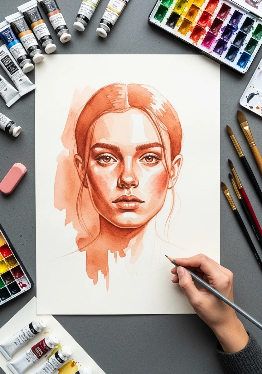
Skin in one earth red is an old workshop exercise. Lay the palest wash over the whole face, build the shadow side in two or three more layers of the same color, and leave the lit cheek and nose bridge as bare paper.
5. Building Facade in Red Line
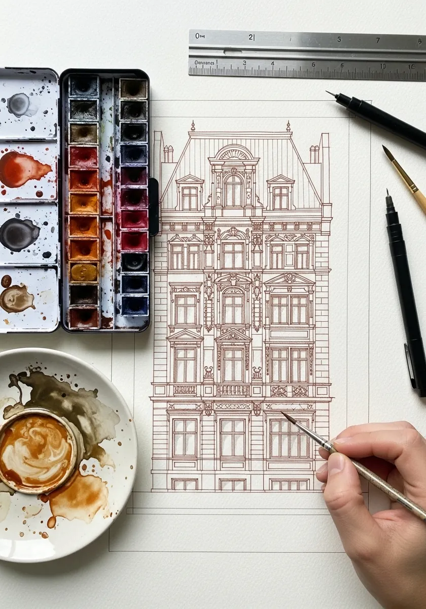
Line work in red rather than black changes the whole feel. Keep the line thin and consistent, rule only the main structural verticals, and draw every ornament freehand. The warmth makes an architectural drawing feel like a sketch rather than a plan.
6. Soft Red Mountains
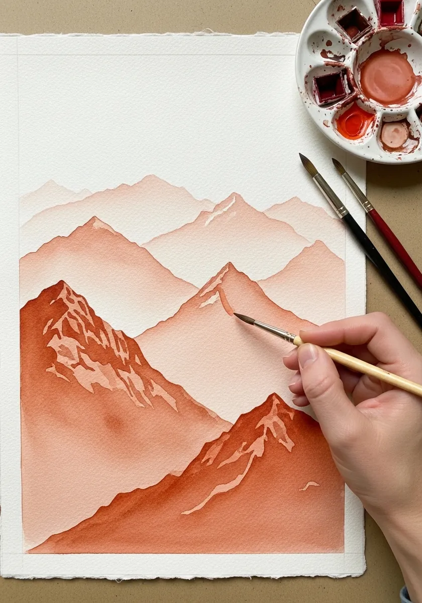
Layered ranges are built from the back forward. Paint the furthest ridge palest and let it dry completely, then paint the next one over it slightly stronger, and repeat. Each hard edge on top of a dry layer becomes a new ridge.
7. Floating Red Landforms
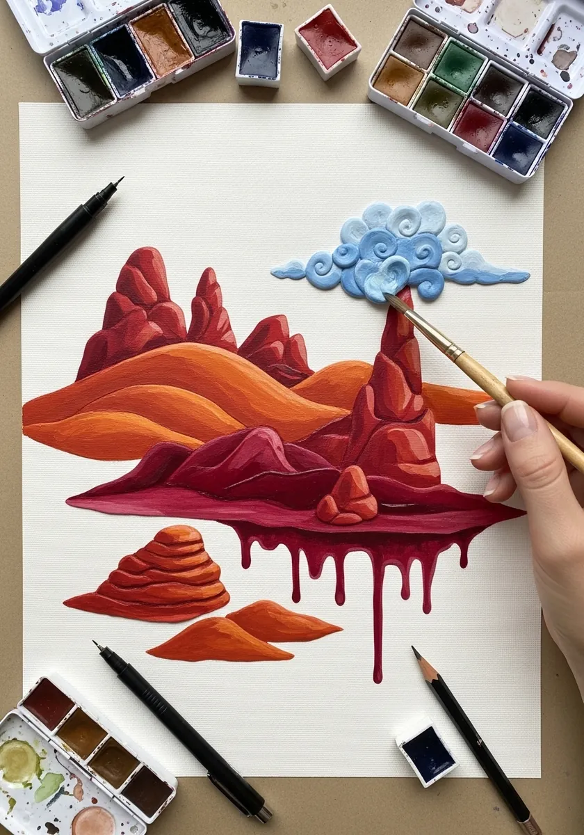
Surreal work still needs consistent light. Light every floating island from the same side, keep the shadows underneath them all pointing the same way, and let the drips fall vertically. Consistency is what makes an impossible scene believable. Let the drips fade out before they reach the bottom edge of the sheet.
8. Overlapping Geometric Shapes
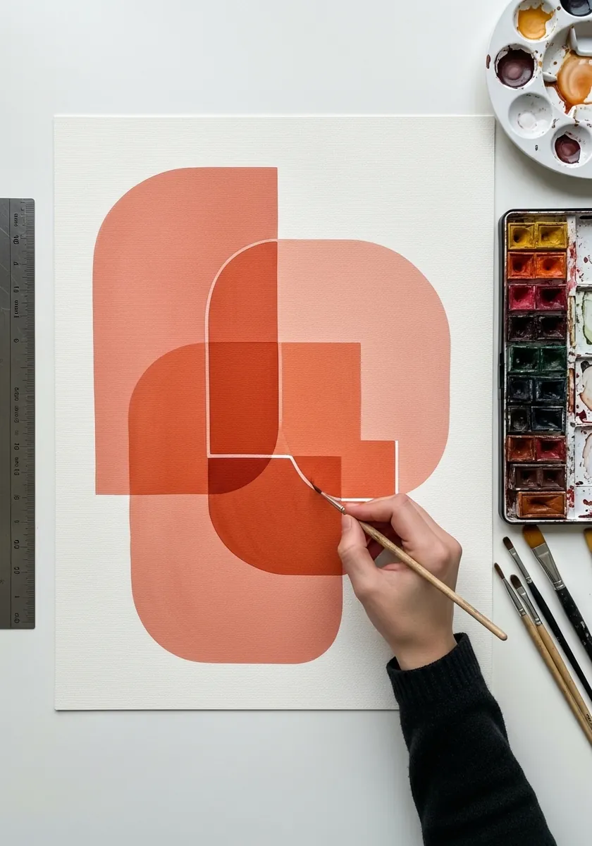
Overlaps are where transparent paint shows what it can do. Paint each shape as a flat wash and let it dry, then paint the next across it, and let the overlap darken naturally. Never mix the overlap color on the palette.
9. Red Brush Calligraphy
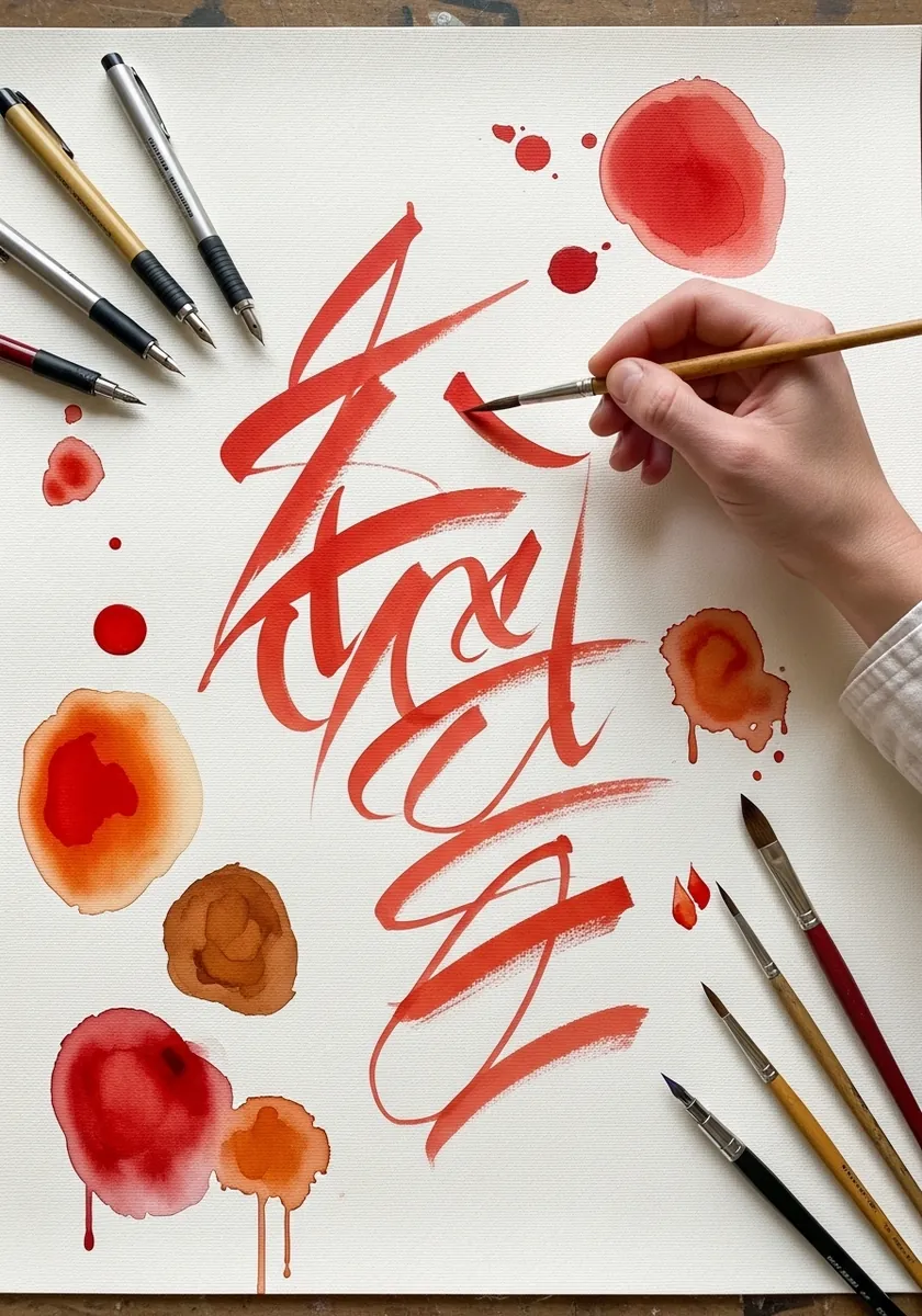
Gesture painting is done at speed or not at all. Load the brush, commit to the stroke without pausing, and accept every blot and dry patch that happens. Slowing down to correct a mark is what kills the energy. Work on a cheap sheet, since half of these pages are meant to be thrown away.
10. Red-Toned Riverside Town
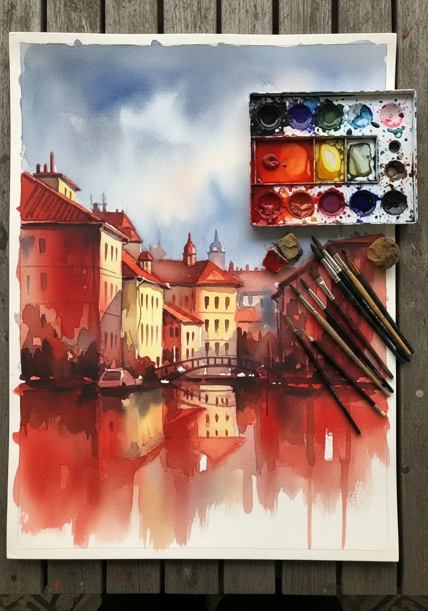
A limited palette forces the values to work. With only reds available, separate the buildings by tone rather than hue, keep the sky palest and the reflections darkest, and let one white wall stay as bare paper. Break the reflections with a few horizontal gaps of clean paper.
11. Brush Mark Practice Page
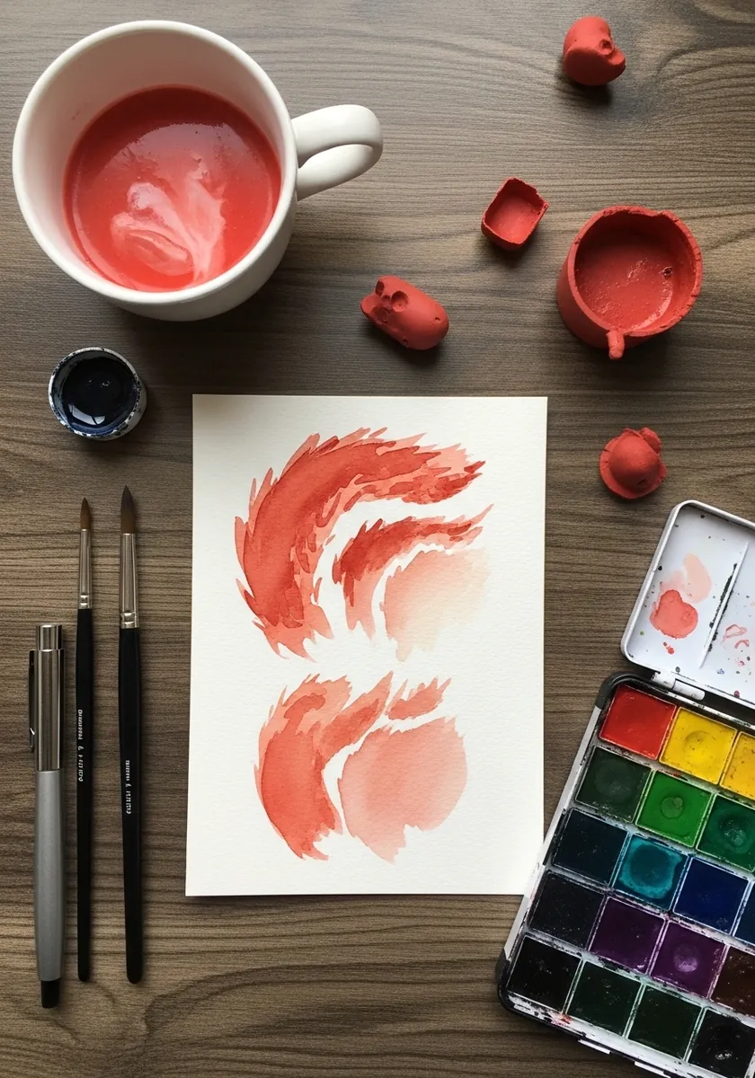
A page of nothing but marks teaches more than a finished painting. Try the same stroke at four dilutions, then the same dilution with four pressures, and label them. That sheet becomes your reference for the whole palette. Date the page, because the same paint behaves differently as a pan ages.
12. Heavy Red and Drips
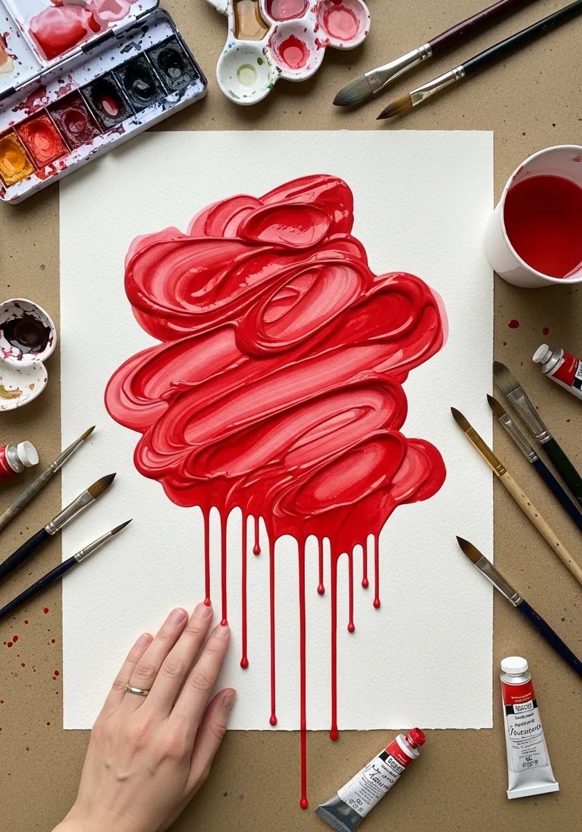
Watercolor used at full strength behaves almost like gouache. Load the brush so heavily it barely spreads, work quickly across the shape, then stand the paper up while the edge is still wet and let it run. Lay the sheet flat again the moment the runs reach the length you want.
13. Terracotta Jugs Still Life
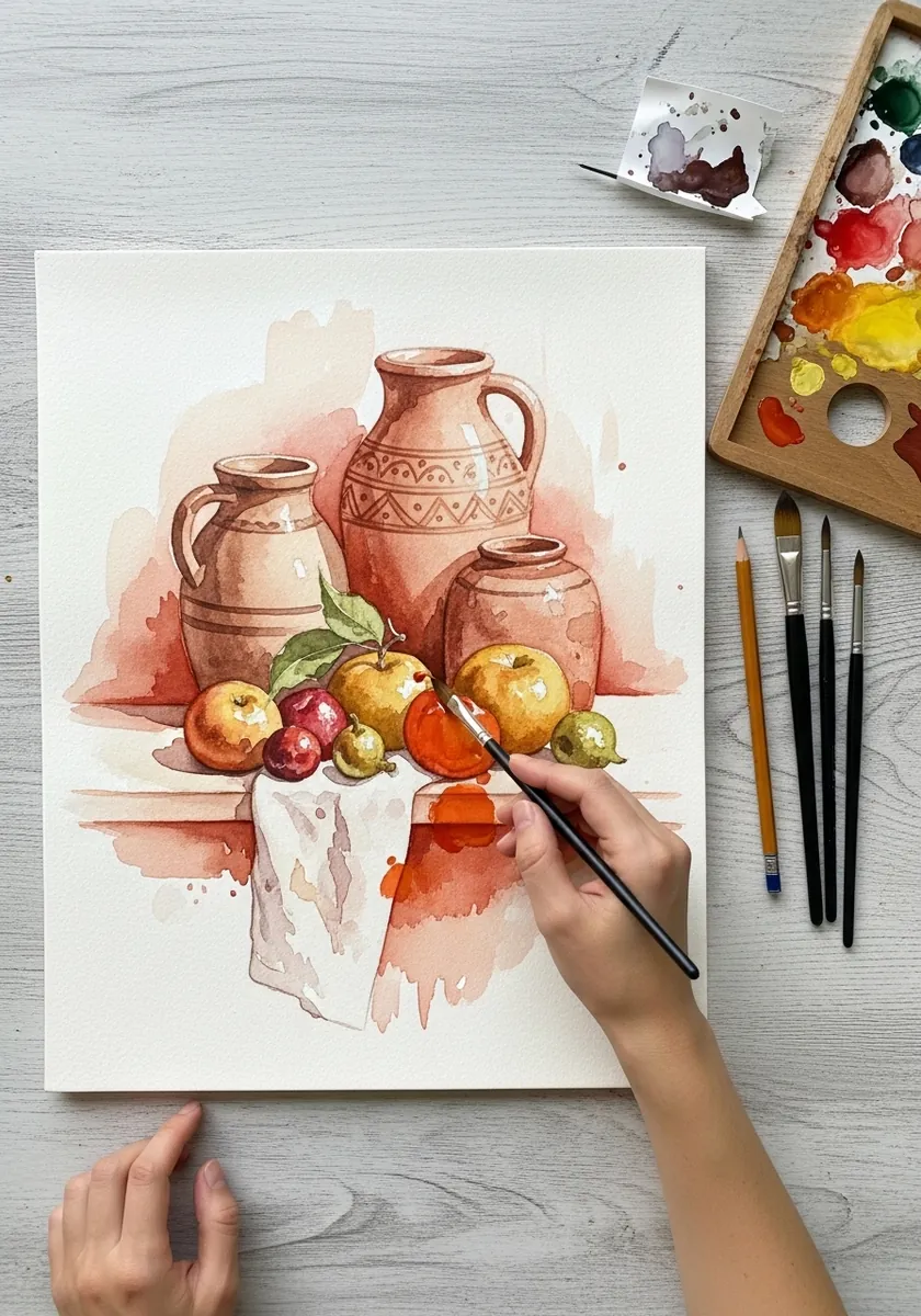
Terracotta objects are the natural subject for this palette. Paint the jugs in the same red you are already using, keep the fruit slightly cooler, and let the shadows on the table be that red mixed with a touch of blue.
14. Peonies in Warm Red
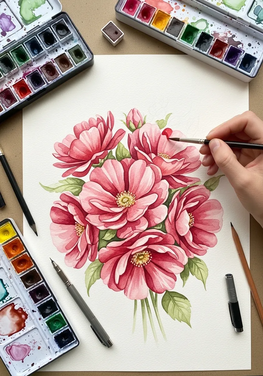
Petals need the layers to stay separate. Paint each petal as its own shape, let it dry before painting the one behind it, and keep the deepest red only in the crevices at the center; blending them together loses every edge.
15. Red Line Dragon
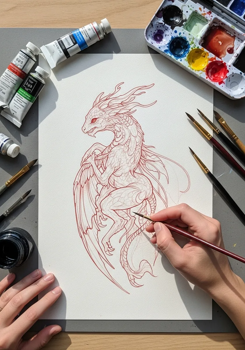
A complex creature drawn in one color depends on line density. Pack the lines tightly on the scales and wings, leave the belly almost empty, and let that difference do all the shading. No wash is needed anywhere. Vary the line weight slightly along each wing bone so the creature reads as solid.
16. Impasto Red Hills
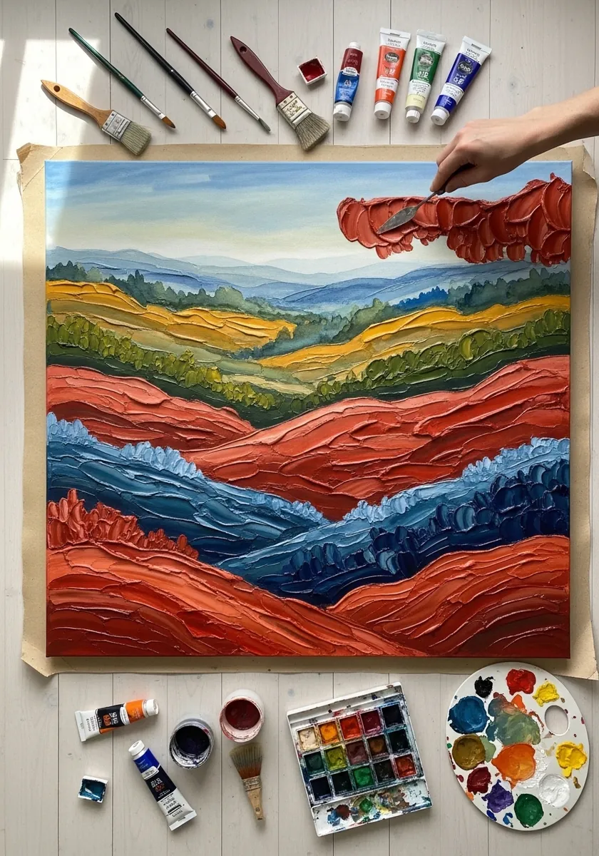
Thick opaque paint over rolling forms wants directional strokes. Run every mark along the contour of the hill it sits on, change direction at each ridge, and let the ridges read purely through the change of stroke. Keep the blue only in the deepest valleys, where the light would not reach.
17. Red Mandala
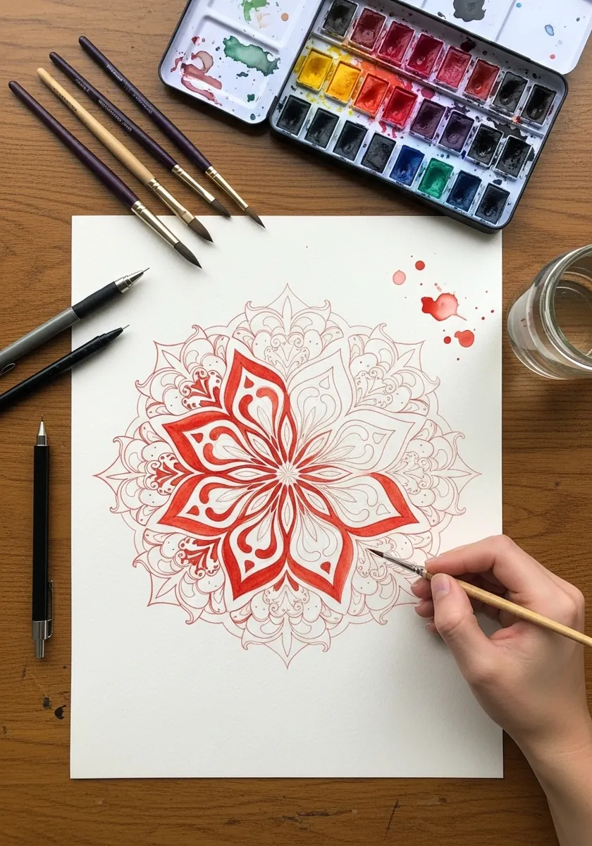
Symmetry needs construction before decoration. Draw the circles and the radial divisions faintly first, work one segment fully, and then repeat it exactly around the rest. Improvising a mandala segment by segment always drifts. Keep a compass and a protractor beside you, since freehand circles will not hold.
18. Industrial Skyline in Red
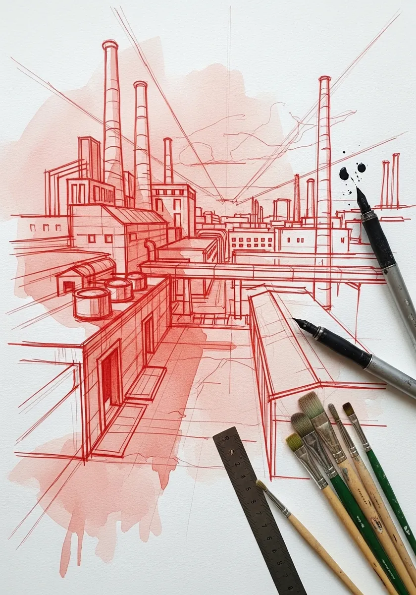
Perspective drawn in red reads as a plan rather than a picture. Run every horizontal to a single vanishing point, keep the vertical chimneys perfectly parallel, and let a loose red wash behind soften the whole thing. Add a few thin plumes of smoke to break up all those hard verticals.
19. Red Sea and Breaking Wave
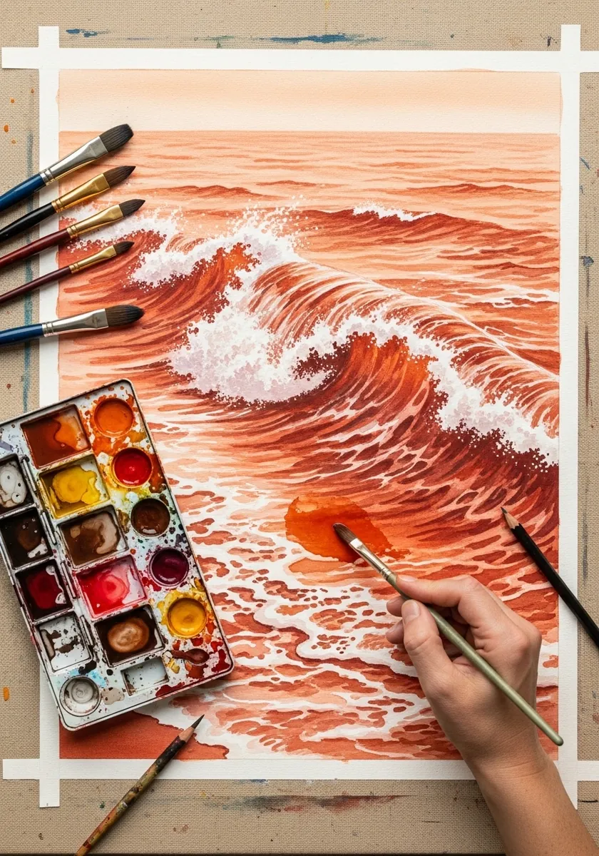
Foam is reserved paper, never white paint. Mask or paint carefully around the breaking crest, keep the water behind it flat and horizontal, and put the darkest red immediately under the foam so it appears to glow. Keep the horizon perfectly level, because a tilted sea undoes the whole illusion.
20. Circular Portrait With Splashes
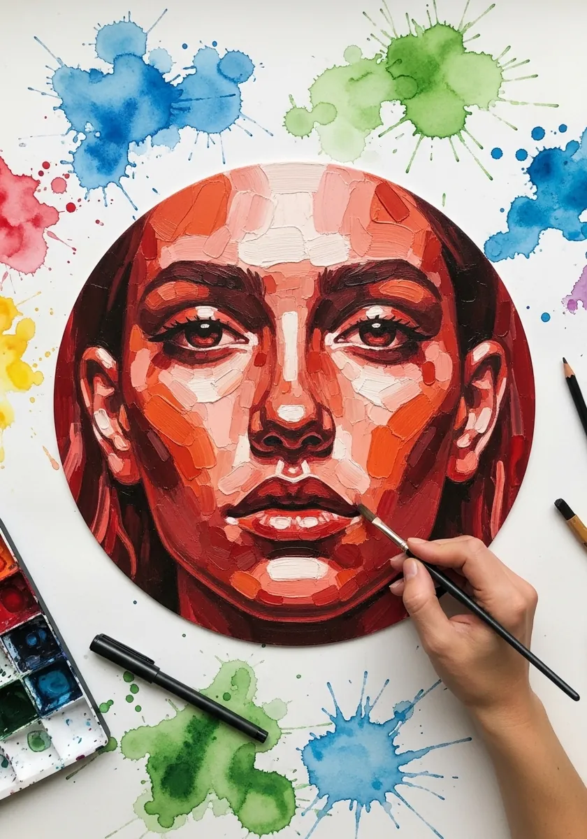
A tondo forces everything inward. Fit the face so it slightly overflows the circle, keep the background inside it plain, and put every splash outside the edge. The contrast between contained and loose is the whole design. Mask the circle with tape first so the splashes cannot creep inside it.
21. Leaves on Red Clay
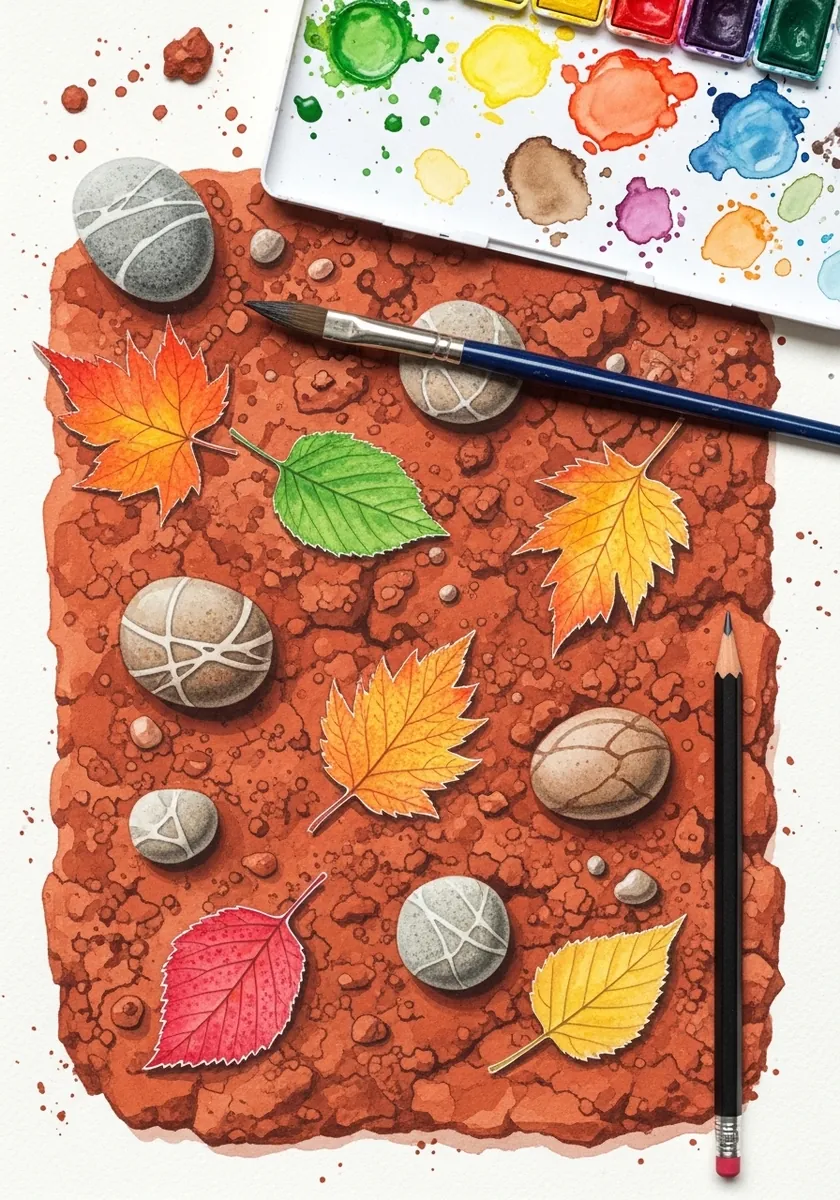
Granulation is the point of this one. Flood the ground with a heavily granulating earth red, tilt the paper while it is wet so the pigment gathers, and let it dry undisturbed before painting anything on top. Paint the leaves on top only once the ground is completely dry to the touch.
22. Red Brush Bull
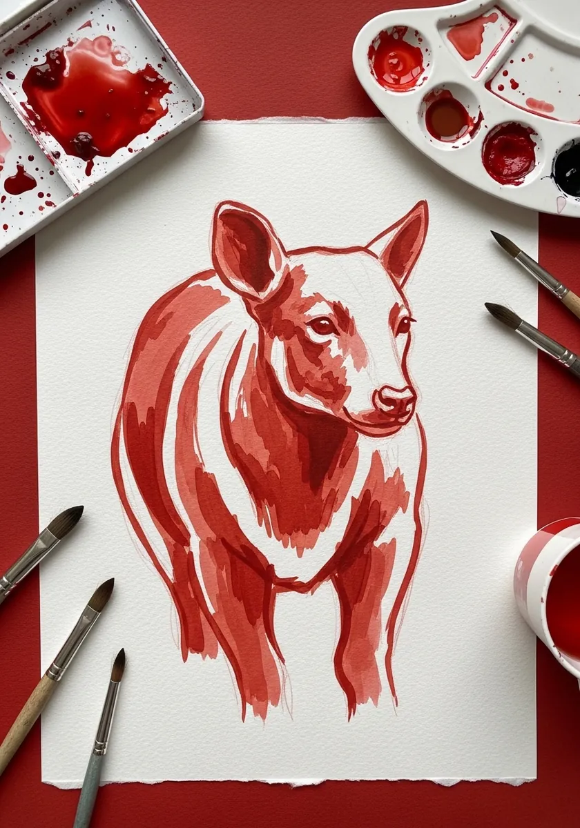
An animal painted in a few strokes needs the silhouette memorized first. Draw it several times in pencil, then paint it in six or seven loaded strokes without looking back, and stop the moment it is recognizable. Leave the paper white inside the body, since a filled shape loses all its speed.
23. Brick Ruins Study
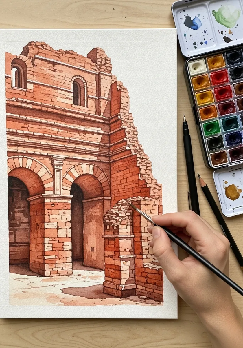
Brickwork is a texture that must be suggested. Wash the whole wall in one earth red, then pick out only twenty or thirty individual bricks near the edges and around the arch, and leave the rest as a flat plane.
24. Misty Red Pine Layers
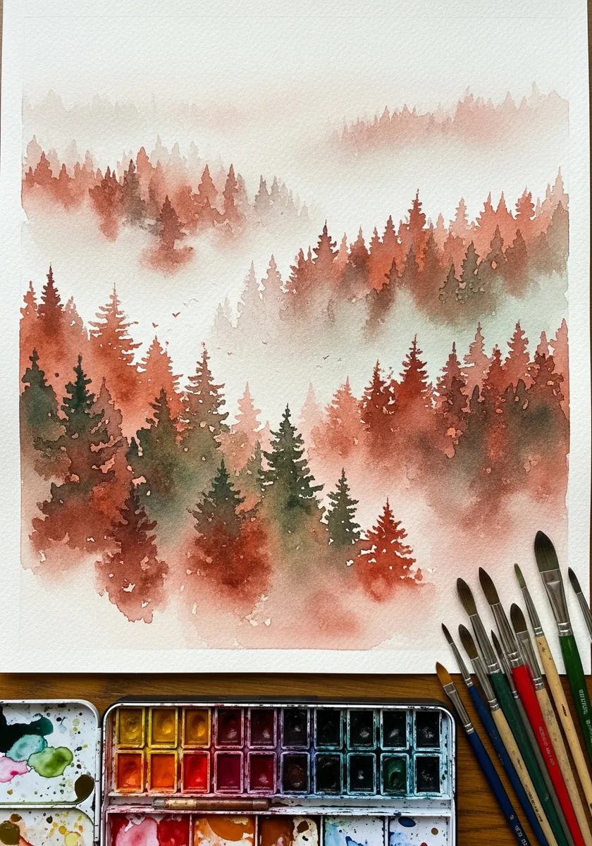
Mist is created by lost edges, not by white paint. Paint each row of trees weaker and softer than the row in front, wet the paper between layers so the tops blur, and keep the nearest trees the only crisp shapes.
25. Red Figure Study
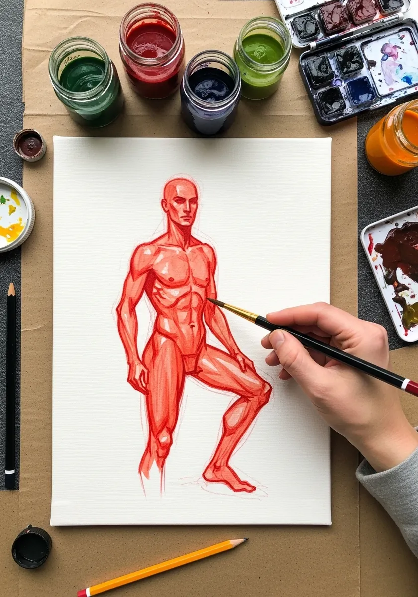
Working in one color makes a figure study about form alone. Establish the light side and the shadow side as two flat tones first, add a third darker tone only in the core shadows, and add nothing else. Keep the outline broken, because a hard contour flattens a figure immediately.
26. Alcohol Drop Blooms
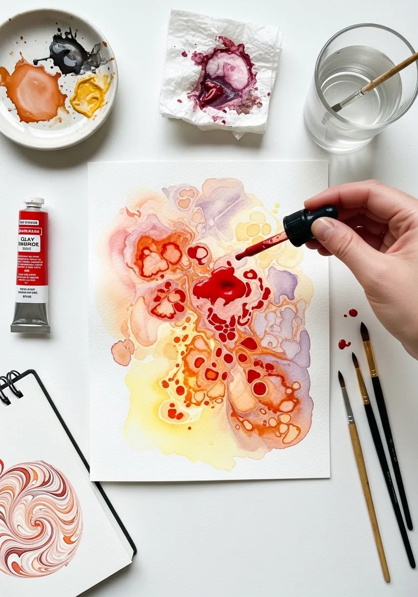
Alcohol pushes wet pigment aside and leaves a pale ring. Lay a rich wet wash, drop the alcohol in from a pipette while the surface is still shiny, and then walk away. Touching it while it works destroys the ring.
27. Red and Blue Galaxy
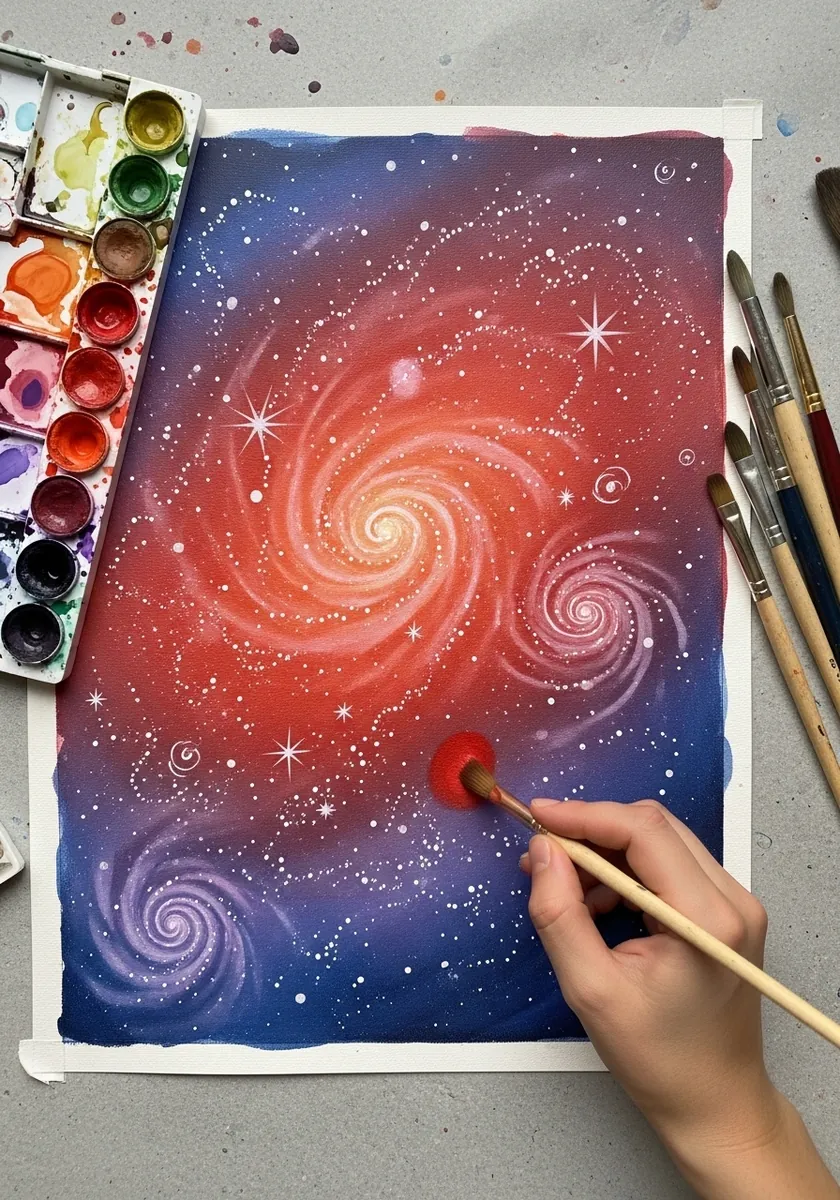
Warm and cool in the same wash need to meet while both are wet. Drop the red and the blue into a damp surface separately and let them mingle on the paper, then flick white specks over the top once everything is bone dry.
28. Red Botanical Line
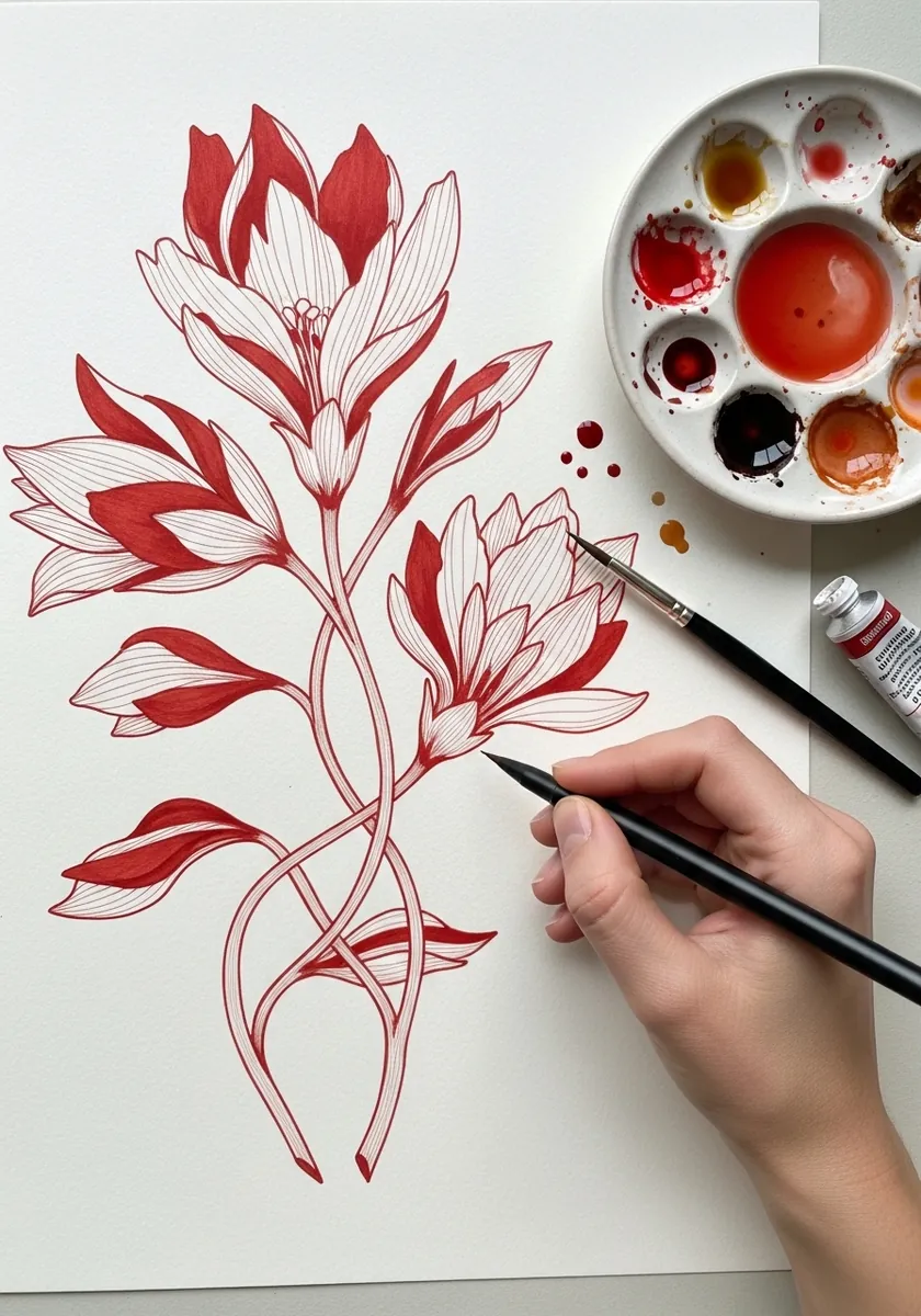
Stylized botanicals are designed rather than observed. Simplify every leaf to one repeated shape, let the stems curve in long uninterrupted arcs, and keep the whole spray asymmetrical so it still feels like a plant. Vary the length of each stem so the spray never settles into a fan.
29. Clay Slab Texture
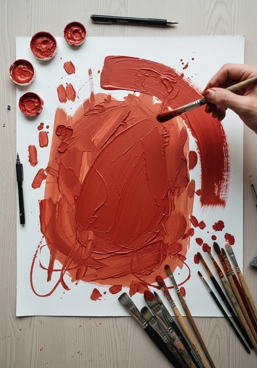
Finish by painting the material itself. Build the slab as a solid earth red with visible granulation, scratch into it with a knife point while damp, and let a few splatters fall outside the shape. The texture is the subject.
Frequently Asked Questions
What is a clay red in watercolor?
Any of the natural iron oxide earths: red iron oxide, light red, Venetian red, English red and terracotta. They are opaque, heavily granulating and low in staining power, which is exactly what separates them from bright modern reds.
Why can I lift earth reds but not other reds?
Because the pigment particles are large and mineral, so they sit in the surface texture rather than bonding to the fibers. A damp stiff brush and a piece of kitchen paper will pull most of the color back, leaving a soft pale mark.
How do I darken an earth red without black?
Add a small amount of its complement, which for a warm red is a green or a blue-green. That mix goes deep and stays warm, while black turns the same red flat and gray almost immediately.
What paper suits granulating pigments?
Rough or cold pressed. Granulation depends on the pigment settling into the hollows of the paper, so a smooth hot pressed sheet gives an almost even wash and throws that character away.
Can I paint a whole picture in one earth red?
Yes, and it is a genuinely useful exercise. A single earth red thinned right down gives a pale skin tone and used at full strength gives a strong dark, which is enough range for a portrait, a landscape or a still life.
References and Further Reading