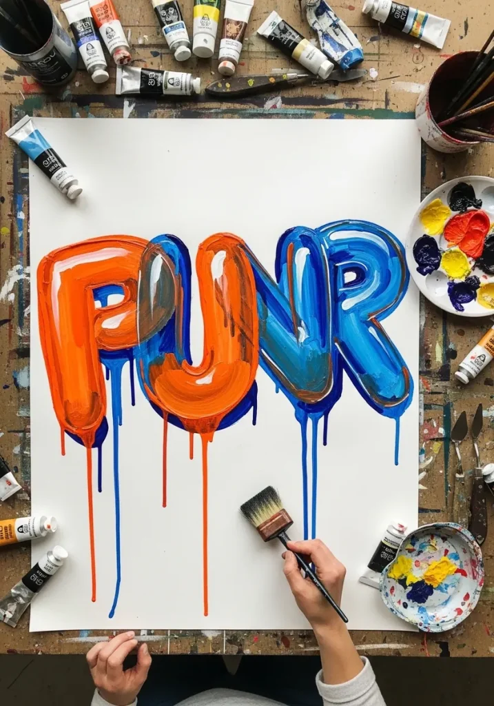
Inflatable lettering works through three rules: round every stroke terminal, pinch the outline inward wherever two strokes meet, and shrink the counters. Add one hard highlight near the top of each letter and the form fills with air.
Key takeaways
- Draw a thin monoline skeleton first, then inflate outward from it by an even distance on all sides.
- Every junction between strokes gets a pinched, inward-curving seam, exactly like a heat-sealed balloon.
- Counters, the enclosed holes in letters like O and A, shrink as the letter inflates.
- One hard-edged highlight near the top plus a soft reflected band along the bottom edge creates the volume.
- Rounded bubble lettering came out of early 1970s New York graffiti, credited largely to the writer Phase 2.
There is one detail that separates convincing inflatable lettering from letters that are merely thick. Wherever two strokes meet, the outline has to pinch inward rather than bulge outward, because a sealed, pressurized object physically cannot swell at a seam. Add that pinch and the whole alphabet fills with air.
The construction is simple once you know it. Write the word as a thin skeleton, then inflate outward by a fixed distance on every side, doming each terminal and shrinking the counters as you go. Two numbers, the inflation distance and the corner radius, keep an entire set consistent.
This style has real roots. Rounded bubble lettering came out of early 1970s New York graffiti and is credited largely to the writer Phase 2, because soft thick letters could be filled fast and still read from across a train yard. For the sharper-edged approach, see 3D lettering design ideas.
The thirty pieces below run from pencil practice alphabets to chrome, gouache, watercolor, mosaic and graffiti treatments. If you want to push the depth further, 3D typography art and alphabet art drawing both build on the same skeleton method.
Compiled by the GS Art Zone editorial team. Last updated August 2026. Each idea is paired with the specific step that produces the effect, so you can go from the reference straight to paper.
What You Need Before You Start
- A pencil and eraser for the monoline skeleton, which every piece here starts from
- A broad marker for filling and a fine liner for the outline, since the two jobs need different tools
- Opaque white gouache or a gel pen, because the highlight has to sit on top of the color
- Gray markers in three values, which is all you need for the chrome and metallic pieces
- A ruler for the baseline only, as the letters themselves should never be drawn against a straightedge
1. Pink Watercolor Bubble Word With Drips
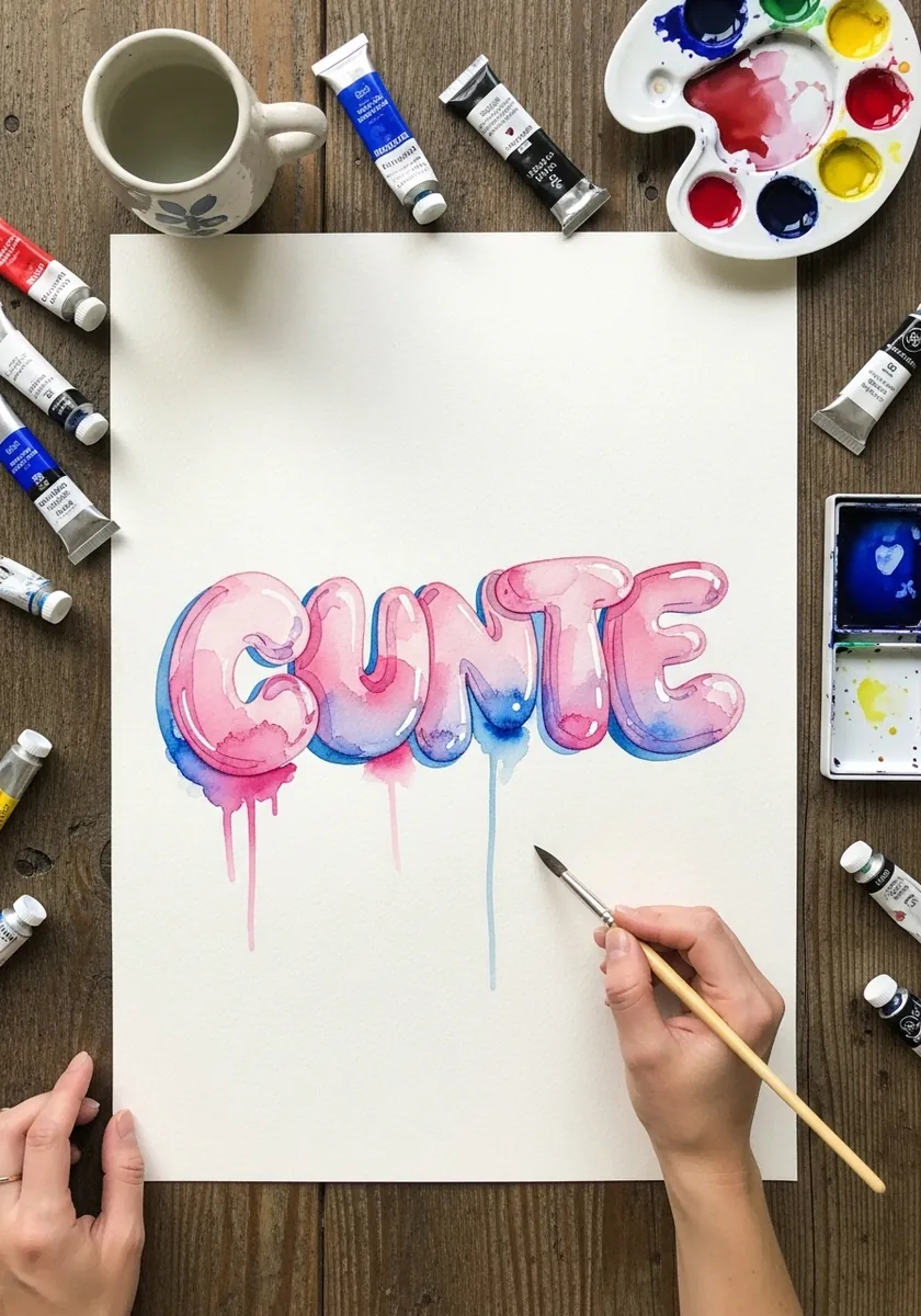
Wet media on inflated letters demands you reserve the highlight rather than paint it. Leave a small patch of dry paper near the top of each letter untouched, then flood color around it. Drips falling from the baseline should all run true vertical, whatever angle the letters sit at.
2. Pencil Practice Alphabet in Outline
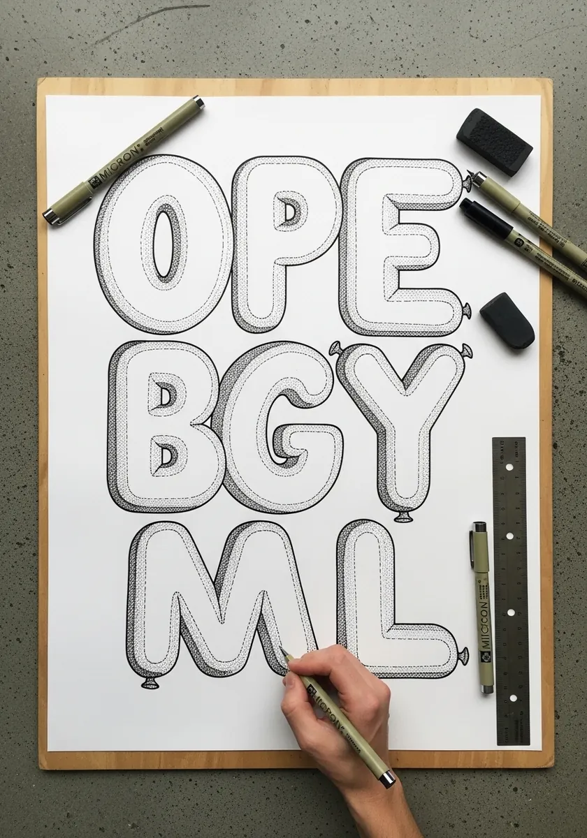
Practice sets are where you fix your two numbers. Decide how far you inflate out from the skeleton and how tight your terminal radius is, then hold both across every letter. Draw the skeleton lightly. Leave it visible while working, since it is your only guide to even thickness.
3. Pink and Blue Graffiti Piece
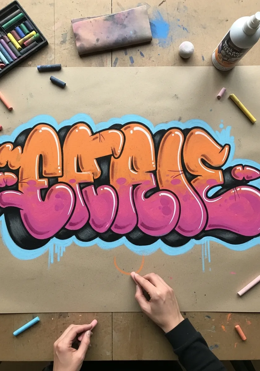
Wall lettering stacks its layers in a fixed order. Fill first, then the black outline, then a bright keyline outside that, and finally the pale cloud shape behind everything. The cloud edge should follow the whole word as one contour, never tracing each letter individually.
4. Earth Tone Gouache Alphabet
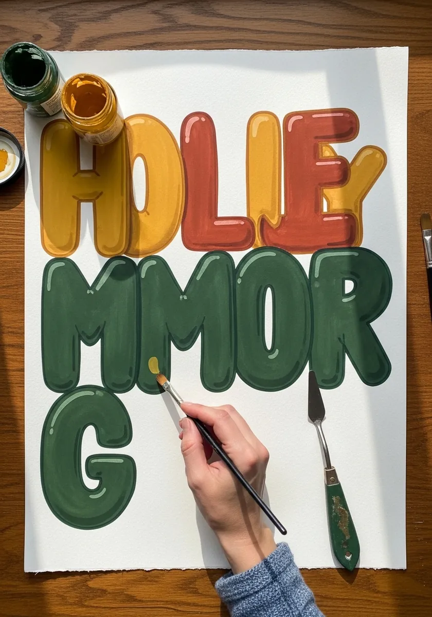
Muted palettes need value separation to stay legible. Pick colors that differ in lightness, not only in hue, and let neighboring letters alternate between light and dark. Gouache suits this because it dries flat, so the highlight you add afterward reads unmistakably as gloss.
5. Orange and Blue Foil Balloon Word
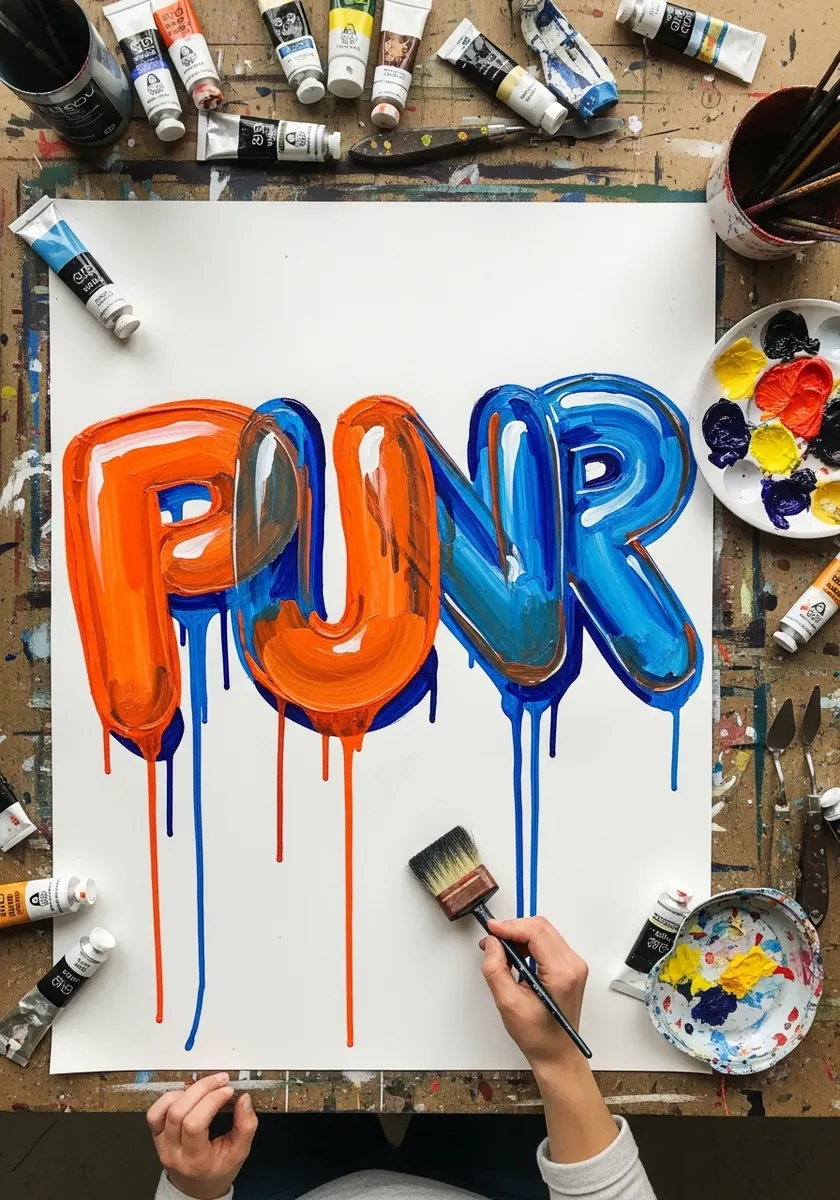
Foil behaves differently from rubber, creasing rather than stretching smoothly, so break the surface into a few flat facets and put a sharp highlight on each one. Give the seam running around the edge a visible welded lip, slightly darker than the face.
6. Soft Pink Script in Colored Pencil
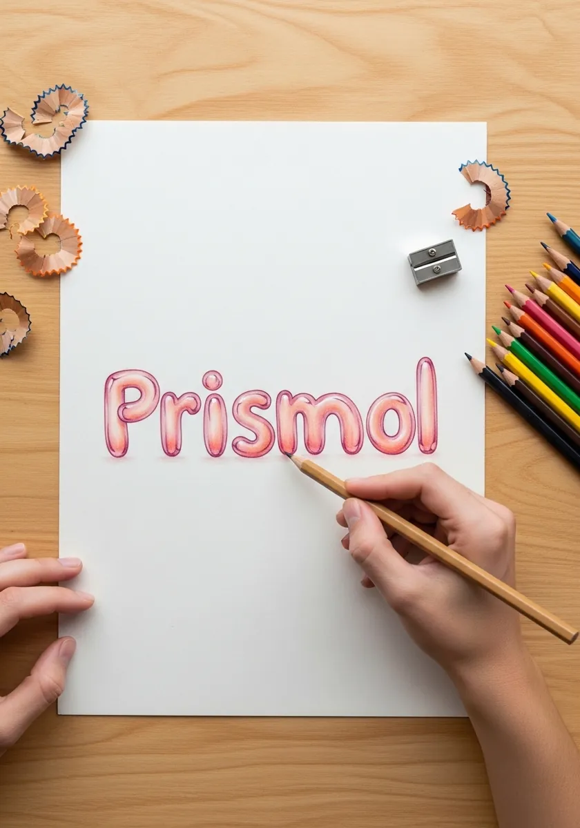
Inflating a joined script is harder than block capitals, because the connecting strokes have to inflate too without swallowing the loops. Keep the inflation distance smaller than you would for capitals, and let the entry and exit strokes stay noticeably thinner than the letter bodies.
7. Marker Alphabet in Gradient Colors
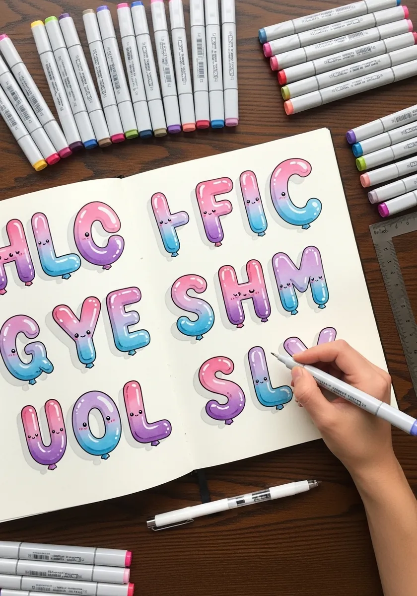
Running a gradient across a whole alphabet ties the set together. Assign each letter a position on the color ramp and stick to it, working left to right so adjacent letters differ only slightly. A single dark outline around every letter keeps the palette from turning to soup.
8. Botanical Inflated Word With Vines
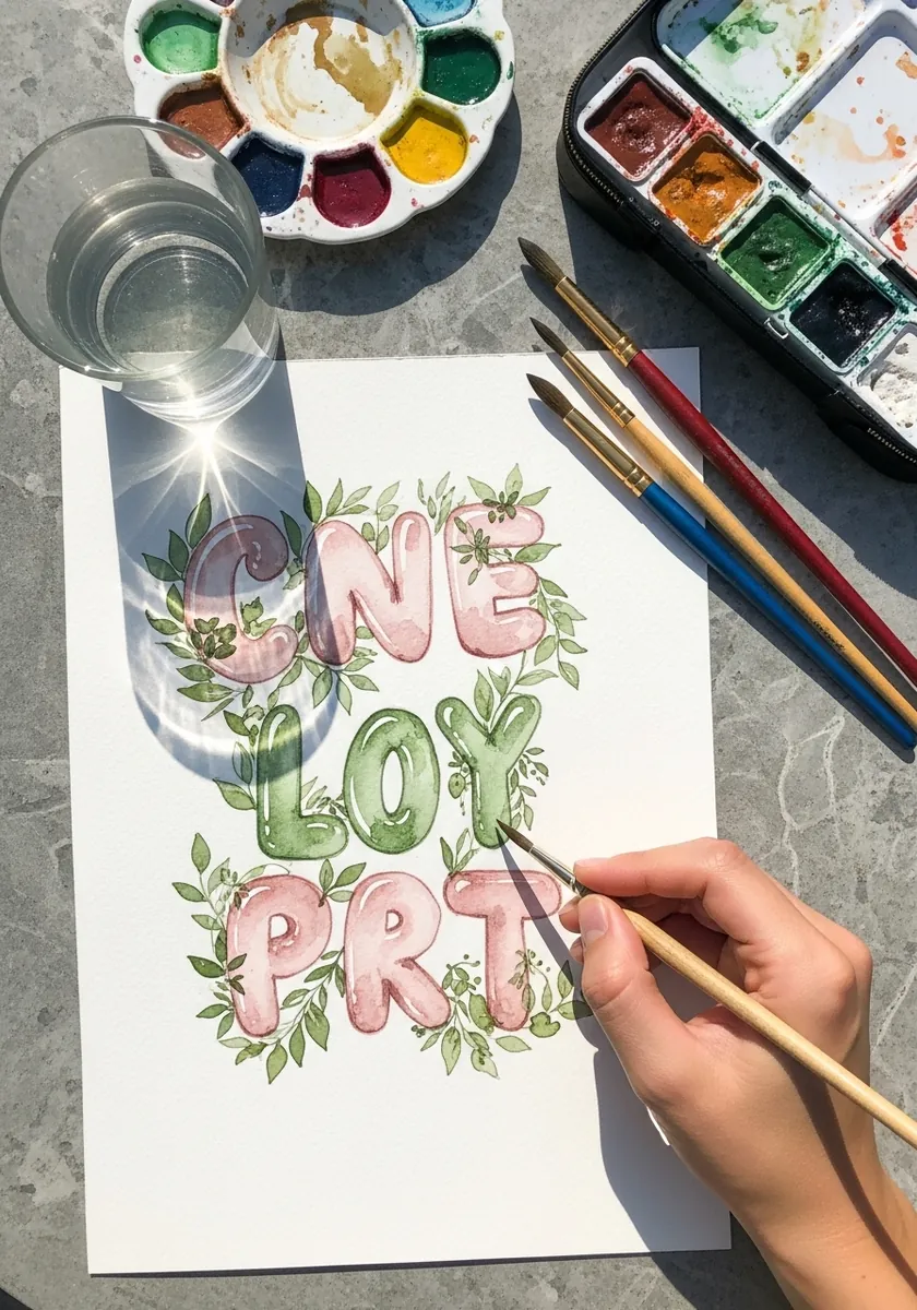
Foliage wrapping a letter has to obey the volume underneath. Pass each vine behind the letter and out the other side at a lower point, never straight across, so it reads as circling a solid tube. Keep the letters pale and the leaves saturated, and the hierarchy holds.
9. Chrome Graffiti Tag on Gray
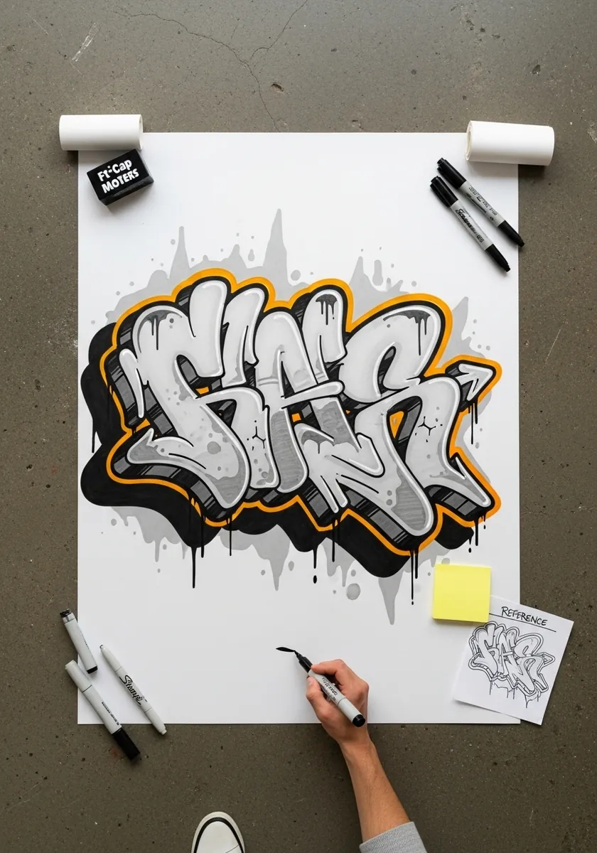
Chrome is painted, not shaded. Use a hard horizon line across the middle of each letter, warm gray above it and cool gray below. Add a pure white slash and a black notch. Reflections do not follow the form, which is exactly why chrome looks like chrome.
10. Rose Gold Metallic Balloon Letters
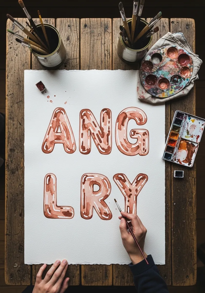
Metallic finishes need a reflected environment, even an invented one. Put a darker band across the lower third of each letter to suggest a floor reflection, and keep the very bottom edge lighter again. That second lift at the base is what separates metal from matte plastic.
11. Blue and Red Outlined Sketch Letters
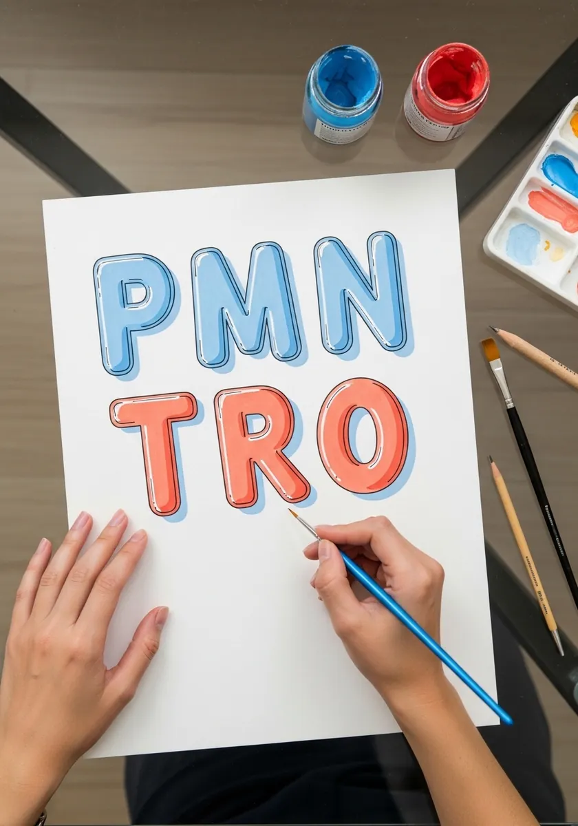
Leaving construction lines visible is a legitimate finish. Ink the outline confidently, add a simple hatch on one side of each letter, and let the underlying pencil skeleton show through. Keep the hatching on a consistent side throughout, or the light source falls apart.
12. Pastel Watercolor Letter Study
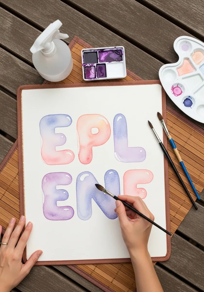
Very pale work relies entirely on edge quality, so paint each letter in one wash, wet the top edge slightly so it softens, and keep the bottom edge crisp. That difference between a soft top and a hard base does the same job a full shading pass would.
13. Graphite Alphabet With Grid Lines
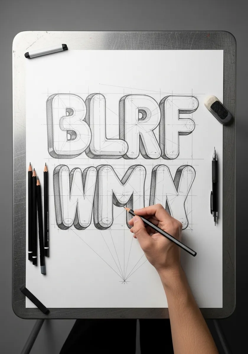
Grid work keeps a set even. Rule a baseline, a cap height and a midline before anything else, then build every letter to touch all three. The visible grid also lets you check your inflation distance letter by letter instead of guessing at it.
14. Glossy Black Ink Letters
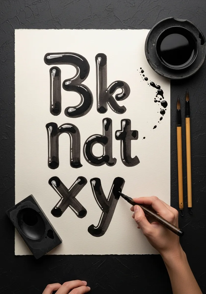
Black objects still show their form through highlights alone. Fill each letter solid, then place two reserved white shapes on it, a small hard one at the top and a long thin one along the lower edge. Everything else stays black, and the volume still reads.
15. Green and Gold Painted Balloon Set
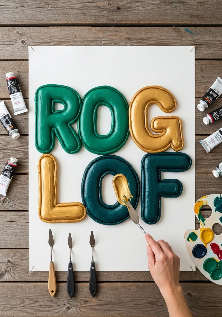
Adding a knot at the base commits to the balloon metaphor completely. Draw it as a small pinched triangle with a tiny loop. Place them all at the same relative position on each letter, and keep every knot pointing downward so the set stays consistent.
16. Pale Blue Katakana Balloon Letters
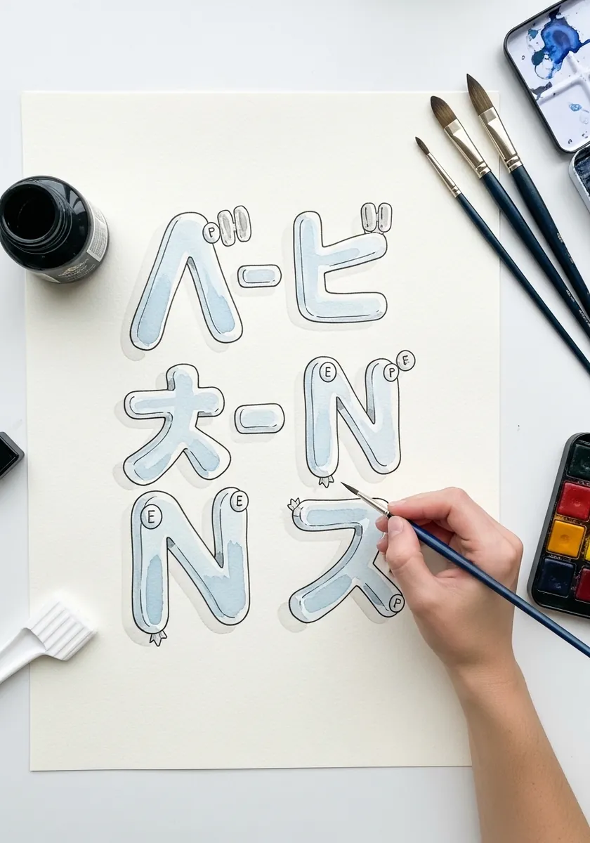
Non-Latin scripts inflate well because their strokes are already modular. Treat each stroke as a separate tube, inflate them individually, then pinch the outline where the tubes cross. Stroke order still matters, since it determines which tube passes in front.
17. Chrome Balloon Letters in Graphite
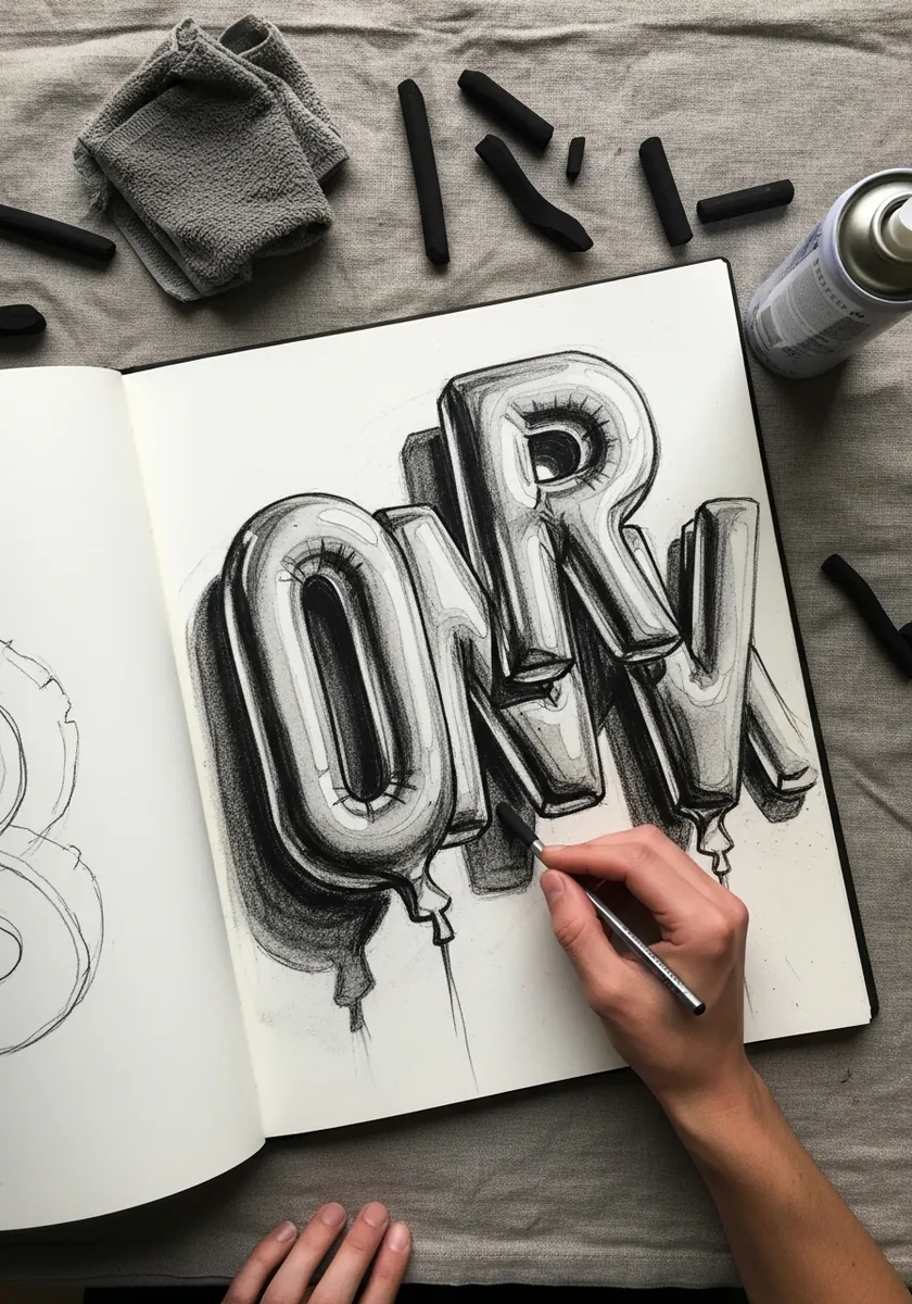
Rendering metal in pencil comes down to value range. Push some areas to nearly black and burnish others to bare paper, with almost nothing in between. See 3D pencil shading practice for building that contrast without flattening the surface.
18. Floral Filled Letters in Bright Gouache
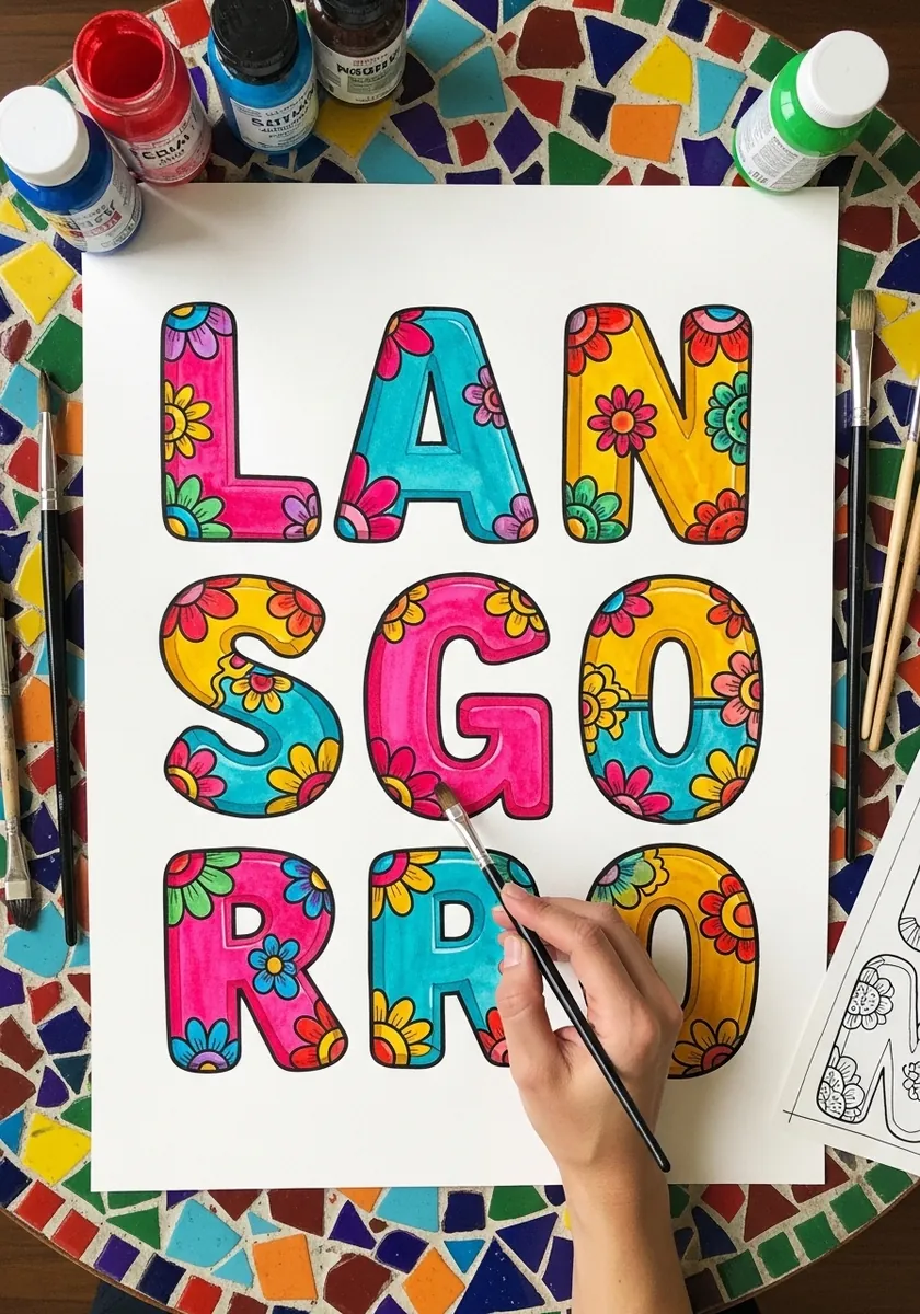
Pattern inside an inflated letter must curve with the surface, so scale the motifs smaller toward the outer edges of each letter, which creates the illusion of the pattern wrapping around a tube. Flat, evenly sized pattern kills the volume you worked to build.
19. White Chalk Alphabet on Navy
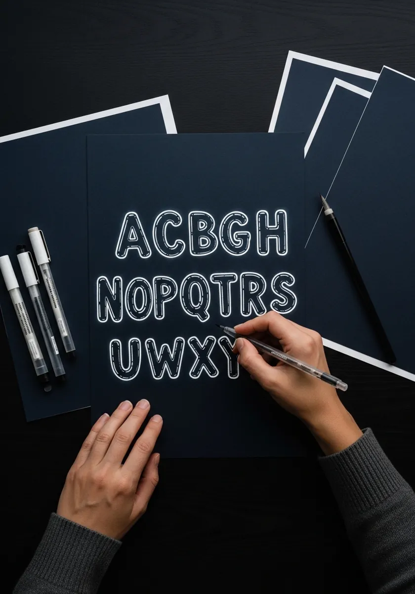
Dark grounds invert your usual approach: the paper becomes your shadow and you draw the light. Outline each letter thinly in white, fill only the lit upper portion, and leave the lower third bare so the navy itself forms the shaded underside.
20. Muted Pastel Letters With Cast Shadow
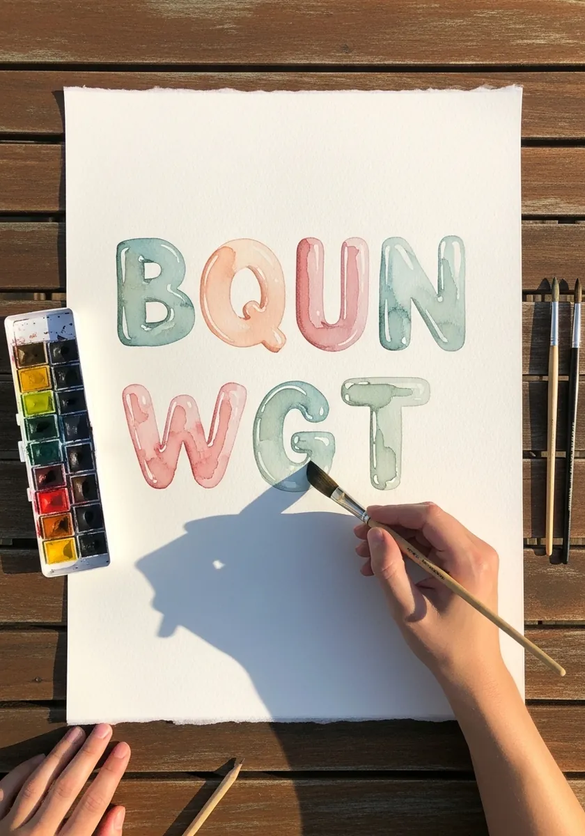
Cast shadows anchor floating letters to a surface. Offset each shadow in the same direction and by the same distance, keep its edge slightly soft, and let it darken where it touches the letter base. Inconsistent shadow angles are the fastest way to break the illusion.
21. Bold Green and Orange Extruded Word
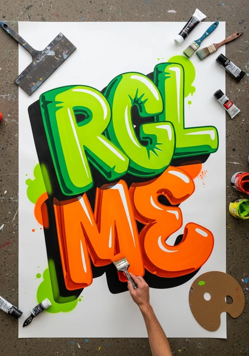
Extrusion is a different beast from inflation, and combining them needs care. Inflate the front face first. Push a solid side wall back at a single consistent angle for every letter. Keep all the extrusion lines parallel, since they run to one vanishing point.
22. Cream and Burgundy Vintage Letters
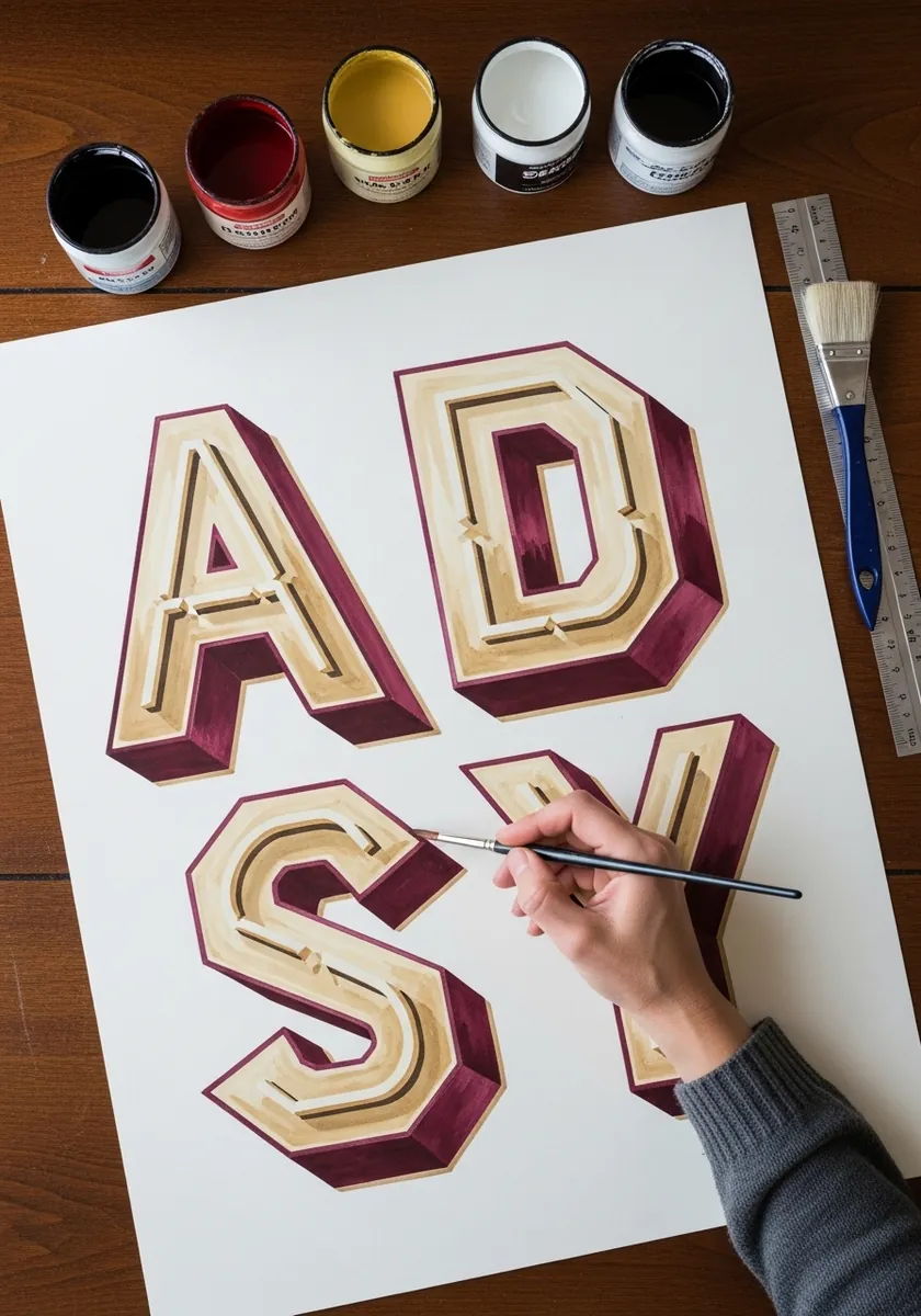
Two flat colors can carry the whole illusion without any blending at all. Draw the letter face in cream, then flood the shadow side in burgundy as a hard-edged shape rather than a gradient. Sign painters have used exactly this shortcut for over a century.
23. Puffy Script Alphabet in a Sketchbook
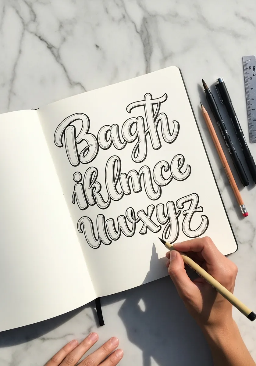
Working through a lowercase set teaches you more than a word does. Ascenders and descenders need their inflation trimmed slightly or they overwhelm the x-height letters beside them. Watch the counters in a, e and o especially, since inflation closes them first.
24. White Letters on a Blue Wash
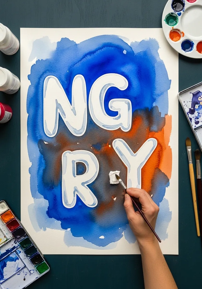
Reserving white is the most elegant way to paint pale letters. Draw them lightly, then paint the blue right up to and around each edge, working in one continuous pass so the wash stays even. Keep a damp brush handy to soften any hard bloom that forms.
25. Red and Blue Alphabet With Rulers
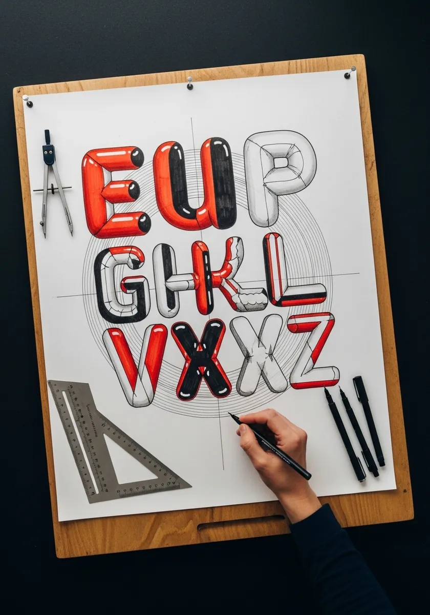
Drafting tools help with structure, not with the letters themselves, so use the ruler for baselines, cap heights and the angle of every shadow, then draw each curve freehand. Compass-drawn bubble letters look mechanical, and this style depends on an organic swell.
26. Tropical Scene Filled Letters
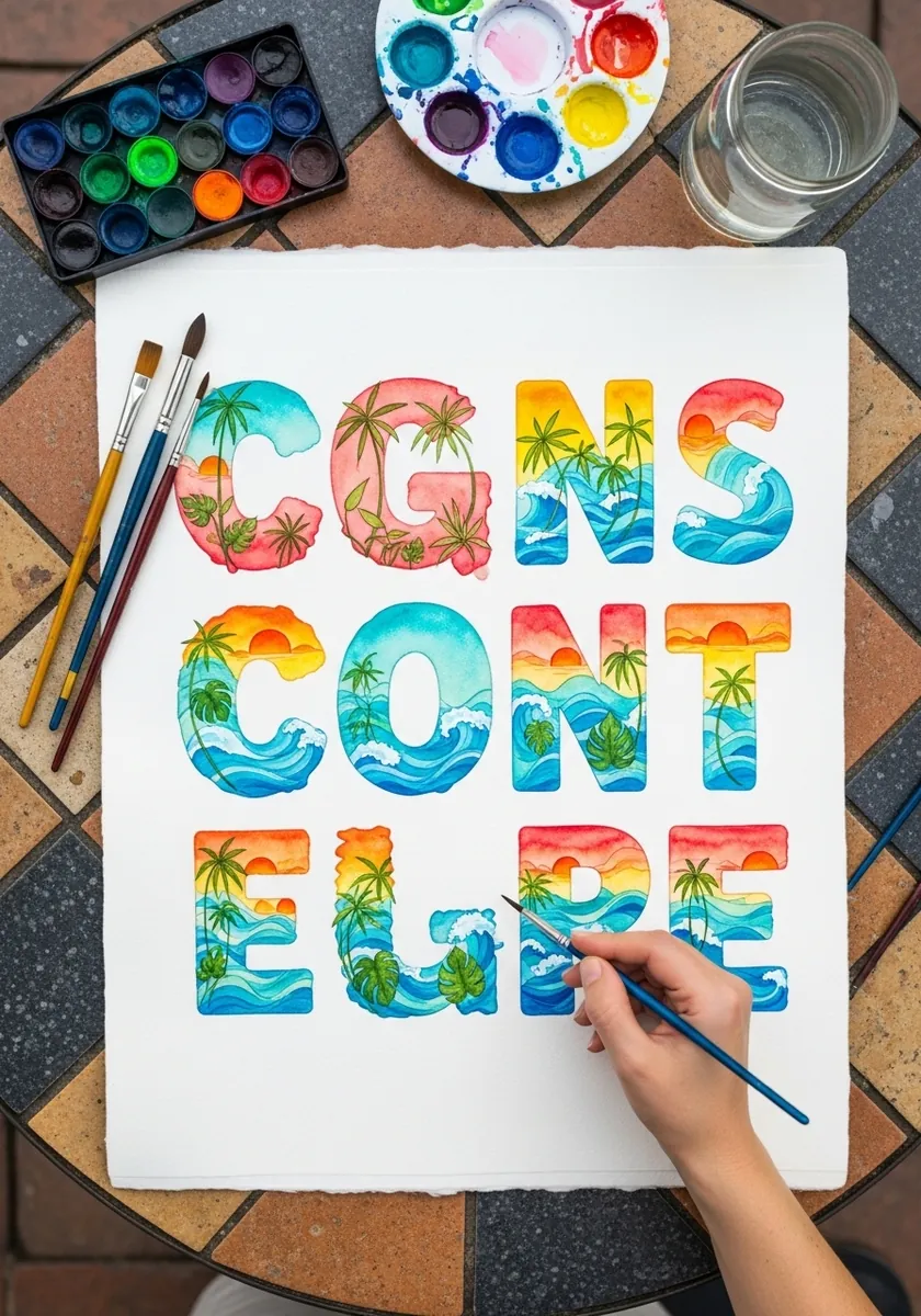
Filling letters with miniature scenes works when the horizon runs continuously. Set one horizon line across the entire word and let each letter show its own slice of it, so the scene reads as a single view glimpsed through letter-shaped windows.
27. Primary Color Crayon Letters
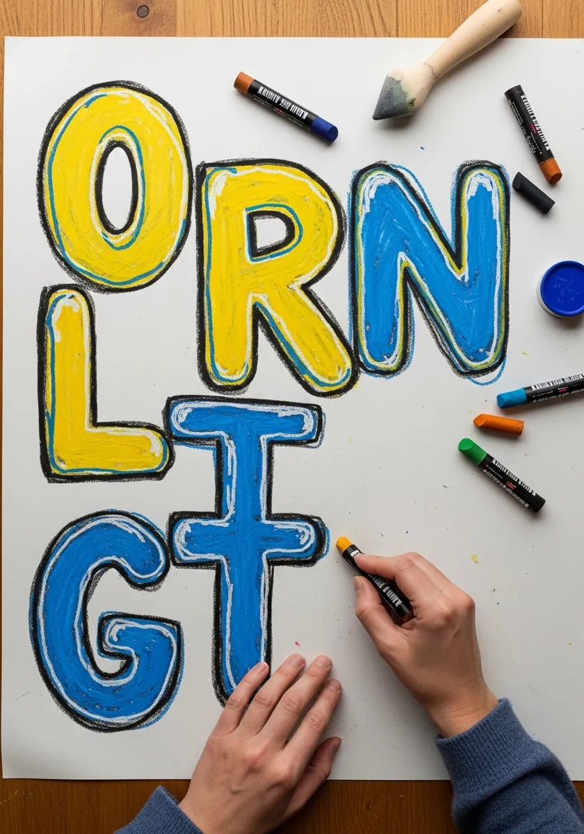
Crayon cannot hold a clean edge, so let that limitation work for you. Fill each letter with heavy scribbled wax in one direction, then outline in marker afterward, letting the outline tidy up whatever strayed. The visible wax texture keeps the letters feeling handmade.
28. Liquid Mercury Chrome Word
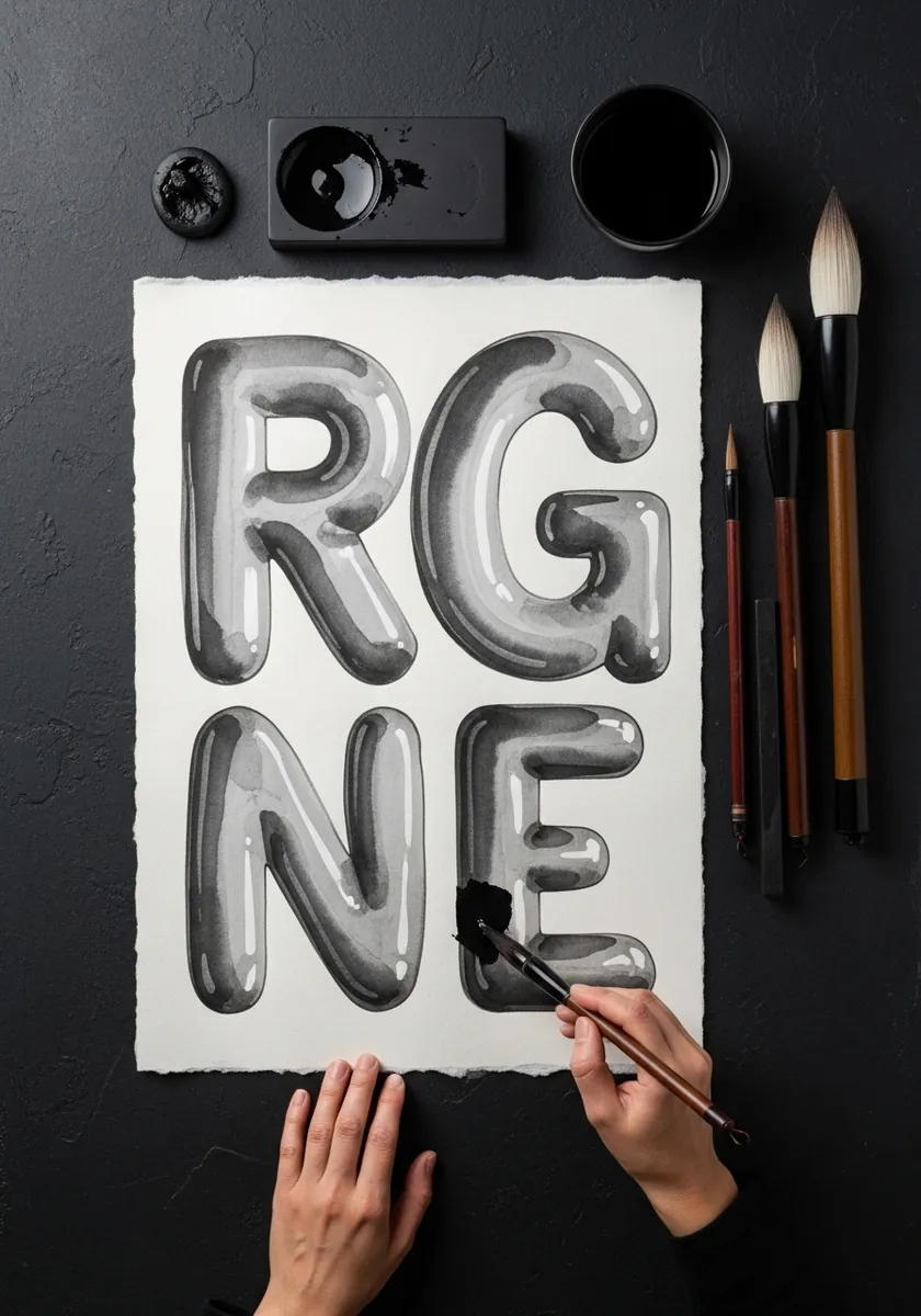
Liquid metal reads as liquid when the reflections distort. Bend your reflection bands where the letter curves. Break them into disconnected fragments, and let a couple run off the edge entirely. Neat reflections say solid chrome, broken ones say mercury.
29. Ghosted Pencil Alphabet in Daylight
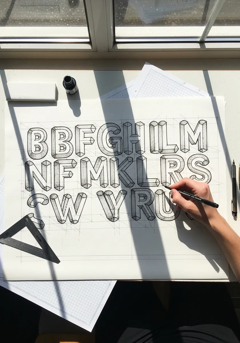
Very light drawing is the right stage to test proportion. Keep everything at a whisper, compare each letter’s width against its neighbor, and fix the awkward ones before committing any ink. Most lettering problems are width problems, and they are invisible once the outline goes down.
30. Party Balloon Letters With Strings
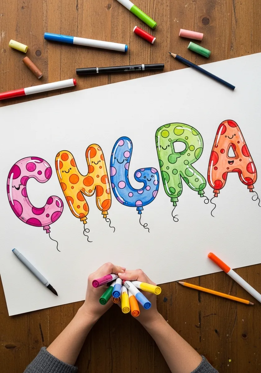
Adding strings turns lettering into an object in a scene. Draw each string with a slight curve rather than straight down, vary their lengths, and let one or two cross behind a neighboring letter. Straight parallel strings look printed instead of floating.
Frequently Asked Questions
How do you draw inflatable or balloon letters?
Write the word in a thin single-stroke skeleton first. Then trace an outline a set distance out from that skeleton on all sides, rounding every end into a dome and pulling the outline inward wherever two strokes meet. Finish with one bright highlight per letter.
What makes lettering look inflated rather than just fat?
The seam pinch. Real inflated objects cannot bulge at a join, so the outline tucks inward there. Fat letters without that inward pull just look like a heavy typeface, no matter how rounded the ends are.
Where does the highlight go on a balloon letter?
Near the top of each letter, offset toward whichever side your light comes from, and kept small and hard edged. Add a second, much softer band of reflected light along the bottom edge, which is what stops the letter looking like a flat sticker.
Where did bubble lettering come from?
New York graffiti of the early 1970s. The rounded bubble style is credited largely to the writer Phase 2, and it spread because thick soft letters could be filled quickly with a marker or a spray can while still reading clearly from a distance.
How do you keep a whole alphabet consistent?
Fix two numbers before you start: the inflation distance out from the skeleton, and the corner radius on your terminals. Apply both to every letter without exception, and the set will look designed rather than improvised.
References and Further Reading