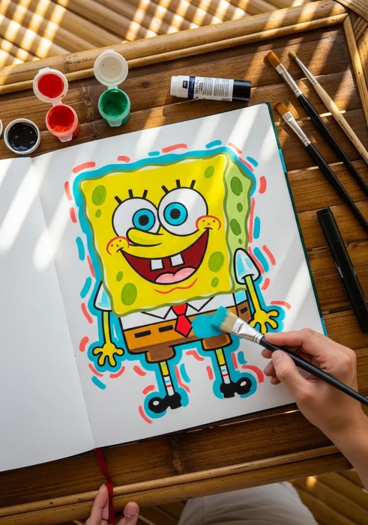
SpongeBob is a kitchen sponge, not a sea sponge, so his corners stay square. Rounding those four corners is the single change that pushes a drawing off model faster than anything else.
Key takeaways
- Keep all four corners square and let only the edges between them wave gently|Draw the body as a rectangle taller than it is wide, roughly five units high to four across|Scatter the pores in uneven clusters with bare patches, never in an even grid|Give every pore a shadow arc on one side only, so it reads as a hole rather than a spot|Set the two eye circles touching at the center and above the midline of the face
Almost every SpongeBob drawing that looks slightly wrong has the same flaw, and it is not the face. The corners have gone soft. He is drawn from a rectangular kitchen sponge, not a rounded natural sea sponge, and those four sharp corners are what the eye recognizes first.
Stephen Hillenburg taught marine science before he made the show, and he knew exactly what a real sponge looks like. He chose the kitchen version anyway because the square shape read better and was funnier. Ruling the rectangle first, then wobbling only the edges between the corners, fixes most of it.
The pores are the second giveaway. They sit in uneven clusters with bare stretches between them, they vary in size, and each one carries a shadow arc on a single side so it reads as a hole rather than a printed dot. An even scatter turns him into polka dots immediately.
Below are twenty-nine approaches, from graphite and technical blueprint through watercolor, graffiti marker, sumi-e and oil pastel. If you want the same construction thinking applied more broadly, 3D cartoon character drawing covers volume, and octopus drawing ideas handles the rest of the neighborhood.
Compiled by the GS Art Zone editorial team. Last updated August 2026. Each idea is paired with the specific step that produces the effect, so you can go from the reference straight to paper.
What You Need Before You Start
- A ruler for the first rectangle, since a freehand body drifts into a trapezoid
- A mid yellow and a deeper gold, because the pores need a darker value than the body
- A fine liner around 0.3 for the pore outlines and a brush pen for the body edge
- A kneaded eraser for lifting the construction rectangle out from under the ink
- Any paper that takes a hard edge, since the whole character is built on straight lines
1. Clean Pencil Line Drawing
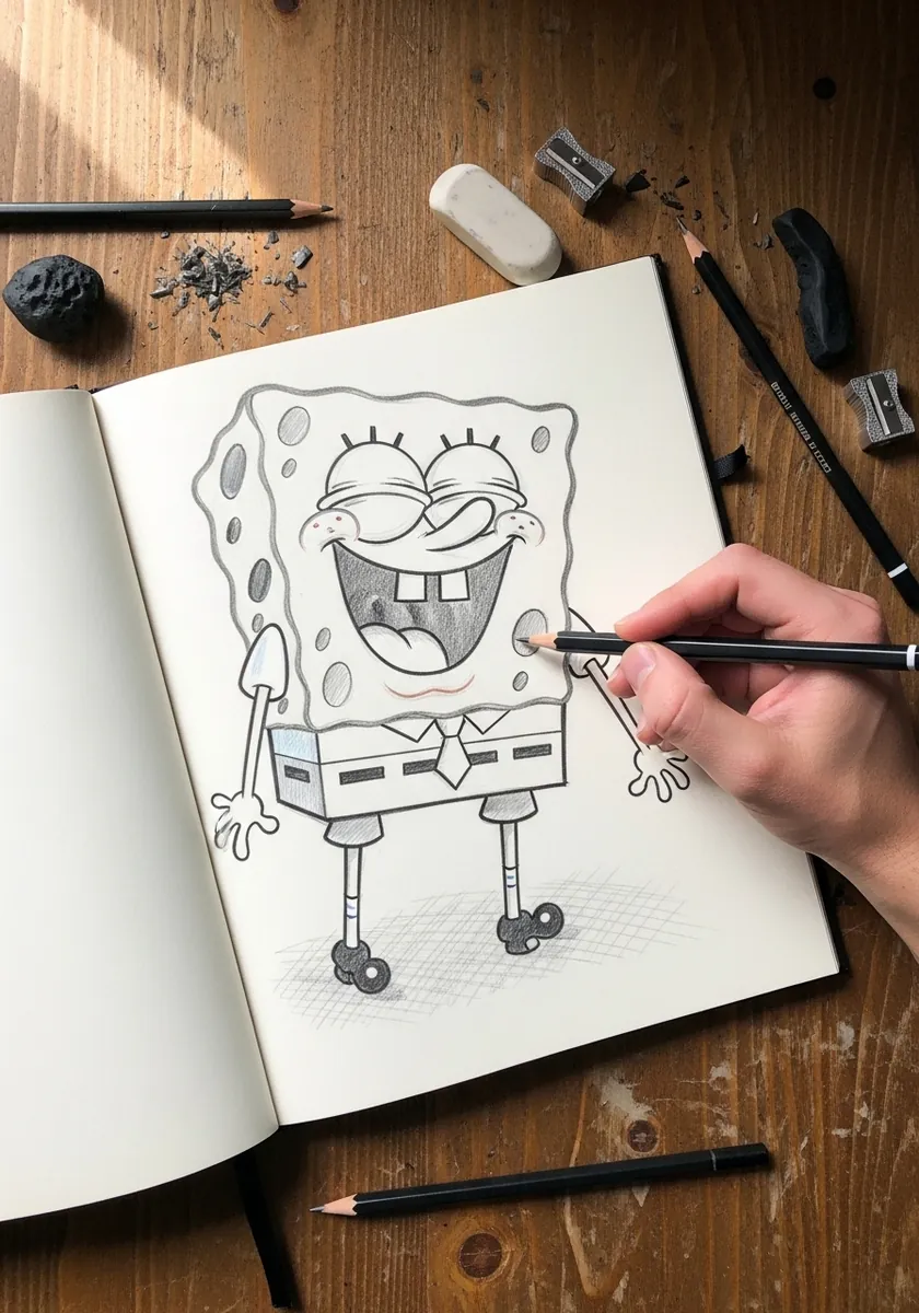
Start where every other idea on this list starts. Rule the rectangle, mark the corners, then draw the wavy edges between them without touching those corner points. Add the eyes and the pores last, and keep the whole thing light enough that you can still lift the construction lines out cleanly afterward.
2. Watercolor Splash Background
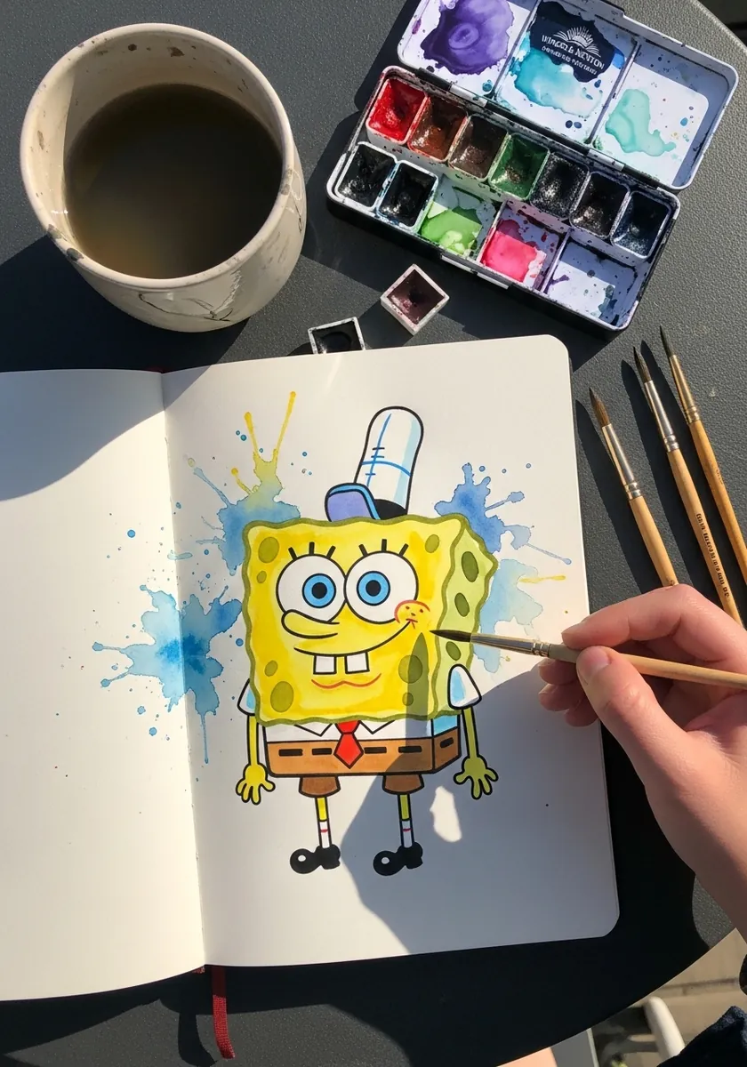
A splash behind a flat character needs to stay behind it. Paint the blue first and let it dry completely, keep the splash asymmetrical so it reads as energy rather than a halo, and only then lay the yellow down on top with clean opaque edges.
3. Ink Karate Action Pose
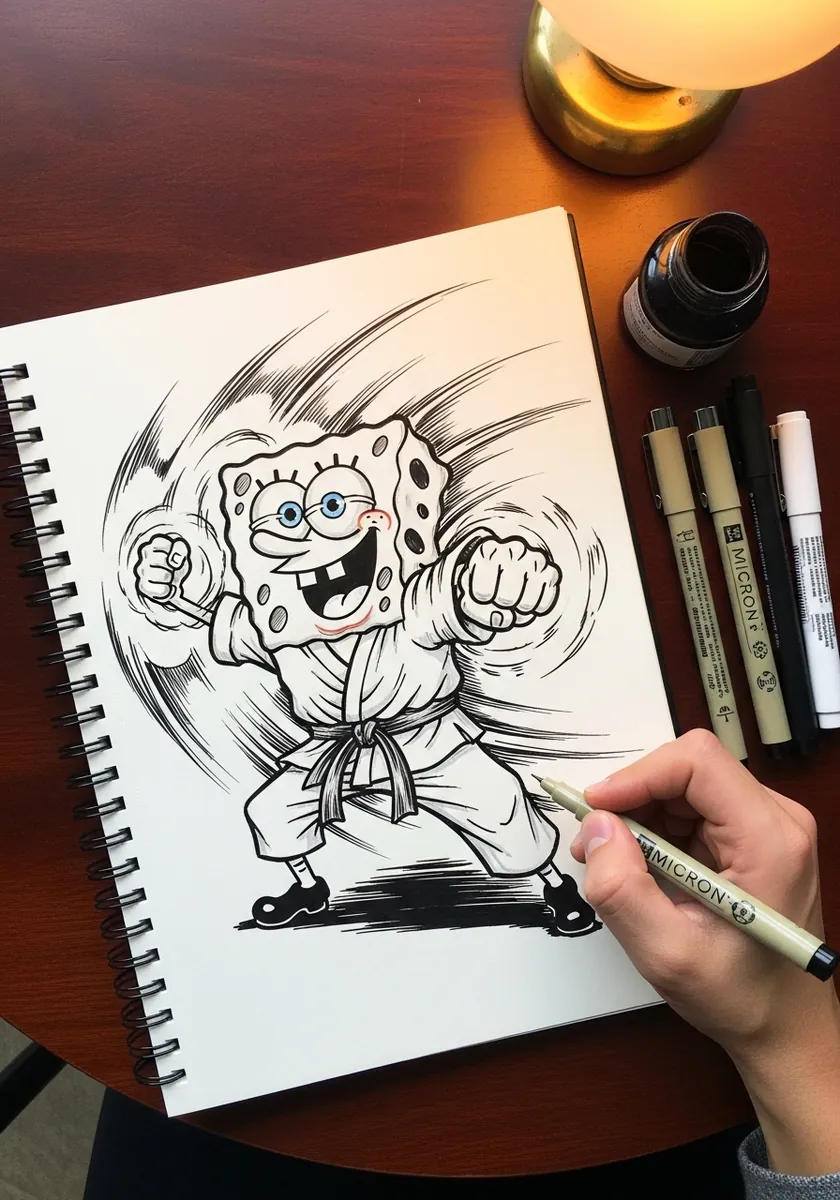
Action on a rigid shape comes from tilt, not bend. Rotate the whole rectangle about fifteen degrees, keep the corners just as sharp as before, and let the arms and legs do all the stretching. Speed lines should radiate from behind the body rather than crossing it.
4. Charcoal and Color Mix
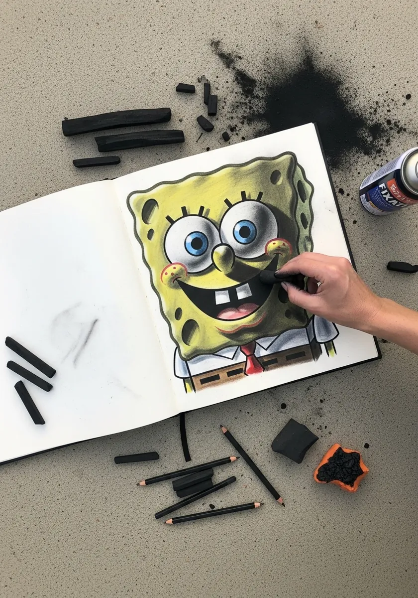
Charcoal and colored media together need clear territory. Block the figure in with vine charcoal, spray or fix it before adding any color, and keep the charcoal to the shadows and background only. Skipping the fixative pulls gray into the yellow and dulls the whole thing.
5. Soft Pastel Wash Study
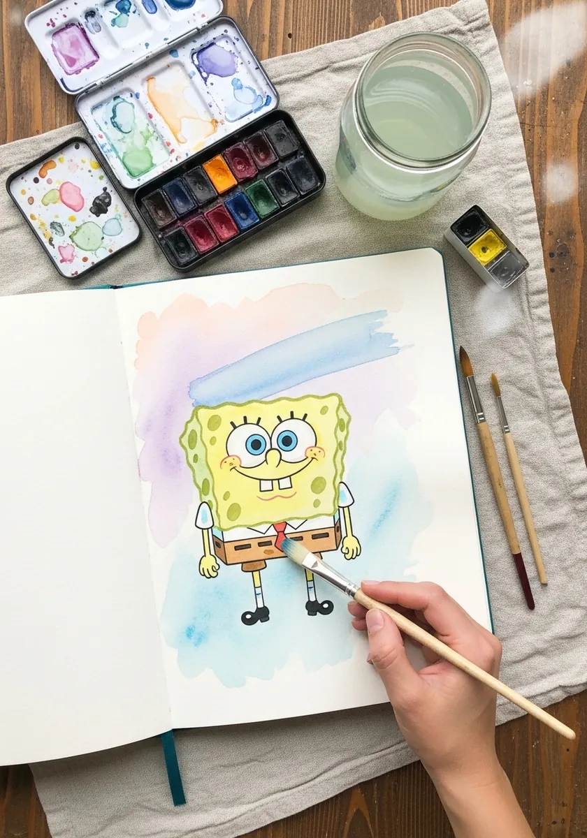
Painting a saturated character in muted tones is a real exercise in restraint. Dilute everything further than feels right, let the washes stay slightly uneven, and resist adding a dark outline. The drawing holds together on shape recognition alone, which is exactly the point.
6. Coral Reef Border Drawing
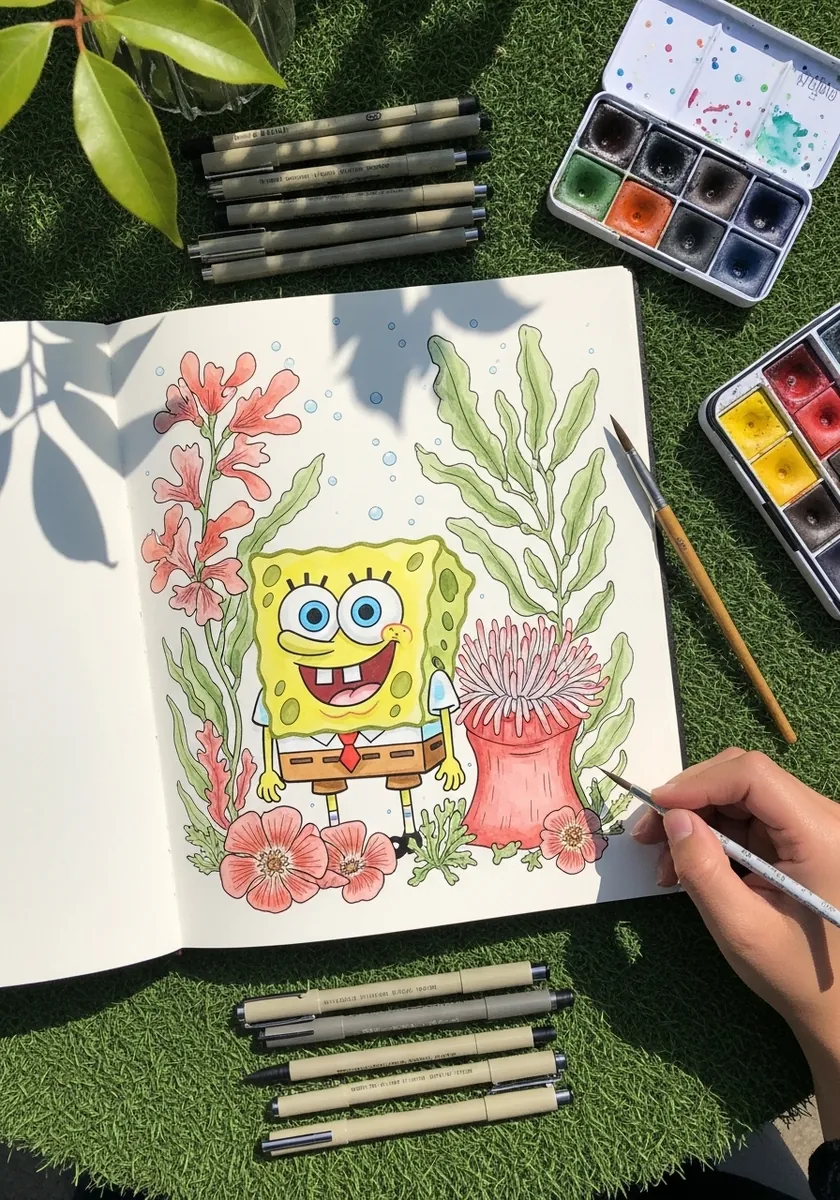
A decorative border works best when it never touches the subject. Draw the figure first, leave a clear margin around it, then grow the coral and seaweed inward from the page edges. Keep the border colors cooler than the yellow so the character still comes forward.
7. Flat Acrylic Color Blocking
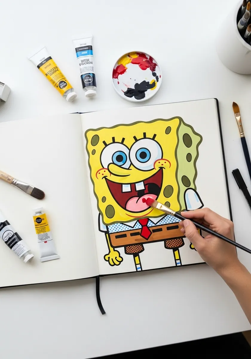
Flat acrylic rewards planning over blending. Mix every color you need before starting, including the darker gold for the pores, and paint each area in one pass without going back over a half dry edge. Two thin coats beat one thick one for evenness.
8. Marker Drawing on a Beach Scene
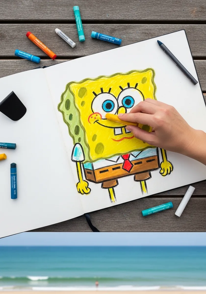
Placing a drawing over a real photograph forces a decision about scale. Match the figure size to something in the picture, keep the marker fully opaque so nothing shows through, and let the photograph handle all the depth while the drawing stays deliberately flat.
9. Blueprint Construction Study
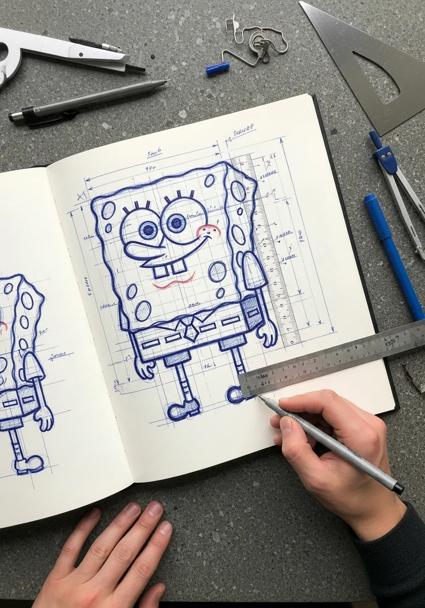
Turning a character into a measured drawing teaches you his proportions permanently. Set the body at five units high by four wide, mark where the eye line falls, note the arm attachment height, and write every number in the margin. Those figures work on every future drawing.
10. Ornate Folk Pattern Frame
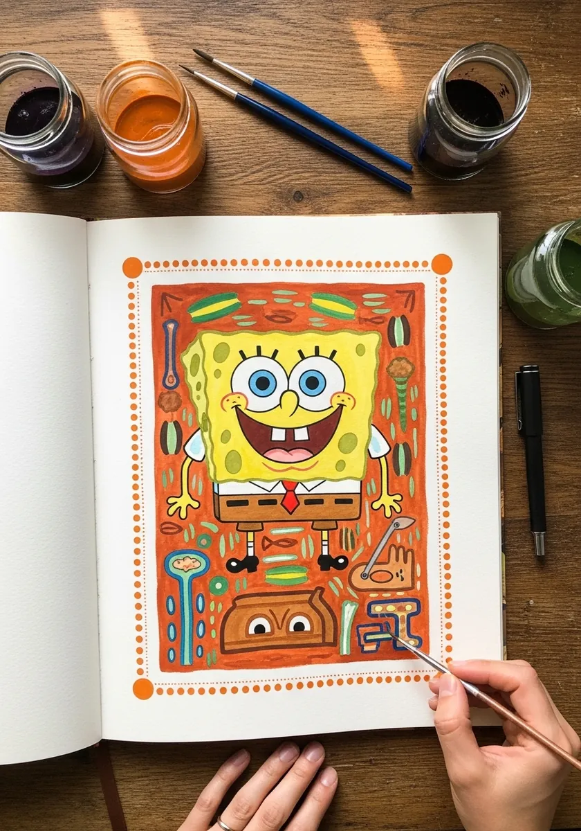
Folk borders live on repetition and symmetry. Rule the frame, divide each side into equal segments, and repeat one motif around the whole perimeter without varying it. The figure inside can stay loose, because the disciplined border is what makes the page look finished.
11. High Contrast Graphite Portrait
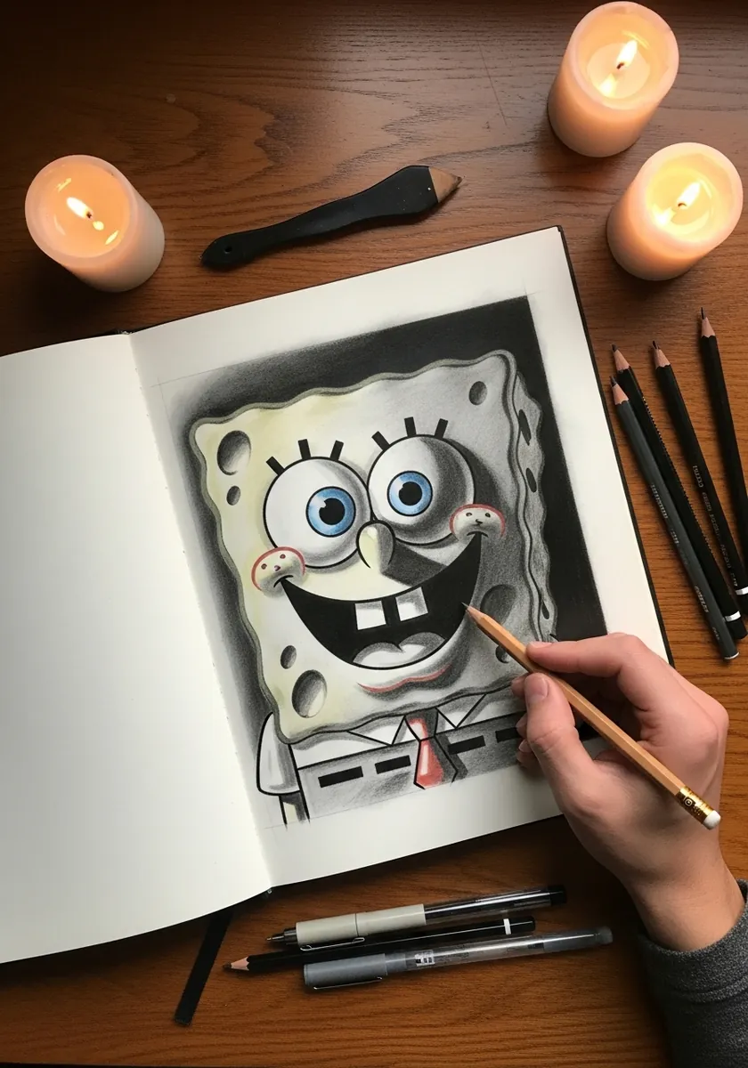
Full tonal rendering of a flat design means inventing form that was never in the original. Give the body a rounded top surface, let the light fall from one side only, and darken each pore into an actual recess rather than a gray circle.
12. Bold Color on a Mosaic Table
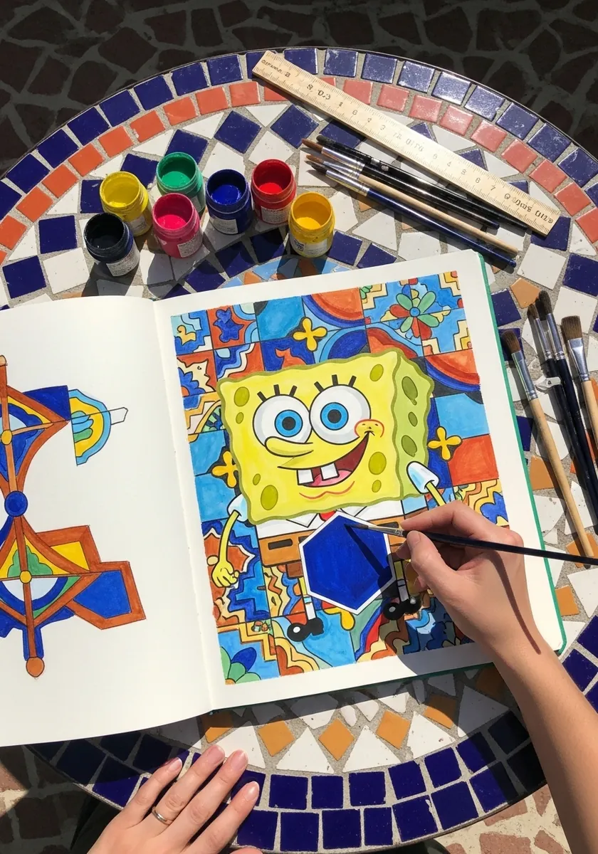
Working on a patterned surface will fight your color judgment constantly. Slide a plain sheet of paper under your work while assessing the colors, then move it aside. The tiles around the drawing are useful company but a terrible reference for saturation.
13. Crayon Drawing With a Wave
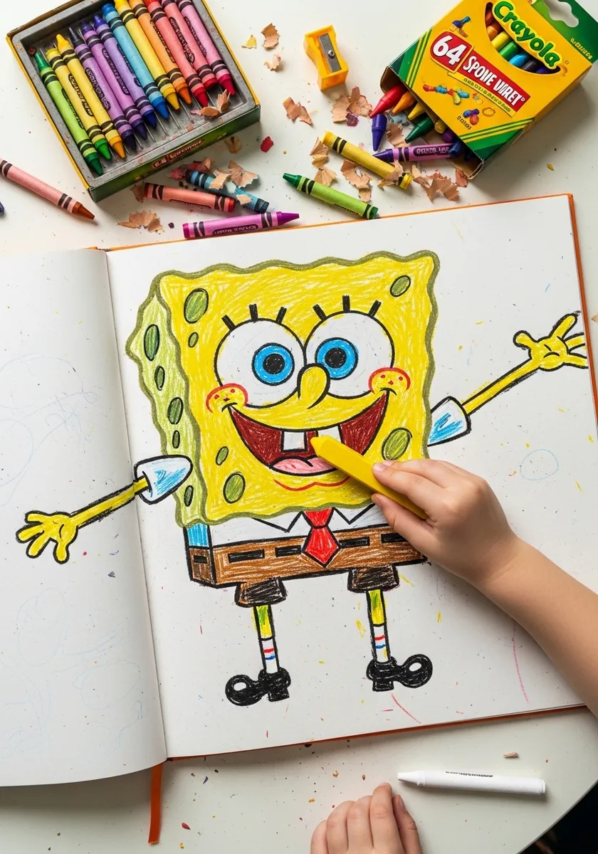
Crayon suits this character better than most media because it cannot blend. Press hard for the yellow, use a darker gold crayon for the pores rather than pressing lighter, and outline with black last so it sits cleanly over the waxy color underneath.
14. Blue Vortex Watercolor
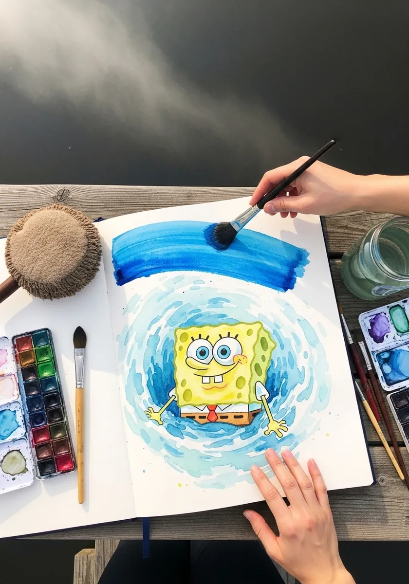
A spiral background pulls the eye straight to the center, which is the whole reason to use one. Paint the swirl wet into wet so the edges stay soft, keep the exact center pale and dry, and place the figure into that clear space once everything has settled.
15. Graffiti Marker Style
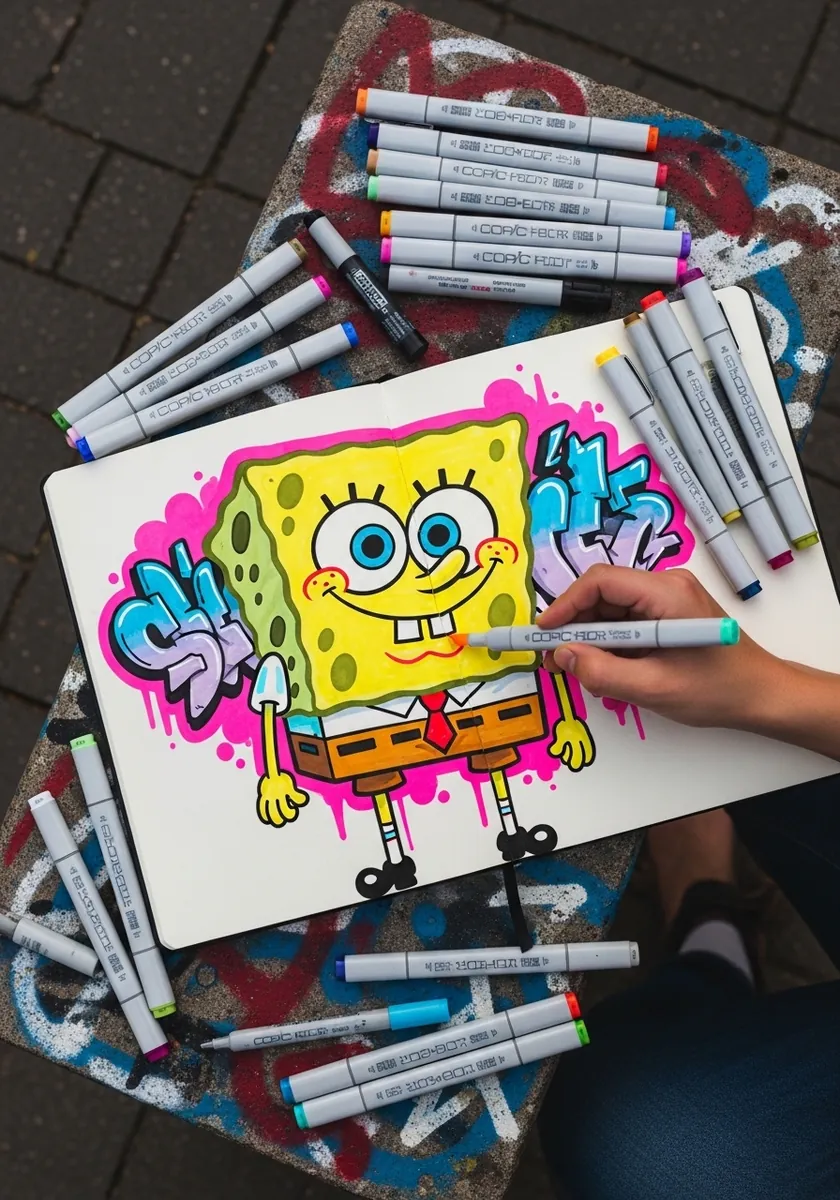
Graffiti lettering logic works on a character too. Give the figure a thick contrasting keyline, add a second offset outline outside the first, and keep the interior color simple. The two outlines are what make the shape pop off the paper at a distance.
16. Palette Knife Thick Yellow
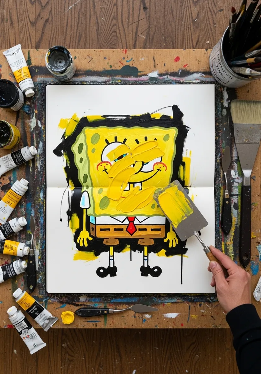
Knife work gives you texture that suits a sponge almost too well. Load the knife heavily, drag rather than dab, and press the pores in with the corner of the blade while the paint is still wet. Do not go back over any stroke.
17. Sumi-e Brush Circle
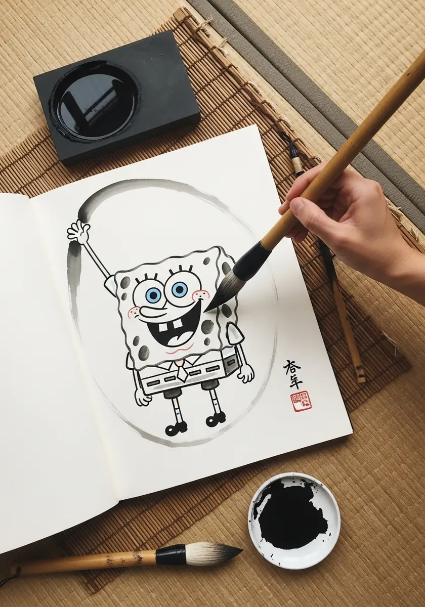
The circle has to be one breath and one stroke, which is harder than the figure. Load the brush fully, make the circle first while the ink is richest, then draw the character inside as the brush dries out and the line naturally thins.
18. Large Detailed Pore Study
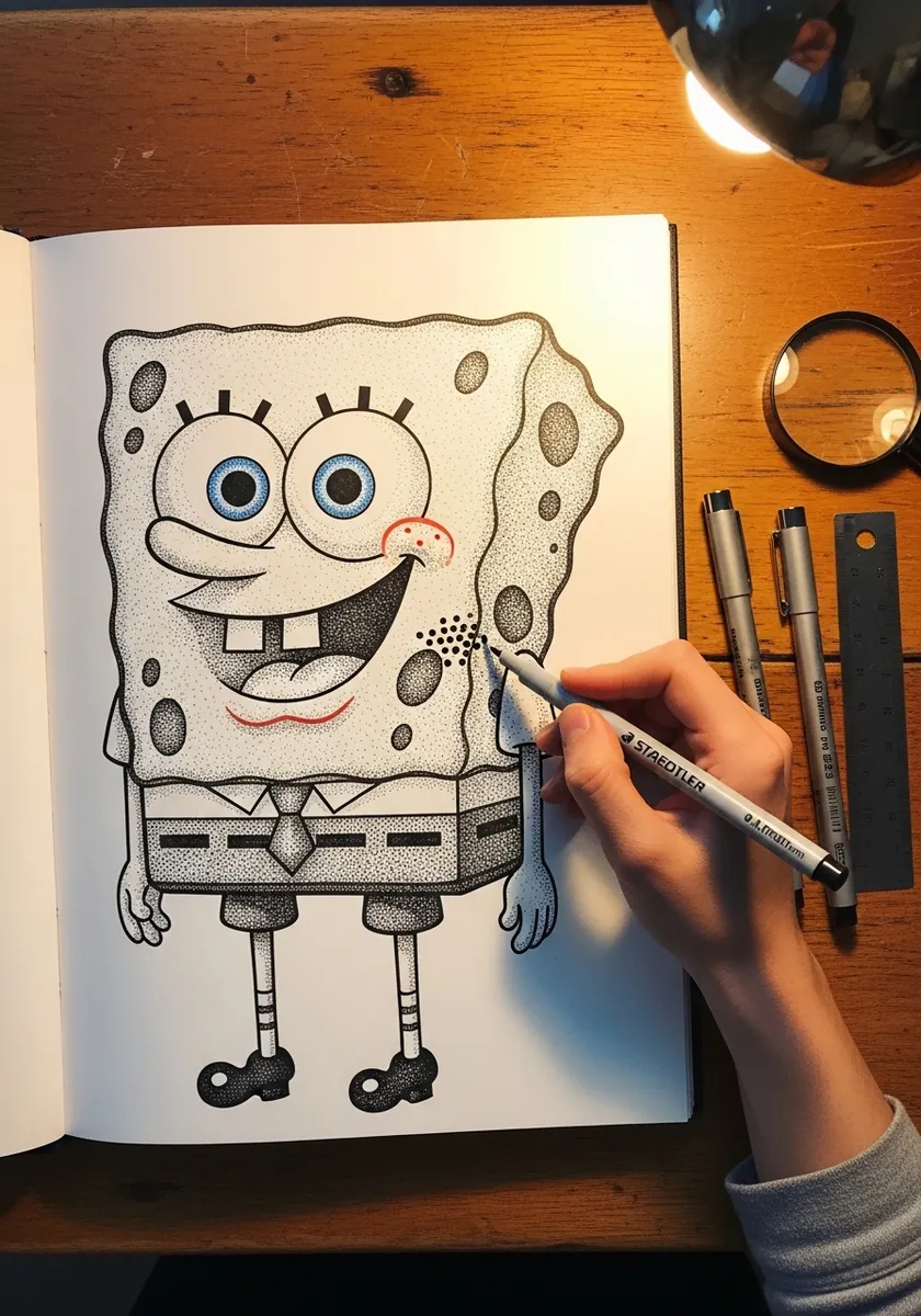
This is the drawing to make if the pores keep letting you down. Work large, vary every hole in size and shape, cluster them unevenly with clear bare patches, and give each one a shadow arc on the same side throughout so the light stays consistent.
19. Sepia Outdoor Sketch
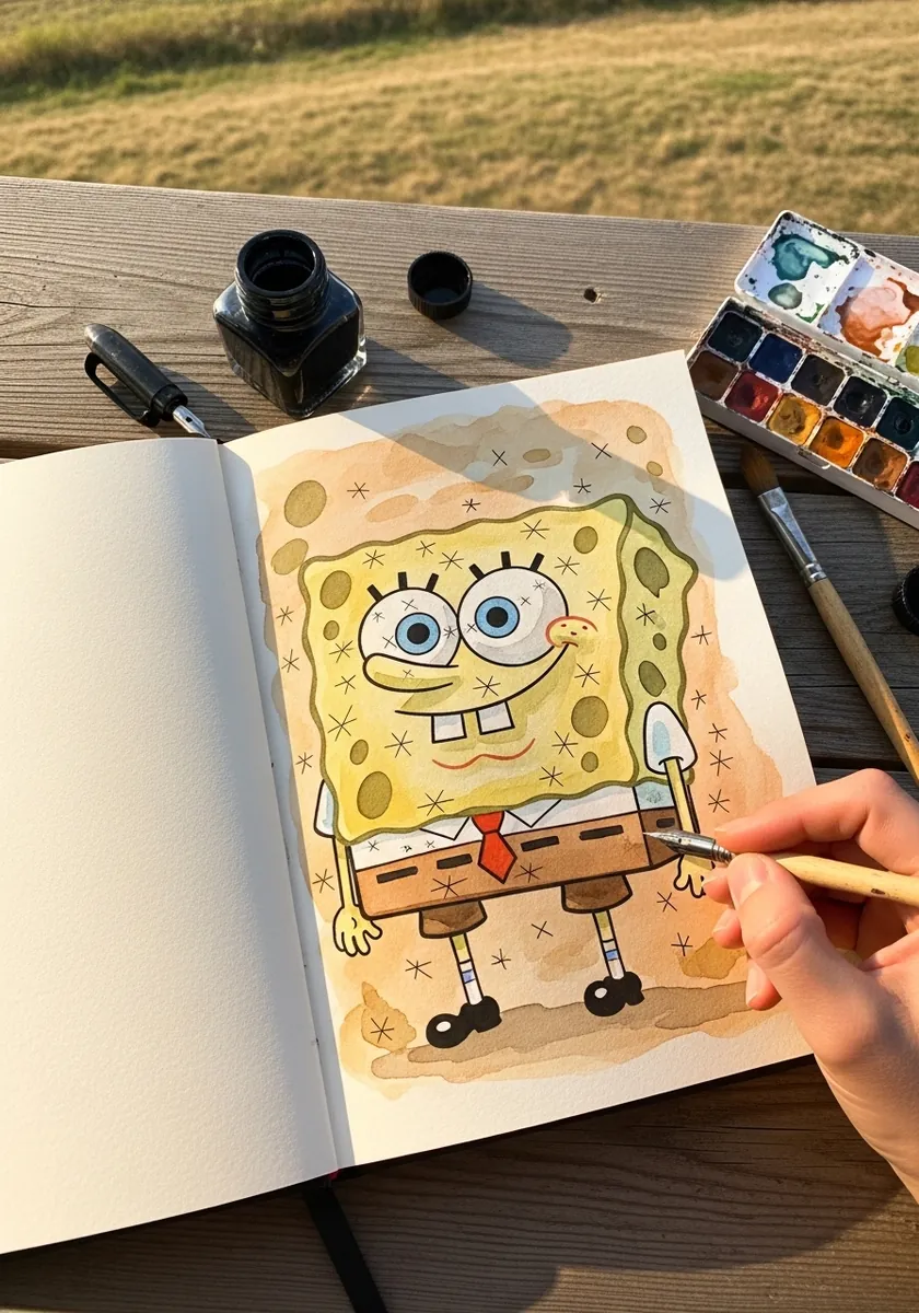
Limiting yourself to one earth color changes what you pay attention to. Without the yellow doing the identifying, the silhouette and the pore pattern have to carry everything, which is a fast way to find out whether your proportions are actually right.
20. Construction Circles Visible
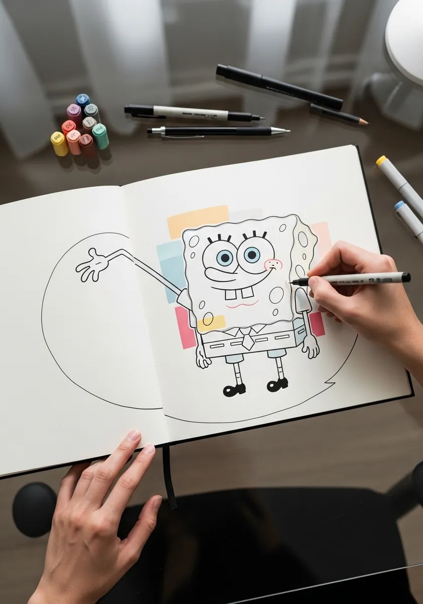
Leaving the scaffolding in place makes a page far more interesting than a clean finish. Draw the guides in a colored pencil, ink the figure over them, and simply never erase. Anyone looking at it learns how the shape was built.
21. Autumn Warm Tone Version
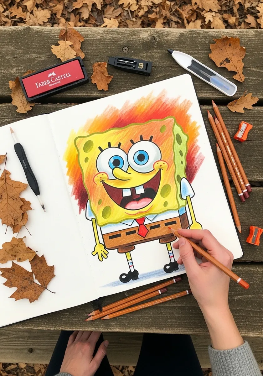
Shifting a familiar character into a different palette tests how much the shape alone carries. Swap the yellow for warm orange, push the shadows toward red brown, and keep everything else exactly on model. He stays recognizable, which tells you something useful.
22. Neon Glow Under Blacklight
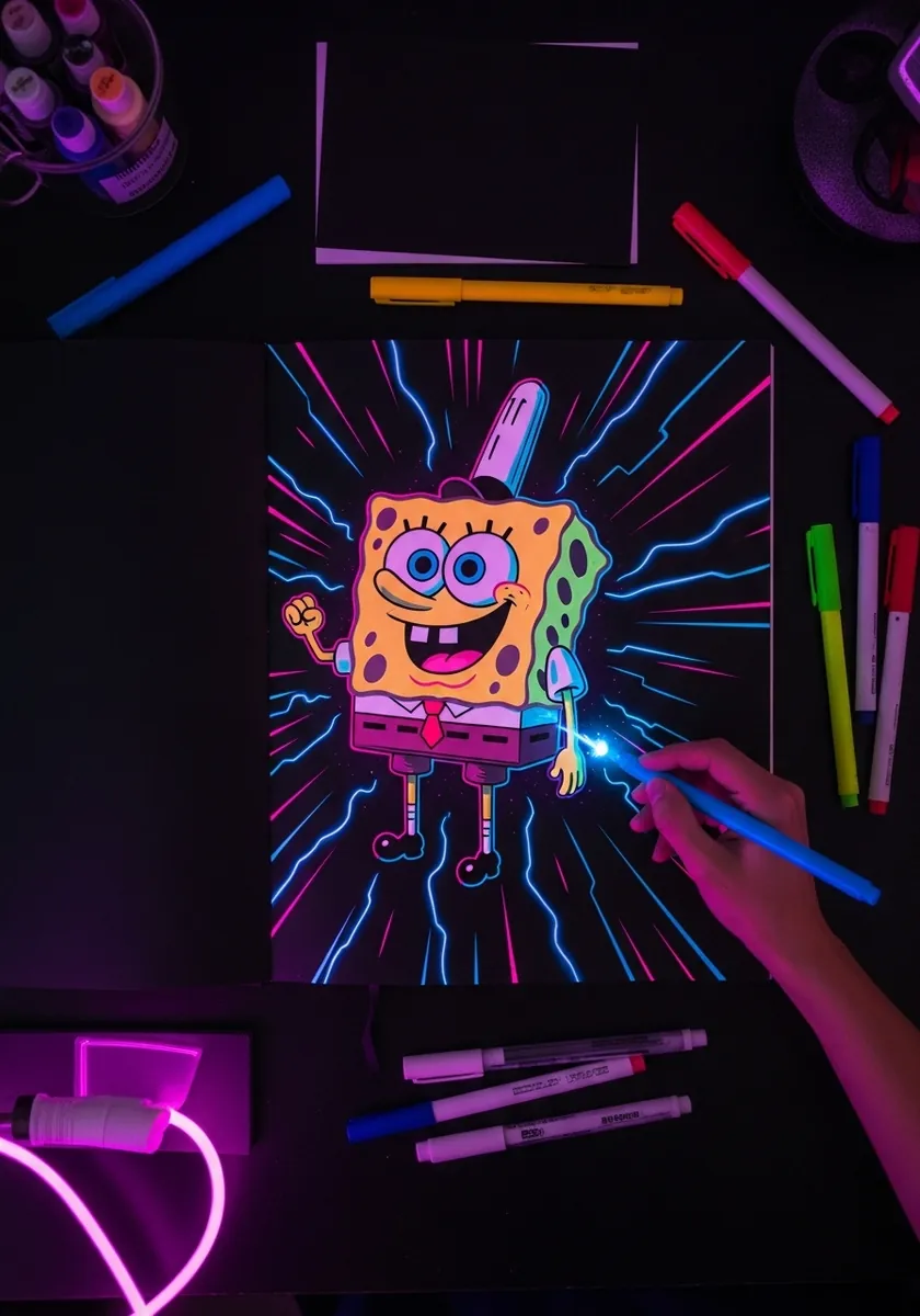
Fluorescent ink on black needs very little coverage to work. Outline the figure and add only a few internal lines, leave most of the black completely untouched, and add short radiating strokes outward from the silhouette so the whole thing appears to be emitting light.
23. Orange Watercolor Drips
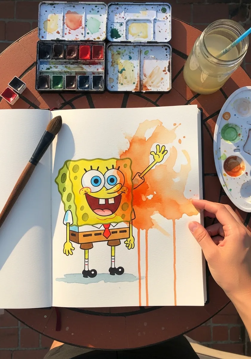
Controlled drips need gravity and patience. Tilt the board upright while the paint is still wet, let the pigment run from the lower edge of the figure only, and lay it flat again before the runs reach the bottom of the page.
24. Botanical Greenhouse Sketch
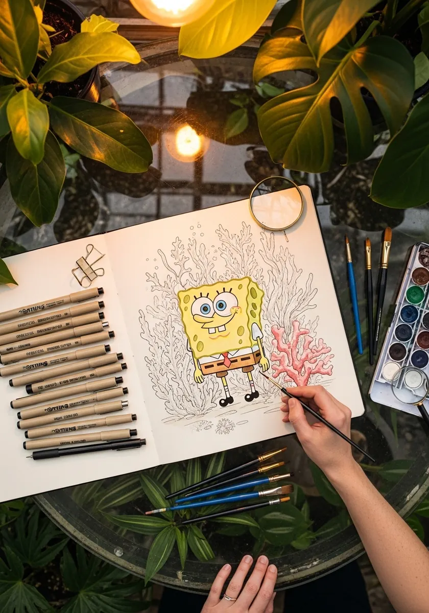
Drawing a cartoon among carefully observed plants creates a deliberate clash of styles. Render the foliage with real botanical detail and keep the character absolutely flat. The contrast between the two languages is what makes the page worth looking at.
25. Gray Paper Graphite Study
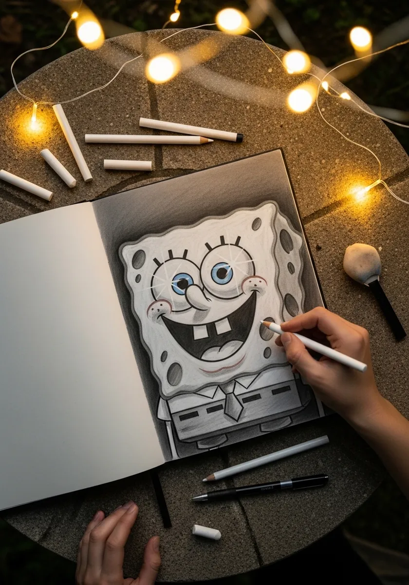
Toned paper gives you a mid value for free. Work the shadows down with graphite and lift the highlights back up with a white pencil, keeping the paper itself as everything in between. It is much faster than building the same range on white.
26. Anaglyph Offset Outline
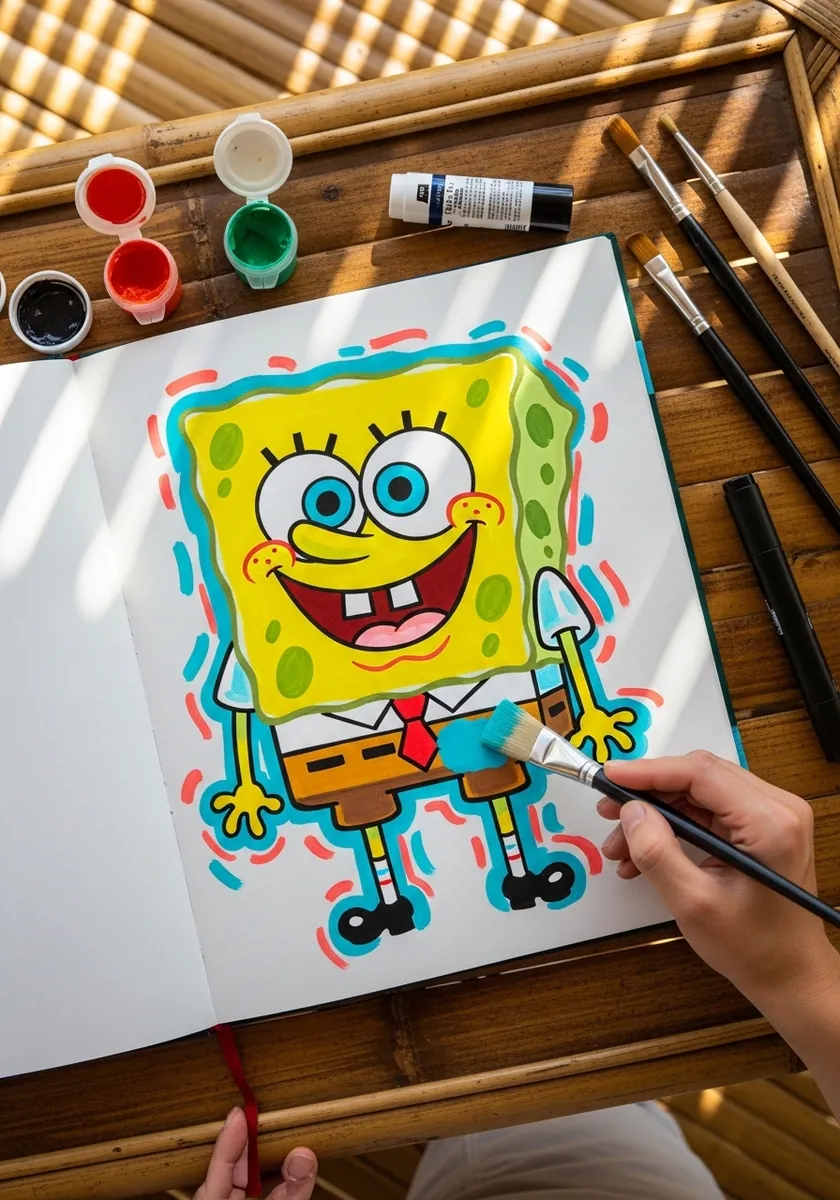
The offset has to be identical everywhere for the effect to work. Trace the whole figure once in red, shift the paper a few millimeters and trace again in cyan, then fill the color in between. Any variation in the shift breaks the illusion.
27. Starry Night Oil Pastel
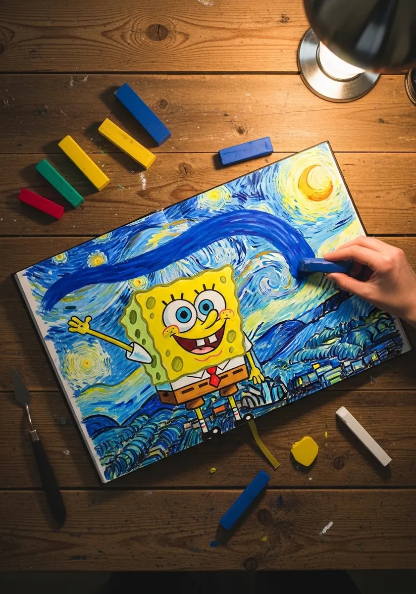
Borrowing a famous background style means committing to its brushwork. Build the swirls from short directional strokes that curve around each other, keep them moving consistently, and set the character in flat unbroken color so he separates cleanly from all that motion.
28. Bathtub Kids Marker Drawing
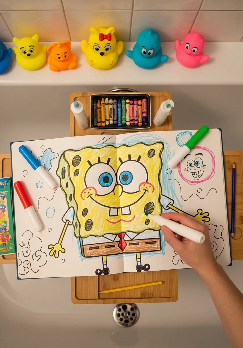
A drawing made for fun still benefits from one rule. Get the rectangle and the corners right at the start, and everything after that can be as loose and quick as you like. That single piece of structure is what keeps him recognizable.
29. Seaweed Framed Ink Painting
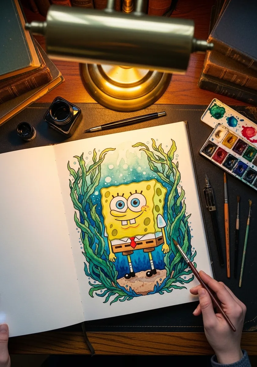
Vertical framing elements narrow the page and focus attention. Run the seaweed up both edges, let a few strands cross in front of the figure to create depth, and keep the water color pale so the yellow stays the brightest thing on the page.
Frequently Asked Questions
Is SpongeBob a sea sponge?
No, and that is the point of his shape. Creator Stephen Hillenburg, who taught marine science before working in animation, drew him as a rectangular kitchen sponge rather than the rounded natural sponge, because the square silhouette was funnier and instantly readable.
Why does my SpongeBob look wrong even when the face is right?
Almost always the corners. If they soften into curves the body starts reading as a rounded rectangle and the whole character goes off model. Keep the four corners sharp and put all your wobble into the edges between them.
How should the pores be arranged?
Unevenly. Cluster three or four together, leave a bare stretch, then cluster again, and vary the sizes as you go. An even scatter looks like polka dots, and a grid looks like a waffle rather than a sponge.
What proportions should the body have?
Slightly taller than it is wide, around five units high to four across. A perfect square reads as squat and anything much taller starts to look like a different character, so the small difference matters more than it sounds.
Can I sell my SpongeBob drawings?
No. The character is owned by Nickelodeon and Paramount, so fan drawings are fine for practice, sketchbooks and personal posts, but selling them or using them commercially is not allowed. Original characters drawn in the same style are yours to sell.
References and Further Reading