Drawing Bart Simpson starts with two overlapping circles for the head and eyes, a spiked hairline built from evenly sized triangles, and a jaw that pushes forward into an overbite. Get those three shapes right and any style will read correctly.
Key takeaways
- Build the head from a rounded shape first, then attach the spikes as one continuous zigzag hairline.
- The two eye circles overlap slightly and sit high on the face, which is what fixes the proportions.
- The forward jaw and overbite carry the character more than any other single feature.
- Keep the outline weight heavier than any interior lines so the figure stays graphic at small sizes.
- Flat color suits this design better than blended shading, because the original artwork is cel style.
Bart is one of the most forgiving cartoon characters to practice on, because the design is built almost entirely from circles and triangles. Three things carry him: the overlapping eye circles set high on the head, the zigzag hairline, and the jaw pushed forward into an overbite.
Get those right and everything else can be loose. That is why the same character below survives being drawn in brush ink, crayon, halftone dots, neon gel pen and thick oil pastel without ever stopping being recognizable. The construction is doing the work, not the rendering.
The thirty-five studies here run from clean pencil roughs through to finished painted pieces. A few are technical exercises in a specific medium, others are just fun. Every note explains the one decision that keeps the character on model, so the practice transfers to other cartoon designs too.
One practical note: these are fan art practice pieces. Drawing a copyrighted character for your own sketchbook is normal, but selling prints or merchandise of one is a different question. If you want original characters to apply the same method to, these 3D digital art ideas are a good place to start.
Compiled by the GS Art Zone editorial team. Last updated August 2026. Each idea is paired with the specific step that produces the effect, so you can go from the reference straight to paper.
What You Need Before You Start
- An HB or 2B pencil for the construction circles, plus a kneaded eraser to lift them cleanly
- Waterproof fine liners in two widths, one for the outline and a thinner one for interior detail
- Warm yellow, red or orange and mid blue in whatever medium you prefer, since that is the whole palette
- Alcohol markers or watercolor for flat color, both of which suit cel-style artwork better than pencil
- Black or toned paper plus a white or neon gel pen if you want to try the reversed styles at the end
1. Clean Pencil Sketch in a Notebook
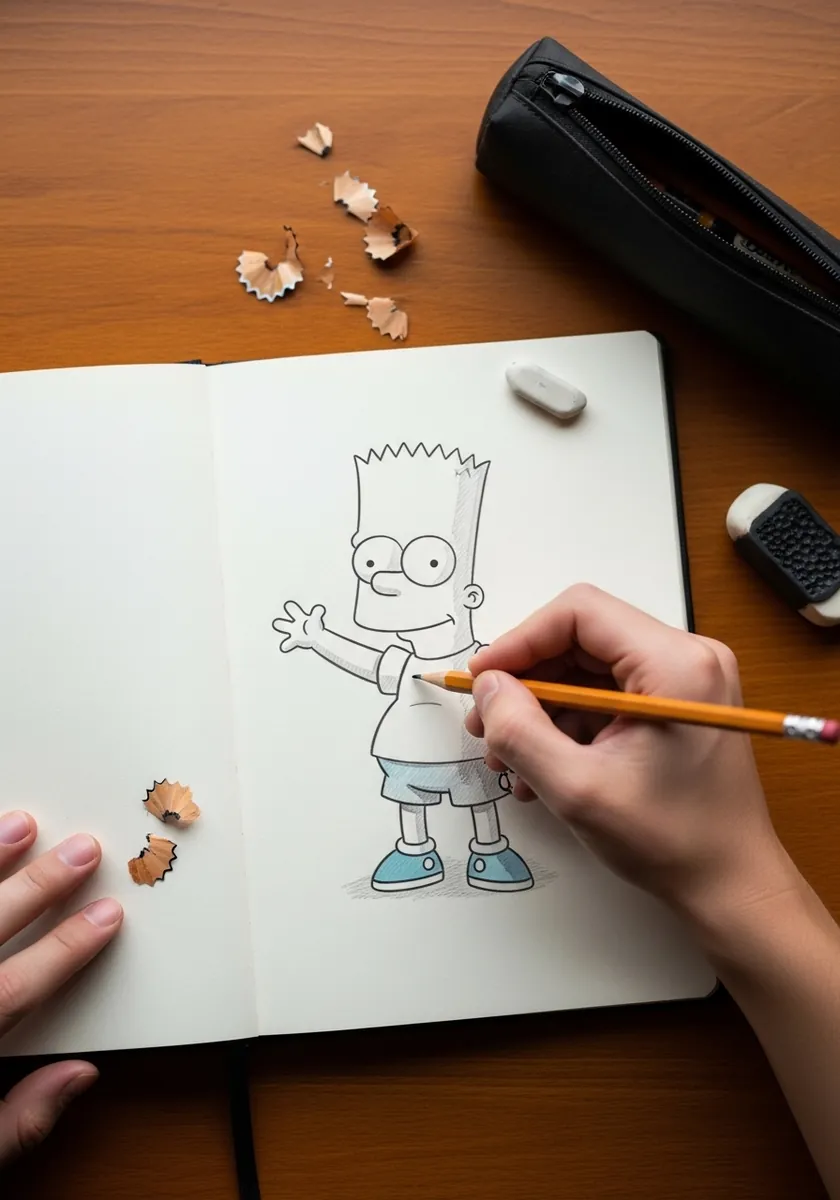
Begin here before anything else. A plain pencil version with one arm raised gives you the whole construction problem in its simplest form. Keep the head shape light until the spikes are placed, because the hairline is far easier to correct while the underlying circle is still visible and faint.
2. Loose Watercolor with Splatter
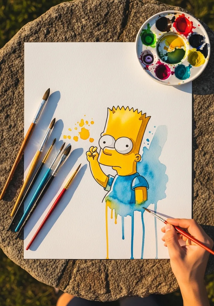
Splatter behind a character is a cheap trick that almost always works, because it suggests energy without you having to draw any of it yourself. Ink the figure first with a waterproof pen and let it cure properly, then flick clean color behind it so the drips run past the outline rather than through it.
3. Graffiti Style with Bold Lettering
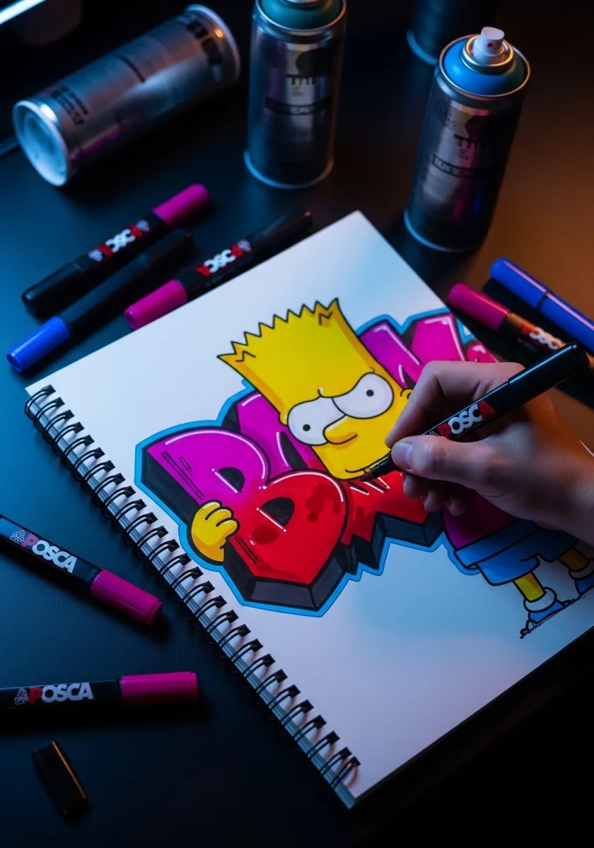
Letters and character have to share one light source or the piece falls apart. Draw the type first and extrude it in a single direction, then place Bart so he overlaps two or three letters. That overlap is what fuses the two elements into one design instead of a drawing beside a word.
4. Hatched Ink Study with a Frame
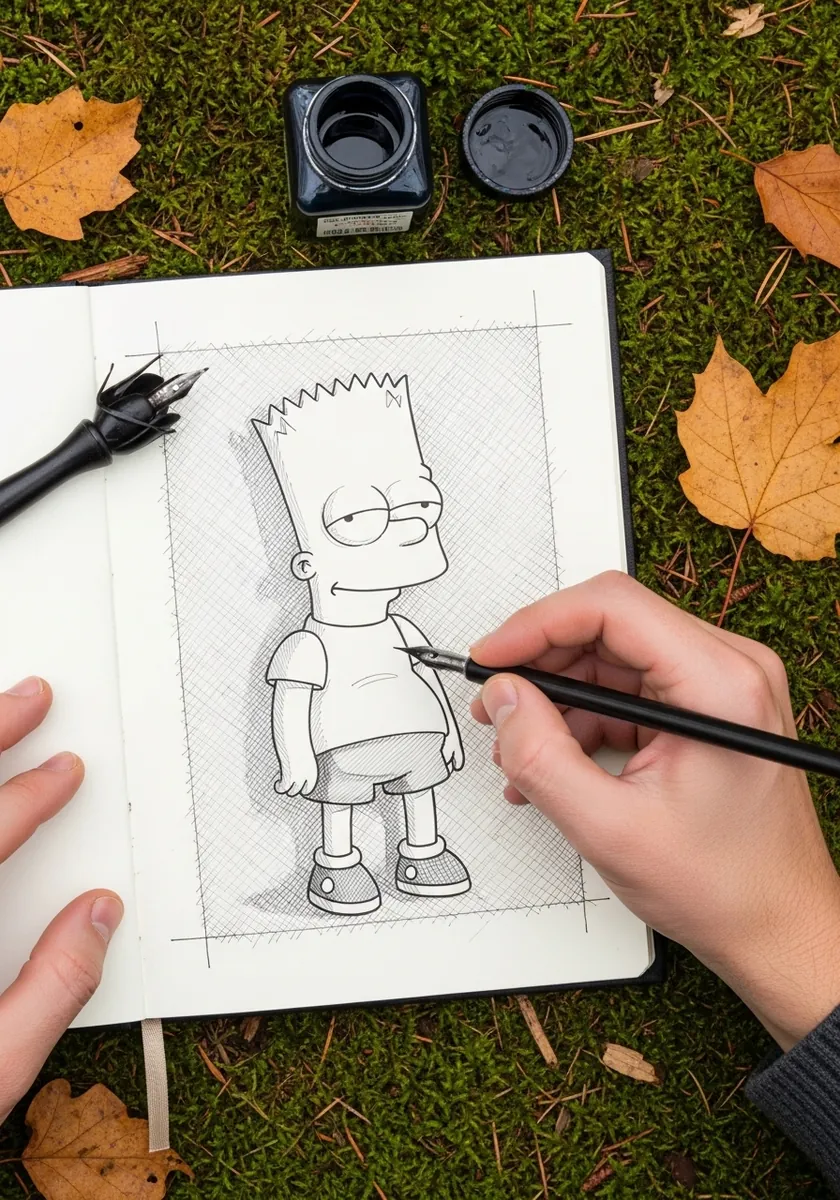
Hatching a flat cartoon design is an odd combination and that is exactly why it is worth trying. Rule a frame, keep the character outline pure and clean, then hatch only the background and the cast shadow. The contrast between untouched figure and worked background does everything.
5. Gouache Portrait in Red and Yellow
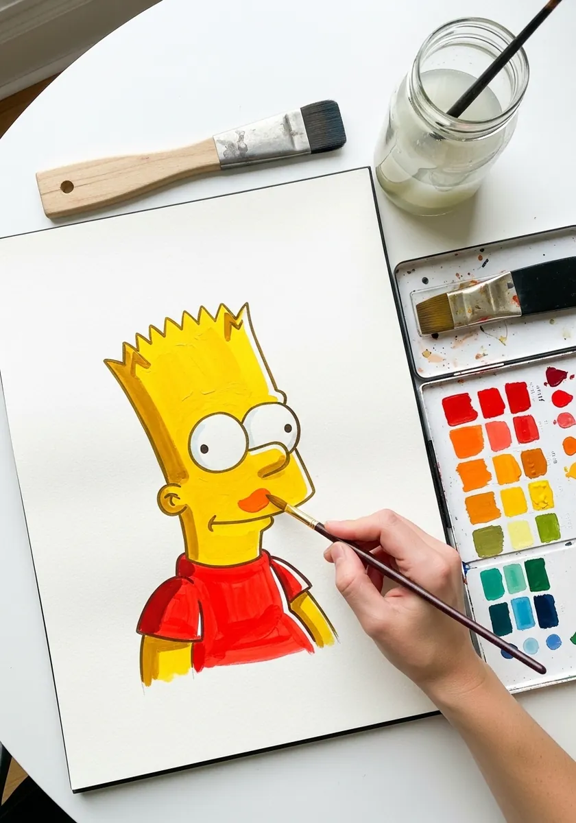
Cropping to a bust portrait forces you to get the head absolutely right. There is nowhere to hide. Mix your yellow slightly warmer than you think it should be. Lay it completely flat with no modeling at all, and let the black outline supply every scrap of definition the face needs.
6. Charcoal Sketch on Toned Paper
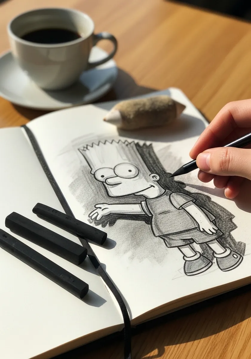
Charcoal is far too soft for crisp cartoon edges, which makes this a useful exercise in restraint. Use the very tip and accept that the outline will be slightly furry. Block the background in with the side of the stick so the figure stays the lightest area on the page.
7. Large Graphite Head Study
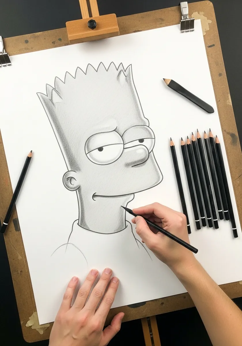
Scaling a simple design up exposes every flaw in it, and at this size the two eye circles need genuinely accurate placement while any wobble in the spikes becomes impossible to ignore. Work on an easel rather than flat, so you can step back regularly and check the whole head at once.
8. Sunset Beach Scene in Watercolor
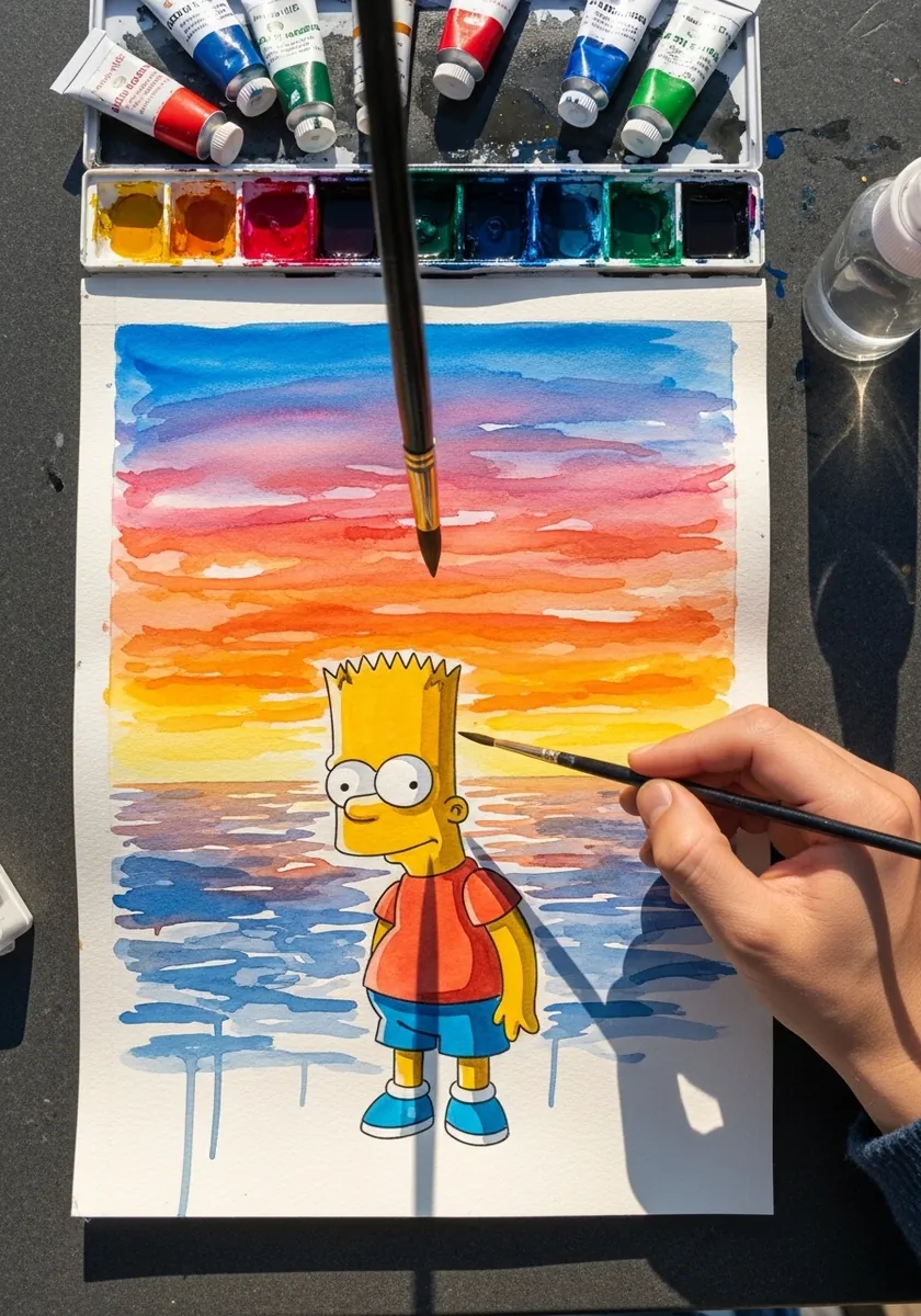
Putting a flat cartoon in front of a soft painted background is a real compositional test. Paint the sky in horizontal bands and let them dry hard before you touch the figure. Keeping the character fully opaque against a transparent background is what stops him sinking into the scene.
9. Stippled Fine Liner Drawing
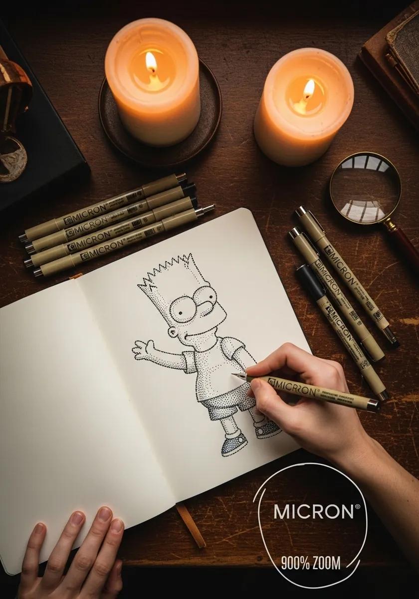
Stippling a whole figure takes patience and teaches you value control faster than almost anything else. Build the darkest areas up in several passes rather than pressing harder. Leave the shirt and shorts nearly bare so the drawing keeps a full range from white paper to solid black.
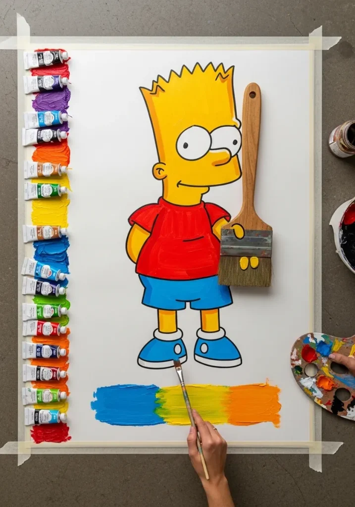
10. Bold Acrylic Full Body Figure
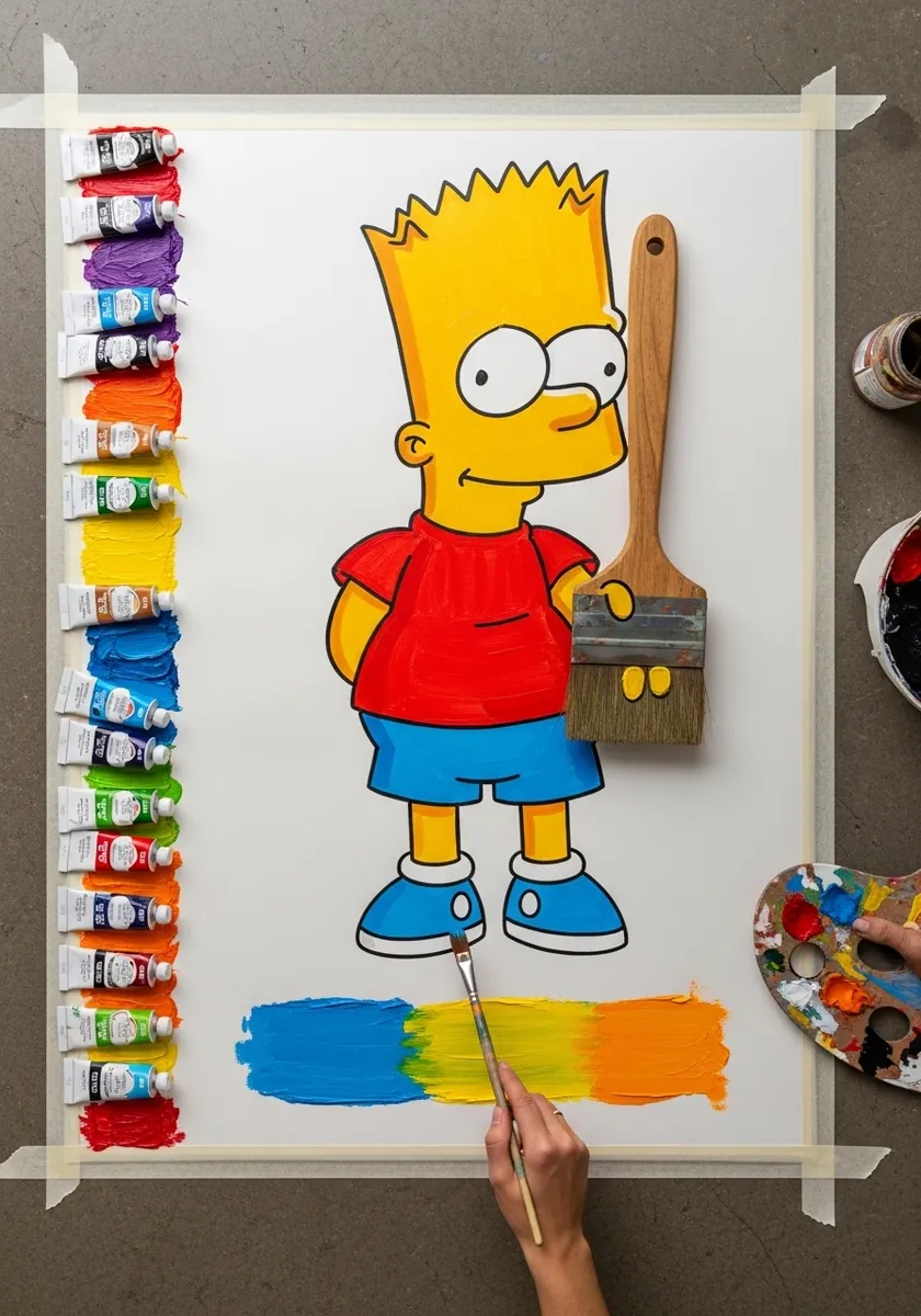
Testing your colors on a strip before committing is a habit worth building. Acrylic dries noticeably darker than it looks wet. A cartoon palette lives or dies on getting that warm yellow right. Paint the flats first. Let everything cure fully, then re-ink the outline over the top in black.
11. Colored Pencil in Warm Pinks
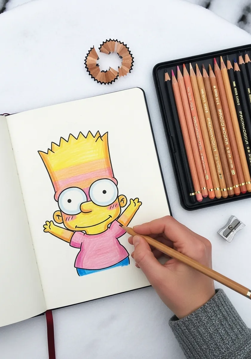
Shifting the palette away from the official colors is a legitimate exercise. It proves the design reads on silhouette alone. Layer colored pencil in several light passes rather than one heavy one, and keep the pressure even so the flat areas stay flat rather than going patchy.
12. Halftone Dot Comic Print Effect
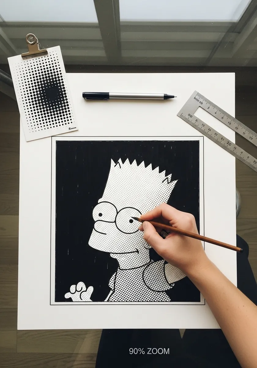
Old comic printing built every tone from dots of varying density, and copying that by hand is genuinely instructive. Vary how close the dots sit rather than how big they are. Keep the pure whites completely empty so the illusion of a printed page holds together.
13. Ink and Wash with Yellow Accents
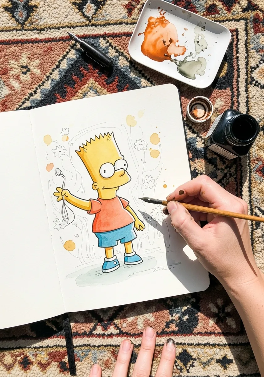
Restricting yourself to one accent color makes a drawing feel designed rather than colored in. Ink the whole figure normally, then add yellow only where it genuinely matters, which here is the skin and hair. Everything else stays black and white and the piece gains a lot of focus.
14. Red Underdrawing with Black Ink
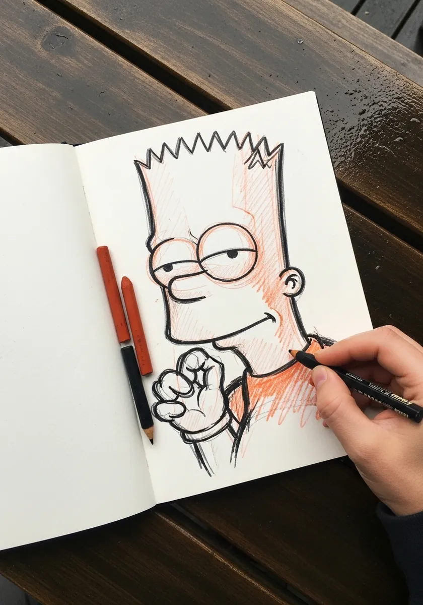
Animators traditionally rough in red or blue pencil because those colors drop out under a camera, so leaving the underdrawing visible here is a deliberate nod to that process rather than laziness. Rough loosely in red, ink confidently in black over the top, and resist every urge to erase the construction.
15. Oil Pastel with Textured Background
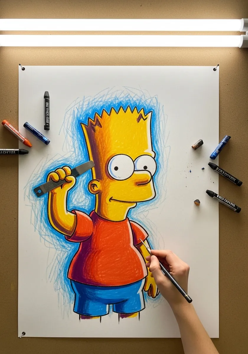
Oil pastel refuses to make a clean line, so lean into that instead of fighting it. Lay the background down in loose diagonal scribbles first, then build the figure on top with heavier pressure. The physical thickness of the pastel does the separating for you.
16. Technical Fine Liner Line Work
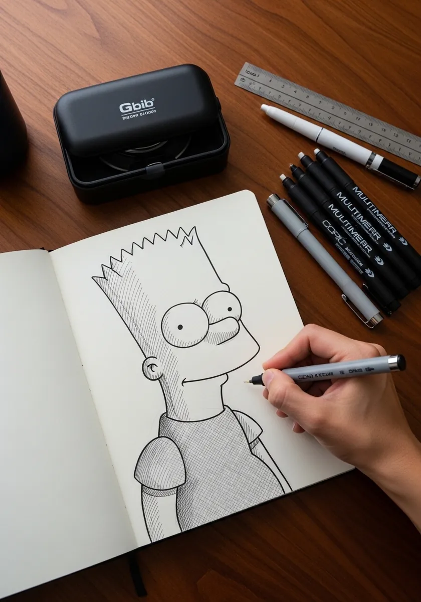
Working with a graded pen set teaches you line hierarchy quickly. Use the thickest nib for the outer silhouette, a medium one for internal edges like the shirt hem, and the finest for details such as the pupils. Three weights are enough for almost any cartoon drawing.
17. Monochrome Sketch on a Pier
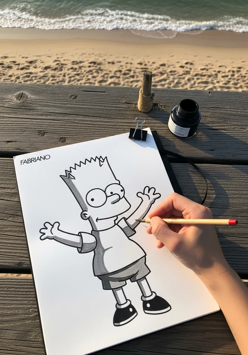
Dropping color entirely is the fastest way to check whether your values work. If the drawing reads clearly in gray, it will read in color. Keep the shoes and hair the darkest notes and let the shirt sit mid gray so the figure separates cleanly from white paper.
18. Brush Ink with a Wash Background
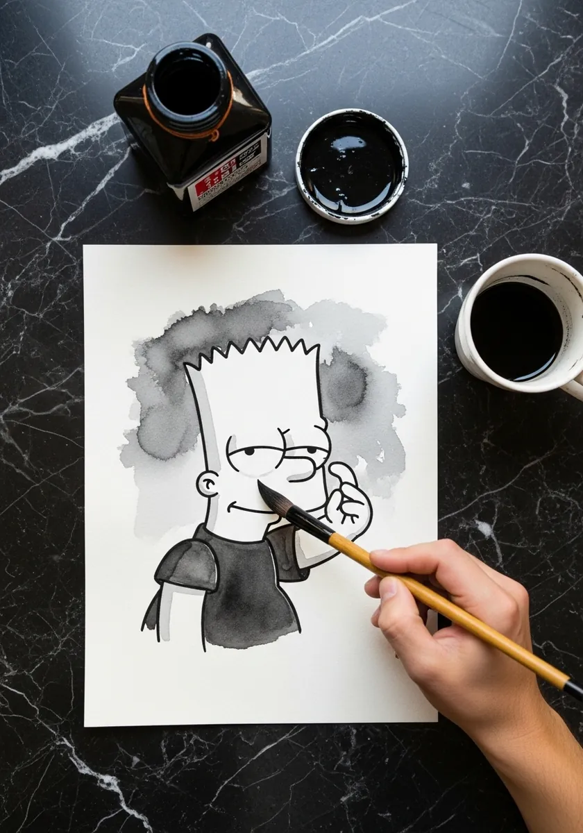
A loaded brush gives you a line that swells and tapers on its own, which suits cartooning far better than a pen. Vary pressure through each stroke and accept the variation. Add the gray wash only after the ink has dried completely, or it will lift and muddy.
19. Crayon Drawing on Textured Paper
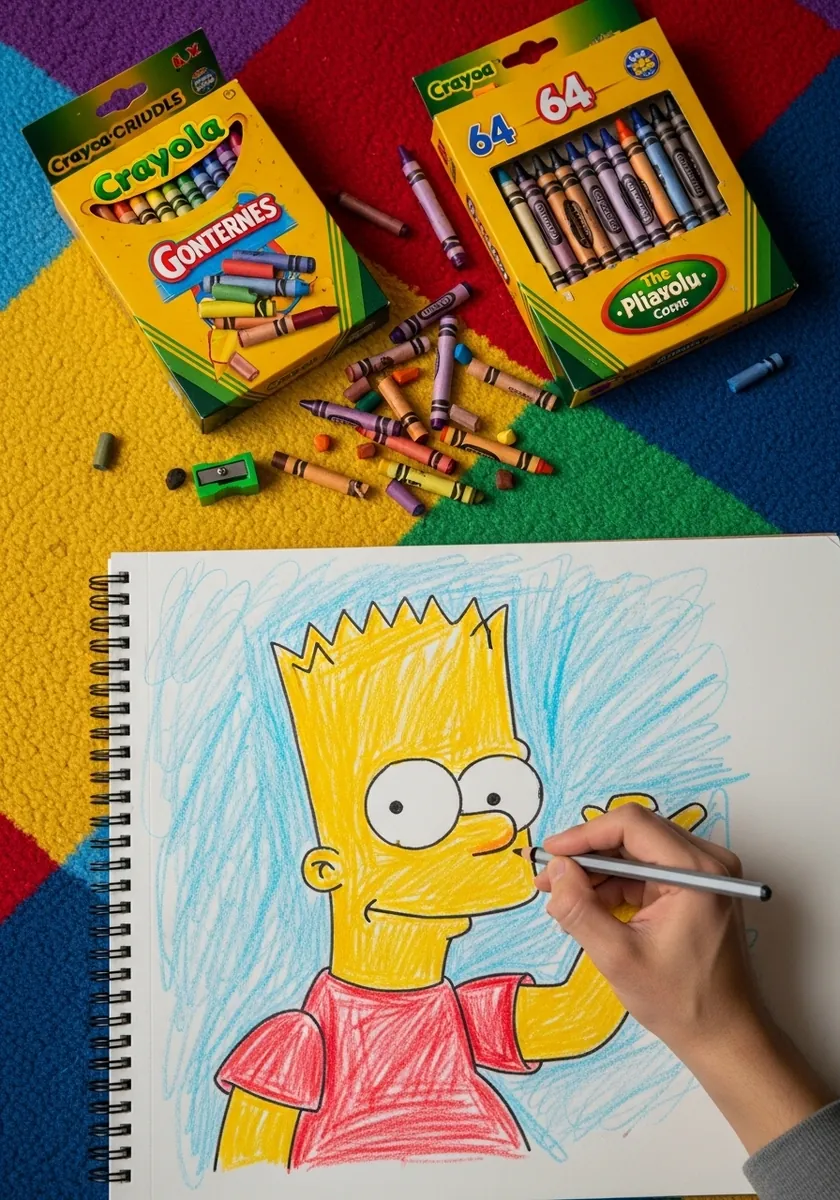
Crayon has real limitations and working inside them is the whole point. You cannot get a fine line, so simplify the design further than usual and let the wax skip across the tooth of the paper. Scribble the background in one direction only, which keeps it reading as background rather than competing with the figure.
20. Art Nouveau Ornamental Border
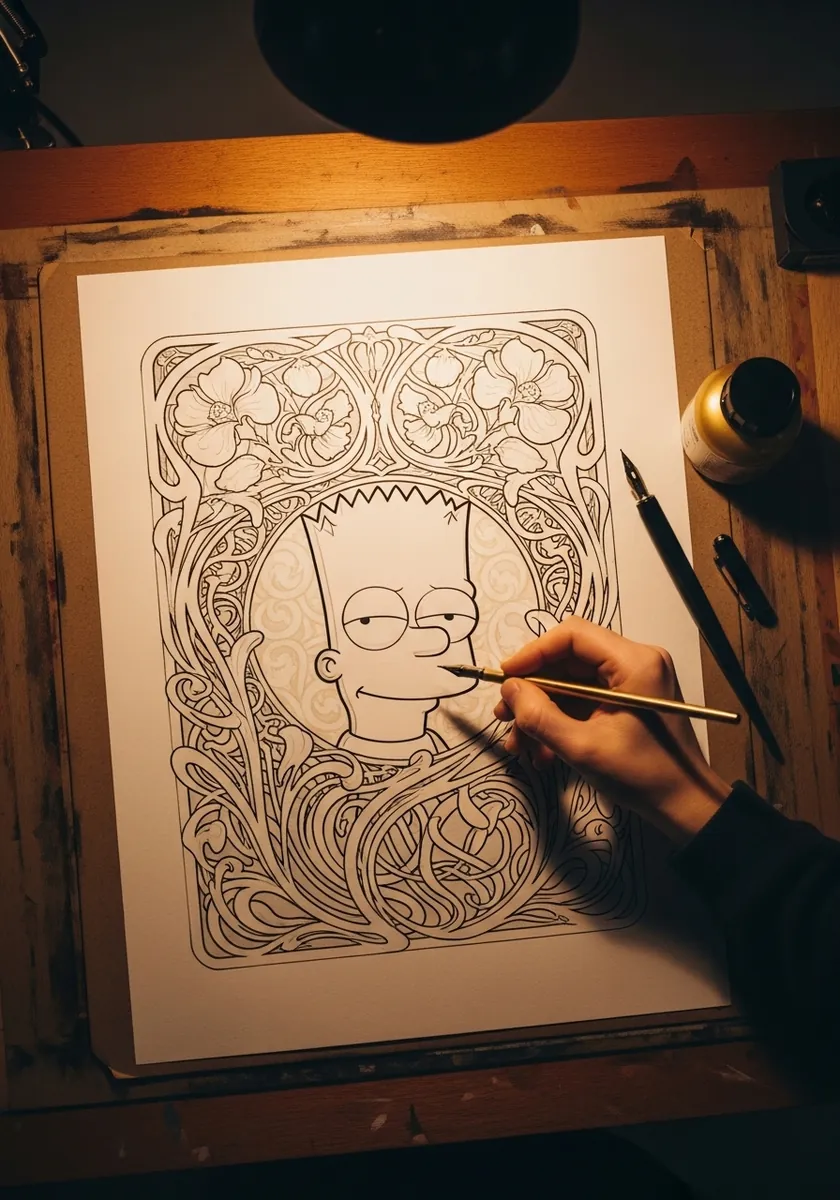
Framing a modern cartoon in a hundred-year-old decorative style is an odd juxtaposition that works surprisingly well. Draw the border first and treat it as a fixed container, then fit the character inside. Let one or two ornamental lines cross in front of him to lock the two layers together.
21. Monochrome Pink Watercolor Study
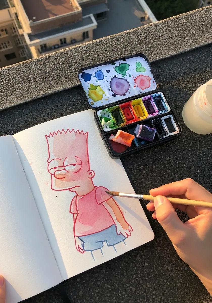
Painting a whole figure in one color at different dilutions is a classic value exercise. Start with the palest wash across everything, then build up in two or three darker passes. Because there is no color information to distract you, every mistake in the drawing shows immediately.
22. Soft Pastel with Cloud Background
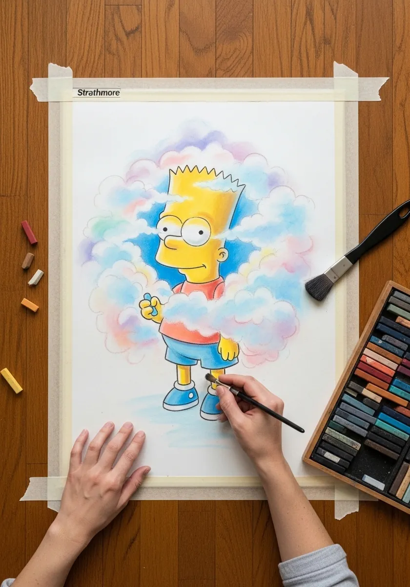
Hard character against soft background is a reliable combination and this is a clean example of it. Blend the pastel clouds thoroughly with a finger or stump, then keep every edge on the figure crisp. The eye reads the sharp thing as the subject and the soft thing as air.
23. White Line Art on Black Paper
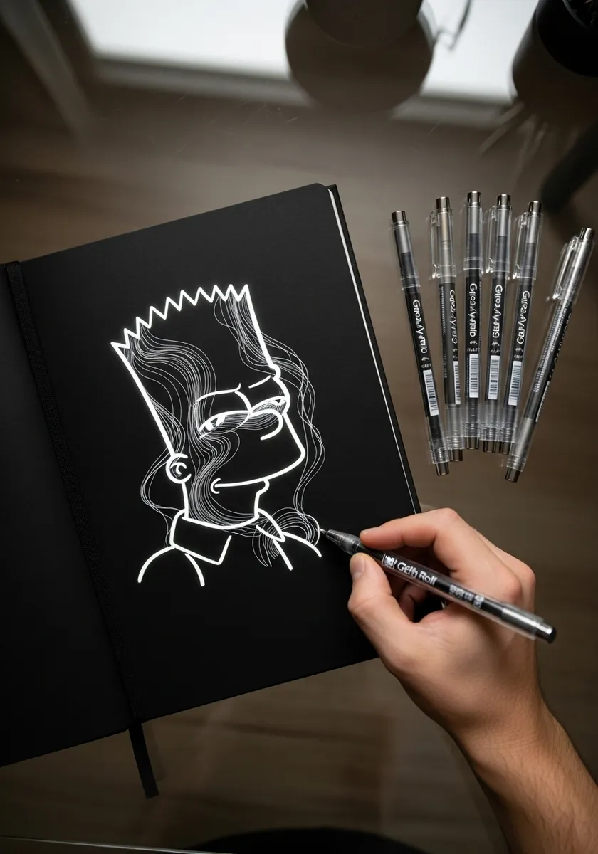
Working in reverse is genuinely disorienting at first. You add light rather than shadow, so plan where the line goes before touching the page. A continuous flowing line over the top of the design adds movement without obscuring the character underneath, provided you keep it thin.
24. Botanical Frame with Line Flowers
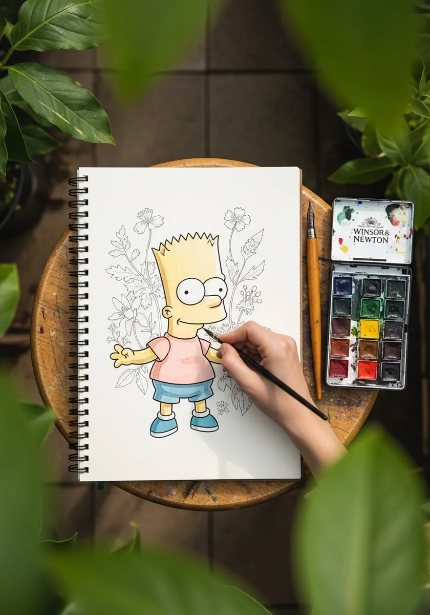
Leaving part of a drawing uncolored is a strong design decision, not an unfinished one. Color only the character and leave the surrounding flowers as pure line. The contrast pushes the figure forward instantly and saves you a great deal of painting time into the bargain.
25. Two Color Teal and Coral Portrait
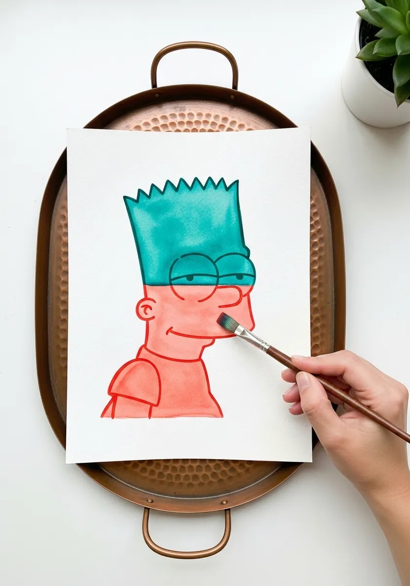
Limiting yourself to two colors forces real decisions about where each one goes. Teal hair against coral skin should not work and yet the design survives it, which again proves how much of the character lives in the shapes. Keep both colors flat and let them meet at hard edges.
26. Ballpoint Pen Scribble Sketch
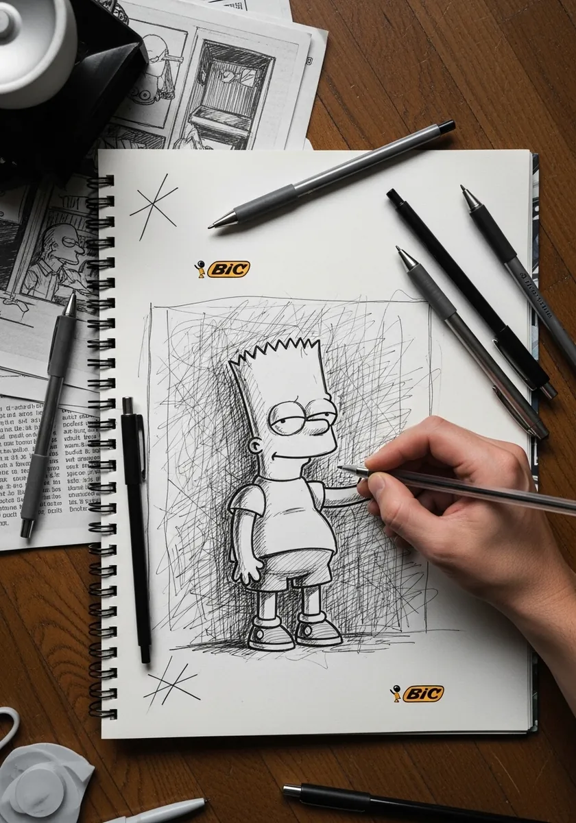
Ballpoint cannot be erased, which makes it excellent practice for committing to a line. Build tone with layered scribbles and accept every stray mark as part of the drawing. Work small, because a ballpoint drawing that gets too large starts to look labored rather than lively.
27. Psychedelic Pattern Fill
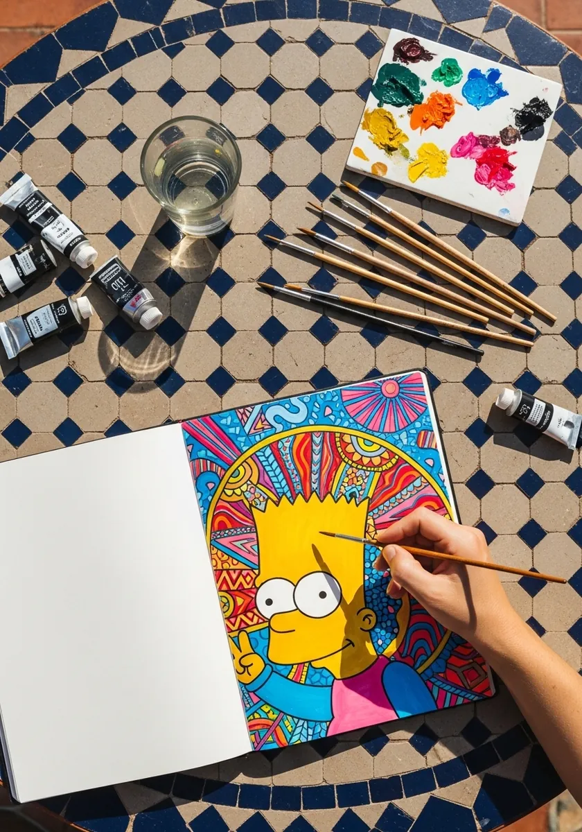
Pattern inside a silhouette is a great way to practice designing within a fixed boundary. Draw the character outline in heavy black first and treat it as a wall that nothing crosses. Then fill each separate area with a different motif, keeping the black line thick enough to hold every pattern apart from its neighbors.
28. Splash Background in Blue
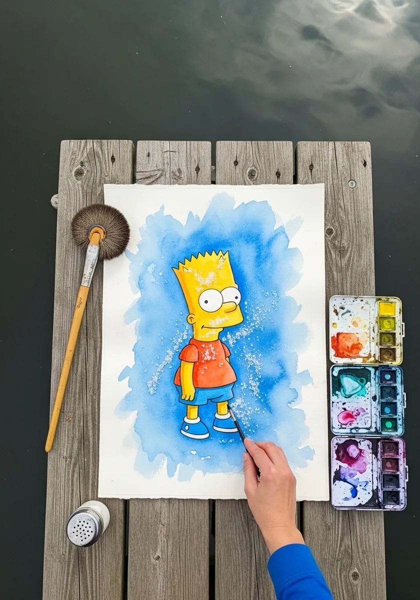
A halo of color around a figure isolates it from the paper without needing a drawn background. Wet the area around the character first, then drop pigment into that damp ring and let it spread outward. Keeping the figure itself dry stops the color bleeding across the outline.
29. Construction Grid Drawing
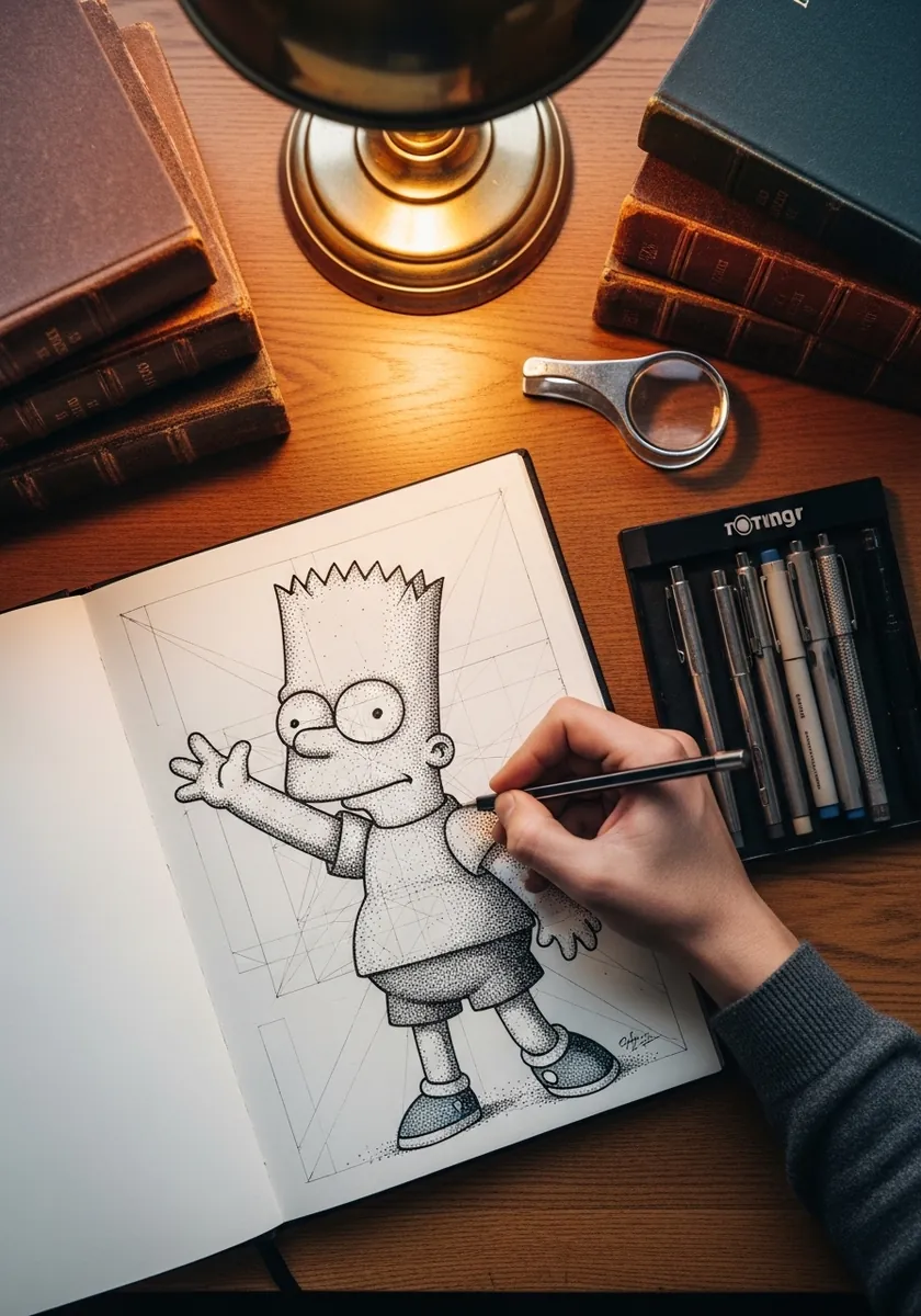
This is the most useful sheet in the whole set for learning the character. Rule a light grid, place the head circle, mark the eyeline, and build outward from there. Leaving the guidelines visible turns a finished drawing into a reference you can actually work from later.
30. Sumi Brush Drawing with One Stroke
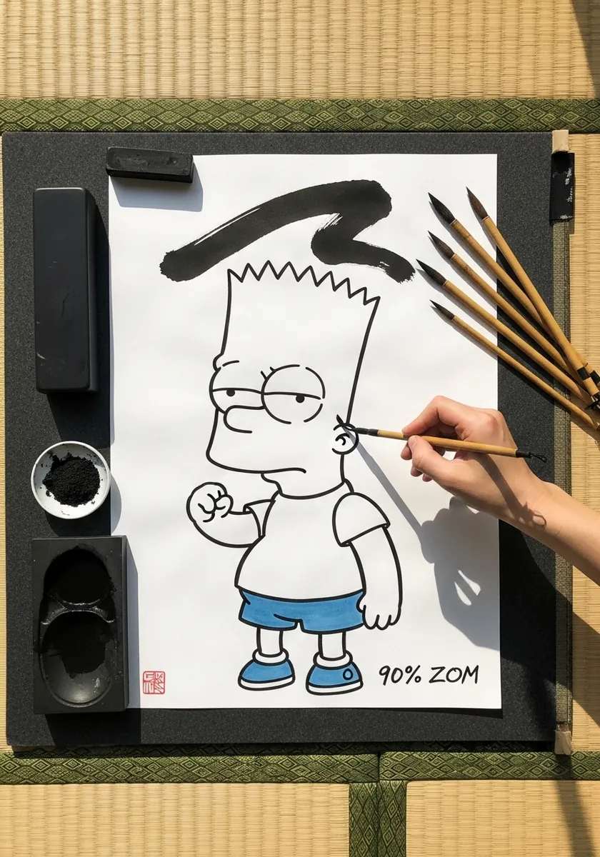
One confident mark can carry an entire composition. Draw the figure cleanly first. Then load the brush fully and lay a single sweeping stroke above the head in one motion without stopping. If you hesitate halfway the stroke will show it, so practice the movement in the air a few times before you commit.
31. Expressive Ink Splatter Portrait
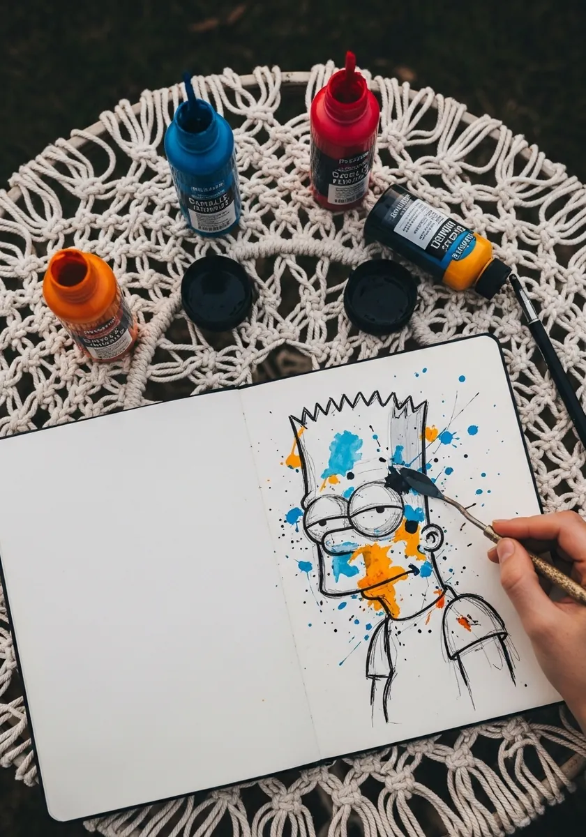
Deliberately damaging a clean drawing takes nerve but produces the liveliest results in this list. Finish the line work properly first, then flick ink across it while the drawing is completely dry. Splatter across the face rather than around it, since half-covering a face is far more striking.
32. Alcohol Marker Flat Color
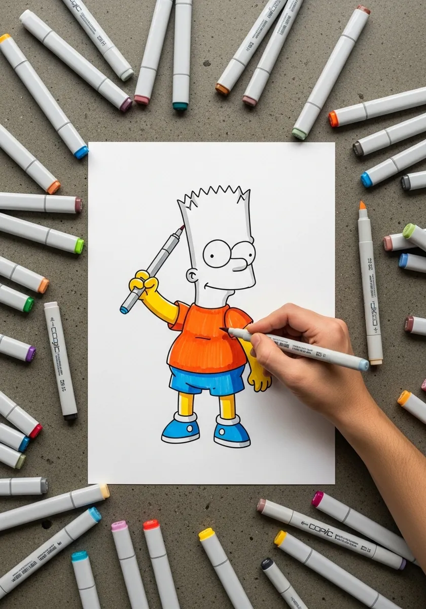
Markers demand smooth paper and a fast hand, because any hesitation leaves a visible streak. Work each flat area in one continuous pass while the ink is still wet at the edge. Ink your outline with a waterproof pen first or the marker solvent will dissolve it straight away.
33. Warm Watercolor with Sky Background
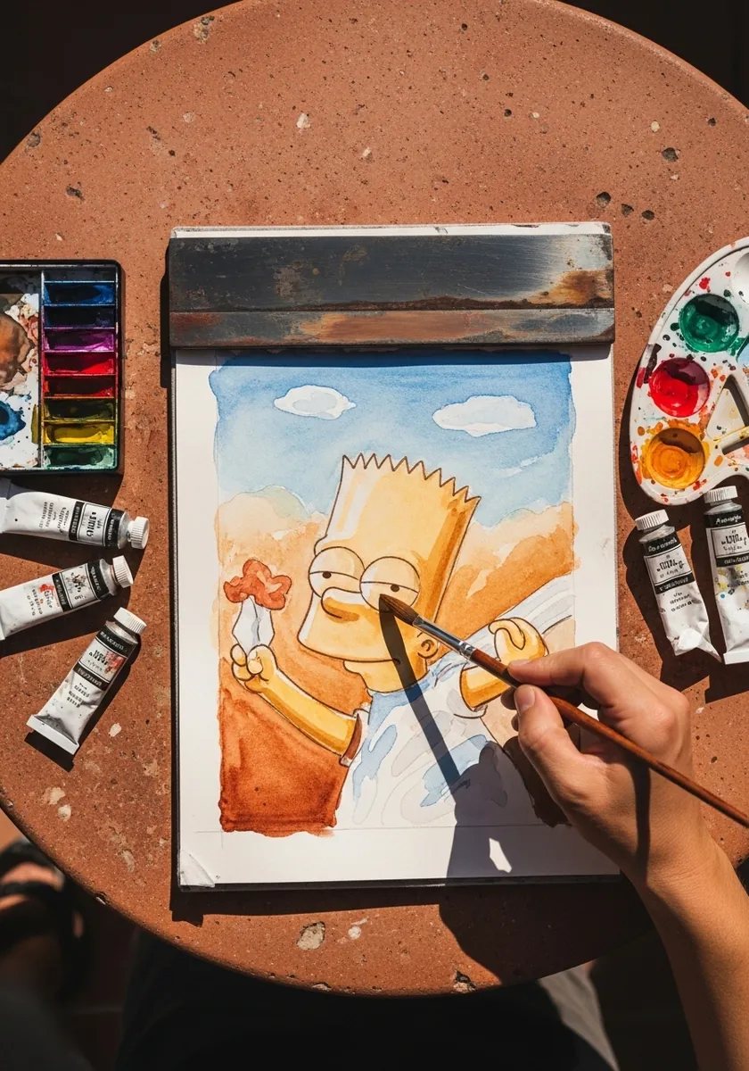
Shifting the whole piece toward warm earth tones gives a cartoon an unexpectedly painterly feel. Mix a little orange into the yellow, keep the sky cool as a counterweight, and let a few white paper gaps show through so the painting keeps some sparkle.
34. Neon Gel Pen on Black
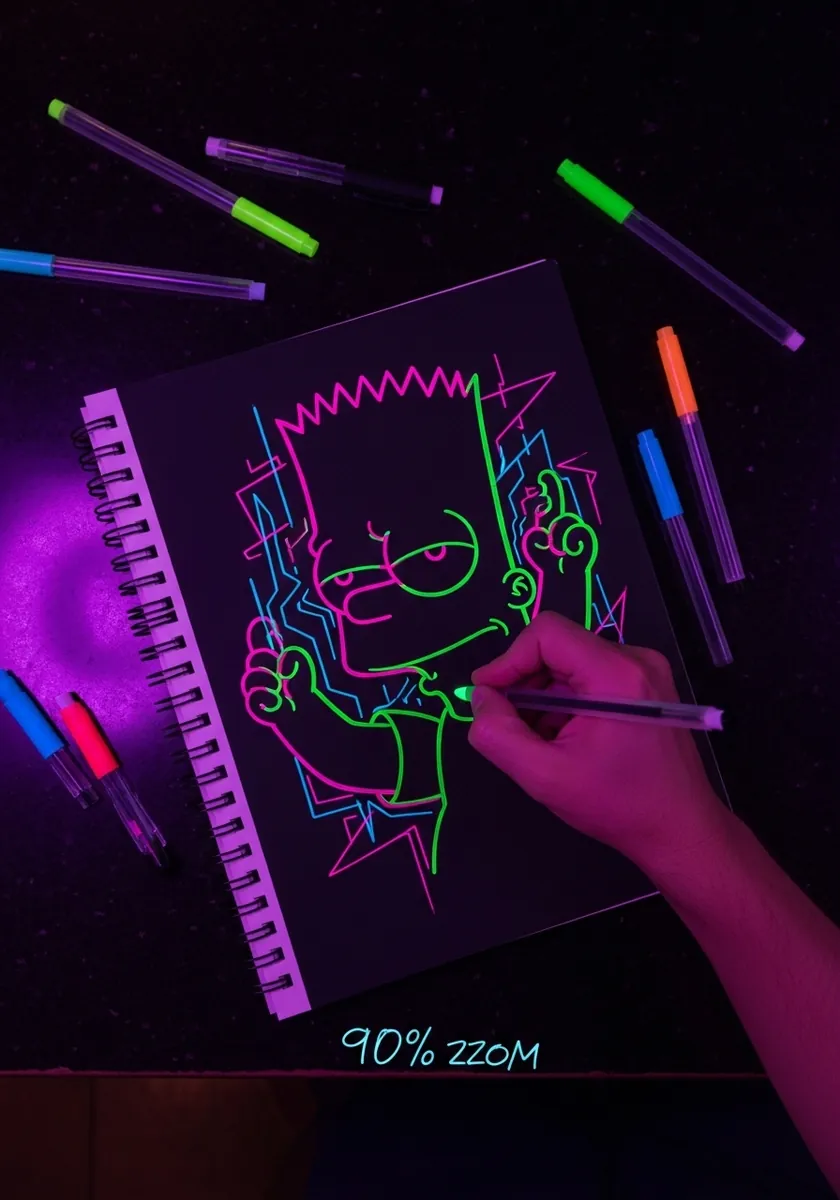
Neon on black is essentially the opposite of everything else here, so draw only the lines that genuinely carry the design and leave the rest of the page to darkness. Use two or three colors at most and let them sit adjacent rather than overlapping, because gel pens go muddy the instant they mix.
35. Vintage Map Illustration Style
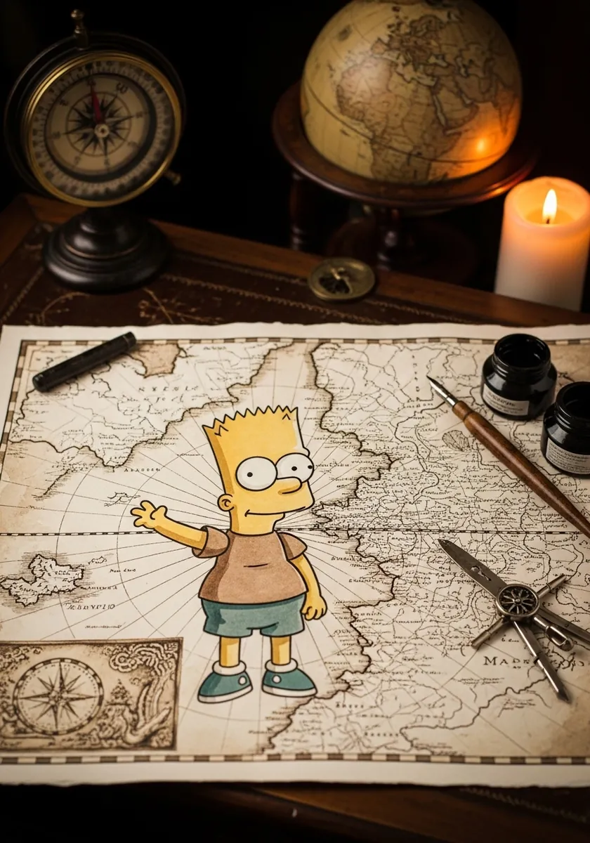
Placing a modern character on an aged ground creates instant contrast. Stain the paper first with weak tea or a thin brown wash and let it dry completely flat. Draw in brown ink rather than black, since pure black sits on top of an aged surface instead of belonging to it.
Frequently Asked Questions
How do you draw Bart Simpson step by step?
Draw a rounded head shape, then add two overlapping circles high on the face for the eyes. Build the hairline as a continuous zigzag of evenly sized triangles across the top. Push the jaw forward into an overbite, add the body as simple tubes, and ink the outline last.
How many spikes does Bart Simpson’s hair have?
Bart is usually drawn with nine spikes across his hairline. Counting them matters less than keeping them even in size and spacing, because an irregular hairline is the first thing that makes fan art look off model, more so than any error in the face.
What colors do you need for Bart Simpson?
Three colors cover almost every version: a warm yellow for skin and hair, red or orange for the shirt, and a mid blue for the shorts and shoes. The palette is deliberately tiny, which is why flat blocks of color work better than any blended shading.
Why does my Bart Simpson drawing look wrong?
It is nearly always the eyes or the jaw. The two eye circles must overlap and sit high on the head rather than centered, and the mouth area has to project forward past the eyeline. If both are correct, the drawing reads as Bart even when everything else is loose.
Is drawing Bart Simpson fan art allowed?
Drawing a copyrighted character for personal practice, study or a private sketchbook is normal and widely done. Selling prints, merchandise or commissions featuring the character is a different matter and generally requires permission from the rights holder, so treat these as practice pieces.
References and Further Reading