Every stem in a hand-tied bouquet converges on one binding point. Draw that point first, then the outline of the dome above it, and only then the individual flowers, because stems that do not converge are what make most bouquet drawings fall apart.
Key takeaways
- Draw the single binding point first, and make every stem converge on it|Use three scales together: large focal flowers, medium fillers and thin vertical spikes|Keep focal flowers in odd numbers, since even groupings read as arranged and stiff|Put the tallest flower off-center, because a symmetrical high point looks static|Leave visible gaps between the stems below the bind, or the base reads as grass
Bouquets fall apart in drawings for one structural reason, and it has nothing to do with the flowers. Every stem in a hand-tied bunch converges on a single binding point. Draw the flowers first and you end up with stems running in vaguely parallel directions toward nothing in particular.
So reverse the order. Mark the binding point, sketch the outline of the dome sitting above it, and only then place individual blooms inside that shape. Florists build the same way with a spiral hand-tie, laying each stem across the last at a consistent angle so the whole bunch opens outward and stands on its own.
The second rule is about variety of scale. A convincing bouquet uses three sizes at once: large focal flowers, medium fillers that occupy the gaps, and thin vertical spikes such as lavender or delphinium that break the outline. Leave out any one of the three and it flattens.
Two smaller things finish it: keep the focal flowers in odd numbers, and put the tallest point off center. The thirty ideas below run from cyanotype and sumi-e to folk pattern, impasto and art nouveau. For circular arrangements see watercolor floral wreath ideas, and for single blooms, flower drawing ideas.
Compiled by the GS Art Zone editorial team. Last updated August 2026. Each idea is paired with the specific step that produces the effect, so you can go from the reference straight to paper.
What You Need Before You Start
- A fine liner for the thin spike flowers, which need a lighter line than the focal blooms
- Three greens rather than one, because stems, leaves and grasses are never the same green
- A small round brush that keeps a point, since wildflower petals are small and irregular
- Masking fluid if you want white daisies against a colored background
- A real bunch of flowers, because invented bouquets always end up evenly spaced
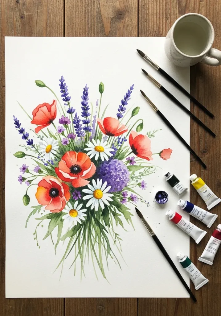
1. Classic Watercolor Wildflowers
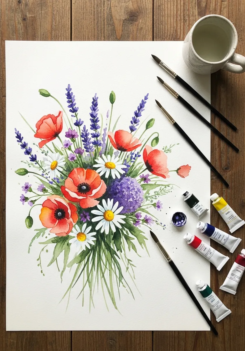
This is the arrangement everything else builds on. Poppies are the focal flowers, daisies the fillers and lavender the vertical spikes, so all three scales are present. Keep the daisies as reserved white paper rather than painted white, and let every stem run down to one point.
2. Pencil Line Bouquet
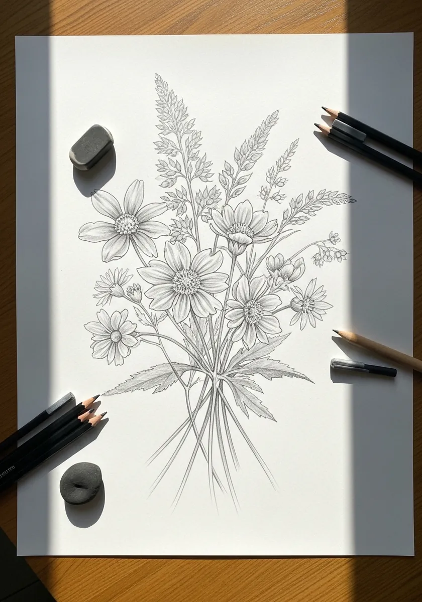
A pure line drawing exposes the structure immediately. Mark the binding point, run every stem to it, and resist adding a single tone until the convergence looks right. Count the stems below the bind and make sure that number matches the flower heads above it, because a bouquet with more blooms than stems is a surprisingly common error.
3. Ink Line With Gray Wash
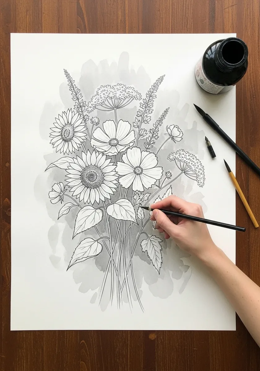
A pale wash behind line work has to stay clear of the drawing. Keep the wash irregular and slightly larger than the bouquet, let it run off one edge of the paper, and leave the flowers themselves completely untouched white.
4. Bold Gouache on Peach
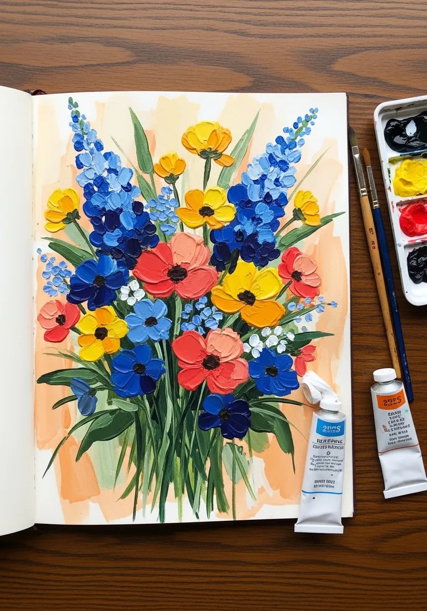
Opaque paint on a colored ground lets you work light over dark. Block the peach in first and let it dry hard, then place each flower as flat unmodulated color, keeping the darkest blues at the outer edges so the bouquet holds its shape.
5. Fine Ink on Kraft Paper
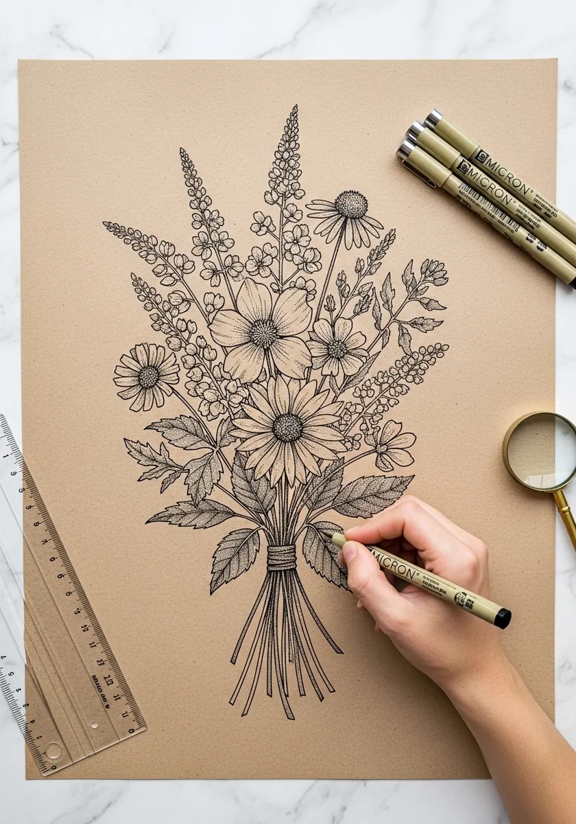
Kraft gives you a mid tone for free, so the drawing becomes about the darks. Keep the ink line consistently fine, add no white at all, and let the paper stand as every light value in the picture. Keep the stem gaps genuinely open, since kraft shows every mark you make.
6. Folk Art Flat Bouquet
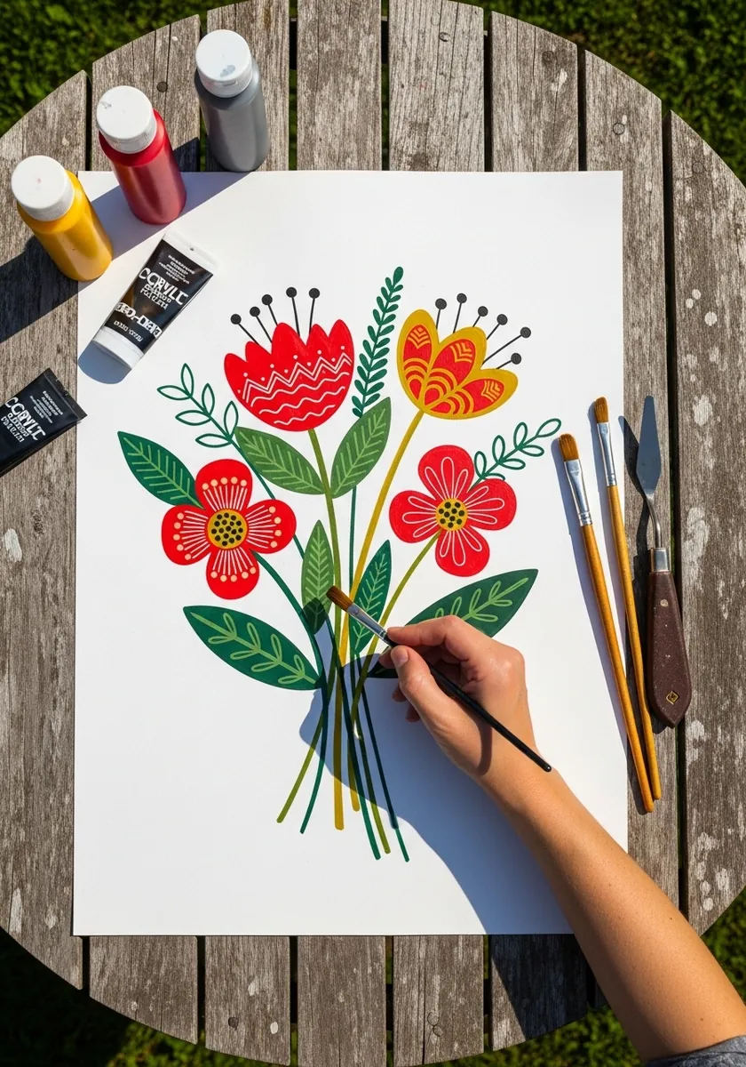
Folk flowers are designed rather than observed. Reduce each bloom to two or three simple repeated shapes, use flat color with no shading anywhere, and mirror the arrangement roughly left to right without making it perfectly symmetrical. Outline everything in one dark color so the flat shapes stay separated.
7. Loose Splashy Watercolor
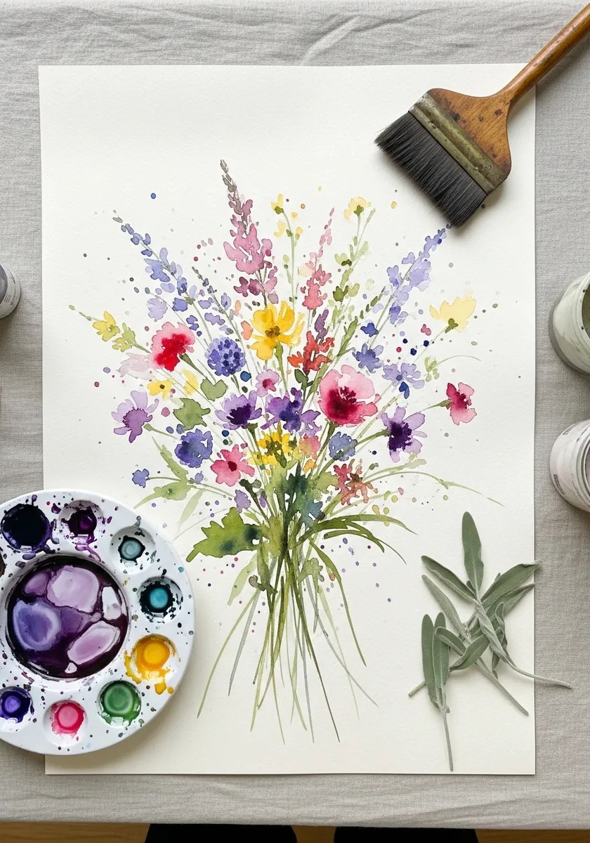
Loose work still needs the underlying structure to be correct. Place the binding point and the dome outline in very light pencil first, then paint freely inside that framework, and the looseness will read as confidence rather than accident. Flick the spatter from one direction only, well away from the flower heads.
8. Dense Black Ink Bouquet
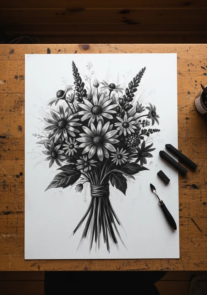
Filling a page with black demands somewhere for the eye to rest. Leave two or three flower centers as bare white paper, keep the stems below the bind much more open than the head, and let those gaps carry the whole composition.
9. Detailed Graphite Study
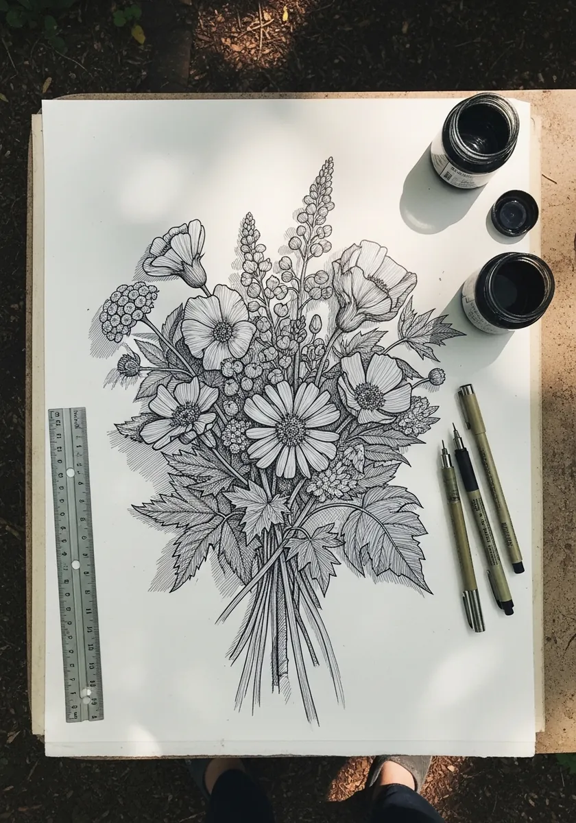
Graphite handles the overlapping depth of a bouquet better than color does. Push the flowers at the back a full value darker than those in front, keep the front blooms crisp, and soften every edge that sits behind another. Darken the table immediately behind the bouquet so the pale petals separate.
10. Sumi-e Bouquet With Seal
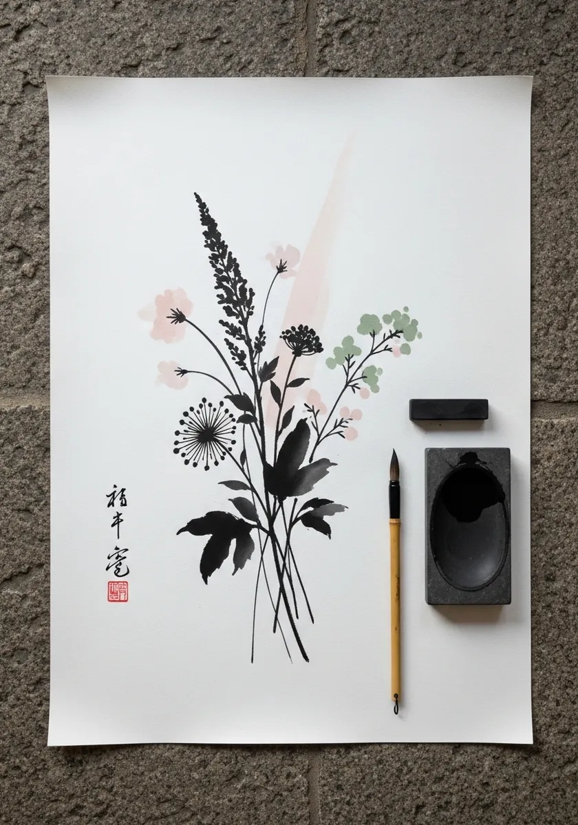
Brush work suits wildflowers because the stems are already single strokes. Load once and pull each stem in a single upward movement, let the brush dry out toward the flower heads, and place the red seal small and well off center.
11. Colored Pencil Bouquet
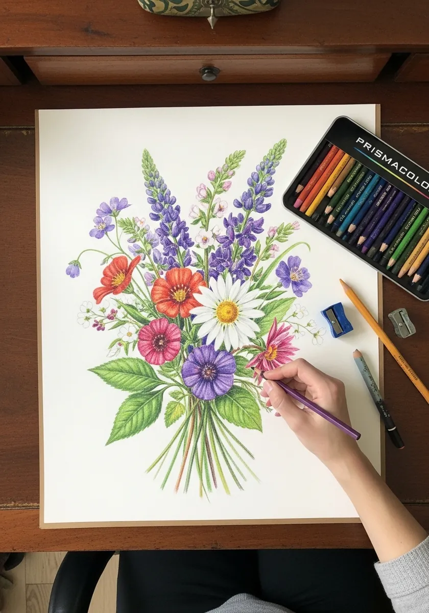
Colored pencil builds slowly, which suits layered petals. Lay the palest color across each flower first, then push the shadows in two or three passes, and keep the burnishing only for the focal blooms so they come forward. Leave the background paper completely bare, because colored pencil skies rarely help.
12. Vibrant Purple and Yellow
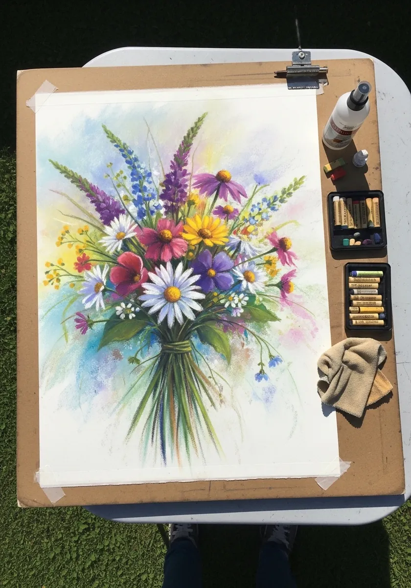
Purple and yellow sit opposite each other on the color wheel, which is why this pairing sings. Keep both fully saturated, let them touch directly rather than separating them with green, and add the foliage only around the outside. Work on damp paper so the two colors bleed slightly where they meet.
13. Ink and Colored Pencil Mix
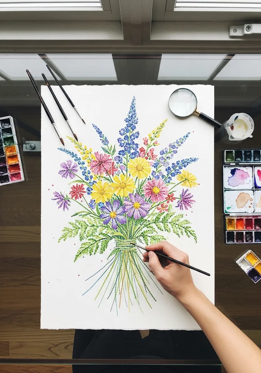
Mixing line and color means deciding which one leads. Ink the full structure first including every stem, then add color inside the lines without ever covering them, so the drawing still reads as a drawing rather than a painting. Let the ink dry fully first, or the pencil will drag the line into a smear.
14. Flat Botanical Illustration
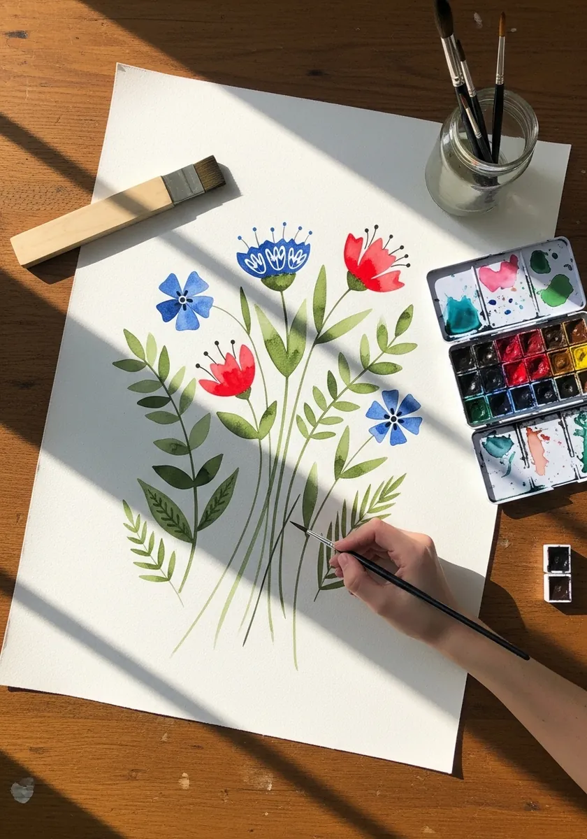
Flat botanical work removes depth on purpose. Keep every flower fully visible with no overlap at all, space them evenly across the page, and let the arrangement read as a specimen chart rather than a bunch. Label each species in a small consistent hand beneath it if you want the full effect.
15. Bright Sketchbook Bouquet
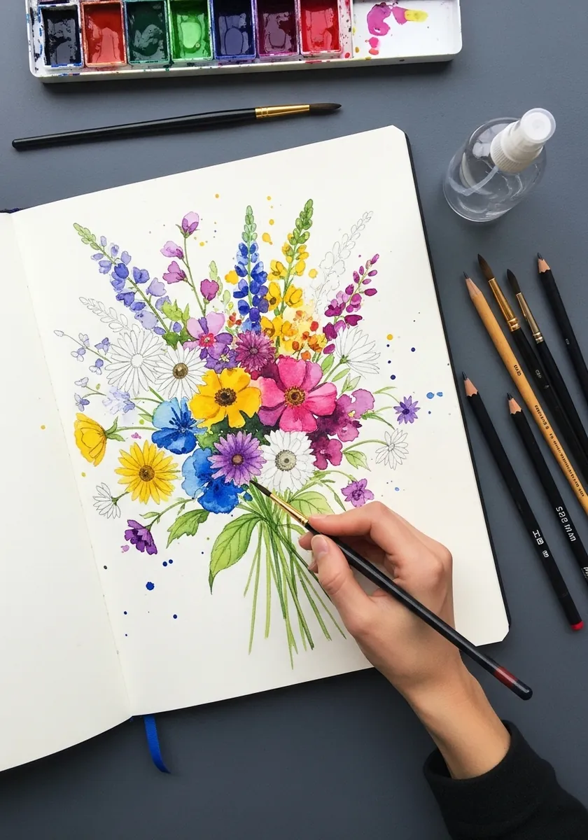
Working in a sketchbook means accepting the gutter. Place the binding point on one page rather than across the fold, let the flower heads spread over the seam, and the spread reads as one image rather than two halves. Tape the spread flat while it dries, because wet paper buckles across a binding.
16. White Line on Tan Paper
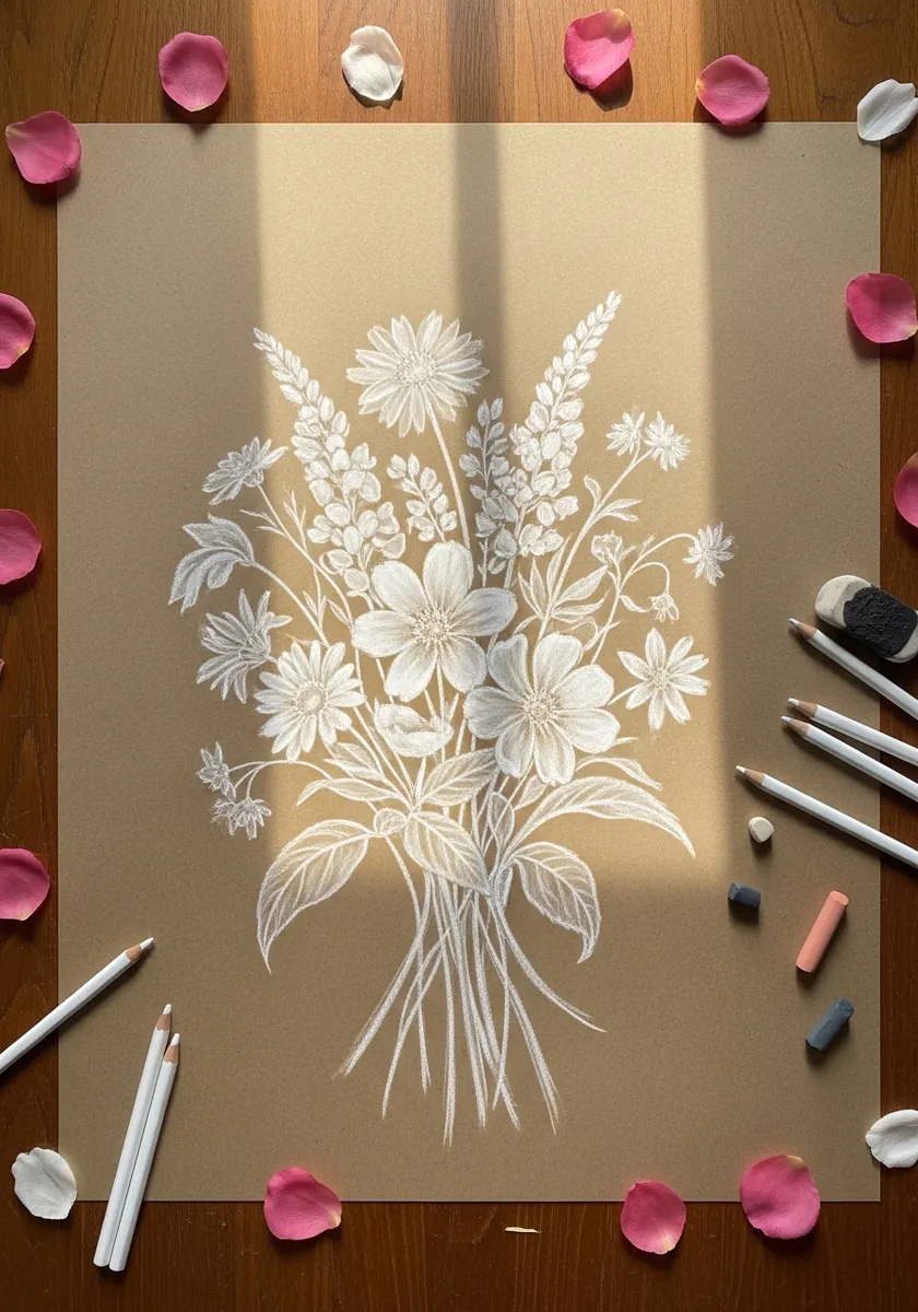
Drawing in white reverses your thinking entirely. Put down only the lines that would catch the light, leave every shadow as untouched paper, and keep the whole thing sparser than feels right. Add a single warm accent somewhere so the whole page does not read as cold.
17. Impasto Bouquet in a Vase
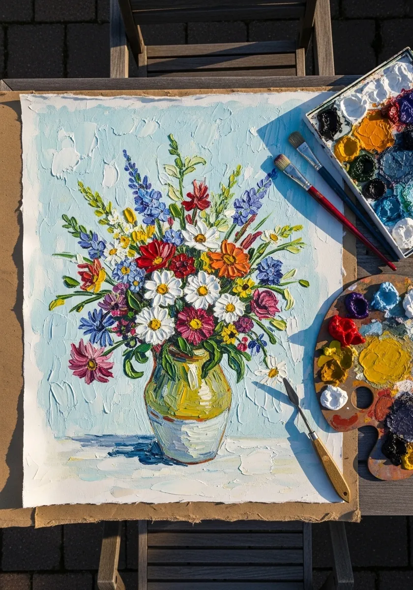
Thick paint means each flower is one loaded stroke rather than many. Charge the brush fully, place each petal in a single confident press, and never go back into a stroke while it is still wet or the color turns to mud.
18. Minimal Pencil Sketch
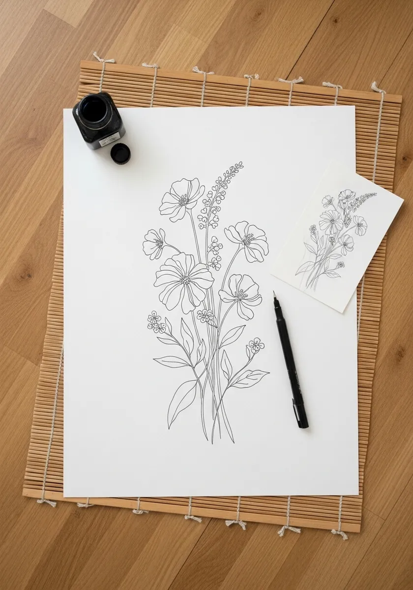
A quick outline is a planning tool rather than a finished piece. Get the dome shape and the binding point down in under a minute, check the proportion of head to stem, and only commit to detail once that balance is right.
19. Detailed Graphite With Texture
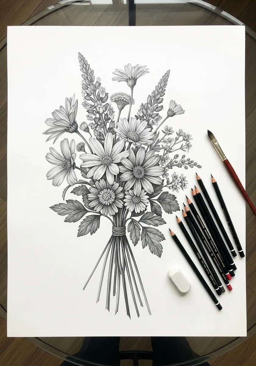
Every flower type needs a different mark. Use small circular strokes for the daisy centers, long parallel strokes for the grasses, and short flicks for the seed heads, so texture identifies the species without any color at all. Keep one flower almost untouched, since a page of texture everywhere becomes noise.
20. Scandinavian Folk Pattern
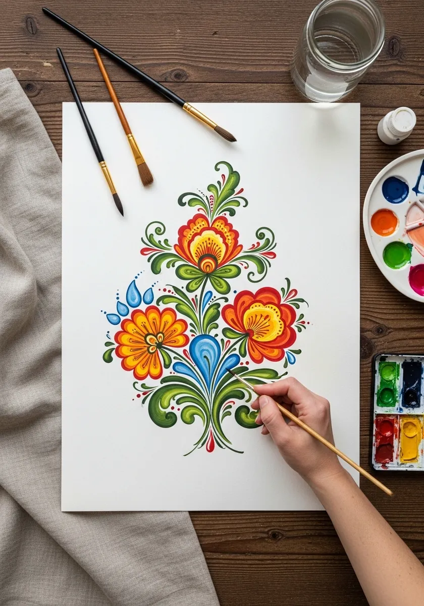
Nordic folk design is built on mirrored curls. Draw a light center line, build each element as a matching pair either side of it, and let the leaves curl in opposite directions so the symmetry stays lively rather than rigid.
21. Cyanotype Blue Print
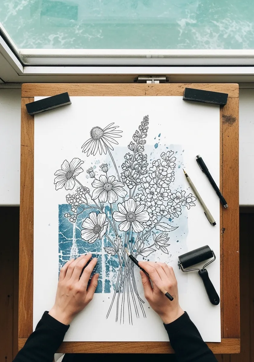
Cyanotype records silhouettes rather than detail, so the outline is everything. Choose flowers with distinct profiles, separate them so no two overlap, and remember that anything touching the paper directly will come out crisp white. Press the plants under glass so nothing lifts and blurs during the exposure.
22. Soft Pastel Pink Bouquet
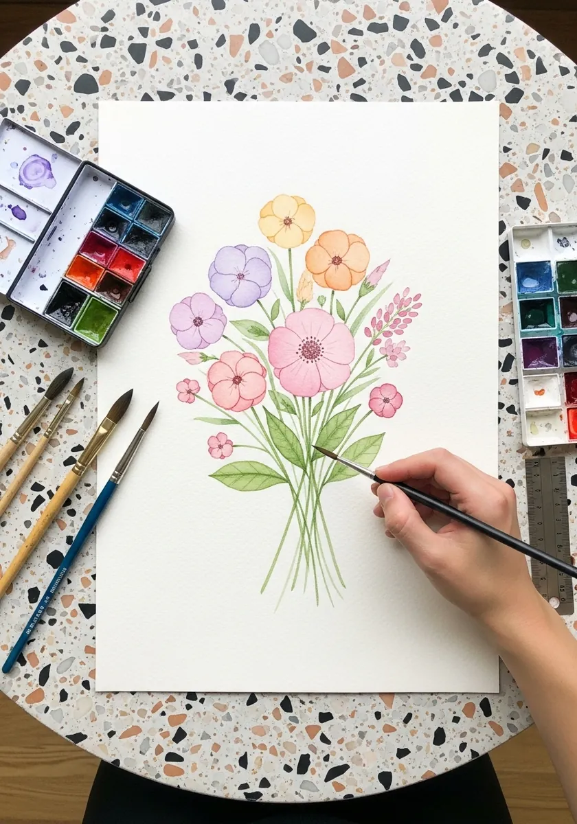
A very pale palette needs one darker note to hold it together. Keep the flowers soft and low contrast, then drop a single deeper green at the binding point, and the whole arrangement suddenly gains structure. Work on a warm white paper, because a cool sheet makes pale pinks look gray.
23. White Silhouette on Navy
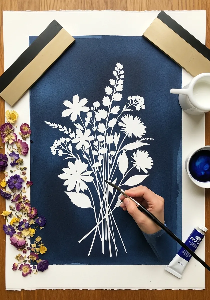
A solid silhouette lives or dies on the negative space between stems. Keep the gaps varied in width, let a few stems cross to create small enclosed shapes, and never let the base become one solid block. Paint the navy first and let it cure hard before any white touches it.
24. Sepia Ink Notebook Study
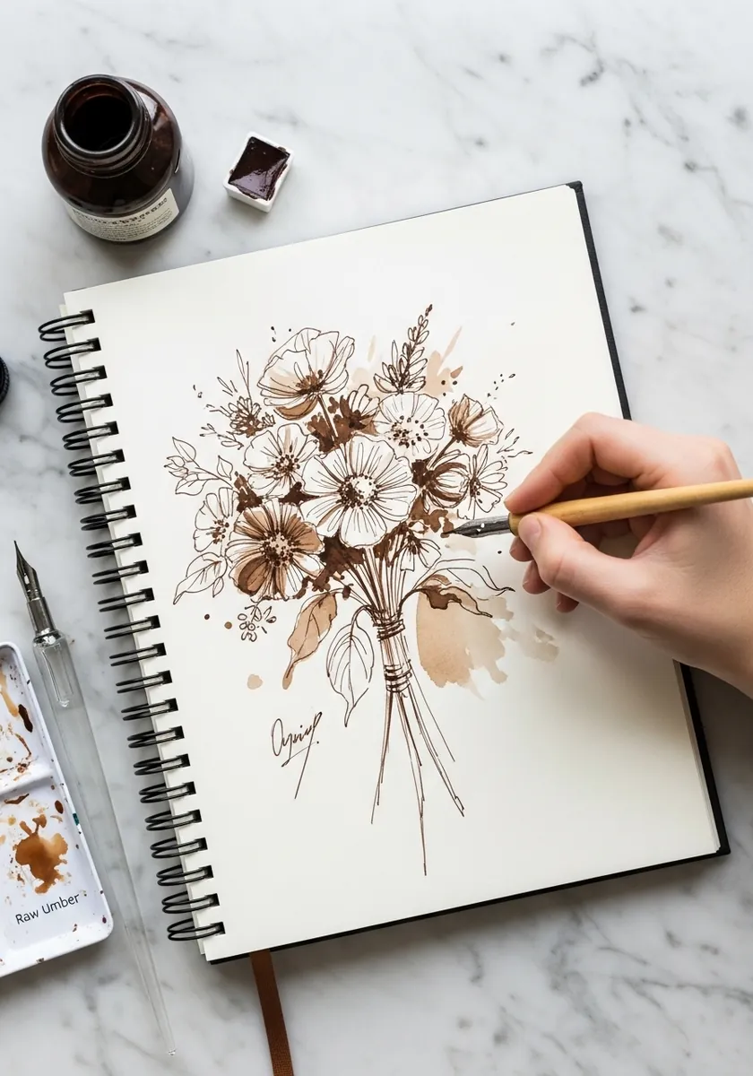
Working in a single earth color turns a study into a design exercise. With no color separating the flowers, you have to use line weight and density instead, so keep the focal blooms boldest and the background flowers faintest. Vary the nib width between flower types rather than relying on tone alone.
25. White Pencil on Gray
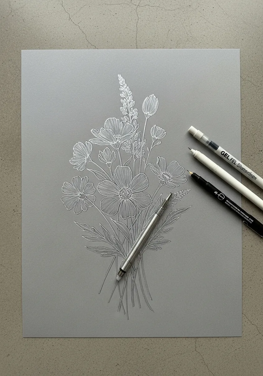
Mid gray paper gives you a starting value in the middle of the range. Add only the highlights in white, leave the paper as the mid tone, and resist adding any dark at all so the drawing stays high key.
26. Rust Ink Round Bouquet
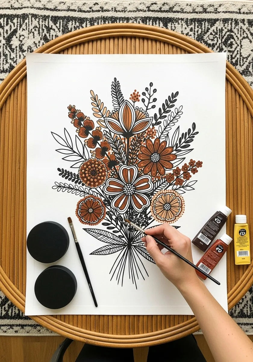
A round bouquet needs its outline broken or it becomes a ball. Let three or four spikes and grasses escape the circle at irregular points, and keep the rest of the silhouette tight so those escapes read as deliberate. Draw the containing circle faintly in pencil first, then break it deliberately.
27. Bright Multicolor Watercolor
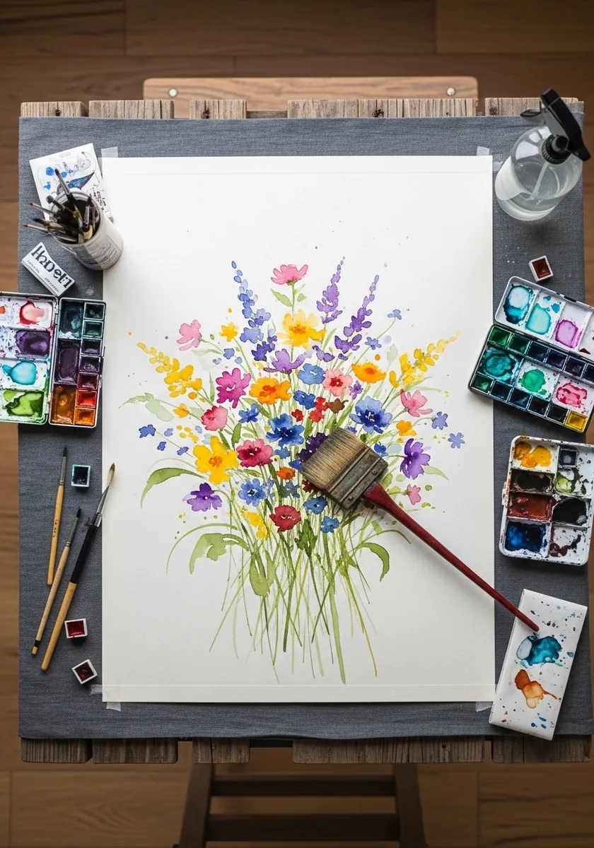
Using many colors at once needs one to dominate. Choose a single hue for roughly half the flowers, scatter the rest as accents, and keep the greens consistent throughout so the foliage unifies everything above it. Test the greens on scrap first, since one wrong green flattens every flower above it.
28. Gold Line on Black
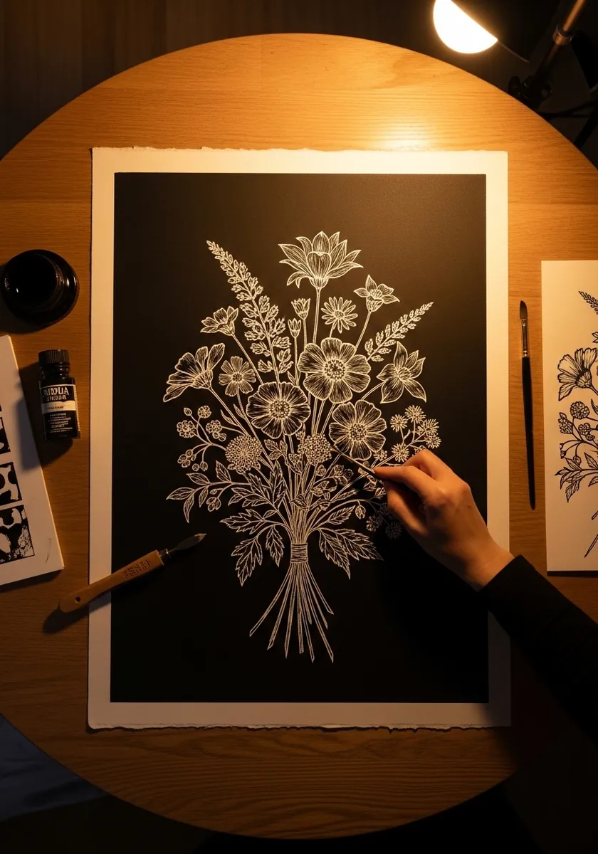
Metallic ink on black reads as light rather than as color. Keep the line even and fine, let the density of lines create the value rather than pressing harder, and leave large areas of pure black between flower groups. Work under a raking light so you can actually see the metallic ink as you draw.
29. Art Nouveau Panel
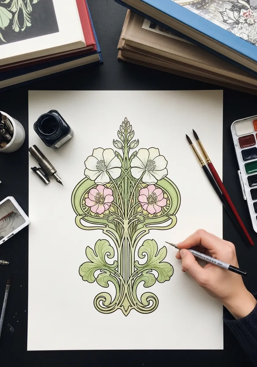
Nouveau turns plants into architecture. Build the arrangement around one strong vertical axis, let every stem swell and taper as it curves, and repeat the same curl shape at different scales through the whole panel. Rule the central axis in pencil and check both halves against it constantly.
30. Loose Bouquet With Drips
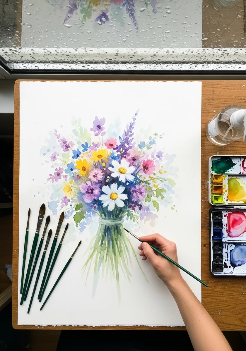
Drips work when they come from one place only. Let the color run from the base of the stems downward, keep the flower heads completely clean, and lay the board flat again before the runs reach the bottom edge. Blot the end of each run so it fades rather than pooling into a hard blob.
Frequently Asked Questions
How do you draw a bouquet so the stems look right?
Mark the binding point before anything else and treat it as the anchor. Every single stem has to travel toward that one spot, fanning out below it and spiraling outward above. Stems that run parallel or converge on different points are the most common error in bouquet drawings.
What makes a bouquet look designed rather than picked?
Three different scales working together. Large focal flowers such as poppies or daisies, medium fillers that occupy the gaps, and thin vertical spikes like lavender or delphinium that break the outline. Miss any one of the three and the arrangement looks flat.
Why do florists use odd numbers?
Because an odd number of focal flowers cannot split evenly, so the eye keeps moving around the arrangement instead of settling into two matching halves. Three, five or seven focal blooms will nearly always look more natural than four or six.
What is a spiral hand-tie?
The standard florist method where each stem is laid across the previous one at the same angle, so the stems spiral around the binding point. It opens the bouquet into a dome and lets it stand up on its own, and drawing that spiral is what makes a hand-tied bunch convincing.
How do I keep white flowers white in watercolor?
Reserve them rather than paint them. Either mask the daisy petals before you lay any wash, or paint carefully around them, because watercolor has no opaque white and lifting a clean petal shape out of dry paint almost never works.
References and Further Reading