If you keep asking yourself why do my drawings look flat, here is the honest answer: your drawing is probably using only one narrow band of medium grays, and nothing in it overlaps or casts a shadow. Real scenes look deep because they mix bright light, deep shadow, and objects sitting in front of and behind each other. When a drawing leaves those things out, the eye reads it as flat, like a sticker on the page.
This is not a talent problem. Almost every beginner draws flat at first, because we naturally draw what we know an object looks like instead of how light actually falls on it. The moment you start copying light and shadow instead of outlines, your drawings begin to look round and real.
In this guide you will learn what is really causing the flatness, seven simple ways to add depth, two quick tests that reveal flatness instantly, and a 15-minute exercise that ties everything together.
TL;DR
- Drawings look flat when every part uses similar mid-level tones, with no real darks and no bright highlights.
- Push your shadows close to black, protect your highlights near white, and add both a core shadow and a cast shadow to every object.
- Overlap objects, make far things lighter and softer, and vary your line thickness to build layers of depth.
- Squint at your drawing: if it melts into one gray blob, it needs a wider value range.
In this guide
The Short Answer: Your Values Are Too Similar
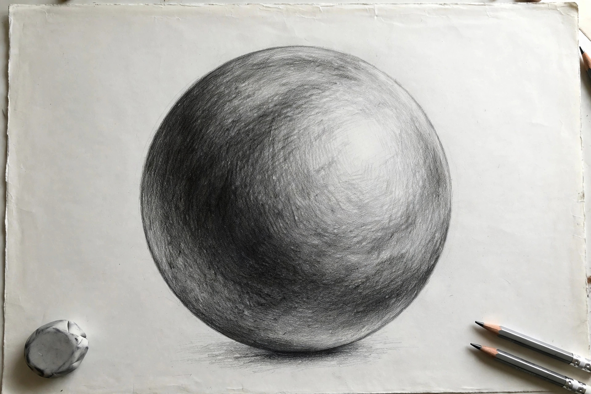
The main reason drawings look flat is that all the tones sit too close together. To fix it, you first need one simple idea: value. Value means how light or dark something is, ignoring its color completely. A lemon and a pale gray can share the same value. A dark red apple and a dark green leaf can too.
Picture a scale from 1 to 10, where 1 is pure white paper and 10 is the blackest black your pencil can make. Real objects in real light use most of that scale. A white cup in sunlight might have values from 1 on its bright side to 8 in its shadow. But flat drawings tend to live in the middle of the scale, around 4, 5, and 6. With no strong darks and no clean lights, everything looks the same distance away, and the eye gives up and reads the picture as flat.
The fix is not to shade harder everywhere. It is to plan your values: decide where your darkest dark and your lightest light will go before you start, then keep everything else in between. If you want the full shading toolkit first, our guide on how to shade a drawing covers the basic techniques step by step.
One more habit makes planning easy: choose a single light source before you draw a single shadow. Imagine a lamp sitting in one corner of your scene and never move it. Every highlight faces the lamp, every core shadow turns away from it, and every cast shadow falls on the opposite side. When all the shadows in a picture agree with each other, the scene feels solid and believable. When shadows point in random directions, the eye gets confused and the drawing flattens again, even if the shading itself is neat.
7 Ways to Add Depth to a Drawing
You do not need all seven tricks in every drawing. Even two or three of them, used on purpose, will make a sketch feel deeper right away. Try them one at a time so you can see what each one does.
1. Use a Full Value Range, From Near-Black to White
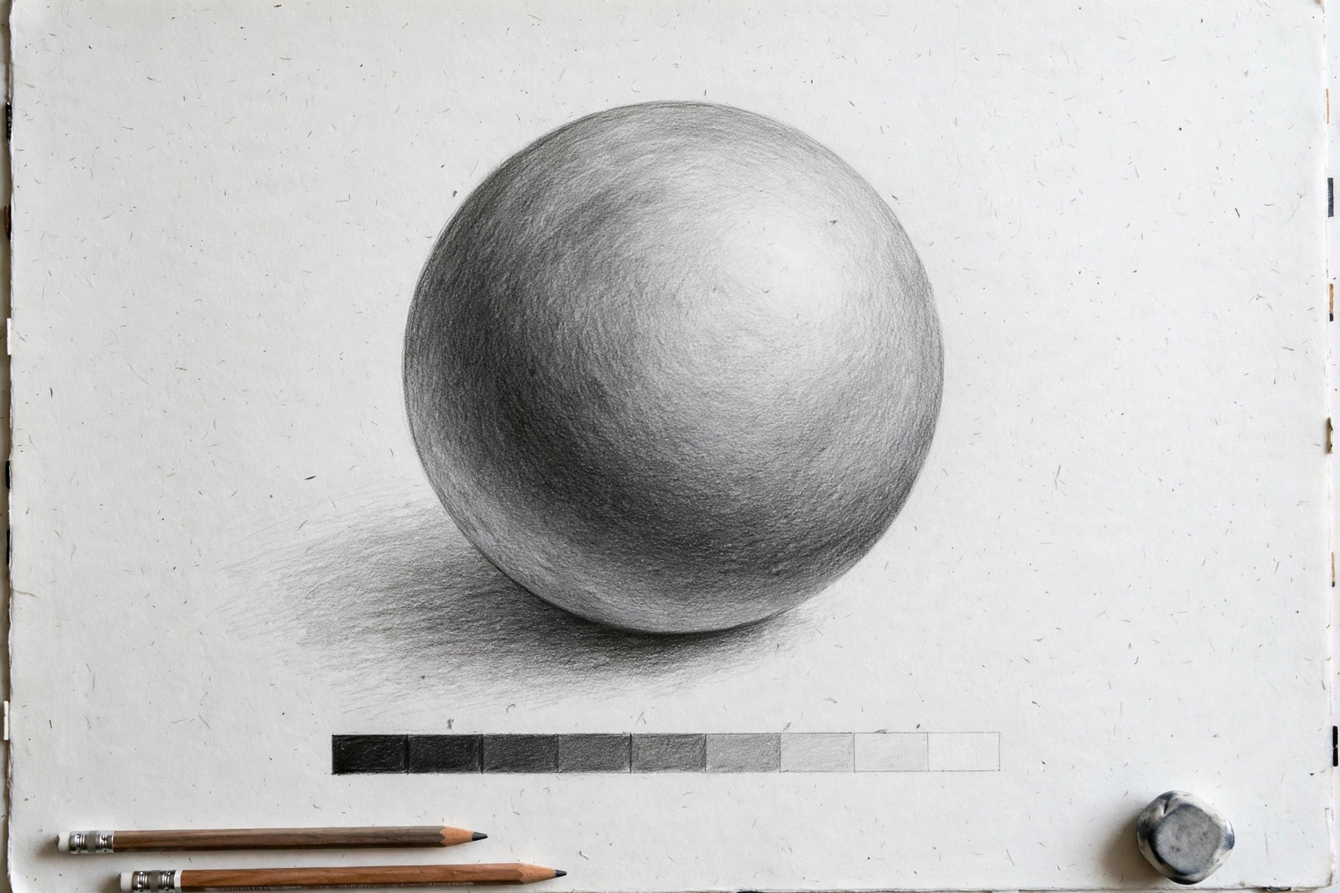
Give your drawing real darks and real lights. Press firmly in your deepest shadows so they reach 8, 9, or 10 on the value scale, and leave your brightest spots as clean, untouched paper. Most flat drawings are simply afraid of going dark.
Mini exercise: Draw a row of five boxes and fill them from white to black, one step at a time. Keep this little value scale next to you while you draw and check your shadows against it.
2. Add a Core Shadow and a Cast Shadow
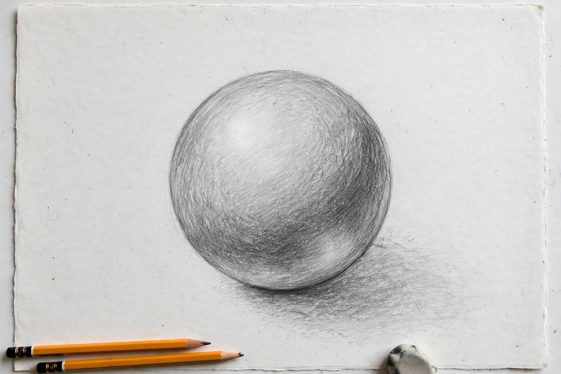
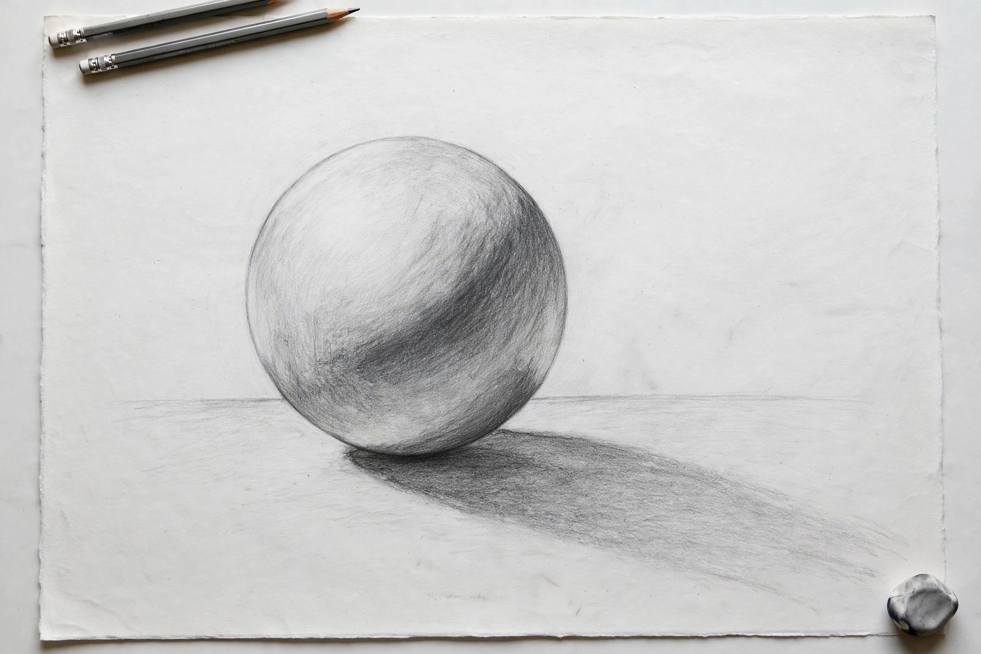
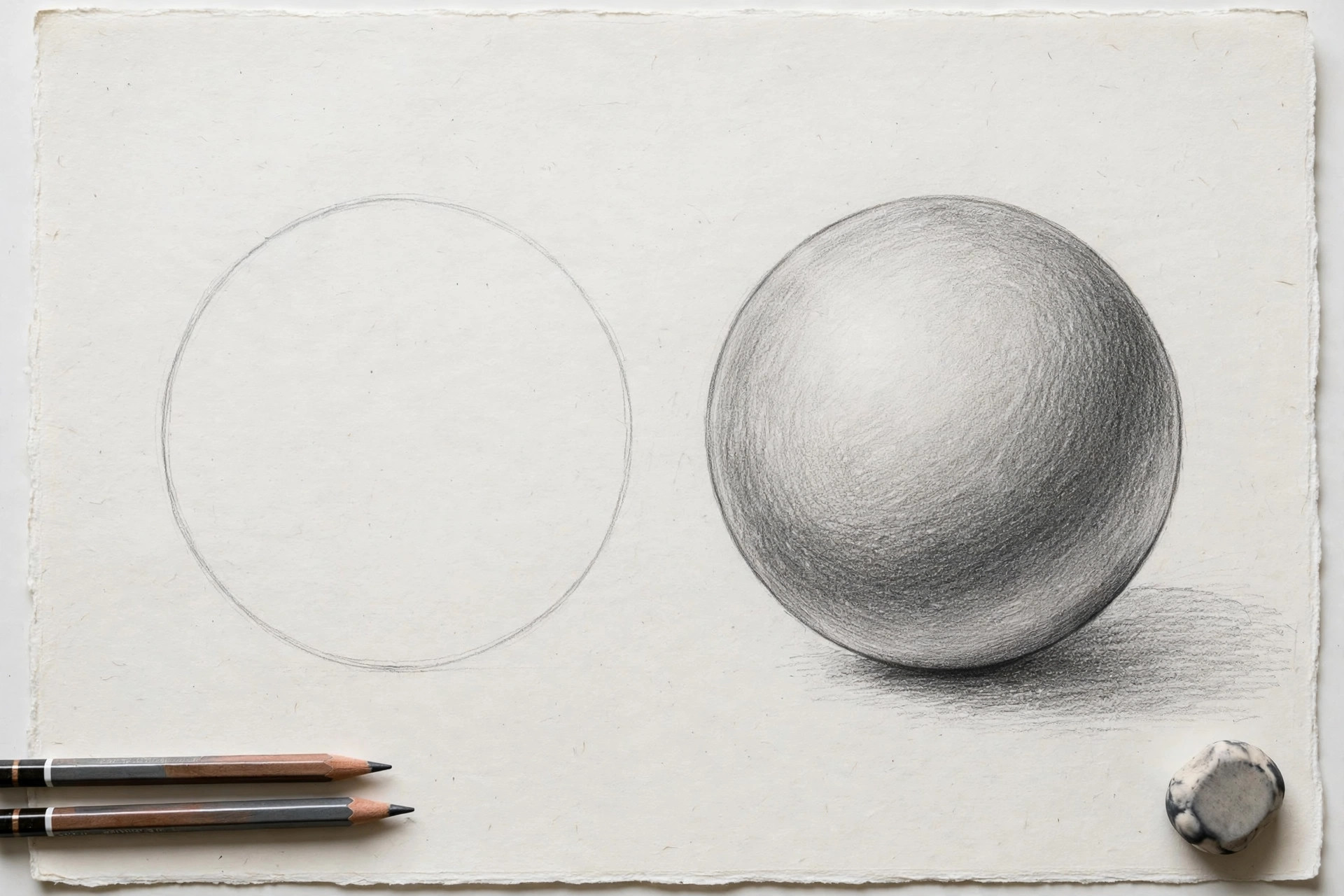
Every rounded object has two shadows, and beginners usually draw neither. The core shadow is the dark band on the object itself, on the side turned away from the light. The cast shadow is the shadow the object throws onto the ground or table beneath it. The cast shadow is what glues an object to the surface so it stops floating.
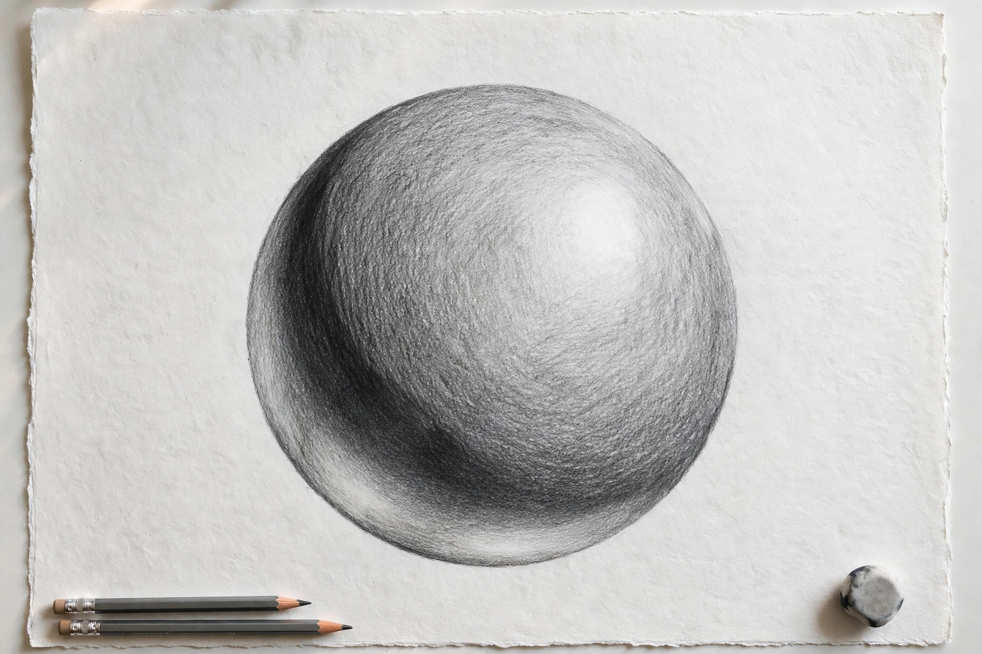
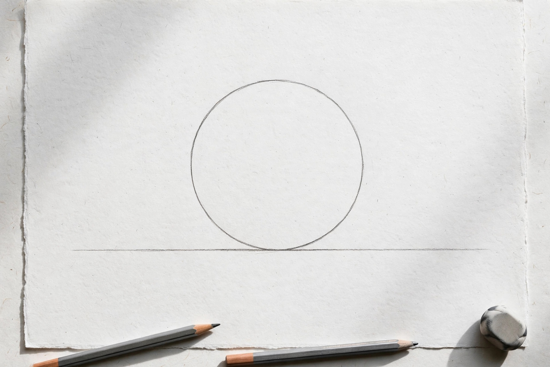
Mini exercise: Draw a ball on a table line. Shade one side of the ball dark (the core shadow), then add a soft oval shadow on the table under it, darkest right where the ball touches. Watch it sit down.
3. Overlap Objects
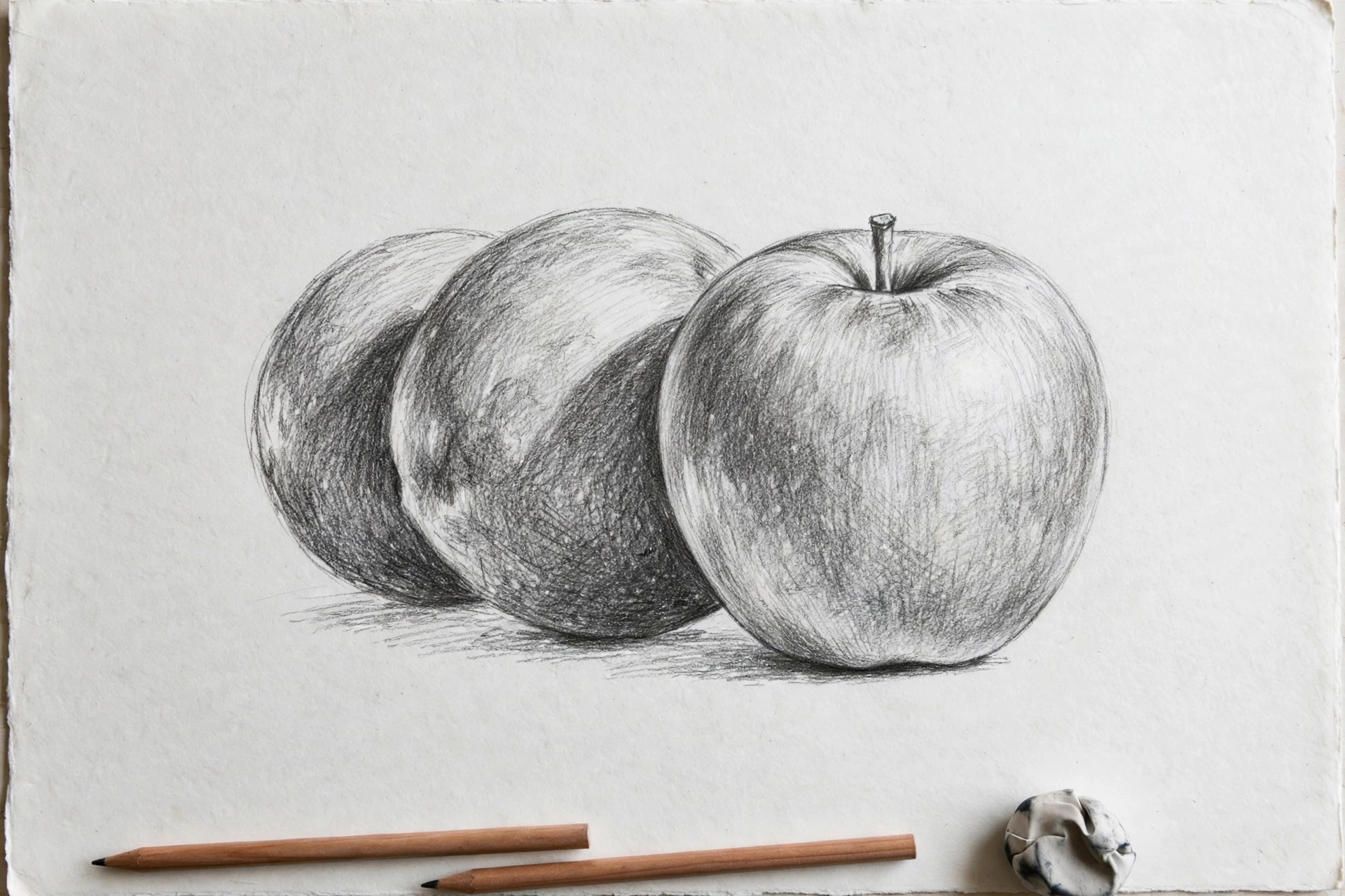
When one object covers part of another, your eye instantly knows which one is in front. Overlap is the cheapest depth trick there is: it needs no shading at all. A row of separate, non-touching objects looks like a lineup of stickers. Let them overlap and they become a scene.
Mini exercise: Draw three circles in a row without touching. Now draw the same three circles overlapping like bubbles. Compare how much deeper the second group feels.
4. Make Far Things Lighter, Smaller, and Softer
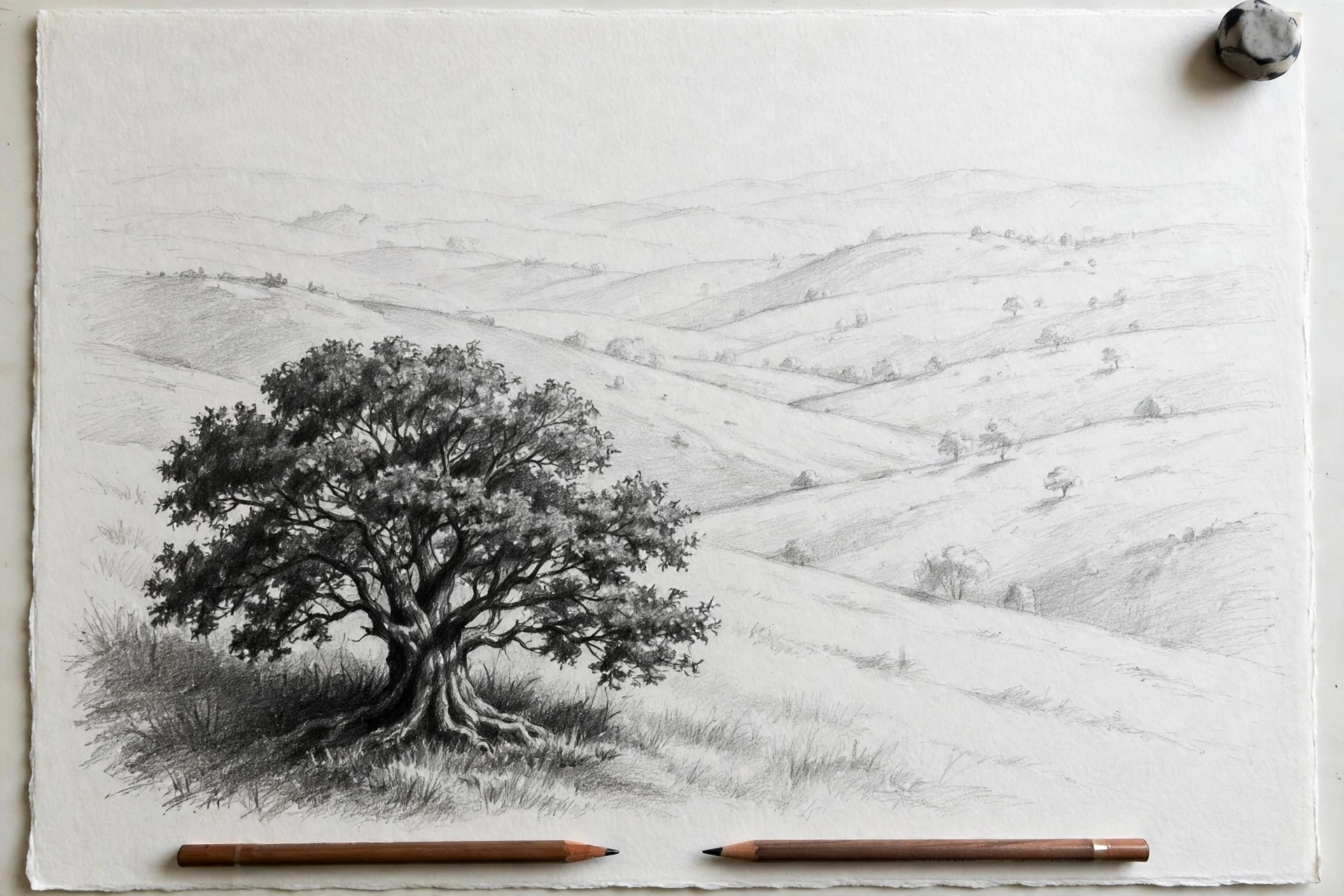
Things that are far away look paler, smaller, and less detailed than things close up. Artists call this atmospheric perspective, which is a fancy name for a simple fact: the air between you and a distant object washes out its colors and edges, the same way far mountains look blue-gray instead of green. In a pencil drawing, that means far things get lighter values, fuzzier edges, and less detail.
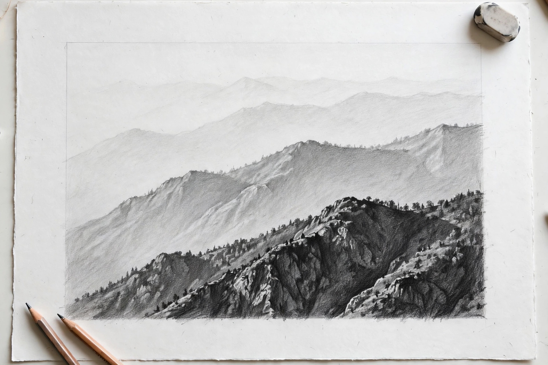
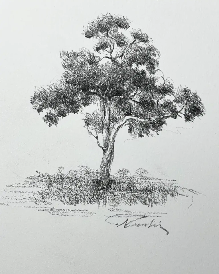
Mini exercise: Draw two trees, one near and one far. Make the near tree big, dark, and detailed. Make the far tree smaller, lighter, and soft-edged, with no tiny details.
5. Vary Your Line Weight
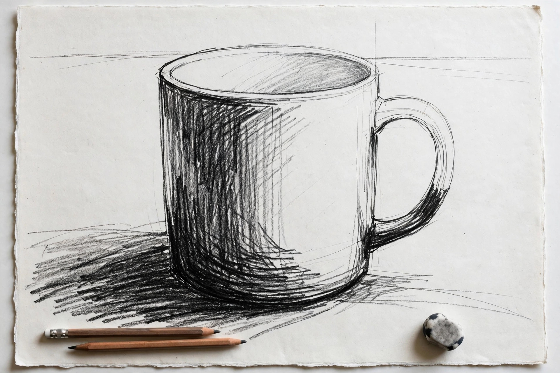
Line weight means how thick and dark your lines are. If every outline is the same thickness, everything feels equally close. Instead, use thick, dark lines on the parts nearest to you and on the shadow side of objects, and thin, light lines on far edges and details. The eye reads bold lines as “close” and faint lines as “far away.”
Mini exercise: Draw a simple box twice. Give the first one an even outline all around. On the second, press hard on the front edges and barely touch the paper on the back edges. The second box will look more solid.
6. Add a Background Tone So the Subject Pops
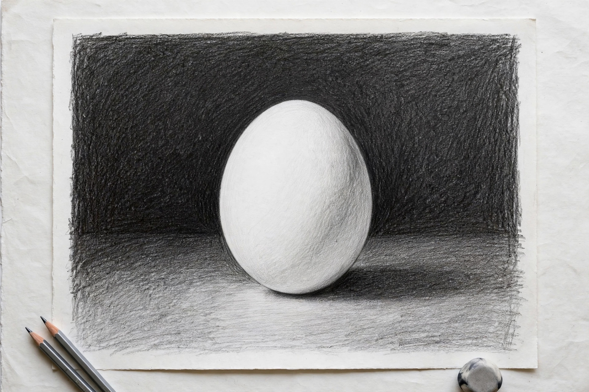
A white object drawn on white paper disappears. Shading the background behind your subject gives it something to stand against, like a spotlight on a stage. Put a mid-gray or dark tone behind light subjects, and leave the background light behind dark subjects. The contrast at the edges is what makes the subject jump forward.
Mini exercise: Draw a simple white mug shape and leave it empty. Now shade only the background around it with an even mid-gray. The mug suddenly looks round, bright, and in front of the background.
7. Frame the Scene With a Foreground Element
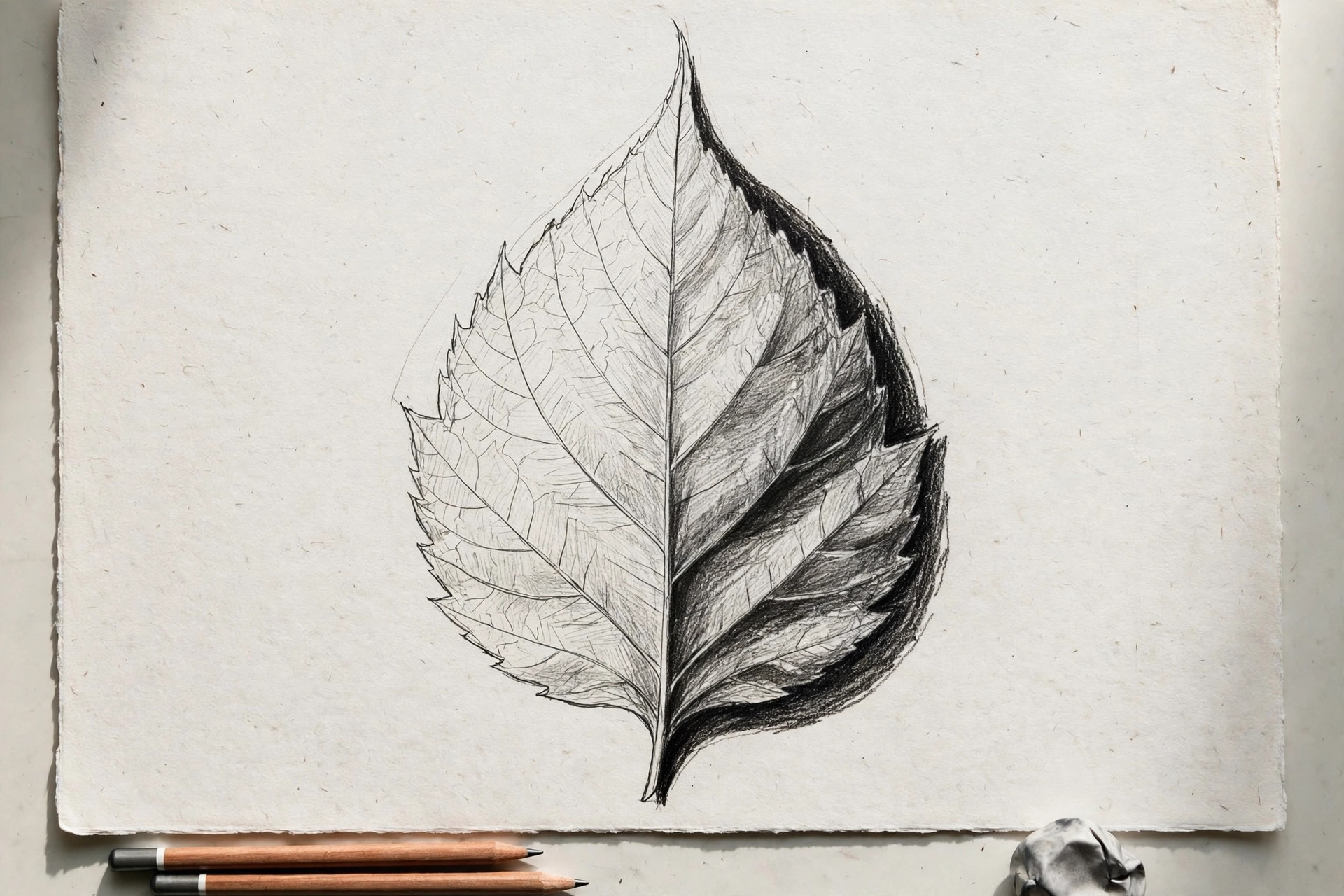
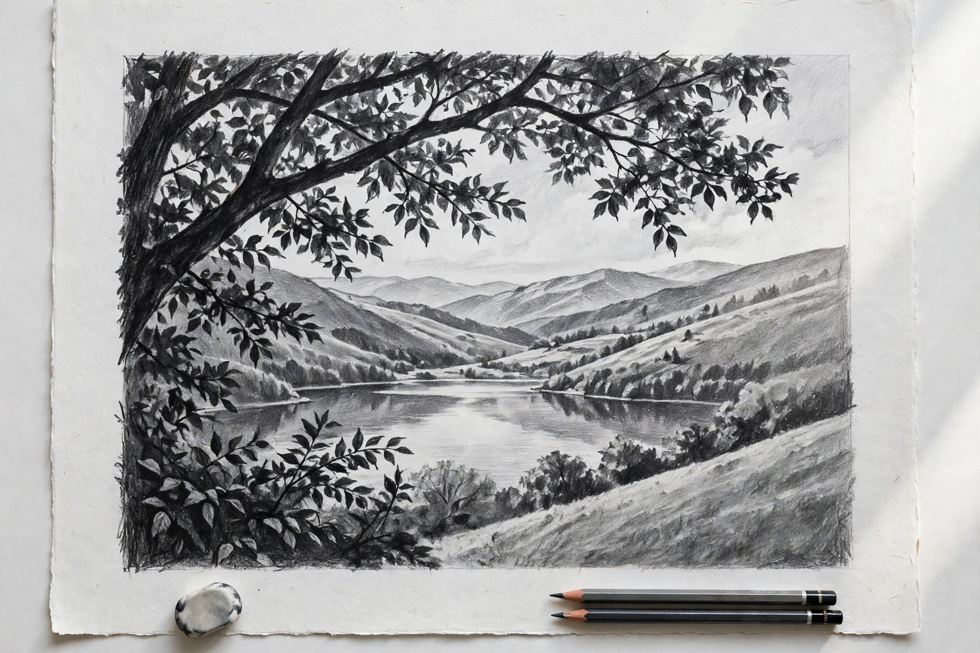
Real photos often have something close to the camera at the edge of the frame: leaves in a corner, the side of a doorway, a branch overhead. Adding one near element in a corner of your drawing gives the viewer a “front layer,” which makes everything behind it feel deeper by comparison. Foreground elements are usually the darkest and simplest shapes in the picture.
Mini exercise: Take a plain landscape sketch and add a few large, dark leaf shapes in one top corner, letting them get cut off by the edge of the page. The whole scene will feel like it has more space.
Two Quick Tests That Show Flatness Instantly
You cannot always see flatness while you are drawing, because you are too close to the work. These two tests take ten seconds each and show you the truth.
The squint test: Step back from your drawing and squint at it until the details blur. Squinting hides the small stuff and shows only the big value shapes. If your drawing turns into one even gray blob with no clear dark shapes and no clear light shapes, it is flat. If you can still see a bold pattern of lights and darks, your depth is working.
The phone photo test: Take a photo of your drawing and shrink it down small on your screen, or switch the photo to black and white. At thumbnail size, flat drawings lose all their depth and look like gray smudges, while drawings with a strong value range still read clearly. The black-and-white version also removes color, so you judge values honestly instead of being fooled by pretty colors.
Both tests work because they take away the details you worked hard on and leave only the big shapes of light and dark. Depth lives in those big shapes, not in the details. If a drawing passes both tests, it will look deep from across the room, which is exactly how most people will first see your work on a wall or on a phone screen.
A 15-Minute Depth Exercise
The fastest way to feel the difference values make is to draw the same object three times. Set a timer and draw one apple, three ways, spending about five minutes on each version.
1
Version one, no shading: Draw just the outline of the apple, with its stem and leaf. It will look like a flat symbol, and that is the point.
2
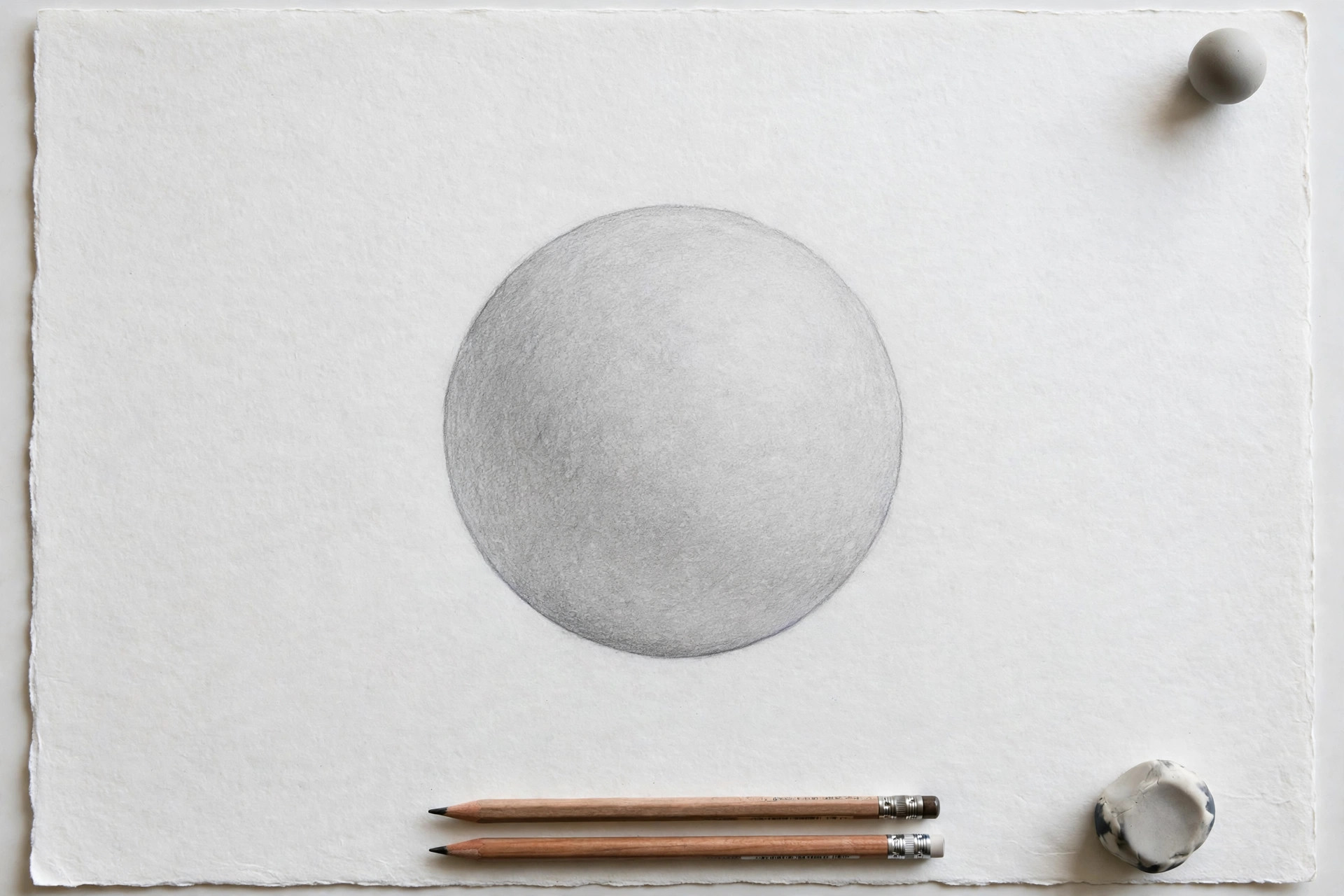
Version two, mid shading only: Draw the apple again and shade it, but only with medium grays. No deep darks, no clean white highlights. Notice how it looks soft and a little muddy, like it is made of gray clay.
3
Version three, full value range: Draw the apple a third time. Add a strong core shadow on one side, a cast shadow under it, and keep one small bright highlight untouched on the lit side. Push the darkest areas as dark as your pencil allows.
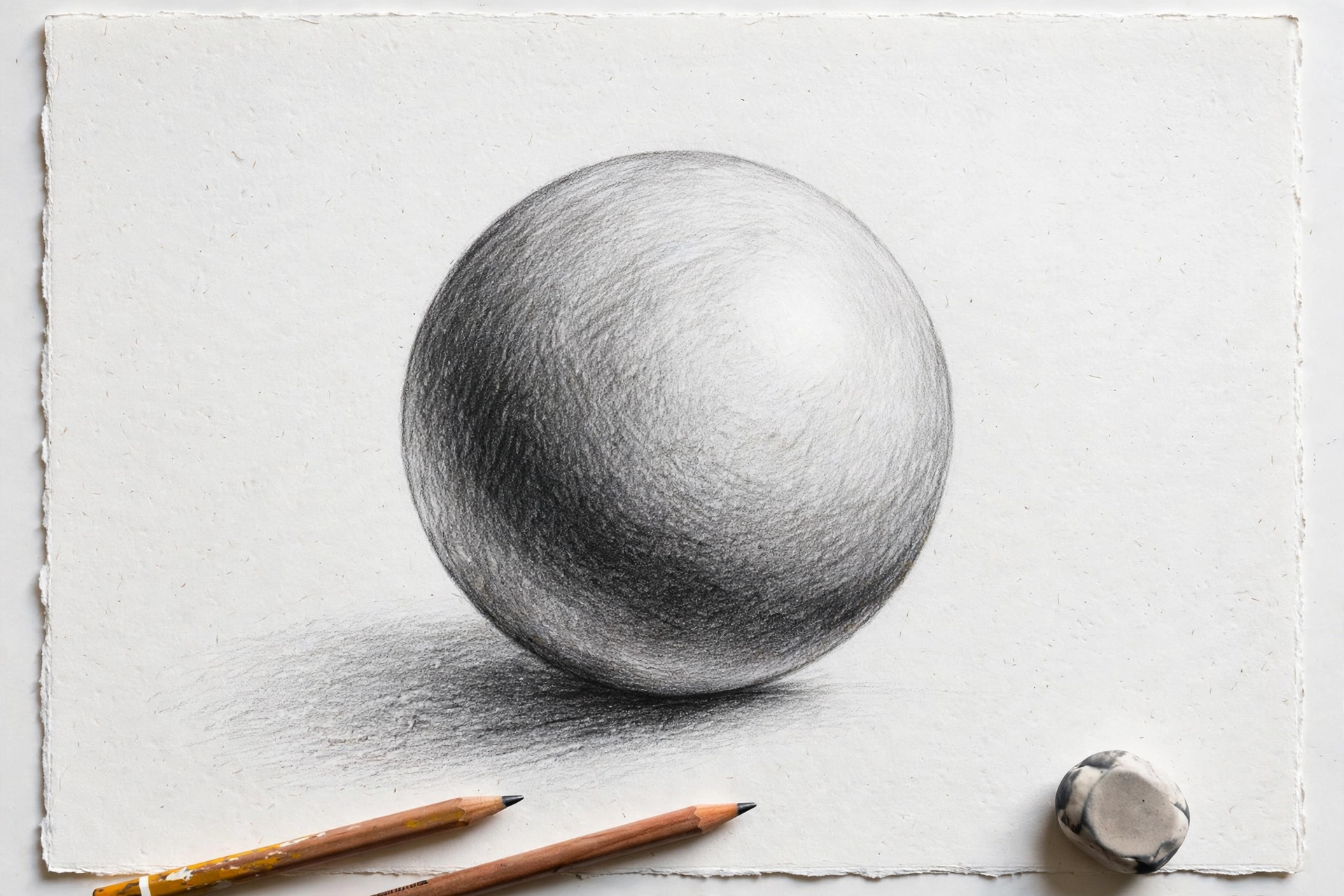
Now line the three apples up and squint. The third one will look round enough to pick up, and the only thing you changed was the range of values. Repeat this exercise with a cup, a shoe, or a ball whenever your drawings start feeling flat again. It trains your eye faster than almost anything else.
Frequently Asked Questions
Why do my drawings look 2D?
Drawings look 2D when they rely on outlines alone and keep every tone in the same middle range. Real objects have bright highlights, deep shadows, and parts that overlap each other. Add a full range of values, a shadow under your subject, and some overlap, and the same drawing will start to look 3D.
How do I make a drawing look 3D?
Pick one light direction and stick to it. Shade the side away from the light with a dark core shadow, add a cast shadow where the object meets the ground, keep a clean white highlight on the lit side, and let closer objects overlap the ones behind them. Those four habits create most of the 3D effect in pencil drawing.
Why does shading make my drawing look dirty instead of deep?
Dirty-looking shading usually comes from smudging everything into the same mid-gray and letting your highlights get covered in stray pencil dust. Protect your lightest areas by keeping them clean, use an eraser to lift highlights back out, and build darks with layered strokes instead of rubbing. Depth needs contrast, not more gray.
Is flat-style art okay?
Yes, completely. Cartoons, icons, posters, and many illustration styles are flat on purpose, and they can look fantastic. The difference is choice: flat style is a decision you make, with clean shapes and bold colors, while accidental flatness is what happens when you wanted depth but the values were not there yet.
Where to Go Next
Depth grows with practice, so give your new skills somewhere to play. Browse these sketchbook page ideas and fill a page using only value studies this week. If shading itself still feels shaky, work through our beginner guide on how to shade a drawing for the core techniques. And if your sketches frustrate you for other reasons too, our honest troubleshooting guide on why your drawings look bad and how to fix them will help you spot the issue fast.