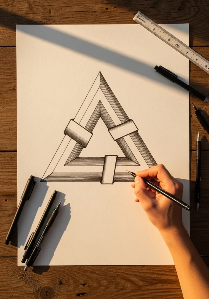
Impossible objects only work in isometric projection, where every parallel edge stays parallel and nothing converges. Add real perspective and the eye immediately resolves the depth, which destroys the illusion.
Key takeaways
- Draw impossible objects in isometric projection, with no vanishing point and no converging lines.
- The Penrose triangle came from Oscar Reutersvard in 1934 and was popularized by Roger Penrose in 1958.
- Op art movement comes from high contrast plus gradual distortion; any sudden jump reads as a mistake.
- A figure-ground flip needs both readings to have equal area and equal contrast, or one wins outright.
- Anamorphic depth on paper depends entirely on the cast shadow matching the real light in the room.
There is one rule behind almost every impossible object on this list. Draw it in isometric projection, where every edge stays parallel to one of three fixed axes and nothing converges toward a vanishing point. Add real perspective and the eye resolves the depth instantly, which ends the illusion.
These shapes have a documented history. The Penrose triangle was first drawn by Oscar Reutersvard in 1934 and later popularized by Roger Penrose in 1958, after which Escher built entire worlds from the idea. Knowing that helps, because it tells you the construction is geometric rather than intuitive.
Op art works differently. Movement appears through high contrast plus distortion that changes by a tiny amount at every step, so the eye never settles. For the depth-on-paper pieces, 3D pencil shading practice covers the value range these need.
The thirty-one drawings below run through impossible triangles and staircases, spiral targets, figure-ground vases, anamorphic holes, geometric tilework and negative-space landscapes. If you want the lettering version of the same tricks, 3D typography art and 3D pencil drawing are the closest companions.
Compiled by the GS Art Zone editorial team. Last updated August 2026. Each idea is paired with the specific step that produces the effect, so you can go from the reference straight to paper.
What You Need Before You Start
- A ruler and a set square, since almost every impossible object depends on exact parallel lines
- A compass for the concentric and radial pieces, which cannot be drawn freehand convincingly
- A 2H through 6B range, because the depth pieces need a genuinely full value scale
- Waterproof black ink, which is the only way to get the flat solid blacks op art requires
- Black paper and a white pencil for the glowing and reversed-value pieces further down
1. Penrose Triangle in Pencil
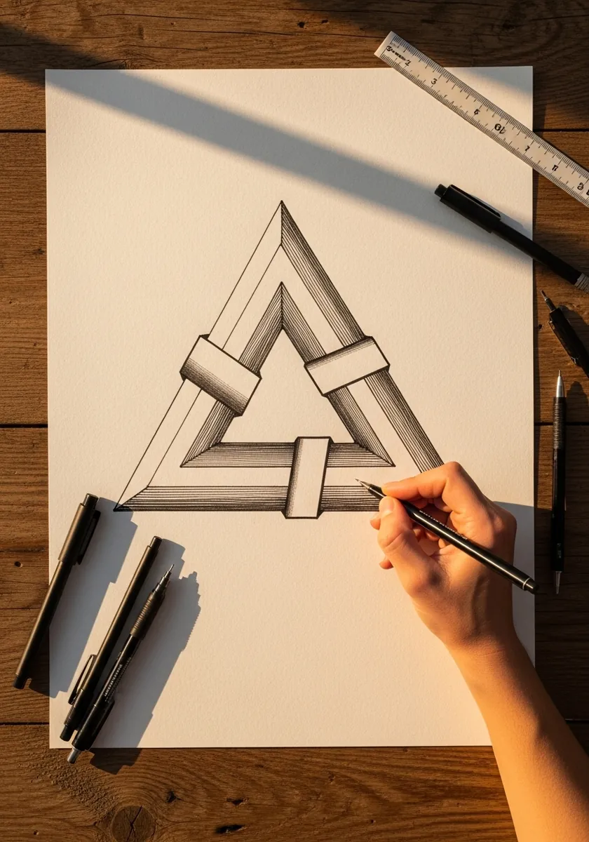
This is the foundation figure, so build it geometrically. Draw three bars using only three line directions, keep every parallel edge genuinely parallel, and close each corner as a simple overlap. Shade all matching faces identically, because varied shading tells the eye which bar is in front.
2. Concentric Circle Target
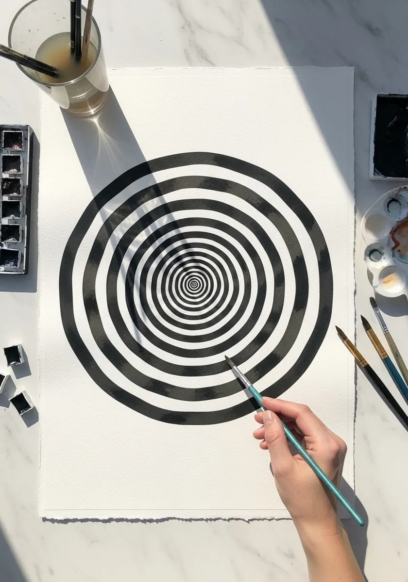
Alternating rings need to change width progressively. Keep the innermost bands narrow and widen each one slightly as you move outward, which is what creates the sense of a receding tunnel. Equal-width rings just read as a flat target with no depth at all.
3. Cracked Hole in the Ground
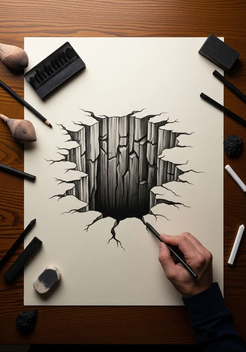
Depth comes from the crack edges, not from the darkness inside. Draw the broken slabs tilting inward with their top faces visible and their sides falling away, then let the interior go almost solid black. Uneven, angular fragments read as broken far better than smooth ones.
4. Koi Circle in Watercolor
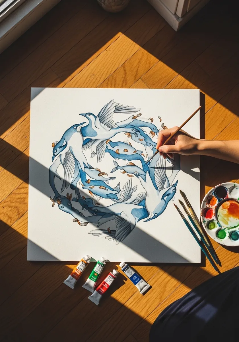
A rotational composition should read the same however you turn it. Place two identical forms head to tail, keep the negative space between them the same shape as the fish themselves, and paint both at matching value. Symmetry of that kind is what makes the eye keep circling.
5. Impossible Stacked Cubes
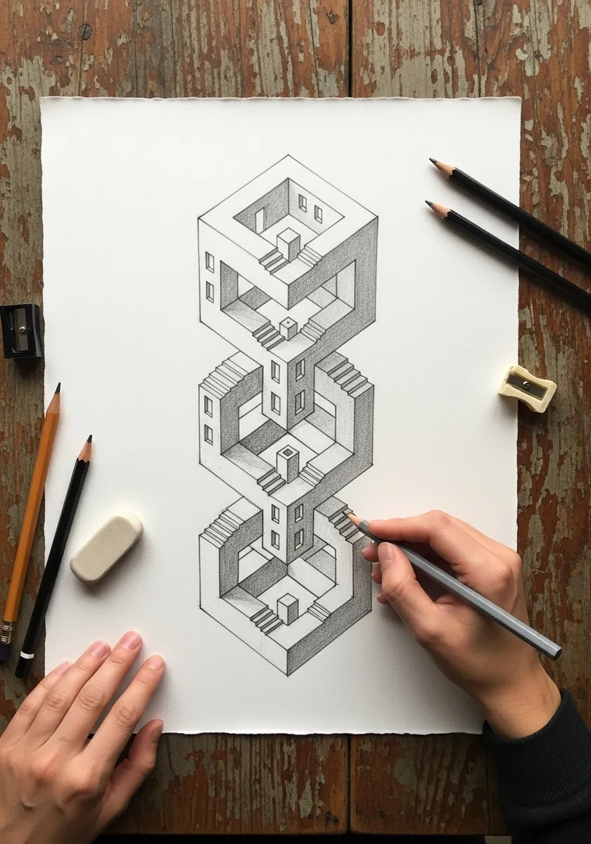
Stacking impossible forms multiplies the effect but also the difficulty. Establish your three isometric axes on the page first and never deviate from them, then let each cube share an edge with the next. Every individual junction has to be locally believable.
6. Color Perception Grid
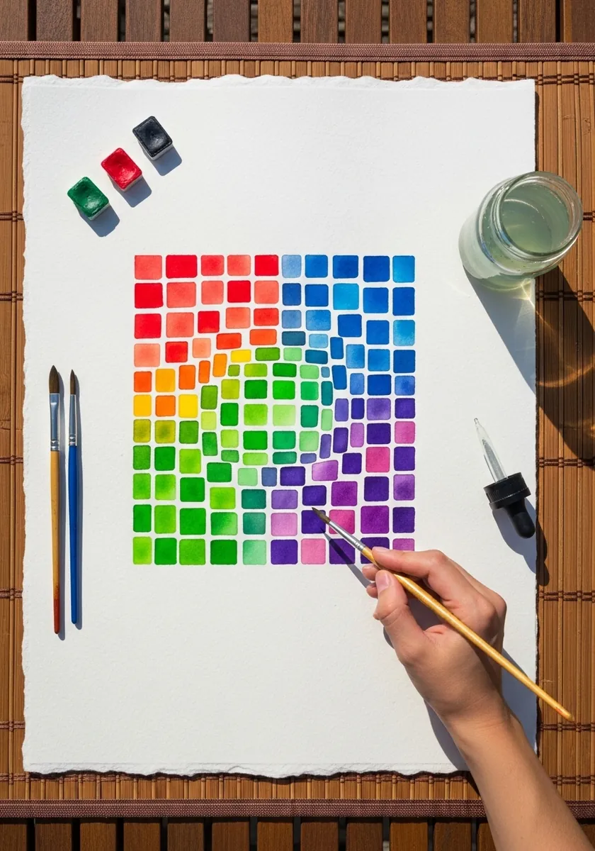
This is a demonstration rather than a picture. Paint each square as a flat patch and change only one variable, hue or lightness, by a small step between neighbors. Identical squares appear different depending on what surrounds them, which is the entire point.
7. Hands Drawing Hands
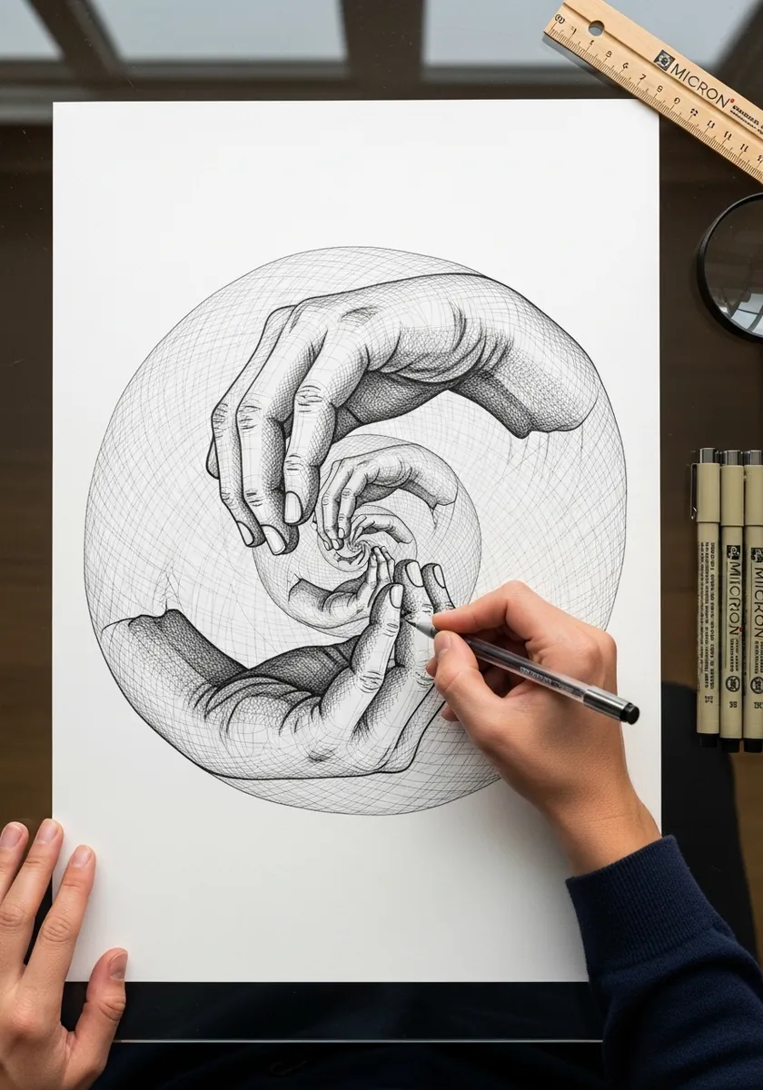
A self-referential loop needs a clean handover point. Let the pencil in one hand rest exactly on the wrist of the other, and keep both hands at identical finish and value. Any difference in rendering tells the viewer which one is real.
8. Vase or Two Faces
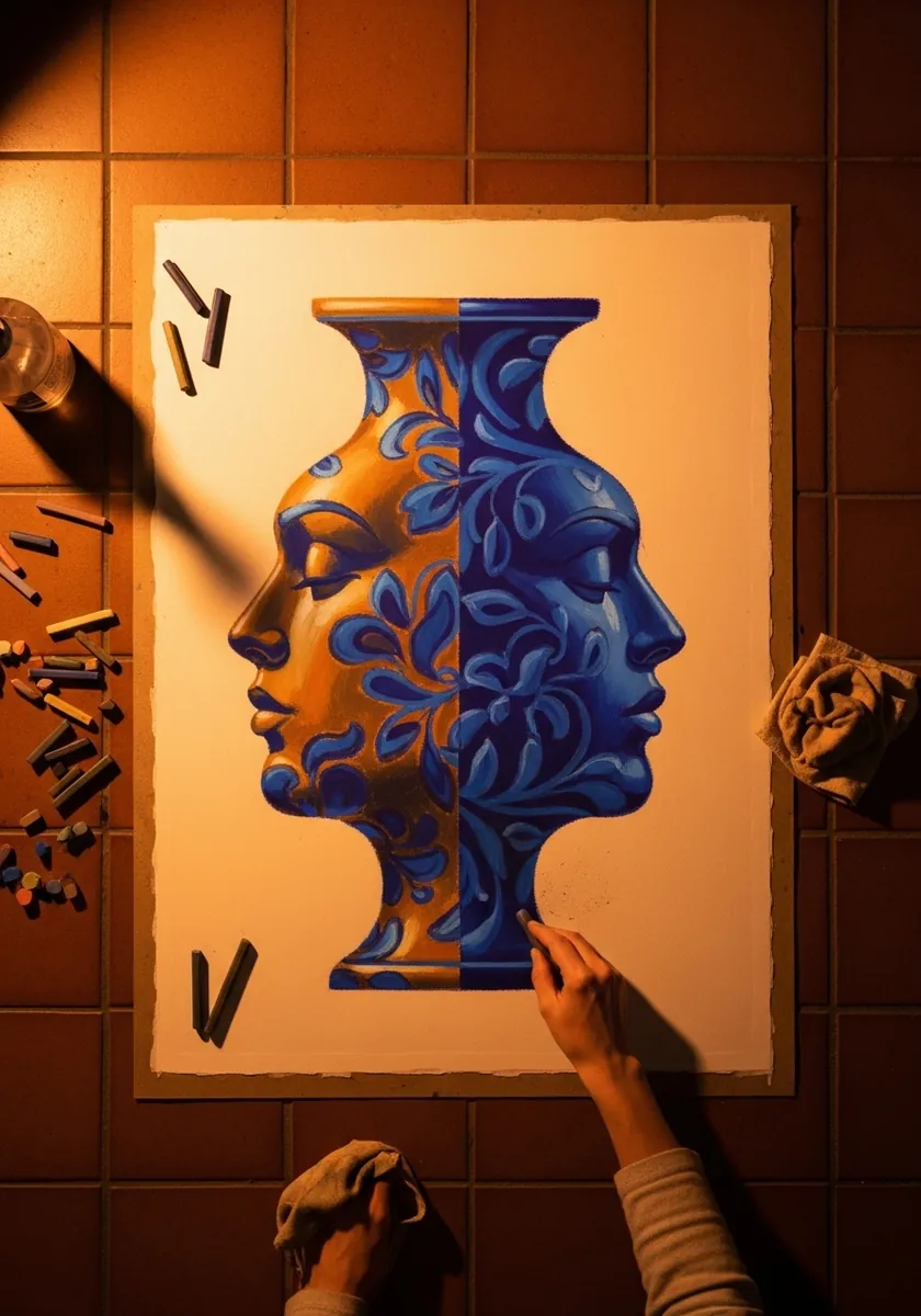
Figure-ground flips depend on balance. Give the vase and the two profiles roughly equal area, keep both silhouettes free of internal detail, and use a single flat background. Detail on either side immediately makes the eye choose that reading and stay there.
9. One Point Tunnel Corridor
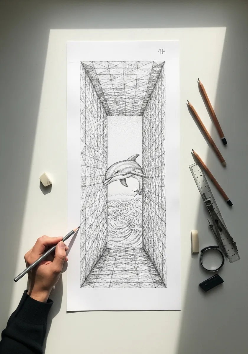
Here you want the opposite of isometric. Set one vanishing point, run every receding edge to it, and compress the spacing between wall panels as they retreat. Placing the vanishing point off center makes the corridor feel far less mechanical.
10. Trees and Birds in Negative Space
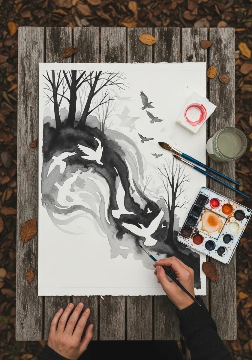
Negative-space work is designed backward. Draw the birds first as solid shapes, then let the gaps between the branches take exactly those outlines. The transition works best in the middle of the composition, where neither reading has fully taken over.
11. Hand Drawn Spiral in Ink
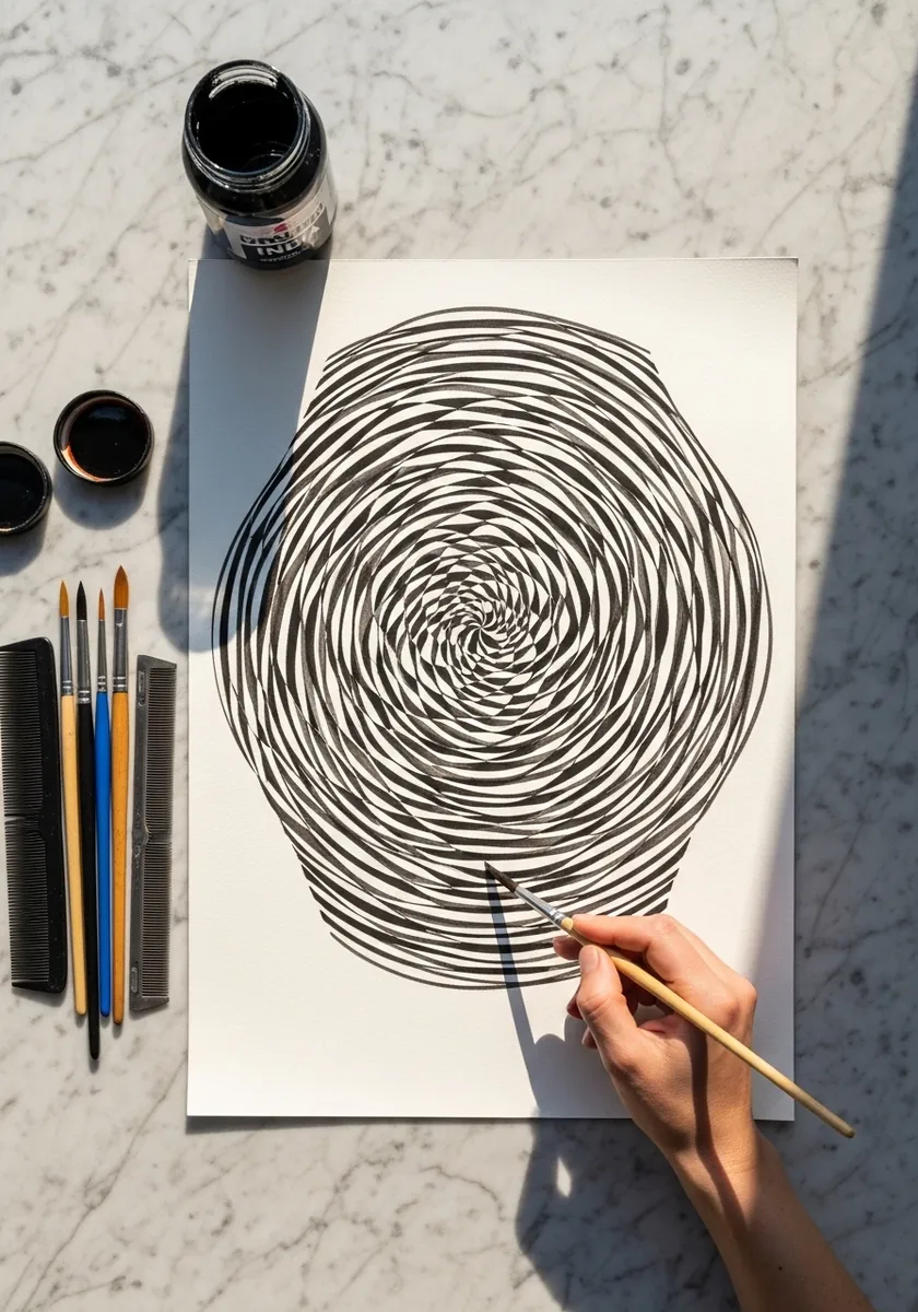
A freehand spiral beats a compass one for this effect. Keep the line continuous, hold the spacing roughly even, and let your small irregularities accumulate. Those tiny wobbles are precisely what makes the surface appear to shift as you look at it.
12. Impossible Interlocking Rings
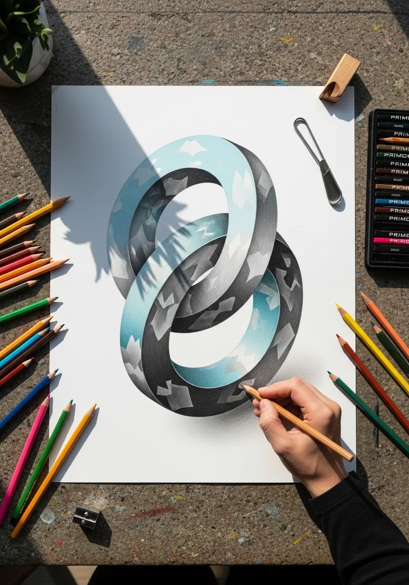
Interlocking rings work by reversing exactly one overlap. Draw both rings correctly first. Swap which one passes in front at a single crossing, and leave every other junction entirely honest. One contradiction stays convincing, while several become obvious at a glance.
13. Glowing Eye on Black Paper
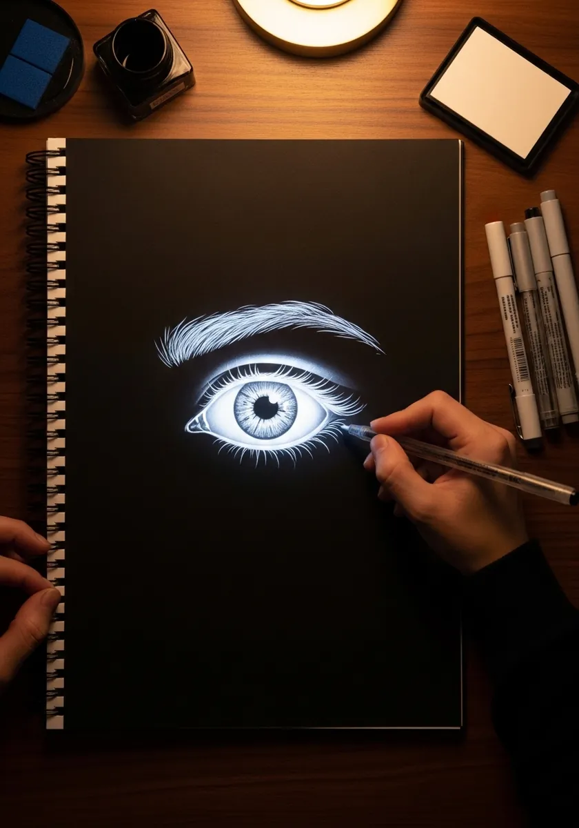
On black paper you are drawing light rather than form. Build the iris fibres outward from the pupil in fine white lines, keep the sclera restrained, and place one hard highlight at the top. Untouched black around the eye is what makes it appear lit.
14. Impossible Waterfall Structure
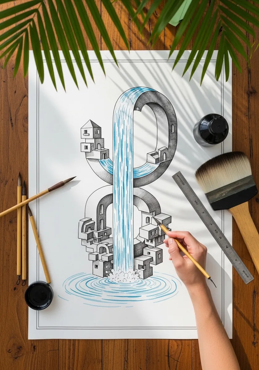
A perpetual waterfall is a Penrose triangle in disguise, so build the aqueduct along isometric axes until the channel appears level throughout, then let the water fall at one end back to where it began. Keep the architecture flat and completely unshaded.
15. Rainbow Radial Pinwheel
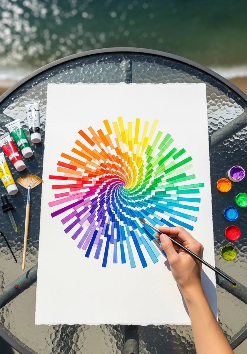
Apparent rotation comes from a consistent lean. Angle every bar by the same amount away from true radial. The whole wheel then appears to turn in one direction, whereas straight radial spokes look static however brightly you decide to color them.
16. Crumpled Paper in Graphite
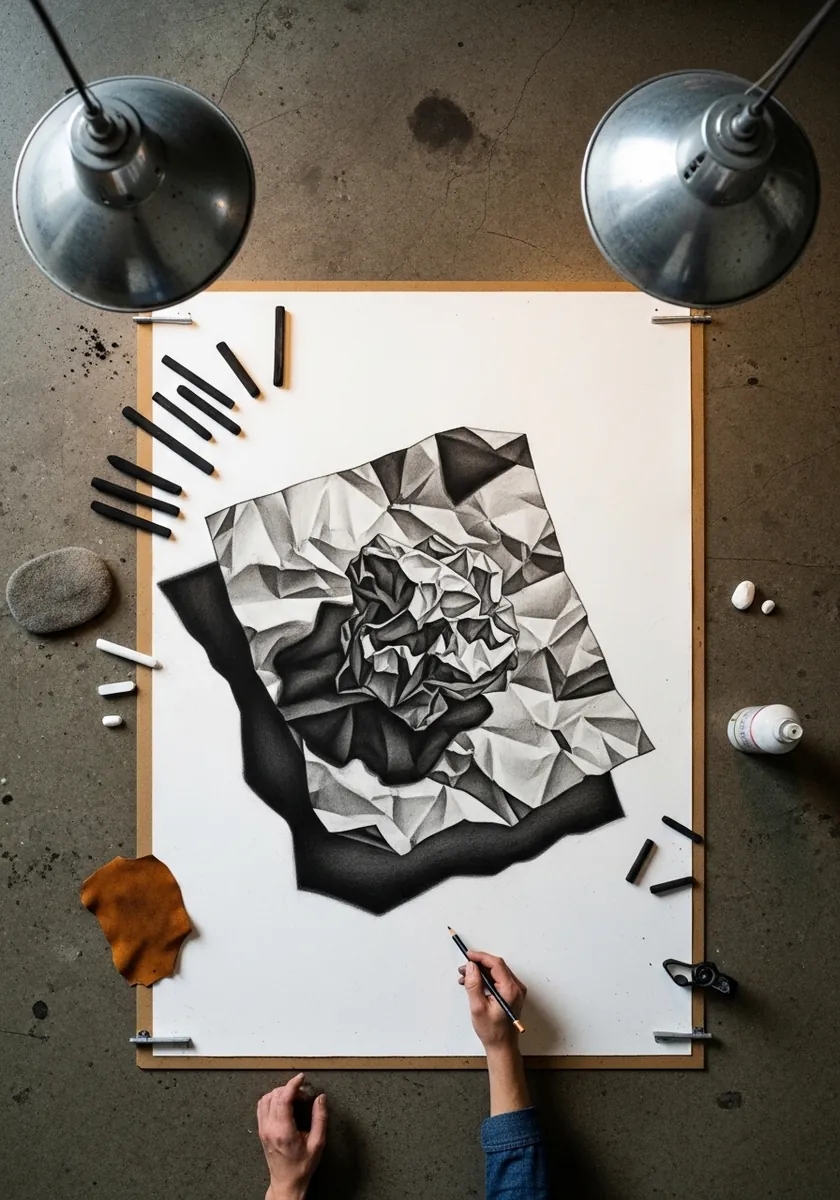
Crumpled paper is a puzzle of flat planes. Break the shape into hard-edged facets, give each one a single flat value, and keep the transitions absolutely crisp. Smooth blending destroys the effect, because real creased paper has no gradients. A cast shadow beneath one raised corner is what lifts the whole thing off the page.
17. Striped Sphere With a Shadow
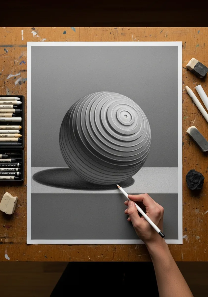
Stripes reveal form when they follow it. Curve each band as an ellipse that flattens toward the sphere’s equator and tightens near the poles, then add one soft cast shadow. The stripes alone establish the volume before any shading is applied.
18. Tree With Mirrored Roots
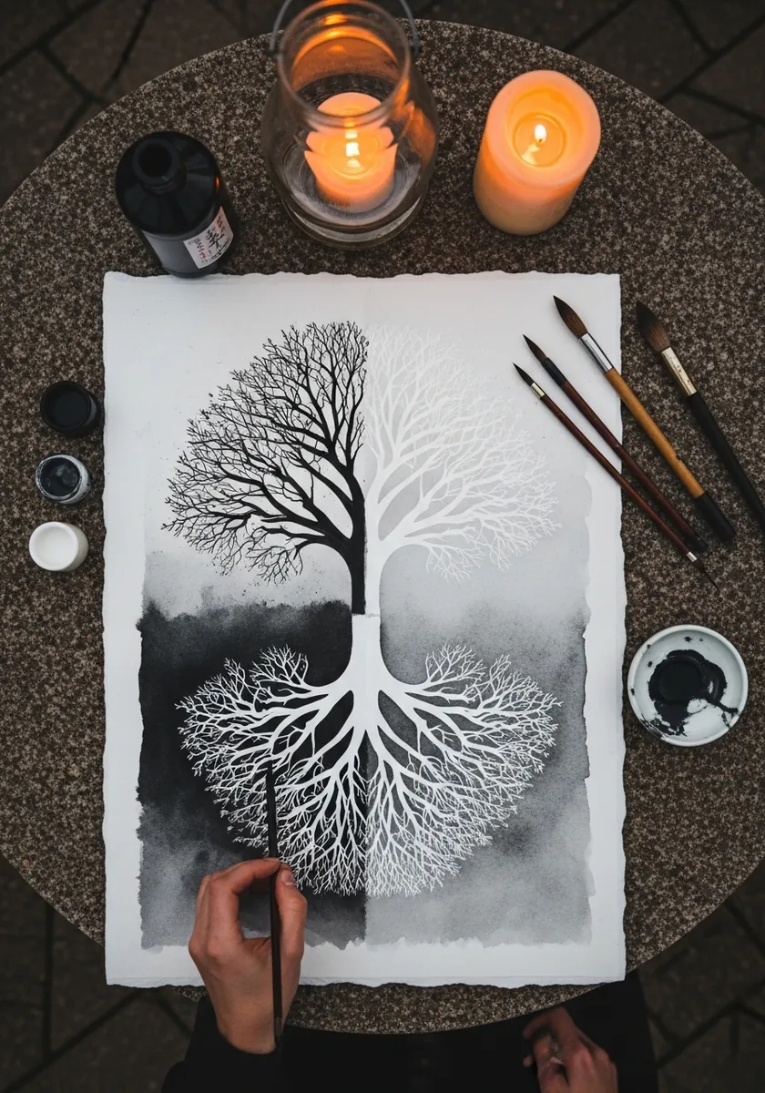
A mirrored composition needs one clear axis. Set the ground line dead center, keep the branch and root structures similar but not identical, and let the ink tone differ slightly above and below. Perfect symmetry looks printed rather than drawn.
19. Floating Isometric City
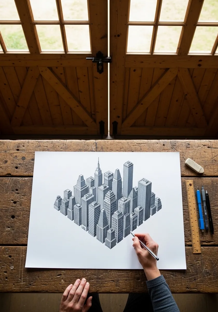
Isometric city blocks stay convincing only if the axes never change. Set thirty degrees for both ground directions and keep every building vertical, then let the underside of the block show. That visible base is what makes it read as floating.
20. Ripple Lines Around a Piston
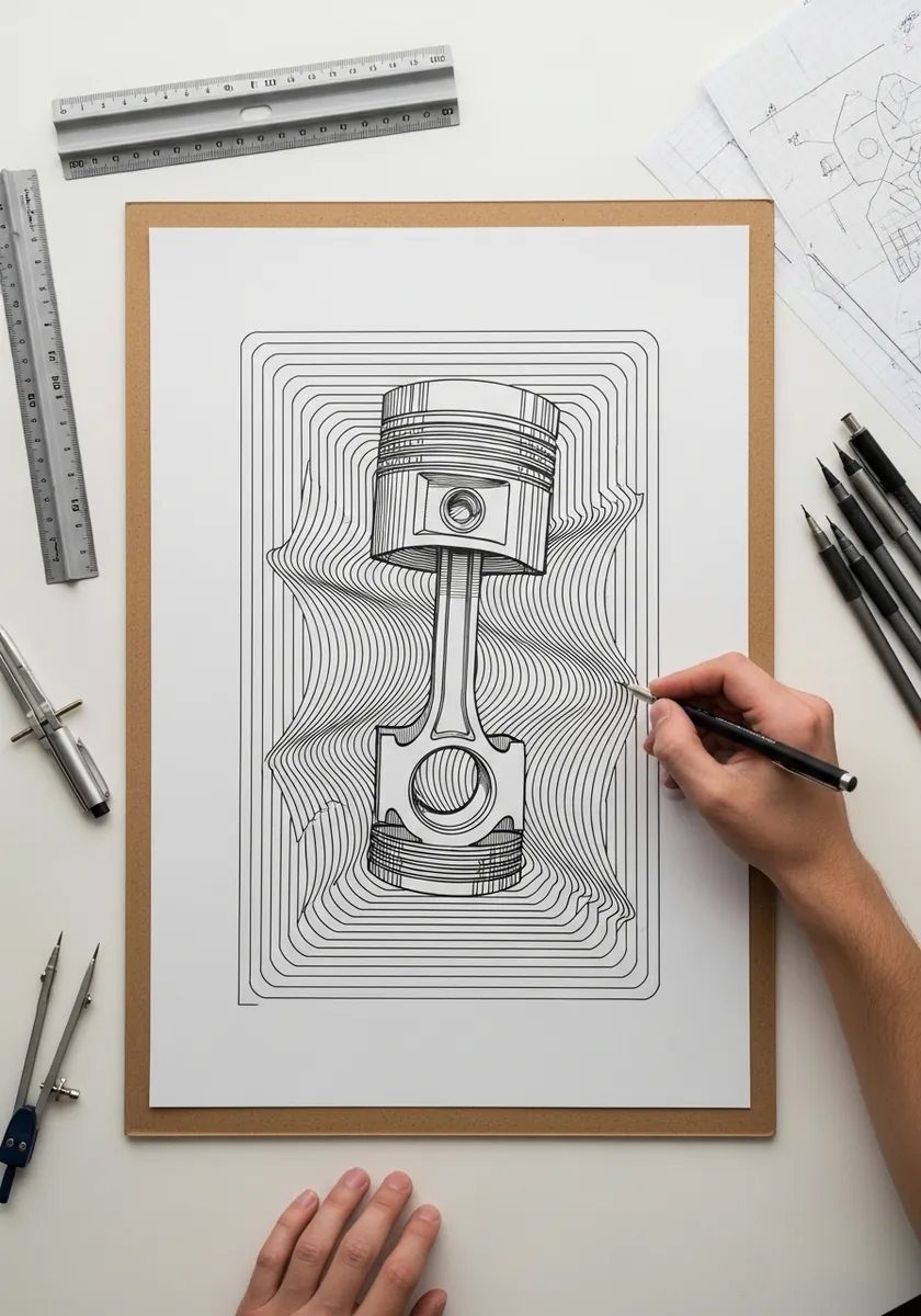
Contour lines bending around an object imply a surface behind it, so rule them evenly across the page and then deflect them smoothly around the subject without ever letting two of them cross. That gradual deflection is entirely what creates the bulge.
21. Dimensional Calligraphy Strokes
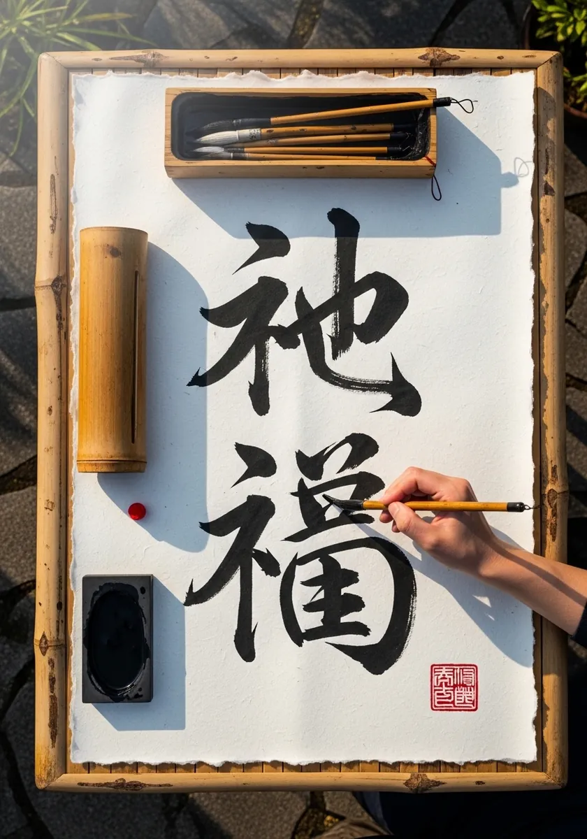
Adding depth to brush characters means committing to one light direction. Shade the same side of every stroke throughout. Add a consistent drop shadow beneath each one, and leave the stroke faces flat. Varying the light between characters breaks the whole page at once.
22. Nested Squares in Line Color
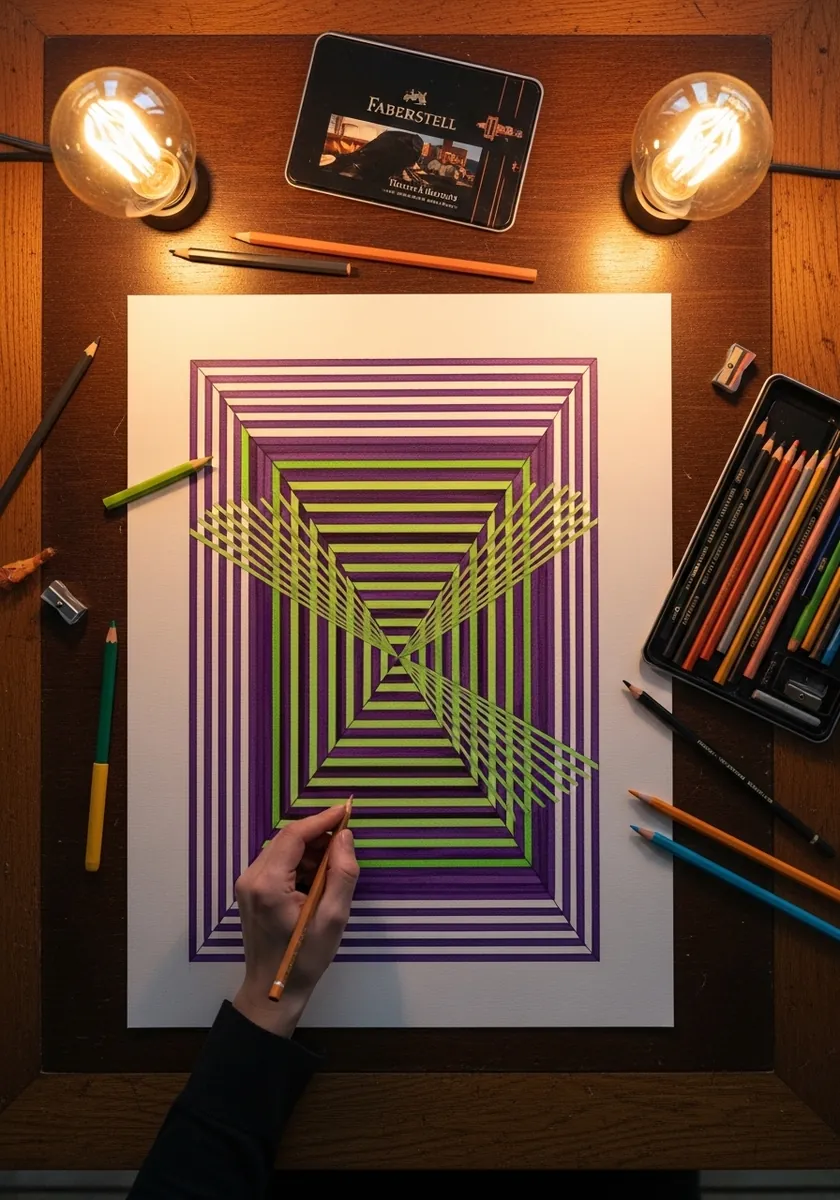
Line-only tunnels rely on progressive spacing, so reduce the gap between each square by a fixed proportion as you move inward and rotate every one very slightly as you go. That small rotation is what turns a flat nest into a genuinely twisting shaft.
23. Primary Color Square Tunnel
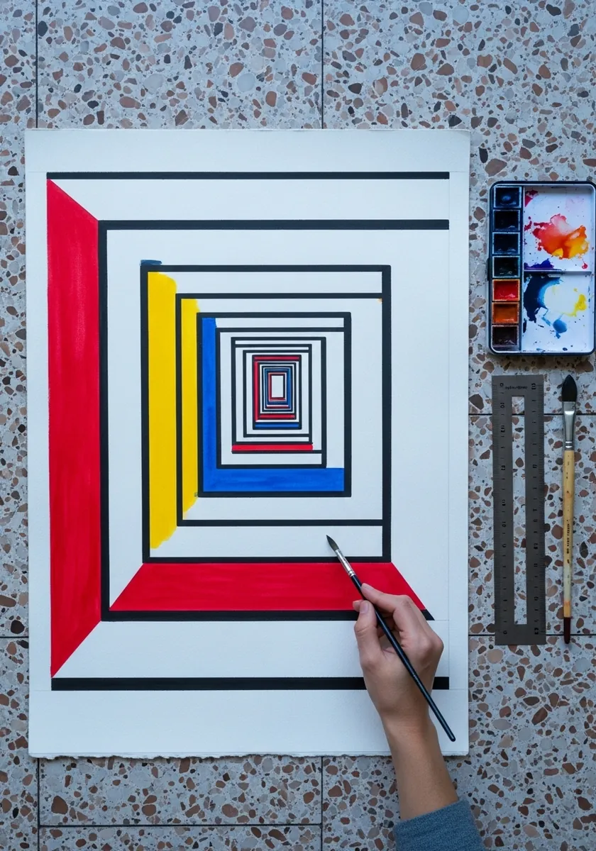
Flat primaries plus black lines is a modernist recipe worth following exactly. Keep every band a single unmixed color, separate them all with equal black rules, and place the smallest square off center. Off-center placement gives the tunnel its direction.
24. Mirrored City Skyline
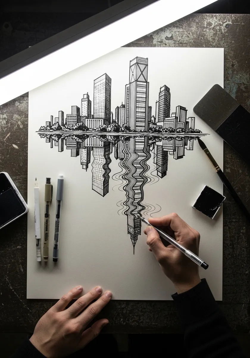
A reflected skyline should never be a perfect copy. Compress the reflection vertically. Break it with a few horizontal gaps, and lighten the whole thing overall. Those three changes are what separate a convincing reflection from a rotated duplicate. Keep the water line itself perfectly straight, since any wobble there breaks the mirror.
25. Blue Geometric Tile Mandala
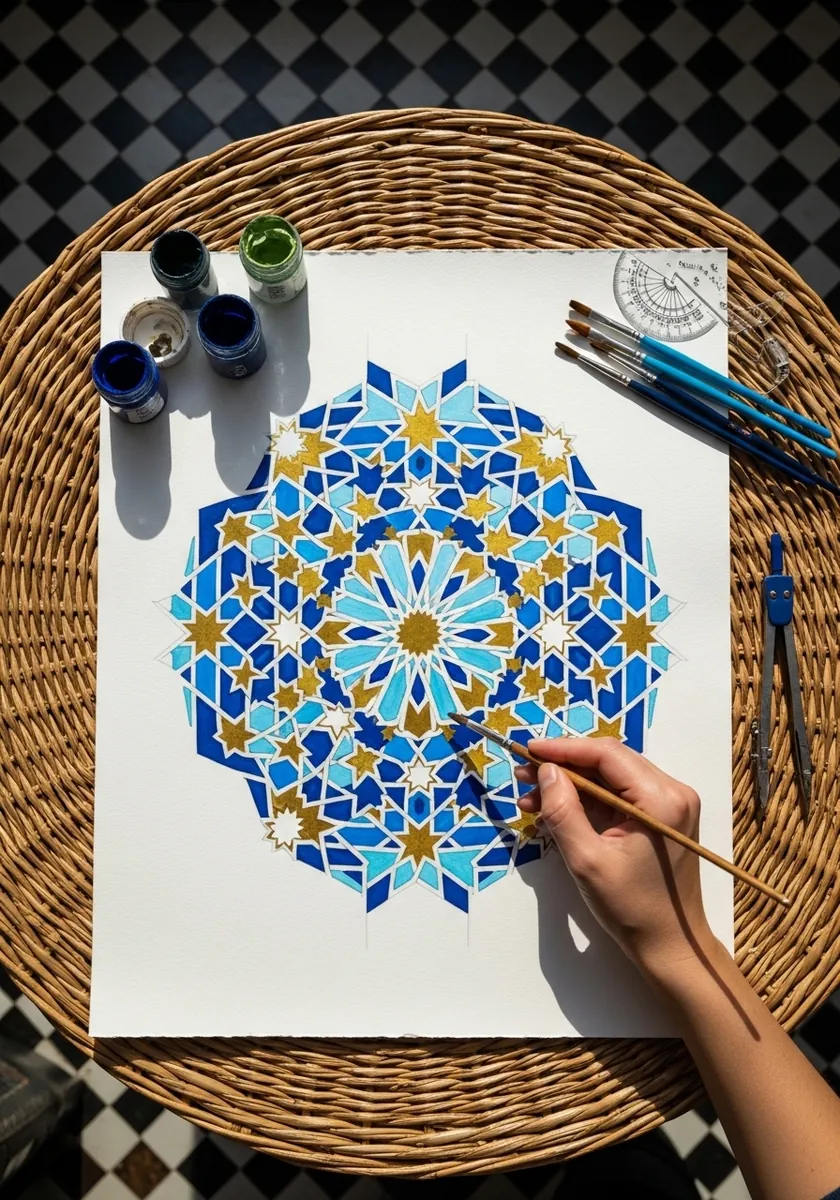
Islamic geometric pattern is built from a hidden grid rather than by eye, so construct the underlying circle divisions with a compass first and only then draw the interlacing bands over them. The illusion of infinite depth comes from that strict repetition.
26. Lion Formed From Landscape
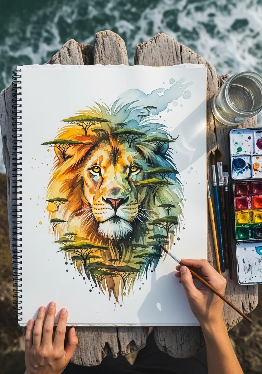
Double-image work needs the two subjects to share edges. Let the treeline become the mane boundary and a hill become the jaw, so no outline belongs to only one reading. Keep the whole piece in one palette so neither image separates out.
27. Impossible Beam on Kraft
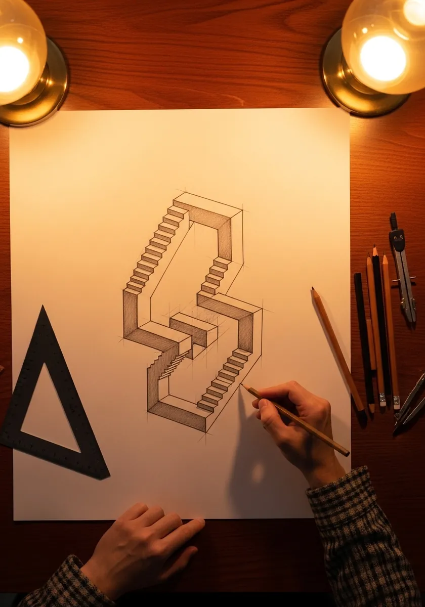
Toned paper makes an impossible object harder, because you must add both light and dark. Use white for the top faces, the paper itself for the sides, and pencil only for the deepest planes, keeping matching faces at matching values throughout.
28. Paper Cut Figures With Shadows
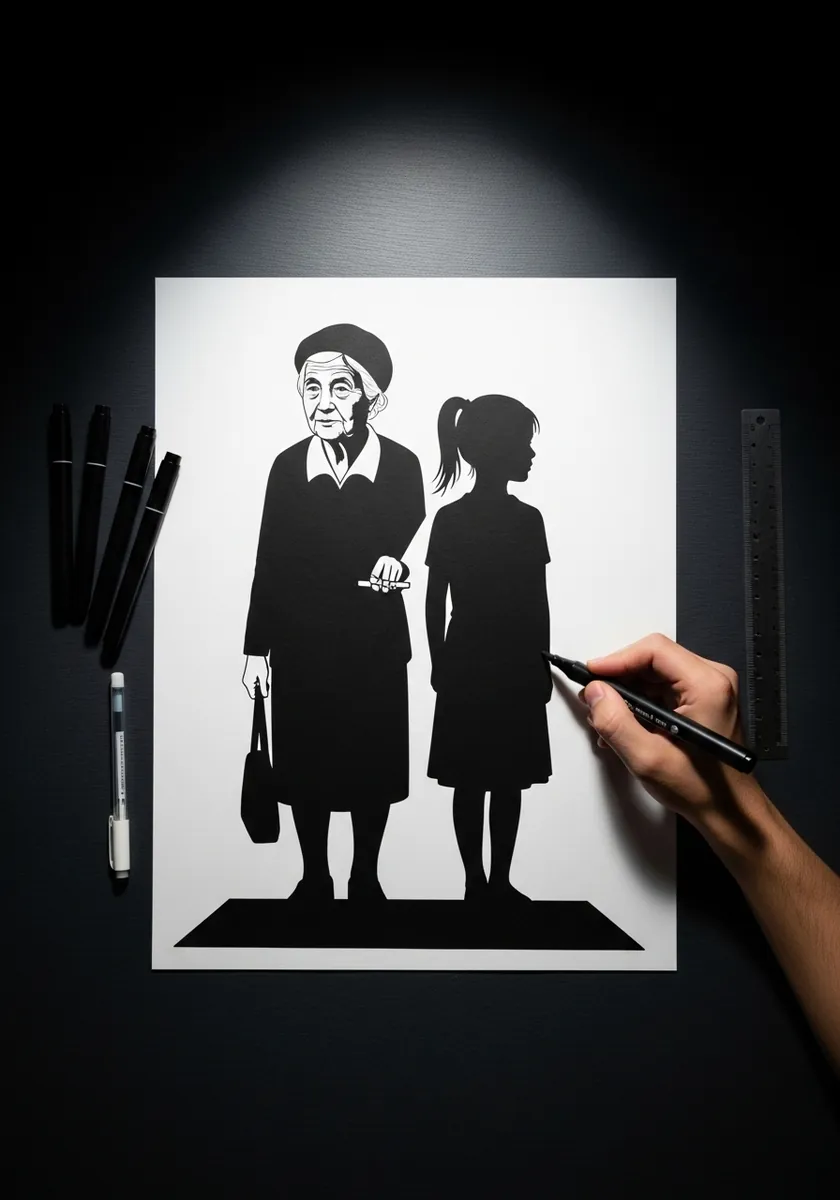
Cut-paper illusions rely on real light. Position a single lamp low and to one side. Let the actual shadow become part of the composition, and design the silhouettes so their shadows read as something different from the figures casting them.
29. Negative Space Balloon Shapes
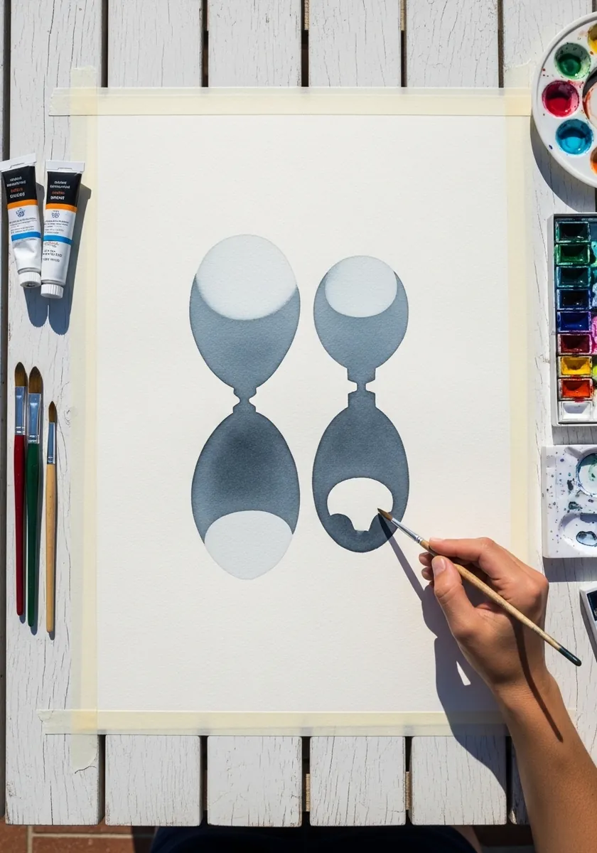
When gaps carry the picture, the positive shapes must stay dull. Paint them in one flat muted tone with no internal detail, and shape their edges precisely, since the negative form is defined entirely by what you leave out. Test it by squinting: if only one reading survives, the two shapes are not yet balanced.
30. Circle Grid Moire Pattern
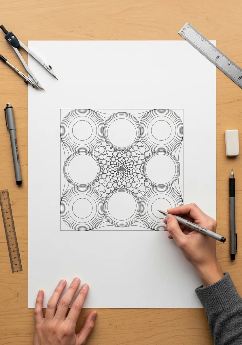
Moire appears when two regular patterns overlap slightly out of step. Fill each circle with fine radiating lines at a slightly different angle from its neighbor, and keep the line spacing constant. The shimmer arises from the interference, not the drawing.
31. Black and White Square Tunnel
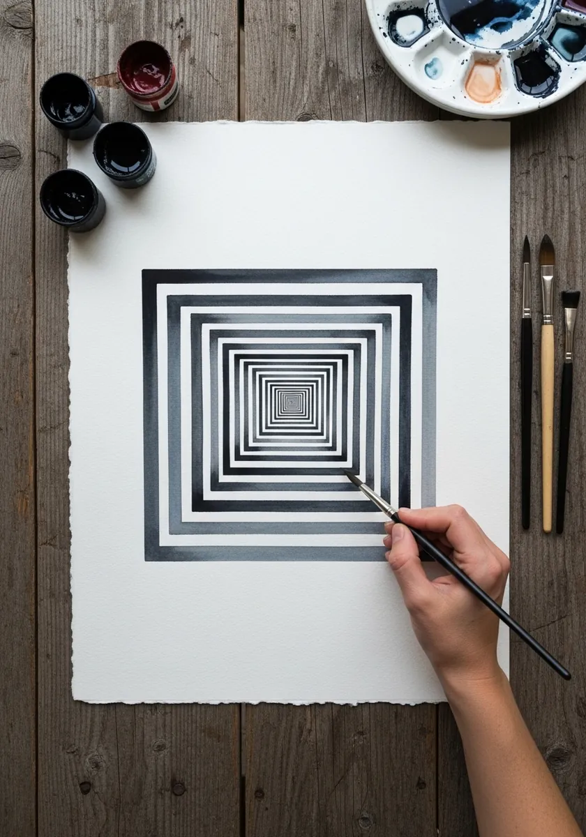
Maximum contrast plus accelerating spacing gives the deepest illusion. Alternate solid black and pure white bands, halve the width of each as you move inward, and keep every corner absolutely square. Any softness at the edges reduces the depth immediately.
Frequently Asked Questions
How do you draw an impossible object like the Penrose triangle?
Use isometric projection. Draw three bars whose edges all stay parallel to one of three fixed axes, with no lines converging anywhere, then join them so each corner reads correctly on its own. The impossibility only appears when you look at the whole figure.
Why do my impossible shapes stop working when I shade them?
Because shading implies a light source, and a light source implies consistent depth. Keep the shading flat and identical on every matching face, so the eye cannot use it to work out which bar is nearer. Realistic lighting resolves the ambiguity and kills the trick.
How do you make a drawing look like a hole in the paper?
Distort it deliberately. Stretch the shape along the viewing direction, because you look at the page at an angle rather than straight on, then draw one cast shadow matching the real light in your room. That shadow does most of the work.
What makes op art appear to move?
High contrast combined with gradual distortion. Repeat a simple element many times and change its size, spacing or angle by a tiny amount each step, so the eye keeps trying to resolve the pattern. Every jump has to be small or it reads as an error.
Why can I only see one image in a figure-ground illusion?
Usually because the two readings are not balanced. Give both interpretations roughly equal area and equal contrast against the background, and keep any detail out of both. The moment one side carries more information, the eye locks onto it and stops flipping.
References and Further Reading