Yellow ochre mixed with a blue gives a natural muted green, and mixed with a red it gives a natural brown. That means ochre, one red and one blue will paint almost any landscape without a green tube on the palette at all.
Key takeaways
- ["Ochre plus a blue makes a natural green; ochre plus a red makes a brown", "Ochre is opaque and low in chroma, so it dulls whatever it is mixed into", "A thin ochre wash over a whole sheet unifies every color already on it", "Ochre is one of the oldest pigments, used in cave painting for millennia", "Keep one saturated accent, or an all-ochre painting turns muddy"]
Ochre is the most useful color on a landscape palette, and not because of how it looks alone. Mixed with a blue it makes a natural muted green, and mixed with a red it makes a natural brown. Ochre, one red and one blue will handle almost any landscape without a green tube in sight.
The second property is what makes it a working color rather than a decorative one. Ochre is opaque and low in chroma, so it quietly dulls whatever it touches, and a thin wash of it laid over a finished sheet pulls every other color into agreement. Painters have used it that way for centuries.
It is also the oldest color we have. Ochre appears in cave paintings tens of thousands of years old, because iron-rich clay was available almost everywhere and did not fade. That continuity is part of why an ochre painting reads as warm and settled rather than modern.
The thirty pieces below cover sunsets, portraits, architecture, botanicals, texture studies and abstracts, all built on that warm earth range. For the red end of the same family see the clay red watercolor palette, and for another warm subject, watercolor coffee drawing ideas.
Compiled by the GS Art Zone editorial team. Last updated August 2026. Each idea is paired with the specific step that produces the effect, so you can go from the reference straight to paper.
What You Need Before You Start
- Yellow ochre and raw sienna, which behave differently despite looking similar
- One cool blue, since that partnership makes every green you will need
- A large flat brush for the toning wash across the whole sheet
- Cream or buff paper, which pushes the palette further without any extra work
- One bright accent color kept aside, to rescue the picture if it goes flat
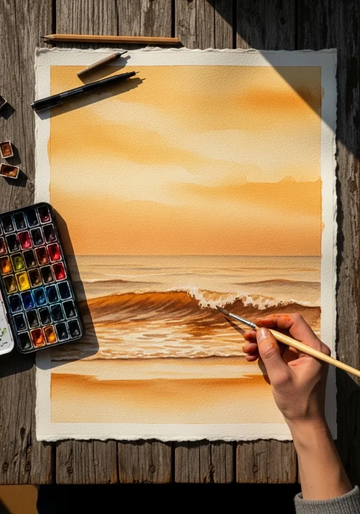
1. Ochre Sunset Seascape
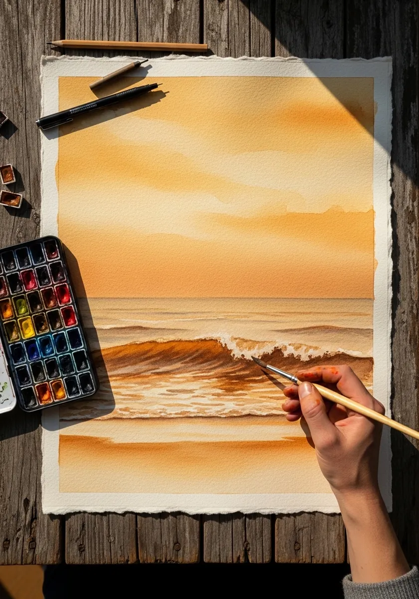
A sunset sky is one graded wash and nothing more. Wet the whole sky, drop the strongest ochre along the horizon and let it weaken upward, and leave the paper untouched where the sun sits. The sea below repeats those colors in horizontal bands.
2. Sky Gradient Bands
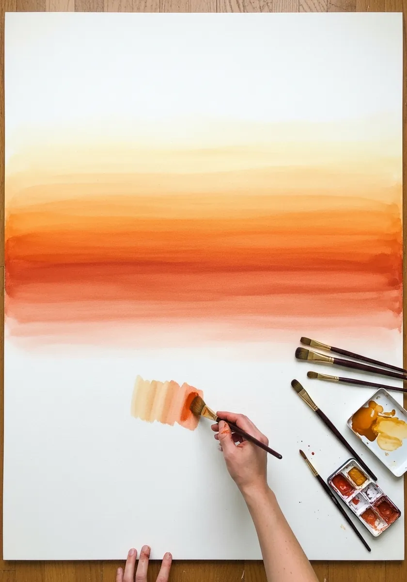
Flat bands are harder than they look. Mix enough of each color before you begin, lay each band in a single pass without going back, and let one dry completely before the next touches it. Any hesitation shows as a hard line.
3. Golden Leaf Spray
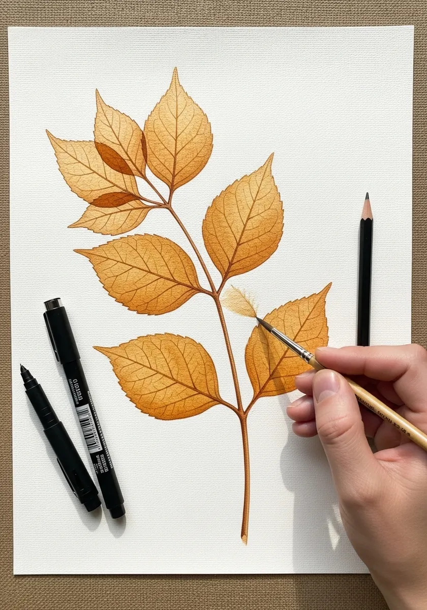
Leaves in one color need value to separate them. Paint the whole spray in a mid ochre, let it dry, then glaze a second layer only on the leaves that sit behind. Two layers is enough to create three clear depths.
4. Ochre Portrait Study
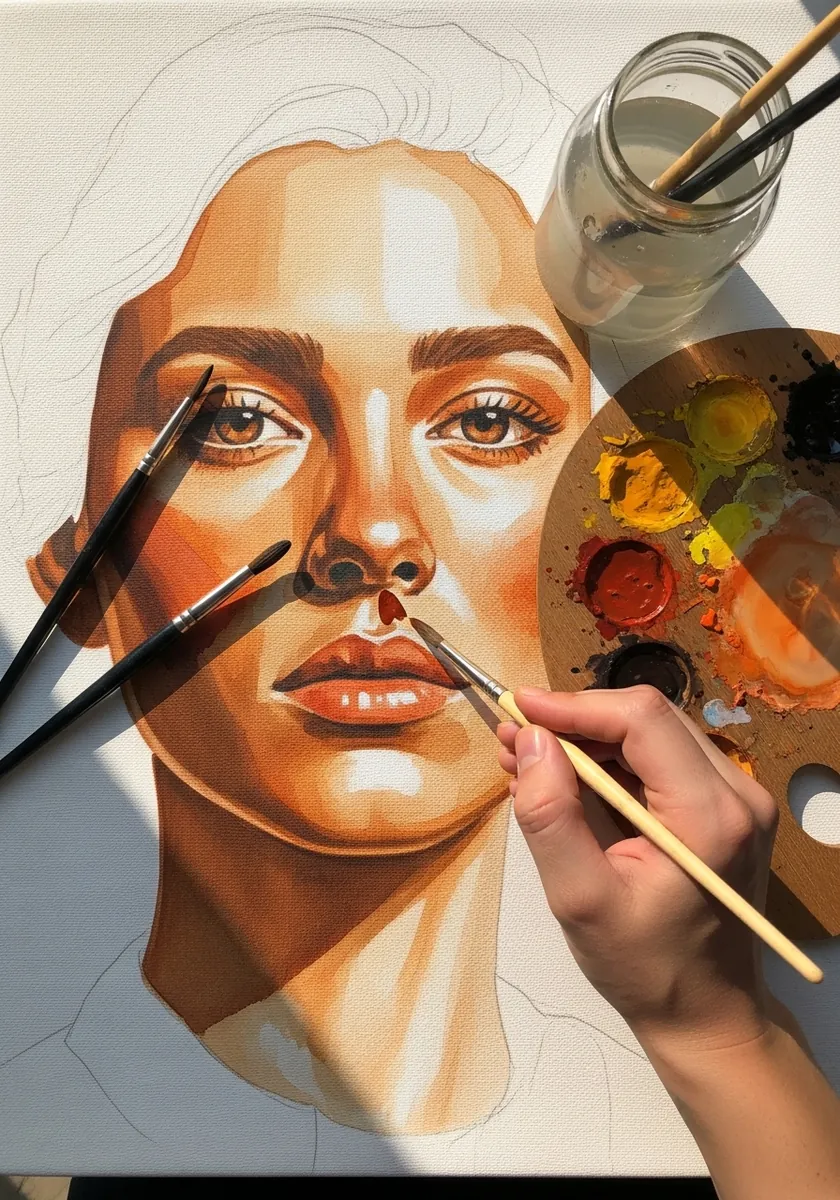
Ochre is close to a mid skin tone in most lighting. Wash it flat across the whole face, mix it with a red for the shadow side, and leave the forehead and nose ridge untouched. Nothing else is needed for a convincing head.
5. Town Street in Ochre Line
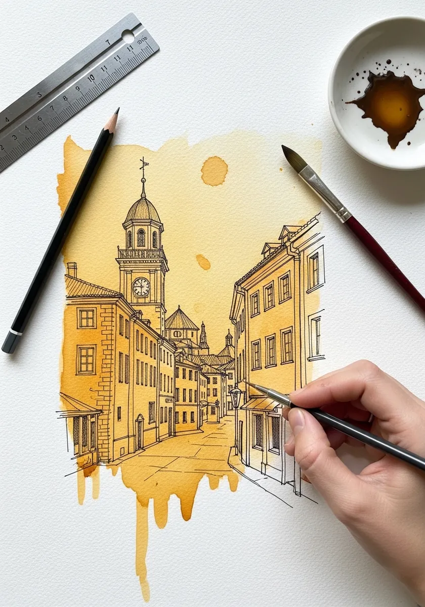
Line and wash should never agree exactly, which is the whole appeal of the technique. Rule the buildings precisely in fine ochre, then flood a far looser wash behind them that spills past the drawn edges and off the paper entirely. That mismatch is what stops it looking like an illustration.
6. Rolling Ochre Hills
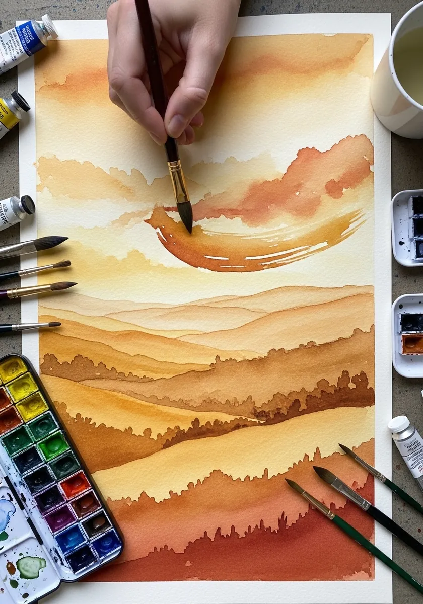
Distance is made with value, not with detail. Paint the furthest hills palest, warm them slightly toward the horizon, and let each nearer band be stronger and browner. Every band is a flat shape with a hard top edge. Leave a sliver of white paper along one ridge for a distant light.
7. Fantasy Canyon Citadel
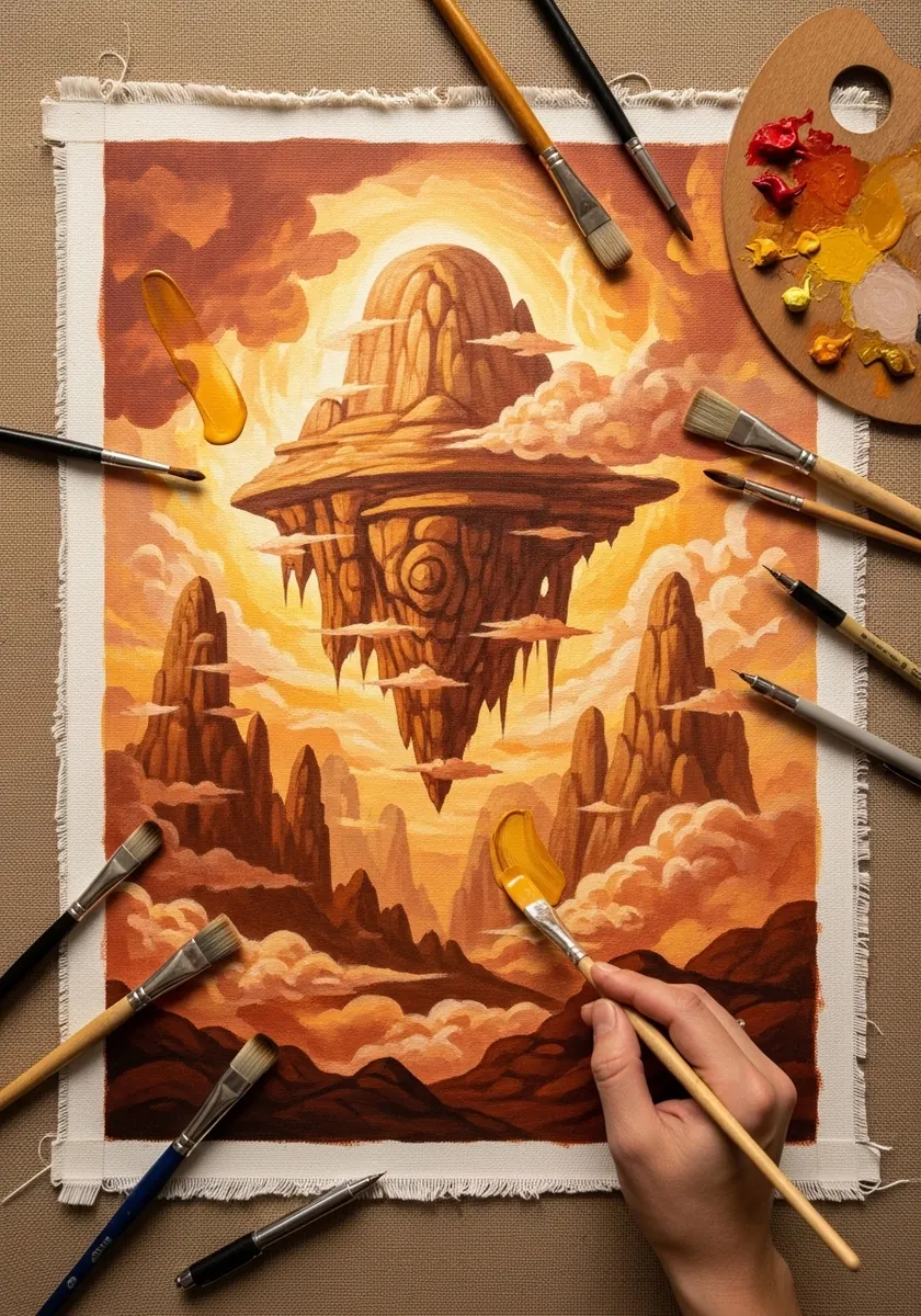
Invented rock still needs consistent light. Decide the sun’s direction before anything else, keep every lit plane in pale ochre and every shadow plane in ochre mixed with blue, and never let a single surface break that rule. Keep the sky pale so the rock formations stay the darkest shapes.
8. Folded Geometric Planes
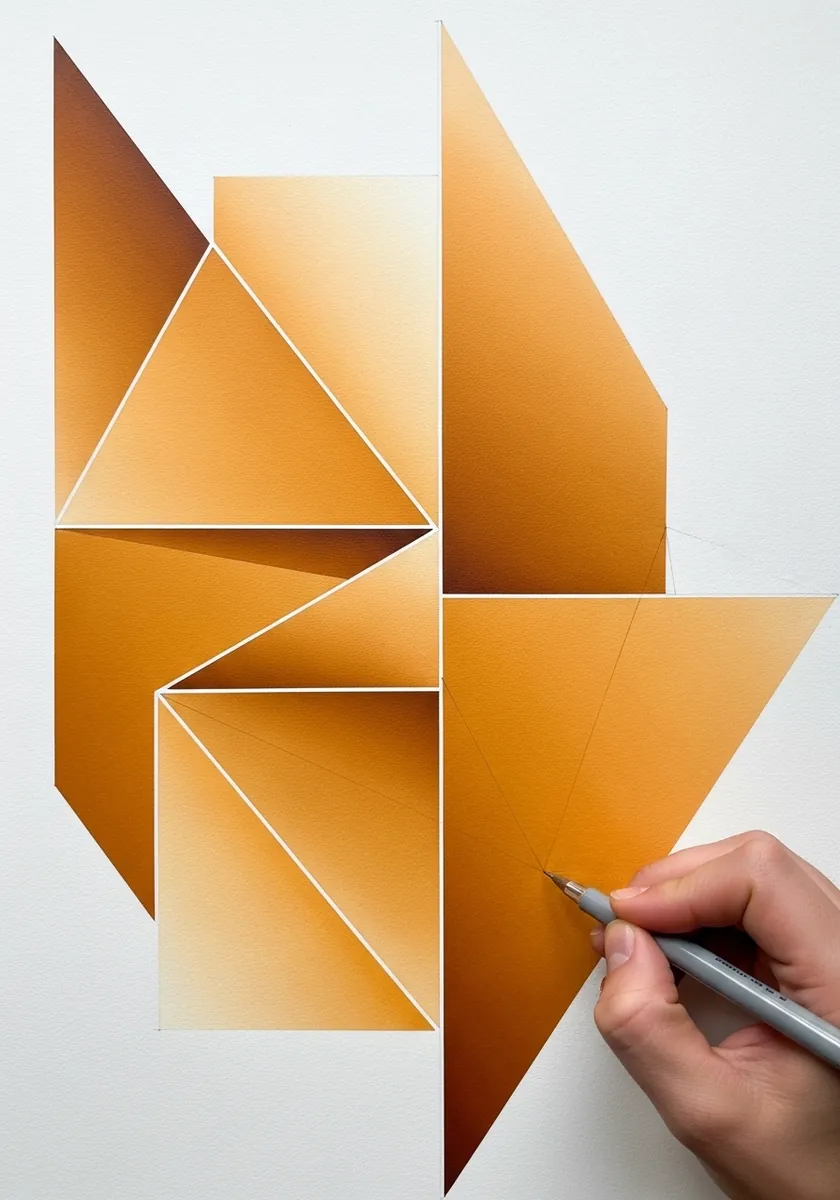
Flat planes read as folded only if each one has a different value. Paint every facet a distinct step lighter or darker than its neighbor, keep the edges razor sharp, and never blend across a fold. The value change is the fold.
9. Anatomical Figure in Ochre
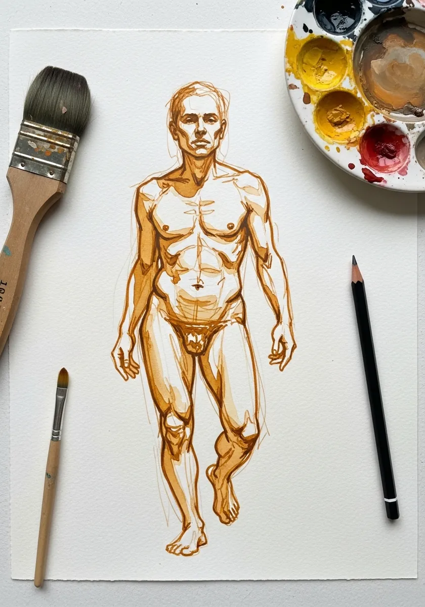
Ochre line is gentler than black and suits anatomy. Draw the whole figure in one color, use line density rather than tone to indicate the muscle masses, and keep the pressure consistent so the drawing stays diagrammatic. Label the main muscle groups faintly, since a study is meant to be read.
10. Bold Brush Loops
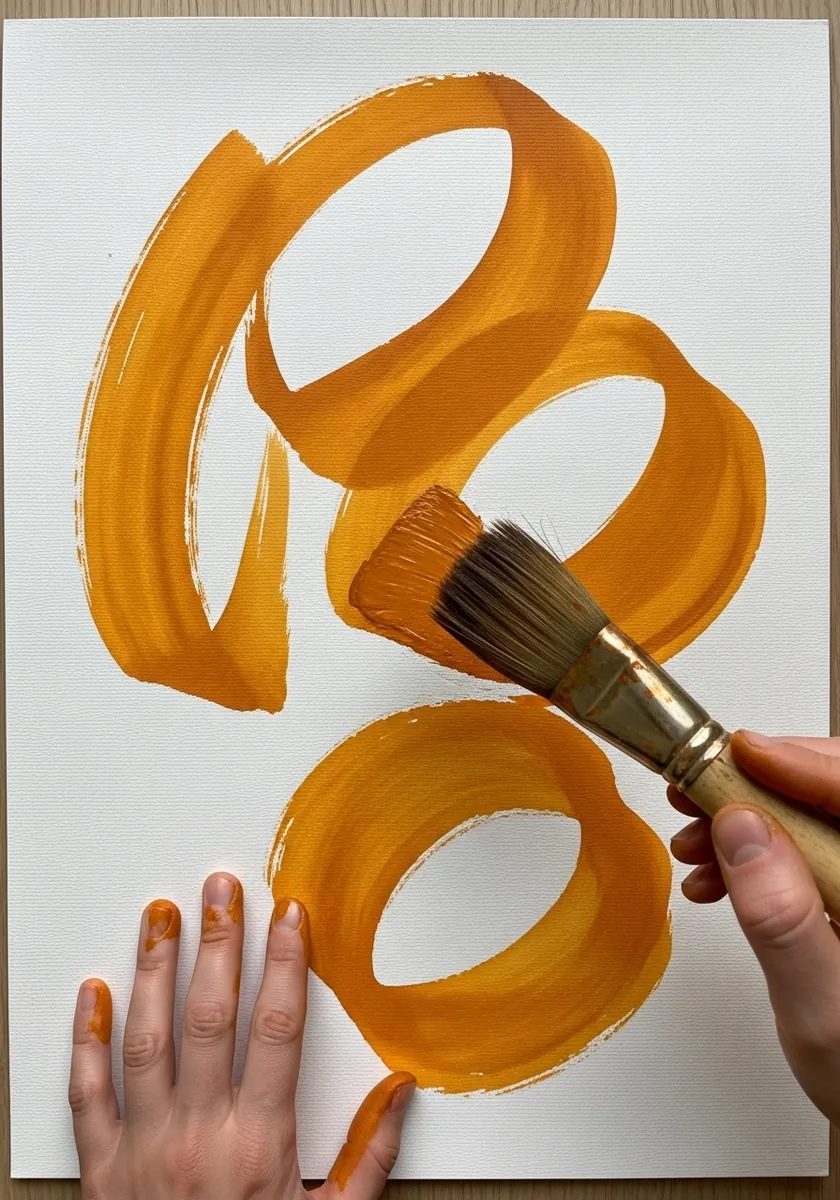
A loop drawn with a loaded flat brush shows the whole width of the bristles. Turn the brush as you go so the stroke widens and narrows, do not lift it once, and let one loop overlap another while both are still wet.
11. Aerial Cityscape
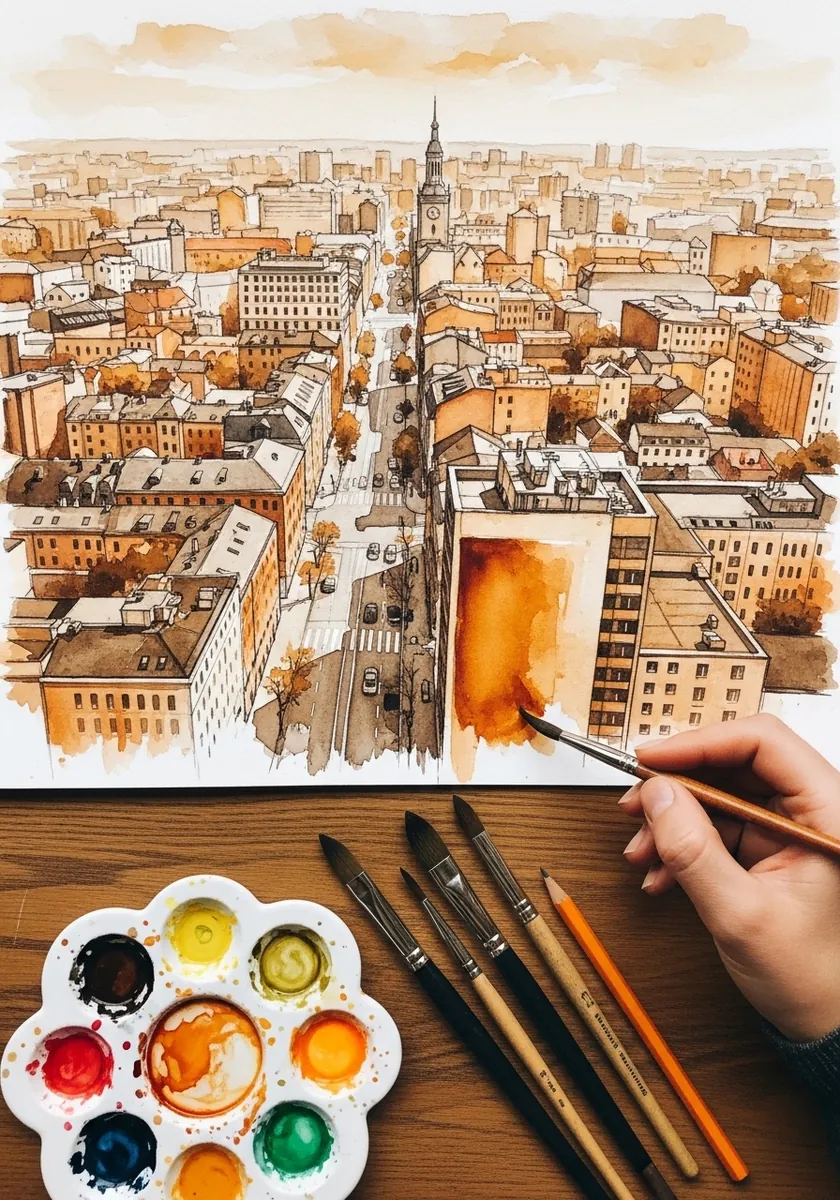
Looking down at a city means every roof is a flat shape. Keep them all as simple quadrilaterals, vary their values so the streets between them read as gaps, and let the tone weaken toward the far edge of the picture.
12. Feather and Fur Texture
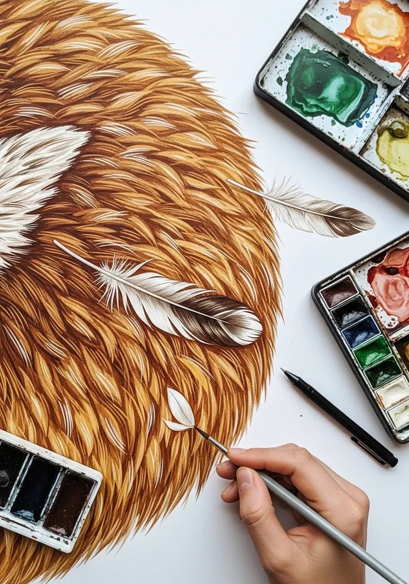
Texture studies are about stroke direction. Run every fur stroke the way the coat actually lies, keep the feather barbs angling away from the shaft, and change nothing but the direction between the two areas. Work from a real feather on the desk rather than from a photograph.
13. Marbled Ochre Pour
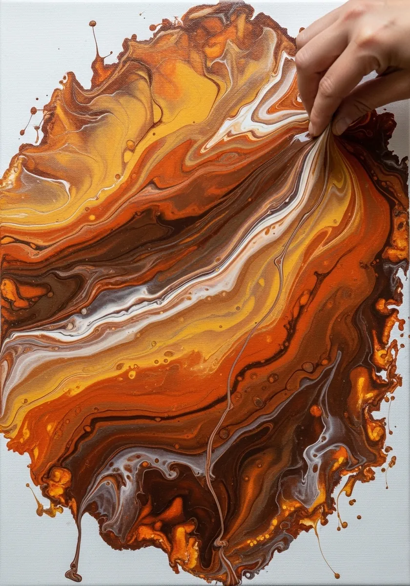
Pouring is controlled by tilt rather than by brush. Puddle two or three strengths of ochre side by side, tip the board slowly so they run into each other, and stop the moment the pattern reads. Over-tilting turns marbling to mud.
14. Jugs and Fruit Still Life
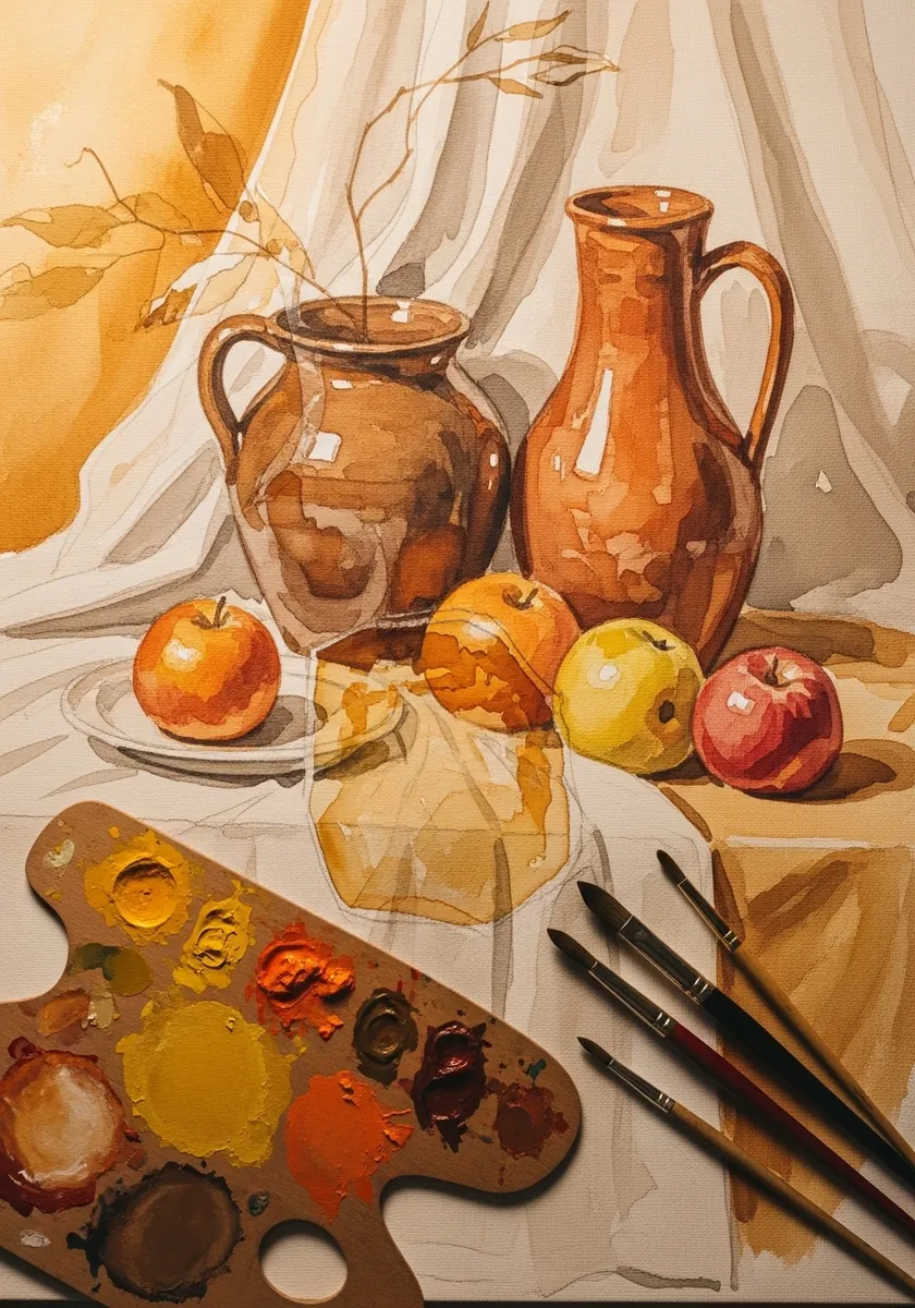
A still life in one family needs a value plan. Decide which single object will be lightest and which darkest before mixing anything, and let everything else fall between them. Drapery should stay the palest area. Keep one piece of fruit unmixed and saturated so the group does not go flat.
15. Golden Flower Bouquet
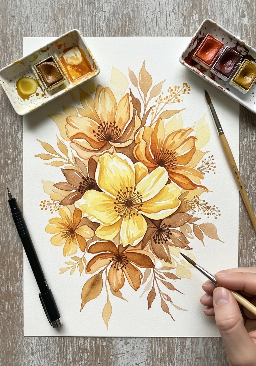
Yellow flowers on white paper have almost nowhere to go. Warm the background slightly so the petals have something to sit against, keep the deepest ochre only in the flower centers, and let the outer petals stay near-white. Drop a little raw sienna into the centers while they are still wet.
16. Golden Dragon
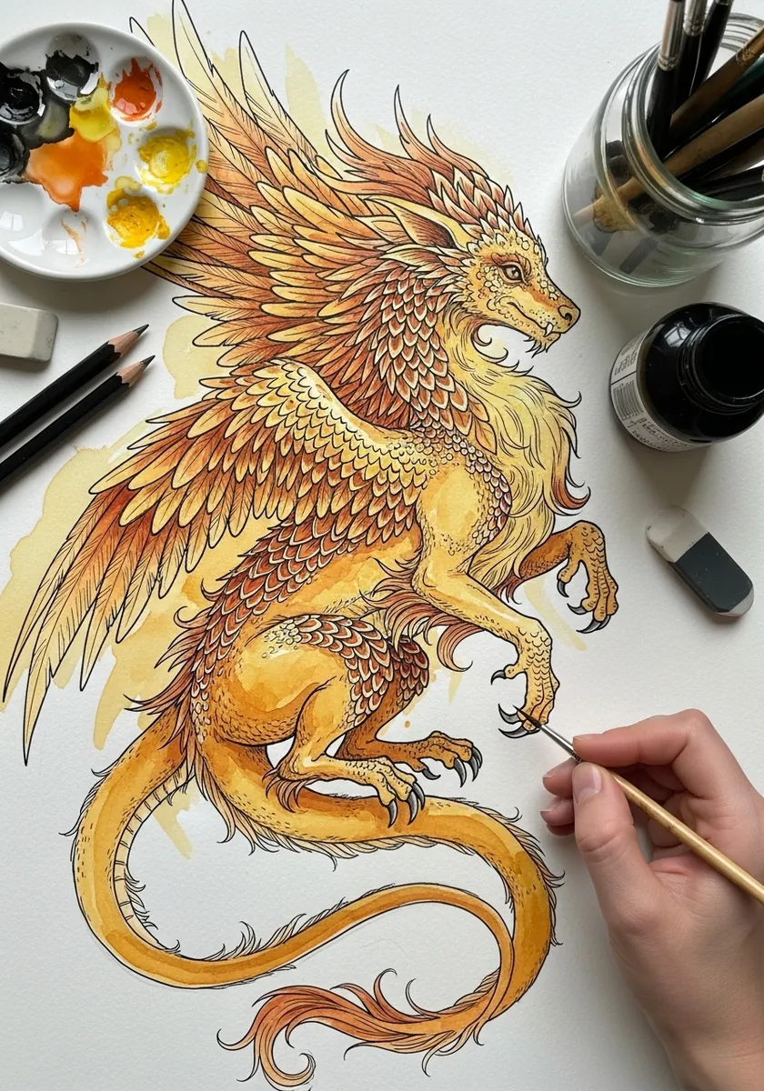
Scales are a repeating shape, so build them in rows. Draw a light guide curve down the body, hang each row of scales from it overlapping the row above, and shade only the lower edge of each scale. Keep the wings and the belly plates plain, since scales everywhere read as noise.
17. Textured Ochre Ground
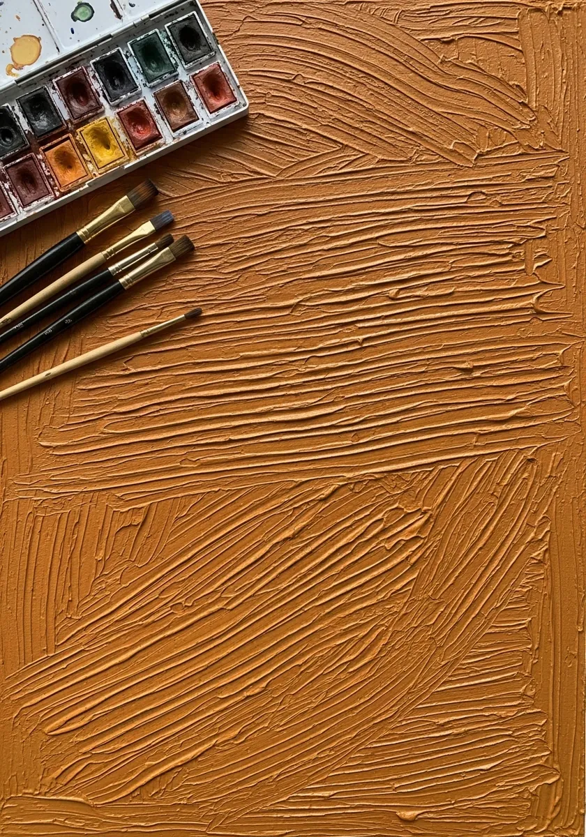
Sometimes the surface is the subject. Load the brush heavily, drag it across dry paper so it skips, and leave every ridge and gap showing. Working on a slightly damp sheet will destroy the effect entirely. Use a stiff old brush, because a soft one lays the paint down too smoothly.
18. Ochre and Red Mandala
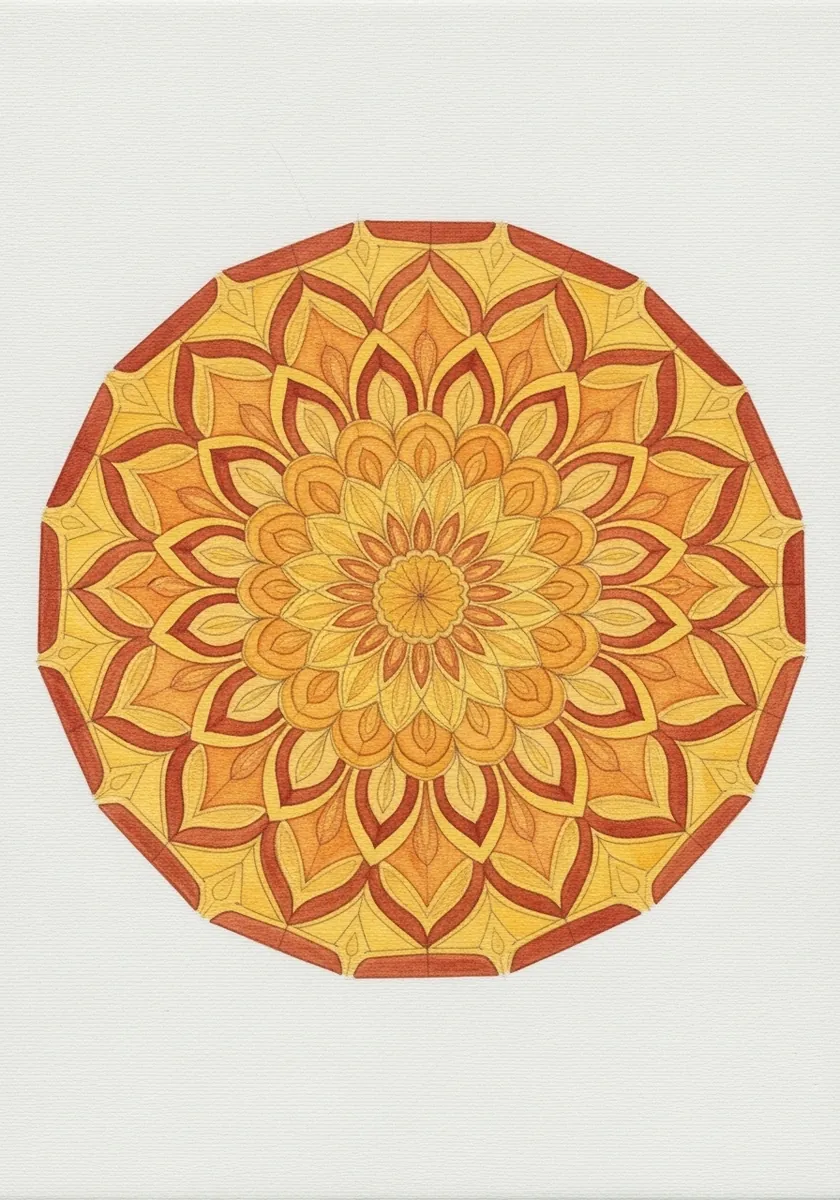
Two warm colors in a symmetrical design need a clear rule. Assign ochre to one set of petals and red to the other, alternate them consistently all the way round, and never let the two mix on the paper. Rule the radial guides in pencil first and rub them out at the very end.
19. Industrial Pipework Perspective
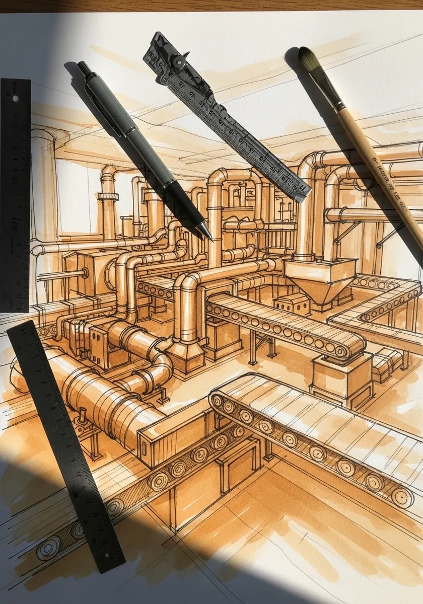
Cylinders in perspective are ellipses that flatten with distance. Draw every pipe end as an ellipse rather than a circle, make them narrower the further back they sit, and keep the long edges converging on one point. Keep the joints and flanges simple, since detail everywhere flattens the depth.
20. Ochre Breaking Wave
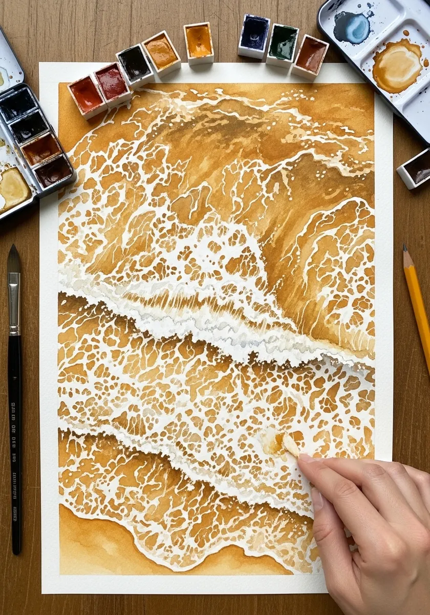
Foam has to be reserved. Paint around the whole crest so it stays as untouched paper, keep the wave face darkest immediately beneath it, and let a few dry-brush marks break up the flat water behind. Keep the horizon high so the wave has room to build beneath it.
21. Face in Flat Blocks
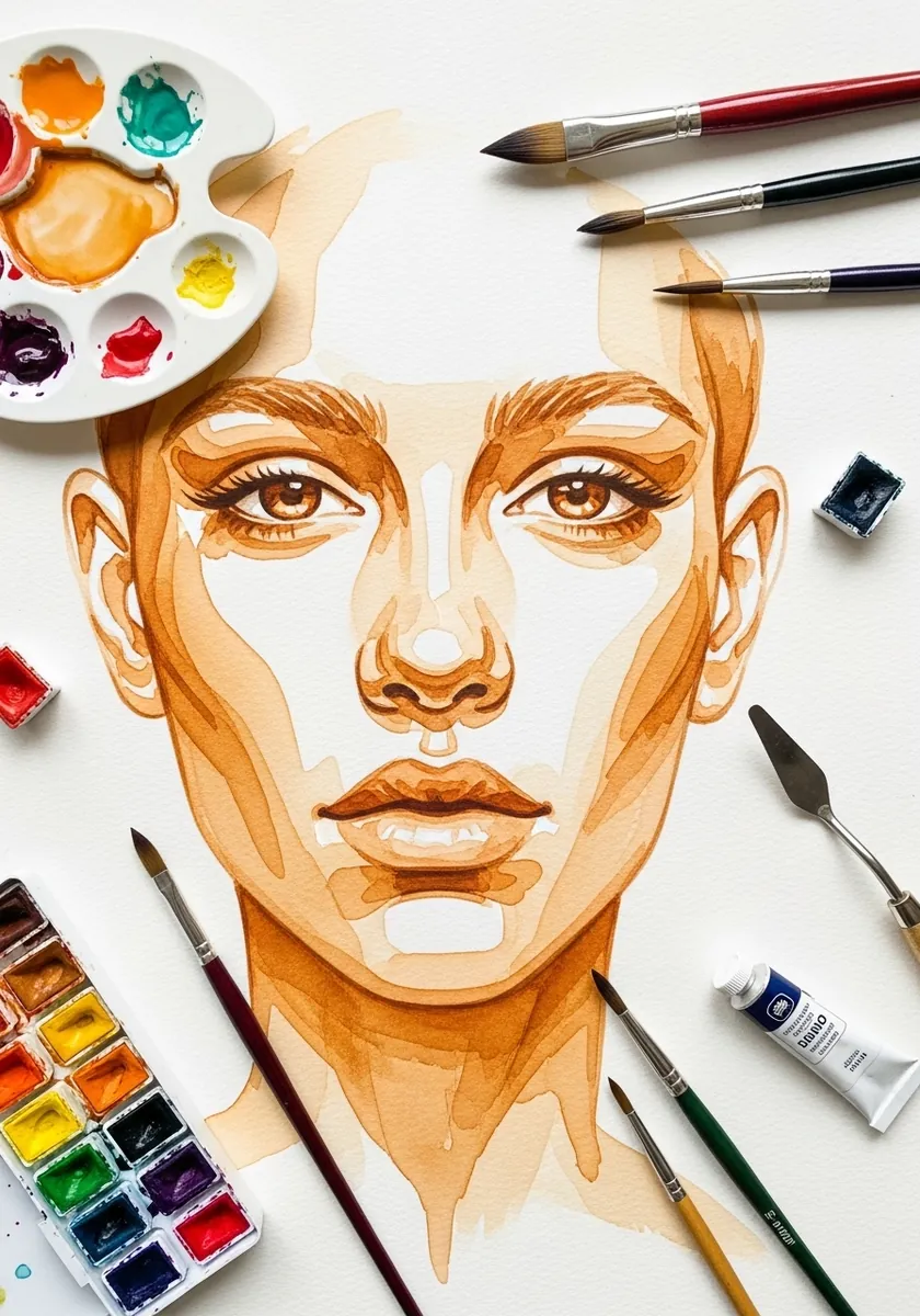
Reducing a face to flat shapes is a value exercise in disguise. Squint at the reference until the head becomes four or five patches, paint each as a flat unblended area, and refuse to soften any edge between them. Photograph your reference in strong side light, which forces the patches apart.
22. Rock and Leaf Studies
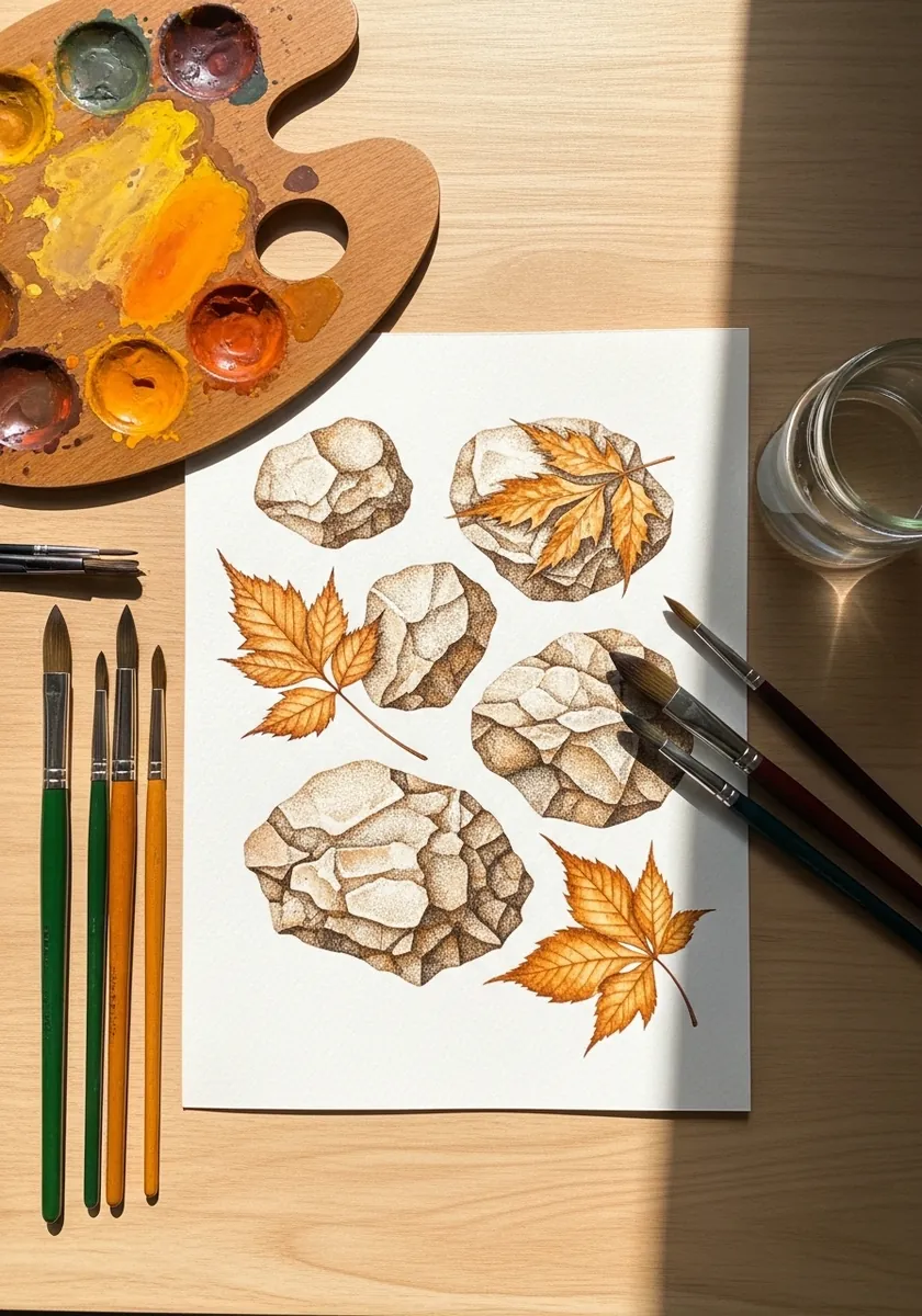
A study sheet should isolate one problem. Paint the same rock four times at different strengths, keep the leaves as a separate group, and label what you learned. Mixing finished work into a study page defeats the purpose. Number each study, so you can refer back to a mix that worked.
23. Antelope Head Study
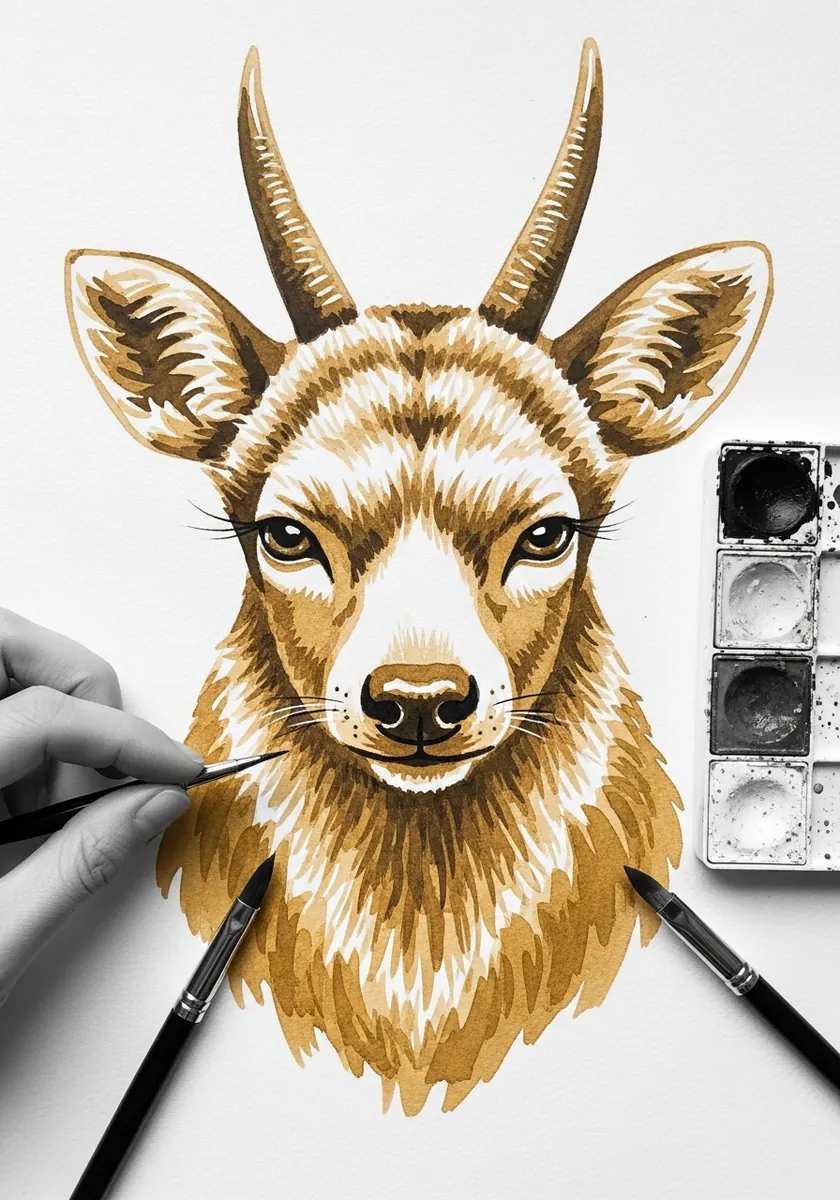
Short animal fur follows the bone underneath. Run the strokes down the muzzle, outward across the cheek and up between the horns, and let the direction change exactly where the underlying skull changes plane. Keep the horns smooth and hard-edged, which sets off the softness of the coat.
24. Archaeological Site Study
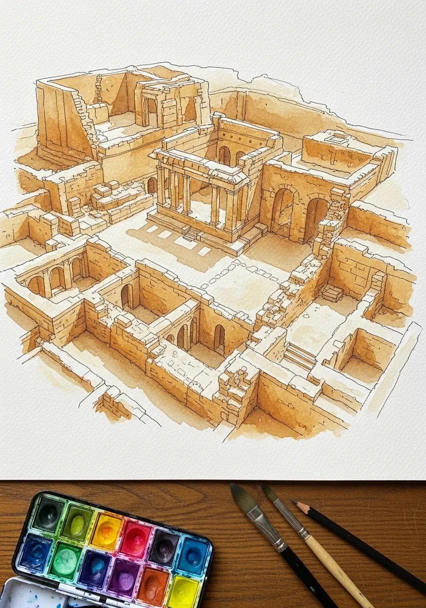
A site drawing is halfway between a plan and a picture. Keep every wall line ruled and accurate, add a light ochre wash only where the ground is exposed, and leave the sky and surroundings completely blank. Add a small scale bar in one corner, as a real site drawing always would.
25. Misty Ochre Forest
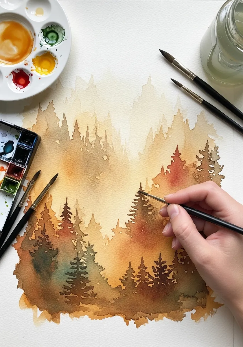
Mist over warm color is unusual and worth trying. Paint the nearest trees strongest, wet the paper behind them and let each further row soften into it, and keep the whole picture within two or three values. Let one tree break the top edge of the picture to anchor the near distance.
26. Figure in Motion
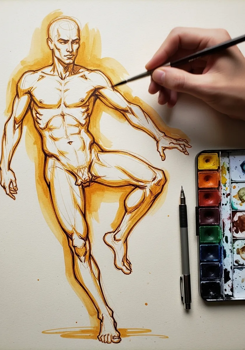
Gesture comes before anatomy. Draw the line of action from head to supporting foot in one stroke, hang the body on it afterwards, and accept that some limbs will be wrong. The energy matters more than the accuracy. Keep the line unbroken from head to foot, since a lifted pen breaks the flow.
27. Ochre and Gray Smoke
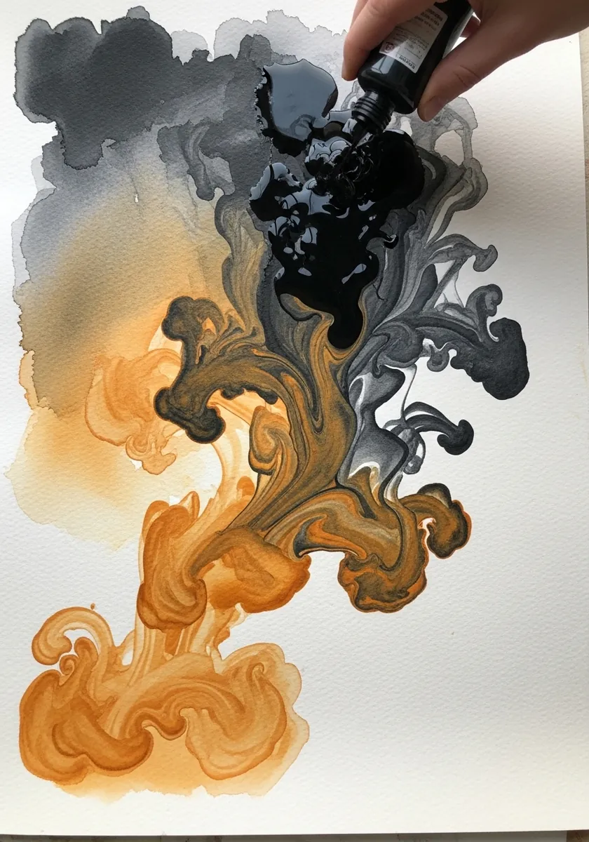
Warm against cool in a single wet area is unpredictable, which is the point. Drop the ochre and the gray into the same damp patch, tilt the board once, then stop; the boundary where they meet does the work. Standing the board upright gives the two colors somewhere to travel.
28. Sun and Moon Motifs
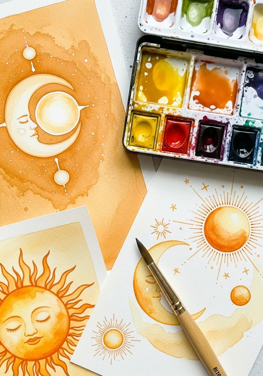
Celestial motifs are pure design. Keep every face simple with closed eyes, radiate the rays at even angles, and repeat the same star shape at three sizes. Consistency of motif matters more than any single element. Keep the background plain, because pattern behind pattern cancels both out.
29. Gold Botanical Line
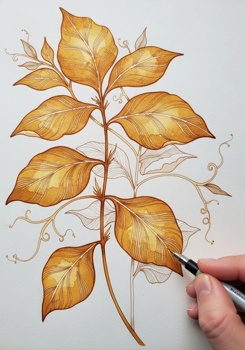
Fine line work in a pale color needs somewhere to concentrate. Draw the whole plant at one line weight, then go back and strengthen only the stems and the leaf midribs, and leave the outer edges faint. Work on cream paper, since gold line on pure white almost disappears.
30. Loose Ochre Blooms
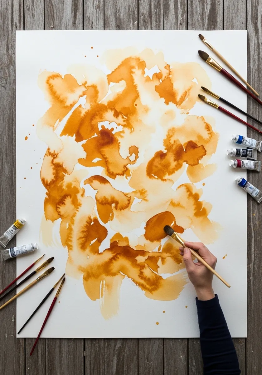
Finish with the pigment behaving on its own. Wet the paper unevenly, drop strong ochre into the damp patches, and let it bloom outward into the wet and stop dead at the dry. Every touch after that flattens the pattern, so put the brush down.
Frequently Asked Questions
What color does ochre make with blue?
A natural muted green. Because ochre is a dull yellow rather than a bright one, the green it produces is the sort you actually see in grass and foliage, which is why many landscape painters never buy a green tube at all.
What is the difference between yellow ochre and raw sienna?
Raw sienna is more transparent and slightly warmer, while yellow ochre is more opaque and a touch cooler. Raw sienna glazes beautifully over other colors; yellow ochre is better for covering and for toning a whole sheet.
Why does everything go muddy in an ochre painting?
Because ochre dulls whatever it is mixed with, so a palette of nothing but earths has no chroma left to lose. Keep one saturated color completely unmixed somewhere in the picture and the rest will read as deliberate.
What is a toning wash?
A single thin wash of color laid over the whole sheet, either before painting or over a finished piece. Ochre is the traditional choice because it is warm and dull, so it harmonizes everything underneath it without changing any hue much.
How old is ochre as a pigment?
It is among the oldest known. Iron oxide earths appear in cave paintings tens of thousands of years old, and they survive because the pigment is chemically stable and does not fade in light the way many organic colors do.
References and Further Reading