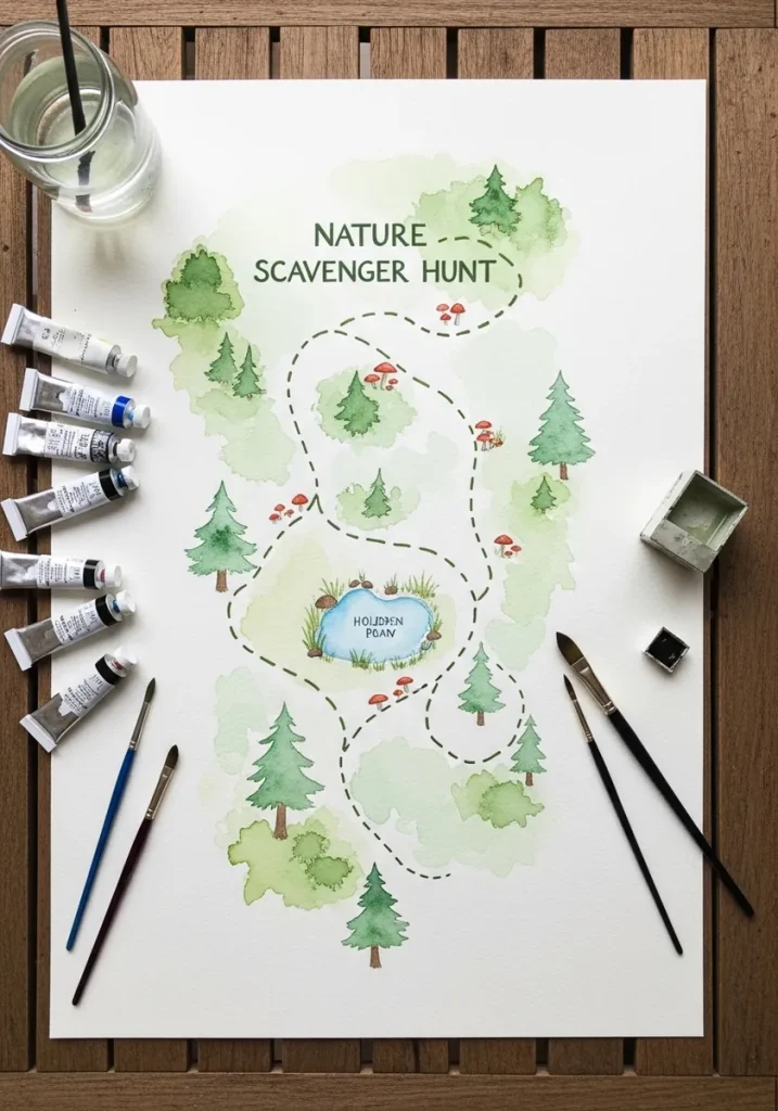
Draw the path first. A pictorial map is a schematic rather than a scale drawing, so lay one clear dashed route across the page and hang every landmark off it, using one repeated symbol per feature type.
Key takeaways
- Draw the route before anything else, then place landmarks along it rather than the other way round.
- Repeat one symbol per feature type; inconsistent symbols make a map read as a picture instead.
- Dashed lines mean a path and solid lines mean a boundary, which is a convention worth keeping.
- Landmarks are drawn oversized relative to the terrain so children can actually find them.
- A compass rose, a legend and a border are the three devices that instantly say map.
Every map on this list was built the same way, and it is not the way most people start. Draw the route first, as one clear dashed line crossing the page, then hang every landmark off it. Placing trees and rocks before the path leaves you with a landscape rather than a map.
The second rule is consistency. Use one symbol per feature type and repeat it exactly, so every conifer is the same conifer and every boulder the same boulder. Varying them turns your map back into an illustration, because the reader stops recognizing the shorthand.
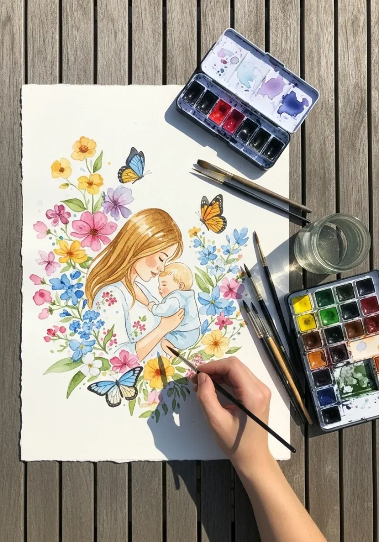
Three conventions do the rest of the work: a compass rose, a legend, and a ruled border. Illustrated maps have never been to scale, which is why landmarks get drawn far larger than the terrain around them. For the terrain itself, nature watercolor studies are useful practice.
The thirty designs below run from aged treasure-map parchment and block-printed hills to a graffiti city hunt, a botanical specimen border and a fantasy village island. If you need the plants and trees along the way, tree drawing ideas and flower drawing ideas pair naturally with these.
Compiled by the GS Art Zone editorial team. Last updated August 2026. Each idea is paired with the specific step that produces the effect, so you can go from the reference straight to paper.
What You Need Before You Start
- A pencil and ruler for the border and the compass rose, both of which need straight edges
- Waterproof fine liners in 0.1 and 0.3, one for symbols and one for the route line
- Two greens, one yellow-leaning and one blue-leaning, which covers most terrain
- A brown or sepia for paths and aged-paper effects, plus tea or coffee if you want real staining
- Somewhere to leave blank space for tick boxes, since the map has to be usable outdoors
1. Watercolor Trail With a Pond
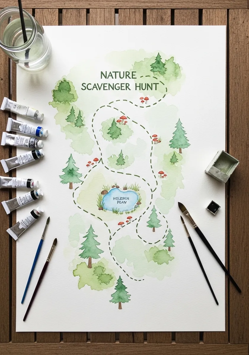
This is the plain version of the whole method. Lay the dashed route as one continuous curve, place the pond at a bend rather than at an end, and cluster three or four trees at each turn. Leaving the page mostly white keeps the route obvious.
2. Pencil Map With a Compass Rose
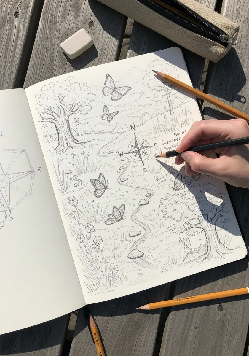
A compass rose earns its space by being genuinely constructed. Draw two crossed axes, then a square rotated forty-five degrees over them, and build the points from that. North sits at the top by convention unless you have a reason to break it.
3. Fine Ink Contour Map
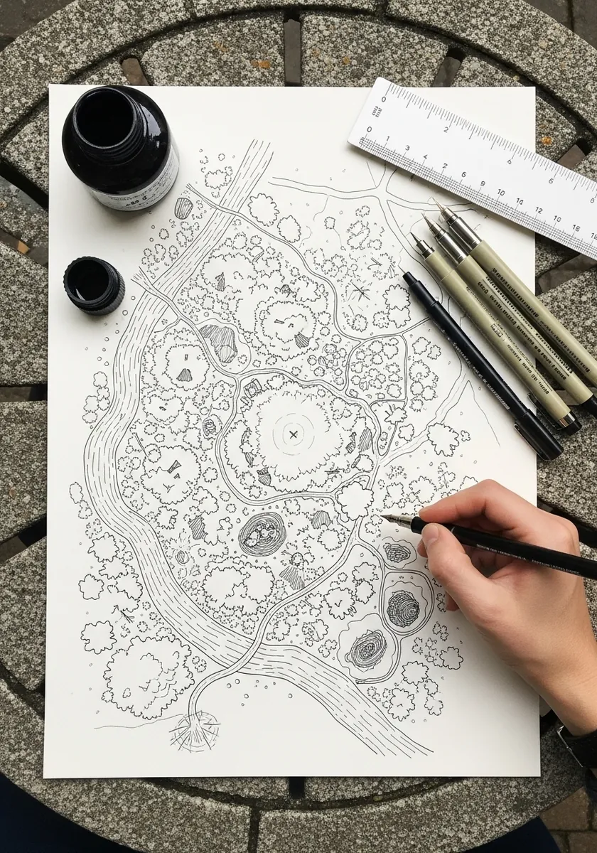
Contour lines never cross and never split. Draw them as closed loops nesting inside one another, tighter where the ground rises steeply and wider where it flattens. That simple rule is what makes an invented landscape read as real terrain.
4. Forest Waterfall in Watercolor
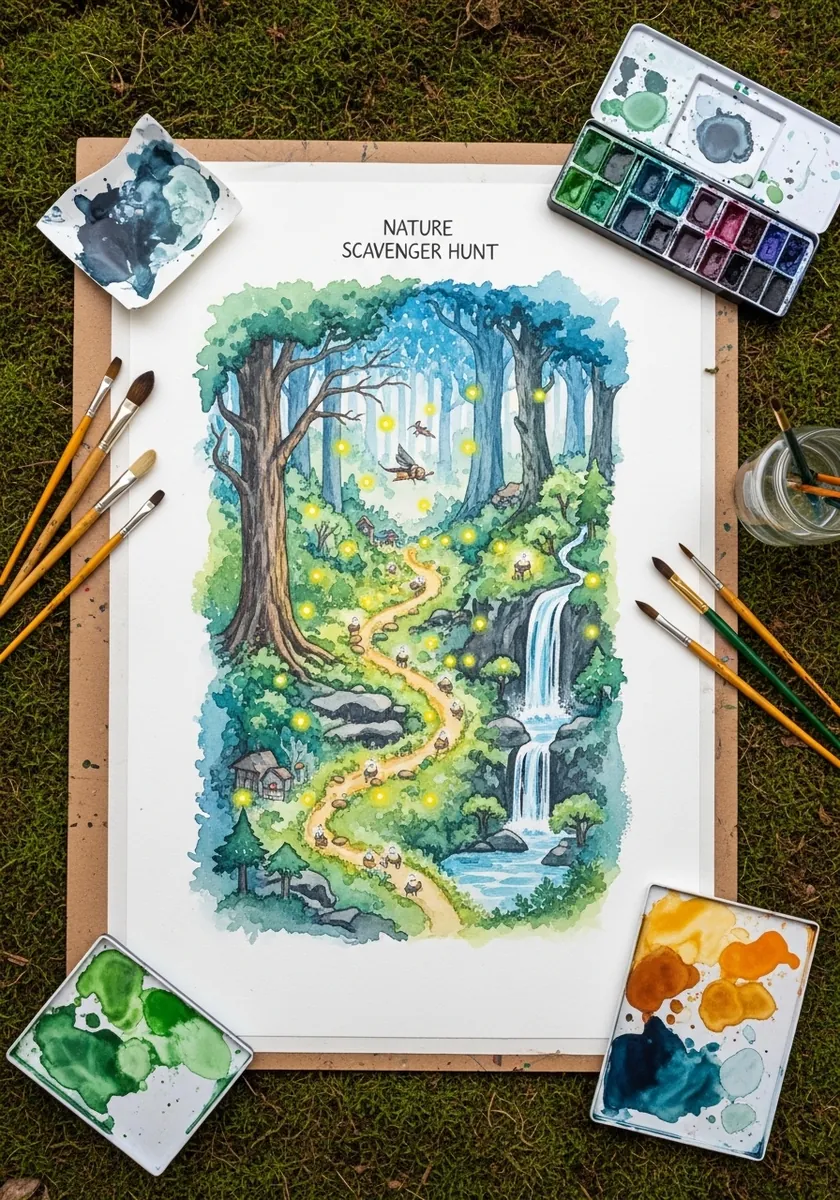
Water falling vertically anchors a map that is otherwise all horizontals. Place the waterfall at the top of the route so the path appears to descend from it, and keep the white of the falling water as bare paper. Everything else stays green.
5. Aged Treasure Map on Parchment
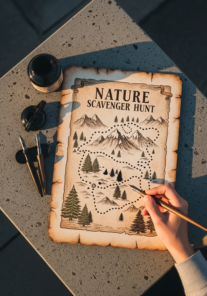
Aged paper needs uneven staining to convince. Brush tea or dilute coffee across the sheet and let it pool at the edges. Tear the border rather than cutting it. Mountains in this tradition are drawn as simple side-on triangles, never seen from above.
6. Block Print Hills and River
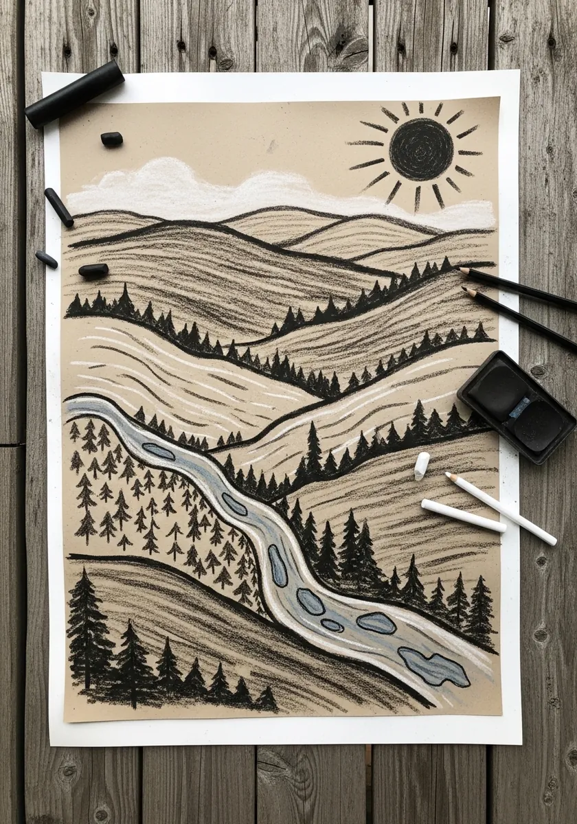
Relief printing forces you to design in solid shapes. Carve the river as a clean negative channel, keep the hills as stacked bands, and repeat one small pine shape across the whole print. Every mark is either cut away or left.
7. Stepping Stones in Minimal Watercolor
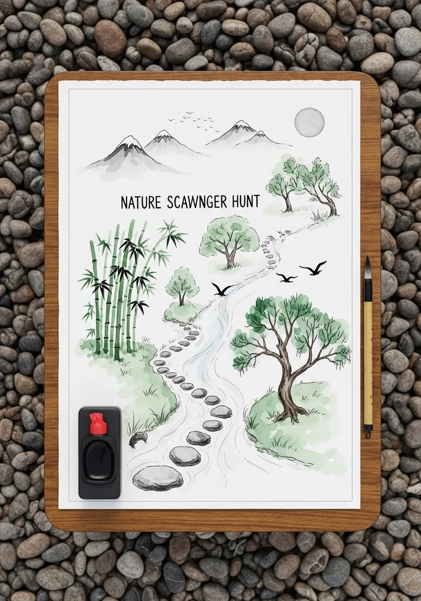
Very sparse maps rely on rhythm rather than on content, so space the stepping stones unevenly and let the eye travel along them at varying speed, keeping the bamboo clustered at one side only. Large areas of untouched paper read as calm, not unfinished.
8. Detailed Urban Park Map
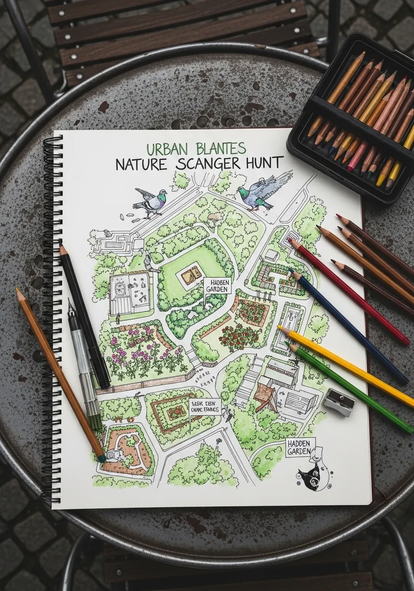
City maps need a hierarchy of line weights. Ink the main paths heaviest. Draw secondary routes lighter and building outlines lightest of all, then label everything with small consistent lettering. Three weights are enough to organize a surprisingly complex page.
9. Autumn Stream With Butterflies
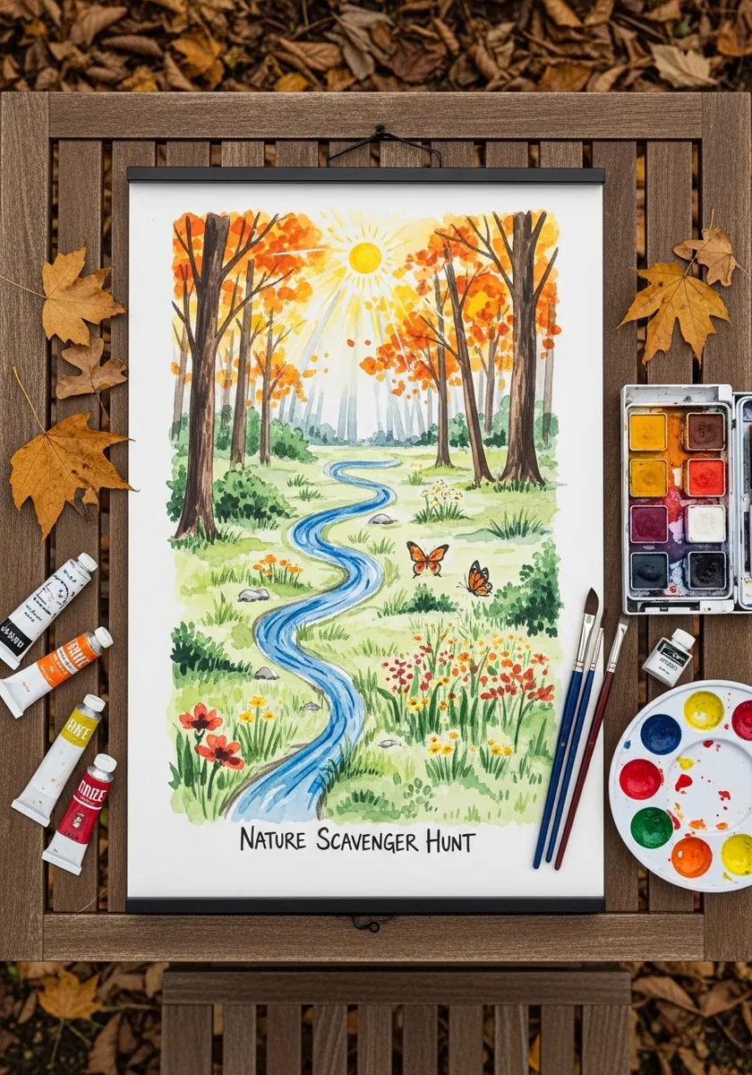
Autumn palettes risk collapsing into one warm blur, so keep the stream a genuinely cool blue that separates from everything around it, and vary your oranges between yellow-leaning and red-leaning. That temperature contrast is what holds the whole page together.
10. Cartoon Animal Map for Children
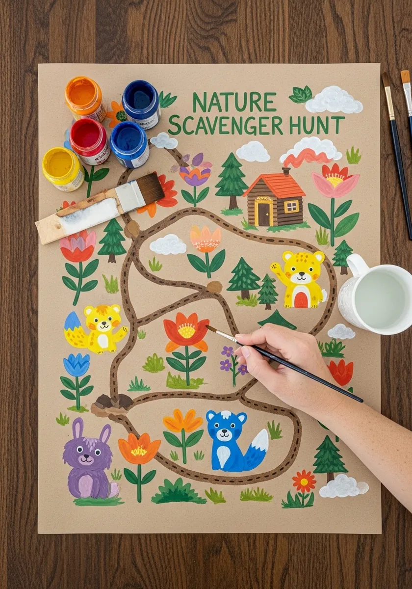
Designing for small children means limiting choices. Use one wide brown path, six or seven large animal symbols, and no shading anywhere. Every element should be big enough that a young child can point at it and name it. Give the path a thick outline too, so it survives being folded and carried around outdoors.
11. Pond and Wetland Map
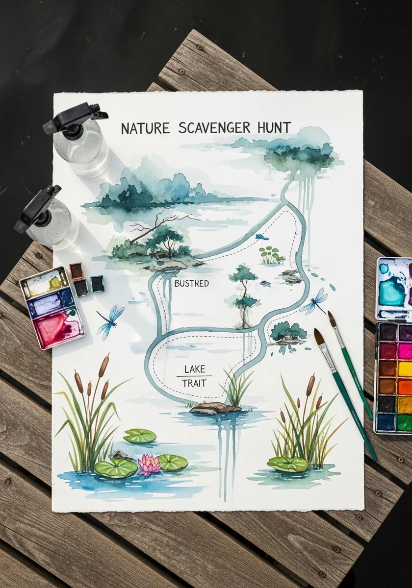
A wetland map benefits from labeled zones rather than a single route. Divide the water into two or three named areas, join them with a light path, and let the plants mark the boundaries. Labels sit on the water where there is room.
12. Insect Identification Chart
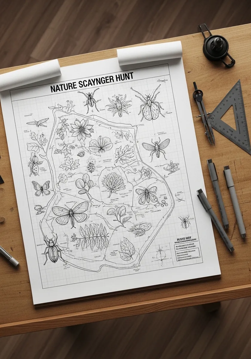
A chart is a map of a different kind. Rule a light grid first. Center one specimen in each cell at a consistent size, and keep every label aligned to a single baseline. Uniform spacing is what makes a reference sheet usable rather than merely decorative.
13. Blue Coastal Cliffs Map
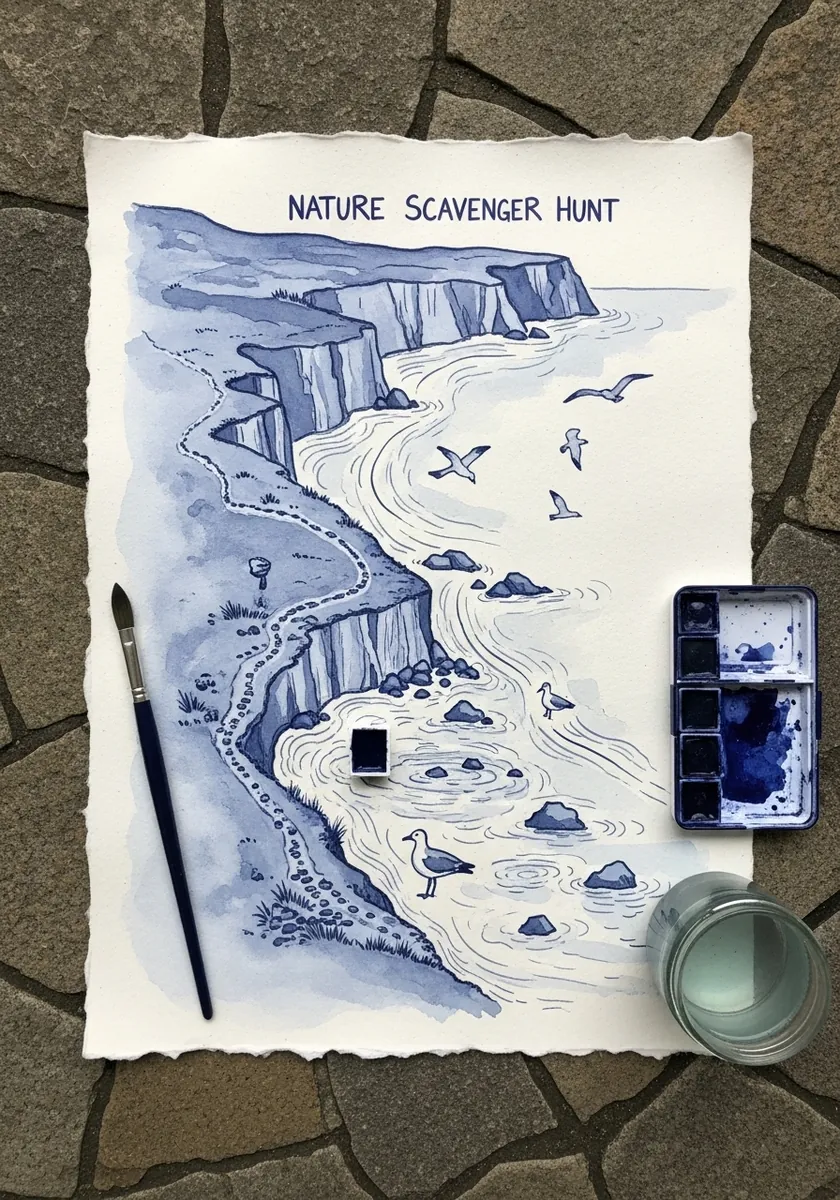
One color forces value to do all the work, so mix four distinct strengths before you begin and assign them deliberately: sky palest, sea next, cliffs darker and the path darkest of all. Mixing as you go leaves everything sitting in the middle range.
14. Fine Pen Field Notes Map
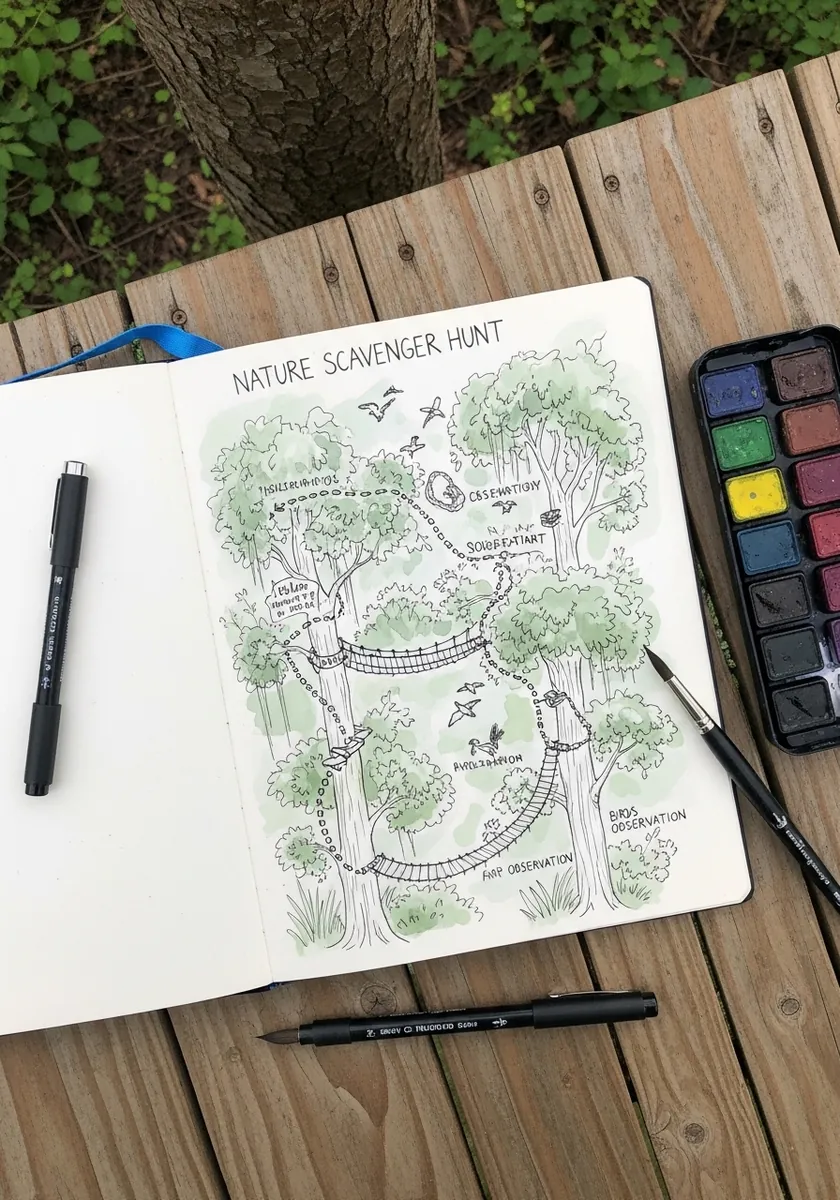
Field notes look right when the handwriting is small and slightly irregular. Keep the drawing loose, write observations in the margins as you go, and date the page. The notes are part of the composition rather than an afterthought. Leave one margin completely empty, since notes always expand once you are actually outside.
15. High Contrast Jungle Map
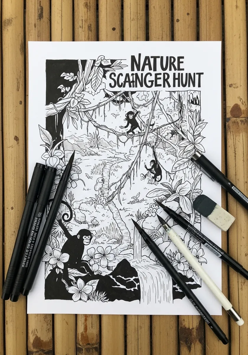
Working with no midtones at all means every shape must be decided. Fill the dense canopy solid black, leave the path pure white, and use hatching only at the boundary between them. That hard division gives the piece its energy.
16. Specimen Border Around a Map
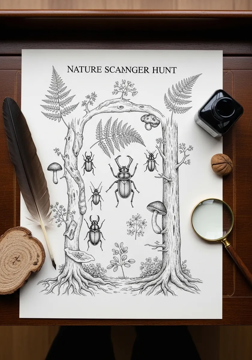
A specimen border works when the frame and the map differ in treatment. Render the border creatures with full detail and shading. Keep the central map in simple outline by contrast. That difference tells the reader immediately which part to read first.
17. Flat Geometric Trail Map
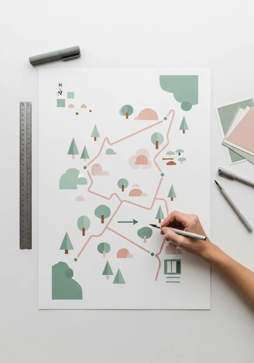
Reducing nature to geometry means committing to a small vocabulary. Choose three shapes, a circle for deciduous trees, a triangle for conifers, a rounded rectangle for buildings, and use nothing else. The route stays as a single flat line. Keep the palette to three colors as well, which reinforces the same discipline as the shapes.
18. Pressed Botanical Specimen Map
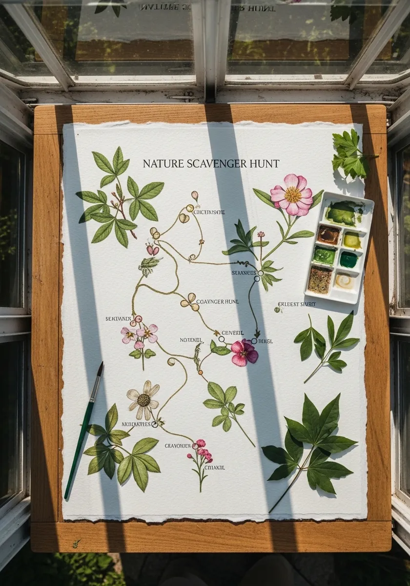
Real specimens on paper change how you draw around them, so arrange and glue the plants first, then run the pencil route between them, letting the line pass under a leaf and reappear on the far side. The drawing accommodates the objects, never the reverse.
19. Street Art Scavenger Hunt Map
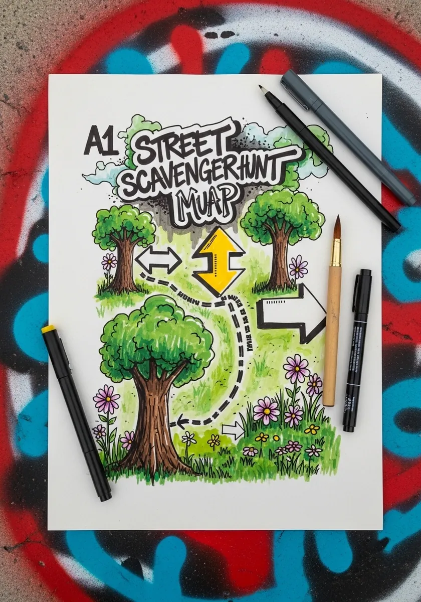
Street styling swaps subtlety for direction. Use oversized arrows, heavy black outlines and flat saturated fills, and let the lettering dominate the top of the page. Legibility from a distance matters more than fine detail here. Drips belong under the lowest edge of each shape and nowhere else on the page.
20. Radial Botanical Map
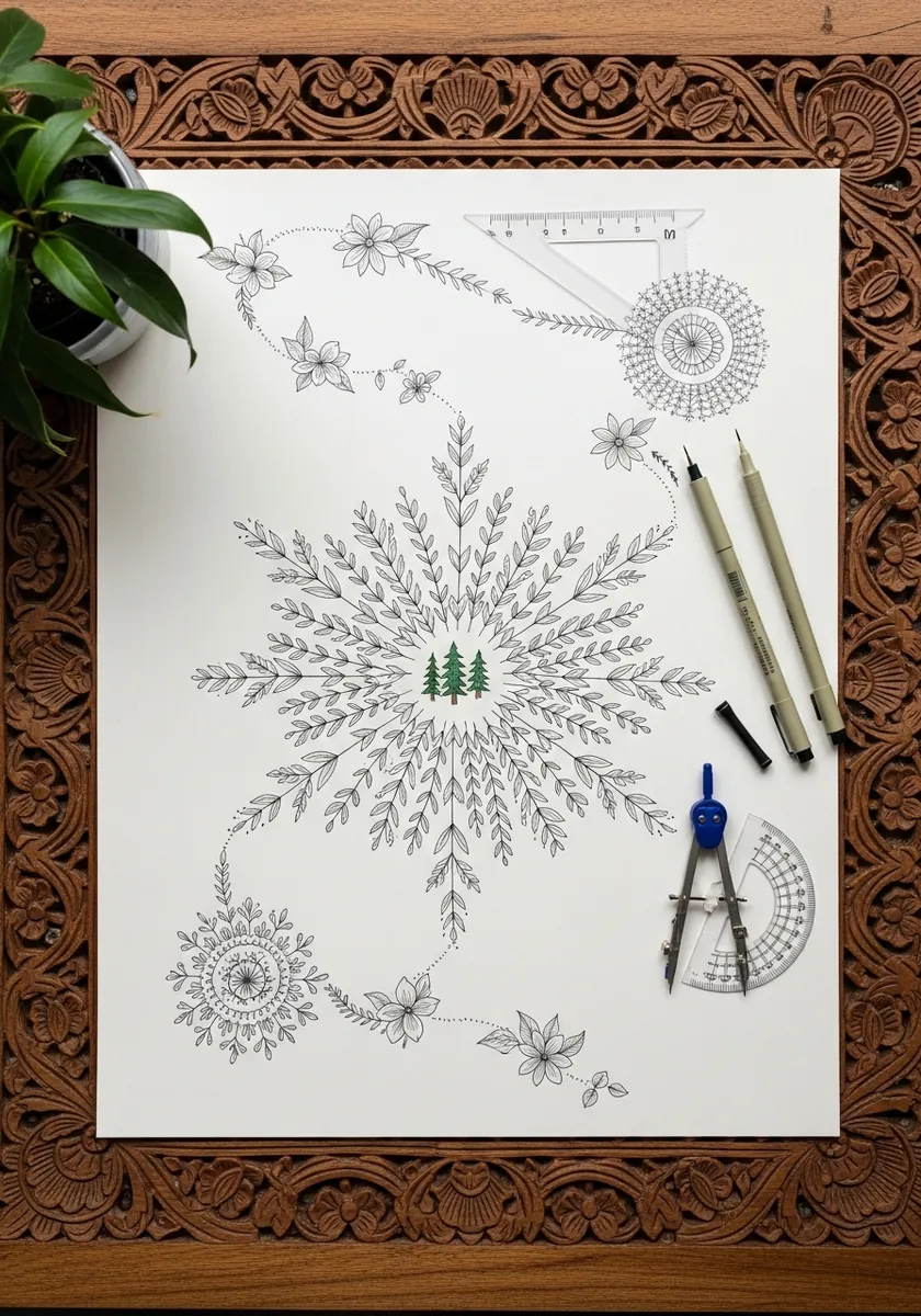
A radial layout replaces a route with a center. Work outward in rings, keeping each ring to one plant type, and let the density drop as you move toward the edge. The same construction logic appears in mandala work.
21. Coastal Cove With an Arch
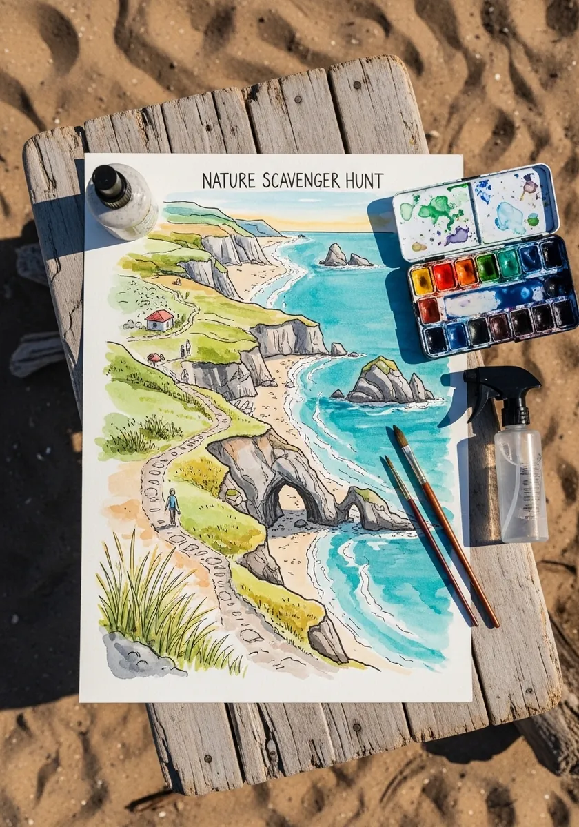
A distinctive landmark is worth exaggerating. Draw the arch larger than true scale and place it where the path bends, since that is what makes it findable. Turquoise water reads best when the sand beside it stays almost colorless. Add a few gulls at varying sizes, which gives the cove an immediate sense of scale.
22. Ballpoint Forest Path
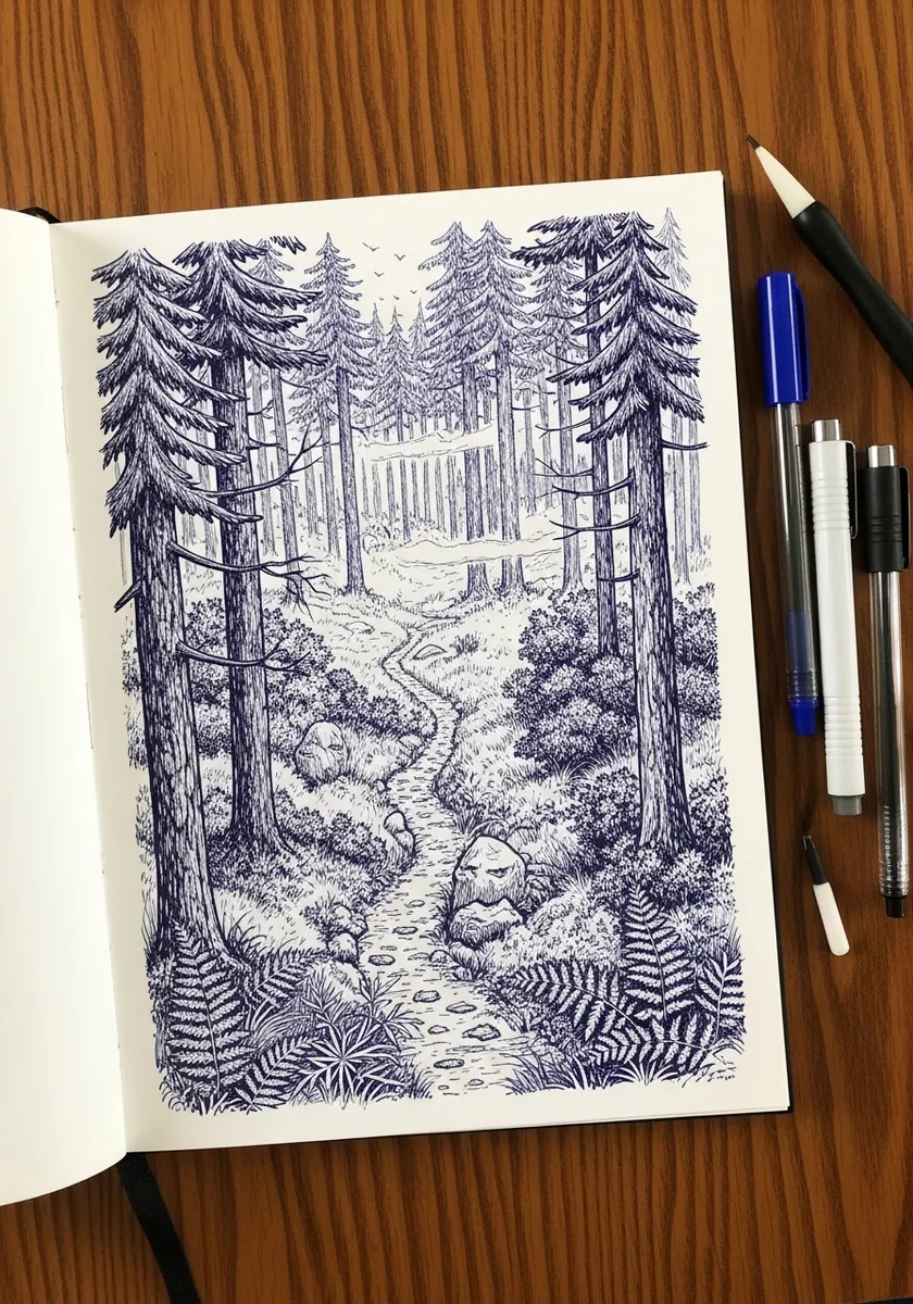
Ballpoint builds tone only through layering, so plan your lights before you start. Leave the path almost bare. Hatch the near ferns moderately, then build the deep forest in several crossing passes. Nothing can be lightened once the pen has touched the paper.
23. Gouache Trail on Canvas
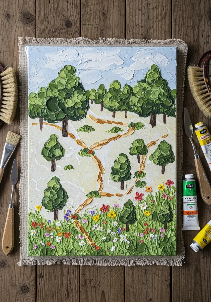
Canvas texture changes how flat paint behaves. Load the brush more than you would on paper, let the weave break the edges slightly, and keep your shapes simple to compensate. Fine detail disappears into the surface at this scale. A coat of gesso beforehand tames that absorbency if you want crisper symbols.
24. Mountain Lake With a Pine Border
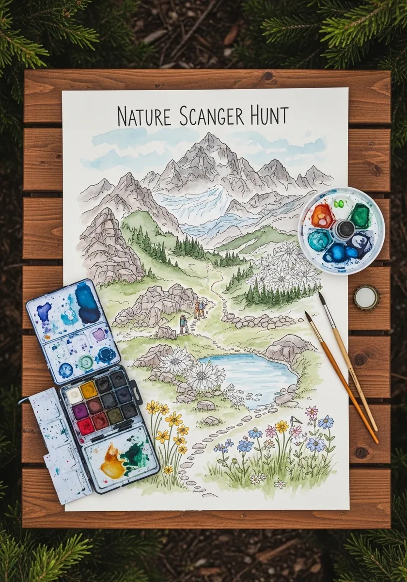
A painted border is a decision about the edge. Let the pine branches overlap the map slightly at the corners so the two layers interlock, and keep the border darker than the scene. That weight difference frames without closing the page in.
25. Canopy Map From Above
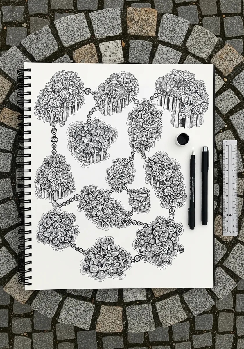
Overhead views are entirely about silhouette. Draw each treetop as an irregular cloud shape, vary their sizes, and let the gaps between them form the paths. Shadows fall short and directly beneath, since the viewpoint is straight down. Vary the green slightly between neighboring crowns so the canopy does not flatten into one mass.
26. Whimsical Meadow With Named Zones
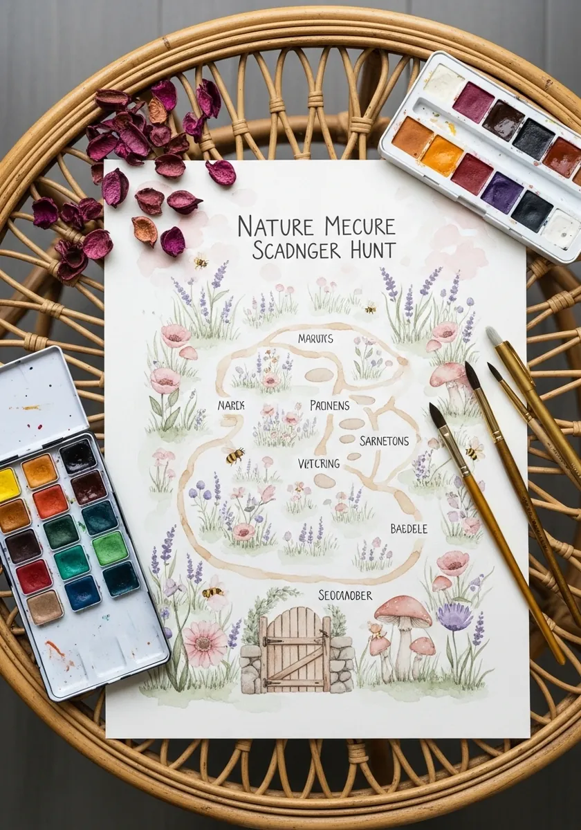
Naming areas turns a map into a story. Give each zone a short invented name. Mark the boundaries with a change of ground color rather than a hard line, and put the gate where the route enters. Labels stay handwritten and deliberately small.
27. Charcoal Forest With Lights
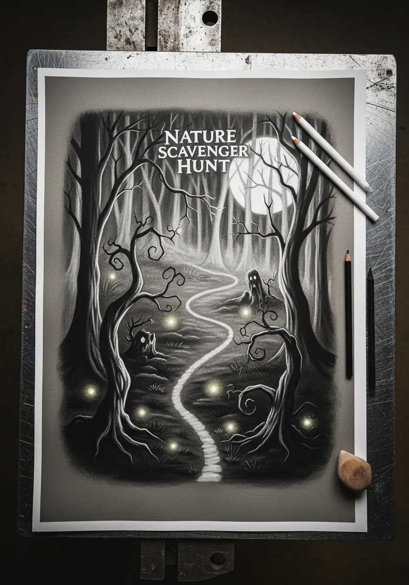
Working dark to light on a full charcoal ground is the fastest way to make lights glow. Lay the whole page dark, then lift the path and each small light with a sharp eraser. Lifted marks have an edge quality applied white cannot match.
28. Japanese Style Map With Tigers
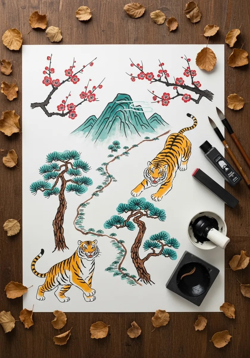
This tradition builds depth in flat stacked bands rather than through perspective. Set the pines low, the path in the middle band and the mountain highest, with mist separating each layer. Animals sit within a band rather than crossing between them.
29. Fantasy Village Island Map
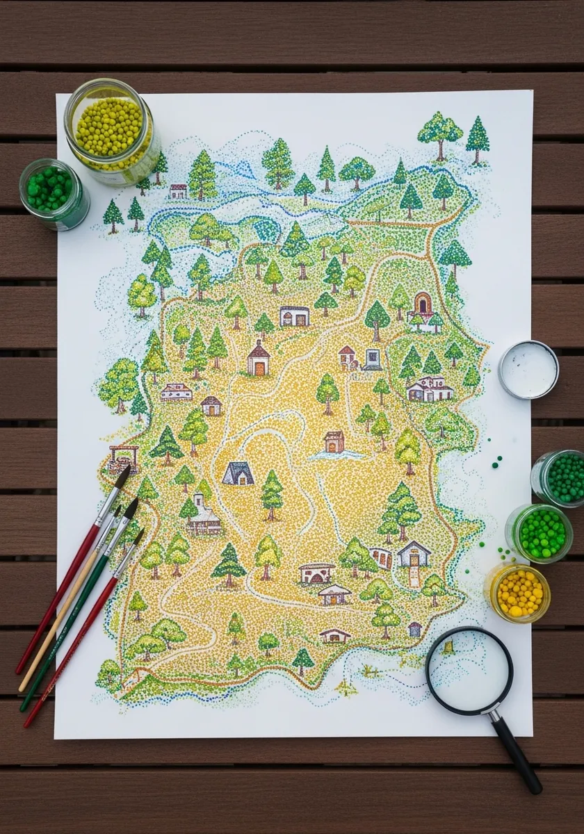
Tiny buildings need a consistent viewing angle. Draw every house from the same three-quarter view with the same roof pitch, then vary only their size and color. Mixed viewpoints across a small village is what makes fantasy maps look amateur.
30. Autumn Leaf Framed Forest Map
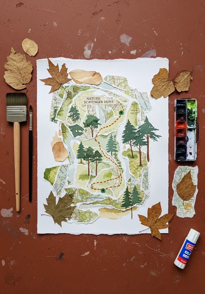
Real objects arranged around a map extend it beyond the paper, so choose leaves that echo colors already present in the painting, place them asymmetrically and leave one corner empty. Framing an image with objects is a composition in its own right.
Frequently Asked Questions
How do you draw a scavenger hunt map for kids?
Start with the route as one clear dashed line across the page, then add eight to twelve landmarks along it, drawn much larger than true scale. Leave a blank column or tick boxes down one side so children can mark off what they have found.
Should a pictorial map be to scale?
No. Illustrated maps are schematics, so distances get compressed or stretched to fit the page and landmarks are deliberately oversized. What matters is that the order of features along the route is correct and that each one is recognizable.
What makes a drawing read as a map rather than a landscape?
Three conventions do most of the work: a compass rose, a legend explaining the symbols, and a ruled border around the whole image. Add a top-down or tilted viewpoint and repeated symbols, and it reads as a map immediately.
What do dashed and solid lines mean on a map?
Dashed lines conventionally indicate a path or trail, while solid lines mark boundaries, roads or water edges. Keeping that distinction consistent means a reader understands your map without needing the legend explained to them.
How many items should a nature scavenger hunt include?
Eight to twelve is a workable range for young children, since it can be completed in one outing without anyone losing interest. Mix easy finds such as a round stone with harder ones such as a feather so the list stays engaging throughout.
References and Further Reading