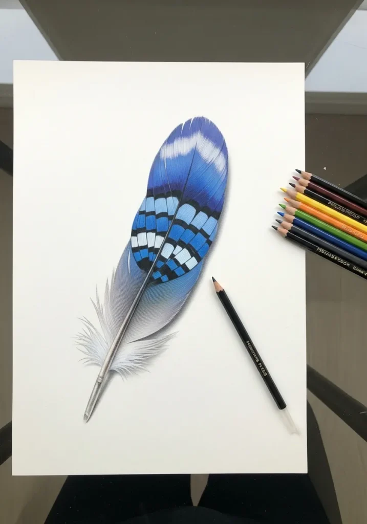
Draw the rachis first. That central shaft sets the feather's entire curve, and every barb branches off it at a consistent angle, always sweeping toward the tip. Get the shaft and the barb angle right and the rest is detail.
Key takeaways
- The rachis is the central shaft, and its curve determines the shape of the whole feather.
- Barbs branch off the rachis at a consistent angle and always sweep toward the tip, never straight out.
- A feather is asymmetrical: the leading edge is narrower than the trailing edge on flight feathers.
- Draw a few gaps where the barbs separate, because a perfectly sealed vane looks artificial.
- Peacock eye iridescence is structural color from barbule geometry, so it shifts with viewing angle.
Every feather drawing begins with one line. The rachis, the central shaft, sets the entire curve, and every barb branches from it. Draw the outline first and you will spend the rest of the study forcing barbs into a shape that does not match them.
The second rule fixes most stiff attempts. Barbs sweep toward the tip at a consistent shallow angle, never straight out at ninety degrees. Keep that angle steady along the whole shaft, then break the vane in two or three places, because a perfectly sealed feather looks manufactured.
The thirty studies below run from peacock eyes and jay barring to charcoal ostrich plumes, gold leaf and palette knife impasto. For the birds these came from, watercolor bird drawing and the bird nest studies are the natural companions.
Several pieces treat the feather as pure pattern rather than anatomy, so mandala construction covers the symmetry side, and botanical leaf tracing is worth reading since a leaf midrib behaves much like a rachis.
Compiled by the GS Art Zone editorial team. Last updated August 2026. Each idea is paired with the specific step that produces the effect, so you can go from the reference straight to paper.
What You Need Before You Start
- A sharp 2B and a 6B, since a feather needs both crisp barb lines and deep shadow at the base
- Fine liners in 0.05 and 0.1, because barb work demands finer nibs than most subjects
- A kneaded eraser sharpened to a wedge for lifting the pale shaft out of a dark vane
- One or two real feathers if you can find them, which beat any photo for barb structure
- Black or toned paper with a white pencil, as feathers suit reversed studies particularly well
1. Peacock Eye in Loose Watercolor
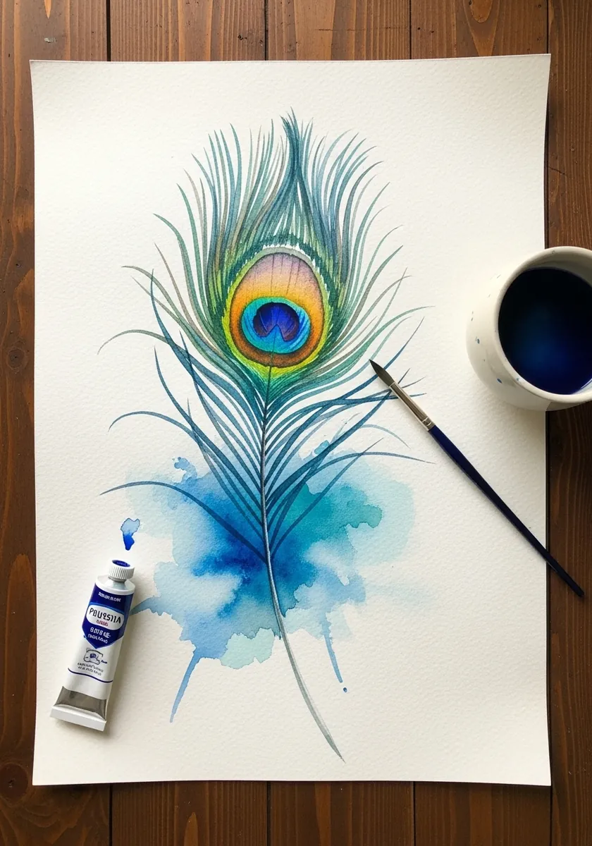
Build the eye in concentric rings from the outside inward, blue-green then bronze then the dark center. The barbs radiating out from the shaft should get progressively wispier toward the base, which is where a peacock feather naturally separates into loose strands.
2. Three Barred Feathers in Graphite
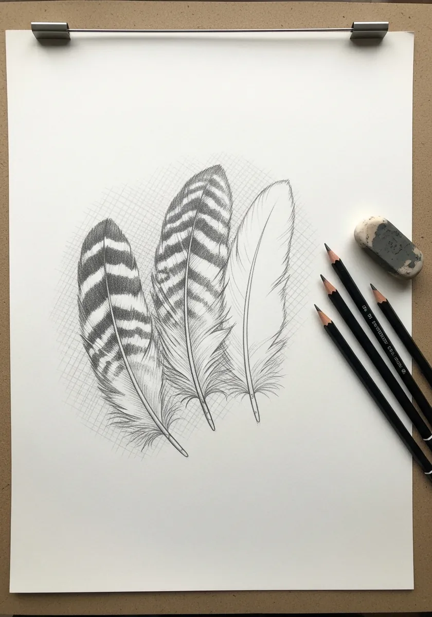
Barring runs across the vane at right angles to the shaft, never along it. Draw the rachis and barbs first in light pencil, then lay the dark bands over the top so they visibly follow the barb direction rather than sitting flat on the surface.
3. Warm Toned Feather on Kraft
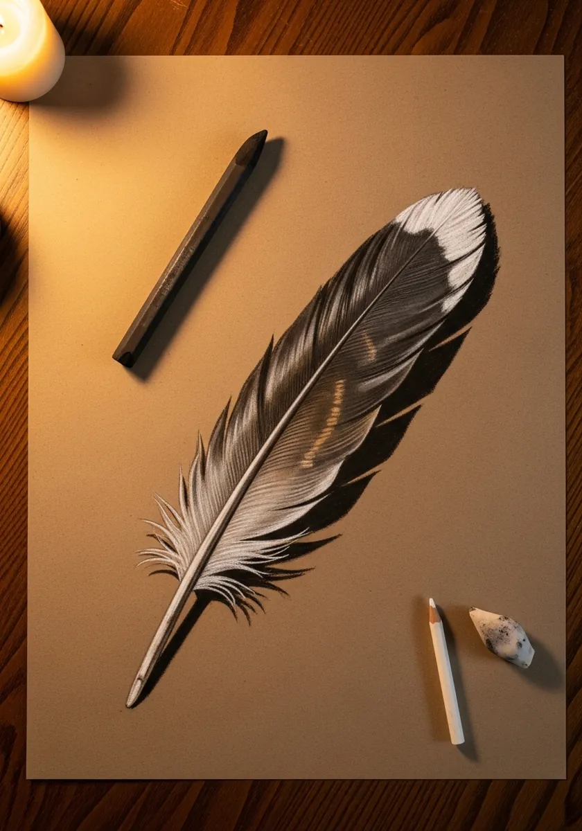
Toned paper hands you the mid value free. Add white only along the lit upper edge of the vane and darken beneath the shaft, letting the kraft itself carry every mid tone. The pale tip against the dark body is the strongest contrast here.
4. Soft Gradient Feather in Ink Wash
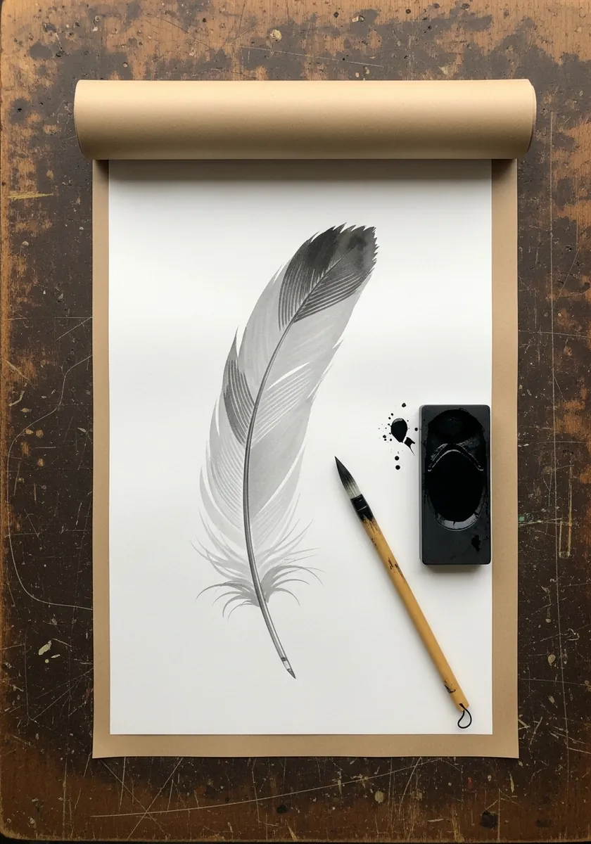
A gradient along the length is a good discipline exercise. Start dark at the tip with a loaded brush and let the ink run out naturally toward the base, adding no more water. The fade should happen because the brush empties, not because you diluted it.
5. Rainbow Stippled Feather
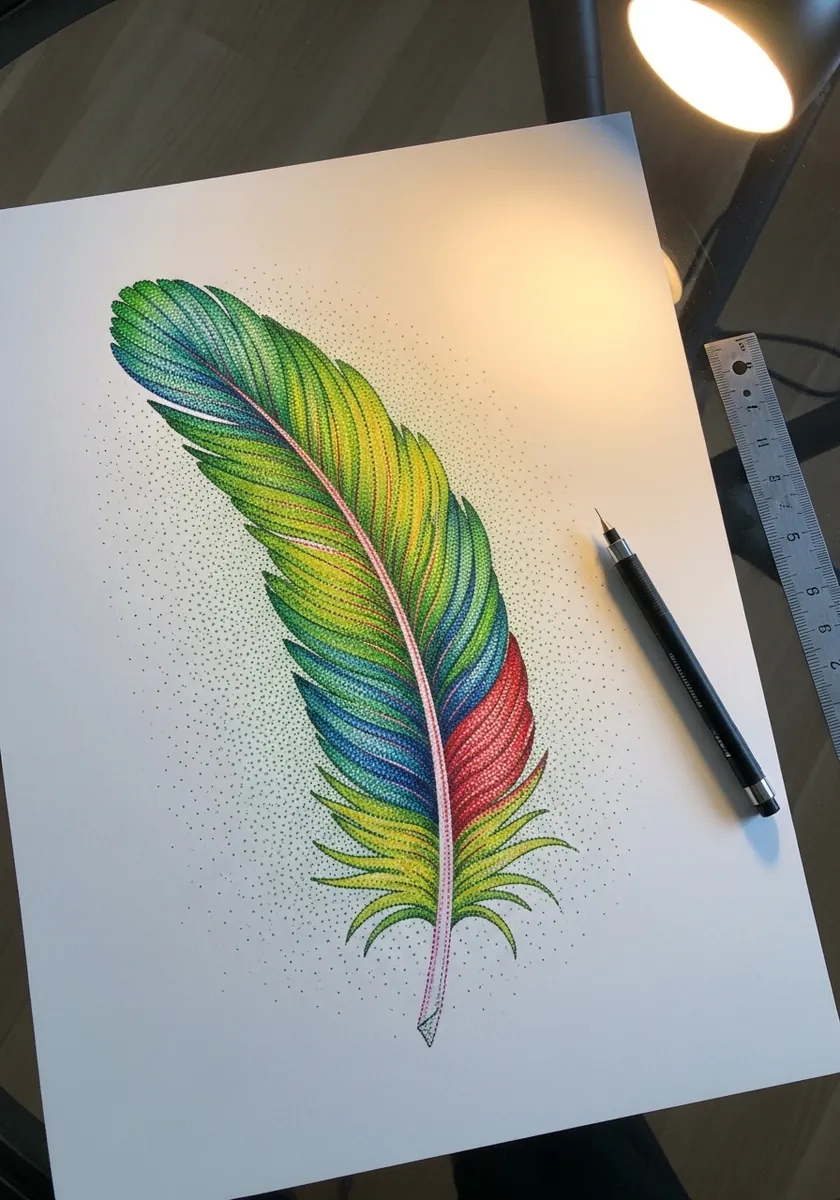
Stippling in color is slow but teaches enormous control. Work one hue across the whole feather before starting the next, which keeps the balance even, and let the dot density thin out toward the wispy barbs at the base. Work under a strong lamp, because stipple density is almost impossible to judge in dim light.
6. Peacock Feather in Fresh Green Wash
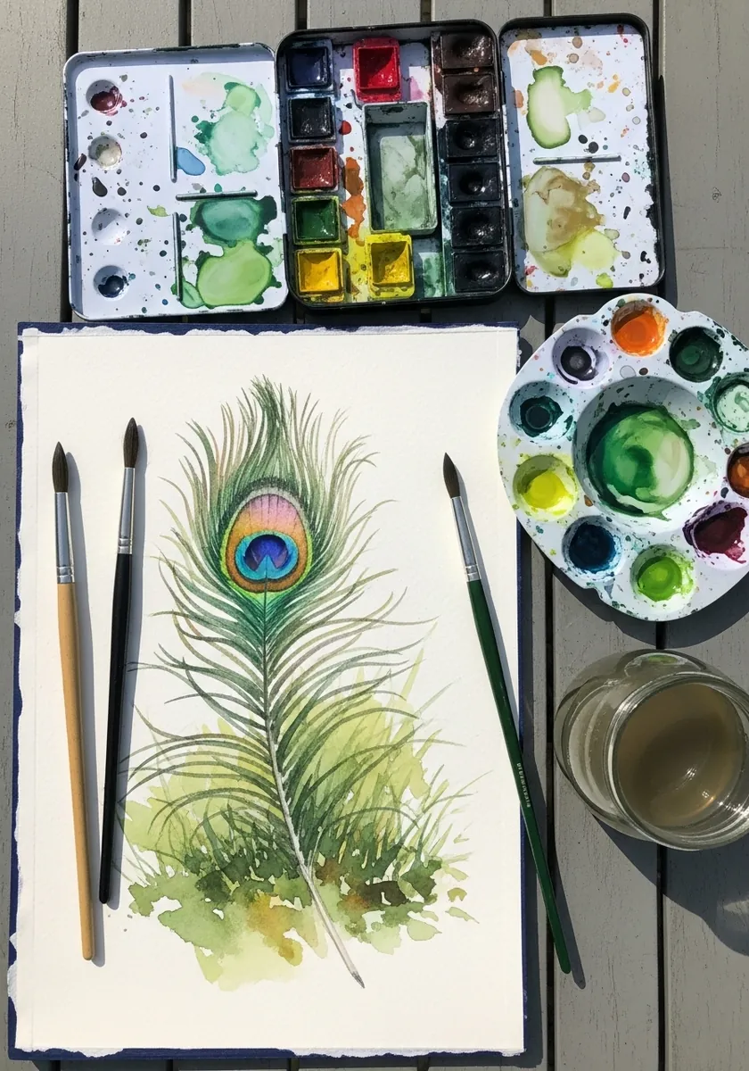
Wet on wet gives you the softness a peacock feather actually has. Wet the vane area, drop the greens in and let them mix on the paper, then wait until the sheen has gone before painting the eye so it stays crisp.
7. Blue Jay Feather in Colored Pencil
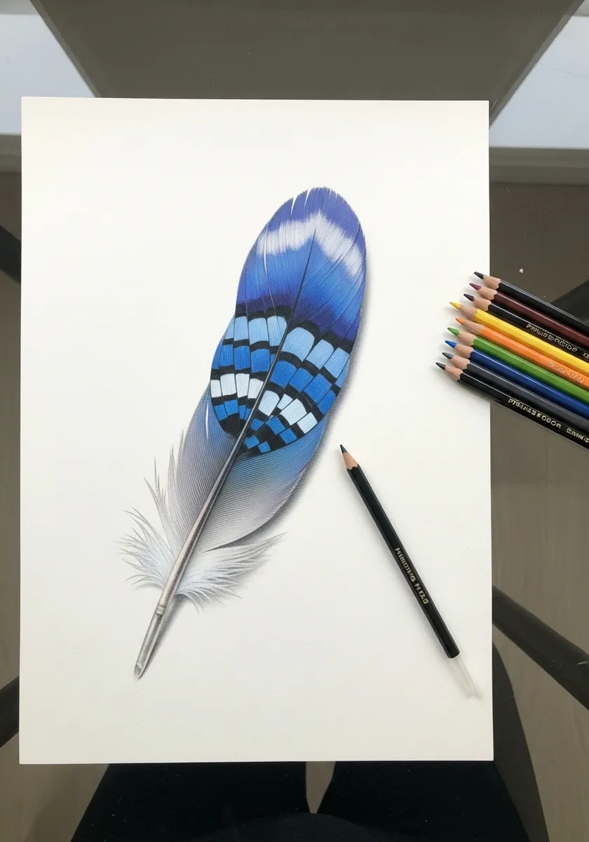
Jay blue is structural, produced by the barb microstructure scattering light rather than by pigment. Layer several blues rather than using one, and keep the white bars as bare paper because painting white over blue always goes chalky. The shaft catches a bright specular line along its length, and leaving that unpainted sells the gloss.
8. Minimal Outline Feather Study
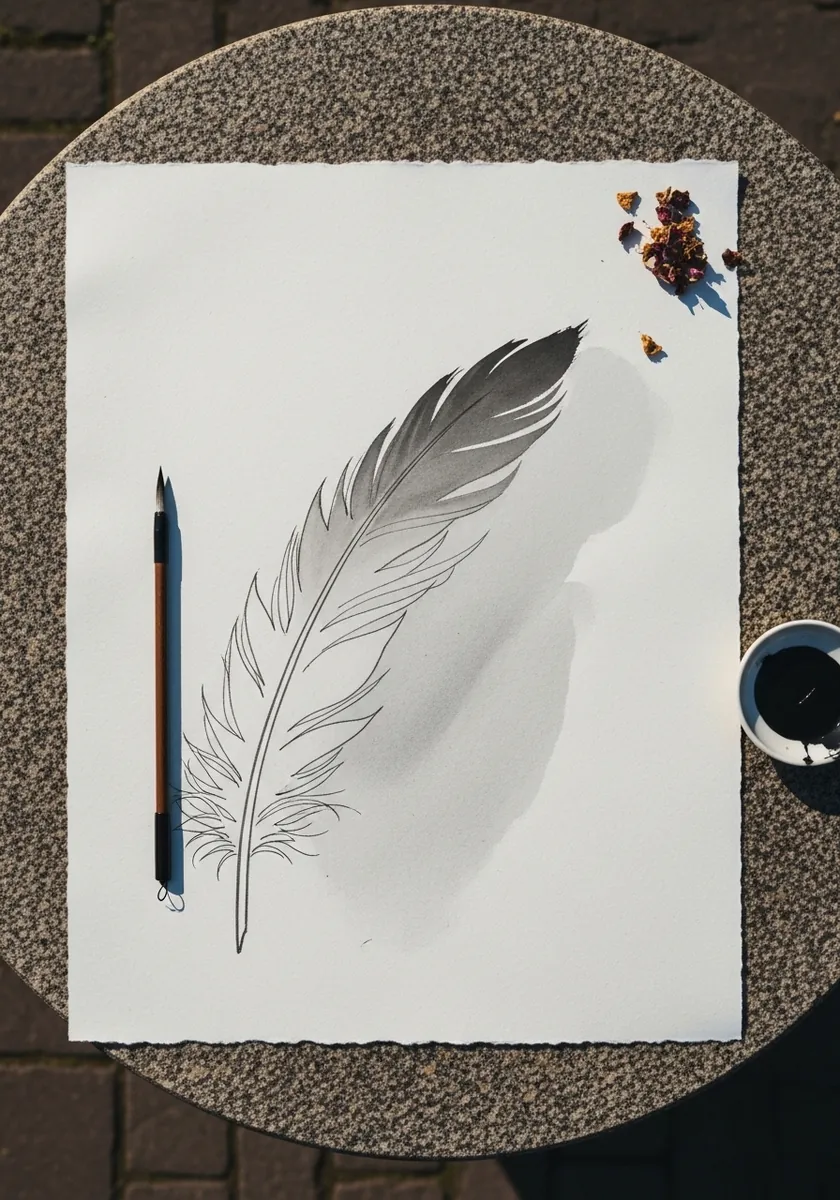
Stripping everything back exposes the drawing underneath. With almost no tone, the rachis curve and the asymmetry between leading and trailing edge have to be correct, which makes this a better test than a fully rendered study. Give the cast shadow a soft edge, since a hard one would make the feather look cut from card.
9. Folk Rooster Made of Feathers
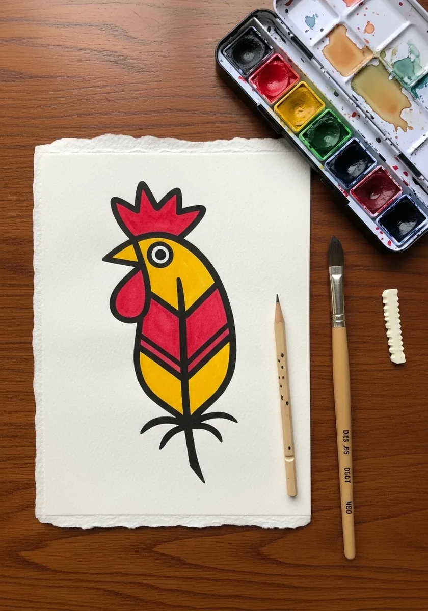
Reducing a bird to stacked feather shapes is a useful design exercise. Use three flat colors, keep every shape a simple pointed oval, and let the black outline hold them apart. No shading is needed anywhere. Draw the comb and wattle as the only curved shapes, which keeps them separate from all those points.
10. Pink Impasto Feather
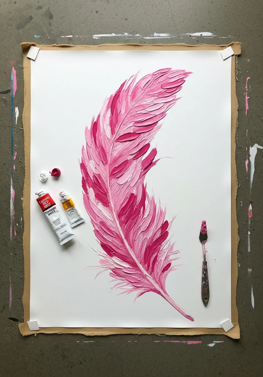
A palette knife naturally leaves a directional ridge, which is close to what a barb already is. Load the knife and pull each stroke outward from the shaft in one motion, and resist smoothing them together afterward. Scrape a few barb lines back through the wet paint with the knife tip for extra texture.
11. Charcoal Ostrich Plume
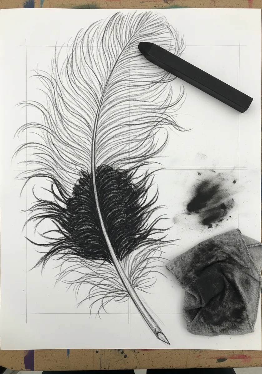
Ostrich feathers have no barbules locking the barbs together, which is why they look so soft and separated. Draw each barb as an individual curved line with visible gaps between them, and smudge only the densest area near the shaft.
12. Vintage Quill on Aged Paper
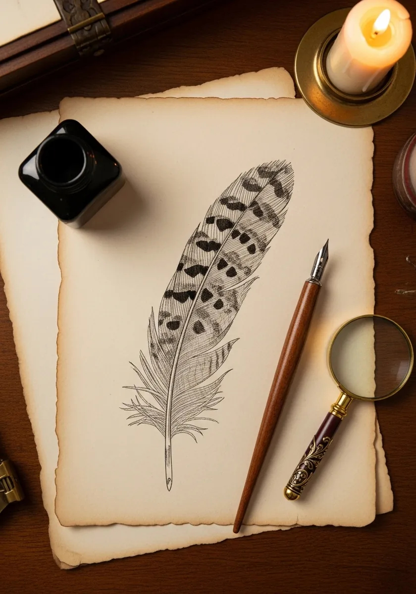
The calamus at the base is a hollow transparent tube, which is why real quills were cut for writing. Leave it almost entirely unshaded, add just two curved lines to suggest its cylinder, and let it contrast with the dense vane above.
13. Feather Against a Sunset Sea
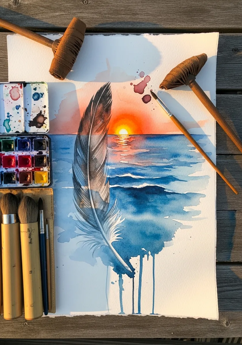
Two subjects need a clear hierarchy. Paint the sunset loosely and let it dry completely, then render the feather crisply over the top. Sharp against soft always reads as near against far, with no other depth cue required. Keep the horizon line well below the feather tip, or the two subjects will fight for the same space.
14. Glowing White Feather on Black
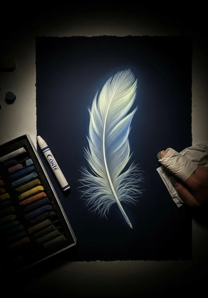
Working on black reverses your process entirely. Because you can only add light, decide which barbs actually catch it before touching the paper, and leave everything else as darkness. Two passes of white, one soft and one sharp, build the glow.
15. Pale Gray Feather in Soft Wash
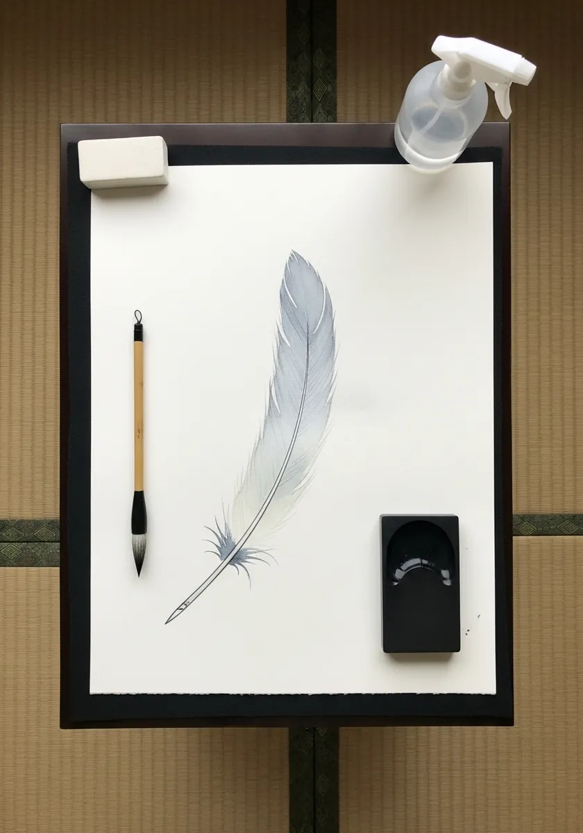
Restraint is the whole exercise. Keep the entire study within three close values and let the paper carry most of it. The temptation to add a dark accent for contrast is exactly what you resist here. Mix a touch of the complementary into your gray, as a neutral straight from the tube looks dead.
16. Purple and Gold Marker Feather
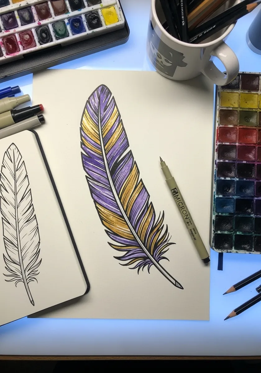
Markers demand one continuous pass or they streak visibly. Lay each section of vane while the previous stroke is still wet at the edge, and ink your outline with a waterproof pen first so the solvent cannot lift it. Test each marker on a scrap first, because alcohol inks dry noticeably darker than they appear wet.
17. Feather Mandala in Watercolor
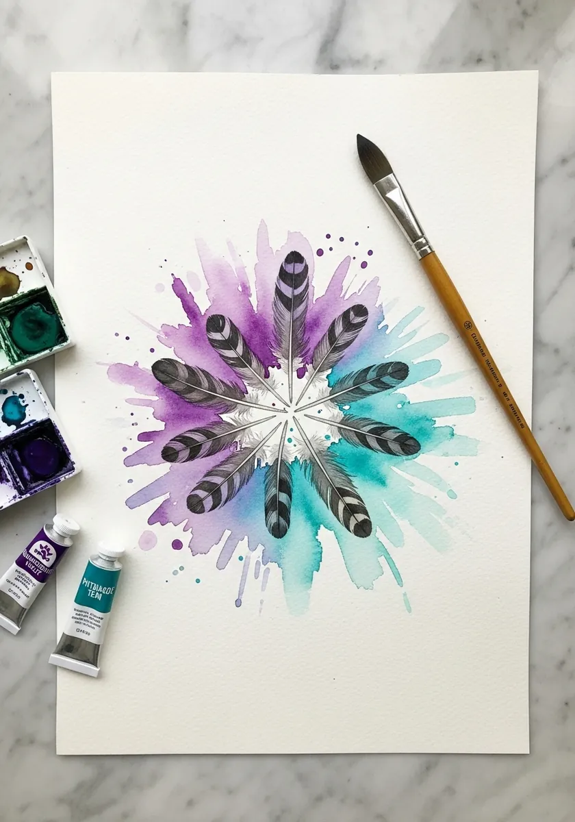
Radial symmetry needs measurement rather than instinct. Mark the center, divide the circle into eight equal segments with a protractor, and place one feather along each division line before adding any color. Rule your division lines in light pencil and erase them only once every feather is fully painted.
18. Annotated Anatomy Diagram
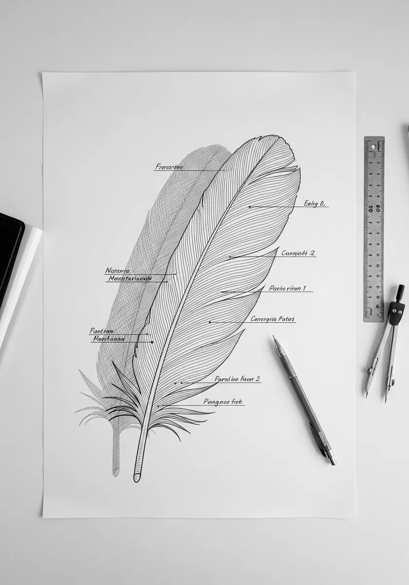
Naming the parts fixes them in memory. Label the rachis, the vane either side of it, the calamus at the base and the barbs themselves, and the structure becomes far harder to draw incorrectly afterward. Number each label and repeat the numbers on the drawing, which keeps the leader lines from crossing.
19. Neon Feather on Black Pastel Paper
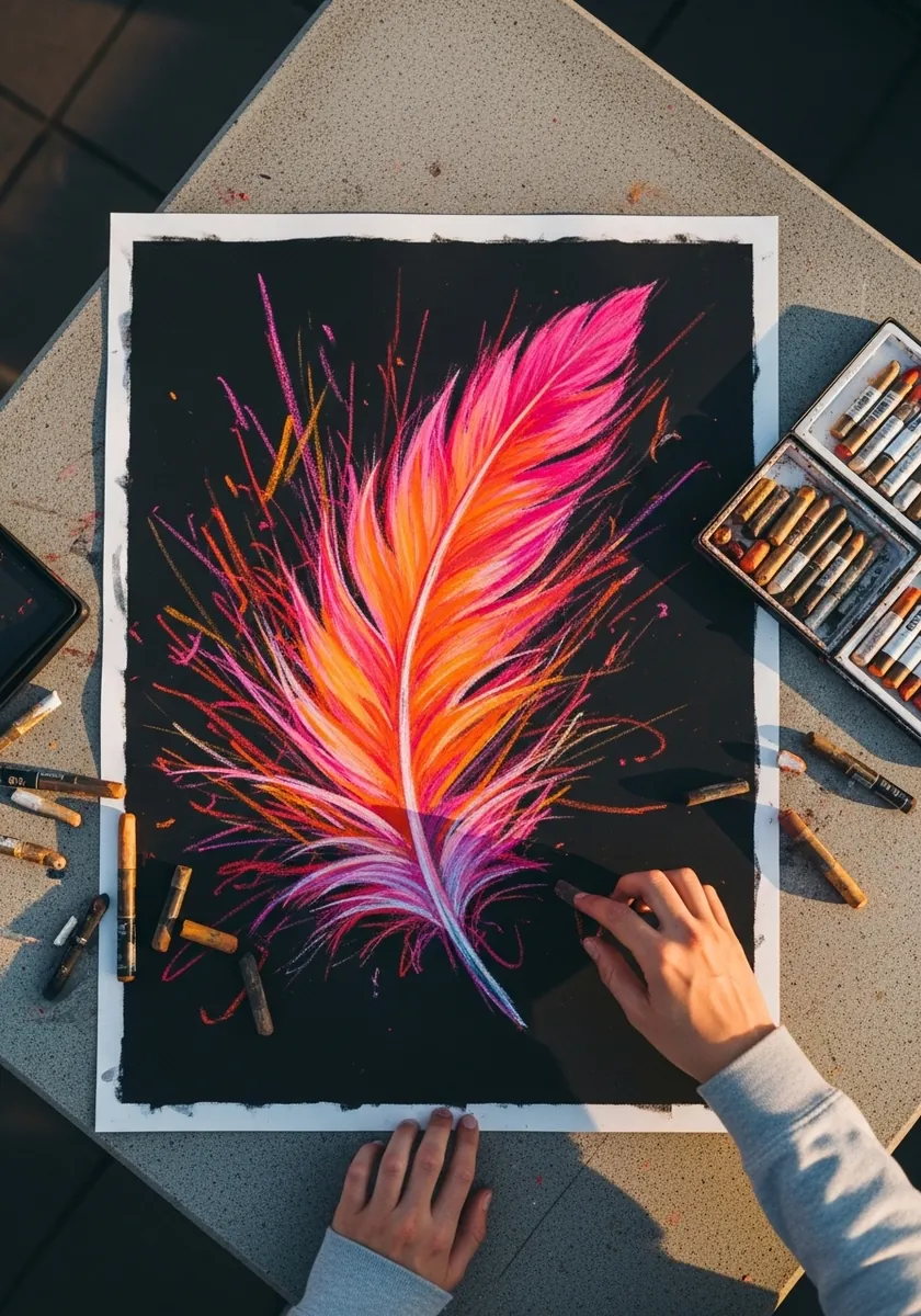
Saturated color on black needs a light hand. Lay the brightest pinks along the barb tips only and let them fade to bare paper toward the shaft, since covering the whole vane kills the glow you are trying to create.
20. Three Small Feather Specimens
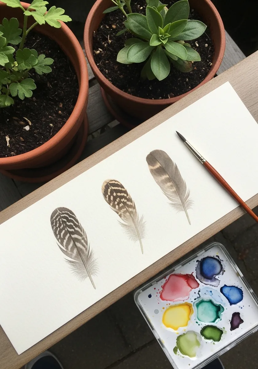
A row of specimens teaches you comparison. Paint all three at the same scale with the same light source, and the differences in barring, shape and edge become far more visible than they would in three separate studies. Group them by size rather than by color, since a size sequence reads as a deliberate study.
21. Indigo Feather in Layered Blue
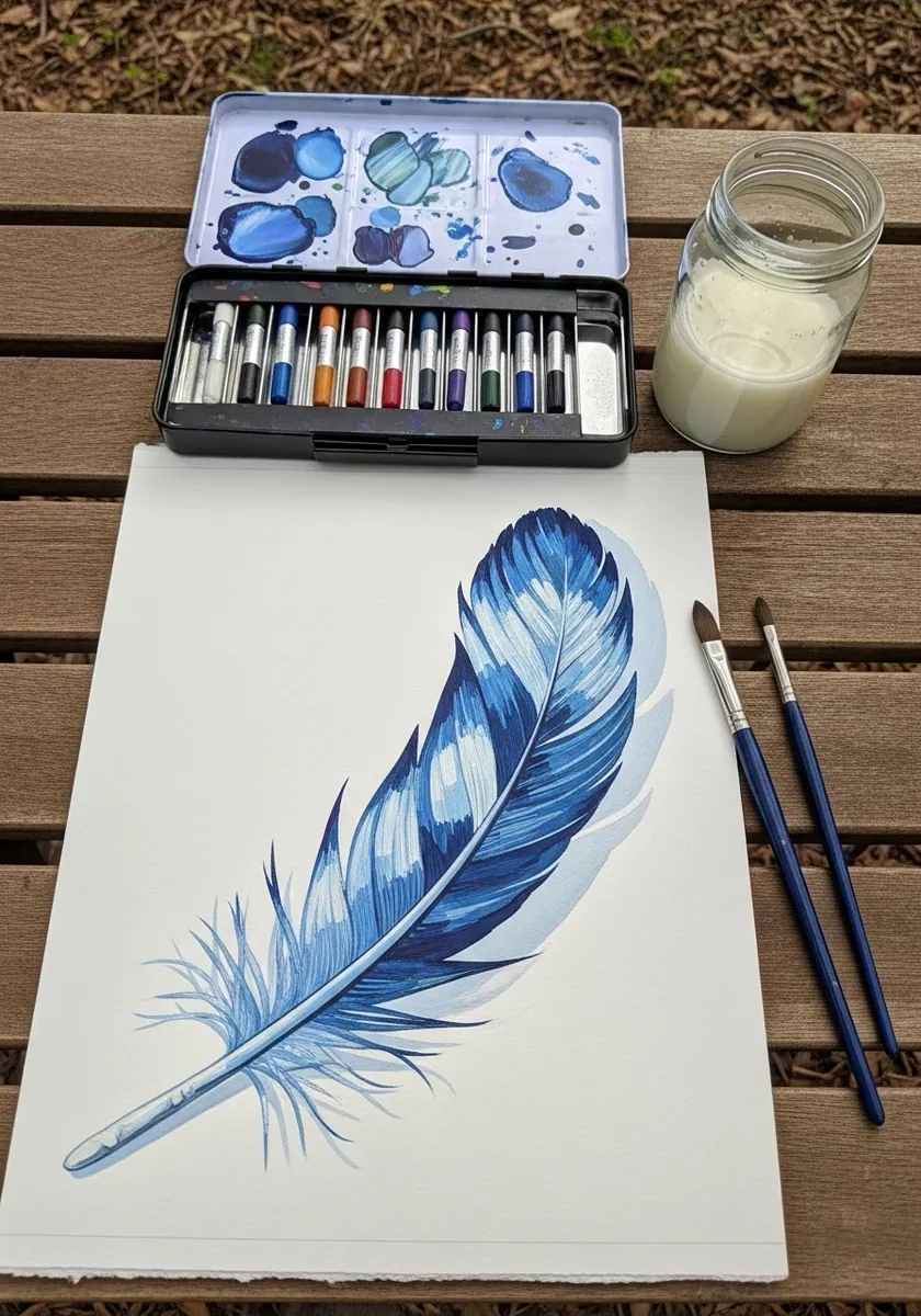
Layering builds depth that one wash cannot. Lay a pale blue over the whole vane, let it dry hard, then add progressively darker blues in narrower bands, leaving the earlier layers visible along the edges. Let each layer dry completely before the next, or the earlier washes will lift and go muddy.
22. Marker Feather with Bold Highlights
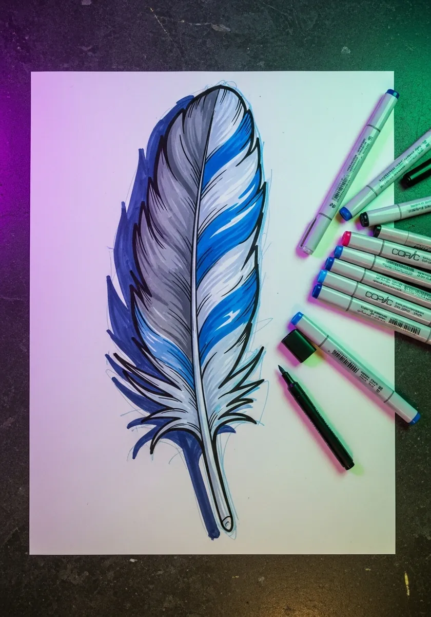
Strong highlights need to follow the barb direction. Run each white stroke outward from the shaft at the same angle as the barbs beneath, because a highlight drawn across them flattens the feather immediately. Keep the outline weight heavier than every interior line, which stops the highlights floating free.
23. Fine Hatched Feather on Cream
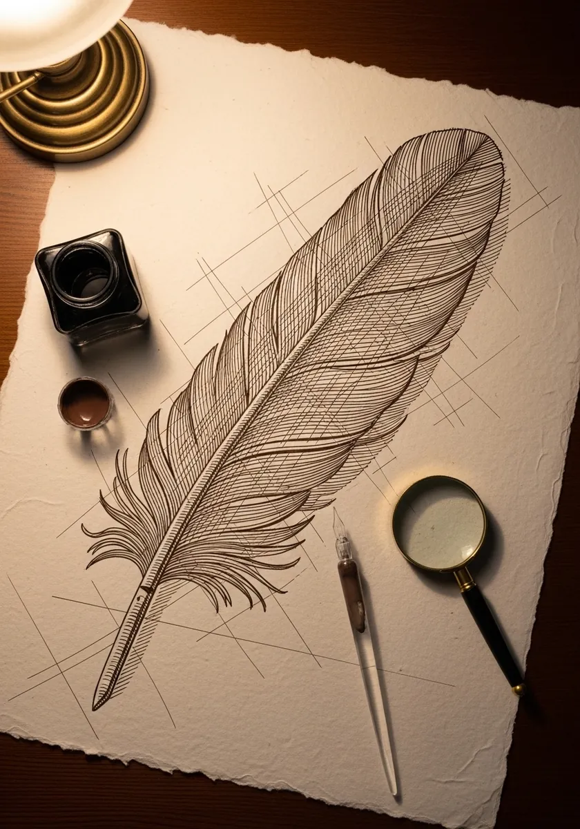
Old engravings built every value from line alone. Hatch along the barb direction rather than across it, cross-hatch only in the deepest shadow beside the shaft, and leave the paper bare at the lightest edge. Use one nib width throughout, because changing pens mid-drawing breaks the illusion of an engraving.
24. Delicate Pink Feather with Bubbles
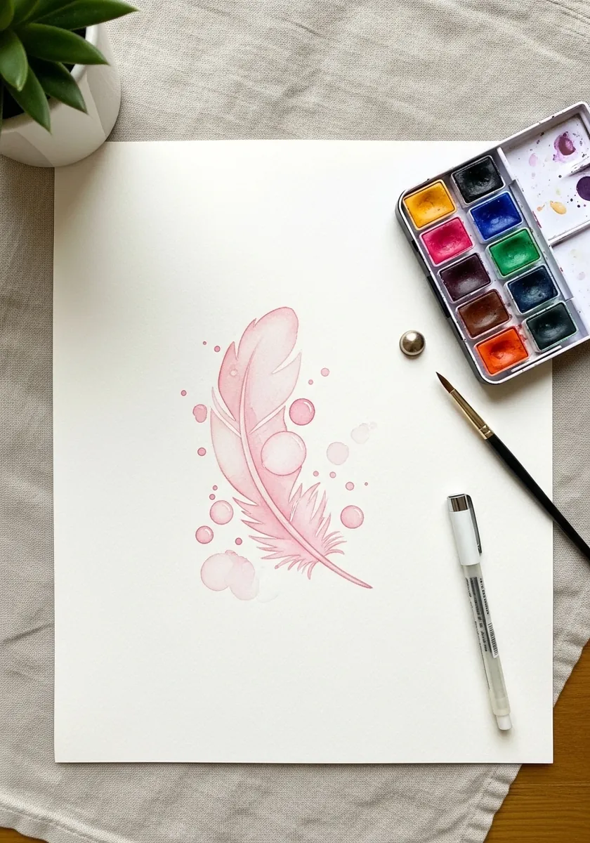
Negative space is doing real work here. Lift the pale circles out with a damp brush while the wash is still slightly wet, rather than painting around them, which gives them a much softer edge. Work on hot pressed paper, as a rough surface would fight the delicacy this piece depends on.
25. Dark Feather on Orange Brushstrokes
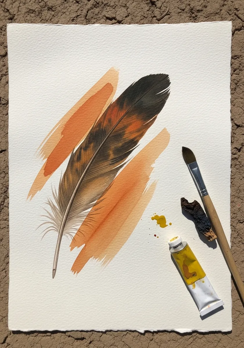
A complementary background makes a neutral subject sing. Lay the orange strokes first with a dry brush, let them dry, then paint the dark feather across them so a little orange shows through at the edges. Keep the orange strokes running diagonally, which stops them lining up with the shaft and flattening the composition.
26. Gold Leaf Feather in Warm Tones
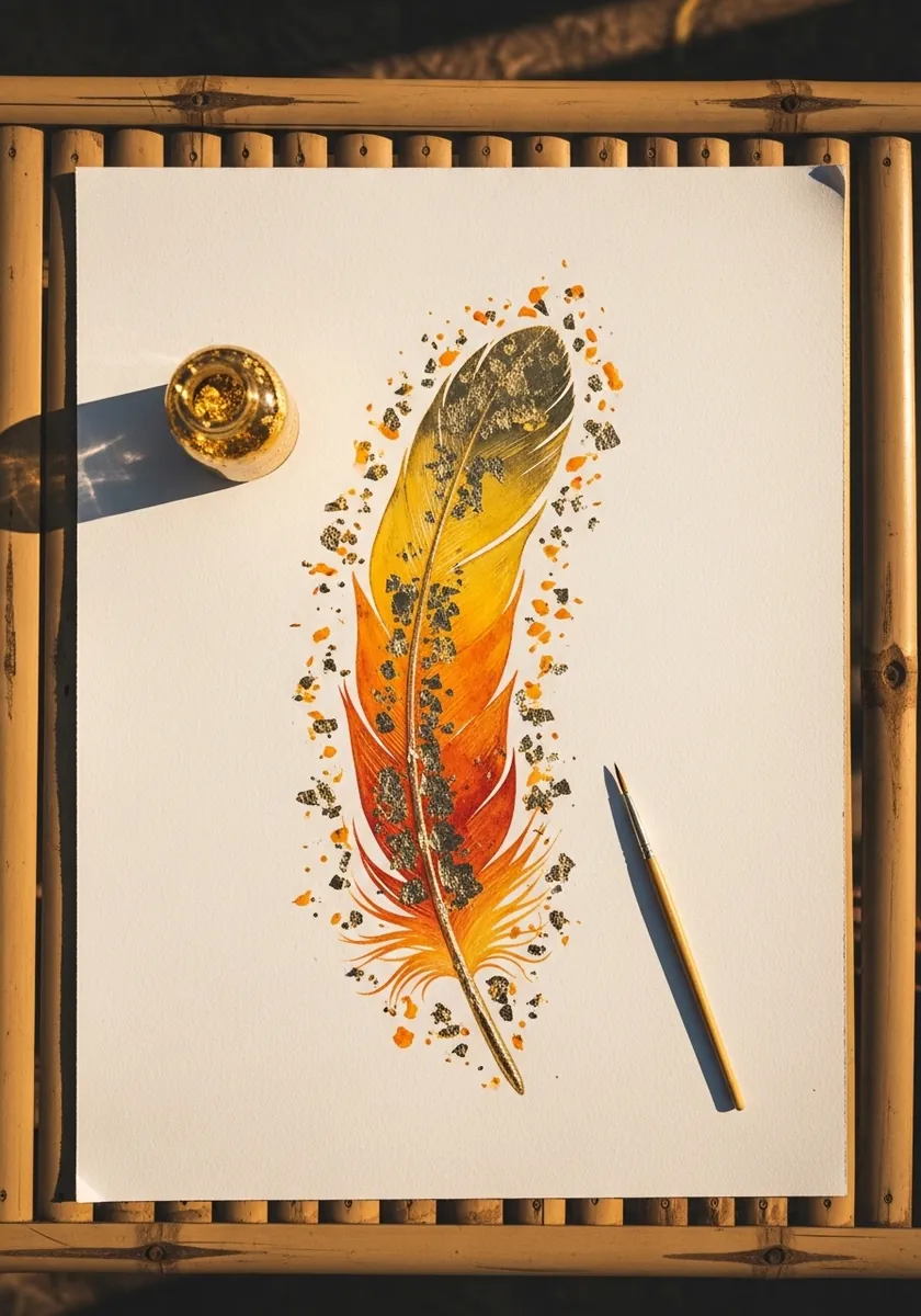
Metal leaf works best applied sparingly and last. Paint the feather completely, let it cure, then apply small flakes only along the upper barbs where light would catch, leaving the base entirely plain. Apply the leaf with a soft dry brush rather than fingers, since skin oils stop it adhering cleanly.
27. Geometric Angular Feather
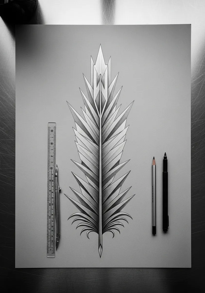
Reducing an organic form to straight lines is a genuine test of observation. Replace each curved barb with a single straight stroke at the correct angle, and the feather still reads because the angle was the important part. Rule every line rather than drawing freehand, because one wobble undoes the whole geometric idea.
28. Bold Ink Feather with Splatter
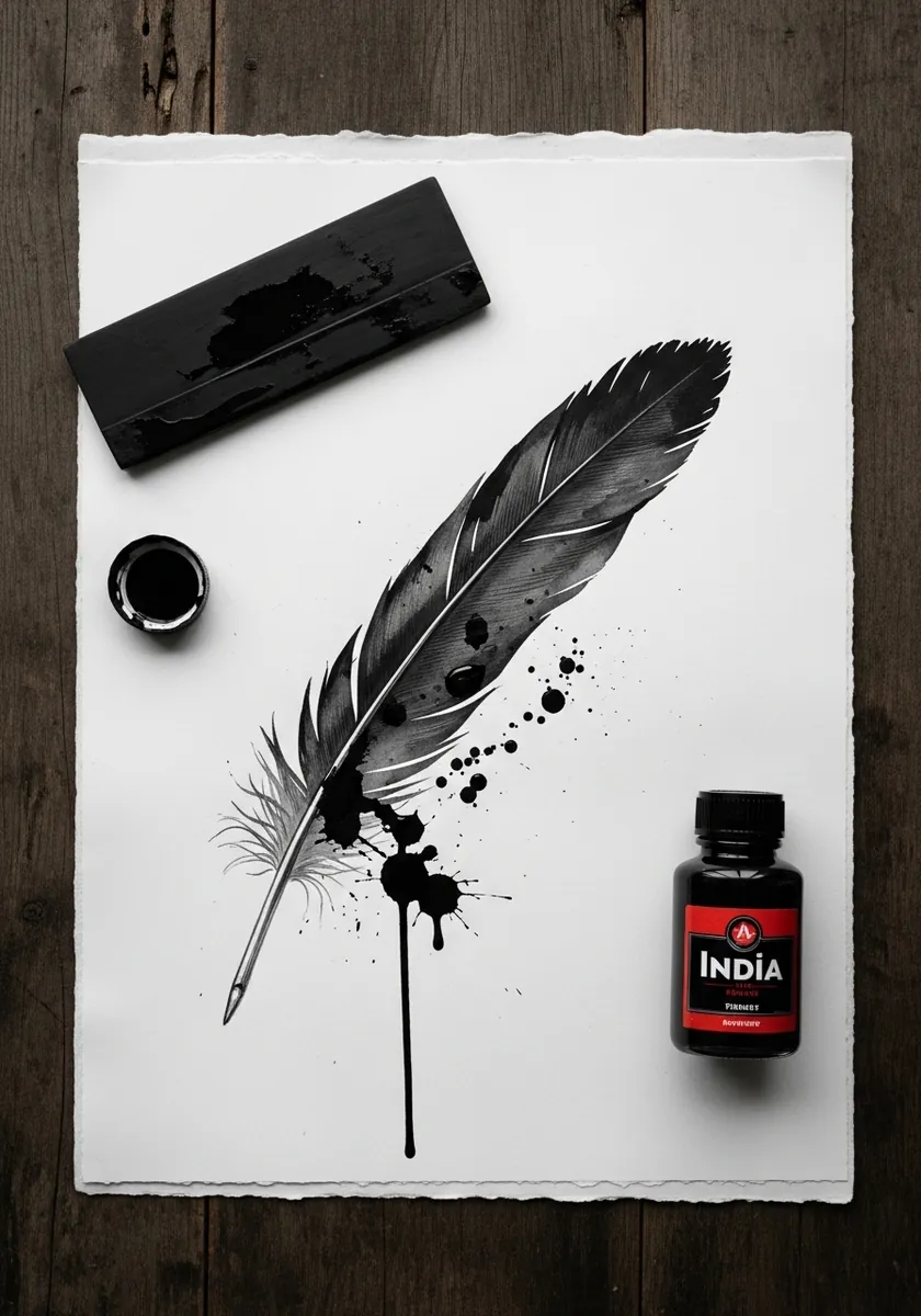
Precision and mess need clear separation. Paint the feather itself with a controlled loaded brush, let it dry completely, then flick ink across the page. The contrast reads as energy rather than as an accident. Stand back and flick from the wrist, as splatter from close range produces blobs instead of streaks.
29. Zentangle Peacock Feather
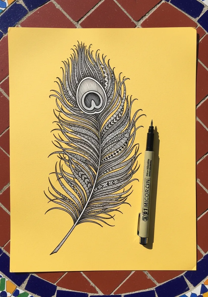
Pattern inside a fixed boundary is meditative practice. Outline the feather and its eye firmly, then fill each region with a different repeating motif while keeping your line weight identical throughout the whole piece. Yellow paper warms every black line slightly, which is why this reads softer than the same work on white.
30. White Impasto Feather on White
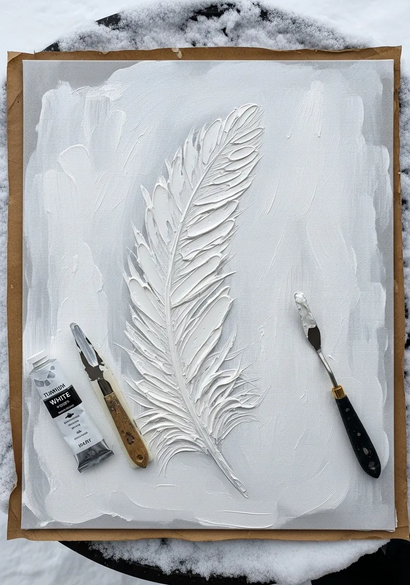
Removing color entirely leaves only texture. Build the feather in heavy white paint and let the raised ridges catch real light, so the drawing exists physically rather than tonally. Photograph it under raking light to see it properly. Build the paint in two layers, letting the first set before adding the raised barb ridges on top.
Frequently Asked Questions
How do you draw a feather step by step?
Draw the rachis first as one confident curved line, since it sets the whole shape. Mark the tip and base, then stroke the barbs outward from the shaft at a consistent angle, always angling toward the tip. Add a few separations last.
What is the central line of a feather called?
The rachis. It runs the full length of the feather and carries all the barbs. Below the vane it continues as the calamus, the hollow transparent quill that sits in the skin, which is why the base of a feather looks pale and empty.
Why does my feather drawing look stiff?
The barbs are probably drawn straight out at ninety degrees. Real barbs sweep toward the tip at a shallower angle, and that angle stays consistent along the whole shaft. Correcting it alone transforms most stiff feather drawings.
Should a feather be symmetrical?
Not usually. On flight feathers the leading edge is noticeably narrower than the trailing edge, which is what lets the feather cut through air. Drawing both sides equal instantly makes it look like a decorative shape rather than a real one.
How do you paint a peacock eye feather?
Build it in concentric rings from the outside in, blue-green, then bronze, then the dark center. The color is structural rather than pigment, so let the hues shift slightly across the eye and keep one small hard highlight off center.
References and Further Reading